How many of your new users churn on day 1?
Be honest. Is it:
- 30%?
- 50%?
- 75%?
Data from Churnkey suggests that apps are doing well if they can retain even as many as 40% of their users after the first 24 hours.
This is an astonishing statistic. Think about how much money is being left on the table by companies who aren't getting their new users to onboard and adopt their product!
What's the key to preventing those new users from churning?
That's right, it's new user onboarding.
So in this post, we'll show you how you can stop your new users from churning – and turn them into champions who advocate for your product.
TL;DR:
- What is new user onboarding? A process of educating users in their first 24 hours to 2 weeks, ensuring they activate and realize value from your product.
- Key strategies:
- Segment and personalize: Use a welcome screen to categorize users and guide them to their specific activation goals.
- Interactive onboarding: Employ interactive product tours, gamification, checklists, and hotspots to keep users engaged.
- Self-service support: Reduce friction with a help center and knowledge base for instant answers.
- Iterative improvement: Continuously measure metrics like activation rates and churn to refine your onboarding flows.
- Why it matters: Personalized, efficient onboarding boosts user activation, retention, feature adoption, and creates loyal product champions.
- Best tools for onboarding: Use platforms like UserGuiding to streamline the creation of in-app surveys, product tours, and more without coding.
What is new user onboarding?
User onboarding is best understood as customer education. You're teaching your customer how to get the most value out of your product for their use case.
This is something that happens across the entire customer lifecycle. Someone who's a lead can be educated through blog content and social media stories. Someone who's a power user can be educated through new feature announcements.
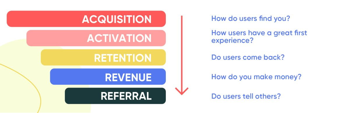
In the case of new user onboarding, we're specifically focusing on the product education that happens when a user first signs up to your platform.
Different companies will have different definitions of what constitutes "new," but it's generally anywhere from the first 24 hours to the first 2 weeks.
Alternatively, you could think of "new" users as those users who haven't activated yet – so they are yet to experience the value of your product directly from your product.
So what characterizes user onboarding in those first few hours and days? Typically, it's some combination of:
- Welcoming the new user to your product
- Giving them a product tour that's relevant to their specific use case
- Showing them a checklist of key product tasks
- Leading them towards activation
- Ensuring that support resources are available in-app for any problems that arise
These items are important to check because new users need a lot of support during their first week due to the fact that:
- They’re unfamiliar with the interface.
- They’re unsure how to achieve their goals.
- They hit unexpected friction points.
- Features may be overwhelming or poorly introduced.
- They need reassurance and quick wins to stay engaged.
Why do user onboarding when you have a product tour?
At this point, you might be wondering:
But I'm already giving my users a product tour that shows them how to use what we've built. Why bother with user onboarding?
That's a bit like saying:
But I already eat potatoes, so why do I need to eat any other vegetables?
Just as potatoes are just one of many types of vegetables you need to stay healthy, your product tour is only one part of a successful user onboarding framework.
Besides a product tour, user onboarding also comprises:
- Pre-boarding: the onboarding that takes place before your customer signs up for your platform
- Secondary onboarding: showing existing customers how to get value from new or under-utilized featured
- Support resources such as a resource center and a knowledge base
- And much more!
By investing time and resources into user onboarding, your customers will be more likely to understand how to derive value from your product, meaning that you will:
- Ensure that more users activate
- Boost retention and reduce churn at every stage of the product lifecycle
- Have higher NPS scores, leading to more referrals
- See more of your features get adopted by the user segments that will benefit from them
- Convert more of your new users into champions
How to create a successful new user onboarding experience
An onboarding flow can convert users by improving customer satisfaction and user engagement. To achieve this, you will need a good onboarding strategy and also a good application.
Here are 4 steps that will help you with this task.
Step 1. Understand what your users need
Value is subjective. What one user finds valuable might be a complete waste of time for another user.
For example, if you're a sales person using a sales CRM like Pipedrive, the ability to map out where leads are in the sales flow is insanely valuable.
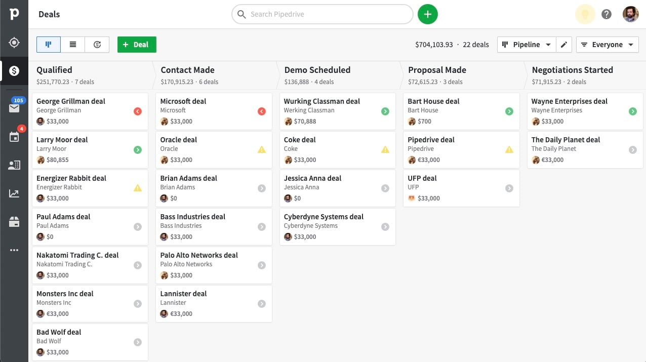
But to an accountant who only logs into Pipedrive to check that the card details provided are accurate, that same feature isn't interesting at all!
What does this mean for your business?
It means that you need to understand the pain points that individual users bring with them to your product, so that you can customize their experience accordingly.
How do you do this?
In my personal experience, there's no substitute for customer development interviews. It might seem a bit old-fashioned to sit down with users and just listen to their problems, but it works incredibly well.
Inside your product itself, it's smart to begin onboarding new users by putting them through a welcome screen, like this:
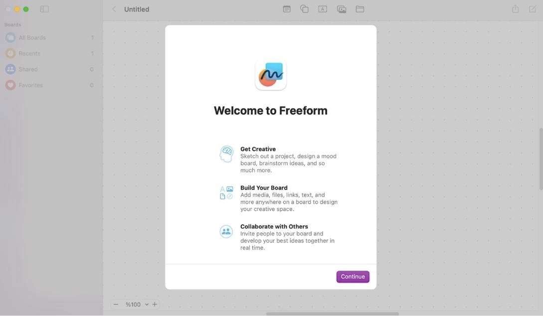
Use the welcome screen to ask customers what they want to accomplish by using your product.
Then, guide them accordingly towards the value they asked for.
Common mistake
A classic mistake here is to skip the segmentation that happens in a welcome screen and dive straight into a detailed product tour.
You know the type I mean? One that outlines all the features exhaustively, but doesn't actually tell you anything useful.
This is the user onboarding equivalent of a boring history lecture at school, one in which the professor gives you all the pointless details that no-one cares about, rather than telling an engaging story.
It's a snooze-fest. Don't do it.
Step 2. Be ready to reveal your value for different user segments
So you've learned that the goals of your users vary, and you've recorded data about their preferences using your welcome screen.
The next step is to give each user segment what they came to your platform for.
In onboarding-speak, this is "activation," or the point where a user directly experiences value from your platform for the first time.
For example:
- For a project manager using Asana, it might be when they create their first project board
- For an operations manager using Slack, it might be when they create their first channel and invite a few colleagues to it
- And for a therapist using BetterHelp, it might be when they get their first client through the platform
The trick here is to build activation into the product tour you create for each new user.
So here at UserGuiding, for example, the product managers who use our product activate once they've added the UserGuiding script to their product.
For this reason, we give them a product tour that leads them in this direction – complete with a checklist or progress bar that literally has installing the UserGuiding script as one of the steps:

So as long as a new product manager user completes the product tour, they will always activate. Literally, 100% of the time.
Pretty cool, right?
So it's really helpful to map out what the goals are for each of your user segments, defining activation for each segment accordingly, and then creating a product tour for each segment that walks them towards that milestone.
Common mistake
There are too many companies who disregard segmentation and give all their new users the same, generic product tour.
I appreciate that it's easier on your team to just create the one tour and serve it to everyone. But that strategy just isn't going to fly anymore. McKinsey have found that 71% of users expect personalization as a matter of course – and if they don't get it, they'll churn.
If creating segmented user onboarding is challenging, spend more time studying user journeys and designing personalized journeys into your product experience.

It can also sometimes be helpful to study existing user onboarding templates. These can be a useful point of departure, but you'll still need to do your own user research to really build a unique product journey.
Step 3. Design in-app interactions to improve the onboarding experience
Ever had a conversation with someone who refuses to listen to what you say? Every silence is seen as an opportunity to monopolize the focus of the conversation.
Not very engaging, is it?
In the same way, onboarding that simply lectures users about what to do inside your product is a rather tedious user experience.
So what can you do instead?
You can turn the onboarding of your new users into an interactive experience. There are tons of ways to do this:
You can use tooltips that show text when the user hovers over them:
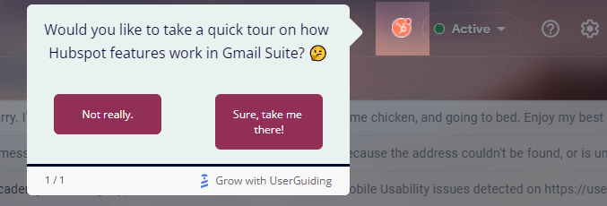
Have the user complete key actions in your app and check them off in onboarding checklists as they go:
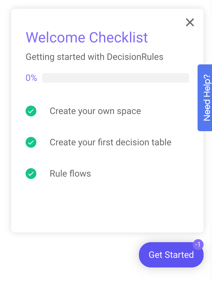
Position little dots called hotspots next to your features and let users who are curious explore them:
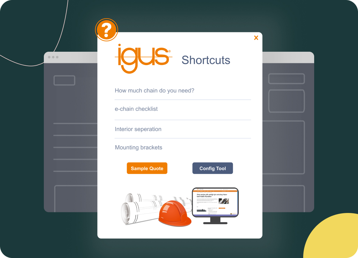
You can even put surveys into your app and ask what users think of some of your features:
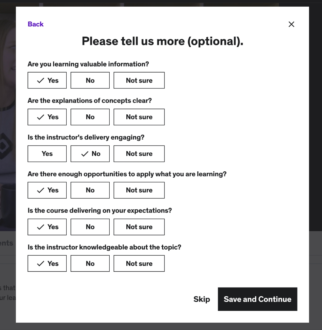
This turns what would otherwise be a boring onboarding lecture into an engaging conversation, where your user feels involved and listened to.
Common mistake
In your enthusiasm to onboard your new users, it's tempting to be swept up in exuberance and force users to engage in onboarding interactions – whether they want to or not.
For example, let's imagine that a user has just joined your app and is busy doing something important with it.
And then your onboarding system comes along and gives them a huge modal that takes up the whole screen, telling them about this shiny new feature that's oh-so-perfect for their use case.
There's no X to click on to get rid of the modal, so the user is forced to take the tour for this new feature.
Even though the feature is actually helpful for them, the user feels annoyed. They were in the middle of doing something important, after all.
To avoid this mistake, always ensure that any onboarding you show users is optional. There should always be a way for users to click away from onboarding, either by clicking on an X or by clicking something like "Skip," or "Not now."
Step 4: Measure, evaluate and get better at new user onboarding
Even if you follow all the onboarding best practices you can get your hands on, you still won't get your new user onboarding right the first time. Some users will still churn.
But you can increase your chances of getting the results you want by dedicating yourself to the entire onboarding process. Every month or so, look at your user onboarding data and see how you can use it to improve.
Data points that are especially useful include:
- Your activation rate
- Your feature adoption rate
- Your churn rate
- Your trial-to-paid conversion rate
- Making a note of where in your onboarding flows users are dropping out of the process
You can find a full list of onboarding metrics and how to measure them here.
Common mistake
A common mistake in this area is to collect data for all of the above points but not analyze the data or take any action.
This happens most often when SaaS teams have a maximalist sort of mindset and try to collect as much data as possible. Inevitably, they find themselves not having the time to really sit with the data and see what it's telling them.
So you can avoid this mistake by starting small.
Choose one or two user onboarding metrics and make a schedule for analyzing those on a regular basis (monthly is best) and taking action on the results.
Can you manage that? Great. Add another 1-2 metrics the next month.
That way, you won't overwhelm yourself, and the time invested to collect the user onboarding data will actually be useful.
6 Best Practices To Convert New Users Into Champions
With a great user onboarding experience, you can guide users to be paying customers, and also champions.
These tips will help you streamline onboarding so you can encourage first time users to adopt core features and drive users to complete key tasks easily.
Personalize the user onboarding experience
We already mentioned how valuable it is to segment your new users with a welcome screen and give them a product tour that leads them to their specific segment's activation goal.
But that's not the only way that you can personalize how you onboard new users.
Perhaps you have evidence suggesting that one group of users will respond better to certain copy than others.
In this case, you can set your user onboarding materials so that they show one set of copy to one segment and another set of copy to the other users.
Or perhaps you have the sort of app where different user groups use different sets of features for their respective use cases.
In this instance, it makes sense to only highlight the features that a particular user segment finds valuable.
For companies that serve enterprises, you'll likely find that enterprise users require a different level of customer support than regular users. They often expect an account manager, or for you to drop everything as soon as they bug you with a question.
It follows that you'll have to offer them more hands-on support during the user onboarding phase of their journey.
Increase self-service options with a help center
Even if your product tour is incredibly informative, new users are bound to have questions and get stuck occasionally.
This happens most often when they're trying to use a feature that they haven't yet explored, or when the feature is complex.
When new users have questions, companies respond in various ways.
Companies that are teetering on the edge of going out of business won't respond at all. And then they'll be surprised when their users churn.
Average companies will send users to their support agents. The users will eventually get the help they need, but it might take a few minutes to a few days, depending on the size of the company.
But do you want to know the secret of companies whose customers get answers to their questions immediately?
It's called a help center.
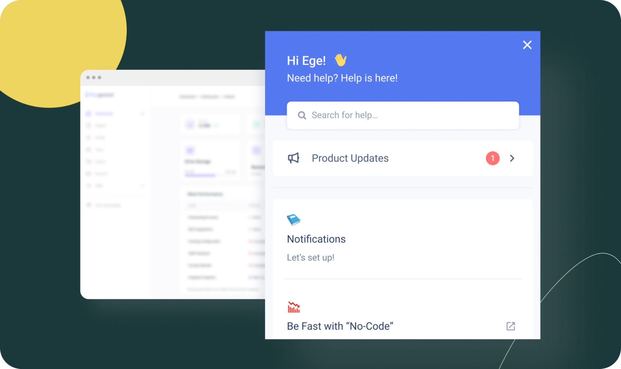
It's a little widget that lives in your app and pulls in resources from your knowledge base. Users can consult it whenever they get stuck.
So, the best way to help new users understand complex features and drive feature discovery is to provide them with a self-service option.
Why is this better than traditional support agents?
- It's significantly faster for users than waiting in a queue to talk with an agent
- It's empowering for users to know they can solve their own problems
- Given the average customer support salary in the US is $45k, it's a lot cheaper than hiring support agents
- It allows users to access contextual support – support that's in the exact context they're in when their question pops into their head
Gamify your onboarding to make it fun
A core element of human nature is that we love to play. Children do it instinctively, and even adults love to play video games or joke around with friends.
You can make your new user onboarding significantly more engaging by bringing an element of play to it. This is called gamification.

For example:
- Have users create an avatar when they first sign up, almost as if they were playing World of Warcraft
- Give users the ability to earn points, and show leaderboards that display the users who earned the most points in a given week or month
- Award top users badges for their in-app accomplishments
You're only limited by your imagination for this one!
Collect user feedback continuously through in-app surveys
Collecting user feedback from new users about your onboarding isn't a particularly new or radical idea.
In fact, I daresay that you've probably received an email like this in the last week or two, asking you what you think of a product you're using:
But that's exactly the point. An email.
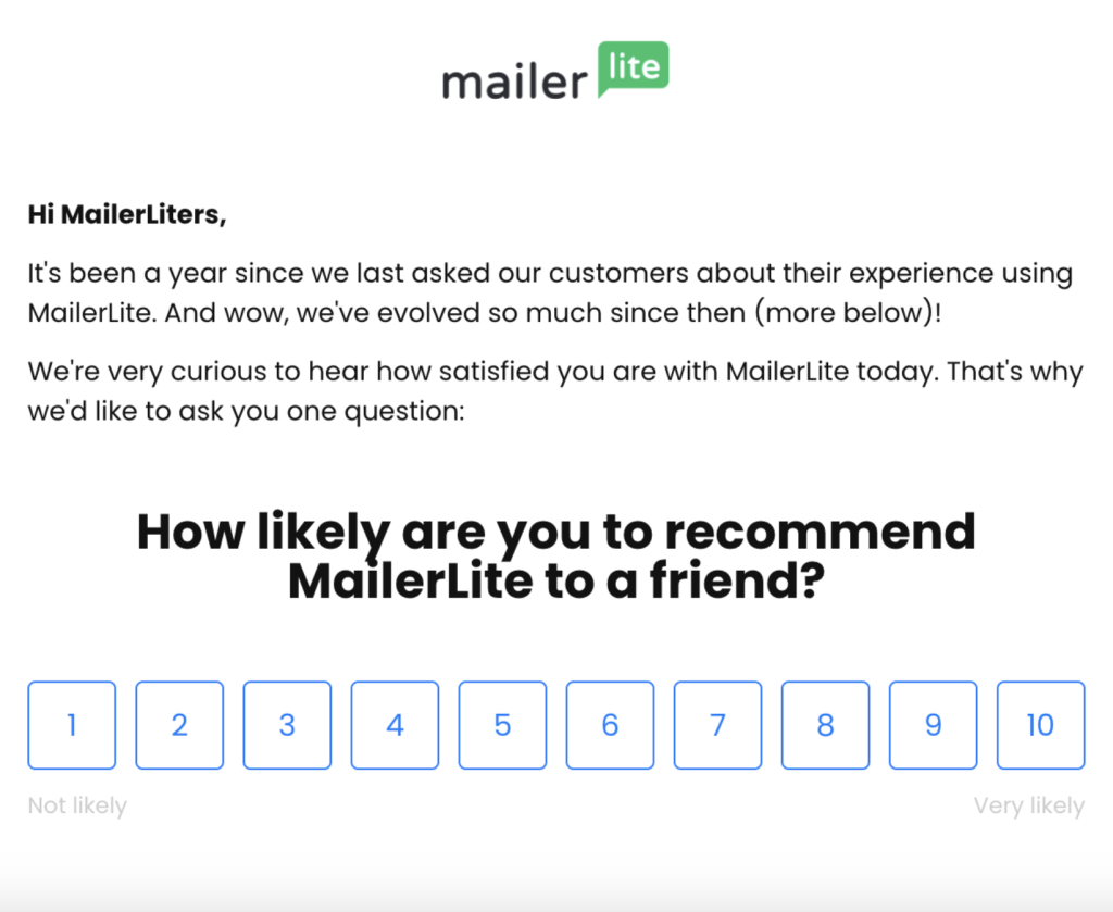
How much more engaging would it be if you could survey your new users inside your product itself? That would mean that they wouldn't have to click away to a different platform in order to fill out the survey.
There are two types of surveys that I've seen that are doing particularly well right now in onboarding circles.
The first is a quantitative survey. This basically asks customers to rate your features, or your whole app, on a scale – normally 1-10, but not always.
The key point here is that your users' answers are always in the form of numbers.
Then there's the qualitative survey. Think of this as the meat on the bones of the initial quantitative survey, or as something that provides an extra level of context about your users' answers.
For example, you could ask users to rate a particular feature. And then you could follow that up with another survey asking them why they gave you that score.
This is especially useful if the user gave you a low score. Now you'll get some data that might point you to some problems with that feature that you weren't previously aware of.
And just to stress again: these surveys can be released to users in-app. Such a powerful tool, when used correctly.
Find and eliminate onboarding friction
Another way you can make the onboarding experience more pleasant for new users is by reducing friction.
What does this mean?
Well, let's say you're signing up to a platform for the first time. And that platform asks you to create a new account so that you can use their service.
This means you have to create a new account that's only for their platform. More often than not, complete with a password that has to have a capital letter, a number and a special character. Zzzzzzz….
It's all rather tedious, from the user's perspective.
Contrast this with a platform that lets new users sign up through their existing Google account.
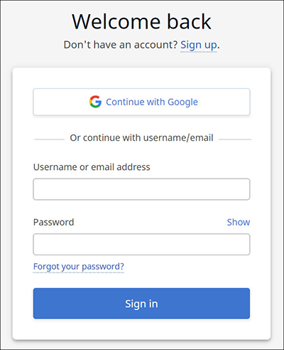
One click, and you're done. Easy. No friction at all.
Other common sources of onboarding friction include having too many questions in your initial sign-up form, and greeting new users with an empty state, so that they have absolutely no idea what to do when they first sign in.
Eliminating these will help, too.
But a word of caution here. There are some industries where a degree of onboarding friction is necessary.
Banking comes to mind. Highly regulated, high levels of data security needed.
Even if you wanted to throw caution to the wind and rush users through a quick sign-up process, the regulators probably wouldn't let you.
I've also seen onboarding flows in highly technical industries that require code in order to get value out of the product.
All that being said, in the majority of cases, it's wise to lean towards eliminating friction where you can.
Choose an onboarding tool that will bring it all together
So, you're all-in on the value of onboarding new users, and you want to jump in and get started. Great!
There are basically two ways you can go about creating onboarding elements inside your product.
You can code them yourself, or you can create them using a third-party tool. Build or buy, as the saying sometimes goes in the SaaS world.
If you build your onboarding elements in-house, you get an unparalleled amount of control over the finished product.
But the downside is that it's immensely time-consuming and expensive. Developers cost a small fortune. And don't forget to factor in the opportunity cost of shifting development resources away from your primary features, as well.
It's often smarter to partner with a low-code tool like UserGuiding to get the job done cheaper and faster.
UserGuiding will let you build…
- In-app surveys
- Product tours
- Guides
- Hotspots
- Tooltips
- And more
… all without having to write a single line of code.
This means that your non-technical product managers can create onboarding elements, leaving your devs free to do the heavy lifting.
And it's all incredibly affordable. Check out this page to see UserGuiding's pricing.
3 Inspiring New User Onboarding Examples
Vieworks
Vieworks.io is a video marketing and customer engagement platform that helps companies educate their users by offering rewards.
Their onboarding begins with a welcome screen, which then points users towards adding their company details:

From there, some tooltips lead users towards creating a seat:
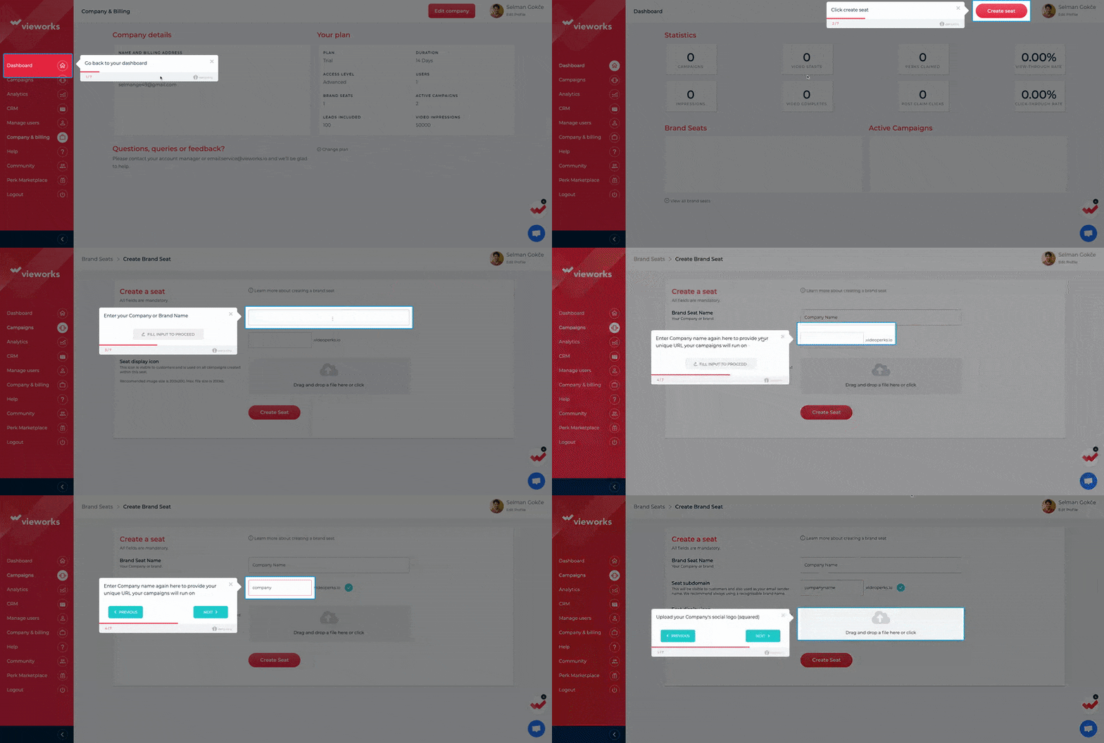
These are the first two steps in Vieworks' onboarding checklist, which houses the whole onboarding process:
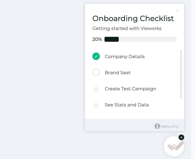
We like this example because it's extremely intuitive.
At no point in the customer journey is the user wondering what they should do next. It's very apparent what the next steps are after signing in for the first time.
Read more about Vieworks' onboarding process here.
Plandisc
Plandisc's software provides a circular planning tool that allows users to have a visual overview of their whole year. It consists of multiple concentric rings, instead of the usual rows and columns.
Their new user onboarding begins with a welcome screen:

After that, the user is taken on a product tour that shows them how to add events to their new circular calendar:
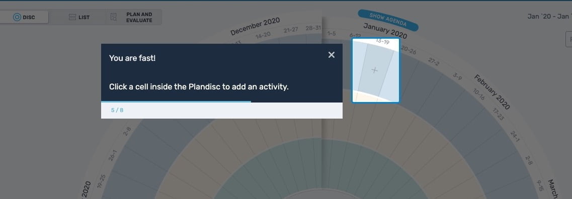
Once the user has set up their first calendar, a hotspot points them towards sharing it with other people. This is important to Plandisc's value proposition, since their software really shines as a collaborative planning tool.
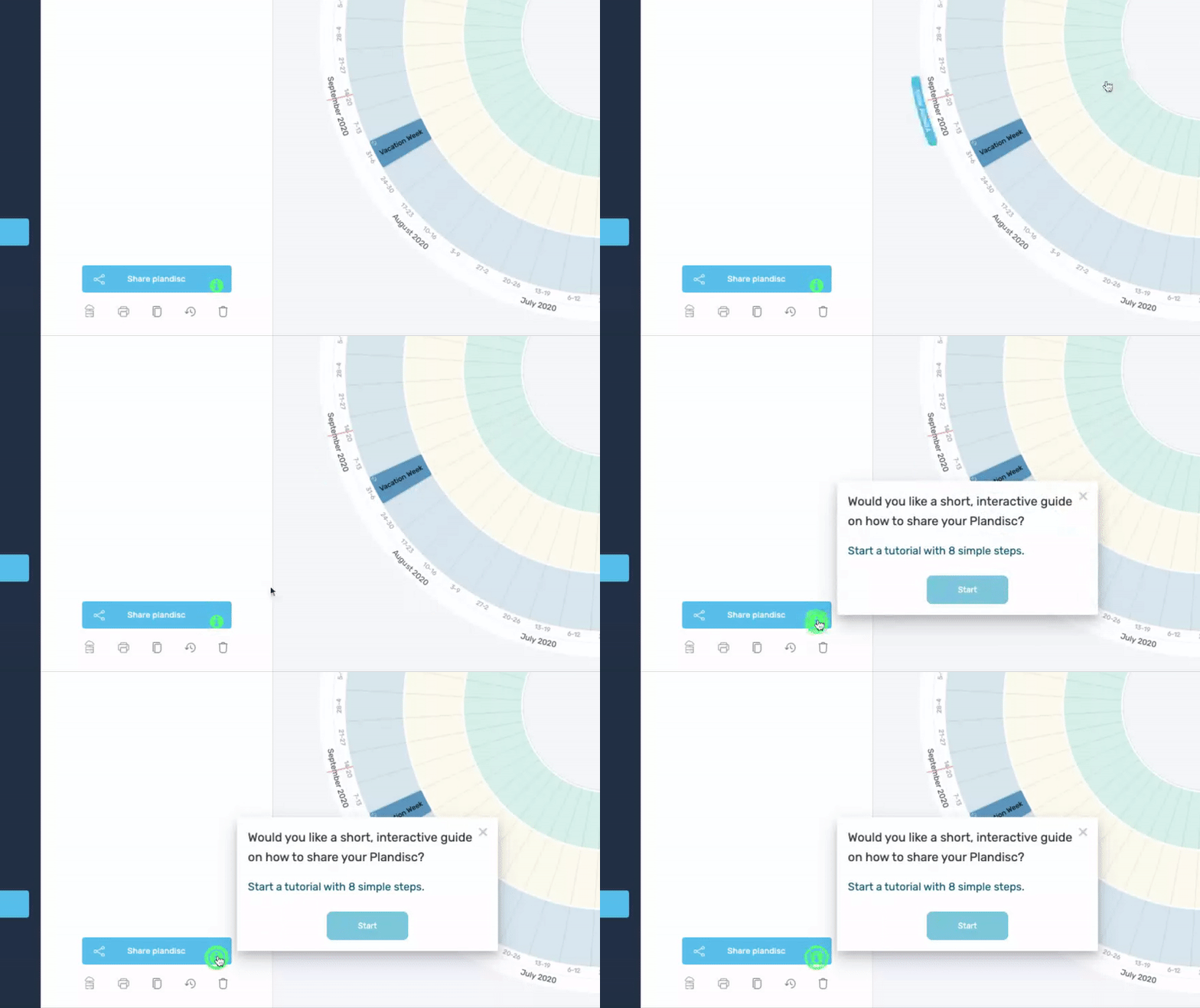
We like this example because it shows that your initial product tour doesn't need to be all-encompassing. Remember: if your product tour is too long and contains too many features, it won't engage users.
What Plandisc does instead is give users just enough information so that they can set up their initial calendar, and then additional features like the share functionality have their own separate walkthrough.
It's simple, but it breaks the learning down into chunks, making it more digestible.
Click here to find out more about Plandisc's user onboarding.
Duolingo
Duolingo is a popular mobile app for learning new languages.
Their welcome flow has a few segmenting questions about the language the user wants to learn, how much time they have to dedicate per day, and their existing language level:

This helps Duolingo ensure that the user has an experience that matches what they're looking for.
Rather than have users make a dedicated Duolingo account, Duolingo reduces friction by letting them log in with Facebook or Google instead:
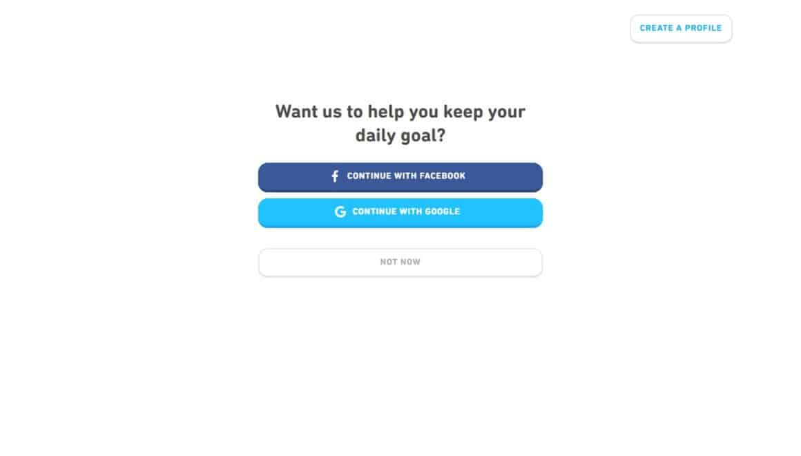
Once they're inside the app itself, tooltips facilitate the users' learning by highlighting the meaning of individual words:

This onboarding process stands out for the way that it consistently reduces user friction.
Whether it's with an intuitive welcome flow, a sign-up with Google or Facebook, or helpful tooltips, Duolingo is constantly looking for ways to make their user experience just a little simpler.
Click here to read a full breakdown of Duolingo's onboarding.
To sum up
And there you have it!
You now know what sets new user onboarding apart from regular onboarding, why it matters, and what best practices you should follow to build an excellent new user onboarding process for your company.
As a next step, you'll want to either build those onboarding elements yourself, or partner with a third-party tool.
Since coding is so expensive and time-consuming, I strongly suggest that you consider the third-party tool route.
When you're ready for that, you can sign up for a free UserGuiding tour here to see if we can help you.
Frequently Asked Questions
What constitutes a new user?
Most companies define "new users" as users who are in their first 2 weeks of product usage. You can also think of a new user as someone who hasn't activated yet.
What makes new user onboarding different from regular onboarding?
The risk of churning is higher, and there's more of an onus on the initial product tour.
How can you get new users to stick around?
Improve your onboarding by adding a product tour, a new user checklist and some guides for your most important features.
What tools should I use to improve my KPI on % of onboarded new users for our product as a product manager?
To improve your onboarding KPI, use tools like UserGuiding to build interactive walkthroughs, checklists, and in-app messages that guide users step by step. You might pair this with Mixpanel or Amplitude to track onboarding funnel metrics and drop-off points. Also, FullStory or Hotjar can help you understand user behavior through session replays and heatmaps. In short, combining guidance, analytics, and communication is key to boosting onboarding completion rates.
How to quickly onboard users before seasonal peak?
In order to quickly onboard users before seasonal peak, you should streamline onboarding with short, goal-based flows using checklists, tooltips, and guided tours as well as focusing on core actions that deliver immediate value, and removing any unnecessary steps. You might also use segmentation to tailor the experience by role or use case, and reinforce learning with a resource center or quick-start guides.


.svg)
.svg)
.svg)
.svg)
.svg)


.svg)
.svg)


.png)


