


.svg)
.svg)
.svg)
.svg)
.svg)


.svg)


.svg)
.svg)


You have 0.05 seconds to make a great first impression on a website or an app.
That’s 50 milliseconds.
And that’s HALF the time of an average blink.
It’s a pretty amazing statistic, but it is also extremely scary.
This means that users judge the majority of your content by the very first thing they see on your website or app.
And that’s usually a welcome page.
Now, I hope I made it crystal clear how important that first impression is.
But to emphasize it even more, in this article, we will go over:
👉 How to create a welcome page in 5 steps,
👉 The do's and don'ts of welcome page design, and
So, without further ado, let’s dive right in ⬇️
What Exactly Is a Welcome Page?
A welcome page is an introductory page for a website or an app and is often the very first official piece of UX your users experience. Whatever its shape, colors, or format might be, a welcome page essentially aims to increase conversion rates by converting visitors into customers or free trial users into paying customers. Thus, high-converting landing pages can often be considered welcome pages.
But then, apart from being the very first impression of your potential customers, why do welcome pages matter?
Let's take a look ⬇️
Why Is Your Welcome Page Important?
Because, duh, first impression.
Then, why does the first impression matter?
There are 3 main reasons:
1-Brand Image
One of the first and most noticeable things on your welcome page is your brand image.
Whether you use bright colors or not, where your action buttons are, if there are popups - and whether they are annoying or too annoying - is all noticed right off the bat.
And whether your messaging comes across or not depends heavily on visual hierarchy.
Might wanna consider that when you're working on your landing page design 👀
2- Value Proposition
A welcome page, especially a website welcome page, is one of the best places to display your value proposition.
And if you took my advice and minded your visual hierarchy, you would know that placing it high on that hierarchy is a priority.
Look at how Monday.com does it, for example:
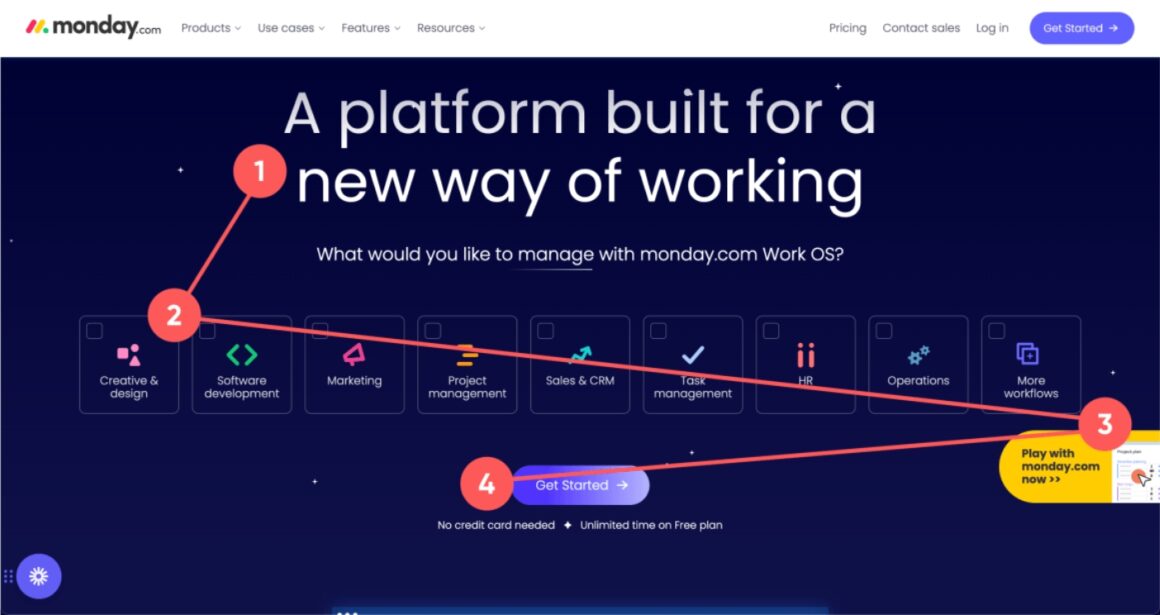
💡 Pro tip: Make sure your value prop is the first or at least second thing your users look at on the welcome screen.
3- Quick Conversion
Now if you did brand image and value prop right, then a quick conversion is possible.
And it is also one of the reasons why welcome pages matter.
Because without one, users might not realize your branding or value prop.
And thus not convert.
And thus not pay.
And thus, you fail.
So, a welcome page matters, because it shows users your brand image, your value proposition, and gives users a space to quickly convert.
Now, if we are on the same page about how everyone needs a welcome page...
Let's take a look at how to create one ⬇️
How to Create a Great Welcome Page in 5 Steps
#1- A Simple Layout
First things first...
Keep it simple, and not exhausting to look at.
Here are some quick notes:
✅ Let people know where to look; you would not like to confuse them with an overwhelming view,
✅ Using a defined and limited color palette and patterns derived from your branding is preferred; it is best to keep it simple,
✅ You want to grab your visitor’s attention, not divert it elsewhere; use a monochrome or white background
✅ Write a good headline and greet people warmly in a way that still matches your brand
Then comes establishing the right message ⬇️
#2- The First Contact
Remember that 2016 movie Arrival with Amy Adams?
Where she plays a scientist trying to communicate with aliens?
Now, for a second, imagine her first words were, “put your hands where I can see them!”
Best scenario they leave, worst scenario, they evaporate us all.
Well if you display the wrong first-contact message to users they might do the same thing.
They might leave.
Or straight up destroy your business with bad word-of-mouth and negative reviews.
First off, be enthusiastic and kind with your welcome message. And then you can mix things up by adding something creative to the equation.
#3- Action!
After your welcome message, continue with a button that makes people want to click on it.
The button might say...
“Let’s get started”, or
“Explore {your brand}”
You know, the classics.
But it may be more interesting to add what they are going to do to the CTA button.
Like, "let's improve my user onboarding" that we have up there ↗️
Or if you're feeling sassy...
"Better conversion is behind this button"
It is better if you pick a different color for the button than the page’s tones; this way, it will be more luring.
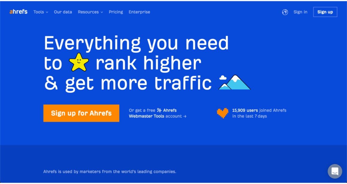
Ahrefs gets it, look at the calls to action on the screen:
#4 Repeat without boring users
You may increase your value proposition’s power if you use it on your welcome page again.
Then again, and again.
But do it without becoming boring.
Repetitive sentences are more likely to stick in people’s minds.
You can lay the foundation for a successful future brand by making your value proposition memorable.
But if you are not going to use your value proposition, be easy to understand, and explain what you do in different words by being simple still.
No one is going to use a service that they do not understand.
#5 “This one’s for you!”
You know who you’re selling to.
You are solving a problem, and your customers are the people who experience that problem.
So you know who your customers are, what they think of your product, what they think of the competition, and much more.
So when designing that welcome page, remember all that.
👉 For example, let's say you have a webpage that contains advanced articles on history.
You aim mainly for scholars and students.
It is a better idea to use a sophisticated-looking design with soft colors to impress them.
👉 Let’s say that you have a website that deals with up-to-date news and video games; using neon colors - tastefully - would be pleasant and eye-catching.
Still, try to stay away from cliches and stereotypes.
It might come off wrong if you write with a certain dialect just because your target audience is from a specific region, for example.
In the end, the most certain way to understand your audience’s likes and dislikes is the trial and error method.
Everyone has a different taste.
So you should consider your target group’s taste.

Creating a Welcome Page - Dos and Don’ts
1- Do choose impressive words ✅
You must attract the visitor to your page.
But at the same time, exaggerating your product, what to expect, and other details might not look good.
That's why "the best", "the only X you'll need", and "All-in-one" have become questionable welcome page copy 🤷
So instead...
Deliver a powerful and clear message.
Pick power words like “ideal", "most used", and "worldwide,” but try to stay away from them if you think you are exaggerating.
2- Do personalize the experience ✅
2 main points of personalized experiences:
👉 It shows that you care,
👉 You offer better UX, making it more likely the user will activate, convert, or upgrade.
For example, many web pages and apps take personal information like name, e-mail, age, and all.
When customers pass this step, greeting them with their names is a clever way to increase their enthusiasm.
Do not forget to thank them, and maybe even consider carrying the sentiment to an email, making the message last longer.
3- Do add a checklist to your sidebar ✅
A checklist, be it for user onboarding or for accessibility, is a great idea for most products.
That way, people can click on the sidebar and get a better idea about which contents are available on your website or do whatever you design the checklist to do.
4- Do be original ✅
Do not use any other app’s headlines or sentences to introduce your product.
It is not only unethical but also not too good for conversion.
If you say something and your competitors are saying the same thing, how will your potential buyers will figure out which one they need?
We all like unheard and original stuff.
You are creating a new business and a new brand; some features differentiate your brand from other likely brands, so why use an old idea that everyone got used to, or why copy?
Do not risk it; be original.
5- Do follow up with a great user onboarding ✅
Yes, I did say that the welcome page is where the users form their initial opinion about you.
But it doesn’t mean that their opinion can’t and won’t be changed.
Especially if you don’t follow up on your welcome page with great user onboarding.
User Onboarding refers to getting new users to their aha! moments by showing them the value of your product and how they can achieve it.
And if you're just discovering the concept, what you need is...
UserGuiding, a no-code digital adoption platform, where I created this walkthrough in under 5 minutes ⬇️
You can create user onboarding welcome pages using UserGuiding's:
✅ Interactive guides, product tours, walkthroughs,
✅ User onboarding checklists,
✅ Hotspots, tooltips, in-app messages,
✅ Resource centers,
✅ In-app surveys,
And more, all powered with analytics, customization, localization, user segmentation, and targeting.
After getting your welcome page done, focus on your user onboarding to complete the experience.
And don’t take my word...
👉 Try UserGuiding for free, NOW 👈
6- Don’t (ever) put advertisements on your welcome page ❌
There isn’t much to say about this, but it is pretty self-explanatory.
You might have advertisements on your website, and that’s okay. Just don’t put any on your welcome page.
It’ll not only hinder an effective landing page experience with extra loading time for ads, but it will also affect your brand reputation badly.
7- Don’t put CTAs after all the text ❌
People may not scroll if you are going to make the page extend below.
You might want to think they will.
They won't.
Put your offer, sign buttons, and explore buttons above the fold.
No one is willing to scroll and scroll and scroll and read or figure out everything about your page.
Stay away from making them scroll, give people a tempting button to just click on.
8- Don’t force it ❌
We get it.
It’s your beautiful welcome page that is followed by an introduction to your great product.
But believe me; it’s not as beautiful as you think.
Most people make the mistake of forcing the welcome page and what follows onto their users, which will dramatically reduce the completion rates and take a heavy toll on your business.
They’ll have to see the welcome page at one point, but you must give them the option to move quickly into the product.
If it is a returning user, imagine how going through the same onboarding would feel.
Exactly…
Now that we get the essentials in theory, let's take a look at some of the best welcome page examples ⬇️
Top 10 Best Welcome Page Examples
Here are some examples of some of my personal favorites of well-designed welcome pages:
1- Trivago
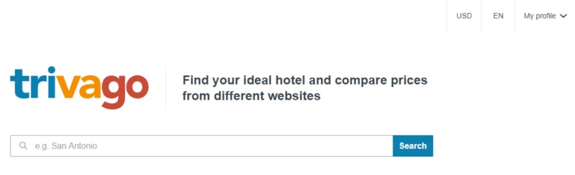
Here is Trivago’s welcome page.
We all know its slogan; it is catchy, but is it tempting for us to use Trivago when it comes to the welcome page?
Well, the answer is yes.
It is a fairly plain design, and anyone can understand how to use it.
What it’ll do for you is stated clearly and gets you directly in the business. You are just going to decide on a destination and search for hotels there.
2- Letterboxd
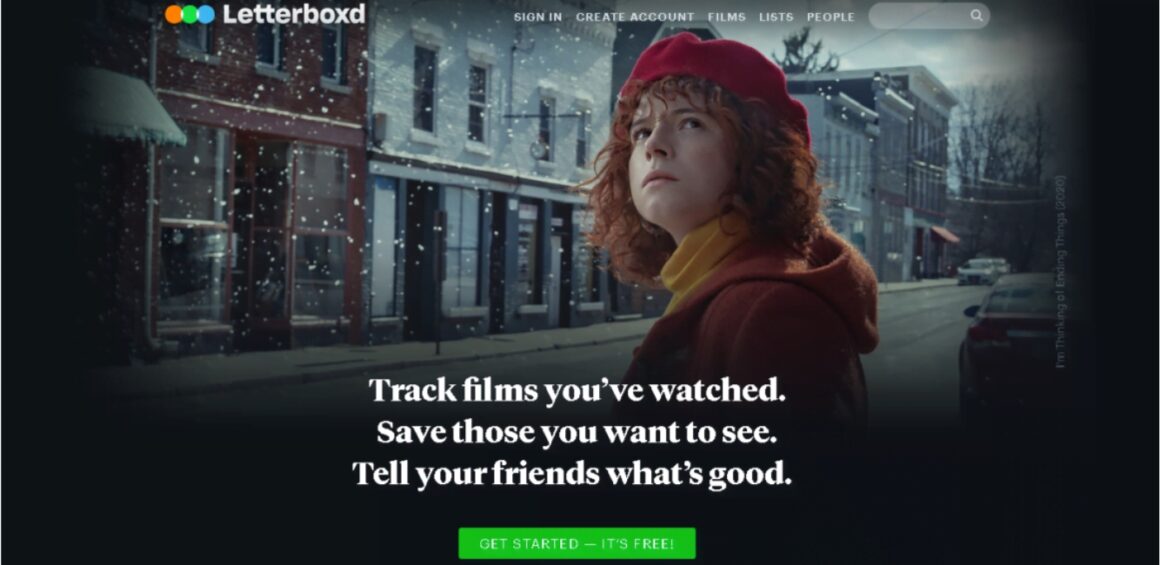
Letterboxd tells you right away what their business is.
It helps you with tracking the movies you have watched, setting a watchlist, and commenting on the movies.
There is a good old CTA saying “Get Started – It’s Free!”, which is actionable.
This button also draws your attention with its striking green and it gives you info about the initial price, which doesn’t exist 🤫
3- Lyft
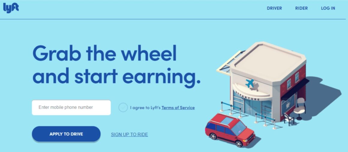
In this welcome page of Lyft, a cute illustration of the service that they are providing takes place.
Nice usage of colors and a very short and basic explanation with a big font size makes it a well-designed welcome page.
The call to action is for both their key partners and their customers, but because the welcome page was actually for drivers, the button for that is more prominent.
4- Khan Academy

Khan Academy is one of the most used free education sources online.
The welcome page introduces the users to what Khan Academy is for, and you can easily start using it by picking which fits you from the three buttons below.
The page after that takes some information from you and guides you to the website, where you can just start right away.
The best part about the welcome page is how well the value proposition is relayed.
And highlighted.
5- Airbnb
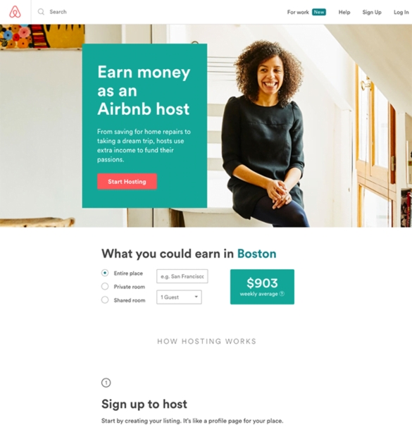
Airbnb’s welcome page is also a very clear one with an innovative approach.
The statement tells what hosts do, and the extra income calculator is a very well-designed element that tells users what exactly they’re getting into.
A picture of the host also gives trust; she is welcoming and someone you can trust enough to stay in her house.
Or, from the perspective of someone applying for the host profile, it is a statement of status.
Clever!
6- Grammarly
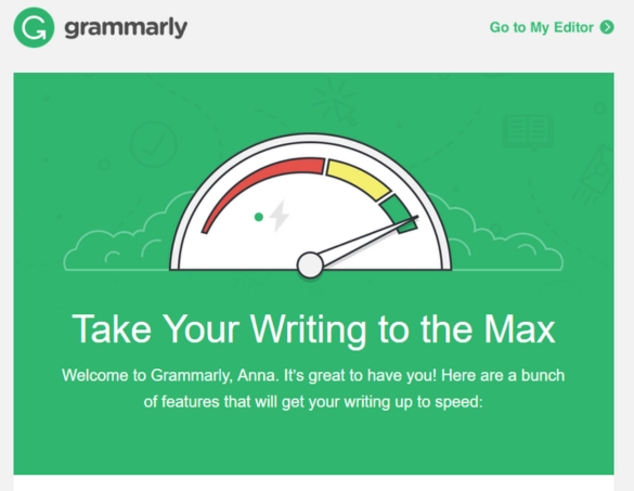
Grammarly’s welcome page is personalized AND fun.
There is a slogan sentence as a headline and a greeting with the user's name.
Colors are nicely used and Grammarly gives some options to improve your writing, right away.
It is both visually satisfying, and welcoming.
7- Devon Stank
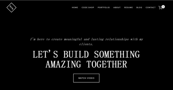
Devon Stank’s welcome page calls people to do something together, to collaborate.
People innately want to be a part of something, so it is smart to use this feature. Putting a video after may not be a smart move, though, I wouldn’t like watching a video on a welcome page no matter how interesting it is.
Still, the page is elegantly designed, and the messaging is really clear.
Soooo, that's a win 🤷
8- Skype
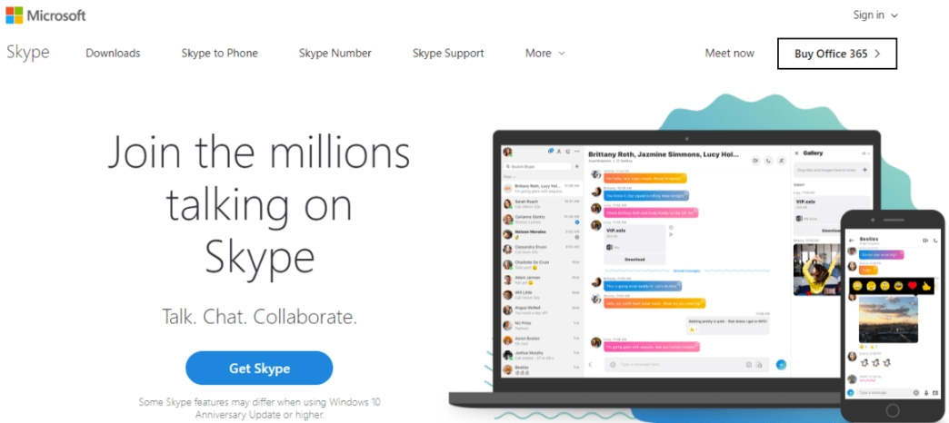
This welcome page of Skype does an excellent job of catching your attention with a big font, inviting headline.
Under that, 3 words describe what you can do on Skype: You can talk, chat, and collaborate.
It is a simple yet well-designed welcome page.
9- Dropbox
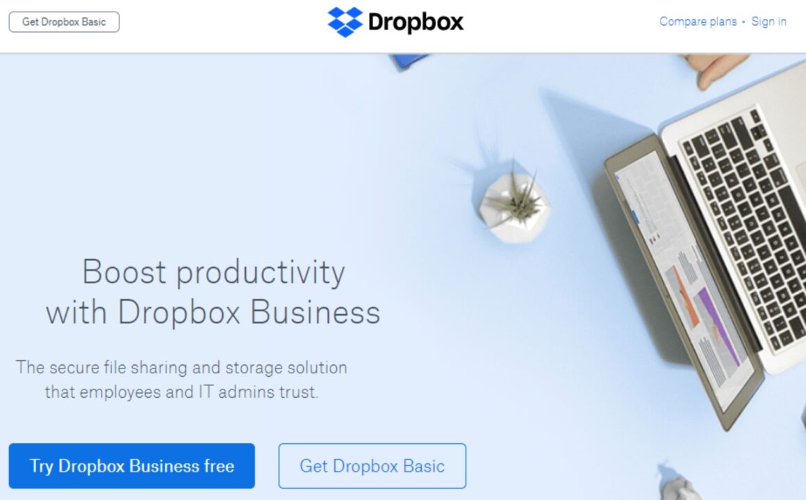
Everyone knows how dangerous technology may get sometimes; there may be errors, and your personal information may get stolen, other horrible things.
Dropbox shows that it offers a promising service that is secure and that employees and IT admins trust.
It tells you about Dropbox’s reliability, showing people who know technology as their reference.
It is a cleverly designed welcome page that awakens a sense of trust.
10- 2048 Puzzle
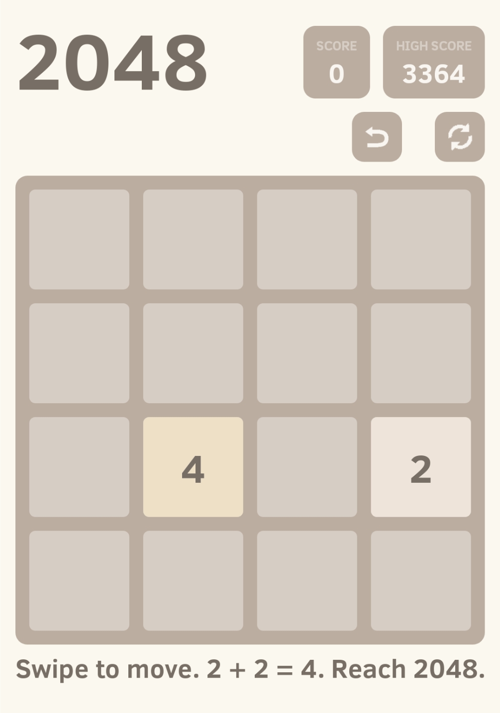
But wait, this is not a welcome page!
You might be telling me right now, but it is.
The 2048 Puzzle game uses their game as their welcome page, and what makes them great is the page being as simple as the game itself.
There is no need for additional blah-blah.
You just want to open the app and start playing, so that’s what they give you!
To Wrap Up...
You might go through email addresses for big email campaigns, pay lots for ads, and build message popups.
Nothing's gonna get you conversion without a good welcome page.
So, it is crucial that you create the most convenient welcome page for your business to improve the first impression that you get from potential customers.
Being original in your copy, keeping the design simple, and the experience frictionless are just a few ways to increase the quality.
Also, don’t forget to polish the experience that follows.
The overall UX you offer later on can make or break the connection you've formed with potential customers.

.png)


