.svg)
.svg)
.svg)
.svg)
.svg)


.svg)


.svg)
.svg)

You've probably heard that your product needs an "Aha Moment." But what exactly is it? Why does it matter so much for retention and growth? And more importantly, why are most of your users not getting there?..
You probably have an answer to "why should a user use your product?", but what matters is that your users have that answer too.
And that they get it quickly.
On their own, mostly.
In this article, we'll cover everything about Aha Moments:
- What they are (and what they're not),
- The psychology behind why some product experiences reliably produce them,
- The dos and don'ts of Aha Moment optimization, and
- Real-world examples from 12 SaaS products,including their observable activation indicators and how they optimize for more micro Aha Moments across the user lifecycle.
TL;DR
- An Aha Moment is the moment a user feels your product can solve their problem or help them reach a goal. It’s also not a single magical moment but there are many micro Aha Moments in a user journey.
- Getting users to their Aha Moment matters because users who activate in the first week are far more likely to still be active three months later, and a 25% increase in activation leads to a 34% increase in MRR over 12 months.
- The psychology behind Aha Moments draws on Gestalt principles (how the brain connects your product to a user's goal), Kahneman's System 1 & 2 (emotional impressions must fire before rational evaluation), and Csikszentmihalyi's flow state (challenge and skill need to be balanced for users to stay engaged enough to reach value).
- You can find your product's Aha Moment in 5 steps:
- Analyze behavioral data to find what retained users did that churned users didn't,
- Collect direct feedback from active and churning users,
- Use session replays to observe engagement shifts,
- Pressure-test your shortlist against five key questions, and
- Run real user tests to validate your hypothesis.
- The biggest Aha Moment mistakes to avoid:
- Confusing your features with the Aha Moment itself,
- Treating onboarding completion as value realization,
- Pushing users too aggressively toward the moment,
- Relying solely on quantitative data, and
- Ignoring what churned users have to say.

What Is the Aha Moment?
The “Aha!” Moment is a moment when a user feels they are getting value from a product and/or believes the product has helped them solve a problem or reach a goal they had prior to using it. We’re saying it’s “a moment,” not “the” moment, here, as there are many micro-Aha moments along the way, each one motivating the customer/user to take a slightly different action that contributes to their loyalty to your product/service in the end.
According to Wes Bush and ProductLed Academy:
Three things happen when you (or a user) "feels" an Aha moment. One, you understand exactly how a product can help you. Two, you experience the core value of a product. And three, you’ve achieved something very quickly that might have taken you hours previously.”
👉🏻 So, Aha moments (as feelings) are the result of certain user interactions and experiences that make the users go WOW!, or HUH!.
👉🏻 They are, however, also the reasons why users take certain actions like switching from a trial account to a paid plan, getting an add-on, adding more seats to their plans, or recommending your product to a colleague or a friend.
That is why you want to get as many of your users to Aha moments as fast as (and as consistently as) possible to their Aha moments. When you can successfully keep your (new) users inside your product and ensure that they experience Aha moment(s), you can…
✅ Reduce early churns.
✅ Increase trial-to-paid conversions.
✅ Drive organic growth through referrals and word-of-mouth from users.
✅ Build the kind of product loyalty that turns one-seat accounts into multi-seat expansions.
✅ Raise your average contract value over time.
And What Is NOT the Aha Moment?
Aha Moment is a feeling, a sense of achievement, a certain experience, a thought, a dream, even… But it is not the user interaction that precedes it.
One common mistake many SaaS teams make when it comes to Aha moments (which we’ll discuss in more detail later in this article) is equating user interactions, such as feature usage or onboarding completion, with Aha Moments. While using a feature or completing a workflow a certain number of times could indicate the user is getting to their Aha Moment and experiencing a sense of happiness, appreciation, or even thankfulness for finally finding a way to reach their goal or solve their problem, that interaction is not the Aha Moment per se.
An Aha Moment, as the word itself suggests, is a moment your users (hopefully) experience. And while you can optimize your overall product experience, onboarding, and customer communication to smooth the way to this moment and remove potential friction that can prevent users from experiencing their Aha moment with your product, you cannot fully control this process or “push” people to experience an Aha Moment.
An Aha Moment is NOT…
❌ The features or experiences you built and offer in your product.
❌ Something that is fully and completely under your control.
❌ A one-time event, as we’ve discussed above.
❌ The same experience for every user, as different users interact with your product in different ways, have different goals/needs, and can “wow” at your product for different reasons at different moments in their user journeys.
Aha Moment vs. User Activation
Just like an Aha Moment is not the user interaction that precedes it, it is also not the desired user action, which can be an indicator of user activation. As a general statement, with room for exceptions, we can say that Aha moments, especially those experienced early in the user journey, precede user activation and can indicate it.
To claim that, let us first define user activation.
User activation is the stage right after acquisition and right before retention in the AARRR funnel. It is a behavioral signal that a user has taken the action, proving they've extracted real value from your product. It's the observable, measurable evidence that the aha moment most likely occurred.
And that's the key distinction: user activation is measurable and observable, whereas an aha moment can only be presumed to have happened, or confirmed by directly asking a user.
So does that distinction actually matter?
Well, maybe not at first glance. But equating aha moments with activation metrics risks overemphasizing feature usage or workflow completion. It can then cause teams to miss why users activate, why they keep coming back, and what value they're actually getting out of the product.
As Rodrigo Fernandez, …, says:
Activation is an equation. Not an event. Too often, most companies pick a single “aha moment” that doesn’t necessarily map to the user receiving value. Instead, they should treat activation as an equation that measures whether that job gets done.”
So, differentiating Aha Moment from user activation indicators and metrics is crucial for establishing the right relationship among user interactions, perceived value, and desired outcomes, which are often indicators of user activation.
Why the Aha Moment Matters for Retention and Growth
We have said that user activation, in almost all cases, is an indicator of a value realization and actualized Aha Moment on the user’s end. And because we also said that you cannot really, directly measure an Aha Moment, but you can measure and monitor user activation, to talk about the direct impact of successful Aha Moment realizations, we will look at the activation statistics.
According to Amplitude’s 2025 Product Benchmark Report, for half of all products, more than 98% of new users aren’t active two weeks after their first interaction.

Amplitude shows the correlation between activation and retention in the same report, as well. According to their survey, 69% of top performers in seven-day activation were also the top performers in three-month retention, meaning that if your users come back after week one, they’re very likely to be still active and engaging users of your product months later.

Now, according to Lenny Rachitsky and Yuriy Timen (from Lenny’s Newsletter), the average activation rate is 34%, and the median activation rate is 25%. This number is around 36% for SaaS products, specifically.

This means that on average, 2 out of every 3 new users who sign up for a SaaS product never reach the initial Aha moment that would give them a reason to stay.
Userpilot's 2024 Product Metrics Benchmark Report, too, puts the overall average activation rate across industries at 37.5%, which is consistent with Lenny's findings and confirms that this is not a niche problem.
Now, another data at hand suggests that a 25% increase in activation leads to a 34% increase in MRR over 12 months.
So, with all that said (and shown in diagrams), we can say that getting your users to their aha moment, and through it, to activation, directly impacts every revenue and growth metric.
- More users convert from trial to paid because they've experienced the value before the trial ends.
- Churn drops because users who activate in the first week are statistically far more likely to still be active three months later.
- MRR grows without additional acquisition spend.
- Expansion revenue increases, as activated users are the ones who upgrade plans, add seats, and buy add-ons.
- CAC becomes more efficient because retained users reduce the pressure to constantly replace churned ones.
Types of Aha Moments
There can be many Aha Moments in a user’s journey, and the Aha Moments in each user’s journey are slightly different from those in another user’s journey. But before discussing the differences at the user segment level, let us first discuss the categories of Aha Moments that follow different stages in the user journey and trigger different interactions.
There is no official categorization accepted by every actor in the SaaS world; however, here are our groups and categories👇🏻
Activation Aha Moments
The activation Aha Moment is the first Aha Moment users experience, if they experience any. It is the moment a new user realizes, for the first time, that your product can genuinely solve their problem or help them reach a goal. It happens early in the user journey, typically during onboarding or the first few sessions, and it's the moment that determines whether a user stays or leaves.
This is the Aha Moment that most product and growth teams focus on, as it's the gateway to everything else. A user who never experiences an activation Aha Moment will never experience a retention Aha Moment, will never upgrade, and will never refer anyone.
The “value” an Aha Moment makes a user feel/realize increase exponentially along the user journey. This means that for the entrance Aha Moment, the one that triggers user activation, the stakes and expectations are generally lower. A micro moment of seeing potential in the product is often enough to keep the user going. While
Kate Syuma says:
Your product should prove its value in under 60 seconds. However, what really matters in the first minute is “confidence”, not the full Aha Moment.”
So, for this activation Aha Moment, you’re not really required or expected to enable a completely new user to reach nirvana with your product. All you need to do is create confidence in their ability to use your product to their advantage. This will create enough motivation for them to keep engaging with your product, experience a few more micro-Aha Moments as they use it more, and, hopefully, reach user activation.
Retention Aha Moments
If the activation Aha Moment gets a user through the door, retention Aha Moments are what keep them from leaving once the novelty wears off. These happen at various points after initial activation.
- A retention Aha Moment might be the first time a user realizes how much time the product has saved them over a month.
- It might be the moment they discover an advanced feature that makes a workflow they'd been doing manually suddenly effortless.
- It might be hitting a milestone, like "I've sent 500 messages through this platform", which makes them feel embedded in the product
Retention Aha Moments are the reason long-term customers often feel differently, more strongly about a product than new users do. They've accumulated so many "this is why I use this" moments that each one adds a layer of commitment that's hard to undo.
Talking about retention, we can’t not mention Customer Lifetime Value (CLTV).
CLTV refers to the total revenue a customer generates throughout their entire relationship with your product. It's one of the most important metrics in SaaS because it determines how much you can sustainably spend to acquire a customer and how healthy your business actually is beneath the surface-level growth numbers.
And each micro aha moment is a small but important investment in that user's lifetime value.
Think of it this way, your activation aha moment determines whether a user stays past the first week. Your retention aha moments, on the other hand, determine how long they stay, how much they pay, and whether they eventually become the kind of customer who shows up in your case studies.
Upsell/ Upgrade Aha Moments
The upsell Aha Moment is the one where a user's emotional state shifts from "this is good" to "I need more of this." It's the moment they hit a plan limit and feel frustrated at their own plans and restrictions, rather than the product itself. Or the moment they see a premium feature in action and immediately understand what they're missing. Or the moment a team member shows them a capability that isn't available on their current tier.
This Aha Moment is particularly powerful because the user is essentially selling themselves the upgrade.
Virality Aha Moments
The virality Aha Moment is when a user realizes the product is better when shared with others. Sometimes this Aha Moment belongs to the person sharing, like a Notion user who shares a workspace. However, the virality aha moment can also belong to the recipient, like the person on the other end of a Loom video.
So, virality Aha Moments don't just retain existing users but also acquire new ones without a paid channel, because most virality Aha Moments are experienced (or spread) due to users’ own desire and will.
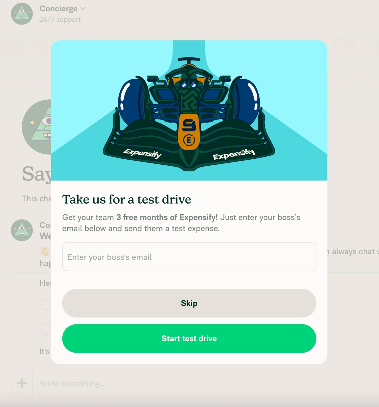
This does not mean that you cannot create motivations and small triggers that lead to virality Aha Moments, though. Expensify, for example, triggers a pop-up modal that encourages a new user to invite their team/boss to the platform and get an additional 3 months for their trial account, during which they probably will hit a few Aha Moments that will make them long-term customers.
Here’s the modal:
The Psychology Behind Successful Aha Moments
We’ve said that you cannot fully control Aha Moments or push your users towards them. However, this does not mean that Aha Moments are completely coincidental, nor that all you can do is pray that your users somehow stumble upon them.
Aha moments are more likely to occur under certain cognitive and emotional conditions than others. And those conditions can be designed for. There are well-established psychological frameworks that explain why some product experiences consistently produce aha moments while others (even with equally strong underlying value) don't. Understanding them gives you a practical lens for auditing and improving your UX, your onboarding flow, and the overall product experience you deliver to new users.
Throughout this section, we'll connect each framework to onboarding specifically, as well-designed in-app onboarding is one of the most direct and accessible ways to create the psychological conditions that make aha moments possible.
So, here we go 🏃🏻➡️
Gestalt Psychology and UX Design That Allows Users to Link Your Product and Their Goals
Gestalt psychology is built on one central idea: the brain does not perceive things as isolated parts. It perceives them as unified wholes, and it actively works to organize what it sees into patterns that make sense, even when the raw visual information is incomplete.
The most relevant Gestalt principles for product and onboarding design are closure, figure-ground, and proximity.
👉🏻 Closure describes the brain's tendency to complete incomplete shapes and patterns. A checklist with five items and three ticked off feels like it wants to be finished. An onboarding flow that has a clear endpoint creates a felt sense of incompleteness until the user reaches it.
Product teams use this instinct to keep users moving through onboarding and toward the activation Aha Moment eventually.
👉🏻 Figure-ground is the brain's ability to separate the important thing (the figure) from the background. In a cluttered UI with too many competing elements, there is no clear figure, so the brain can't identify what to focus on, and cognitive overload sets in before the user can experience value.
Effective onboarding removes the ground almost entirely at key moments, leaving only the action or feature the user needs to engage with to reach their Aha Moment.
👉🏻 Proximity groups elements that are visually close together as belonging to the same concept. When the visual design of a product places a user's goal and the product feature that achieves it in clear proximity (not just spatially, but also conceptually, by highlighting relevant use cases and capabilities to the user’s persona), users make the connection faster.
That connection becomes the initial micro-Aha Moment itself in most cases.
Kahneman's System 1 / System 2 and Emotional First Impressions That Lead to Rational Commitment
Daniel Kahneman's dual-process theory describes two modes through which the brain operates:
System 1 is fast, automatic, emotional, and largely unconscious. It runs constantly, forming impressions in milliseconds, relying on intuition, pattern recognition, and emotional response.
System 2 is slow, deliberate, analytical, and self-aware. It reasons through problems, applies logic, and makes conscious decisions. It requires effort, and it tends to take over when System 1 is confused or uncertain.
Most Aha Moments fire through System 1. However, System 2 is required to confirm it afterward, rationalizing the emotional signal into a decision to stay, upgrade, or recommend.
So, for a successful Aha Moment, you need to address both systems, first the first one, then the second one. However, if you cannot stimulate the System 1 prior to the System 2, then things can get trickier, as the System 2 is much more skeptical and requires much more energy.
There could be two things happening in this case:
- The System 2’s questions and skepticism, triggered by complex UX, confusing onboarding, vague value points, or signup flows with a lot of friction, never allow the System 1 to hype up and give the emotional boost and foundation for an Aha Moment.
- If System 1 is not triggered first, the user will automatically give up on your product due to the perceived complexity and required effort. They will simply churn or never sign up at all.
Thus, the path to the aha moment must be frictionless enough for System 1 to reach it first. Clean UI, conversational copy, a single clear call to action, and a quick win that feels good before it needs to be justified.
Csikszentmihalyi’s Flow State and the Challenge-Skill Balance That Puts Users in Range of the Aha Moment
Flow state is a mental condition of complete engagement in which time disappears, self-consciousness fades, and performance peaks. There’s one central rule to the flow state, and it is that for a flow state to be experienced by a person (your user, in our case), the challenge of the task must be closely matched to the skill of the person doing it (the workflow/onboarding of your app should match the technical skills and familiarity of your user).
- When the challenge significantly exceeds the skill, the result is anxiety.
- When skill significantly exceeds challenge, the result is boredom.
However, if you can find the middle and create the perfect condition for a flow state to occur during your user’s session/journey, they’re very likely to reach their Aha Moment, as well.
Because when a user is in flow, they are very focused, engaged, curious, making progress, and noticing things. The mental noise that normally competes for their attention quiets down, and what's left is a user who is genuinely present in your product.
That level of deep engagement is very useful for reaching an Aha Moment.
How to Find Your Product's Aha Moment (5 Steps)
Step 1: Analyze behavioral data to find the correlation.
Because Aha Moments are hard to monitor directly and can vary from user to user, let alone from one user segment to another, you need to do some investigation and guesswork here. First, start by pulling user interaction and activation data from different user groups, users who activated, and users who haven’t.
Then, map what each group did, specifically, what retained users did that churned users didn't.
You're looking for correlation, so the way you should be formulating your findings should be something like this:
Most retained users did X, and very few churned users did X.
An action that both groups took in equal measure is not your aha moment. Neither is an action that only a tiny fraction of retained users ever reached; the aha moment needs to be achievable by most of your new users.
Put together a list of 10–20 candidate behaviors and sequences and test each against that correlation logic. The ones that show a strong asymmetry between your retained and churned cohorts are your shortlist.
You can also create cohort maps and conduct an analysis on the cohort charts, as well.
Step 2: Collect direct feedback from the right segments.
Your most engaged, most retained users can often name the moment things first made sense. When responses cluster around one event, that confirms your cohort finding. When they split across two or three, you likely have different aha moments for different user personas, and your onboarding should eventually account for both.
You can also conduct mid-onboarding surveys or surveys you trigger shortly after onboarding completion to get a fresher sense of user feelings.
Or, you can also ask your churning users about what went wrong. This could also give a sense of what works and what doesn’t, where users reach value realization, and where they feel confused or disappointed.
The key thing you should keep in mind is that what you can learn from users in different stages of their user journey will give you different insights, and you should tweak your survey strategies accordingly.
- Active and loyal users have the deepest perspective and the most patience for sharing it. They're often open to longer, open-ended surveys where they can describe the moment things clicked in their own words, and the most engaged among them may be willing to sit down for a 1:1 conversation with a success manager.
- New users are motivated to engage but haven't been around long enough to reflect meaningfully on what's valuable or what clicked. Keep it short and immediate with a quick in-app prompt like "How are you finding things so far?" .This way, you can capture their real-time experience without asking them to think too hard about something they're still figuring out.
- Churning users hold some of your most valuable insights, but are the hardest to reach. The window to catch them is also narrower; thus, you need a quick, low-friction survey surfaced at the exact moment they're canceling or deleting their account. Not a follow-up email, or a scheduled check-in…
Here are the top tips to master user feedback and in-app surveys:
Deel, an HR and payroll management tool, takes this one step further and collects feedback from their targeted landing page viewers, to get insights on whether or not their value proposition is clear enough for the first time viewers of the page.
Now, they expect too much, as they ask 2 open-ended questions and a multiple-choice question to people who are basically strangers to them. However, if they can get a few of the website visitors answer the questions, even partially, they will be able to get some really insightful feedback.
Here are their questions:

Step 3: Use session replay to observe aha moments in the wild.
Up until now, we’ve been saying that you cannot really observe Aha Moments. Well, now we’ll shift our tone and certainty on that a little bit, as session recordings can actually make the Aha Moments, or the road to the Aha Moments, visible to some extent.
Filter your recordings to sessions from users who went on to retain, then watch them at the divergence point you identified in Step 1.
Now, you're looking for behavioral tells that indicate a shift in engagement, like a sudden slowdown as a user reads more carefully, going back to re-examine something they just did, a burst of activity after a quiet period, or time spent on a feature they hadn't touched in prior sessions. These micro-behaviors often correspond to the aha moment firing, even when the user never says a word.
Then watch sessions from users who churned at the same point in the journey.
The contrast should be immediate, as churned users tend to show confusion signals like erratic clicking, repeated backtracking, and sessions that trail off without completing anything meaningful.
UserGuiding’s session replay walkthrough.
Step 4: Build a shortlist of aha moment candidates.
By this point, you should have behavioral data pointing at specific events, qualitative feedback describing when the value has clicked (or hasn’t) for your power users and churning users, and replay evidence showing how the experience looks in practice.
Now, it is time to bring your product team together and pressure-test each Aha Moment (candidate) against five questions:
- Does it happen early enough to prevent churn, before most users have already decided to leave?
- Does it directly demonstrate the product's core value, not just a setup prerequisite or a surface feature?
- Can the majority of new users reach it without significant friction or prior expertise?
- Does reaching this moment correlate with long-term retention and conversion in your cohort data?
- Is this moment consistent across user segments, or do different personas reach value through different paths?
That last question matters a lot, as a sales team and a marketing team using the same product will often have entirely different aha moments, or even if their Aha Moments look similar, they will have different paths reaching them.
Thus, onboarding that routes them identically will underperform for at least one group.
What you should do then, depending on your answers to these questions, is to tweak the user journey, in-app communication, onboarding, and maybe even your UI to smooth and optimize the road to Aha Moment(s) for different user segments and personas.
Step 5: Test user experiences and Aha Moments in real life.
A hypothesis is not an aha moment until it survives contact with real users. You need to take each candidate (Aha Moments) and design an onboarding flow and/or in-app experience/ communication built around getting users there as directly as possible.
Then, measure three outcomes for each variant:
- Activation rate,
- Day-7 retention,
- And trial-to-paid conversion.
Run each test for at least two weeks before drawing conclusions.
Be prepared to be wrong about your first hypothesis. and treat that as part of the process.
Even experienced product teams (like Loom) can build their entire onboarding strategy around the wrong moment. The aha moment you think your users are having and the one they're actually having can be different…
For example, Loom’s assumed Aha Moment was recording a video, and their onboarding was designed to get users to that first recording as quickly as possible.
But when they ran cohort analysis comparing users who recorded versus users who shared, the retention differential told a different story. According to the results, sharing a video (not recording one) was the event that actually predicted whether a user would stick around.
How to Design User Experiences That Gently Move Users towards the Aha Moment(s)
Up until now, we’ve talked about what Aha Moments are (as well as what they are not), how they help your business revenue and customer relationships, what the psychology behind them is, and how you can detect their whereabouts in your user journey.
We’ve also (very briefly) said that you should smooth your UX, in-app onboarding, and communication that lead to those moments.
Now is the time to get into the specifics of those “Aha Moment optimizations”.
Personalize the path to Aha by segment
We have talked about different Aha Moments in the user journey, like activation Aha Moment, retention Aha Moment, Upgrade Aha Moment, and virality Aha Moment. However, beside these different types of Aha Moments, there are also slight variations from user segment to user segment and/or user persona to user persona.
For example, let’s go over an example.
YouTube’s activation Aha Moment is subscribing to a creator after watching and reacting to 3 or more of their videos. This shows that the user has found value in a creator (thus, YouTube, where the creator publishes their content) and would like to keep watching their future videos. Clicking on the little bell icon to get notifications when the said creator shares a new video can be an important indicator of a successful activation Aha Moment, too.
To bring different types of users with different user personas (a language learner, a traveller, a reader, a parent), you need to personalize their experience, conduct an onboarding survey and bring relevant crerators onto their home pages until their algorithm is shaped.
Personalizing their user experience with relevant suggestions based on their persona will ensure that they will find interesting creators and videos easily and keep using the app until they get to their Aha Moment.
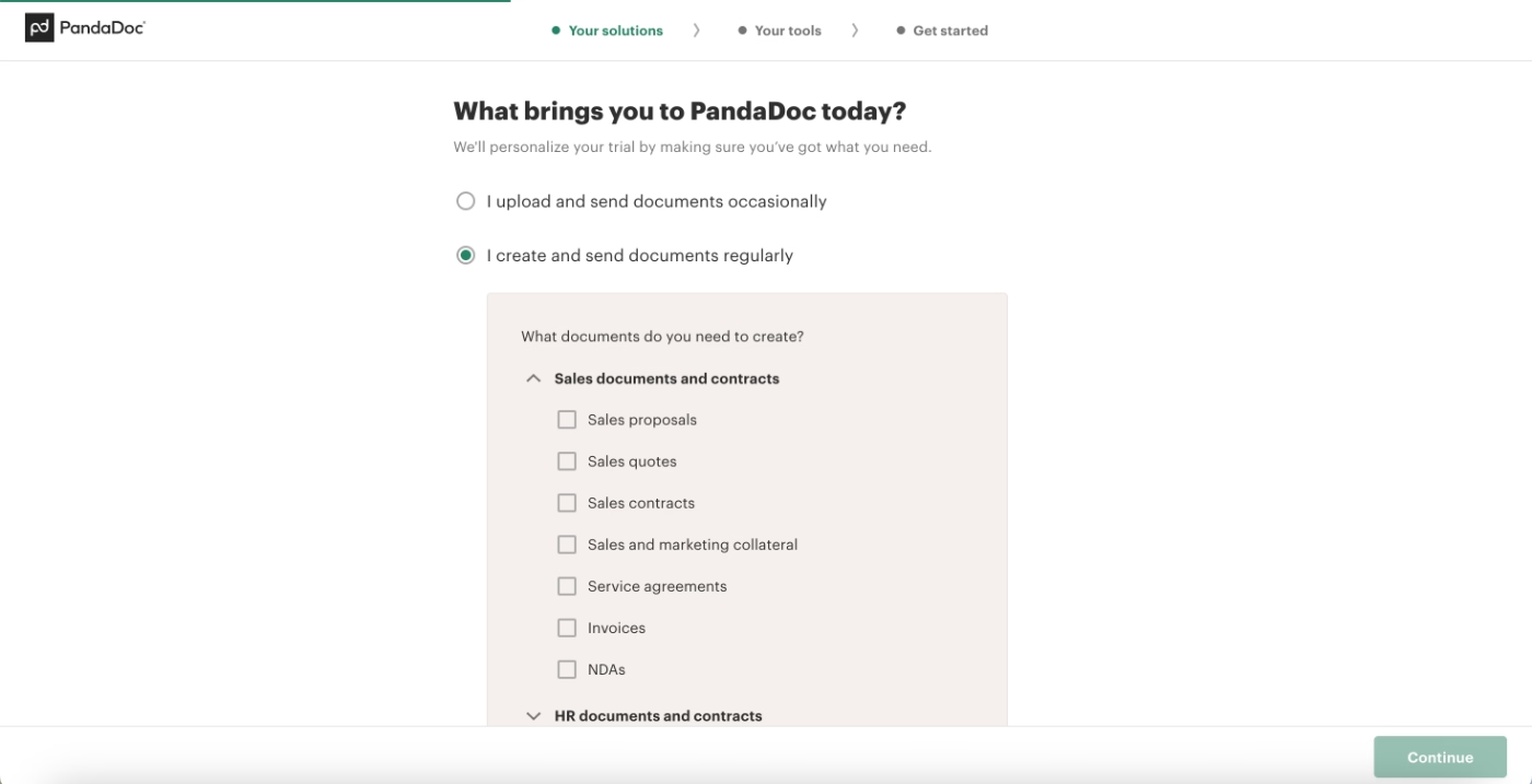
Here’s an example UX personalization survey from PandaDoc, asking the user about their specific use cases to bring the most relevant templates to them:
Remove friction between signup and the early Aha Moment(s)
Remember what we talked about System 1 and System 2? Well, to make sure you trigger System 1 prior to System, you should take friction and complex decision making processes out of the user journey in the early stages, as much as possible.
- Allow new users to skip additional steps like inviting team members to workspaces, allow them to set up their spaces later on, even.
- Do not make verification obligatory to even set up an account or access your product, allow users inside and make it necessary to complete real workflows inside, not see the home page.
- Offer trials, freemiums, or if your product is too complex and requires too much of a customized setup, offer interactive demos on your product page to allow users to experience some sort of a Aha moment prior to committing to a sales demo.
- Pre-populate the product with sample or demo data so users don't land on an empty state and can experience value with mock data before bringing their own data.
Many AI tools allow their (new) users to use the tool without even creating an account and position creating an account as a value point to their users. Once users experience value out of a tool, they will want their interactions to stay within the app and thus, create an account.
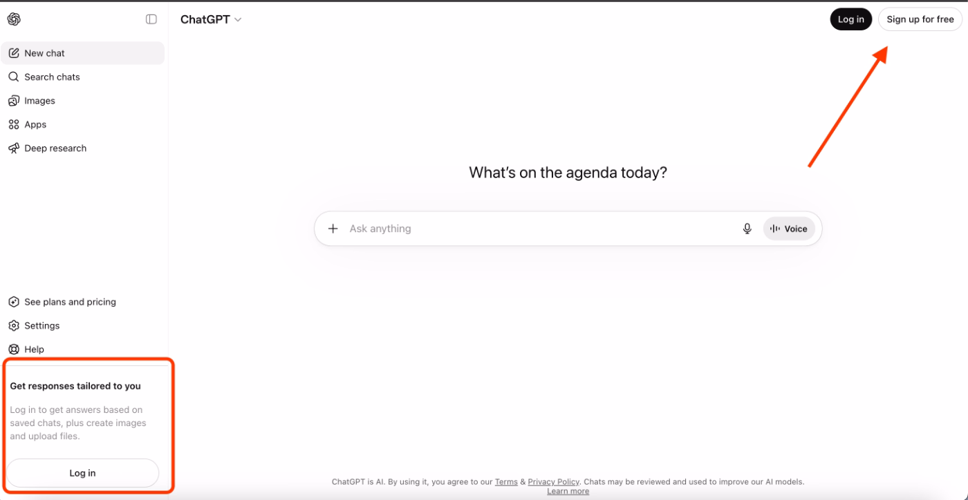
ChatGPT is one such example.
You can chat with the tool without logging in or creating an account first, so users can check the tool out anonymously, without giving their information or spending time setting an account. But then, if you want your answers to be tailored to your previous chats, or if you want to keep your previous chat histories, then, you need to create an account.
ChatGPT eliminates the whole set up flow before the potential value and early micro Aha Moments.
Then, an account creation becomes the Aha Moment indicator for them.
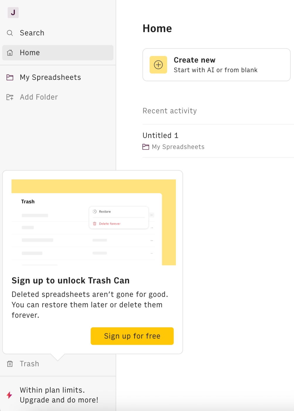
Rows, an AI-powered spreadsheet tool, too, follows a similar pattern and allows their new users to experiment with their tool without committing to a personal account. Then, once the user has used the tool and (hopefully) experienced some micro value moments, they offer creation an account:
Use in-product guidance and signposts
In-app guidance through tooltips, hotspots, and checklists is important as both part of user onboarding as well as user experience personalization. And these two are important for quick and smooth Aha Moment realization, of course.
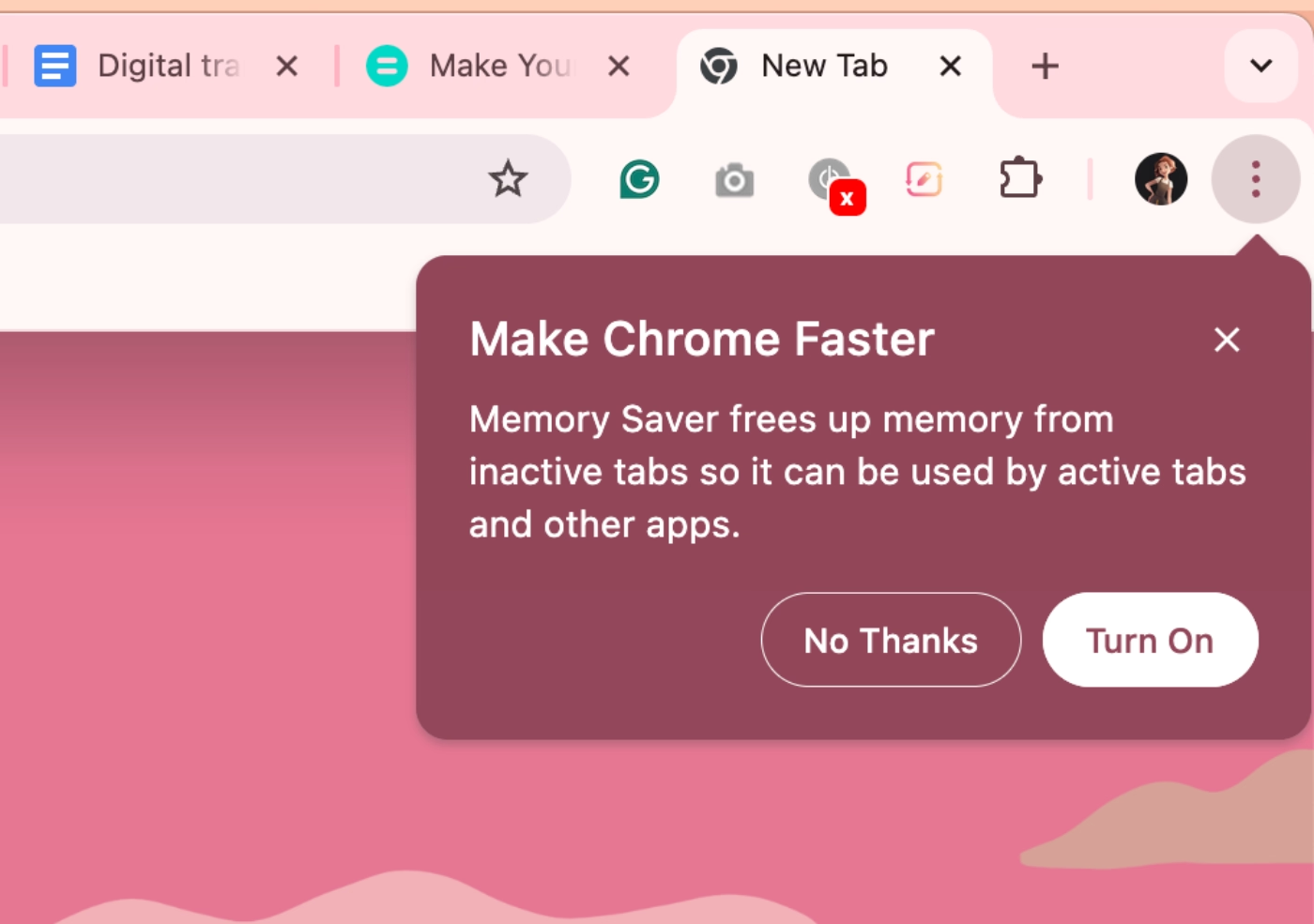
With tooltips, you can offer pro tips, shortcuts, and best practices to help users get more out of a feature.
Google’s tooltip for their Memory Saver feature is a great example, as it is triggered when there are a lot of tabs and windows opened at the same time:
Or you can use them to create short, interactive flows and tutorials that teach users how to use a feature by actually doing it. This smooths the onboarding experience and decreases the learning curve. Completing an interactive workflow (even before bringing in real data or finishing account setup) triggers System 1 and delivers a micro aha moment with a sense of completion and a glimpse of what the product can do for them.
Tooltips can also serve as persistent on-screen information, reducing mental load and keeping users on a consistent, friction-free path through a feature.
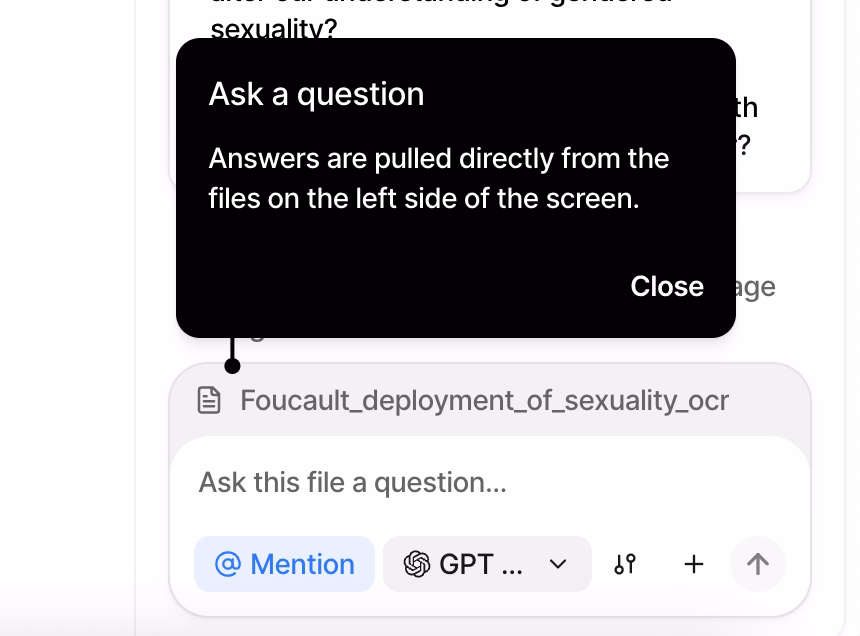
Anara, for example, uses tooltips to onboard new users, introduce their UI, and explain how their features work:
With hotspots, you can draw attention to features and buttons that users might otherwise miss but that would meaningfully increase the value they get from the tool. You can also embed educational content, like a short video, directly in a hotspot, helping users engage with a feature more confidently before they try it themselves.
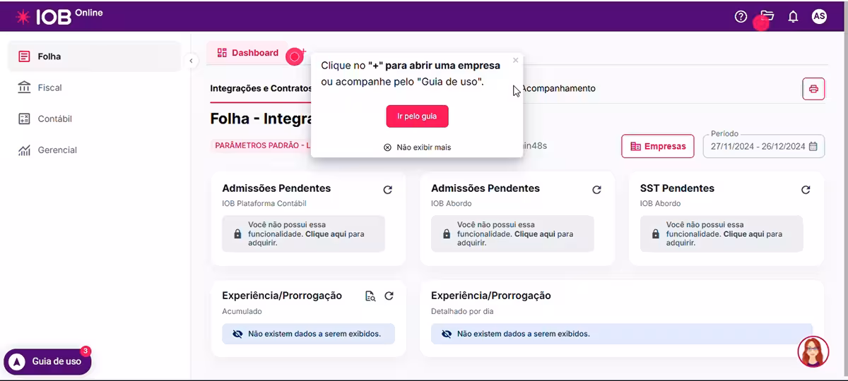
IOB Group, a leading accounting management solution in Brazil, uses hotspots to draw attention to specific buttons and features on the UI that might go overlooked by users. Here’s an example hotspot:
“Click on "+" to check a company or follow the User Guide”
With checklists, you can create personalized roadmaps to value realization for different user types and use cases. For a marketing manager in Canva, that might mean creating a social media post and a poster. For a school teacher, a presentation and a worksheet. Checklists can highlight not just which features to try, but which templates and workflows are most relevant to each user's job.
With pop-up announcement modals, you can introduce new features to the right users, like the users who requested that feature, active users of a similar feature, or users whose behavior suggests they've hit the problem the said feature can solve.
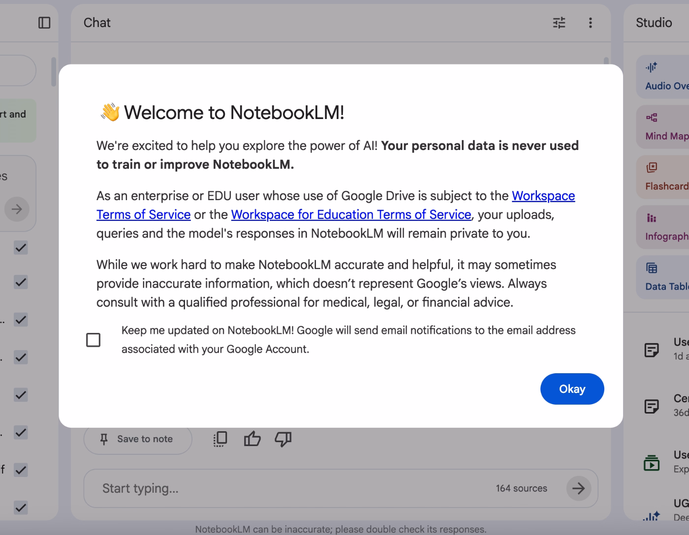
You can also welcome users and provide important information about your product to clarify any potential confusion right from the beginning.
Google’s Notebook LLM, for example, informs their new users about their security and compliance regulations with an announcement modal, and ensures them that they do not use their private data/information to train their modals.
Setting things right from the beginning and preventing any confusion or skepticism is important for users to experiment with a tool freely, without triggering their System 2 early on.
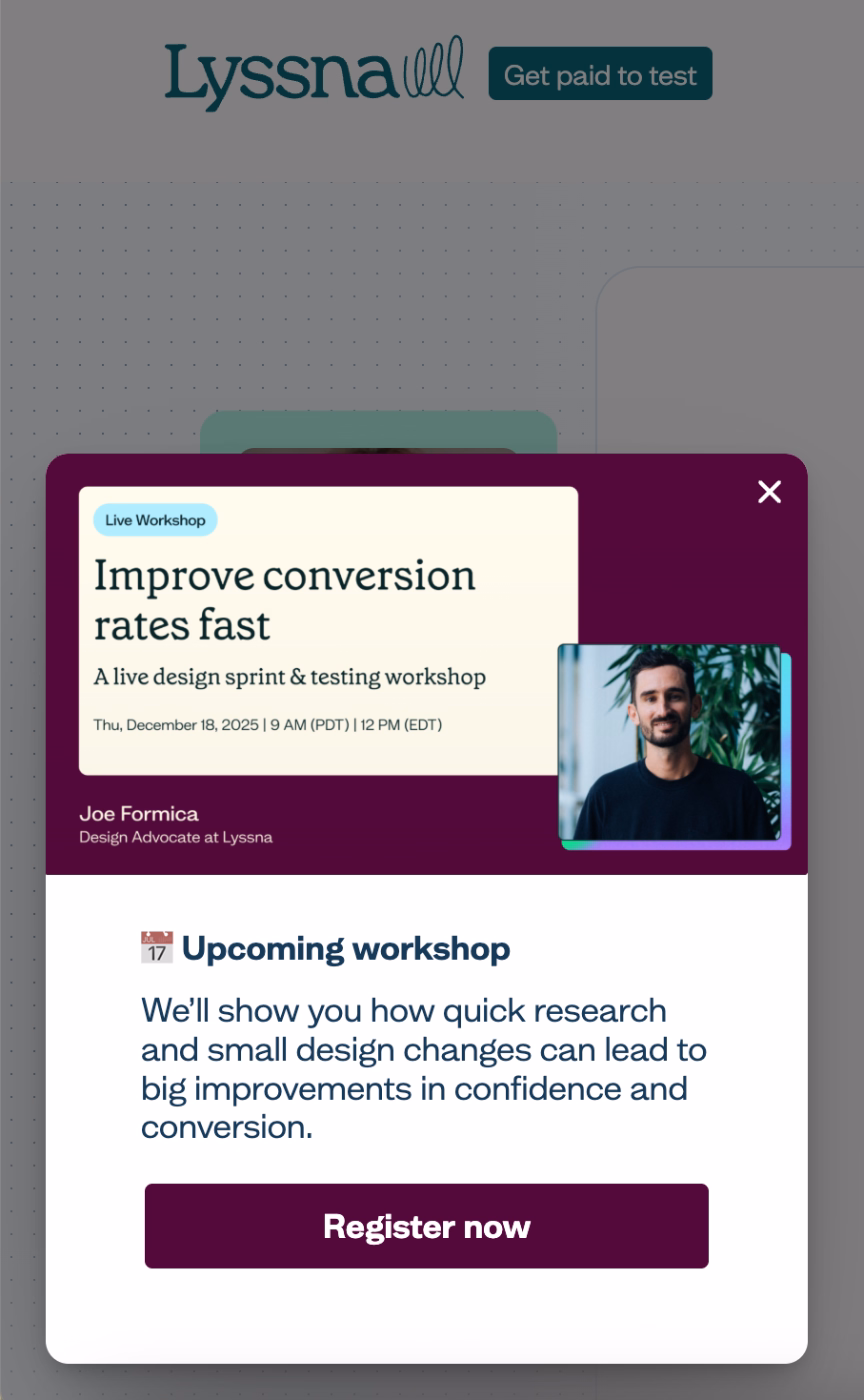
Lastly, you can use slideout modals to announce relevant events and webinars to users. With these kinds of events, you can go over specific workflows and best practices, or, conduct Q&A sessions, where users can learn from your product experts, as well as other users’ questions.
Here’s an example slideout modal, which Lyssna uses to announce their use-case-specific webinar:
Design for multiple Aha Moments across the lifecycle
A user who only ever has one Aha Moment is a user who's one bad day away from churning. As we’ve talked many, many times up until now, there are (or should be) several micro Aha Moments that users experience as they continue interacting with your product and business. During the trial, during the onboarding, during the usage, during the meetings with your sales, success, and support teams…
We’re talking about a feature that makes a weekly task effortless for a user, a usage milestone that makes them realize how embedded the product has become in their workflow, an integration that connects two tools they already use and saves them a step they didn't know could be saved.
Each of these is a retention Aha Moment, and each one raises the cost of leaving for the user.
And the customer lifetime value for you. 💰💰
5 Aha Moment “Don’t”s for SaaS Teams
❌ DO NOT mistake your Aha moment(s) with your product features
A feature is what your product does, while an aha moment is when a user understands what your product does for them.
And these are not the same thing…
Slack's Aha Moment isn't "sending a message", it's the moment a team realizes they've stopped emailing back and forth, losing track of email chains, or missing important updates because their email is full of unimportant junk mail.
You need to make sure that realization happens with your in-app communication or product messaging copy.
❌ DO NOT mistake completing onboarding for reaching the Aha moment
A user who finishes your product tour has completed a series of steps.
That's it.
Onboarding completion and value realization are related but not the same, and treating them as equivalent is one of the most common reasons activation metrics look healthy while retention numbers don't.
❌ DO NOT “push” your users towards the Aha moment(s)
There's a difference between guiding users toward value and pressuring them into it. Aggressive tooltip sequences, mandatory walkthroughs, and over-triggered modals create friction and resentment that get in the way of the user actually experiencing your product.
And as you might guess, users who feel herded through a product don't feel delighted…
❌ DO NOT rely solely on quantitative data to define your Aha moment(s)
Data can tell you what users did, yes, but it can't tell you what they felt, what they were hoping for, or why something that looked like engagement was actually confusion. Teams that over-index on dashboards and behavioral funnels often end up with a precise answer to the wrong question.
This risk gets even sharper as AI tools make it easier to generate confident-looking insights at scale…
The more fluently a tool can summarize your data, the easier it is to stop asking whether you're measuring the right things in the first place.
Frank Mertens writes about this dynamic and how AI tools can “kill curiosity”.
He uses his own kid's natural curiosity as a starting point: children ask why instinctively, they explore without a destination, and they arrive at their own discoveries. A product team doing genuine aha moment research does the same thing. They form hunches, chase unexpected patterns in the data, talk to users with open-ended questions, and sit with ambiguity long enough to find something real.
When AI does that work for them or they heavily rely on automated quantitative data dashboards, the curiosity loop gets short-circuited. The team gets an answer without going through the process of finding it.
The more fluently a tool can surface a "key insight," the easier it is to stop questioning whether you're measuring the right things. A dashboard can tell you that users who complete Step 3 retain at twice the rate, but it can't tell you that Step 3 only gets completed by users who have already had their aha moment somewhere else. That kind of nuance requires curiosity, qualitative investigation, and a willingness to distrust a clean-looking number.
So, while quantitative data is very useful and certainly insightful, it should be the starting point for finding your Aha Moment(s), not the one and only destination you look to.
Here’s Frank Mertens’ article for those who would like to read the full version:
❌ DO NOT ignore your churned users when finding your Aha Moment
Churned users are the clearest signal you have of where your aha moment failed to land, as they can show you whether users attempted the aha moment and failed, or never got close enough to attempt it.
An exit survey at the moment of cancellation, when the experience is still fresh, is one of the highest-signal inputs you can have when mapping your aha moment.
However, you need to make sure the survey is quick to complete, with no more than 4 questions, skippable questions, and only 1 or 2 open-ended questions, which are best left to the end.
Real-World Aha Moment Examples from Popular SaaS Products
Spotify
Aha Moment:
The moment a song appears in Discover Weekly or a Daily Mix that the user didn't search for but immediately loves because it is a) either a new release (or a song they haven’t listened to) from an artist they already follow, or, b) the recommended song/artist’s vibes are similar to what the user already listens to and they have now discovered a totally new artist.
Activation indicator(s):
Following 5+ artists during onboarding AND creating a playlist within the first week.
How does Spotify optimize its UX for more micro Aha Moments?
Spotify front-loads personalization by asking users to select favorite artists immediately after signup, so the first generated playlist already reflects their taste rather than a generic default.

But the bigger retention play is Spotify Wrapped.
Seeing "you listened to this artist 847 times this year" creates a powerful micro-Aha Moment around habit and identity, and it's one of the most shared product moments in consumer SaaS.
Netflix
Aha Moment:
Finding something worth watching within the first 30–90 seconds of opening the app. Or, the first time a "Because you watched X" row surfaces a show, which the user ends up watching and loving.
Activation indicator(s):
Clicking play on a recommendation from a "Because you watched" or "Top picks for you" row within the first week OR saving the recommended show to watch later by adding it to their list.
How does Netflix optimize its UX for more micro Aha Moments?
Netflix A/B tests thumbnail artwork by user segment. This means that two users browsing the same show may see completely different cover images, depending on which version is statistically more likely to get that specific user to click play. So, a thriller fan and a drama fan might see entirely different imagery for the same film. The aha moment of "this show feels like it is made for me" is an illusion Netflix engineers at the image level for a quicker decision and Aha Moment realization.
ChatGPT
Aha Moment:
The first answer that genuinely surprises the user, like something that solves a problem they'd been stuck on, explains something they'd been struggling to understand, or produces something in seconds that would have taken them an hour.
Activation indicator(s):
Returning for a second session within 24 hours, and/or copying or acting on a response within the first conversation. Multi-turn conversations (3+ exchanges) within the first session are a strong proxy for value realization.
How does ChatGPT optimize its UX for more micro Aha Moments?
The memory feature lets ChatGPT remember details about a user across conversations, creating ongoing retention aha moments like users discovering that it already knows their preferences, their job, their tone, etc., without them having to re-explain every time.
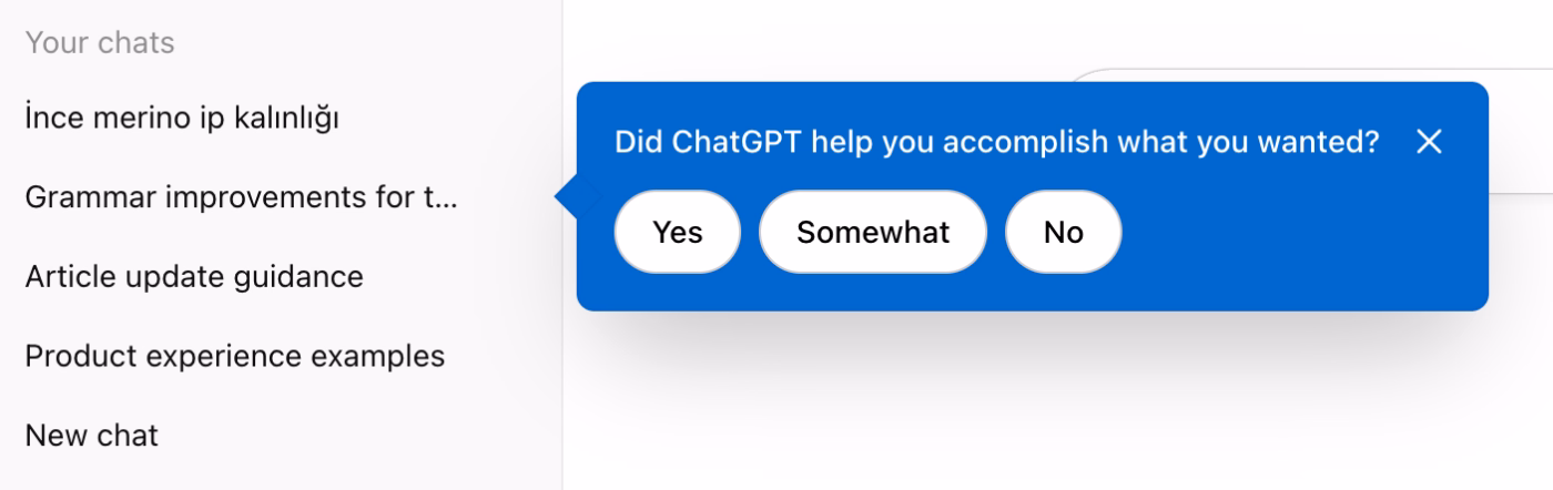
Additionally, ChatGPT also triggers tooltips to ask about a user’s past experience/chat. The tooltip asks: Did ChatGPT help you accomplish what you wanted? And there are 3 choices you can choose among: Yes, Somewhat, and No. What this quick survey-tooltip allows the ChatGPT team to ensure is that a) they get feedback about a user’s experience and the quality of their model’s answers in a specific chat topic, b) the user reflects on their experience and the value they get out of ChatGPT.
So, especially if the user had a positive experience with the chat and their answer to the survey-tooltip is a Yes (or even a Somewhat), they will have a micro Aha Moment right then and there!
Figma
Aha Moment:
The moment a PM, a developer, and a designer are all in the same file without a single "can you send me the latest version?". Figma’s key value proposition is its ability to bridge the communication gap between different actors.
Activation indicator(s):
Inviting at least 1 collaborator to a file and having them make an edit or leave a comment within the first week OR being invited to a workspace and making an edit or leaving a comment there.
How does Figma optimize its UX for more micro Aha Moments?
Figma's onboarding is heavily contextual with tooltips triggered on relevant pages. Additionally, the onboarding tours are not automatically triggered, instead, they are offered to the user without being pushy.
For retention and upgrade, Figma shows users exactly how much of the product they're already using, and how much more they could unlock with a usage reminder/tracker tooltip. This type of tooltips, similar to ChatGPT’s “Did ChatGPT help you accomplish what you wanted?” tooltip, creates a confrontation moment for the user and see how much they’re actually using a product and experience a micro Aha Moment that can motivate them to keep using a tool, or even upgrade to a higher plan.
Zoom
Aha Moment:
Clicking a link and being in a meeting in seconds without a complex setup. In Zoom’s case, the first micro Aha Moment many users experience is the ease of use and frictionless access to a meeting, even if that is your first time using the app. This way, Zoom speaks directly to System 1.
Activation indicator(s):
A user connecting their calendar to Zoom, which shows that the product embeds itself into an existing daily workflow and every meeting they schedule automatically becomes a Zoom link.
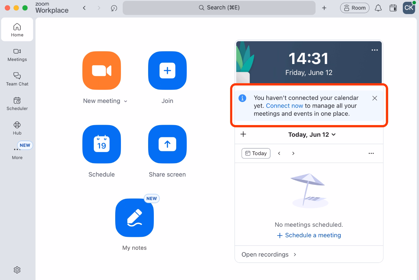
How does Zoom optimize its UX for more micro Aha Moments?
The most important retention move Zoom makes is encouraging for a calendar integration. On the desktop app, they surface an embedded card, similar to a tooltip, prompting users to connect their calendars to manage their meetings and events in one place.
Discord
Aha Moment:
Joining a server with thousands of members, participating in conversations, and realizing nobody knows your real name, your location, or anything about you unless you choose to share it. The product offers a sense of community with shared interests but without the personal exposure that comes with most other social platforms.
Activation indicator(s):
A user sending friendship requests to people they know, AND/OR joining 3+ servers.
How does Discord optimize its UX for more micro Aha Moments?
Discord's entire structure is designed to make a 100,000-person server feel like a cozy room you chose to be in. The first thing it does is filter the noise. When you join a large server, you don't land in a wall of messages from strangers. Channels are organized into categories, so you navigate to what's relevant and ignore the rest.
Then comes the identity layer. Discord is pseudonymous by design. You pick a username, get assigned or self-select roles within a community, and those roles shape what you can see and where you can participate.
There are also bots that make community scaling invisible. Moderation, role assignment, spam filtering, welcome messages can be all run automatically.
All of these capabilities (server/channel management, user roles, bots, etc.) make entering into a community, or creating and managing a community really easy and fun, thus, users get Aha Moment(s) that trigger retention.
Discord also enables server creators to build onboarding flows for new members to introduce channels, explain roles, and auto-assign the relevant ones based on a few quick questions. This ensures that server owners can keep their communities organized and members engaged, and in turn, keeps Discord users coming back.

And here’s how the onboarding and UX customization survey flow looks on the server creator’s side:
Duolingo
Aha Moment:
The moment a user realizes they just learned vocabulary and grammar without creating a vocab list or conjugating the same sentence 6 times in a notebook.
Activation indicator(s):
Completing the first lesson AND returning to maintain a streak on day 2 or day 3. Or, earning enough XP to move out of the Bronze League into Silver, AND returning to check the leaderboard at least twice in the same week.
How does Duolingo optimize its UX for more micro Aha Moments?
The streak system is the primary retention engine of Duolingo. Once a user has a 3-day streak, the psychological cost of breaking it kicks in, and Duo (the owl) is very willing to remind you about it. Along with the streaks, there are of course leaderboards, badges, and XPs you gather as you engage with the app and all this gamification creates micro Aha Moments all the time.
Duolingo also sends weekly report emails showing users their stats like time spent, XP earned, lessons completed, etc., which functions like a personal Wrapped moment every week, creating a micro aha moment around habit and progress that pulls churned users back in.
Ahrefs
Aha Moment:
The first time you type a competitor's domain into Site Explorer and see their full organic traffic, top-ranking pages, and backlink sources laid out in one dashboard.
Activation indicator(s):
Running a Site Explorer report on at least one competitor domain AND/OR using Keywords Explorer with the Keyword Difficulty filter applied to find rankable keywords.
How does Ahrefs optimize its UX for more micro Aha Moments?
Ahrefs lowers the barrier to the aha moment with a suite of free tools like Backlink Checker, Website Authority Checker, Keyword Rank Checker, which give users a real taste of the platform's data before committing to a paid plan. Thus, each free tool is a micro Aha Moment in itself creating the pull to see the full thing.
Inside the product, Ahrefs' reports are designed to be action-oriented rather than just informative. In line with the Gestalt principle, every report organizes complex SEO data into the simplest, most meaningful form possible. The KD score, for example, tells you exactly how many more backlinks you need to rank for a keyword, and the Content Gap report shows you exactly which keywords your competitors are ranking for that you aren't. So, instead of leaving users to interpret raw data, every report contextualizes the insight and makes the next step obvious, which is what creates the recurring micro Aha Moments that keep users coming back.
Dropbox
Aha Moment:
Uploading an important document or photo on one device and being able to access it instantly from another without emailing it to yourself or without carrying a USB drive. Or, receiving a shared Dropbox link after an event and getting everything you needed without chasing anyone down for files from their personal devices.
Activation indicator(s):
Uploading at least 1 file from one device AND accessing it from a different device and/or at a later time. Or, sharing a Dropbox link to a file or folder with at least 1 other person.
How does Dropbox optimize its UX for more micro Aha Moments?
Dropbox runs 2 onboarding flows. The first triggers at signup, walking new users through uploading their first file and understanding the core value of the platform. The second targets users who signed up but never really engaged. So, if you created an account, left it dormant, and came back months later, Dropbox treats you like a new user and runs you through the basics again. Rather than assuming you remember what Dropbox offers as value (and tangible capabilities/features), they use the re-engagement moment as a second shot at the Aha Moment you missed the first time.
Notability
Aha Moment:
Opening the app and realizing your lecture notes, readings, and recordings can all live in one place without juggling a notes app, a PDF reader, a voice recorder, and a folder of slides at the same time.
Activation indicator(s):
Creating at least 3 notes across different subjects or folders, and/or importing at least 1 external document (PDF, slide deck, etc.) alongside handwritten notes.
How does Notability optimize its UX for more micro Aha Moments?
Notability benefits from an active user community that shares templates, note structures, and study systems like Cornell notes, lecture frameworks, and reading annotation layouts. For a new student who opens the app and doesn't know where to start, discovering that someone has already built the perfect template for their use case is an Aha Moment.
The community (and sharable templates and designs) also creates a Virality Aha Moment, with active users sharing their designs and inviting other people (even non users) to use the app more extensively and/or start using it after getting inspired by a template, design, or a use case.
Calendly
Aha Moment:
Sharing a link and receiving a meeting confirmation with all the details already filled in without a single "does Tuesday 2pm work for you?" email. The entire back-and-forth that used to eat up 20 minutes per meeting disappears with Calendly.
Activation indicator(s):
Connecting a calendar, setting availability, and receiving at least 1 confirmed booking from a shared link.
How does Calendly optimize its UX for more micro Aha Moments?
It’s super easy to create a booking link with Calendly, you do not need to go through an automatically triggered onboarding flow (though there’s video onboarding tutorials and a checklist if you want guidance), you are not even required to link your calendar to the app to set up your availability, though it is recommended.
The first time you set up an account, within a minute, you can send a meeting invite link. There’s little to no friction before the first Aha Moment.
Then, calendar connection surfaces as an enhancement rather than a requirement. Once users have had their first aha moment and understand the product's value, connecting their Google or Outlook calendar becomes an obvious next step, as it means Calendly can automatically block off times they're already busy.
Even within the onboarding checklist, the first action a new user is encouraged to take is to set up a meeting. Then, comes the Chrome extension, then, trying out the automated reminders and follow ups, and only after then, comes the integrations with your existing tools, like calendars or video meeting apps.
Grammarly
Aha Moment:
The moment when the browser extension catches a mistake in an important business email, or in an important final paper for a student.
Activation indicator(s) for the realization of Aha Moment:
Installing the browser extension AND having it flag and correct at least 1 error outside of Grammarly's own editor within the first session.
How does Grammarly optimize its UX for more micro Aha Moments?
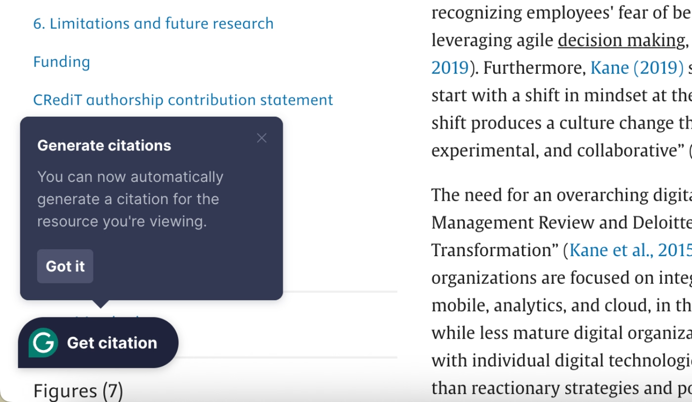
Grammarly makes use of onboarding flows, hotspots, and tooltips extensively to make sure users understand the app’s potential and engage with it deeply. In addition to their onboarding flow, however, Grammarly triggers timely and contextual tooltips outside the main app through its extension to announce new and relevant use cases.
For example, when they released their citation generator, instead of announcing it via an email or even within the app with a generic pop-up modal, they triggered a contextual tooltip via their extension. The tooltip was triggered when a user was already on an academic journal's site, reading a paper.
This timely tooltip created a micro-Aha Moment for the user, even if they didn’t use the feature at the time while reading the paper. They knew they could do that easily with a tool they already had as an extension and probably used many many times for grammar correction.
So, then this tooltip is a great example of an optimization for retention Aha Moment.
To Wrap Up…
Aha Moments are the moments your users feel the value of your product, they are not your features themselves, not onboarding flows, and not activation metrics, either.
They are those moments when users determine whether to stay, upgrade, refer your app to a friend (or churn without ever telling you why if they do not happen).
You cannot manufacture Aha Moments, but you can design and optimize experiences for them.
You can…
- Remove the friction that stands between a new user and their first realization,
- Personalize the path so users reach value through the route that makes sense for them,
- Use in-app guidance to make sure the moments you build get noticed.
In this article, we've gone over how to find and validate Aha Moments in your own product, the design principles and in-app guidance patterns that smooth the path to value realization, and real-world examples from some of the most well-known SaaS products out there, along with their activation indicators and how they optimize for more micro Aha Moments.
Now, you’re ready to go into the wild and work on your own Aha Moments as we’ve talked.
Good luck!
Frequently Asked Questions
What is an aha moment in SaaS?
An Aha Moment is the moment a user feels your product can genuinely solve their problem or help them reach a goal. It's a feeling of value and/or potential of value realization, in short. There can be many different Aha Moments in a user’s journey that motivate the user to continue engaging with a product.
What's the difference between an aha moment and user activation?
User activation is the measurable, observable action that indicates a user has likely experienced an aha moment like completing a workflow or connecting an integration. The aha moment itself is the feeling that precedes or accompanies that action. You can track activation, but you can only infer the aha moment.
How do I find my product's aha moment if I don't have much data yet?
Start with what you have. Talk directly to your most engaged users and ask them when things first clicked. Talk to users who churned early and ask what they never got to try. If you have any behavioral data at all, even basic session data, look for patterns in what retained users did that churned users didn't. The five-step process in this article is designed to be scalable, meaning you can start lean and add more rigor as your data grows.
Can a product have more than one aha moment?
Yes, and it should. Different user personas often reach value through different paths, so a one-size-fits-all aha moment will underserve at least one segment of your users. Beyond that, there are different types of aha moments across the user lifecycle (activation, retention, upgrade, and virality) and each one serves a different purpose. A user who only ever has one aha moment is probably on its road to churning.
How long should it take users to reach the aha moment?
As quickly as possible, but without forcing it. As Kate Syuma puts it, what matters in the first minute is confidence, not the full aha moment. Users don't need to reach product nirvana during onboarding, they just need to feel like this product could work for them. From there, the job is to keep removing friction so that the deeper aha moments can follow naturally. The exact timeline varies by product complexity, but the general rule is: if users aren't feeling some form of value within their first session, most of them won't come back for a second one.

.png)