


.svg)
.svg)
.svg)
.svg)
.svg)


.svg)


.svg)
.svg)


Tooltips can be an amazing way to educate and engage with users on various platforms including web, mobile, and desktop.
But creating one on your React app by yourself can be a challenge.
Various open-source JavaScript plugins and libraries can help you with that challenge and make the job of developing overlay elements easier.
If you'd prefer to create your tooltip without having to mess around with code, you can also try using a no-code tool like UserGuiding.
But in this article, I'll go over the top 6 tooltip plugins that are made exclusively for React apps.
What Is a React Tooltip?
A React tooltip is an overlay element that is displayed on the side of points of interest (buttons, features) in React apps. It can include pieces of information, call-to-actions, buttons, surveys, videos, and more if developed correctly. React tooltips are especially of great use when creating your React tour.
Although most people find these elements very annoying and disruptive, when it's used right, it gives you a great opportunity to inform and engage with users.
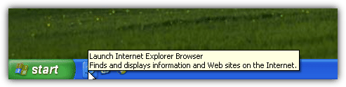
You can find the first examples of tooltips utilized in earlier versions of Windows, such as 95 and XP. For example, here's the tooltip displayed when you hovered over Internet Explorer for a bit:
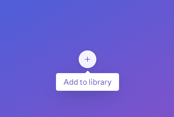
And to this day, this tradition continues in many apps, especially when you use just a simple icon to act as a button for a feature or an app. For example, Adobe uses tooltips with gifs and buttons in their popular apps too:
So tooltips have been used for a long time in the UI design and development space, and they don't seem to be going away soon. So, it might be high time you gave them a chance in your own React app:
How do I add a tooltip in React?
There are a number of ways you can add tooltips in your React app. The three main ways to create a tooltip in React are
- developing one from scratch,
- using a library or a plugin,
- or using a no-code platform to create in-app elements like tooltips.
For the first method, which can be considered the "hard mode" of creating anything, you can find different guides online.
For the second method, you can just keep reading this article to find the plugin that best suits your needs.
And for the third method, you can try a user onboarding software such as UserGuiding.
Decided on the method you're going to use?
Great, let's move on.
What to expect from tooltips and how to get more
What purpose will your tooltip serve?
What should you expect to gain or lose from adding a tooltip to your app?
What's a good tooltip anyway?
The last thing you want is to place a tooltip that will not add any value or help the user in any way, or worse, annoy them.
With so many businesses just spamming tooltips in their software without proper research or analysis, many designers started to avoid tooltips in their design. But, a tooltip that is displayed to the right user in the right time will positively affect user engagement and conversions, so you shouldn't give up on them yet.
Here are a few suggestions to keep your React tooltips engaging and interesting:
✅ Make sure the tooltip doesn't disrupt the user experience and is displayed when the user actually needs it
✅ Don't forget to place an "exit" button and a "do not show again" dialog box
✅ Improve the copy to make your tooltip sound friendly and clear
✅ Place gifs and images to visualize the information whenever possible
✅ Keep it short, if what you're telling needs to be long, include a "learn more" button
✅ Measure the effectiveness of the tooltip, do A/B testing and track user engagement
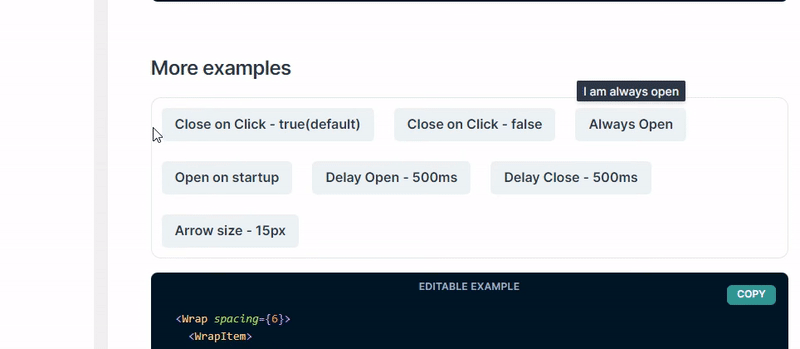
6 Best React Tooltip Libraries
There are a vast number of open-source plugins for creating UI elements in React apps, but I'd say for tooltips, you need something that's well-equipped for the job.
It should be very responsive, lightweight, and have a really good performance to not disrupt anything in your app.
Here are the six libraries that fit that description:
React Tooltip Library #1- Tippy.js / React
Almost 5M developers every month download Tippy.js, one of the top overlay element libraries for web.
It contains popovers, dropdowns, and menu elements too, but Tippy's top feature is its tooltips. The biggest advantages to Tippy.js are the variety of options when creating tooltips and of course, it's high-end documentation that can help you get started easily.
Tippy.js for React is the version of Tippy that's modified especially for React web apps, and has over a thousand downloads on GitHub. The maintainers of Tippy are very attentive towards issues on both the original and React libraries, with around 250 closed and 26 open issues on Tippy.js for React GitHub page alone.

Why Tippy.js / React?
▶ High-end documentation
▶ Wide variety of options for tooltips
▶ Easy to setup, easy to maintain
▶ High performance
Tippy.js / React Setup
You don't have to install the original Tippy.js to use the React binder. You can just install Tippy.js for React by using the code:
npm i @tippyjs/react
or you can use the CDN link.
After that, you should follow the official documentation for the React version on GitHub or Tippy.js's extensive guides.
React Tooltip Library #2- Chakra UI
Is speed important for you?
Who am I kidding, of course it is!
Chakra-UI, a library exclusively developed for creating a huge variety of components for React apps, will have everything you need to meet your need - the need for speed.
From modals to sliders, any type of input components to progress bars (or circles), accordion/toggle components to transition animations, Chakra has you covered.
Their tooltips happen to be very satisfying aswell. With various options for different properties, you can easily create the exact tooltip you've imagined.
If you want to have a solid library for creating custom components and want to spice-up your React websites, Chakra UI should be your go to.
Why Chakra UI?
▶ Lightweight
▶ Fast, high performing
▶ Easy to setup, easy to use
▶ Huge variety of React components
▶ Numerous options for creating customized tooltips
▶ Good documentation
Chakra UI Setup
Install Chakra UI components and all peer dependencies using NPM:
$ npm i @chakra-ui/react @emotion/react@^11 @emotion/styled@^11 framer-motion@^6
You can also use Yarn:
$ yarn add @chakra-ui/react @emotion/react@^11 @emotion/styled@^11 framer-motion@^6
From there, follow the official documentation of Chakra-UI to start creating tooltip components and more.
React Tooltip Library #3- Radix UI's React Tooltips
Another component library with different elements is the Radix Primitives.
It's not as fast or diverse as Chakra, but Radix UI has its ups too.
It's created with accessibility and developer experience in mind, so I'm sure it'll be easier to develop for you.
Also, I think Radix Primitives' documentation is much more extensive than any other plugin on this list, so if you're a encyclopedia-in-hand person, it might be the right choice for you.
Why Radix UI's React Tooltip?
▶ Accessible
▶ Has better developer experience
▶ Great documentation
▶ Easy customization
▶ Variety of components
Setup
First, you need to install Radix Primitive:
npm install @radix-ui/react-popover@latest -E
Then, you need to install the tooltip:
npm install @radix-ui/react-tooltip
After that, just follow the steps in Radix UI's official guidelines from its website.
React Tooltip Library #4- wwayne's React Tooltip
Did you just say "Hey, I'm here just for the tooltip!"?
Huh, pretty sure I've heard something like that.
Anyway, I'm sure this'll give you the exact component you need. Wwayne's React Tooltip plugin is all about its name, a React tooltip, and a good one at that.
It's pretty straightforward and simple, which is sometimes exactly what we need from a new component.
Also, it has an option to float over the cursor instead of the component you set it on, which is an original idea in my opinion.

Why wwayne's React Tooltip?
▶ Lightweight
▶ Fast, high performing
▶ Easy to setup, easy to use
▶ Interactive floating elements
▶ Straightforward documentation
Just one downside, though; if you're stuck, you might have a had time getting help from the maintainers because there are already 241 open issues on the plugin's GitHub page.
Setup
Simply install using NPM:
npm install react-tooltip
And follow the documentation on React Tooltip's GitHub page.
React Tooltip Library #5- RC-Tooltip
RC Tooltip is another "just the tooltip, please" library that you can quickly setup and start creating with.
It's not the best tooltip element, but if the other options aren't working well for you, this can be the plugin you're looking for.
It has 849 stars on GitHub and 162 forks, but the maintenance is below average since there are a lot of unresolved issues too.
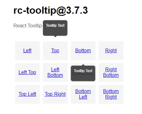
Why RC-Tooltip?
▶ Lightweight
▶ Easy to setup, easy to use
▶ Good documentation
▶ Has accessibility options too
RC-Tooltip Setup
Install the plugin with NPM:
npm install rc-tooltip
and follow the documentation on the library's GitHub page.
React Tooltip Library #6- Floating UI React DOM
Floating UI, formerly PopperJS, is another popular component library for React apps.
It is very lightweight and low-level and offers the common floating elements like popovers, menus, and dropdowns in addition to tooltips.
There is a good variety of customization options for tooltips, and you can also add nesting to most elements like popups and popovers.
It has a great API and architecture that is great for devs that are looking for a simple, scalable way to create components rather than fancy high-level elements.
Also, the maintainers are absolutely legendary and attentive, with over 841 closed issues and only 22 open issues.
Why Floating UI?
▶ Lightweight, low-level
▶ Easy to setup, easy to use
▶ Very fast, high-performing
▶ Variety of components with plenty of customization
▶ Good documentation
▶ Great maintenance by devs
Floating UI Setup
Install the React DOM positioning engine version from NPM:
npm install @floating-ui/react-dom
From there, just follow the official documentation.
Select based on your needs
The library that will work the best for your tooltip totally depends on your needs. Have a look at each of these libraries in turn, and start trying them out with the one that seems like the best fit.
If you don't have the time to code your tooltip yourself, even from a library, consider checking out UserGuiding. UserGuiding will let you build all your onboarding elements in your product tour – without having to use any code at all.
You can sign up for UserGuiding and play around with it for free, so what are you waiting for?
Frequently Asked Questions
What are the best React Tooltip libraries?
The 6 best tooltip plugins and libraries for React are:
- Tippy.js
- Chakra UI
- Radix Primitives
- wwayne’s React Tooltip
- RC-Tooltip
- Floating UI
Is an open-source library the best way to create tooltips in React?
There are a number of great open-source libraries to create tooltips for react apps, but, creating one using these libraries might not be the most cost and time-effective solution. You should try 3rd party user onboarding software instead.
What is the best alternative to React tooltips?
Third-party tools like UserGuiding can help you create tooltips for any web app regardless of the framework, and do so without having you write a single line of code. It’s also free to start so, would make the best alternative.
How do I customize/style my tooltip in React?
If you’re developing a tooltip from scratch, you can follow Joe Morgan’s guidelines on component customization. However, if you’re using open-source libraries, you should be able to customize according to the plugin’s code.

.png)


