Stonly and Pendo. Both tools have amazing capabilities, and both of them offer in-app guides.
And they are almost equally good as well as equally bad.
So, which one of these tools is the best option for your company?
Which one can offer you exactly what you want, and which could be only a waste of time?
Today, I am sharing the results of my research about whether Stonly or Pendo is a better product adoption platform so that you can provide the best customer experience.
In this article, I will:
- Introduce Stonly and talk about the tool's cons and pros,
- Introduce Pendo and talk about the tool's cons and pros,
- Compare those tools side-by-side for you to have a better overview.
And also, if you want to skip all those, you can benefit from this quick table:
Side-By-Side Comparison Table
| Stonly | Pendo | |
|---|---|---|
| Starting Price | $61/month |
$1000/month
|
| G2 Rating | 4.8⭐ |
4.4⭐ |
| On-Screen Slide Modals | ✅ |
✅
|
| In-App Resource Centers | ✅ |
✅
|
| Knowledge Base Feature Integration | ✅ | ❌ |
| Announcement Modals/Banners | ✅ |
✅
|
| Interactive Walkthroughs | ❌ |
✅
|
| Tooltips | ✅ | ✅ |
| Hotspots | ✅ | ❌ |
| Onboarding Checklists | ✅ |
✅
|
| In-Product Surveys | ✅ |
✅
|
| Avg. Deployment Time | ≈ 2-3 Days |
2-3 Hours
|
| User Segmentation | ✅ | ✅ |
| User Analytics | ✅ | ✅ |
| Learning Curve | 😐 Steep |
😟 Steeper
|
What is Stonly?
Stonly is a self-serve support and user education platform that offers engaging and (not so) interactive guides for software products.
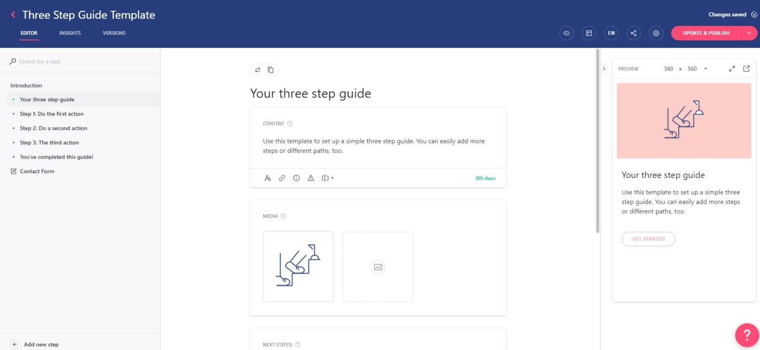
With Stonly, you can create Help Centers and Knowledge Bases that are much more engaging than traditional ones.
Stonly onboarding offers step-by-step instructional guides that you can add images inside to illustrate your topic better, and the content of these step guides can be optimized based on end-user segments and preferences.
Of course, you can use these guides to create product tours that show your users how different UI elements and core functions of your product work.
Although it doesn’t actually have the most interactive content, it can be a good choice for small to medium-sized businesses that would prefer free/affordable products.
But the rest of the users should be aware of the expensive plans and hidden costs within the product.
Pros 🤩 Stonly is good for:
✅ Stonly is relatively more affordable and has a free plan, which is something that most of its competitors don't have.
✅ Stonly makes it easy to create product walkthroughs. Once you pass the integration step, the ease of use increases quickly.
Cons 😮💨 Stonly isn't good for:
❌ If you want to integrate Stonly into your UI elements, and of course, implement Stonly’s knowledge base and help center into your platform, you’ll definitely need a bunch of developer hours to get it done.
❌ It looks like most of the interactivity, in Stonly's case, is pressing the “Next” button on the guide steps after reading a bunch of text and looking at a screenshot.
❌ Your customization options are very limited with Stonly. After a while, a lot of the guides look very similar to each other, and since you’re limited to a single element, you can mix things up as you can in other user onboarding products like UserGuiding.
Stonly Pricing
Stonly has 3 pricing tiers at the moment, and a 14-day free trial:
- Starter Plan: $99/month with 2500 monthly guide views, 30 guides, and access to core features.
- Business Plan: $199/month with 4000 monthly guide views, $399 with 15000 monthly guide views, unlimited guides, and additional VIP features.
- Custom Enterprise Plans: Additional Enterprise features with increased usage limits, but you need to contact Stonly's sales team for a custom quote.
What is Pendo?
Pendo is a robust product analytics, and user engagement platform businesses use to build better products.
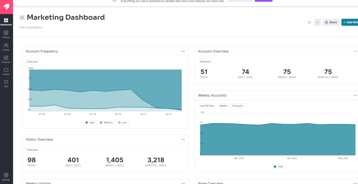
You can onboard users, introduce new features, survey users, gather feedback, and prepare a product roadmap with Pendo.
Although it is a great product that solves multiple problems at once, Pendo users usually complain that it takes them more than a few days to figure out how they can use the product.
It is definitely an amazing tool to add to your toolkit, but you might still have to find different solutions to provide engagement features, such as resource centers.
Pros 🤩 Pendo is good for:
✅ The best feature Pendo provides is its in-depth analytics; meanwhile, its user segmentation truly makes a significant change in the way users consume onboarding material.
✅ Pendo puts together different solutions like user experience, user onboarding, and highly sophisticated data collection and analytics under one tool to guarantee customer success and easier customer engagement tracking for digital product teams.
✅ Founded in 2013, Pendo is among the first comers of digital adoption; it has a strong background and customer portfolio.
✅ Though Pendo is quite expensive, it offers a free trial and a freemium, something other platforms of its caliber rarely do.
Cons 😮💨 Pendo isn't good for:
❌ Though Pendo represents itself as a digital adoption solution, its onboarding UX elements are pretty limited to the very basics, leaving out checklists, hotspots, and more.
❌ Being a highly sophisticated tool with a complex UI, it might be hard to set up and use if not used by an experienced user.
❌ Likewise, Pendo’s features tend to be complex and use case-specific, so it might be hard to leverage all features and possibilities without a fully established game plan dedicated to Pendo.
❌ Though Pendo does not publicly share its pricing, it is very well known that Pendo is more expensive than the market average.
❌ Yet another enterprise-level tool, Pendo’s customer service might not be as responsive as smaller products’ customer service teams.
Pendo Pricing
Pendo has a free plan called “Pendo Free“ for up to 1,000 monthly active users, one web and one mobile app.
For bigger plans, Pendo doesn’t have a set pricing.
Instead, you can get a custom plan for your business by contacting their sales team.
However, a former Pendo user claimed that they are a medium-sized business that paid $12,000/year for the standard package of Pendo while another user upped this number to $20,000. Additionally, there is a Pendo customer that claims to pay $2000/year just for the “Guides” feature of the product - which is included in the free plan for up to 1,000 MAU
Pendo’s pricing is feature and usage-based, and it possibly scales with how many users you have like other analytics tools.
How about having the best of both? 😎
Way too many products have hidden costs that they don't reveal until you get a demo like it's a big secret nowadays, and honestly, even before.
What difference does doing that make? I couldn't tell.

🤨🤨🤨
But I know a different user onboarding tool that can make a huge difference in your onboarding flows - and budget.
UserGuiding is an (absolutely) no-code digital adoption tool that's easy to use, geared up for effective onboarding for both customers and employees, and budget-friendly.
Some of UserGuiding's features are:
✅ Interactive guides and product tours,
✅ Tooltips, checklists, hotspots, and other onboarding elements,
✅ Powerful analytics,
✅ User segmentation and targeting,
✅ Resource centers,
✅ NPS survey, and more!
Don't want to pay thousands of dollars for a product you cannot use effectively? You know where to go.
Stonly vs. Pendo
| Stonly | Features | Pendo |
|---|---|---|
| You can use Stonly for onboarding purposes, but if you want an actual interactive product walkthrough, Stonly isn’t the one for you. | Onboarding ⬅️🤩 |
Pendo mainly focuses on data and feedback collection, so it doesn’t have a complete set of onboarding features.
|
| Stonly doesn’t have an in-app analytics feature at all and the tool doesn’t have many integration options either. | Analytics 🤩➡️ |
As a digital adoption tool, Pendo rocks it when it comes to analytics. If you can afford the bigger plans, Pendo definitely gets this one.
|
| Stonly doesn’t have a surveying feature. | Surveying 🤩➡️ |
Pendo provides a variety of surveys that can be customized for each need.
|
| Stonly isn’t a cheap tool either, but the fact that they do provide a free plan makes it affordable. | Pricing ⬅️🤩 |
Although Pendo does have a freemium price, it is very limited and insufficient. The actual pricing starts from $1000/month, without most features.
|
| Stonly is not the easiest-to-use tool on the market, but compared to Pendo, it is a tad easier to set up and figure out how to use. | Ease Of Use ⬅️🤩 |
Pendo is a mostly no-code tool, but it still takes lots of technical knowledge to integrate the tool and customize it to your liking.
|
| Stonly clearly cares about their customers and this is why they provide fast and personalized customer support – as per what actual users have said about them. | Customer Support ⬅️🤩 |
Pendo’s customer support for enterprise customers is said to be exquisite. However, for all other businesses, it can take up to a few days to get a response from their support team.
|


.svg)
.svg)
.svg)
.svg)
.svg)


.svg)
.svg)


.png)


