Need to build an onboarding process for your SaaS app but feeling unsure where to start?
We feel you. The amount of information out there about onboarding is overwhelming, and not all of it is helpful.
In this article, we collect all our knowledge about in-app onboarding in one place, and lay it out openly so that you can take what's useful.
Let's get right into it.
TL;DR
- In-app onboarding is the user education you provide inside your product.
- It's valuable because it
- reduces churn,
- boosts activation and
- increases feature adoption.
- Onboarding can be designed to give new users a quick start, engage them with gamification, or speak to the function or value of particular features.
- Commonly used onboarding elements include a sign-up page, a welcome screen, an onboarding checklist, an interactive walkthrough, a resource center and in-app surveys.
- Successful onboarding highlights your most important features in a way that's personalized to your core audience. Keep onboarding elements simple, unobtrusive and skippable.
- Don't fall into the trap of delivering generic onboarding that aims to describe every single one of your features in an identical manner to all users. Your users will find that incredibly tedious.
- Use metrics to track the success of your onboarding and optimize over time.
- It's faster and cheaper to build onboarding elements with UserGuiding than it is to code them from scratch.
What is In-App Onboarding?
Onboarding is best understood as customer education. You are educating your user about how to get as much value out of your product as possible.
Some of this education takes place outside your app. Classic examples include:
- Social media content
- Blog content
- Landing page content
- Testimonials
- Meeting you at a conference
But when we talk about in-app onboarding, we're referring to the user education that happens inside your app itself. This could include:
- A product tour that shows users the main features that suit their use case
- A tooltip that highlights a common misunderstanding inside your app
- An in-app chat widget that links users to support resources, both human and automated
Here is an example of in-app onboarding from UserGuiding 👇

Why Keep Onboarding In-App?
Compared to users who don't go through onboarding, onboarded users are more likely to:
- Feel engaged when using your app
- Experience less friction when trying to get value from your app
- Have higher overall levels of satisfaction with your product
- And be retained as customers for a longer period of time
All of these benefits of onboarding apply to in-app onboarding as much as they do to external onboarding – the onboarding that takes place on your homepage, blog or social media accounts.
However, in-app onboarding has a big advantage over external onboarding. It keeps your users where you want them: inside your app.
This is a win-win.
Your users don't have to click over to their email addresses to read emails about how to use your product. They don't have to click over to LinkedIn, read your blog, or anything like that.
Instead, they stay inside your product. And whenever they need help, you provide it contextually – right next to the part of your product that was confusing for them. All this benefits them by saving them time.
And from your company's perspective, the more time users are spending inside your app, engaging with it, and learning how to use it, the better.
4 Types of User Onboarding That Take Place In-App
Here at UserGuiding, we work with a lot of different SaaS companies who are trying to improve their in-app onboarding.
Here are the main types of onboarding that we see companies doing in-app:
1. Quickstart Onboarding
This type of onboarding is all about giving new users a jump start as they're logging into your product for the first step. The aim is to reduce Time to Value and get new users to activate as quickly as possible.
It can look like this👇

Typically, quickstart onboarding involves:
- A frictionless sign-up flow
- A welcome screen
- A product tour that's segmented to the needs of the individual user
More on these onboarding elements later. But first, let's discuss…
2. Progressive onboarding
Imagine a user journey where complexity fades away. Progressive onboarding does just that.
It guides users through a series of focused steps, making it effortless to learn and adopt new features. This contextual approach ensures a smooth and enjoyable onboarding experience.

Gamification elements can help you create progressive onboarding experiences. Think points, leaderboards, badges, player avatars, and everything you'd expect from a video game!
3. Function-oriented onboarding
Right at the other end of the onboarding spectrum, from gamified onboarding, you have function-oriented onboarding.
Very simply, this is when you use onboarding elements to explain the function of a particular feature.
Classically, this is done with hotspots that open when you mouse over them. For example:

4. Value-oriented onboarding
This type of onboarding is a bit more engaging than function-oriented onboarding.
Instead of explaining the function of a particular feature, you explain WHY that feature is valuable.
(Note: since value is subjective to the individual, you'll have to explain how a particular feature is relevant to each user segment's particular use case!)
Ever heard of the marketing slogan: "benefits, not features?"
Yep, it's the same logic here. People are more likely to engage with language that tells them why something is beneficial to them, as opposed to just a dry description of what a feature does.
Think tooltips and hotspots for this one, but with more engaging text that talks about benefits.
.png)
6 Must-Have Features of a Great Onboarding Process
1. Sign-up page
Users aren't just going to magically start using your product. You'll need to create a sign-up flow to point them in the right direction.
For SaaS companies, these flows often begin with the pricing page or the sign-up CTA button in the top navigation.
Here's our sign-up button at UserGuiding so you can see what we mean:

Typically, once a user has clicked here, they're taken to a sign-up page that looks like this:

Here are some best practices to follow:
- Keep this page as brief as possible. Minimal text, minimal complexity.
- Have one CTA path that you push users towards. If you give them too many options, they'll feel confused and overwhelmed.
- Ask as few questions as possible on the sign-up page. We're trying to keep friction to a minimum here. Save the questions for your welcome screen (more on that in a second).
- Use copious white space so that the page feels fresh, light, uncrowded, and stress-free
- Perhaps the most important tip: allow users to save time by signing up with Google or Facebook, as opposed to creating a new account that's exclusively for your app. Don't we have enough user accounts already?
- Don't be one of those businesses that require fancy passwords with 17 uppercase characters and 4.73 special characters. The security of users' passwords is up to them. Just let them sign up and leave them in peace.
2. Welcome screen
Whenever you meet someone new, you have a handful of seconds to make a good first impression.
Your welcome screen is the first impression your customers will have of your product. So let's explore some ways to ensure that it counts!
Here's a welcome screen, just so we're on the same page about what we're discussing:

Good welcome screens:
- Feel friendly and warm
- Containing a smiling picture, ideally of someone on your team
- Greet the user by their first name – which is data you collected in the sign-up page part of your onboarding flow
- Summarize briefly what your product does and what value your user will expect to find there
3. Welcome surveys
Companies that really get the value of a welcome flow use them to segment their users. What do we mean by that?
Well, not everyone comes to your product for the same reason.
Some people might come every day, others only for an hour or two a year. Some people might care about your primary set of features, whereas others might only be there for one niche feature that your competitors don't provide.
So a welcome flow is a chance to ask your users: why did YOU come to our product?
Here's an example of a good welcome survey that does that:

4. Onboarding checklist
Lithuanian psychologist Bluma Zeigarnik was a clever person.
She discovered that humans are more likely to remember tasks that they've already started as opposed to ones that they have already completed.
This phenomenon is known as the Zeigarnik effect – and it's precisely why onboarding checklists are so powerful.
You see, when you give users a checklist, you're showing them a list of tasks that they have to do.
Here's an example of a checklist from Circle:

Perhaps you can give them credit for a task they've already completed as well, such as signing up for your product.
So when your users see a checklist, they automatically think, "these tasks need to get finished." You harness the Zeigarnik effect.
And if the tasks on the onboarding checklist correspond to the actions which that particular user's segment needs to go through to activate, then you've just significantly increased the odds of that user activating.
Neat, huh?
4. Interactive walkthrough
So you've segmented your users and given each one a checklist that corresponds to the most important product actions for their particular use case.
That's great, but who's to say that the user will figure out how to do those actions on their own?
That's where a walkthrough comes in.
In a product walkthrough, you walk your user through the process of each of the tasks in their checklist, step by step.
You can do that using a combination of modals, tooltips, and hotspots. See the tooltip Canva uses. 👇

A good walkthrough is interactive, in the sense that the user is very much an active part of the process.
The next step in the walkthrough won't appear until the user has completed the prior step, often by clicking somewhere.
Once the user has completed the steps associated with a particular checklist item, the checklist will mark that item complete. The user feels a sense of accomplishment – after all, if you segmented them correctly, they will have just done something that directly relates to the reason why they came to your product in the first place!
Then, it's time to walk through the next checklist items in the same way.
5. Self-serve support
Even if you give them the best product walkthroughs, your users are only human. So they're bound to get stuck sometimes.
Classically, SaaS products are used to send users with queries to support agents, either on the phone or (more commonly) online chat.
While there's still a place for this, our analysis of the SaaS market suggests that the industry is moving in a different direction: self-serve support resources.
One of the most common self-serve support is to prove a knowledge base. Here is what UserGuiding’s knowledge base looks like. 👇

This means that you give users resources to answer their own support queries instead of directing them to an agent.
Resources could include:
- Your knowledge base, which is a dedicated section of your website full of helpful tutorials and answers to FAQs as shown above
- Your resource center, which is a widget that pulls all the resources from your knowledge base into your app
- User-generated content, such as a forum where other members have discussed their respective questions and answers
- Your blog
Why are more and more SaaS companies moving in the direction of self-serve support?
First and foremost, it's a matter of economic incentives. It's much cheaper to create support resources that can be reused and updated than to employ a small army of support agents.
But from a user perspective, it's just more convenient. It's often faster to look up the answer to your own question. And it gives you a nice sense of empowerment as well when you can solve your own problems, without having to bug someone else.
6. Feedback mechanism
The idea of seeking feedback from users on parts of your product isn't a novel one.
But historically, most product feedback was obtained by email, in customer success calls, or in chats with support agents.
Well, perhaps not anymore.
Because it's increasingly possible to build feedback mechanisms into your product itself that tell you which features are working as planned and which need more work.
Classic example: the in-app survey. Simply ask users what they think of your product or a set of features:

Then, get them to provide more detail about why they gave you the score they did:

There's also a strong case to be made for putting a chat widget inside your app where users (disgruntled or otherwise) can reach out to your support team in-app. You'll pick up some useful feedback that way as well.
And don't forget your behavioral analytics, too. Platforms like UserGuiding can tell you:
- Where users are dropping off in onboarding flows
- How many users are activating
- How many users are finishing your product tour
This is all useful data which will help you pivot your way towards a better onboarding process, given sufficient time and dedication.
In-App Onboarding Best Practices That Boost Product Adoption
Here's how 100+ fast-growing start-ups are onboarding their users
Highlight your value proposition
Coming back to what we said earlier about the difference between features and benefits, don't view your onboarding solely as a way to describe how your features work.
Rather, spell out the value of your features to the particular user segment that's discovering them.
Heap does this very well here:

Bonus points if you use the same language to describe your value proposition inside your app that you do in your marketing. That will really give your users a sense of continuity and consistency.
Tailor to your core user base
Many companies make the mistake of targeting a large number of different user personas in their first few weeks and months of business.
While onboarding so many different personas is absolutely a viable strategy if you're an enterprise with an established market presence, it doesn't make as much sense if you're a startup just trying to get off the ground.
When resources are scarce, it's wiser to focus your attention on one dominant audience and the narrow range of features that they value, and real nail onboarding for that use case.
Once your analytics are showing you that your onboarding is working for that segment, then it's time to think about expanding.
Adopt the KISS principle
No, this isn't anything creepy 😅
KISS is an acronym standing for Keep It Simple, Stupid.
It's a design principle that means that you should keep any UX decisions you make regarding your onboarding as simple and intuitive as possible.
For example:
- Don't load tooltips with a massive wall of text
- Don't have a product tour that's 103 steps long
- Focus only on the features that are relevant to an individual segment's use case
- Don't use corporate or industry jargon unless absolutely necessary
Minimalist onboarding is often more effective than trying to seem clever and making everything more complex than it needs to be.
Collect data for further personalization
Research by McKinsey suggests that 71% of customers expect personalization, as a matter of course.
So it's logical to look for opportunities to collect data so that you can tailor your product experience to the needs of individual customer segments, sometimes even in real-time.
For example:
- You can collect data on the user's first name during the sign-up flow, and then call them by their first name
- During the welcome screen, you can ask users segmentation questions and customize the product so that it matches their segment's objectives
- If a customer hasn't used a particular feature and you think that feature could be valuable for them, you can create a new segment of users who haven't discovered that feature and then create an onboarding guide that's only visible to that segment
- You can customize the tooltip and hotspot text across all your onboarding actions based on which segment a customer is in.
- Look to offer upsells (such as a higher pricing plan) to users based on which features they might find valuable, given their in-app behavior
Implement progress indicators
We spoke earlier about the value of checklists, primarily as a way to keep users accountable for completing their onboarding tasks.
But another nice bonus of a checklist is it shows users how much progress they've made towards finishing their onboarding, and how much they still have to go. From a user's perspective, this is motivating.
Expanding this point further, Neil Patel has this really neat graphic showing all the ways you can show users graphically how much progress they've made:

Perhaps you can build one of these into your onboarding?
Make your onboarding flow skippable
Sometimes, users don't want to go through your interactive walkthrough or read a modal that pops up telling them about some shiny new feature.
This could be for any number of reasons:
- Your customer could be very familiar with your industry already
- They might be extremely busy or on a tight schedule and just not have the time to go through onboarding
- Or they could just be having a bad day and not feel in the mood to learn something new
Whatever the reason, if your onboarding isn't skippable and you force your users to go through it, you're just going to annoy them.
So always make sure you include that little X in the top-right corner of any onboarding elements, so users can click away if they feel the need to.
3 Common Mistakes to Avoid in In-App Onboarding
Everyone makes mistakes in their in-app onboarding process!
But you can save yourself some time and heartache by reading about some of the most common ones ahead of time 🙂
1. Don’t oversimplify your onboarding content
A classic mistake that we see a lot here at UserGuiding is when companies decide to simplify their onboarding work by creating one, generic product tour and then serving that to all users.
Yes, all users, regardless of what segment they're in.
Yes, it makes your life easier. Only one product tour to create, right? Save some time?
The only problem is that your product tour will be so generic that it will send all your customers to sleep.
Remember boring Professor Binns and his lectures in Harry Potter?

Yep, that's a generic product tour. A snooze-fest if I ever saw one.
It takes more work to make a walkthrough for each segment, but it's so much more valuable!
2. Don’t push unnecessary onboarding
Another classic mistake is when companies think that their initial onboarding needs to cover every single possible feature that a user could find in their app.
This results in product tours that take 20 minutes to complete (yes, really, I've seen that before!)

A far better approach is to only walk the user through the features that their particular use case warrants immediately.
There will be time to discover all your obscure secondary features later. And yes, you can even create onboarding for those – hotspots and tooltips are especially helpful here.
But don't push too many things on your poor new customer all at once.
3. Don’t skip beta testing
This is a slightly unorthodox one.
Whenever you release a new feature as part of your SaaS app, you put it through a rigorous QA and testing process, right?
You do that to minimize the odds of bugs of users getting confused and so that you can find where the UX is currently unintuitive.
So, the same logic should apply to your user onboarding. Get people to test it before you release it publicly!
Ideally, this entails watching real beta users go through your onboarding in real time. If this isn't possible, there's also something to be said for getting them to record their screen, or using a screen-recording tool like Clarity.
Discover some more classic onboarding mistakes in this helpful video.
5 Metrics for Analyzing Onboarding Effectiveness
1. Trial-to-Paid Conversion Rate
If you're like most SaaS apps, the majority of the users who sign up for your product initially will be trial users.
This is a sign of a product-led strategy, where you're trying to let your users experience your product for free in the hope that enough of them will find value in the product and want to pay for a subscription.
Educate your early-stage users about how to derive value from your product and use the onboarding elements we've discussed in this article. This way, you can increase the percentage of trial users who end up converting into paying customers.
2. Churn Reduction
Why do users churn from products?

Very often, it's because they don't see value in using them.
Now, there are some cases where it's just the wrong fit. The customer wasn't looking for something like your tool, and no amount of onboarding can stop them from churning.
But that's not most customers. More often than not, you can prevent (or at least delay) churn by guiding users towards features they find valuable and showing them how to use them.
3. Activation Rate
Users activate when they experience value from your product for the first time.
For example, a project manager using an app like Asana would activate if they made a project management board, created a task and invited someone from their team to execute that task.

In that instance, the project manager has understood the core functionality of Asana and has started using it.
It's very likely that Asana led the PM to activate through some sort of product tour that showed them how to use their tool.
The better your onboarding and the more precisely you understand the value sought by each individual user segment, the more likely your users are to activate.
You can calculate your activation rate as a percentage, as follows:

4. Feature Usage
Users won't adopt features unless they:
- See the value in them, and
- Understand how to use them
And yes, you've guessed it! Onboarding can help your users understand both of these things.
It doesn't matter if you use a hotspot, a tooltip, a guide, or something else.
If you execute your onboarding correctly, more users will discover, learn, and eventually adopt your features.
5. Guide Completion Rate
A sign of a poorly-designed interactive guide is when customers start going through it, but then drop off after a while.
This normally means the guide was too long, too boring, or not clear enough. It might also be that the guide you created just wasn't relevant to that person's use case.
On the other hand, if a user finishes going through a guide, it means they found value in it – otherwise, they wouldn't have spent their time on it.
So, it follows that a high guide completion rate is a sign that your onboarding is doing something right.
3 Inspiring In-App Onboarding Examples in SaaS
Flowla
Flowla is a sales enablement tool used by revenue teams to create engaging digital journeys, or "flows," for each lead.
Despite having some big-name customers like Insider and HubSpot, the company was struggling with users not understanding their product and churning as a result.
They fixed this problem by creating a compelling onboarding process, thereby boosting their activation rate by 24%.
The onboarding process shows new users where to find templates to help them create flows faster:
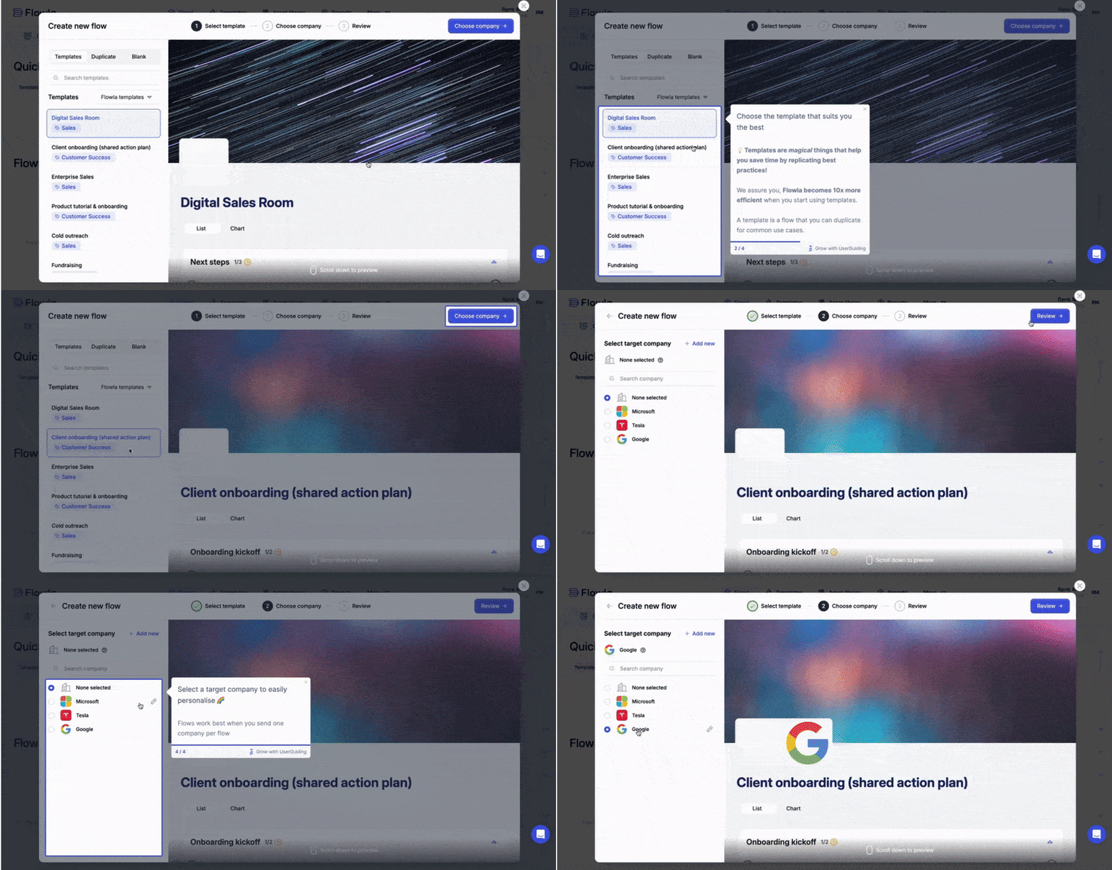
Flowla defines activation as when their users share a digital flow with a potential lead.
They deliberately built this moment into their product tour as the final step:

We like this example because Flowla were crystal-clear about their objective and led their customers to it, step by step.
No wonder that more of their customers activated!
Click here to read more of Flowla's story.
Plandisc
Plandisc offers a circular planning tool that gives users a clear visual overview of their entire year, using multiple concentric rings rather than traditional rows and columns.
Their onboarding process starts with a welcome screen:

This is followed by a guided product tour that demonstrates how to add events to the circular calendar:

Once users have created their first calendar, a hotspot directs them to share it with others, highlighting Plandisc's value proposition as a collaborative planning tool:
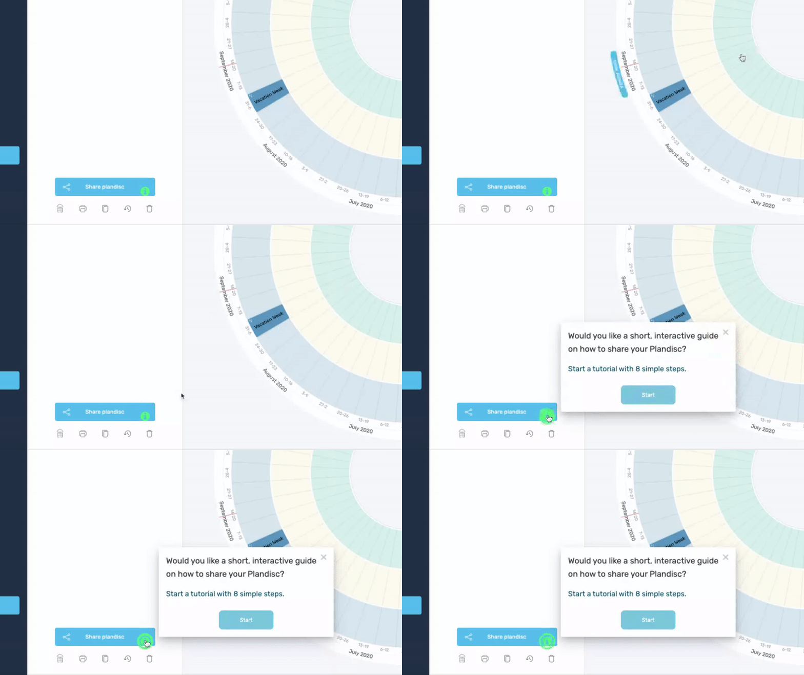
We appreciate this approach because it demonstrates that an effective product tour doesn't have to cover everything at once. A lengthy tour with too many features can overwhelm users.
Instead, Plandisc provides just enough information to help users set up their initial calendar, with additional features like sharing explained in separate walkthroughs.
This method simplifies learning by breaking it into manageable chunks, making it easier for users to grasp.
Click here to learn more about Plandisc's user onboarding process.
Duolingo
Duolingo is a widely used mobile app for language learning.
Their onboarding begins with a series of questions to determine the user's desired language, daily time commitment, and current proficiency level.

This approach ensures a tailored experience that aligns with the user's goals.
To minimize friction, Duolingo allows users to log in using their Facebook or Google accounts instead of creating a separate Duolingo account.

Once users are in the app, tooltips enhance their learning by explaining the meanings of individual words.

This onboarding process is notable for its focus on reducing user friction. From an intuitive welcome flow to easy sign-up options and helpful tooltips, Duolingo consistently seeks to simplify the user experience.
Click here to read a comprehensive overview of Duolingo's onboarding process.
Next steps
Now that you've learned all this about onboarding, you're probably wondering: how do I get started?
Well, you've got a couple of options for creating your onboarding materials.
Coding your walkthroughs, tooltips, hotspots, and other elements in-house will give you the most control – but it will also take the longest and be the most expensive option.
It's expensive simply because in-house developers are expensive – as is the opportunity cost of having devs work on onboarding instead of your main product features.
The alternative?
Partner with an onboarding solution like UserGuiding and have your non-technical product people create onboarding elements without having to code.
You can use UserGuiding to build:
- Tooltips
- Product tours
- In-app surveys
- Hotspots
- A help center
- A knowledge base
- And more!
And UserGuiding's analytics will also let you measure the success of your onboarding efforts along the way.
Frequently Asked Questions
How do I create a great app onboarding experience?
Focus on bringing your users to activation as quickly as possible. Give a personalized experience to each user, based on their segment's product goals.
Is app onboarding necessary?
Absolutely. Businesses that don't do onboarding experience more churn, less activation, and less feature adoption.
How do I design a good onboarding flow?
A good onboarding flow is engaging, playful, short, intuitive, and shows users the features they need. It's faster to design it with UserGuiding than to code it from scratch.


.svg)
.svg)
.svg)
.svg)
.svg)


.svg)
.svg)


.png)


