I absolutely hate info-dumping.
I hate it when I do it (looking at you, fellow ADHD folks), I hate it when others do it to me (looking at you, poor friends of ADHD folks), and I absolutely hate it when any form of media infodumps me.
Yet I have to go through it every time I start using a new app or software, and probably so do you.

You just want to start using a seemingly simple application, but the onboarding designers have other plans, including explaining the entire lore of the tool and each function in it.
I have had enough.
So, in hopes that PMs and developers finally realize what's going on, today we will be talking about:
- What progressive onboarding is,
- Why you should switch to it,
- A comparison of progressive onboarding vs. traditional onboarding,
- Some cool examples of progressive onboarding, and
- How you can create your very own progressive onboarding process
Let's start with a swift description before I start infodumping myself 🤓
What Is Progressive Onboarding?
Progressive onboarding refers to the type of user onboarding experience that prioritizes optimizing users' cognitive load and offering a generally more friendly user experience. Progressive onboarding makes the entire user onboarding process more contextual and makes the comprehension of complex workflows and core features easier. Compared to traditional user onboarding experiences that use simple product tours and walkthroughs, progressive onboarding makes use of contextual hotspots, onboarding tooltips, and more effective user onboarding techniques.
So, if we were to consider traditional user onboarding as a UI tour-focused or function-oriented onboarding method, progressive onboarding, as the name suggests, is a more progressive, effective, cognitively less tiring, and more sticky, benefits-oriented onboarding method.
But is it really the way to go for your specific product?
Let's find out.
Why Should You Switch to Progressive Onboarding?
Though progressive onboarding in and of itself sounds like the type of onboarding all products should be employing, you might have your reasons to be skeptical.
After all, unless you use the right software to create your user onboarding process and come up with a thoroughly designed onboarding strategy, the chances of failure are still high, even with progressive onboarding.
But once you realize the obvious benefits of a more progressive, contextual onboarding, you just might change your mind.
Here are just three of the many reasons why progressive onboarding might be what you need:
Enhanced user experience 🧑💻
The most obvious benefit of switching to a progressive user onboarding is better user experience not only during the first-use onboarding stage but throughout the entire user journey and beyond.
Thanks to user onboarding UX patterns like actually helpful tooltips and contextual guides, friction is eased, and potential users aren't overloaded cognitively with unnecessary information they might not need yet or at all.
Higher user retention (and acquisition) 📈
Because progressive onboarding will automatically enhance your overall user experience, higher user retention rates should be expected as user frustrations will be lowered and satisfaction with the app experience will go up.
What you might not expect, however, is an increase in conversion rates as well as acquisition rates which is ought to happen since higher user satisfaction equals more referrals and more acquisitions.
If you have a product-led onboarding approach, with progressive user onboarding, conversion rates are bound to go up since users will be in contact with your onboarding sequence before converting to paying customers.
Higher new feature adoption ✅
Lastly, besides the positive experience of first-time users, your existing user base will be continuously enjoying a more seamless onboarding sequence as new updates arrive to your product and new feature promotions take place.
Instead of implementing feature adoption through more product tours like in traditional onboarding, using different UX patterns and a more benefits-oriented onboarding approach will trigger higher feature adoption and product usage rates.
Now, I've been talking a lot about the differences between progressive and traditional onboarding up until now, but we might just need to dive deeper into it to understand the upgrade progressive onboarding would entail.
Let's take a look at the benefits of progressive onboarding and the benefits of traditional onboarding.
Progressive Onboarding vs. Traditional Onboarding Practices
While the reasons why you should be switching to progressive onboarding show a difference between progressive and traditional onboarding, there are still some differences between the two worth mentioning.
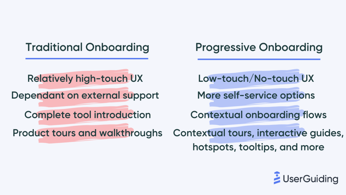
👉 Due to its focus on educational content over value proposition, traditional onboarding fails to create a low-touch or no-touch user experience and instead might require a sales rep or another representative in the user journey.
👉 Progressive onboarding gives users more of a chance to self-serve since it often brings along different onboarding UX patterns like resource centers or complete pages like fully-established help centers. Traditional onboarding might depend more on external support from a customer support specialist.
👉 More often than not, traditional onboarding defines an onboarding sequence where the key features of a tool are introduced fully in a function-oriented onboarding at one go. Progressive onboarding, on the other hand, uses way more contextual practices of user onboarding.
👉 Lastly, the general onboarding UX patterns used in traditional onboarding often don't go beyond product tours and walkthroughs, especially designed for first-use onboarding and with onboarding steps not going beyond key feature introduction. Progressive onboarding, on the other hand, uses many different UX patterns like contextual product tours, interactive guides, onboarding tooltips, hotspots, and more.
Now that we have the differences and similarities established let's take a look at some of the best progressive onboarding examples you can come across right now.
3 Outstanding Examples of Progressive Onboarding
It is not every day we come across a good, fully progressive onboarding, but there are some software and platforms out there that really put the progress in progressive onboarding.
Here are three of them.
1- HubSpot
HubSpot is known to have a better-than-average onboarding process, and now we can finally say that it owes it to progressive onboarding practices.
Here's a look at its signup flow:

With a progress bar and fun little images to go along with it, the signup flow sets the tone for the rest of the progressive onboarding experience.
Along the onboarding sequence, there are several contextual onboarding flows with a skip button:

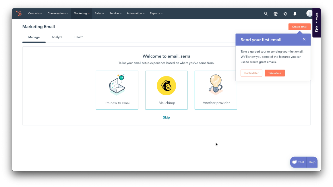
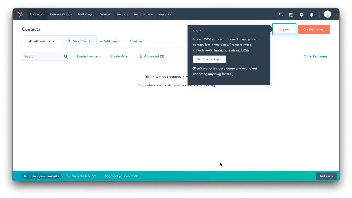
There are also demo experiences for first-time users to see the tool in action without the need to upload data:
And to tie it all together, HubSpot uses a user onboarding checklist with a few tasks users can complete along the way:

The contextuality and the interactivity of HubSpot's user onboarding experience on top of the overall smooth onboarding process make HubSpot's onboarding a progressive one and a good example of onboarding method.
2- Canva
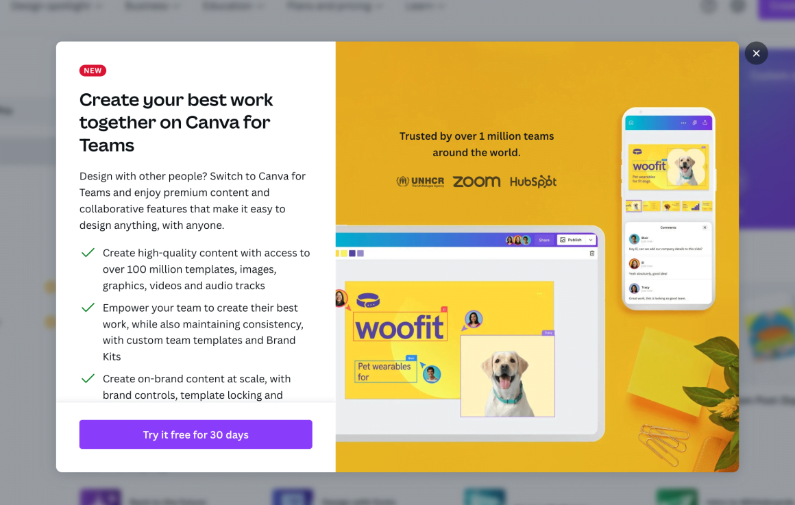
Canva greets users with a modal for their premium version, and though the copy is quite long, the image that covers most of the modal and the formatting helps makes the modal quite engaging.
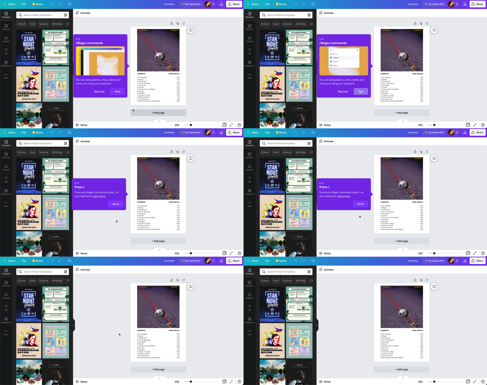
On different pages and features of the platform, users are prompted with different tooltips that give them quick tips and generally describe how to use certain functions, often with gifs.

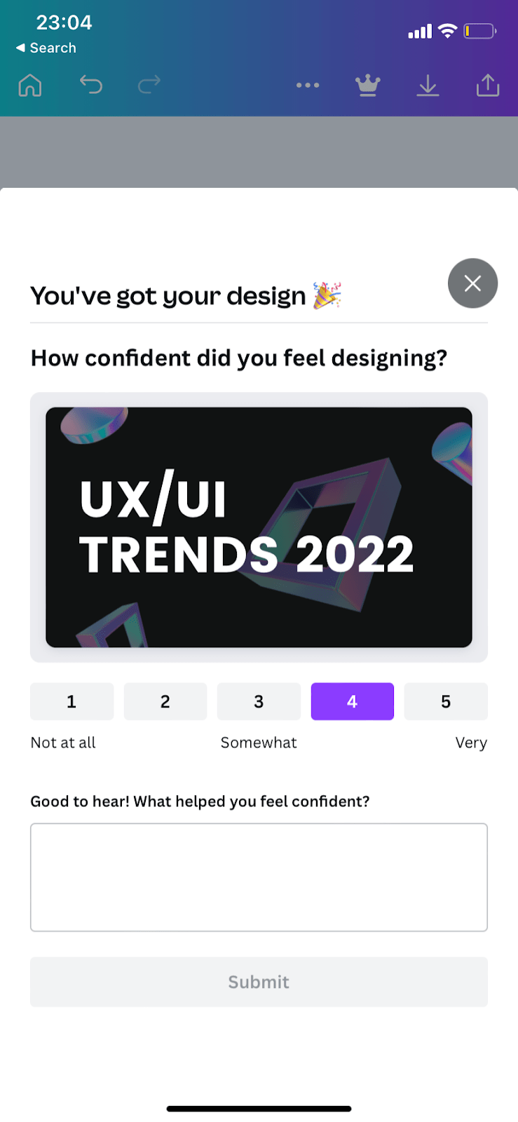
Canva's NPS surveys and user feedback collection surveys look like this on mobile:
Canva being a quite extensive platform, there is a necessity for progressive onboarding with different onboarding UX patterns, especially onboarding tooltips. So, it is easily one of the best examples of progressive onboarding.
3- Loom
Loom makes use of many different onboarding UX elements from pop-up modals to empty states.
For example, if a user using a free plan exceeds the video duration limit, Canva prompts a modal to upgrade to premium:

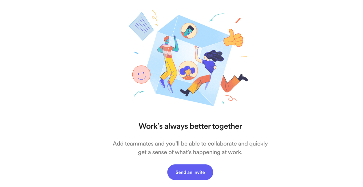
Loom also promotes inviting friends through tooltips and empty states on different sections of the platform:
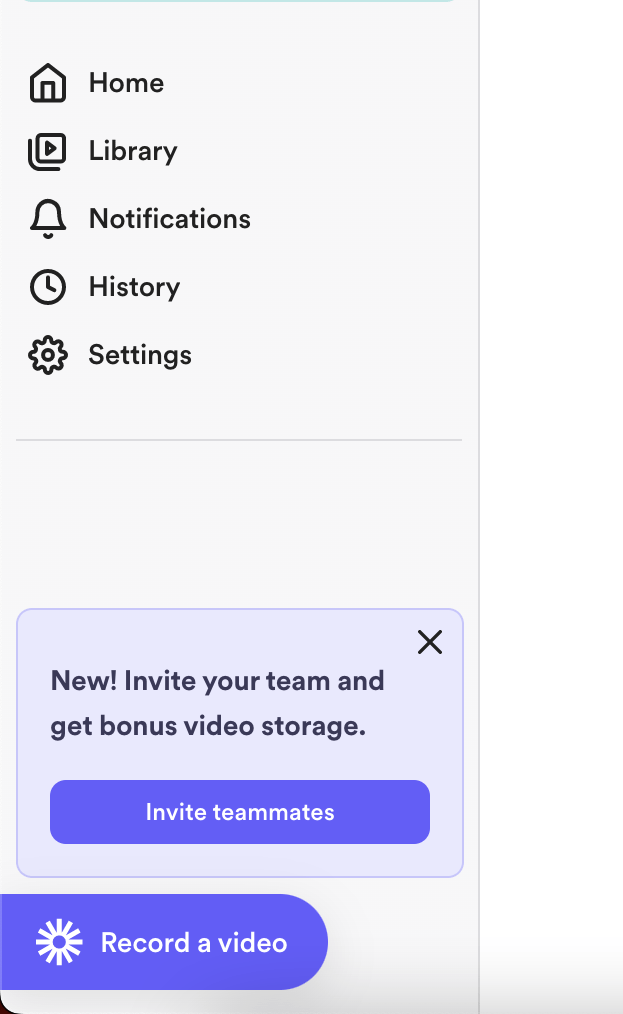
Because Loom is not a very complicated tool, there is not much need for educational content, so the use of onboarding elements for different tasks and goals of onboarding is viable for Loom.
Now, let's take a look at how you can create a progressive onboarding process in 6 simple steps.
Creating a Progressive Onboarding Process in 6 Steps
Depending on whether you already have a user onboarding process (any series of steps to guide your users in getting onboarded) or whether your product is a brand new one with no insight whatsoever about your user base, creating a progressive onboarding process can be a whole different process.
But no matter what, there are some simple steps that outline any onboarding creation process that we can talk about in the light of progressive onboarding.
Here's an actionable outline for you:
1- Clearly describe your product
To decide which road to take with your onboarding strategy, the number one priority is to always know your product.
Remember: you just might need a traditional onboarding process too.
Of course, this doesn't change the fact that almost all SaaS products are better off with more engaging and contextual progressive onboarding processes.
But hey, there are more decisions to make even if you're setting out on creating a progressive user onboarding experience, like the onboarding UX elements you will be employing depending on the complexity, the UI, the UX, and the user persona of your product.
2- Figure out aha! moments
Let me tell you this right off the bat: progressive onboarding is all about aha! moments.
You cannot possibly design an onboarding app that does not simply make a tour of all the features and not touch upon some aha! moments.
So, to make sure your users reach value - preferably even before they fully understand your product and what it does - you have to map out aha! moments you want to navigate users to.
This can be completing a key task, creating content with your product, or even just seeing one of your core features at work.
What matters is that however many aha! moments you have, you continuously serve them to your users to see through your progressive onboarding process.
3- Use the right software
Another main concept of designing a good, working, progressive onboarding sequence is the amount of different onboarding UX patterns you use.
And let me tell you, the best way to do this is through third-party tools.
For example, to enable your users to self-serve when in need of support, you can use support software like Intercom.
Or, to take your progressive onboarding outside of the product, you can use MailChimp to easily create and send out email campaigns and continue the onboarding via email.
But if it is the many onboarding UX patterns and the ease of no-code you are looking for, the tool to use is without a doubt...
Drumrolls... 🥁
UserGuiding: progress your onboarding process 📈
Remember back when online games had a "how to play" button?
All games kind of assumed that you already knew how to play, and if you didn't, there was always that one button.
Recently, the notorious online game Among Us had that option too, and it occurred to me just how much beyond that we are now.
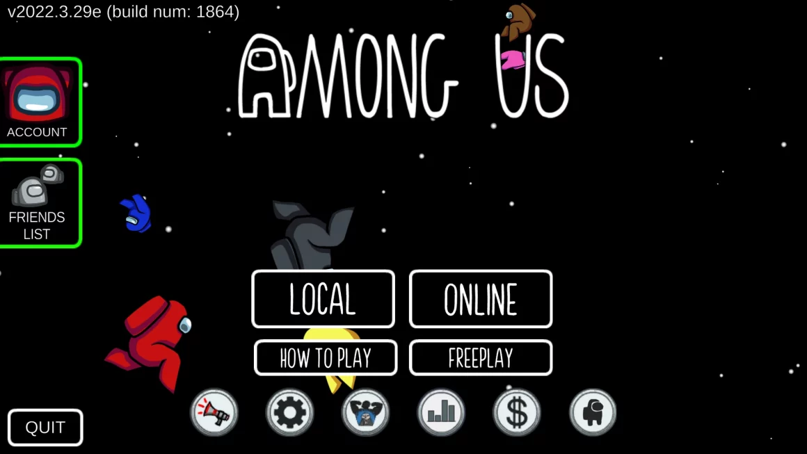
Even for game tutorials or game onboarding, we come across pop-up modals, background dimming, and even onboarding checklists.
Mind you, all elements of progressive onboarding.
It is only natural for us to want to use these cool progressive onboarding UX patterns in SaaS products, and I just might know how 👀
UserGuiding is a no-code user onboarding tool and it is easily the simplest and most affordable tool on the market for creating progressive onboarding flows.
Some features of UserGuiding are:
✅ Interactive guides, product tours, walkthroughs,
✅ Tooltips, hotspots, in-app messages,
✅ User onboarding checklists,
✅ Resource centers,
✅ NPS surveys, and more...
...All with powerful analytics, user segmentation and targeting, and high customization.
👉 Give UserGuiding a try for FREE 👈
4- Design with the user in mind
After getting the idea, the design roadmap, and the software to use down, it is time to get down to the onboarding design process.
The last thing you want to do is to NOT put yourself in the shoes of your target audience.
Progressive onboarding does not get its name only from how it is the type of onboarding that progresses with time and in a step by step manner but also from the obvious fact that it is quite progressive in different spheres of product design.
Most importantly, user-friendliness.
So, when creating your progressive onboarding sequence, make sure to:
👉 Keep each contextual onboarding flow short with maximum 7 steps,
👉 Add images and visual support where you can and where it does not cluster the UI,
👉 Adjust the frequency and timing of each bit of onboarding to not frustrate the users,
👉 Make use of empty states and the UI itself before employing another layer of onboarding like tooltips or hotspots, and
👉 Use product demos, mock data, and other onboarding materials to give users a sense of how the tool actually works when at its best
And some other tips depending on your specific product.
5- Conduct A/B testing
Even when you think your progressive onboarding is perfect, there is always room for testing.
And believe me, you will be surprised how many people might not agree with you on micro and macro levels of design.
Of course, A/B testing might not be possible for every product at every point of design and iteration. But as you go along with your design, you can always conduct guerilla testing or depend on user feedback.
What matters is to make sure you test your product with anyone that just might fit your user persona.
6- Iterate, iterate, iterate
Much like the onboarding process itself - especially if it is progressive - being a cyclical process, so is its creation.
A progressive onboarding process is not a one-time endeavor you can publish and go, especially since you will have to design different sequences for every update and alter existing flows according to user feedback.
True progress is through iteration.
To Wrap Up...
So, now you know what progressive onboarding is, why you should switch to it, just how different it is compared to a traditional onboarding process, some cool progressive onboarding examples, and how you can create your very own progressive onboarding process.
You might have a vision in mind, or you might be terribly confused by now.
Either way, we just know that progressive onboarding is the way to go for any product hoping to create a loyal user base and keep retention rates high.
So, good luck with your onboarding design process.
You know where to go when you want to find a reliable tool for it.
Frequently Asked Questions
What is the biggest benefit of using a progressive onboarding flow?
Using a progressive onboarding flow makes user and customer retention rates go up, increases user satisfaction and loyalty, and eases the burden on customer support, customer success, and sales teams.
What does an onboarding screen look like?
Generally, an onboarding screen is any screen where an onboarding material or onboarding UX pattern is present. Alternatively, onboarding screens can refer to setup wizards and onboarding wizards, which are basically simplistic onboarding checklists with tasks for users for onboarding.


.svg)
.svg)
.svg)
.svg)
.svg)


.svg)
.svg)


.png)


