


.svg)
.svg)
.svg)
.svg)
.svg)


.svg)


.svg)
.svg)

You wake up, check in with your customer success team, and face the harsh reality: More and more customers have been churning lately.
Does that feel familiar?
73% of customers will leave for a competitor if they have multiple poor interactions with your product, and more than 50% of them will bolt after a single bad experience.
If you don’t listen to what customers are telling you and don’t create a smooth experience for them, you’ll face this harsh reality every day.
The good news is that you can change this very easily. “How?” you may ask.
Guided website tours.
In this article, you’ll learn:
- What guided website tours are
- How you can create them
- The best tools to try
Let’s start from the basics👇

What is a Website Tour?
A website tour, also known as a guided tour, is essentially an interactive walkthrough of a website or product. It helps you enhance user onboarding, engagement, and feature understanding.
This can be a single tour that explains the core functions of your product or a collection of tours that each focus on different features.
But what does it do for a user?
First, guided website tours help users navigate easily. They can get the most out of the onboarding experience. Why?
Because these tours are designed to be self-serve experiences, meaning that they quickly familiarize users with your product and its key features by encouraging them to complete key actions.

In short, website tours:
- Educate your users with a high-touch onboarding experience,
- Increase feature adoption by using interactive elements, and
- Turn your product into a self-serve experience
Do you need a guided website tour?
If the answer was “No,” then you wouldn’t be here, right?
In all seriousness, you need a guided tour because the traditional methods will almost always fail when they are up against the website tours.
So, let’s address why they might work, but they won’t work long-term👇
Can traditional methods of user education compare to guided tours?
Although traditional methods like online manuals, product walkthrough videos, and 1:1 training sessions can be helpful, they can’t really replace guided tours.
Why?
Guided tours meet the users where they are, give them contextual cues and tasks to complete, and help them see the value of your product as quickly as possible.
In other words, guided website tours add personalization to the educational mix, which makes it easier for users to understand, engage, and adopt.
Not convinced yet? Keep reading! 👀
Online manuals are hard to digest
How many times did you read a manual front to back?
Think again. How many times did you even check out a product’s online manual?
Even if you did, how easy was it to find the answer you were looking for?
Although online manuals are designed to simplify the nitty gritty of your product or service, they are still long documents. It’s easy to get lost in details.
Besides, complex products require more than words on a page to be understood completely. You see where I’m going with this, right?
Take a look at HubSpot’s manual, for example. If you’re lucky, users will take a look at it for a couple minutes, then they will try to figure out the product on their own.
The worst-case scenario is that they will be so frustrated that they will abandon the product completely. This is because most manuals are not written with the consumer in mind.
Long story short, don’t be your own enemy. Ditch the inaccessible and indigestible online manuals.
Product walkthrough videos are hard to create
The average in-house onboarding experience is designed by at least 5 to 10 people:
- A product manager to define the goals, user journey, and success metrics of onboarding,
- A UX/UI designer to design the user interface, experience flow, and visual elements,
- An engineer to implement the onboarding flow, build features, and ensure smooth integration,
- A data analyst to track user behavior, drop-off points, and optimize based on data.
Imagine all the meetings, Slack convos, trials and failures… Just thinking about the process is exhausting in itself.
It’s more exhausting to start and manage an in-house onboarding project.
Twin Science initially gave an in-house project a go, but soon enough, they realized that the cost of hiring new people and the time involved in this project would set them back a lot.
“We had two choices: spend months building an onboarding system or find a faster way. UserGuiding gave us that shortcut,” says Twin Science’s Product Manager, Bennur Amaç.
Look at this walkthrough video example first👇
Visually, it looks easy to follow and engaging. Definitely more accessible and digestible than a manual. The voiceover on the other hand… It’s not an attention-grabber.
Moreover, you have to switch back and forth between the video and the product to apply the steps.
You’ll also need to re-shoot the entire video every time when the design or a UI element changes to stay up to date.
Now take a look at this walkthrough👇

Instead of telling users what they need to do, Twin Science shows them what they can do with the product by highlighting specific parts on a page and suggesting actions. It’s a self-paced and self-learned process.
1:1 training sessions are time-consuming, unsustainable, and costly
Dua Lipa seems to agree that 1:1 trainings are over 😉
Training sessions are probably more preferred than the other two traditional methods, and it makes sense.
These demos are usually common for enterprise-level users and for businesses with big contracts.
But, let’s be honest, they can be as time-consuming and unsustainable as walkthrough videos and manuals.
Brian.study, an AI tutor that helps teachers to create adaptive learning environments, was swamped with support tickets from teachers who asked questions like “How do I add a lesson?”
Their first step was 1:1 sessions. They were able to show teachers how to use the platform step-by-step. However, these sessions got longer and longer, eventually surpassing 90 minutes per session!

UserGuiding’s knowledge base feature came to the rescue. Instead of walking teachers through the product for hours, Brian.study created separate spaces for teachers (and students) so they could find the answers they’re looking for easily.
You need a guided website tour because…
Users don’t want to switch between 5 different tabs to complete one single action.
Guided tours introduce interactivity and personalization. And your users don’t have to leave the product to learn how it works.
Nowadays, almost every platform offers interactive educational content. So, how does it benefit the users?
- First-time user experience can make or break how a user perceives your product. Guided tours reduce friction by introducing gamification and motivating users to succeed.
- Guided website tours also improve feature discoverability by driving users to think outside the box and progress.
- These tours support self-serve onboarding modals and reduce support burden with flexibility to suit the user’s needs.
- Finally, the guided tours impact engagement, retention, and conversion by encouraging users to apply what they learn to the product’s features.

The benefits that I’ve just mentioned are not really valid for the traditional methods. And unlike traditional methods, guided tours are
✅ built right into your product, so your users don’t have to leave your website to access instructions.
✅ digestible as your users complete the tasks themselves in real-time.
✅ less demanding because you can create and update content with a few clicks.
How to create a guided website tour?
Are you ready to create a guided website tour?
Moreover, did you know that you can create one and improve the user experience in 3 simple steps?
The school’s in session, let’s go! 🚀
#1 Design the flow 🎨
Although it’s very tempting, you cannot create a guided tour without planning.
This phase has the longest to-do items, so it may feel frustrating to not see results immediately.
However, planning is necessary to have a strong foundation for your tour.
This stage includes the following steps👇
Identify the user needs, motives, and pain points
Your guided tour can look like anything and what you want to achieve with the tour will define that look.
Do you want to help users activate their account? Discover a new feature? Complete a task?
A guided website tour should have a single objective that drives users to take action.
Go over your analytics to identify where users struggle the most.
You can also conduct user interviews (time-consuming but worth the effort) and record heatmaps and user sessions to see how they behave on your platform.
Then, get ready to👇
Devise and create a path your users can take to reach your product’s core value
Once you have a clear, measurable goal, it’s time to test your own knowledge of your product.
Walk through your product like a new user would. Can you identify all the Aha! and Wow! moments?
Once you answer these questions, you’ll have your path to guide users directly to a core value.
Remember that each step in the tour should guide the user closer to completing that goal.
Divide this path into guided tour steps and design steps
This is where the real fun begins. You cannot just call it a day once you have visualized a path for your guided tour.
A linear tour worked wonders a couple of years ago. But today, users expect contextual guidance to be engaged with the tour (and the platform).
So don’t overwhelm users. They are more likely experiencing your product for the first time.
Stick to 3-5 steps for most tours. If your product is complex, consider breaking it into smaller micro-tours that trigger contextually.
By dividing the tour into smaller parts, you give your users the opportunity to adopt the essential features rather than throwing a bunch of different things in their direction.
Want to make the tour even more memorable?
Let the users skip or exit the tour at any time, and with the option to open the tour again. When users know they are in control, they are more likely to complete the steps.
Also, write your instructions like you’re talking to a human. If your brand voice is casual, keep it consistent. Use emojis, funny GIFs, and even acronyms.
Don’t write your copy as if you’re creating a technical documentation. Otherwise, you have yourself a manual. *cough cough* And we know they don’t grab the users anymore.
Be direct, helpful, and specific. Read these sentences👇
“Click here to create your first project.”
“This button initiates project functionality.”
Which one would you pick? The one that encourages an action with a clear label or the one that just… makes a statement?
✅ “Click here to create your first project.” Exactly.
Also, keep in mind that visual clarity is just as important as written clarity.
Make sure your steps stand out from the rest of the page. You can use high-contrast tooltips, arrows, or highlights.
You can also position tooltips near the element they reference to increase contextuality and avoid obstructing the other key UI parts.
#2 Choose a method of development 🤖
So far, you have:
- A goal
- A visual map of the tour
- Steps that break down the map into manageable, digestible chunks
Now, it’s time to choose a method to develop your product.
There are 2 main ways:
The no-code method 🚀
It’s actually in the name, but don’t worry, I’ll give you more details:
With the no-code method, you don’t have to worry about developing or maintaining the tour by checking lines of code until your eyes twitch.
You just sit back and relax as a third-party tool gets the job done for you. You can actually create tours and other onboarding elements as well. Most of these tools offer design libraries as well as customization.
Psst… Come closer. I’ll show you a shortcut.
A little closer.
There you go🔎

With UserGuiding, you can create interactive guides, tooltips, checklists, surveys and more.
In fact, if you sign up right now, you can actually create your first guided tours within minutes.
The best part? You don’t have to write a single line of code. Build a tour from scratch, customize it to your brand’s image, and motivate your users without the hassle.
The in-house development method 🧑💻
You can also create your tours in-house, but this is called the hard way for a reason.
With this method, you hand over your design to the product and development teams, who potentially already have a lot on their plates, and wait. If you want the tour to be finished faster, you’ll have to outsource the talent (more money spent💸), or wait until your teams get to it. The upkeep will also rely on these teams.
The benefit, on the other hand, is that you have complete control over what you create.
#3 Create and iterate ⚙️
If you decide to go with the in-house option, then your job is done. The development and product teams will handle the rest of the process.
If you’re an outlier, you need to use the third-party tool to start creating your first guided products.
Here’s a checklist to successfully complete this phase:
- Trigger tours contextually: The two birds, one stone method does not work with guided tours at all. In fact, this method will probably annoy most of your first-time users. Separate your tours and use behavioral triggers like “first login,” “after signup,” or “hovering over a key feature” to show features when the users need them the most.
- Include progress indicators: A guided tour with no end in sight… Sounds like every user’s worst nightmare. A simple “Step 2 of 4” can go a long way, reduce the drop-off, and set clear expectations.
- Give users control of what they see: Nothing kills UX faster than forcing someone through a walkthrough they don’t want. Thankfully, there’s an easy fix. Let users pause, skip, or return to the tour later. Self-paced learning experience always rewards the user.
Guided website tour checklist on the go ⬇️
You don’t have to control+F this article to find what you need for creating a guided website tour.
I have something better: A checklist. You can find everything we’ve discussed in the previous section here:
📝 Set the Foundation
- Start with a clear goal; it can be increasing user activation or building awareness around a new or underused feature.
- Guided tours are not one-size-fits-all solutions. Identify the user the tour is for. Is it for first-time users, returning ones, or for a specific role?
- Look at your existing user flow to see where users drop off, then use that map to determine the essential steps of your tour.
📝 Design the Tour Structure
- People don’t have time to sit through long tours. 3 to 5 steps in a single tour is ideal.
- Similarly, the longer the process, the easier your user will get confused. Break long sequences into smaller, contextual tours.
- Progress indicators both motivate the user to continue and make them feel accomplished. A simple text like “Step 2 of 4” indicates the duration a user can expect.
📝 Craft the Copy
- Vague statements are out, clear and action-oriented language is in. Yes, users want to know what they need to do in order to complete a key action.
- Unless your user base is fluent in technical language, you need to avoid using jargon.
- Add helpful microcopy where necessary, such as tooltips or links to relevant documents.
📝 Make It Visually Clear
- Humans do judge a book by its cover. You can be sure that they will judge a platform that they’re paying for. High-contrast tooltips or modals will be your new best friends to make steps visible on the page.
- Position tooltips logically without blocking important UI. This will help users to navigate the page easily.
- Users should be able to access the tour on as many devices as possible. Therefore, design your tour with responsiveness in mind. Make necessary changes for desktop and mobile.
📝 Add Personalization & Targeting
- Every user is unique and so are their needs. Make sure to trigger tours based on their behavior or role.
- What a teacher sees will be different from what a student sees. You should adapt content dynamically by segmenting based on different attributes (like behavior, role, demographics, etc.)
- Try to schedule tours to appear at relevant times, not all at once. Otherwise, users will be overwhelmed and quit the tour before they finish it.
📝 Give Users Control
- Skip, pause, or exit options give the control to the user who then can move through the tour at their own pace.
- Guided tours are not one and done things. Users might forget and need to return to certain steps. So, allow users to return to the tour later via help menu or resource center.
📝 Measure and Improve
- After your tour goes live, you need to track tour completion rates and drop-off points to see if it’s effective.
- Also, consider collecting feedback. Optional thumbs up/down or short NPS surveys do not interrupt the user’s experience, and they are easy to complete.
- Test variations of steps, language, and design (A/B test) to optimize each tour.
- Users change, and so should your tours. Regularly update tours to reflect product changes.
📝 Choose the Right Tool
- Consider using a guided tour tool that supports no-code editing, segmentation, and analytics like UserGuiding to save time and money.
- Make sure it integrates with your existing tech stack. This will make integrations and tracking easier.
Voila! This checklist might be short, but there is even a shorter road, such as…
The Best Website Guided Tour Software (Free & Paid)
No-code guided tour tools
1- UserGuiding
UserGuiding is a no-code user onboarding software that helps you create the perfect guided tours in minutes.
With UserGuiding, you can:
✅ Interactive guides, product tours, walkthroughs,
✅ Hotspots, tooltips, in-app messages,
✅ Resource centers, knowledge bases, localization
And more!

So… what makes UserGuiding better than other tools? I’ll give you 4 main reasons:
1) Affordability
UserGuiding is the best budget-friendly tool in the market for the features it offers, especially for startups and mid-market businesses:
- 14-day free trial, no credit card needed.
- Starter: $174/mo when billed annually for up to 2,000 MAU.
- Growth: $349/mo when billed annually with A/B testing and goal tracking.
- Enterprise: Custom pricing with personalized coaching and priority support.
2) Clean UI & Easy Setup

UserGuiding’s UI is streamlined and intuitive, making the first-time setup smoother compared to other tools.
With checklists and progress bars, first-time users can easily set up their account, complete the first key actions, and see the product’s value immediately.
Considering that 52% of companies already use onboarding checklists to address user needs, your guided tour will start on the right foot for sure.
3) Better for Smaller Teams
UserGuiding doesn’t overload with features that small teams may not need. It keeps things focused: product tours, checklists, tooltips, and analytics.
4) Solid Support & Onboarding
Users often mention UserGuiding’s responsive customer support and good onboarding experience. It also includes templates and guides that help new users get started faster.
2- Appcues
Appcues is a user engagement platform built for SaaS companies. It offers features like:
- In-app messaging,
- User action-triggered emails
- Push notifications
- User engagement tracking
If you want a cost-effective, easy-to-use onboarding tool, Appcues wouldn’t be the best choice. Appcues is better suited for mid-sized to large businesses.
If you fit this description, however, its segmentation, A/B testing, and analytics features are pretty advanced.
Appcues supports both desktop and mobile, which is convenient if you want to keep your tours consistent across different versions of your product. Many other competitors mainly focus on web or desktop apps.
If this is a priority for you, then Appcues is one step ahead in the game.
However, if you're a small-to-mid-sized business looking for essential onboarding features without the enterprise price tag, Appcues will more likely to disappoint you.
Let’s start with the pricing👇
- Start: $375/mo when billed annually for up to 2,000 MAU.
- Grow: $800/mo when billed with NPS and resource center.
- Enterprise: Custom pricing with unlimited user licences and advanced security.
❌ You won’t get extensive support if you’re on the lower plans. What happens when there’s a bug and/or a line of code needs fixing? You’ll solely rely on customer support and risk upsetting your customers as you wait for the tool’s team to reach out to you.
❌ If you’re focused on launching onboarding flows quickly and simply, think twice. Appcues is an extensive tool and this comes with a learning curve. It requires technical knowledge and help from developer teams to fully use some of its capabilities.
3- Userpilot
Userpilot is another product adoption and in-app engagement tool that offers guided website tours. It is known for product usage analytics and is often preferred for more detailed in-app behavior tracking and contextual onboarding.

Userpilot is also one of the best options in the market to create guided tours for mobile apps. It offers unique features for mobile like carousels and slideouts.
Users often mention the variety of UI elements that help them create interactive workflows and see the preview of their tour in real life.
It’s not all sunshine and roses, unfortunately.
❌ The platform itself is inconsistent at best. Many users report that platform crashes are common, especially during editing and previewing processes. You can lose all the progress and might have to start from scratch, which can be annoying pretty quickly.
❌ Some users also mention that some advanced features require a lot of experimentation. The tool can feel overwhelming, as there’s also a lack of additional documentation and tutorials as well.
❌ If you’re paying hundreds of dollars for a product every month, you want it to keep up with industry trends, right? Userpilot still doesn’t offer AI assistants, roadmaps, knowledge bases, or changelogs.
Speaking of pricing… 👇
- Starter: $249/mo when billed annually for up to 2,000 MAU.
- Growth: $799/mo when billed annually with unlimited MAU and product analytics.
- Enterprise: Custom pricing with premium integrations and bulk data export/import.
Open-source guided tour software
1- Shepherd.js
Shepherd.js (also known as shepherd.dev) is an open-source JavaScript library. You can create tours to introduce your web platform to users.
Because it is not a full SaaS platform, that’s pretty much all you can do with Shepherd.js.
A developer library like Shepherd.js can be a good option if:
- You have a skilled dev team.
- You want active community support.
- You want a free, customizable, and flexible solution.
- You’re okay with building and maintaining onboarding flows manually.

Personal use is free. However, you need a commercial licence to use Shepherd.js for commercial apps, plugins, or websites👇
- Business: $50/lifetime with up to 5 projects and 1 month commercial support.
- Enterprise: $300/lifetime with unlimited projects, 6 months support, and prioritized Github issues.
- Shepherd Consulting: Custom pricing with onboarding and training, white-glove services, and advanced analytics.
On the other hand, if you’re looking for more of a hands-off tool and have a non-technical team, no-code tools like UserGuiding are hands-down the better choice.
❌ While no-code tools on this list offer templates and built-in UI, you can only customize your UI by coding. You also have to code for user segmentation and analytics, which makes the platform really limited in its use cases.
❌ Shepherd.js is also hard to maintain. All the hard work falls on your or your development team’s shoulders. You’ll constantly debug the tours, release updates, and spend extra time on customization.
2- Intro.js
Intro.js is another developer library that can help you build simple guided tours and hints.
It’s a very popular platform (and rightfully so!) and an effective solution for guiding new users with customizable tours. Intro.js is also very lightweight, which means that it will not significantly impact your product’s performance.

It is also very easy to integrate into other applications and frameworks like React, Angular, and Vue.
Personal use is free. Commercial license is also available:
- Starter: $9.99/lifetime with one project but no commercial support.
- Business: $49.99 with 5 projects, 1 month commercial support, and 1 custom theme.
- Premium: $299.99/lifetime with unlimited projects, 24/7 priority support for 6 months, and 3 custom themes.
However, if you want to move fast and iterate with minimal engineering support, a no-code solution would fit your needs better.
❌ Like Shepherd.js, Intro.js has limited built-in features. You can create guided tours and hints but it lacks some of the advanced features other user onboarding tools have.
❌ While digital adoption platforms handle maintenance for you, you have to handle everything when using Intro.js.
❌ Implementing and customizing Intro.js requires a certain level of technical expertise. A developer and designer are definitely needed.
3- React Joyride
What makes React Joyride different from other open-source tools on this list is that you have more options for customization.

You can get an interactive demo and edit it to see if it’s the right fit for your product. You can also change the selector labors and button colors, add a skip button or remove the skip button altogether.
It still adds an element of interactivity to your tour but that’s about it.
Unlike other open-source alternatives, React Joyride is 100% free for personal and commercial use.
❌ React Joyride has the same downsides as Intro.js and Shepherd.js. It is also not clear whether you can implement React Joyride across multiple pages as a continuous tour.
With no-code solutions like UserGuiding, you can build onboarding flows directly in the browser, test them instantly, and publish them live.
The choice is yours!
10 best guided website tour examples to get inspired in 2025
1- Canva
It’s rare that people have not used or heard of Canva. It is a graphic design platform that helps users create social media posts, presentations, logos, and more.
Let’s go over its user onboarding process and how it uses a guided tour to explain the design creation process.

Remember when we said users need to be in control?
Canva does a great job doing that!
The user has the option to take the tour. If they want to explore the feature on their own, all they have to do is click on X.
The tour also provides a brief description of what the feature is and can be used for.

The first step is figuring out the menu, and Canva uses tooltips to show where users can complete the recommended actions.
See “1/4”? The user knows how many steps they need to complete to understand the basics of the whiteboards. No confusion about the user’s progress.
Key Takeaways ✍️
- Canva describes what the whiteboard feature is used for. The description is immediately followed by a call-to-action (CTA) button.
- The tooltip does not interfere with the rest of the UI. It is placed where the user would take the action, aka it’s contextual.
- You can see how many steps there are in this tour and exit the tour whenever you want.
- What could make this tour even better? Well, you cannot move between the steps, which restricts what you can do each time.
2- Asana
Asana is a work management platform where you can automate workflows, set company goals, and manage strategic plans.
Since their user base is diverse, their product tour has to be practical.
Let’s see how the platform achieves that👇
🚨 Spoiler alert: Lots of visuals and playful illustrations.

The welcome screen does 2 things well: First, the copy is short and concise. No wordplays, no fancy sentences. The goal is clear: to show you what Asana can do to manage projects and hit deadlines.
Second, the design is simple. It uses buttons and progress indicators to help users hit the ground running without getting bogged down.

No-frills introduction to features like timeline mapping are great. The tour also uses a lot of visuals that show how these features look within the app.

The tour also shows you how to customize within the platform. Visuals once again do most of the work while the short copy gives clarity.
Key Takeaways ✍️
- Short and concise copy can go a long way. First-time users can be easily confused. Therefore, keeping sentences short and getting to the point quickly is helpful.
- Asana uses visuals to show how these features look like and function on the platform. It is a great way for familiarizing the user before they start exploring the product.
3- Loom
With this tour, Loom shows what its AI can do for writing documents, creating an issue on Jira or Linear, or sharing a message.
Let’s take a closer look👇

We have the usual key elements: “Next” and “Close” buttons, progress indicators, and engaging copy.
Loom’s tour adds another element as well: The tooltip is not exactly where the recommended actions can be done. But Loom separates the rest of the page from the key action buttons by highlighting the actions.
The AI feature shows you exactly where you can click to create documents while the copy reinforces that idea.

We’ve discussed how important contextual guidance is for these tours. Loom understands the assignment.
By focusing on “one-click” features and triggering tooltips to guide the users through simple actions, Loom makes sure that users see only what is necessary.
Key Takeaways ✍️
- The tour provides contextual guidance and brief descriptions for each key action.
- The design is not cluttered and the tone is encouraging, highlighting that AI does the heavy lifting.
- The key actions are separated from the rest of the page so users can complete key actions faster.
4- Lattice
Lattice can help HR teams increase productivity, simplify operations, and leverage data to drive business impact.
Let’s go over their onboarding process and how they use a guided tour to explain their Review tool👇

As soon as you sign up for the platform, a welcome message appears on the screen.
This welcome screen works because the goal of the tour is explicitly stated and the image adds a nice touch. But I’d like to emphasize 2 things:
- All the action buttons are amazing. The user can say they’re browsing and ask the platform to remind them of the tour later.
- Users can also take a 5-step tour or watch a 5 minute video. They are in control and know how much time each option will take. It eliminates the possibility that their time will be wasted.
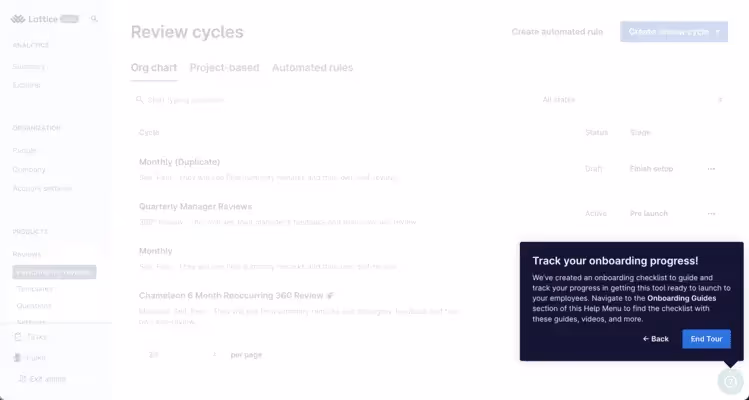
There’s also no pressure to complete the tour in a limited time. Users can move between the steps and go back and complete the action again.
Key Takeaways ✍️
- The tour does not overwhelm users with unnecessary info. It’s just an introduction to the platform’s capabilities.
- Action buttons have clear call-to-actions and give users a clear timeframe about how long each option will last.
- Users have the option to start or skip the tour. They can be reminded of it later as well, which is a nice addition.
5- Airtable
You might know Airtable as a spreadsheet-database platform. You can also create business apps to manage and automate processes with the help of AI.
But did you also know that Airtable’s guided onboarding wizard “drove a 20% lift in activation rates”? 🧙
The wizard asks questions like “What kind of project are you working on?” while visually building users' workflow in real time.

Lauren Isford, head of growth at Airtable, also shares that “this immersive experience reduced friction and helped users quickly understand the product’s value”.
Users can view how their project will look in real-time thanks to the wizard splitting the screen into two: one side for building, one side for previewing.

The wizard uses questions to better understand user needs and personalize the product experience. It collects user input to actively build the flow while also offering immediate, valuable upon login.

Towards the end of the tour, the wizard gives automation options to users to “put workflows on autopilot”. Overall, the user starts using these essential features immediately and customizes them to fit their own needs.
Key Takeaways ✍️
- The onboarding wizard builds workflows in real-time and this shows the product’s value to users immediately. Nothing is left to imagination.
- The tour has a minimal amount of frictions thanks to personalization and customization options.
- Gamification elements like progress bars reduce user dropoff due to uncertainty.
6- ChatGPT
Guided tours are not only for first-time users. As we mentioned, you can create tours to promote underused features or announce updates and changes to your platform.
This is exactly what ChatGPT does.
When ChatGPT dropped GPT-4, it promoted the shiny parts of the version👇

The update announcement is a modal. It shows up when you open the website and not when you’re in the middle of a task.
It’s a low-pressure invite for users to test the new model. “Try it now” action button triggers a tooltip:

Like Asana, ChatGPT uses clear and short copy to intrigue the user without overwhelming. The user can choose to try the new model or press X and close the announcement.
Key Takeaways ✍️
- ChatGPT uses an announcement modal to introduce the changes and updates on the platform instead of simply sending an email. It adds an element of interactivity.
- The tool invites users to try the new model. They are not pressured into or distracted by the announcement modal and tooltip.
- This flow works because it is concise and interesting enough without being overwhelming.
7- Notion
If I asked you “What’s Notion?” your answer would probably be “It’s a note-taking web application.”
But Notion also is a “builder” platform that helps you build simple and functional websites. Therefore, Notion has a big task: To make sure that users do not miss out on this feature.
A guided tour is perfect for promoting such a capability:

The modal is triggered when a user opens the app or website. It introduces what this feature is for and uses a visual to show how easy it is to publish a website.
The tour itself is optional. The user can skip it or use the “learn more” button before attempting to create a website.
Key Takeaways ✍️
- The modal is clear and inviting, showcasing the new feature with the option to explore further via the “Learn more” link.
- The visual communicates the feature’s core value immediately: To publish a website with minimal setup.
- With a direct “Try Sites” button and “Skip” option, it offers low friction for the user.
8- Pipefy
Pipefy is an AI-enhanced process automation platform.
It helps business teams to build and deploy up to 85% of workflows with no coding needed.
Here’s Pipefy’s initial guided tour. Instead of introducing features at once, Pipefy uses modals to divide the tour into “phases”:

What’s great about this tour is that it shows the big picture of the product and the “phases” at the same time. The user gets a sense of how the product works as a whole while also familiarizing themselves with the features.

Since the tour only has 3 steps and each step highlights the relevant “phase” on the screen and shows a modal next to it, users can adopt these features and achieve value faster.
Guided tours have a very serious function, for sure, but that doesn’t mean that they cannot be fun! Pipefy throws confetti at the last step, which motivates and gives the users a sense of achievement.
10/10🎉 Make tours more fun!
Key Takeaways ✍️
- Pipefy’s tour only has 3 steps, so the user is not distracted with irrelevant parts of the product.
- The goal is simple and easily achievable. The confetti on the end screen is a fun touch to motivate the user to keep engaging with the platform.
9- Clay
This guided tour is not so much about the product as it is about an integration.
Clay’s Webflow integration helps you automate the creation of personalized landing pages for hundreds of target accounts for account-based marketing campaigns.
Let’s take a closer look at some of the highlights of the tour:

First things first, this is a long tour. Now, I know that I’ve said short and sweet tours usually work better.
But this is a special case.
Because the integration requires customization, label creation, test run, and more, users need a detailed tour to follow each step closely. With tooltips and hotspots, Clay makes this process so much easier.

Hotspots appear right next to fields where you can create, edit, and save changes. While interactivity is limited to tooltips and hotspots, video recordings give you step-by-step instructions and you can rewatch, go back and forth between steps.

One of the best parts of this tour is that you can run a test version of the landing pages with the target account’s business name and logo and see if everything is visually aligned.
Key Takeaways ✍️
- Despite being on the longer side, this tour gives you a step-by-step overview of how you can integrate Webflow with interactive elements like hotspots and tooltips.
- Video recordings add another visual dimension to the tour and help you follow the steps more easily.
- You can also copy this tour’s template to replicate the steps within the app.
10- Folk App
Following up clients, filling spreadsheets, managing contacts… It can be exhausting. Folk App is designed as simple CRM software that helps you control all of this (and more) within a single platform.
Let’s see how its first-time user tour “does the busy work for you” (as per their website)👇

What do first-time users appreciate more than anything? It’s not thank you emails, discounts or incentives.
It’s personalization. Every user has unique needs, and they want these tours to reflect that (rightfully).
This is exactly what Folk App does. The first step of their tour is dedicated to personalizing the user’s onboarding journey and understanding their jobs-to-be-done (JTBD). The result?
The more you personalize, the more the users will see your value and stick around longer.

Onboarding checklists are great. But they are even better when combined with progress indicators.
Completion of these steps in the checklist help users cross off things and get a dopamine hit. The goal is to ensure that users go through these steps quickly so they can start using the main power features of the Folk App as soon as possible.
Key Takeaways ✍️
- Users can “dismiss” the checklist, aka exit the tour, if they want.
- Progress indicators and checklists, where you can cross things off, reduce time to value (TTV).
- Personalization helps Folk App to segment users (win #1), and the users will see and use the features they need the most (win #2). This will increase adoption rates (win #3). 🏆
Conclusion
You’ve made it to the end, congratulations! This article was packed with a lot of information; it might take a minute to digest it all. Meanwhile, I’d like to go over the key points.
A friendly reminder, if you will👇
A guided website tour is an interactive walkthrough of your website, web product, or software that explains the core functions of your product.
It is different from traditional user education methods because it is essentially a self-serve experience where users can personalize and finish the tour at their own pace.
These tours are extremely helpful if:
- You want easy-to-digest onboarding experience without users leaving your product
- You have a complex product where walkthrough videos or manuals won’t simply cut it.
- You want users to apply what they learn in real-time with interactive elements to increase engagement and retention.
To create a guided tour with all of these benefits, you first need to design the flow, choose a development method (code or no-code), create and then iterate.
You can check out the checklist I’ve created above for more insights into each step.
And if you wish to have a cool guided tour like Duolingo, you have two options: No-code or code.
If you opt for no-code:
- UserGuiding is a great tool for launching an onboarding flow quickly without breaking the bank.
- Appcues is a great choice for advanced segmentation, but their support system is not great if you’re on the lower plans.
- Userpilot offers extra services like carousels unlike the others, but has plans on the higher end of the pricing spectrum.
If you want to code all the way down:
- Shepherd.js,
- Intro.js,
- React Joyride.
Frequently Asked Questions
What is a website tour?
A website tour is an interactive, step-by-step guide that helps users navigate and understand how to use a website or web app. Website tours often use tooltips, modals, and pop-ups to highlight features, walk users through workflows, and improve onboarding. They’re commonly used in SaaS platforms to help new users learn the product quickly and reduce confusion.
What is a great example of a guided product tour?
A great example of a guided product tour is the onboarding flow in Canva. When users sign up, Canva walks them through how to create a design, use templates, and add elements. All with helpful tooltips and visual cues.
Whose responsibility is it to create guided web tours?
Creating guided web tours is usually the responsibility of product teams, growth marketers, or customer success managers, depending on the company structure. If the company uses no-code tools like UserGuiding, non-technical team members can create tours. In other cases, developers may be required to implement code-based solutions using libraries like Intro.js or React Joyride.
What is the #1 software for creating guided tours?
The #1 software for creating guided product tours is UserGuiding. It’s a no-code platform that allows teams to build interactive tours, onboarding checklists, and tooltips without needing developers. UserGuiding stands out for its ease of use, affordability, and powerful analytics, making it a top choice for startups and growing SaaS companies.

.png)


