
Ever updated an app on your phone and ended up scratching your head, pondering, "Why, oh why?" Like, seriously, what's changed? And then you saw the release notes:
"Bug fixes and performance enhancement."

On the other hand, being bombarded with all the technical details kinda sucks, too. There should be a sweet spot in between.
As a user, I deserve to be informed about the changes, but also, I'm not a member of your DevOps team, so I don't need the full detailed documentation.
So I dug deep and found the best of the best who found that sweet spot in their release notes for their users.
Here I present:
13 Release Note Examples That Do a Great Job
Let's learn from the masters!
#1 Airtable organizes its release notes with labels and CTA buttons
Airtable, one of the most popular cloud collaboration tools in the market, gathers its release notes in a "What's New" page and labels them according to their release dates and plan availability.
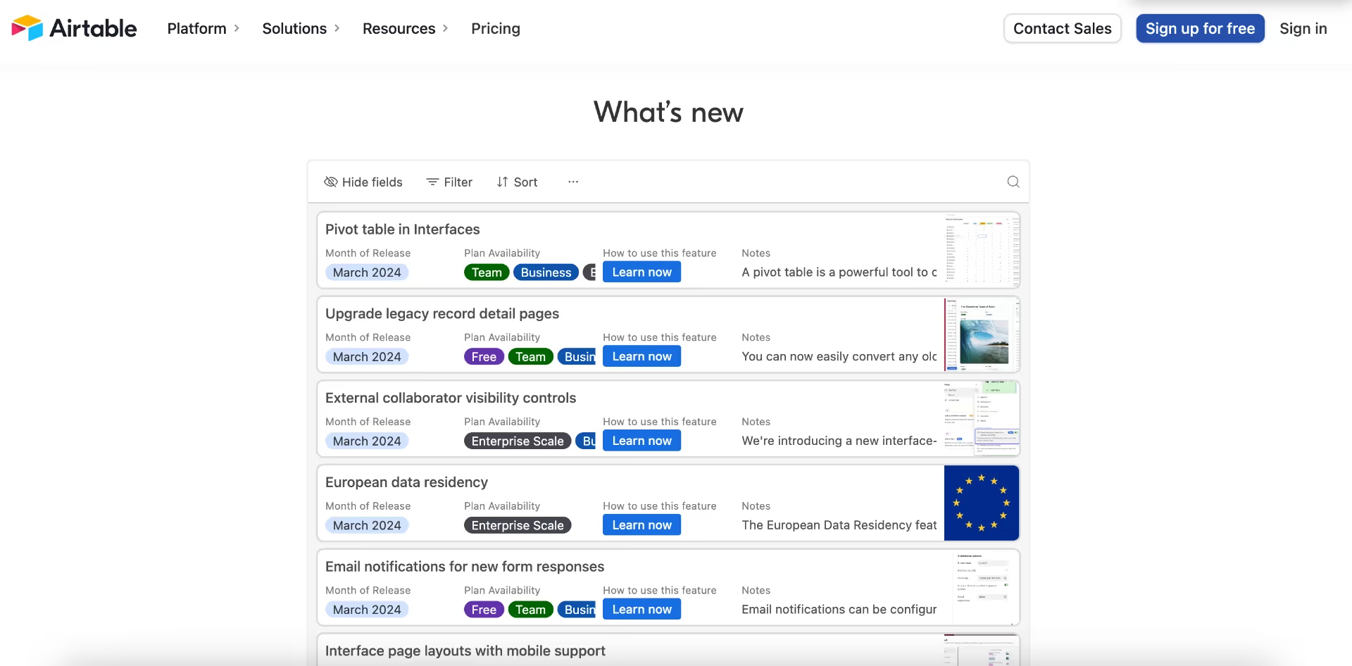
The notes have short and precise titles, stripped of fancy language. Each note also has a CTA button named "Learn now", forwarding users to relevant help topics in the resource and/or help page.
Here's how each note looks individually:
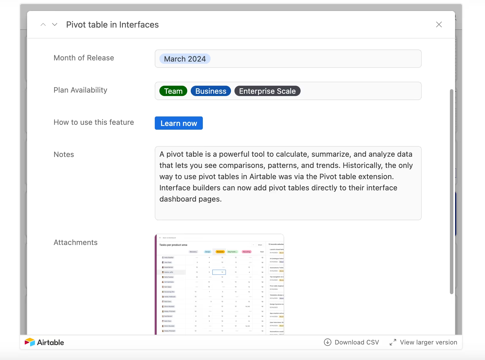
There's a very short and to-the-point note explaining the new feature's importance and use cases. Airtable also provides a comparison between the feature's past and present states, further emphasizing the update's significance. And finally, there's an attached screenshot from the product UI showing how the feature looks after the update.
Would it be more effective to include an explanatory video or an overview GIF, showcasing the feature in action? Probably.
Does the screenshot get the job done, too? Yes.
But is it still a good release note example? Definitely!
Key Takeaways from Airtable's Release Notes
- Efficient labeling
- Clear copy, comparing the past and current state of the feature
- Great CTA usage for promoting help articles and providing additional information
#2 Monday.com offers user benefits filtering on its product release notes page
Monday.com is another popular collaboration and workflow management tool that rocks release notes 💥💥
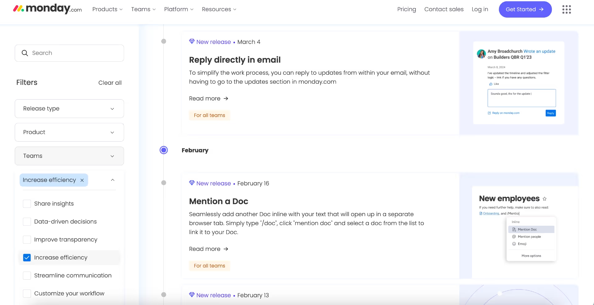
It offers various filtering options based on release type, product, teams, and user benefit. A closer look into the filters:

Labeling based on release type or product is pretty popular among SaaS companies with a lot of sub-products. But it's not enough, says Monday.com
They know that every user is interested in a different update.
The use cases and expectations of support teams, development teams, or marketing teams might differ a lot. So they label their release notes based on teams. But even that's not enough, team-specific labeling could still be very generic; so they take one more step, and label each and every release notebased on the benefits they provide to users, such as workflow customization.
Now, let's see what happens when we click on read more👇🏼
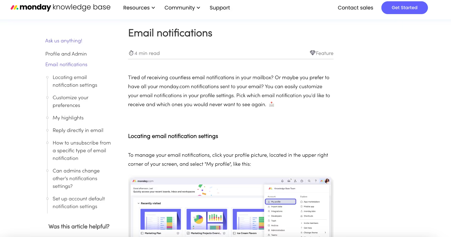
It takes us to a related (and very detailed) article in the knowledge base. On the left side, we have a table of contents. The article has a lot of subheadings and screenshots/gifs explaining the feature and settings.
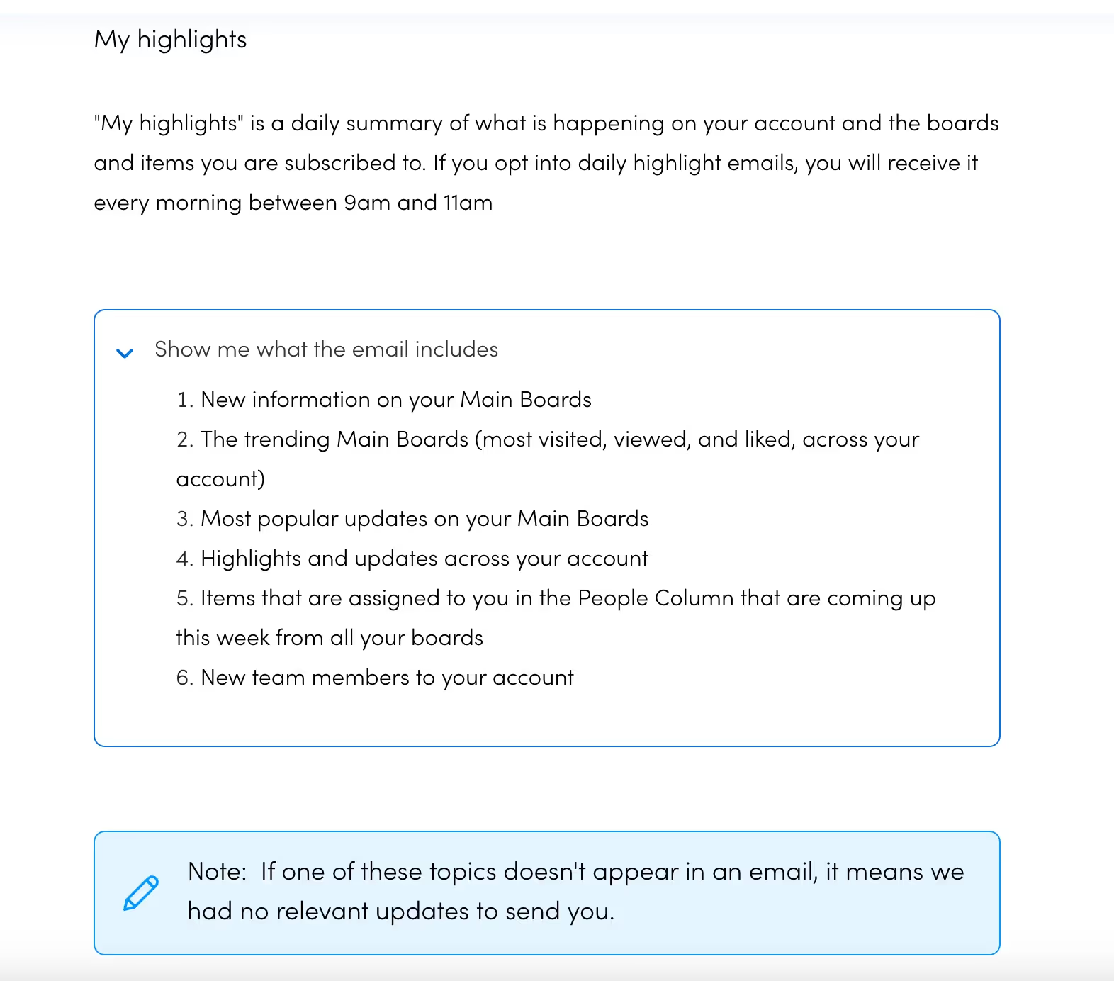
There are also additional notes highlighted in blue boxes, addressing potential questions that may arise in the user's mind and pre-emptively resolving any potential friction points. So, there's actually no continuation of the release notes we see on the main page. Instead, there are further explanations and guides.
Key Takeaways from Monday.com's Release Notes
- Advanced filtering, including teams and user benefits
- Integrations with knowledge base articles
#3 UserGuiding employs GIFs, emojis, and interactive feedback for 110% engagement on its Release Notes Page
UserGuiding is a no-code onboarding tool that helps companies create interactive onboarding flows, product tours, checklists, in-app resource centers, user surveys, and product update pages.
And here's how its release notes page looks:
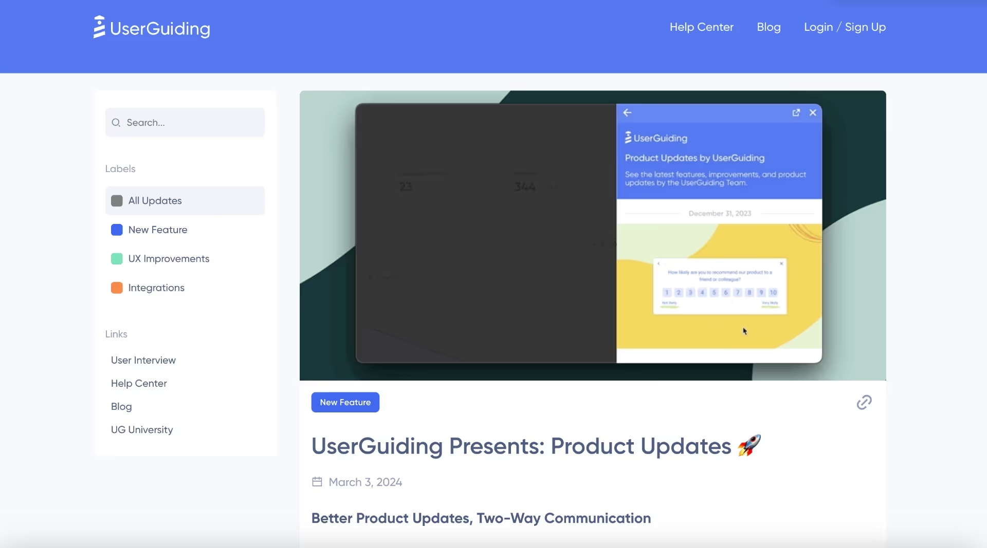
They offer a simple and clear design, with a search bar and color-coded labeling on the left menu. There are also links to their other educational resources, such as UG University. Each note has a GIF from the UI, providing a feature overview for the reader.
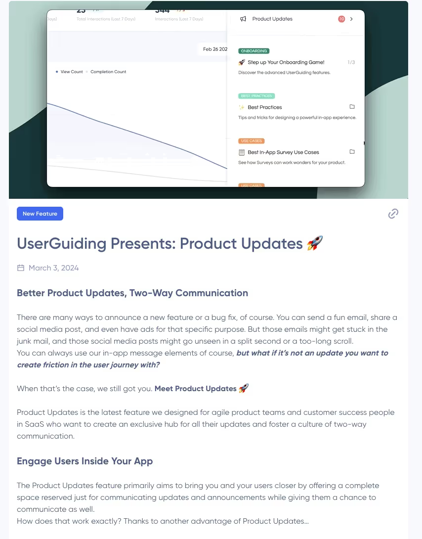
Main value points and use cases are highlighted in the subheadings, making it easy to skim through and still get the value proposition.
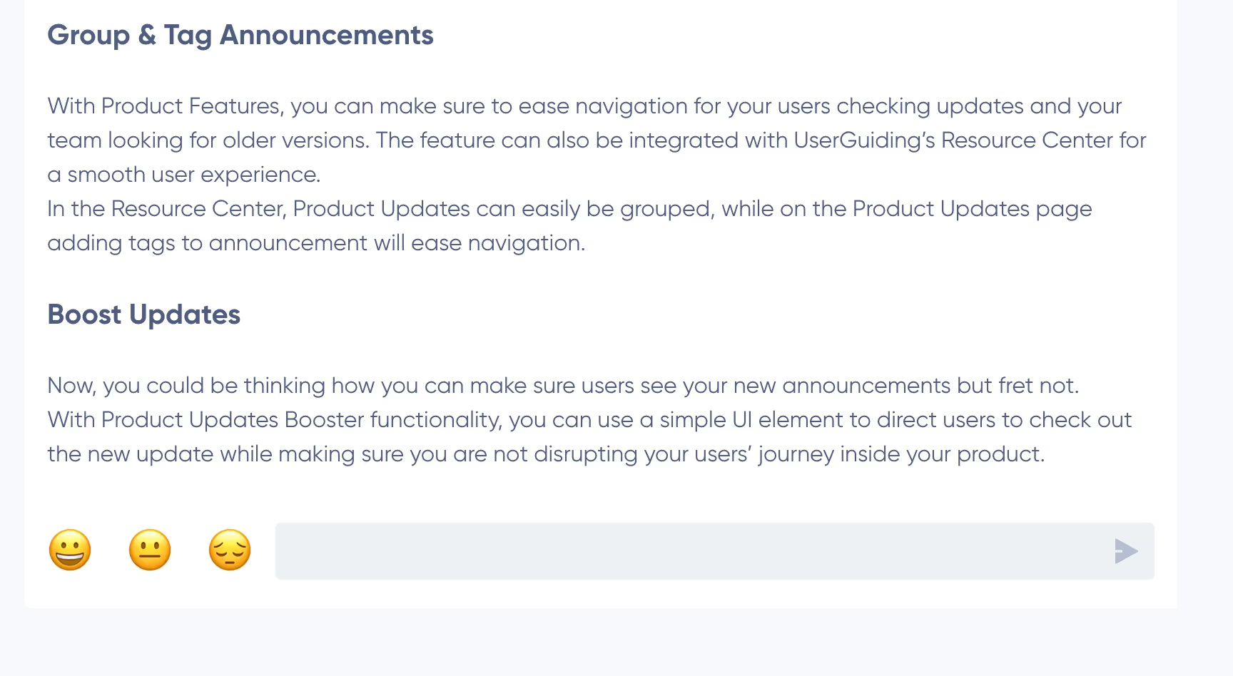
And there's even more!
UserGuiding enables its users to leave anonymous feedback on the updates/release notes, be it a text or a simple emoji reaction. And we know what it means, right?
- Increased user engagement 📈
- Valuable customer feedback 💰
Key Takeaways from UserGuiding's Release Notes
- Engaging copy, with value propositions as subheadings
- GIFs from the product, providing insights on how the feature looks
- Interactive feedback gathering
#4 Hubspot organizes its product release notes from users' perspective
There are a lot of things HubSpot does just right, and writing engaging and actually enjoyable release notes is only one of them.
Here's why 👇🏼
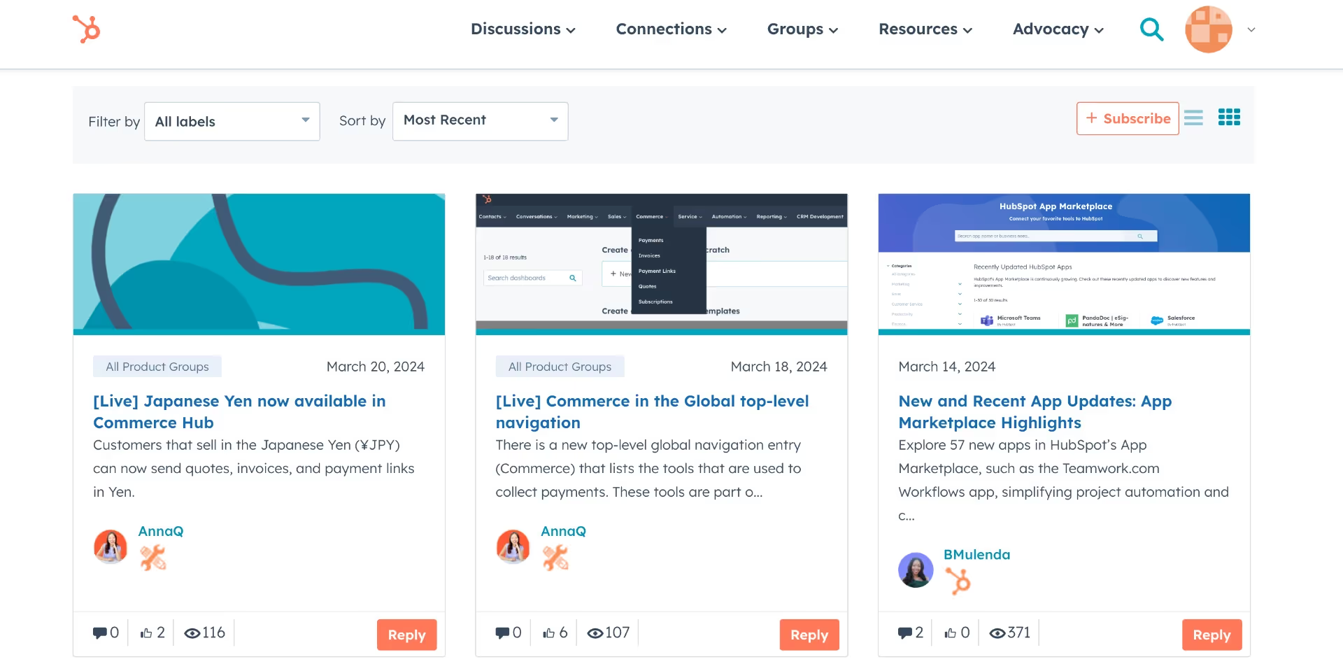
Okay okay, maybe at first glance, the main page doesn't look very special. One could even say it's not very organized, with all the labels hidden in one drop-down menu.
A lot of labels but not enough labels...
But their actual release notes are more promising than their release notes home page:
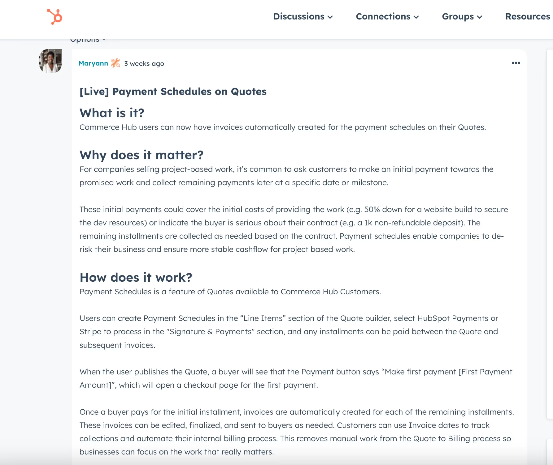
The structure of the note follows basic questions every user asks when faced with a change/update:
- What is it?
- Why does it matter?
- How does it work?
We talk about jobs-to-be-done mindset everywhere all the time, so why shouldn't we apply it to our release notes, as well?
In the end, our main goal is to improve user experience, right? So we should start seeing things from their perspective, and ask questions they're likely to ask like HubSpot does.
Key Takeaways from HubSpot's Release Notes
- User-centric information organization
#5 Amplitude provides a TL;DR for its monthly release notes
Companies have different approaches when it comes to new release notes. There are those who publish everything separately and those who prefer weekly/monthly releases. Amplitude, a well-known analytics software, is among those who prefer monthly releases.
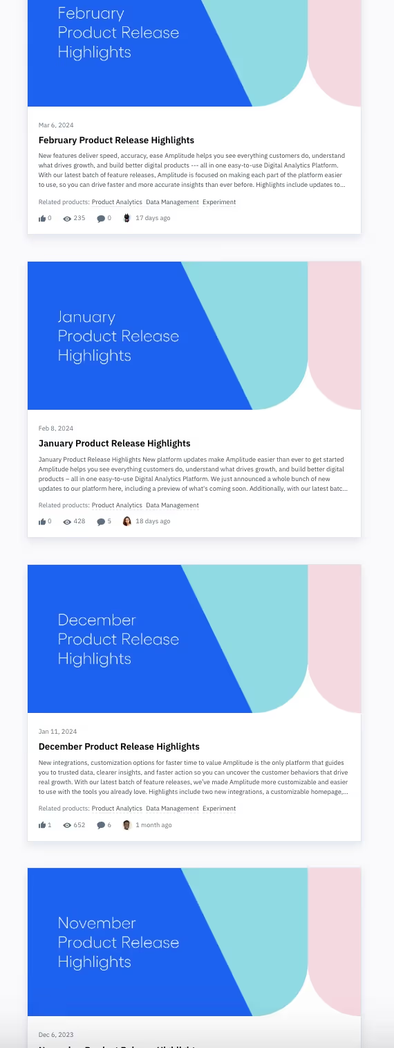
Unfortunately, we cannot really see what they changed and/or released in a specific month on the main page.
But, when we click on one of the notes...
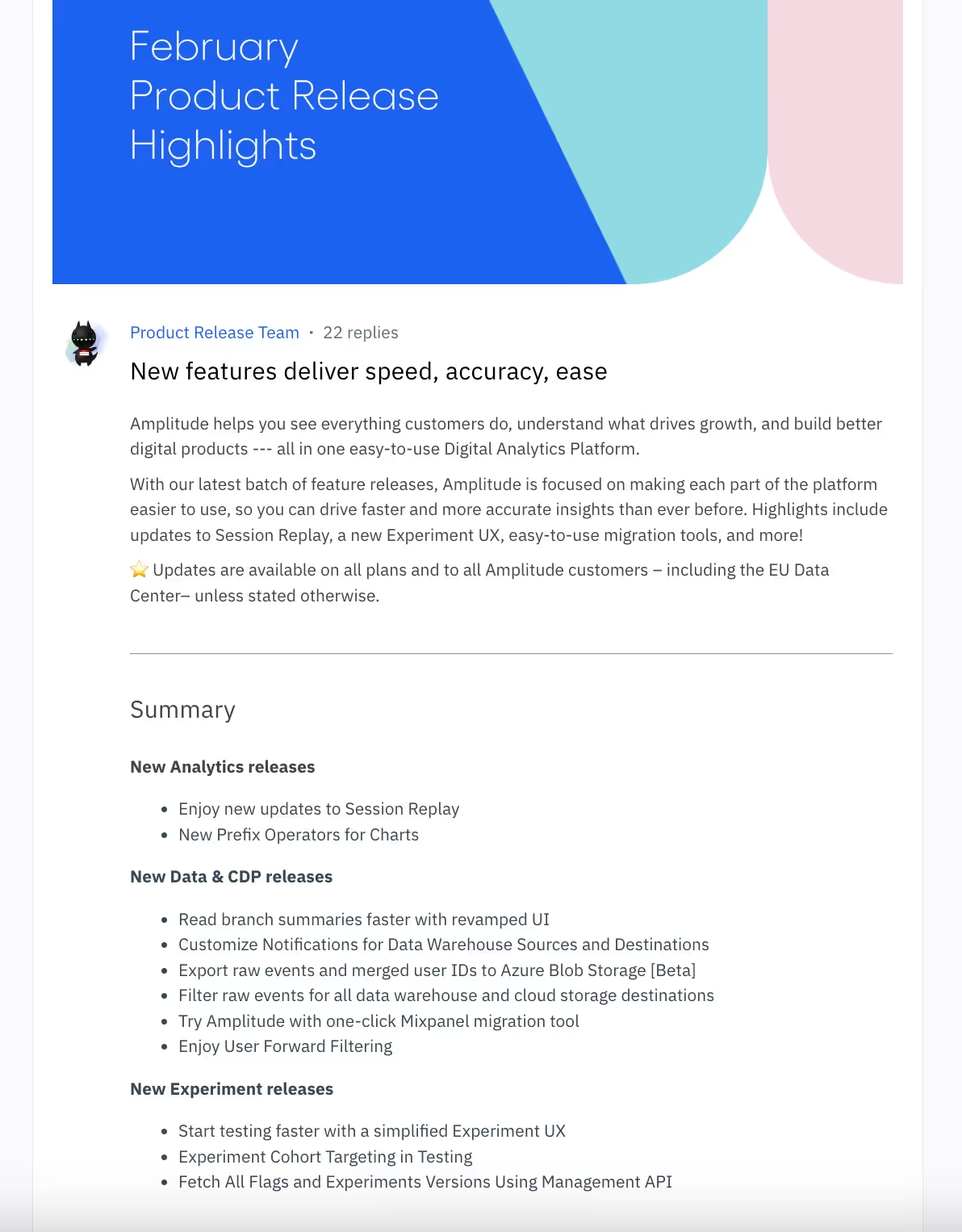
A brief summary of the long content welcomes us!
Before explaining all the things they did last month and showcasing their new cool features, they provide a short list of all the updates/ changes.
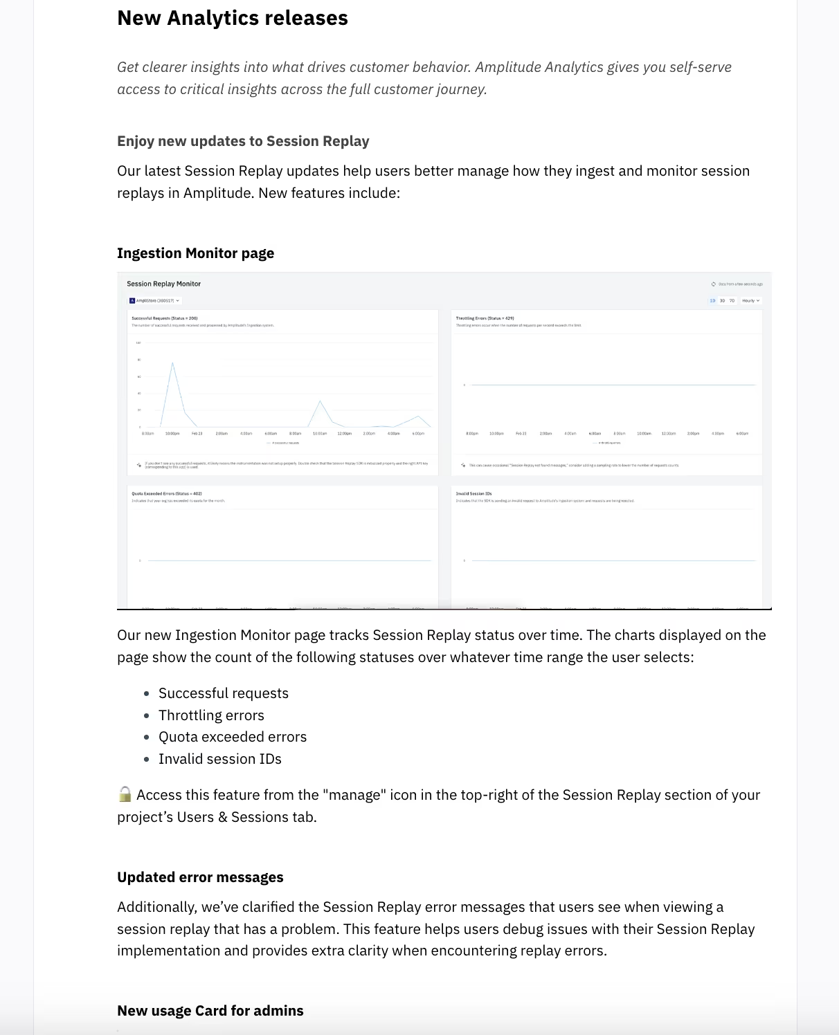
And when it's time to dive deep into the new features, they explain everything in very plain language, making use of bullet points, emojis, and bold formatting.
So yes, it's a pretty long release note, due to its very nature, but it's also a very organized and easy on the eye one.
Key Takeaways from Amplitude's Release Notes
- TL;DR/ Summary
- Great structure with clear headings and readable formatting, proving lengthy release notes can be engaging and approachable!!
#6 Discord publishes easy to read and fun release notes with a unique voice!
I guess you've tried Discord at some point in your life, whether for gaming, language learning, or community involvement. And you probably know how unique and fun their language is, with emojis and jokes.
They maintain their unique tone on their release notes, too!
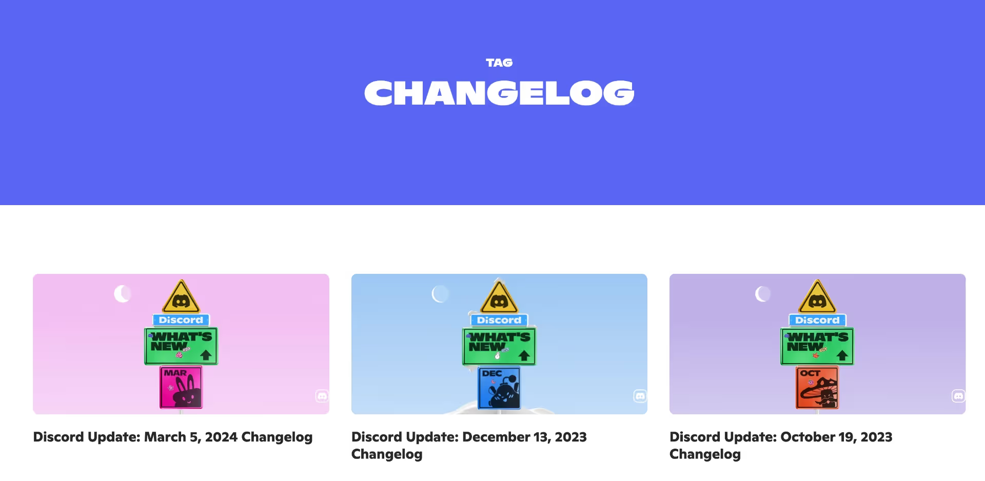
Well, not on the main page, maybe.
But definitely on the notes 👀
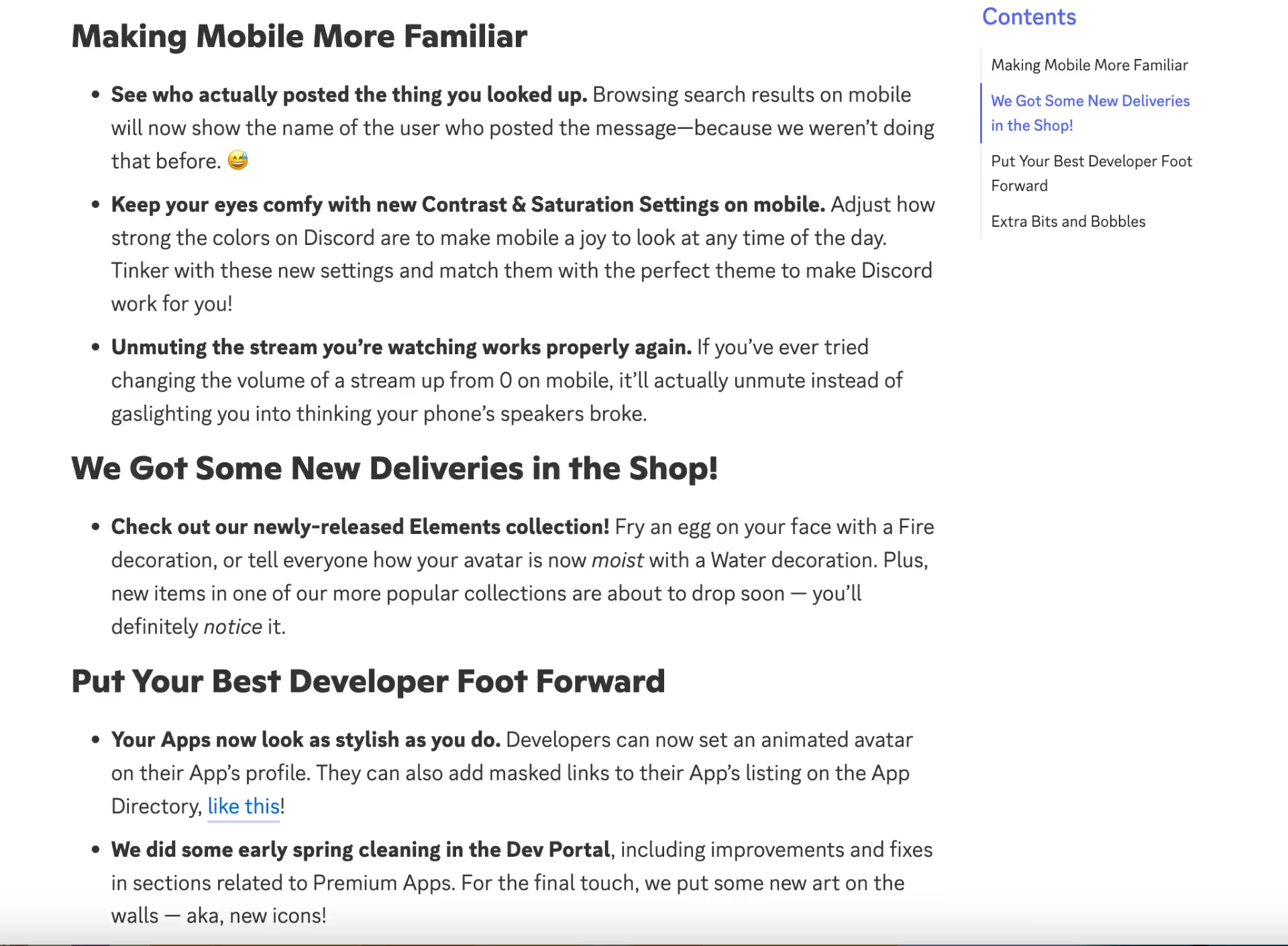
Every update is grouped and bullet-pointed. The main updates are presented clearly, leaving room for a bit of playful explanation here and there. We also see some bold formatting, some examples, teasers for future updates, before and after comparisons...
Everything looks perfect, really!
Key Takeaways from Discord's Release Notes
- Unique and fun language use
- Feature/Update groups that ensure a logical flow for the reader
#7 Correlated explains its new features using example use case scenarios in its product release notes
Correlated is an AI-based sales platform that focuses on revenue expansion and account analysis.
And this is what their release notes page looks like:
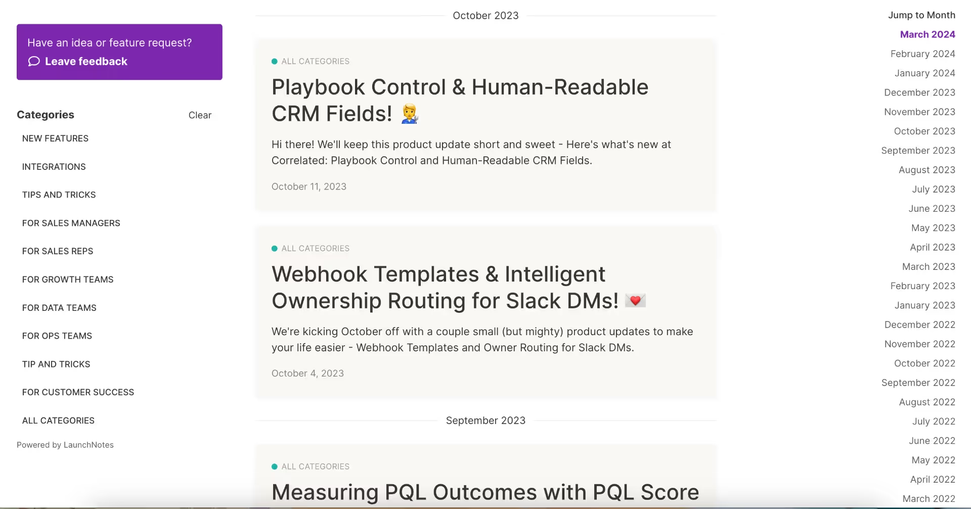
Incredibly organized, right?
👈🏻On the left-side menu, we have release types (new feature, integration, etc.) as well as roles (sales rep, sales manager, growth people, data people, etc.).
👉🏻On the right-side menu, we have a timeline, allowing everyone to navigate around the page and find what they're looking for easily.
And from the small boxes in the middle, we grasp the main point of the new update or release without feeling the need to click on the note. The titles and short explanations are remarkably clear and precise.
But what if I still wanna click and read the whole note, what awaits me?
Well, this:
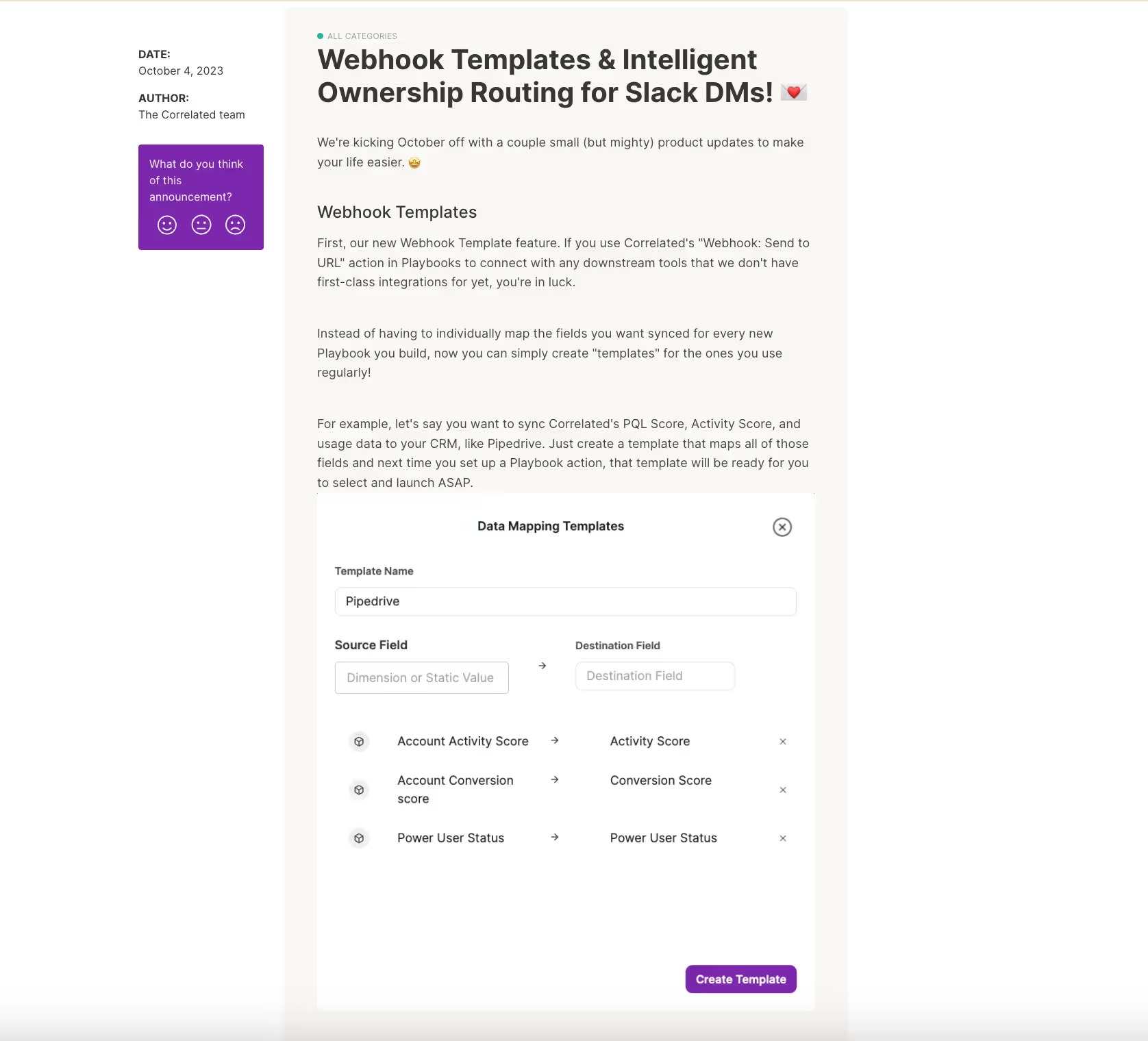
The sincere and friendly copy + helpful screenshots from the product!
The Correlated team explains the product changes in a fun and plain way so that everyone is on the same page with the updates. They also provide example scenarios and use cases in order to show the real value of their new features.
Here's another example:
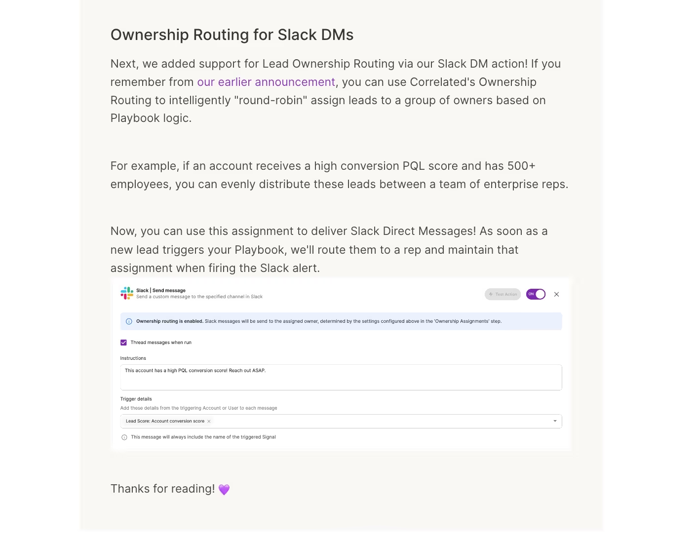
They explain how the feature works, what it enables, and the outcomes you get when you use it. It's a great way to educate end-users, really.
We've got a lot to learn from the Correlated team and their good release note example 📖🖋️
Key Takeaways from Correlated's Release Notes
- Filtering/labeling for every need (role, release type, date)
- Friendly copy
- Educating target audience with example use cases
#8 Pitch prefers short video feature tours over long product announcement notes
Now I have a slightly different release note example.
Meet Pitch! Pitch is an AI-powered presentation tool that enables teams to collaborate on projects and create presentations from scratch and/or templates. And when you claim time efficiency, you're expected to be time-efficient as well. Luckily, the Pitch team is really time-efficient with their video releases!
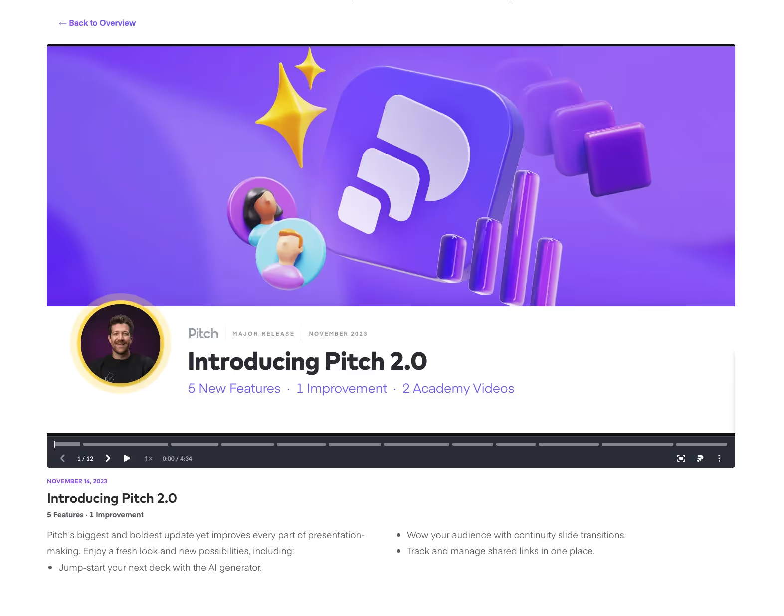
One of the greatest challenges with release notes is overwhelming users. Especially when you've undergone major feature updates and improvements that prompt you to label your product as 2.0, explaining everything solely through text can be challenging for both your product development team and your customers 🧠🤯💥
So, Pitch goes for a video, instead of a long product release note. They still list the main feature changes under the video, but the bulk of the explanation actually occurs within the video tutorial itself, guiding viewers through each feature and providing a visual product tour.
Great job!
Key Takeaways from Pitch's Release Notes
- Video explanation
- List of significant new features/ improvements
#9 Lago promotes add-ons and upgrades on its release notes
Lago is an open-source usage-based billing tool for SaaS businesses. And like every other company, they aim for higher product adoption. Therefore, they seize every opportunity to strengthen their relationship with existing customers through upsells and additional value propositions.
Even on their product changelog:
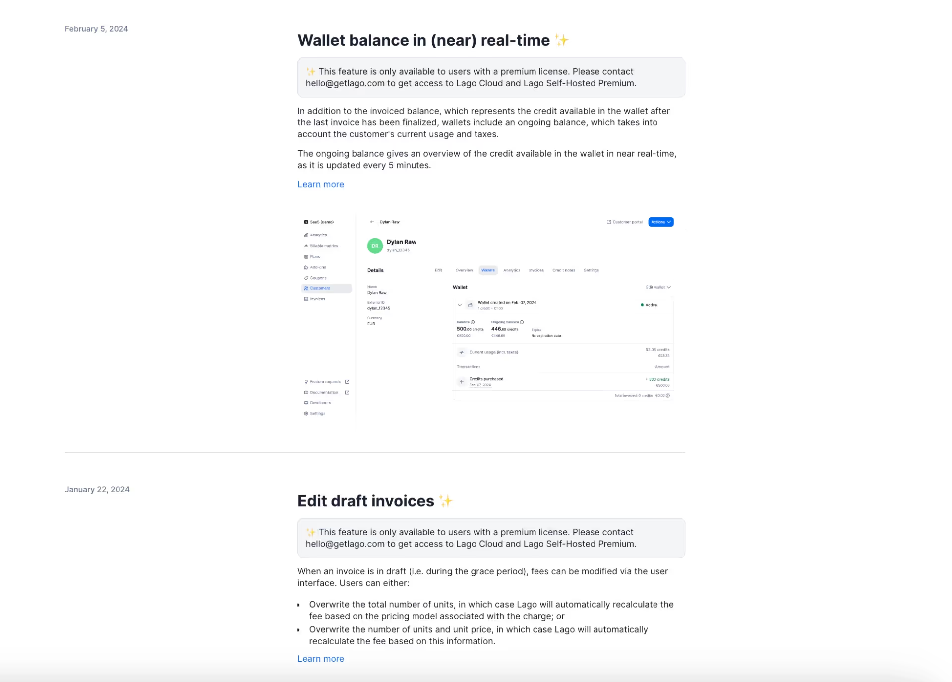
"Hey, we just released these cool features for our premium licensed users! Do you like them? Would you like to contact us to upgrade your plan?"
Key Takeaways from Pitch's Release Notes
- Upsell opportunities are everywhere 💸
#10 DeepL highlights only major releases in its quarterly product updates
We said long monthly release notes can still be enjoyable if they're organized well with clear headings, lists, drop-down menus, and TL; DRs or they can even be more enjoyable when they're turned into short videos.
But how about keeping them actually short and precise?
Do they need to be so detailed and long just because they're monthly? A more minimalistic approach with only the significant changes and important feature updates that will have big impacts on the end user experience is too much to ask?I don't think so, and neither does DeepL -the machine translation software!
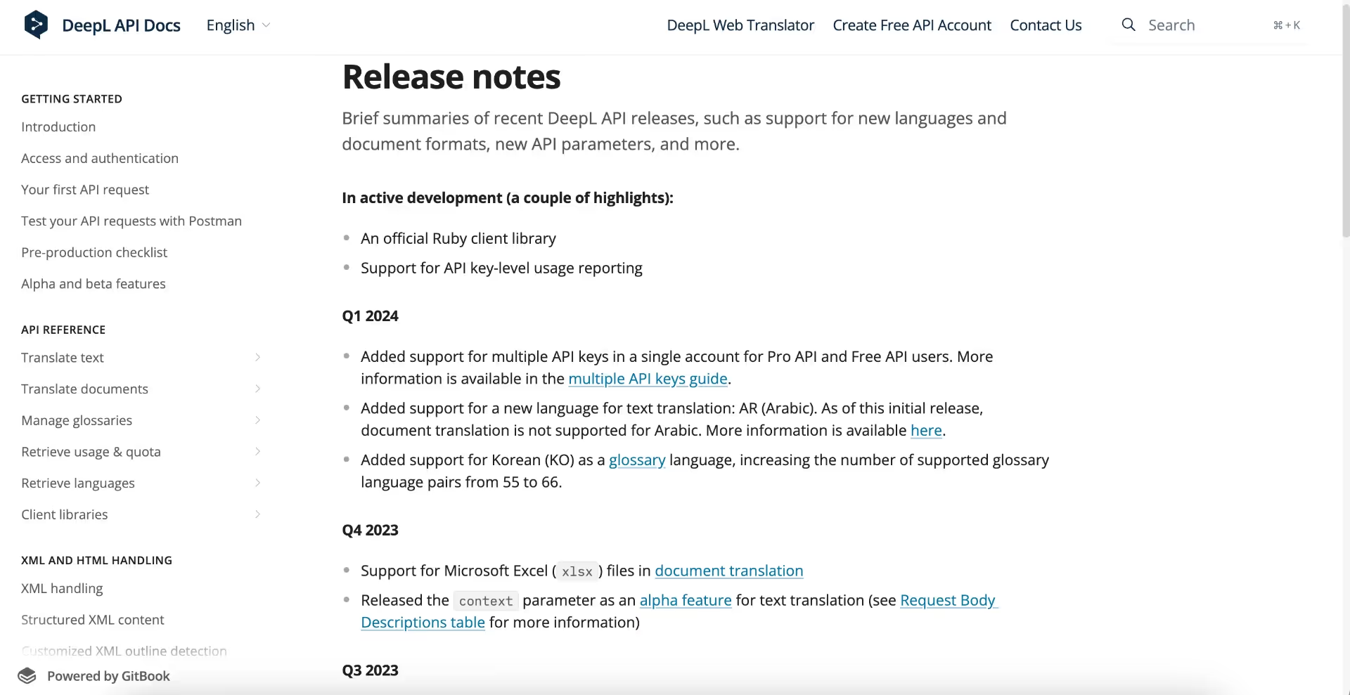
As you can see, DeepL goes for quarterly update notes, but still the team is quite good at keeping everything organized and clear for the users. It's not the most unique and eye-catching design maybe, but it's still very effective, I'd say.
On top of the page, there are new feature/product announcements, highlighting the ongoing projects the development team works on. And then, we have the quarters and updates and lists of updates and improvements done in those quarters. There are also easily accessible links to relevant blog posts/ help pages for almost every release.
Key Takeaways from DeepL's Release Notes
- Focus on only the major releases
- Additional links to help articles/blog posts
- Minimalistic approach and design
#11 Grammarly publishes user-oriented product release notes focusing only on the value of the update/ change
Grammarly doesn't appreciate beating around the bush in our writing, so it doesn't do it, too.
Just to be a great example to us writers...
Not in its sales copy and definitely not in its release notes 👇🏼
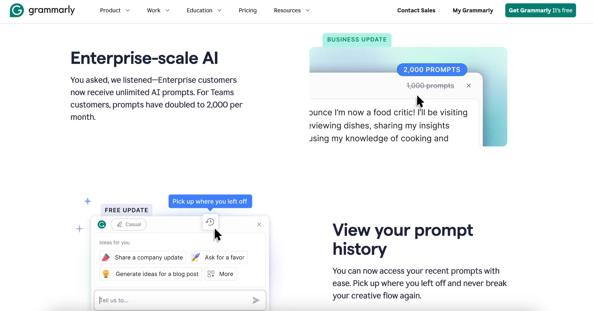
Grammarly uses plain language, focusing on user needs and new values each update/release brings and eliminating all the technical details from the copy. They also categorize the release notes based on the plan they affect, such as the Business Plan or Free Plan.
Another thing Grammarly does with its product release notes is to announce upcoming features with a "coming soon" label:
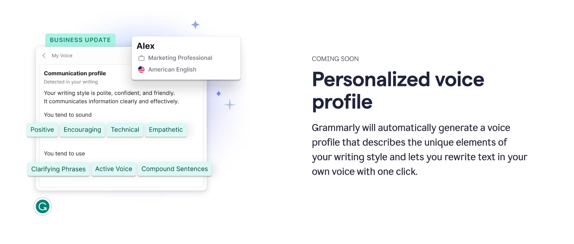
They also provide a visual from the UI for the upcoming features! So everyone has an idea of what it'll look like, which is a good way to set expectations or assess user reactions.
Key Takeaways from Grammarly's Release Notes
- Release notes as to-the-point value propositions
- Teasers for upcoming features (with visuals!!)
#12 CommandBar publishes release notes with a fun, easy-to-read, and user-oriented voice, incorporating gifs and emojis
CommandBar is an AI-powered user assistance tool used by product teams, marketing teams, and customer teams.
Their product changelog/ release notes page looks like this:
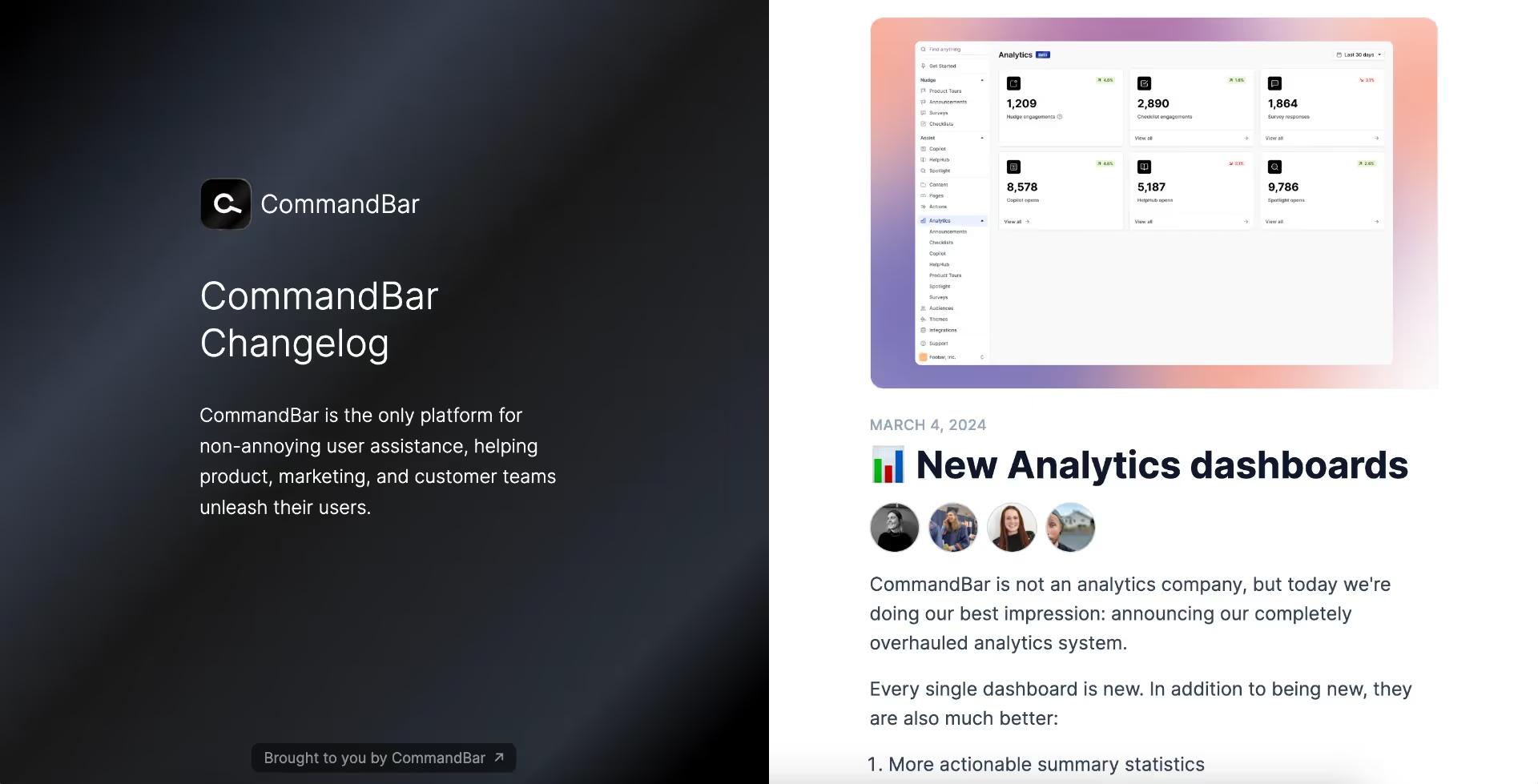
On the left side, we see their value proposition. And on the right side, we have the new updates/ new releases. The release notes are not clickable, so we see the whole notes.
They have very detailed explanations, supported by screenshots of the product:
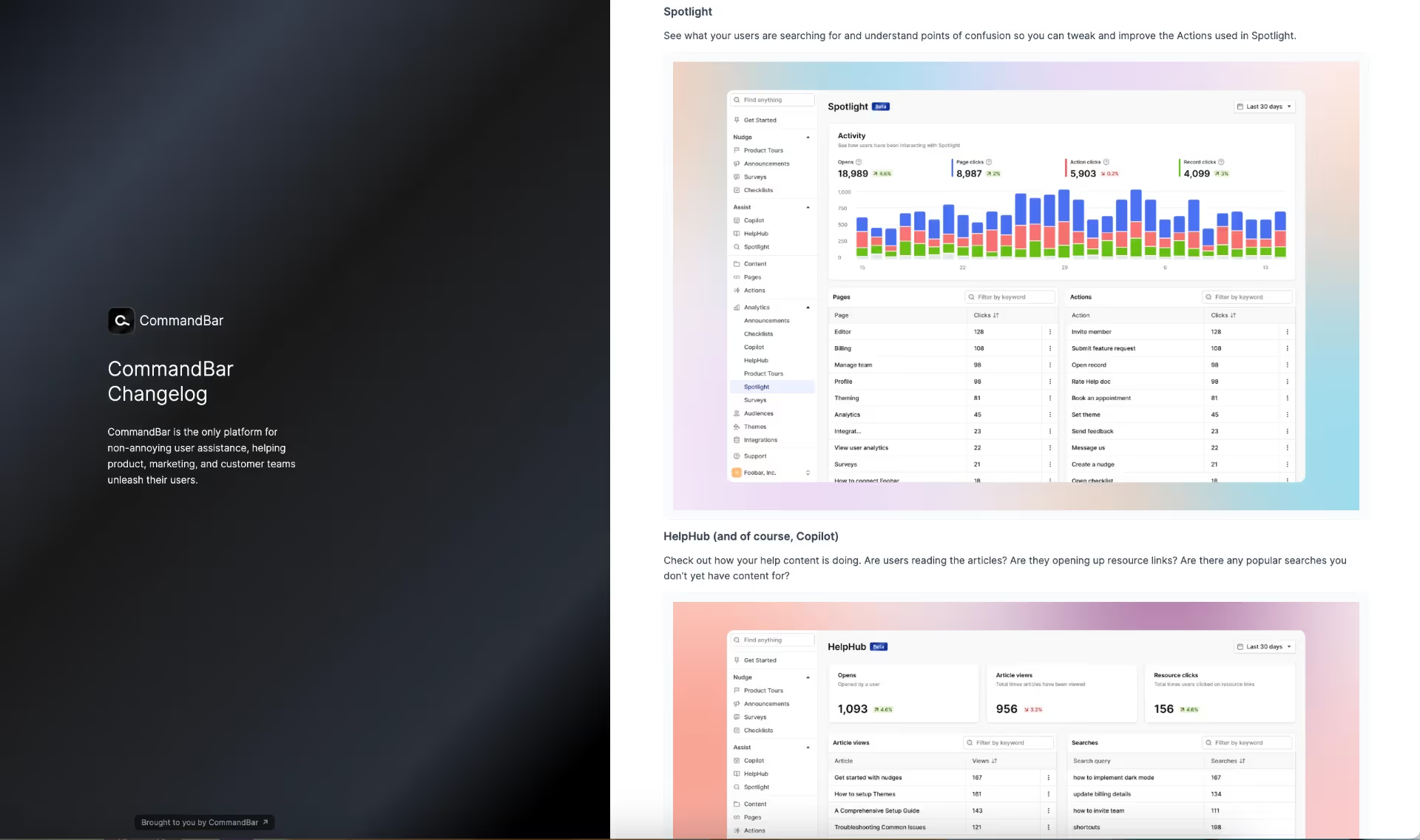
Most of the notes are structured with the user in mind, placing her at the center. They ask questions from her perspective and anticipate potential inquiries she might have beforehand.
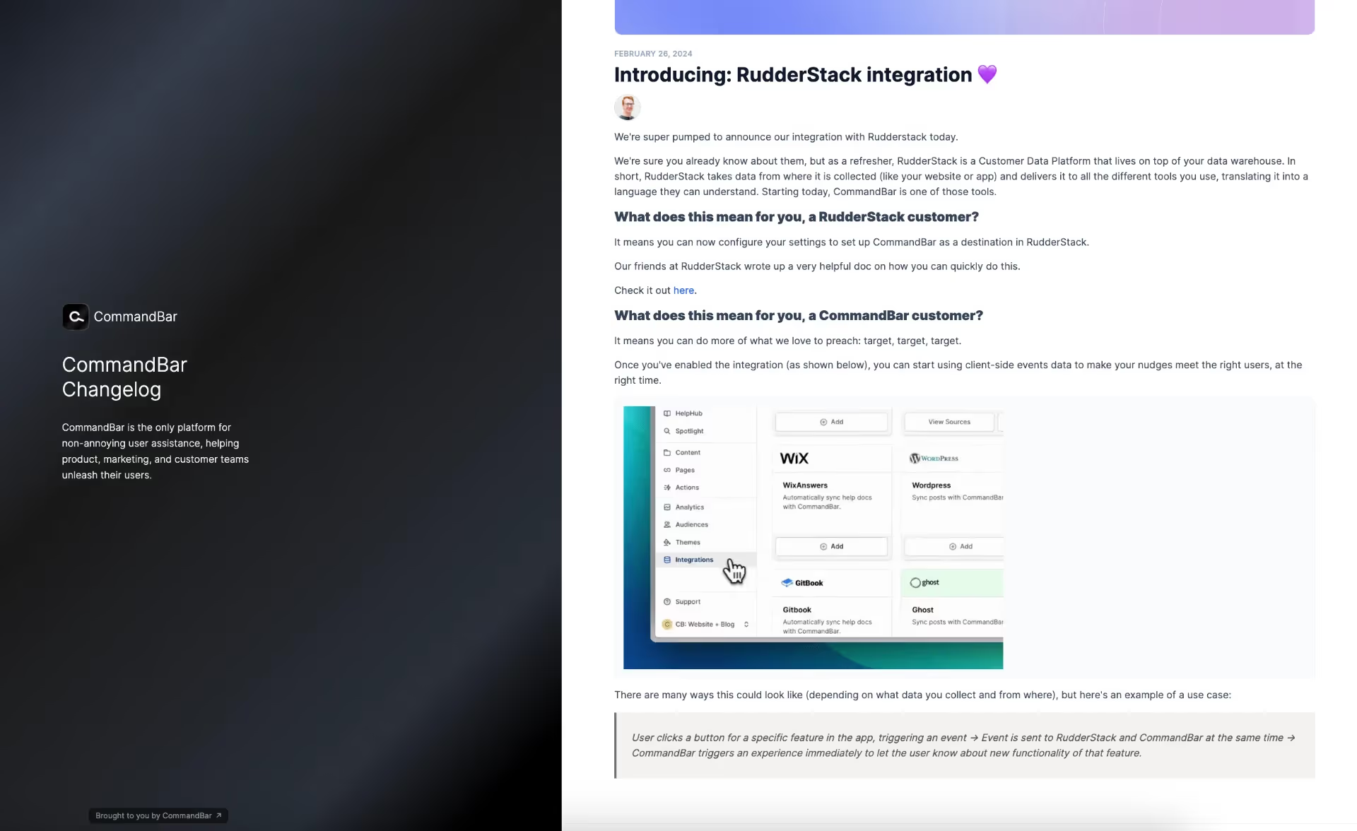
For example here, they explain how their new integration with RudderStack affects RudderStack customers and CommandBar customers, as well as providing an example use case for this integration at the end.
Key Takeaways from CommandBar's Release Notes
- Brand's value proposition is reminded at every opportunity
- New integrations are explained for customers of both companies
- Example use cases for new features/ integrations
#13 Typefully offers a clear and readable design with bullet points and bold highlights
Typefully is an X (formerly Twitter) thread maker and analytics tool. They help their customers to plan and schedule tweets.
Here's how their changelog/ product release notes page looks:
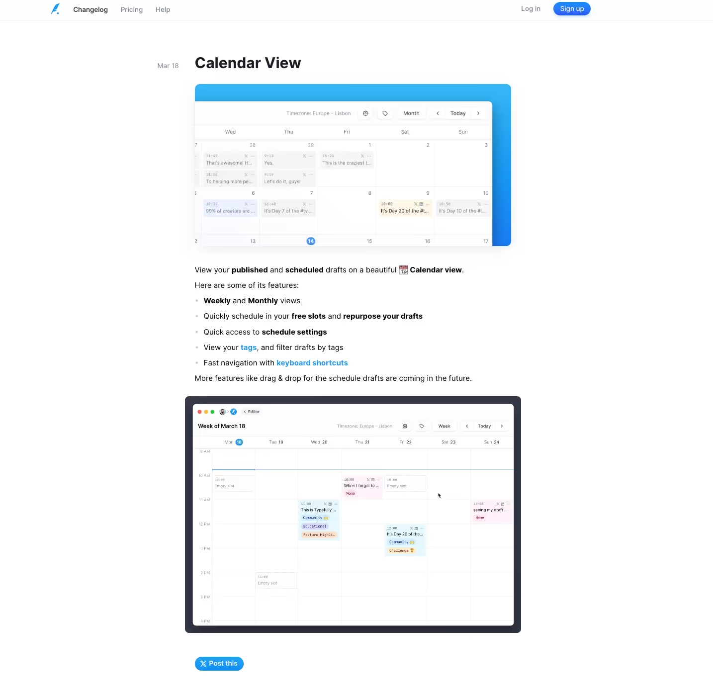
Unfortunately, they don't have any filtering/ labeling option for their release notes, but luckily their notes are pretty short with clear headings, so it's not a big problem to skim the whole page through fast.
At the beginning of every note, there's a screenshot from the UI, showing what the new feature looks like. Then we have very short and well-organized explanations, consisting of only a few paragraphs and/or lists. They provide enough detail for most users, but for those who would like to learn more, there are additional links forwarding users to relevant pages on the website. Finally, at the very end of each note, we have a video, showcasing how the feature actually works. This outline is maintained in each and every release note.
Key Takeaways from Typefully's Release Notes
- A logical information flow, starting with the initial visual exposure to the new feature, followed by an explanation of the feature, and a final video showcasing the process.
- Screenshot + Video 📸 🎥
In Short...
Companies publish release notes for feature announcements and product updates in general, but they all have different approaches and strategies that work -or sometimes do not work- for them.
We analyzed a lot of good release note examples in this article; with search bars, table of contents, bullet lists, screenshots and videos, additional tips and tricks, and so much more.
Think about your development cycle, your brand image, your product, your other marketing strategies, and most importantly your target audience and end users before writing a release note or creating your template.
And voilà! You have the -almost- formula of a good release note 📝
Frequently Asked Questions
What Do You Write in a Product Release Note?
In a detailed product release note, the first thing to do is to mention the version number/ release number and outline enhancements. You can provide links to additional resources for major releases. Also, think about including value propositions, use cases, and examples to illustrate the changes. A good release note incorporates visuals like screenshots or GIFs for clarity and comparison and highlights differences between the older and current versions of features to emphasize changes and improvements for users.
What Shouldn't You Include in Release Notes?
In crafting release notes, you should only include relevant information. High-quality release notes do not contain irrelevant details or excessive technical jargon. They also avoid lengthy explanations or videos. If a feature requires a detailed explanation, it's better to provide additional links for users to explore further. This keeps the release notes concise while offering users the option for more in-depth information if needed.
What Is the Point of A Release Note Page?
Companies write release note pages to inform users about updates, major feature changes, bug fixes, or feature retirements to their products, helping users stay informed about new features, enhancements, and fixes. Release notes also reduce the hassle of learning about changes through trial and error. Additionally, release note pages serve to inform users about upcoming features and collect customer feedback for new releases. It's a great way for companies to engage users proactively, gather valuable input and feature requests to refine upcoming features and product roadmap based on user needs and preferences.


.svg)
.svg)
.svg)
.svg)
.svg)


.svg)
.svg)


.png)


