


.svg)
.svg)
.svg)
.svg)
.svg)


.svg)


.svg)
.svg)


So, you've created the perfect Angular website or app.
Everything works like they're supposed to.
But you want to provide additional information to your users, without making any changes to the website itself.
I get it. Sometimes it's necessary.
And you're in the right place. In this article, we'll discuss all the methods to create tooltips for Angular apps, and then go over the top 5 Angular tooltip libraries that get the task done.
What Is a Tooltip in Angular?
An Angular tooltip is an overlay UI component that is displayed on top of a specific point in a page to communicate with the users. It is generally used to keep users informed or introduce new functionality to them. And there are various ways to create one for your Angular app.
Firstly, you can go the hard way and create a tooltip simply by coding it from scratch. Depending on the complexity you expect from the tooltip, the difficulty of creating it will vary. For example, if you just want to provide an additional piece of information when hovering over a certain point on the page, it won't be as tough; but if you want to add buttons into it, you'll have to work it a bit.
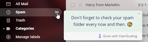
If you want to take the easy way, you can use third-party software like UserGuiding that's designed to create tooltips and other overlay components for web apps. With this method, you don't have to write a single line of code to create any tooltip you have in mind. Click here to try UserGuiding for free and see how easy it is to make a tooltip in 15 minutes.
Or, if you don't want to create something from scratch but still want to create a simple tooltip you coded yourself, you can read on and pick the open-source tooltip libraries from the list I'll get to in a bit. But before that, we need to talk about this:
What is a tooltip used for?
A lot of UI and UX designers don't approve of tooltips as of lately.
Let that sink in.
An overlay element that can be very helpful in numerous scenarios is not preferred by many, simply because it is used in a disrupting way significantly more times than it is used in a helpful way.
Yet that doesn't mean you shouldn't use them, just use them consciously, and use them with a purpose.
Here are some acceptable purposes for tooltips:
To provide relevant information
This is the most common way tooltips are used, and the reason they were invented.
On your UI, not every element is going to be self-explanatory.
Sometimes, you need to provide further context to different buttons and options the user can click on, and tooltips are the right way to do it.
To make sure your tooltip is relevant and not disruptive, do this:
First ask yourself (or your users) if the element is self-explanatory, then create a tooltip that would only be displayed when the user would need it.
You can see in many tooltip examples that the component is only displayed when the user hovers over the feature for more than a few seconds.

To remind or announce
Feature adoption and engagement rates in an average product are very low, which is something a lot of product teams have to overcome.
That's mainly because users aren't actually aware of the value your different features might have, and you can't just spam their email with lengthy campaigns to get them to use a specific feature.
It wouldn't be relevant.
But, you can use tooltips to actually communicate with your users at the right time to remind them that that feature can be used to complete a certain task. It would be much more relevant since they are already there to use your product.
To include CTAs
And sometimes, to introduce new features, functionality, pages, or even promotions; you might need to go a step further with your tooltips.
If you have a new feature or a promotion that you want to market the right way, you can use tooltips to briefly and kindly ask users to give it a chance.
For example, a company that's introducing a new feature can create an interactive guide for that feature and ask users to check that guide out with a simple tooltip including a button.
Although it's a more specific use, there might come a time when you need something like this.

5 Best Angular Tooltip Libraries
So you've decided to use an open-source library to create your own tooltips for your product. Good.
I went through a few dozen libraries on GitHub to find the top plugins based on user preference and, well, a bit of aesthetics.
Here they are:
1- Helipopper
Helipopper is the Angular wrapper of the well-known and widely-used JavaScript component library, Tippy.js.
It is powered by Popper.js and acts as a pretty lightweight plugin, with a wide variety of options for creating customized tooltips, popovers, dropdowns, and more.
Both Tippy and Helipopper is maintained well with only a few open issues. Tippy has around 1.5K stars while Helipopper has around 300 stars on its own.
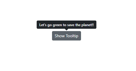
Here's how their tooltips look like:
Why Helipopper?
▶ High-end documentation
▶ Wide variety of options for tooltips
▶ Easy to setup, easy to maintain
▶ High performance
Helipopper Setup
You don't have to download Tippy.js modules to use Helipopper. Just use this code to download:
npm install @ngneat/helipopper @ngneat/overview
And follow the official documentation on GitHub.
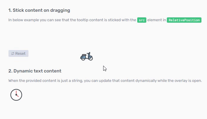
2- NGX-Popper
NGX-Popper is a more straightforward plugin that acts as a direct wrapper for the Popper.js library, which is now known as Floating UI.
And honestly, their tooltips look and perform much better and with more responsiveness.
Floating UI is perhaps the most commonly used overlay component library there is, with 21.6K stars on GitHub and only 22 open issues.
It is low-level, lightweight, fast, good looking...
What more can you ask for?
Just look at how smoothly it works:
Why NGX-Popper?
▶ Lightweight, low-level
▶ Responsive
▶ Easy to setup, easy to maintain
▶ High performance, high speed
▶ Aesthetic base design
NGX-Popper Setup
Use these 2 lines to add NGX-Popper to your app:
$ npm install popper.js --save
$ npm install ngx-popper --save
Then, follow the official documentation for NGX-Popper on GitHub.
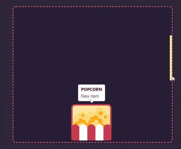
3- Angular Tooltips
Do you just want the tooltips?
Got it.
Angular Tooltips sticks to its name and helps you create, well, tooltips for Angular.
It is fairly old, but it's lightweight and it seems like it still supports all the major browsers including Chrome, Firefox, IE, Opera, and Safari.
It doesn't look bad too:

Why Angular Tooltips?
▶ Basic tooltips
▶ Easy to setup, easy to maintain
▶ Lightweight, high speed
Angular Tooltips Setup
Use NPM to install Angular Tooltips:
$ npm install angular-tooltips --save
From there, just read through the official guides on GitHub to create your tooltips.
4- Toppy
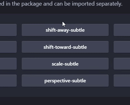
Toppy is a pretty innovative and highly responsive component plugin that works like a charm for Angular apps.
It is very light yet it offers a lot of functionality and a wide variety of components including good-looking tooltips.
It can be used in some innovative ways and for creative web platforms, just check out the possibilities displayed in its demo:
Why Toppy?
▶ Lightweight, high speed
▶ Innovative components with a wide variety
▶ Easy to setup, easy to maintain
▶ Great documentation
Toppy Setup
Simply install using NPM:
npm install toppy
... and follow the official documentation on GitHub.
5- Syncfusion Angular UI Components Library
Responsive. ✅
Lightweight. ✅
Over 70 UI components. ✅
Syncfusion's Angular UI Components Library has it all.
You can create any component that comes to mind for web apps, and tooltips are in there too. It is obvious the devs worked hard to make this a library that will make your life easier.
And a surprising fact: it doesn't have any open issues.
The only downside is that it's not free unless you have less than $1 million annual revenue, and licenses start from $995/year.
Why Syncfusion Angular UI Components Library?
▶ Lightweight, high speed
▶ Wide variety of Angular components
▶ Great documentation
▶ Highly responsive, touch friendly
▶ Attentive maintainers
Setup
The setup is not as easy as other plugins on the list, but it has great documentation that you can closely follow along.
Install using this code:
npm install -g @angular/cli
From there, follow Syncfusion's documentation on their website.
Wrapping up
We hope that you've enjoyed reading about these Angular tooltip libraries! I'm sure there's one here that fits your business needs.
But if you want to build tooltips without having to code at all, it might be worth thinking less in terms of libraries and more in terms of third-party tools. Ultimately, this will be much faster and cheaper than using a library.
If you don't believe me, try one of the libraries, and then get a free UserGuiding trial. See which one is more efficient for your business. The results might surprise you.
Frequently Asked Questions
What are the best Angular tooltip libraries?
The top 5 tooltip plugins for Angular apps are:
- Helipopper
- NGX-Popper
- Angular Tooltips
- Toppy
- Syncfusion Angular UI Components Library
Is an open-source library the best way to show tooltips in Angular?
Not necessarily, especially if you want to save on developer time, therefore in budgetary costs. Although open-source libraries give you a head-start in development, you still have to go through a serious development process for creating and also updating your components.
What is the best alternative to Angular tooltips?
If you want to save on time, third-party software like UserGuiding, which can be used to create tooltips, interactive tours, checklist widgets, hotspots, and other overlay components can be used to remove development time from the equation.
How do I add a tooltip in angular 11?
To add a tooltip in Angular 11 you can use an open source plugin such as NGX-Popper or Helipopper; or to make your job easier, you can adopt a no-code tool for creating overlay elements.

.png)


