Like it or hate it, website overlays are a part of our lives now.
Wherever you go, whatever website you might be on, it is always certain that you’ll get some website overlay type.
On your way in or out.
It might be a discount alert, an exit overlay for you to join an email list, or any other custom overlay.
Whatever it is, I can guarantee that you’ve seen one the last time you were online.
I mean, I got this just now:
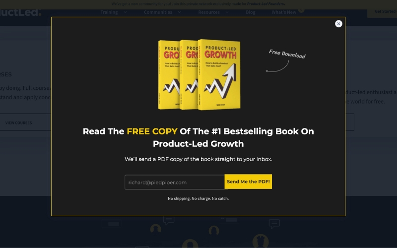
They are EVERYWHERE.
But what about website overlay tutorials?
It might sound like a video title on how to create a website overlay, but it is way more than that.
And today, we are learning about:
- What a website overlay tutorial is,
- What makes it different from a website overlay,
- What the benefits of tutorial overlays are,
- Two great examples of good tutorial overlays, and finally,
- How you can create your very own website overlay
Enough chit-chat; let’s dive right in.
What is a Website Overlay Tutorial?

A website overlay tutorial or a website tutorial overlay is a UX element or a flow of UX elements that are designed to help users learn how a product or service works. the most distinguishing website tutorial overlay feature is a dimmed background which helps the onboarding process by minimizing distractions and highlighting the popup overlay itself.
A website overlay tutorial is not necessarily the most common name for the element, though.
Other terms like product tours, walkthroughs, or guides are also used for it, and overlay tutorial can be used as an umbrella term encompassing all of the above.
It is important to note that the website overlays shouldn’t be mistaken for a website overlay tutorial.
Though they are essentially very similar UX patterns, there are certain differences between the two that make website overlays more general and website overlay tutorials more a classified pattern.
What is the difference between website overlays and website overlay tutorials?
👉 The main difference between website overlays and website tutorial overlays is their goal.
While the former has more of a call-to-action as its primary goal in engaging with a website visitor/user, the latter aims to educate and train the user and familiarize them with the product.
- For example, a website overlay popup can pop up during a booking process to ask for email addresses or a checkout process to check the items in your basket.
Special offers for a limited time, exclusive discounts, and cart notifiers for exit visitors are just some other examples.
But a website tutorial overlay popup usually pops up for a different kind of user action.
Website tutorial overlays tend to be directed at a target audience of existing users or potential customers and often go beyond aiming for conversion rate and focus on the customer experience, and expecially user onboarding.
👉 Secondly, a website overlay might differ a lot from a website overlay tutorial in terms of design and appearance.
The former is often a single overlay screen that often has an overlay image in it as well as a button that will direct the users elsewhere once clicked.
Countdown timers, email address bars,
The latter, on the other hand, features images and other media less often, and its task is already on the page in question.
👉 Lastly, a website overlay and tutorial overlay have different kinds of timing.
Though they both might have contextual triggers occasionally, the former almost always appears when first entering a page or exiting it, whereas the latter might appear any time during the time a user spends on a product.
What are the benefits of tutorial overlays?
Now that we know website overlays and website tutorial overlays are not the same, we can dive deeper into the concept of website tutorial overlays and, specifically, why it is beneficial for SaaS businesses.
Here are three reasons to start with:
1- Enables efficient user onboarding
A website tutorial overlay is, above anything else, a perfect way to give your users/visitors efficient user onboarding.
A great and contemporary alternative to user manuals and long in-app instructions, this onboarding UX pattern can make a difference in the way users approach your product as well as their retention rates since users get to actually know how to use your product.
2- Promotes product-led growth
Using tutorial overlays in your website, app, or software gives out one simple message: “This is us, this is our product. Watch and learn.”
And this approach is a seriously powerful one in terms of product-led growth since you give your users the chance to be guided by you into a learning experience with which they can actually experience how your tool works.
3- Enhances overall user experience
There is a vast cliff between users who are onboarded using a good tutorial overlay and those who aren’t.
Considering onboarding a part of the user journey and taking insightful steps can make the difference of a whole cliff, but when you add in overlay tutorials, it reaches new heights.
2 Smooth Examples of Website Tutorial Overlays
We know what an overlay tutorial is and how it can be beneficial now.
In theory.
Let me visualize it for you with examples.
1- Integromat
A workflow automation tool, Integromat, does a pretty good job utilizing website overlay tutorials on their platform.
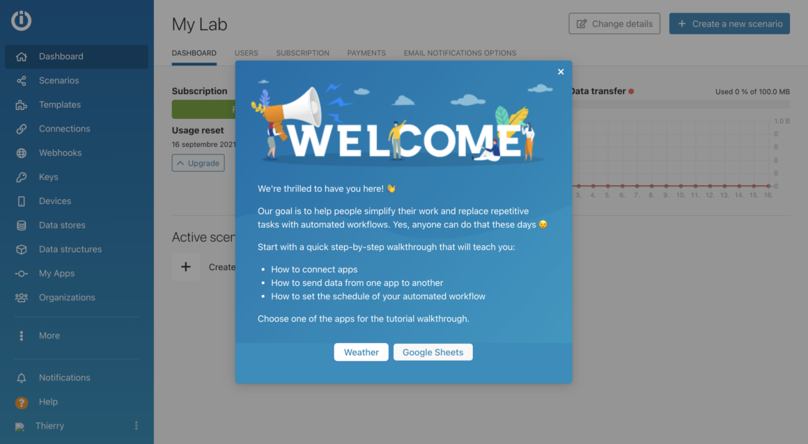
When you first open the Integromat tool, it starts off with a welcome overlay, which will be the start of its tutorial overlay.
The platform provides two different app walkthroughs, Weather and Google Sheets. The users are asked to pick which walkthrough they would like to take.
After picking one of the two walkthroughs, the actual onboarding starts, in a sense.
Users are now asked to make a copy of a Google Sheets spreadsheet to make more efficient work with the onboarding.
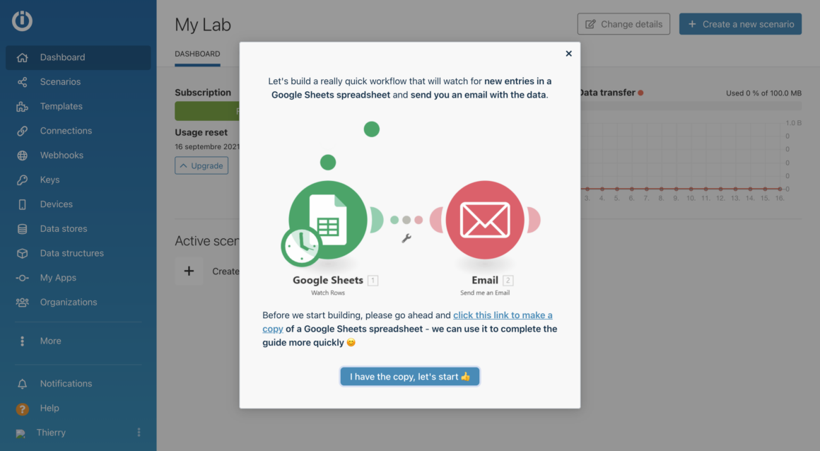
After that, users are directed to the spreadsheet, and the actual onboarding starts with tooltips and modals.
What makes Integromat's overlay tutorial good?
👉 Integromat uses a welcome modal the first time users start using the tool, which is always a great way to engage with users and lead them to the onboarding.
👉 The choice to pick between two of the walkthroughs gives users a sense of willing participation and freedom, which further enhances the user experience.
👉 Giving users a small task right at the beginning keeps them invested and ready to learn because the background is dimmed as fitting for an overlay tutorial; users aren't distracted and can focus on the task and onboarding.
2- Grove HR
Grove HR, an all-in-one HR solution for SMEs, is our other example showing the endless potential of an overlay tutorial.
Once on the platform, users are prompted with a welcome modal that is also the start of their onboarding process. What's even better about it is that the website overlay has a YouTube video inside it, reminding us once again that an overlay image or a video can make all the difference.

After clicking "Let's start," users are prompted with another overlay that asks them to fill out a 3-step onboarding form to help create the right in-app environment for them.
However, this is not the only instance Grove HR uses overlay tutorials to onboard users.
In this instance, we see Grove HR use an overlay tutorial to show users how to use a new feature. Then, they use a YouTube video again, knowing that 86% of users learn better with videos.
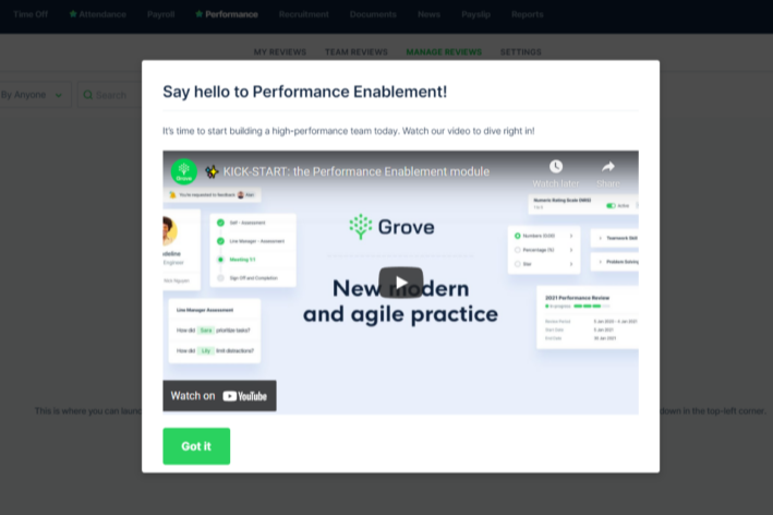
What makes Grove HR's overlay tutorial good?
👉 Grove HR uses website overlay tutorials to their full potential by adding videos to the modals, welcoming users with them, and announcing features with videos as well.
👉 Grove HR avoids user confusion and distraction by dimming the background content and obscuring the current screen which sets priorities straight for users.
👉 Grove HR uses the overlay tutorials as a chance to have users introduce themselves and what they do by putting the segmentation onboarding modal right after the welcome modal to make sure everyone fills it up.
Creating Website Overlay Tutorials with UserGuiding - how easy is it?
Now the art of creating overlay tutorials may seem complicated, but let me tell you it isn't.
So long you have a no-code tool to help you with it.
With a no-code user onboarding tool like UserGuiding, you can create simple and complex website overlay tutorials in a matter of minutes.
And I mean it. My personal record is 4 minutes and 11 seconds.
So let me show you how you can create your very own website overlay tutorial with UserGuiding in 3 simple steps.
1- Pick your modal and start your guide
UserGuiding has a user panel where you can start creating guides, but most of the fun work is performed on your own website for better implementation. To make sure you can create your guides smoothly, don't forget to install the Chrome extension.
First things first, let's go to UserGuiding and create a new guide.

Fun fact: you can also do this by going to your website and running the Chrome extension. Just click the "+ Guide" button.
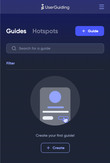
Don't forget to name your guide, and we're ready to start.
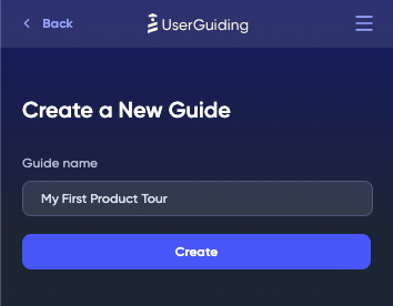
2- Customize and automate
Once you have created your guide, it is time to pick the modals you want to put in your overlay tutorial.
But first, click on the "+ Step" button to start choosing.
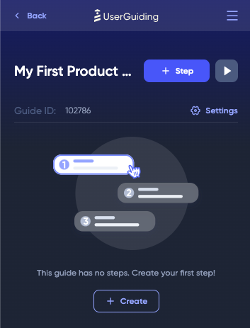
You can pick anything from the modal, tooltip, or input field menu; they are all great UX patterns.
You can create a modal from scratch, but of course, it is always in good taste to start off with a cool welcome modal to start engaging your users from the very beginning.
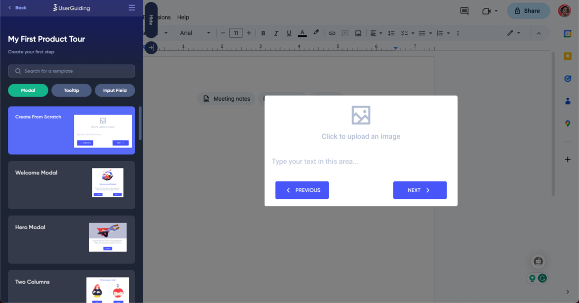
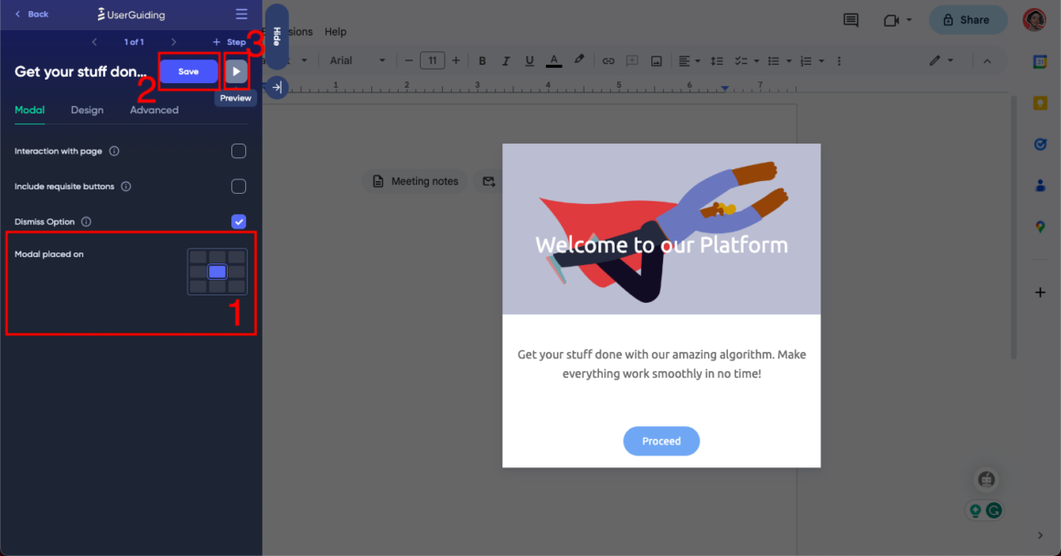
You can then pick where exactly you want to locate your overlay tutorial, how you want the design to be, and other advanced settings.
Once it starts to shape up the way you want, you can save and preview your precious brain child.
3- Save and publish
Once you are satisfied with the overlay tutorial you have created, it is time to save and publish your work.
Simply go back to the UserGuiding panel, add your container code to the guide, and from the guide settings turn your guide to "⚡ active", hit save, and publish changes.

While you are at it, you can change other advanced settings like audience segmentation, custom page targeting, auto-triggers, or scheduling.
It's all up to you!
Like what you see? Give UserGuiding a try, for free!
Conclusion
Website overlay tutorials is a newly acknowledged term next to website overlays.
But as much as the term is new, the practice of enhancing the user experience through great onboarding is a well-established way of customer retention.
If you want to get on board with the rest of the SaaS industry, UserGuiding's no-code solution will be waiting for you 😎


.svg)
.svg)
.svg)
.svg)
.svg)


.svg)
.svg)


.png)


