
Do you remember how many websites you visited one time only and never went back to?
Personally, I don’t.
And I don't think I could ever remember, since there are simply too many of them. And I bet it's the same for most of us.
But did you ever think that your website could be one of those websites that people never go back to?
Don't take it from me, but it's perfectly possible.
And how do you make it not so? How do you make your website one that people want to go back to?
Here is a quick answer to this question:
Make an impression and get people to find out more about it. Through your own assistance.
That means you need a perfect user experience and a well-prepared onboarding process.
And we are about to find out how to do that!
Let's take a look at:
- What website onboarding is,
- Why website onboarding matters,
- How you can start with your website onboarding strategy,
- Some best practices and website onboarding examples
- How to use UserGuiding to improve your onboarding without having to code
Let’s get started!
What is website onboarding?

Website onboarding is a prominent part of user onboarding experiences and is often the first stage of onboarding flows taking place on web. Website onboarding experiences are often for the general audience and don't feature any personalized experiences though they can have persona-based onboarding elements. Any website visitor or user journey, including onboarding users to product features, signup process, user onboarding checklists, or any other onboarding element on a website, can be considered website onboarding.
So, a website onboarding process is the very first user onboarding experience of an entire onboarding process, often in the form of signup forms, core feature user checklists, and other key feature onboarding elements.
The main difference between web app onboarding and website onboarding is that website onboarding experiences don't take place inside your product, while web app onboarding is the onboarding inside the web app, that is your product.
But the real question is:
Why is onboarding important for web apps and websites?
There are many reasons to start with your website onboarding strategy, and most of them are obvious:
✅ You want early user adoption,
✅ You want your website to be engaging,
✅ You want to show off core functionalities without being pushy
And many more.
But we can summarize 3 main reasons why you should start out with website onboarding:
1- First impressions
The landing page of your website is truly the most crucial part of a user’s journey with your product.
First impressions are critical in users’ decision to use your product or not.
If you cannot provide enough information and guidance to your users about what your product is, how they can start using it, and how they can find value in it, there is a big chance that users will quit before even entirely using your product.
User retention is a big old dream if you cannot get users to take mandatory steps to fill out the registration form through your website onboarding experience.
2- Implicit, non-intrusive onboarding
Website onboarding, or any kind of onboarding process, is often thought of as a simple product tour.
However, a website onboarding flow uses more implicit onboarding elements than an entire onboarding process would feature in a web app.
Here's a look at ClickUp's website signup form's first step directly on their website:

The moment people visit your website, your responsibility to attract and help them learn about your product begins.
And ClickUp does this marvelously.
They clearly display product features at the top, a form field saying "enter your email address", and microcopy next to the CTA button to create a user experience they can count on.
Website onboarding provides the necessary information and guidance to users who are likelier to engage with your product for the first time.
So, it's only natural for websites to have a separate user onboarding process.
3- Good start to the onboarding journey
When used right, a website onboarding can be a good base for the rest of your web app onboarding journey.
Picture me this:
One product offers a wide variety of features, all displayed in detail on their website, at the very top, so the users get to experience them.
The other product only mentions core functions briefly and doesn't let users engage with them.
Which product has a higher chance of increased onboarding completion later on inside their product?
I know you know the answer.
Here's a good website onboarding example from Genially's website:

By letting users play around with the tool before even signing up, Genially gets to engage users with early product experience and create a good base for an amazing onboarding process later on in the product.
So, all in all, everyone should care more about website onboarding processes.
In this respect, you should know who your users are and how you can provide them with the best user onboarding experience.
In doing so, you will decrease churn, increase retention and engagement. At the end of the day, you will see how a good onboarding experience will be reflected in your revenue.
How is onboarding for web different than onboarding for mobile?
Like there is a difference between web app onboarding and website onboarding, there is a difference between onboarding on the web and on mobile.
I have been thinking for a while about how onboarding should be designed and processed for websites and mobile apps.
👉 Should there be significant differences?
👉 If so, why and to what extent should those differences be made?
One thing to consider was the user purpose.
Here's the thing:
- People visiting your website do so to learn more about your product
- People downloading your app on mobile, on the other hand, are more likely to already know about your product, and this is why they download it
So, a primary difference when designing onboarding processes for both should be that:
👉 Websites on desktop should focus more on core benefits, core value proposition, and a signup form,
👉 A mobile website onboarding should feature a download button and onboard first to the download process rather than the product itself
Since people downloading your app to their mobile devices are more likely to have an idea about what your product is, instead of focusing on marketing your product, you can focus more on guiding them to teach them how they can use and find value in your product.
But that doesn't mean you can overlook website onboarding.
The reason why people are familiar with your product enough to download it on their mobile devices without checking is likely to be the information they got from your website.
So, there is much work to be done to optimize website user onboarding flows.
Let's take a look:
How to build an onboarding for your website
Every onboarding process is unique.
But there are website onboarding strategies and some specific do's and don'ts of onboarding users to a website without being pushy and by using implicit UX elements.
Let’s talk about the 5 simple steps to start onboarding users to your website (and product!):

1- Do not bombard users with TMI
This is the golden rule of website onboarding.
Do not intimidate users, and do not let them get lost on your website.
So basically, you cannot give too much information at once but also cannot let users do whatever they want.
Because, spoiler alert, either way, they'll leave.
You should master the art of providing the most necessary information with a few words, and you should navigate users only to what’s essential for them.
Tough job, I know.
But as I suggested earlier, website onboarding is more about convincing users about the value of your product, so it is a bit of marketing.
After showing users that they can find value in your product, your goal should be to use call-to-actions perfectly to convince them to use your product.
I personally like Asana's approach to it:

A convincing headline, a good core value proposition, a contrasting colored CTA.
Keep in mind, folks, telling people you are the best can actually psychologically lead them to believe you.
👉 Visuals empower storytelling.
👉 Big white spaces give off professional, fresh, cool vibes.
👉 A stark color for your CTA button can draw attention there immediately.
While there aren't explicit onboarding elements, the UX elements alone make a difference in how the website onboarding will proceed.
2- Time-to-value
Let’s be honest; first-time users do not care about every feature of your product.
What they care about is finding a solution to their problem.
If you fail to provide a solution/value instantly, users will quickly leave your website, and what you have will only be a high bounce rate.
If yours is a paid product, then offering freemium is an excellent way to deliver value to users and encourage them to buy your product.
You can also do one better and offer users value without asking for anything in return.
If your value proposition is good enough, you are more likely to make a sale, even an enterprise one.
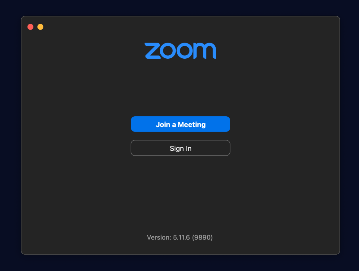
For example, Zoom is available to use without an account; users can jump into any meeting they have the link for:
3- Guide your users
If your users need assistance using your product, you should definitely use interactive guides to help them learn while using it.
You should put yourself in their shoes and help solve any problems they may encounter while using your product.
Of course, giving them a chance to take a product tour, or a video guide with which they can sit back and learn with low effort is always an option.
Here's Hopscotch bringing product tours and video guides together:

And here's BeerorCoffee bringing product tours, interactive guides, and videos together:

4- Provide an excellent customer support
One thing about web products: there will be lots of support requests.
There is no way everyone's brain functions the same way, so you must be prepared for a ton of user questions and problems to be solved.
Problem not solved?
Your user just churned. And if you can't help solve the problems efficiently, they won't be the last.
So, you should be prepared and ready to assist users before, during, and after their interaction with your product.
Your help center should be able to answer and solve problems specific to any kind of situation that your user can face when using or before using your product.
If they cannot solve their problems by checking the knowledge base, then you should be prepared to solve their problems in person.
Your users’ time is one of the most important assets they spend when using your product. This is why you should give the utmost importance to answering their questions and solving their problems in the most efficient way possible.
Heavy support load: Resource centers to the rescue 🦸
For the longest time, I was confused about how websites put the link to their help center at the very bottom.
No, help button, no chat widget, just a link at the very bottom.
And to this day, I don't understand how websites can be so underestimated as a medium of help-seeking. If I had the chance to talk to all those website admins, my suggestion would be simple and effective:
Resource centers.
Here's how CitizenShipper uses UserGuiding's resource center function:
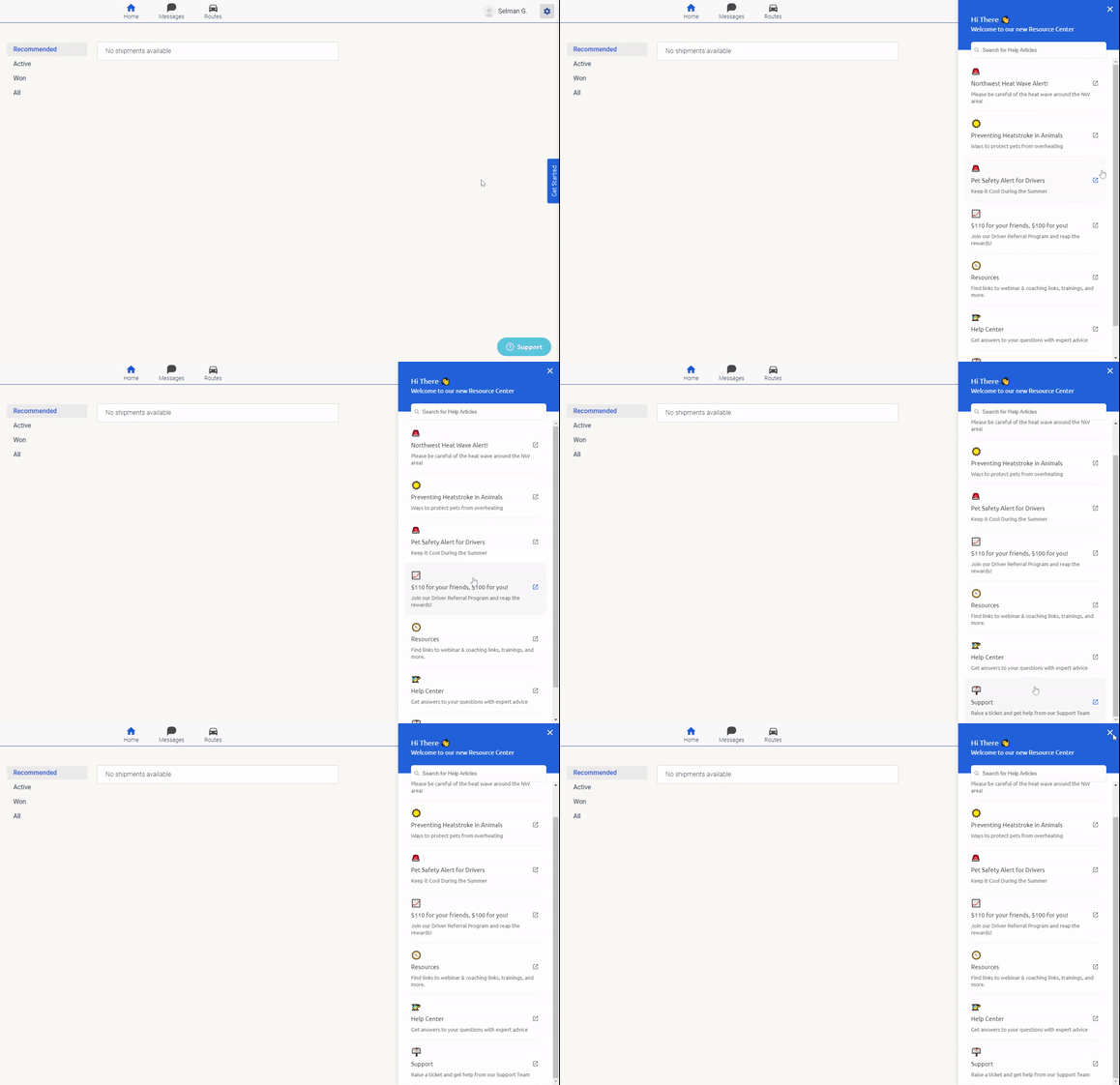
And believe it or not, by combining it with some other onboarding UX elements, they managed to increase activation rates by 25%
And those other onboarding UX elements in question are:
✅ Product tours, interactive guides, walkthroughs,
✅ User onboarding checklists,
✅ Tooltips, hotspots, in-app messages,
✅ Resource centers,
✅ NPS surveys, and more
Combined with powerful analytics, high customization, segmentation and targeting.
Interested?
👉Try UserGuiding for FREE👈
5- Collect Feedback
This is the hardest part of the onboarding process.
Not every user is so eager to take their time giving feedback to businesses.
So, it is your duty not to discourage them from giving feedback.
What you should do is make the process seem as easy as possible using good copy, appropriate onboarding UX patterns, and if possible, visuals.
Do not overwhelm users with too many questions. Instead, you can use more efficient feedback methods like NPS surveys.
If you need extra feedback, you let users know that you would appreciate further feedback to provide them with a better experience.
That is to say, you should make users feel that the feedback that you collect will be evaluated carefully and will be used for their own benefit.
Here's an example from Notion I like:


By indicating how long it will take and asking the easier questions first, Notion raises its survey completion rates successfully.
And those were the 5 simple steps to better contextual onboarding experiences on your website.
Now, let's take a look at some good examples of website onboarding:
Top 5 Website Onboarding Examples and Best Practices
Enough theory.
It is time to go over some real-life examples and best practices of website onboarding and web app experiences.
Here's my top 4:
1- A Perfect Landing Page by Bitly
Bitly’s landing page and product are a thing of wonder.

You can see the direct and clear language that they use to explain to users what they can do with their product.
What’s great about their landing page is that it includes every necessary element, but it is still beautifully plain and simple.
They present value right at the beginning of users’ first interaction with their website, and they let users find what they are looking for.
Without going through any unnecessary processes, users can shorten their links.
An excellent example of time-to-value.
Since their product is very easy to use, they don’t have to guide their users through it. However, if users want to learn more about what kind of benefits they can get from using their product, they can simply scroll down and learn that:

2- An Effective Product Tour Created with UserGuiding for Vieworks
Guiding your users through your product is a crucial step of website onboarding.
Using interactive guides is among the top practices to give a product tour and increase product adoption, therefore, customer retention.
The instructions that you use in your product tour should be as clear as possible.
Here is a good example by Vieworks:
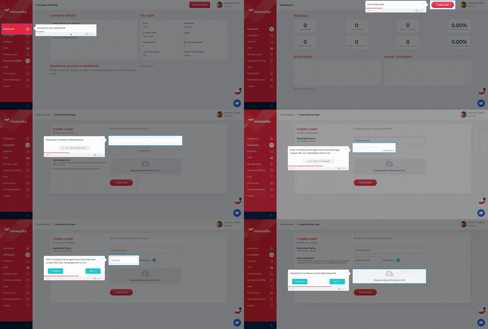
You can see that the instructions are clear and straightforward.
This interactive guide walks users through the product step by step and helps them better comprehend the product by making them take action in the process.
3- An effective help center on your website
Here is a good example:

You can see, on the left, that users can almost find any information they need when using the product.
However, if they need further information, they can get assistance by starting a conversation.
Automating these processes will make it much more efficient for you to use your resources but if users still cannot solve their problems or find necessary information, then you should be able to assist them in person.
4- An excellent feedback example from Skype
When you make it easier for users to give you feedback, you can be sure that you will get the feedback you need.
This example from Skype will give you an idea about how you can make it easier for users:

This method of collecting instant feedback after a call is being used by many others, such as Google.
You can see that users can almost find any problem that they may face when using the product.
If they want to give feedback on anything different, they can simply write it down.
As for overall feedback, NPS surveys will give you a much better idea of users’ experience with your product because if they like using your product, it is highly likely that they will suggest your product to their friends or colleagues.
To Wrap Up
I hope you now have a better understanding of what website onboarding is and why giving users a reason to come back to your website is important.
If you go through these steps successfully, then you will be able to encourage users to come back to your website.
Which means improved acquisition, activation, and retention.
If you're looking for a tool to help you onboard your website visitors without having to code, consider checking out UserGuiding.
It offers tons of onboarding elements, like product tours, a help center, tooltips and surveys, all for a much lower price than the industry average.
Grab a free trial today and see for yourself.
Frequently Asked Questions
What is website onboarding?
Website onboarding is the very first stage of user onboarding that takes place on your website and is often in the form of signup processes and onboarding to core features.
What are examples of onboarding?
Some good examples of onboarding are product tours, walkthroughs, interactive guides, tooltips, and other elements. For example, a series of tooltips on a web app introducing the product is an onboarding process.
What should be on an onboarding page?
An onboarding page might feature product tours, user checklists, and other onboarding UX patterns that can help users learn how to use a product.


.svg)
.svg)
.svg)
.svg)
.svg)


.svg)
.svg)


.png)


