
You go to a party.
There is a bunch of people inside and you want to mingle.
What do you do? Who do you approach first?
Do you try to get to know each and every one, one by one, or do you scan the atmosphere, and connect with the ones you feel closer to you?
I think we both know the answer.
You choose a couple of people who you felt closest to you.
Their clothes, their way of expressing themselves, even where they hang out in a room feel close to you – or to what you want to be.
So why would it be different for a website?
To survive the ‘’scanning’’ process, you either have to stand out or be extremely specific about your niche.
So, let's delve deep into:
- What website engagement is,
- Why website engagement matters,
- Website engagement statistics & benchmarks you need to know,
- Website engagement metrics to track,
- Website engagement best practices, and
- Tools to track website engagement
Got no time? Here's a recap:
TL;DR
👉 Website engagement tracks how well your website resonates with potential users.
👉 It matters for 3 main reasons:
1️⃣ Users decide how they feel about a website in a matter of milliseconds,
2️⃣ Mobile engagement is rising rapidly,
3️⃣ Engaged users become avid promoters of your website and product
👉 One of the most important statistics about website engagement says that 94% of negative website feedback was design-related
👉 Some important metrics to track for higher website engagement are: bounce rate, pages per session, conversion rate, exit rate, top exit pages, average session, duration.
👉 Some of the best practices for better website engagement are:
-Investing in good UX,
-Optimizing website loading speed,
-Providing more content to engage with,
-Simplifying the website navigation,
-Being aware of user personas and different user segments, and
-Making help easily accessible,
👉 Some good tools to consider for website engagement are:
-Heap,
-Google Analyitcs,
-Optimizely,
-HubSpot,
-Hotjar
👉 High website engagement is no easy feat to achieve, but with the info and tools in this guide, you can do it 💪
What is Website Engagement?
Website Engagement is a measurement of how well your website resonates with your potential customers.
Essentially, website engagement tracks how many of your users find value in your website, where they find it most, and for how long, with the ultimate goal of converting users to paying customers for most businesses.
While there are many metrics defining website engagement, it is important to realize that what matters is not the actions but what they indicate.
For example, if a user has exited the website after 10 minutes spent browsing, it might not be such bad news.
Now you get to find out what ticked off an actually engaged user.
Depending on which page or element triggered them to leave, or their average time on these pages, you can reach actionable insights.
So, before deciding that your abandonment rate is too high or your engaged sessions are too low, a holistic view of website engagement can help.

The main purpose of increasing website engagement is to increase the value that your website brings to the user.
But it also helps with more than that.
Let's talk about:
Why is Website Engagement Important?
Having low website engagement rates means that you might be putting your money into something that won’t pay you back.
Even the loading time of your images will determine the outcome of your efforts.
And that brings us to understand that increasing website engagement is an absolute must.
Here's 3 main reasons:
1- People are quick to judge when it comes to websites 🤨
It only takes seconds for a person to decide whether or not they want to spend time on a website.
They don't like it, they bounce.
Putting the calls to action in the right places, featuring relevant content, being aware of the customer experience and its place in the sales funnel all count toward a better website engagement rate.
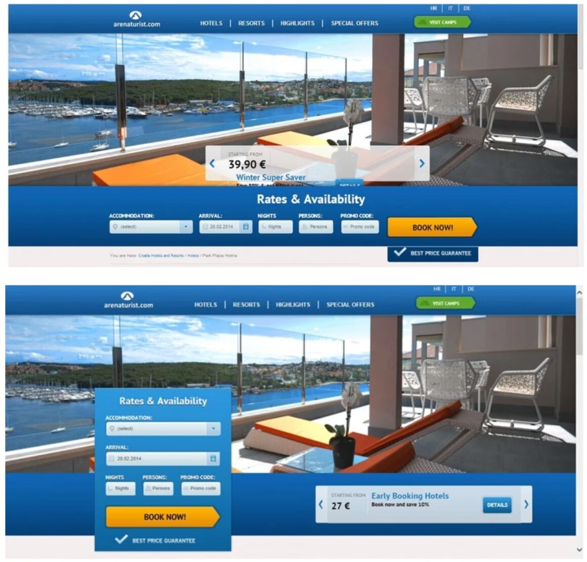
So, even if your key metrics for website engagement show a decrease in average time or click-through rates, it is important to conduct A/B tests.
These will reveal the needs of your target audience, which is your priority before all else.
That's what Arenaturist did, and how they achieved a 52% increase in conversion rates:
2- The usage of mobile devices is increasing rapidly 📱
Beyond desktop experiences, user experience on mobile is something you can't ignore.
In 2021, 72% of all ecommerce sales was done on mobile.
Now, this might have been thanks to the pandemic, and its challenges.
But even so, Insider Intelligence expected that retail mobile commerce sales to make up 43.4% of all retail ecommerce sales in 2023, which was previously 41.8% in 2022.
And so, whether you have a mobile app or not, a mobile-friendly website can make all the difference in user engagement on your website.
3- Engaged users mean promoting users 📢
Highly engaged users are not only a source of user feedback, but they also attract more people to you and your product/website.
Quick reminder ‼️
It still costs more to acquire a customer than to keep an existing one.
The latest data says it is around 6 to 7 times more expensive to acquire than to retain.
So in any case, it is wiser to let social proof do the acquiring for you while you keep user trust and customer engagement high.
And as for proof, here we have:
10 Website Engagement Statistics and Benchmarks
- It takes 0.05 seconds for users to conclude on an opinion about your website, determining whether they like it site or not, whether they’ll stay or leave. (Taylor & Francis Online)
- 57% of internet users say they won’t recommend a business with a poorly designed website on mobile. (sucPUB)
- 38% of people will stop engaging with a website if the content or layout is unattractive. (Hubspot)
- 85% of people think that a company’s website on a mobile device should be as good, or even better, than its desktop version. (invision)
- 39% of people will stop engaging with a website if images won’t load or take too long to load. (Hubspot)
- ESPN.com revenues jumped 35% after they listened to their community and incorporated suggestions into their homepage redesign. (invision)
- It takes 2.6 seconds for a user’s eyes to catch an area of a website that most influences their first impression. (CXL)
- 70% of small business websites don’t have a Call to Action (CTA) on their homepage. (Business to Community)
- If given 15 minutes to consume, two-thirds of people would rather read something beautifully designed than something plain. (Hubspot)
- A study found that 94% of negative website feedback was design-related. (The Real Business of Web Design)
6 Website Engagement Metrics to Track Right Now
Website engagement is more than average session duration, percentage of sessions or organic traffic.
It's all that and more.
Of course, there are lots of metrics that fully or partially contribute to website engagement, but it is important to keep in mind that:
Not all metrics associated with website engagement is necessary or even beneficial for all.
That's why I gathered the most common and effective 6 metrics.
Let's take a look:

1- Bounce Rate
Bounce rate is the percentage of visitors that land on a page and then leave without any other interaction.
This metric will tell you how many people left your site after viewing a single page, as opposed to tracking the number of people who viewed only one post.
It can be useful to see if you have an unappealing landing page or not, but it is also interesting to track the bounce rate on individual posts and see if they do better over time.
Higher bounce rates show that the quality of your content is not high enough or your website design is not attractive enough.
That’s why it’s good to monitor bounce rates from time to time and make sure there are no major changes in your website’s design and performance.
Here's how to measure bounce rate:

Or you can check it via Google Analytics 🤷
2- Pages per session
Pages per session is based on all sessions for a set time period, including multiple page views by individual visitors in one session.
The goal is simple.
With pages per session, we try to see if people are reading the additional resources on a website or just viewing one post and then going away.
Basically, it allows you to see if users are browsing your website in a linear way or not.
And that's something you want to be tracking for higher engagement.
If they are following the path that was intended by the content strategy, then this number should be high.
There is no specific formula for pages per session, but with a user
3- Conversion Rate
Conversion rate, in its essence, is the percentage of visits that result in a transaction.
For an e-commerce site, this can be expressed as revenue per visit; for other types of sites, it may be goal completions or newsletter sign-ups.
This metric is very important for you to track because it will give you a way to measure your success with gaining new customers or goal completion.
These are the three key factors you should keep in mind when measuring your conversion rate:
👉 Your conversion goal (for example, did they purchase an item?)
👉 The number of people who have converted or completed that goal.
👉 If they purchased a certain product, which products they purchased during that session or over time
Here's the formula for conversion rate:

Check out our conversion rate best practices article here 👈
4- Exit Rate
Exit rate, or your exit pages metric, tells you which page the visitor left from.
Similar to bounce rate, it can tell you which posts do not engage your audience and need work.
This number is especially useful for blog websites that produce multiple posts daily or weekly.
In such a scenario, you need to make sure that users are actually engaging with your site, reading your content and interacting with action elements.
Here's the formula for exit rate:

5- Top Exit Pages
Which are the pages where people lose interest, or maybe find what they are looking for?
Do all people leave when they come to a certain page?
Is it because they are done, or they got bored?
Tracking your top exit pages can give you insight into your strongest and weakest pages – though the interpretation is still up to you.
6- Average Session Duration
Average session duration is the total time (in seconds) divided by the total number of sessions.
This metric is very useful because it will tell you how much time your visitors spend on your website during average sessions.
It’s important to keep an eye on this metric so that if the number of time users are spending on your site starts to decrease, you know that changes need to be made.
Here's a quick formula for average session duration:
Now, let's take a look at how you can start putting these metrics to use right away:
6 Best Practices to Boost Website Engagement

1- Invest in good UX
UX or user experience design defines website engagement.
You can invest in better content, research your user personas from top to bottom, get your loading time up, and invest in a mobile app.
None will matter without good UX.
People will take one glance or click a few elements and decide there is no value for them.
Even Google, a search engine that consists of white space and a few buttons only, felt the need to switch to a more engaging interface.
Let me show you what I mean:


If the shapes, colors, and texts that you use don’t make your visitors want to stay on the page, I would suggest you ask for help from a UX designer.
2- Make sure your website loads fast
In the internet era, the information, product, or services you offer is not a gift.
If you aren't available, there is plenty more to check out.
And if your website isn't available on the command of one click, immediately, people don't care for you.
It came to a point where people started counting milliseconds of their time as a big waste.
While this is the case, it shouldn’t be surprising when I say that the most important thing about website engagement is the load time.
I know I said it's UX above, but unless you handle load times, there will be no UX for users to check out anyways.
They'll leave.
Normally, it should take 2 to 5 seconds for a website to load.
But with so many websites that load in under 2 seconds, any second that takes longer might cost you a lot of potential users.
Now you tell me:
If you know there is a substitute for the website you are trying to explore, would you wait for 6 seconds every time you click on something?
I know I wouldn't.
So, to reduce your load time, you can:
👉 Compress the images and the files that you use on your website,
👉 Optimize the images to avoid loading one image more than once,
👉 Avoid an excessive amount of bouncing between pages on your website,
👉 Avoid using render-blocking Java-Script; If not possible, at least minimize the usage,
👉 Use trusted website-hosting providers
Once you're done with that, let's head on to:
3- Provide more content for the users
Did you know that longer content actually results in higher engagement rates?
That’s because it takes longer for a person to consume the content, therefore, stay longer on the page.
This brings us to the main point:
Everyone can use a paraphrasing tool and add some gibberish into the content to make it longer, but that is not the kind of ‘’long content that engages.’’
You need to provide quality content that is slightly longer than a copy text and make sure to deliver value to the user with it.
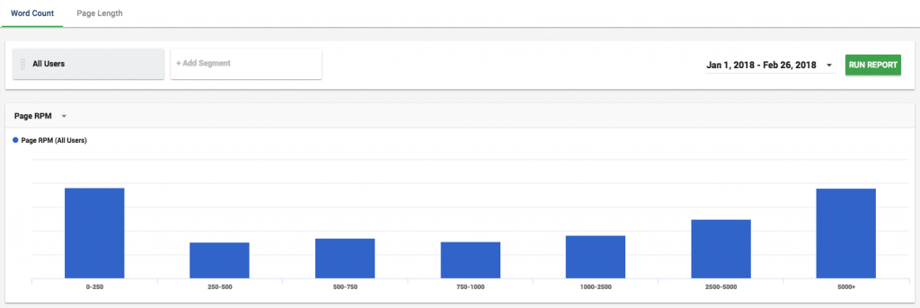
While the ideal content length differs from website to website, here you can learn what strategy you might follow.
4- Make the website navigation as simple as possible
Let me ask you:
Which one of the websites below looks easier to go through for you?
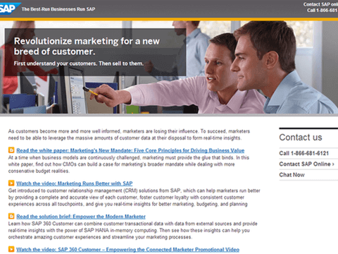
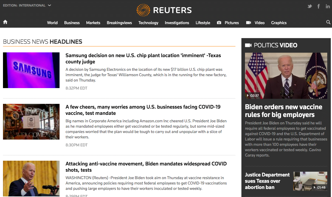
I know you know the answer.
It’s not only about the design, it’s more about UX.
And in your case, it's the same too.
So start by asking yourself a couple of questions when designing or redesigning a website:
❓ Can users easily understand what your niche is and the values you provide?
❓ Can a first-time user easily find an answer on the website, and navigate to the desired next page?
❓ Do you have enough CTA’s to lead the user to a purchase/signup?
In the end, it all boils down to trying to:
Put yourself in the shoes of the user, and try to observe the website from the outside.
Ask your users what they liked and what they didn’t, using NPS surveys and asking for feedback.
5- Be aware of different segments of your user persona
A one-persona business is hard to find nowadays.
If you are bigger than a fresh startup with 10 employees and rich enough to afford a research budget, you should know one thing:
Not everyone on your website is there for the same reasons.
Unless, of course, you're a part of the one-page website trend. Then your website engagement should be easier to figure out.
My point is:
For instance, if the user is wandering through the ‘’how to’’ content, show them a popup that shows how they can solve the problem using your website.
If the user has been looking at one landing page for longer than a couple of minutes, send them an automated in-app message, asking if they need help.
How?
Pro Tip: No-code In-App Messages in Minutes 💬
When I first came across Netflix' "are you still watching?" message while binging Stranger Things with my family, I remember everyone was annoyed.
We needed to find the remote which took us a couple of minutes (I was sitting on it, guilty as charged 🥲)
But I remember being fascinated by the UX, which I didn't imagine I'd need.
But it was so subtly thoughtful that I remember telling myself, "that's how you do UX, by knowing the needs of users before they know it."

But not all of us are Netflix.
Not all products can casually code a full-page screen for better UX.
I know an easier, more affordable way, though.
Meet UserGuiding.
UserGuiding is a no-code product adoption tool that's easy to use, easy on the eye, and on your pocket.
With UserGuiding, you can engage your website users, using features like:
✅ Interactive product tours, walkthroughs, and guides,
✅ In-app messages, tooltips, hotspots,
✅ User checklists,
✅ In-app surveys,
✅ Resource centers, and more.
All powered with powerful analytics, high customization, user segmentation, and targeting.
👉 Try it out, for FREE 👈
6- Make sure to provide easily accessible further help
You might create the best first-time UX and then your user might need help with something you never would have guessed.
So, it's important to offer further help on your website.
Hypothetically speaking, even if you can’t provide a perfect personalized experience for each persona, or if your navigation is not the clearest that exists, you can cover up for it.
Why not incorporate a live-chat feature, a help center, or a resource center?

Check out our guide to help center software here 👈
Now, upon learning all this, you might want to check out a tool or two for best results.
Let's take a quick look at:
Top 5 Best Website Engagement Tools You Need
1- Heap

Heap Analytics is a production-ready web analytics platform built on React and GraphQL by Heap.
“It’s been great being able to measure the impact that every new feature or change has had on our users.”Rian van der Merwe, CTO of TeePublic
Heap is a simple and powerful analytics platform that you can use to measure user behavior and understand your customers.
Heap beats Google Analytics, Amplitude, and Mixpanel in capturing user behavior from users who have not been to a website before.
On average, over 30% of your website sessions come from first-time visitors, and these are the customers you can’t afford to lose.
Pricing
Free up to 25,000 actions/month.
2- Google Analytics
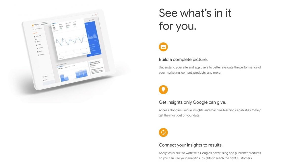
Google Analytics is a freemium web analytics service offered by Google that tracks and reports website traffic.
It is part of the free Google Analytics 360 Suite, and therefore offers advanced features for up to 500 million monthly visits.
Google Analytics is one of the leading web analytics services on the market with tons of integrations (e.g., data warehouses) and support.
Pricing
Free up to 500 million events per month for non-enterprise accounts.
3- Optimizely

Optimizely is a web experimentation platform that allows users to test changes to their website with real users in an effort to identify small changes that are likely to have the biggest impact.
Optimizely is one of the most powerful A/B testing tools on the market, allowing marketers at various organizations to optimize every stage of the customer journey.
Shows one data point per visitor, which is a unique identifier for any browser or device.
Pricing
Optimizely comes with three pricing tiers that include enterprise features such as custom reports, integration support and more.
👉 Basic plan starts at $17/month
👉 Pro from $79/month,
👉 Enterprise package is $349/month.
4- HubSpot
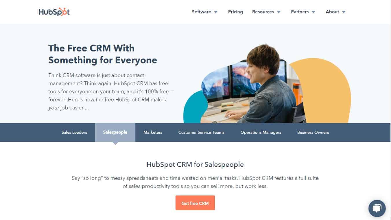
HubSpot is a marketing, sales, and service platform that helps companies attract visitors, convert leads, close customers and grow.
HubSpot lets marketers monitor every stage of the customer journey with real-time reporting across all channels.
HubSpot beats other leading marketing platforms, such as Pardot and Salesforce, in terms of ease of use.
Marketers who are new to the platform take only about an hour to set up their first campaign, compared to close to five hours for the average marketer using Pardot or Salesforce.
Pricing
Free up to 25,000 visitors per month.
5- Hotjar
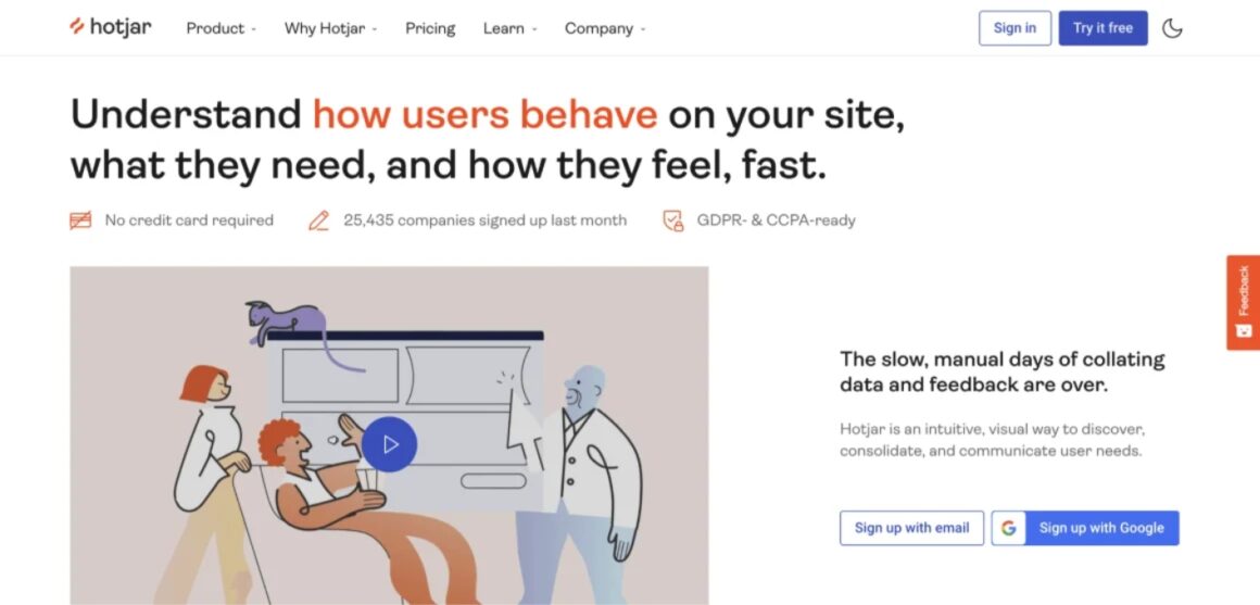
Hotjar is a behavioral analytics tool that has gained popularity thanks to its heatmaps that help users analyze their websites in-depth and gain valuable insight.
It offers real-time visitor recordings, heatmaps, form analytics and more making it one of the best tools to trach website engagement.
Pricing
Forever-free plan for up to 1,050 recordings per month, up to 35 daily sessions, and other limitations.
Paid plans start at €39 per month.
To Wrap Up...
We all have more respect for our time.
No one will take half an hour going through your website if you don't spend half an hour going through someone else's website.
But hey, don't worry.
You don’t have to spend long hours and vaults full of money to have an outstanding website with high engagement rates. There are really simple strategies and tools to help you out.
Take a look at the stats above again, you'll get what I mean.
And don’t forget, spending for your engagement rates is an investment that will lead to profit in the long run – it might not come immediately, but you’ll thank yourself later.
Frequently Asked Questions
How can you get more customer engagement on your website?
There are some really simple strategies to quickly and easily increase your website’s engagement, such as lowering your page load time, having a good UX design, or displaying and referring to related content. You can more in-depth strategies in the article.
How can I track engagement on my website?
There are multiple metrics that you can trace to get a clear understanding of your website engagement rates, such as bounce rate, click rate, or DAU/MAU rate. Keep in mind that those metrics are unique within themselves and you shouldn’t try to track them all at once.
What does engagement mean for a website?
Website Engagement means that your users are happy with your website and are willing to spend more time on it, and are more likely to recommend it. Website engagement is not the same as visitor rate, but visitor rate is a metric that helps you understand your website engagement rate.


.svg)
.svg)
.svg)
.svg)
.svg)


.svg)
.svg)


.png)


