


.svg)
.svg)
.svg)
.svg)
.svg)


.svg)


.svg)
.svg)

There are countless ways to introduce your product to your audience, but product walkthroughs stand out as one of the most powerful tools you can use.
If you’ve found your way here, chances are you already know how effective a well-designed walkthrough can be in onboarding users and guiding them through your product.
However, creating the perfect walkthrough can be a bit tricky.
Don't worry, though —this guide will help you understand the best practices, common mistakes to avoid, and how to create an engaging, user-friendly walkthrough that actually delivers value.
Buckle up, we’re starting!
TL;DR
- A product walkthrough is a guided tutorial that introduces users to the features and functions of a product, often through a step-by-step process within the product interface.
- A product walkthrough can take different forms; it can be:
- Set of welcome screens
- Pop-up guide
- In-app tutorial
- Interactive product tour
- Set of tooltips or hotspots
- Video guide
- Onboarding checklist
- There are several use cases and benefits of a product walkthrough, including:
- Onboarding new users and getting them to their “Aha!” moment ASAP
- Introducing new features and increasing their activation and adoption rates
- Improving user engagement
- Reducing support costs and boosting self-serve support
- Promoting add-ons and creating upsell opportunities
- Collecting actionable user behavior data
- Designing an effective product walkthrough can be tricky. There are several pitfalls to avoid, such as:
- Being too long and monotonous
- Being too generic and lacking value
- Becoming too specific and overwhelming
- Lacking clarity or consistency (in design, tone, and copy)
- Straying from users' needs and expectations
- Subscribe to our newsletter for weekly tips, exclusive guides, and insider interviews on product and growth!

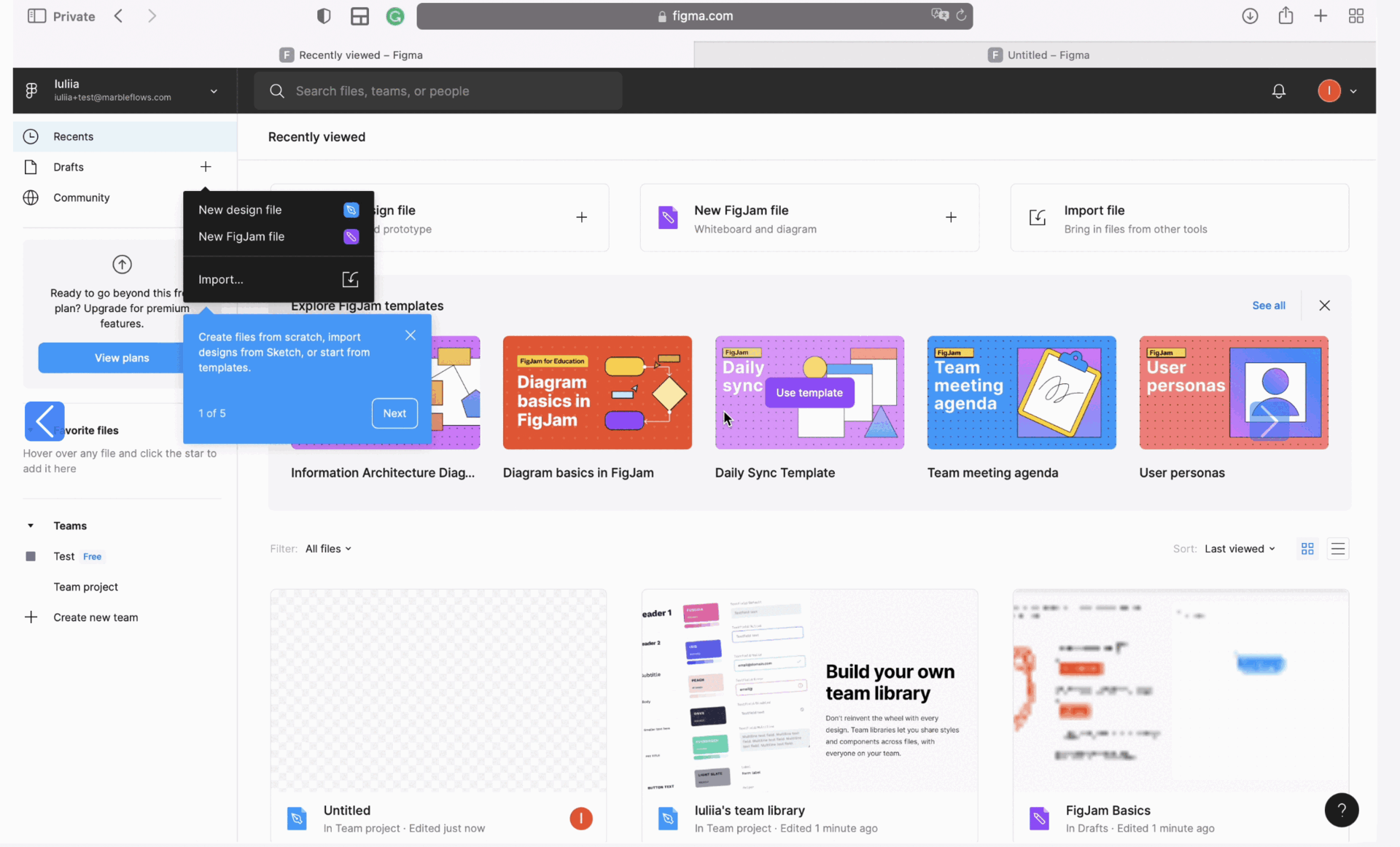
What is a Product Walkthrough?
A product walkthrough is essentially a guided experience of a product, similar to what we’d call a "product tour." It’s there to show users what the product can do, walk them through its features and design, and how it all comes together to solve real tasks.
Here’s an example product walkthrough by Figma:
But unlike a sales pitch, a walkthrough isn’t about convincing someone why they need the product or why it’s the solution to their biggest problem. Instead, it’s about letting the product speak for itself.
A product walkthrough can come in many forms, too, such as videos, tooltips, hotspots, pop-ups, or full interactive tours. There’s no limit to how you can structure it.
We’ll break down each of these forms shortly, but the main takeaway here is that a product walkthrough is about letting the product showcase itself and giving users a real, immersive introduction.
Types of Product Walkthroughs
You can think of a product walkthrough as a flexible strategy —a guiding concept that can be tailored to fit your product and target audience. You start with the core idea of showing users around the product, but how you execute it is entirely up to you.
There’s no rigid path or one-size-fits-all approach here.
In fact, here are some “paths” you can follow to create your own product walkthroughs 👣
Welcome screens
Welcome screens are the first UI modals that appear when you visit a website or, in this case, when you log into a product.
They can serve several functions, including:
- Announcing a new feature
- Conducting a user survey
- Providing a warm welcome to new users
- Setting up and personalizing the product for individual users
- Highlighting main features and functionalities
➡️ For example, Shopify’s welcome screen asks questions about the user’s use case and helps them personalize their product experience:

In a few steps, Shopify tries to get to know the user better (their use cases, needs, goals, etc.) and sets their account and main dashboards accordingly.
This way, Shopify not only provides a more personalized and relevant onboarding experience for its users but also gains valuable insights into its user base. With the information it gathers here, Shopify can continually refine its features and offerings to stay aligned with users' needs.
✅ What’s good in this example?
- Engaging survey with clickable modals, emojis, and transition effects.
- Explanatory microcopy for each “feature” and its functionalities.
- Real-time personalization and setup.
❌ What’s -not really- good in this example?
- No visuals related to the highlighted features.
- No contextualization on where to find the features or how to use them.
Pop-up guides
You can think of pop-up guides as a bridge between static, non-interactive welcome screens and fully interactive in-app tutorials. They offer guidance similar to in-app tutorials but remain stationary, like welcome screens.
Here’s an example from Make to help illustrate this middle ground:
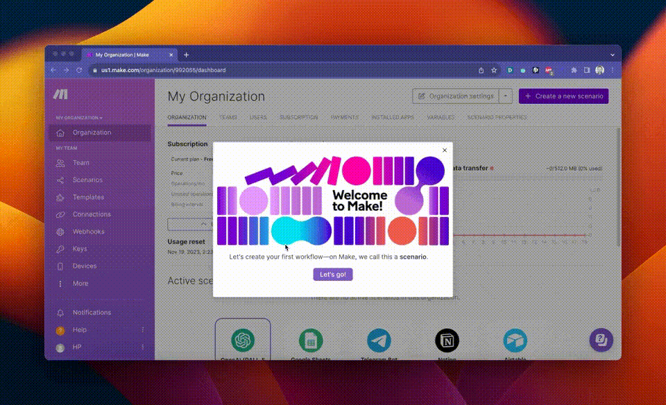
Here, Make explains how to create a workflow (Scenario) step by step.
Just like an interactive guide, we have "Back" and "Continue" buttons, along with information on how many steps are left in the tutorial. The microcopy for the steps is similar to that of the welcome modals.
The videos in each modal show how the UI should look during each action and where the user should click, providing some context. However, the user is expected to memorize the steps and the positions of the buttons and features shown in the video.
And let’s face it; although this might work for a simple 4-step workflow with a straightforward UI and button layout, it probably will not be effective for more complex tasks and features.
✅ What’s good in this example?
- Explanatory visuals.
- Clear and well-structured microcopy and steps.
❌ What’s -not really- good in this example?
- It can be hard for the user to keep everything in mind and repeat themselves later on.
In-app tutorials
In-app tutorials are guides that walk users through specific features of your product and show them how to make the most of each one. Depending on the tools you use to create them, these tutorials can be interactive or static.
They might also be videos on welcome screens or written read-only how-to guides users can access through your resource center.
Each method varies in effectiveness and efficiency, but the goal stays the same: to provide users with guidance on using your product right where they need it, within the product itself.
Here are some examples 👇🏻
➡️ Flourish, a feedback management tool, explains how to add team members to the platform through an in-app tutorial:
Inviting someone new to a platform might seem like a straightforward task, but it’s actually a meaningful step —it’s a real commitment to using the tool.
Sometimes, a simple reminder or seeing the task on an onboarding checklist can motivate users to follow through with what might otherwise feel like a “boring” task. By making this step clear and rewarding, Flourish helps its users make that commitment with ease.
👉🏻 Check out Flourish’s successful onboarding in more detail.
✅ What’s good in this example?
- Explanatory and to-the-point microcopy.
- Original CTA usage (“I’m ready to invite my team”).
- Triggered from an onboarding checklist upon the user’s desire, not automated.
❌ What’s -not really- good in this example?
- The steps could wait for the user to complete the action and then continue.
➡️ Another example comes from Vieworks, a video marketing tool. In this guide, Vieworks walks the user through each step of adding a seat:

👉🏻 Check out Viework’s successful onboarding in more detail.
✅ What’s good in this example?
- Fully interactive –it waits for the user to complete each step.
❌ What’s -not really- good in this example?
- The microcopy could be formatted better with bolds or titles and sub-explanations.
🎥 Watch this video to learn more about in-app tutorials.
Interactive walkthroughs
Interactive walkthroughs are in-product tours that guide users through the interface, pointing out where key features are located and explaining their purpose.
As users move through the tour, they actively participate by clicking on different features, dashboards, or subpages, which keeps the experience flowing smoothly.
Depending on your product strategy, you can provide personalized, goal-oriented walkthroughs tailored to different user segments or opt for a simple, general one —which we don’t really recommend.

Let’s see some examples 🔎
ClickUp’s interactive walkthrough holds the hands of its users while showing them each feature and dashboard around the UI:

The walkthrough (or "tour," as they call it) begins with a brief explanatory video that covers the basics of the ClickUp Hierarchy. In this video, ClickUp highlights key functionalities, use cases, and the overall value proposition.
Afterward, ClickUp reinforces the information from the video by providing a contextualized product walkthrough.
✅ What’s good in this example?
- The information that cannot be given during the walkthrough is provided before the walkthrough with a video modal.
❌ What’s -not really- good in this example?
- Nothing major; let’s give credit where credit is due 🙌🏻
➡️ Another great example is CitizenShipper’s interactive walkthrough:
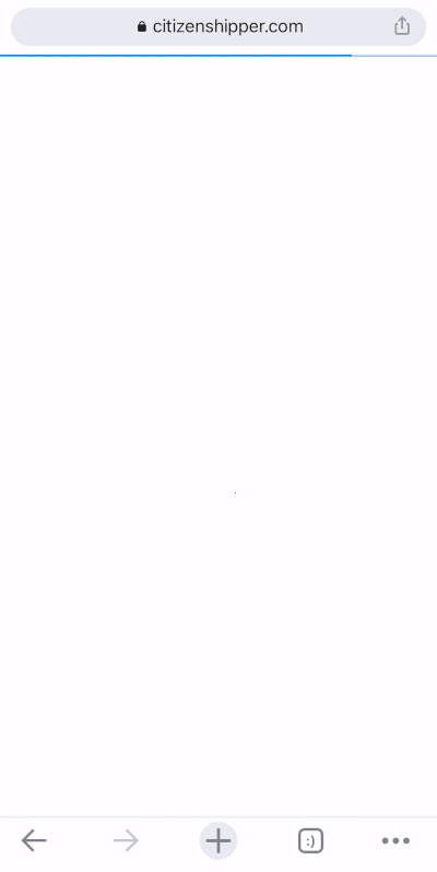
CitizenShipper triggers this walkthrough for mobile website visitors, guiding them through each section of the home dashboard and explaining what each one means and represents.
👉🏻 Check out CitizenShipper’s successful onboarding in more detail.
✅ What’s good in this example?
- Friendly and engaging microcopy.
- Well-formatted, with lists and bold text used when necessary.
❌ What’s -not really- good in this example?
- 10/10 example here 💯
Onboarding tooltips
Tooltips are small boxes of information that can be used to create engaging narratives, guide users through your product, or share tips and tricks about your features. They’re also great for explaining feature settings and capabilities in a clear and concise way.
Here’s how Trello uses them to create its product walkthrough:


As you can see, Trello not only explains the capabilities of the features and UI elements but also provides tips on how to make the most of them, including useful shortcuts.
✅ What’s good in this example?
- Informative microcopy.
❌ What’s -not really- good in this example?
- No formatting whatsoever.
- No exit button.
We can already hear you asking:
"What’s the difference between a tooltip and a guide or a walkthrough?"
Tooltips are UI elements that can be used to create onboarding flows, like guides and walkthroughs. So yes, a walkthrough or guide can be made up of a series of tooltips.
However, you can also use tooltips individually without creating a sequential flow. This means that even if you have multiple tooltips, you can trigger them separately when a user hovers over or clicks on a feature/ UI button.
Like Flourish does here:


👉🏻 Read more on tooltip examples and best practices.
Hotspots
Hotspots are eye-catching UI elements designed to grab the user's attention and encourage them to click. But they’re not just simple "click me" buttons. Like tooltips, hotspots are small info boxes —just a bit fancier and more visually engaging.
You can use hotspots to:
- Announce new features/ UX improvements
- Explain product features
- Trigger guides and/or videos
For example, Plandisc, a calendar tool, uses this hotspot to trigger a tutorial:
When the user clicks on the CTA within the hotspot, it triggers an interactive in-app guide and explains to the user how to share a plandisc.
👉🏻 Check out Plandisc’s successful onboarding in more detail.
✅ What’s good in this example?
- Non-distracting way to offer guides.
- A walkthrough created with hotspots like this allows users to focus on learning what they need rather than exploring everything at once –create your own walkthrough experience.
❌ What’s -not really- good in this example?
- A guide hidden within a hotspot might go unnoticed or unchecked at first and cause frustration or confusion in the user.
Explanatory videos
There are many ways to use videos to create engaging product walkthroughs. Here are a few approaches:
- Human-led walkthroughs: Sales or product team members guide users through the UI, explaining features and their benefits.
- Product-only videos: No narration —just screen actions that showcase features and interactions within the UI.
- Animated walkthroughs: Animated sequences demonstrating workflows and highlighting the key features, or illustrating processes step-by-step.
- Customer testimonial videos: Real users sharing how they navigate and use your product, offering relatable insights and tips.
There are even AI-powered tools that take your written transcription and turn it into an explanatory video with an avatar!
👇🏻 Here’s an example:

This is a 2.5-minute AI-generated video explaining how to utilize Trello: create boards and tasks and collaborate with other people on them.
✅ What’s good in this example?
- Great visual usage, walking the user through each step.
- Cost-effective and relatively easier to create (compared to shooting the videos with your own teams).
❌ What’s -not really- good in this example?
- Lacks engagement –monotonous tone, no facial expressions, etc.
But what happens if you put the money, time, and effort into creating your own videos?
Well, let’s see an example of that, as well.
Loom welcomes its new users with a detailed onboarding checklist –which we will examine very shortly– and then, for each feature and functionality on the checklist, they offer an explanatory video:

This is the video explaining how to record a video with Loom; there are different videos for each must-try feature on the onboarding checklist. So, in a sense, the onboarding checklist can be thought of as a walkthrough hub.
Anyway, back to the video.
This video is longer than 1.5 minutes, and there are 3 more steps with separate videos on the checklist. So it takes more than 5 minutes to complete the videos alone…
And it might not be very optimal and worthwhile from your users’ perspective 🕰️
✅ What’s good in this example?
- Very educative and detailed.
- It can be easier to understand compared to written guidance.
- Has the human touch 🪄
❌ What’s -not really- good in this example?
- It might be intimidating for the users, especially if there are a lot of videos and/or the videos are lengthy.
Onboarding checklists
Onboarding checklists are useful tools for highlighting important features, but that's not their only purpose. They can also serve as a roadmap, guiding users to understand the product better and explore its functionalities step-by-step.
Now is a good time to go back to Loom’s checklist:

As you can see here, Loom guides users through each step of using the product —from downloading Loom to recording, sharing, and tracking video engagement— all with a single checklist.
Each item on the checklist includes a brief description of the feature, along with a CTA button to the feature on the product UI as well as a link to an educational how-to video.
Since these steps follow a sequential order, each CTA remains inactive until the previous step is completed. You can’t share a video without recording one first, and you can’t record until you've downloaded the tool.
✅ What’s good in this example?
- Detailed and clear checklist steps.
- Value-providing and goal-oriented structure.
- Effective CTA usage –different CTAs for the guides and the features.
❌ What’s -not really- good in this example?
- 10/10 onboarding checklist 💯
Let’s see another checklist example from HeyGen, an AI video-generating tool:

HeyGen’s onboarding checklist adopts a unique horizontal design, breaking away from the typical top-down format. Each step highlights the tool’s key features and guides users closer to discovering its value while presenting clear value propositions.
The checklist is concise and user-friendly. It has just three steps. Completed steps dim to encourage progress and maintain motivation.
A truly creative and original approach from an innovative tool!
✅ What’s good in this example?
- Short, to-the-point, value-oriented checklist steps.
- Unique design.
- Clear and distinct CTAs.
❌ What’s -not really- good in this example?
- Nothing!
Which Products Should Utilize Product Walkthroughs?
If you’re aiming to boost user understanding, engagement, and ease of navigation, then yes, it’s a great idea to add a product walkthrough. A walkthrough helps users learn how to use your product efficiently, which is critical if you want them to see its full value right away.
Below are some common use cases for walkthroughs.
If these resonate with you, it’s time to consider implementing a product walkthrough strategy.
Product Walkthrough Use Cases
Onboarding new users
One of the most important moments in a user’s journey is the onboarding experience. Think of it this way: the first impression your product makes determines if users stay, explore, and eventually become loyal customers.
A walkthrough can simplify onboarding by guiding users through key actions they need to take. It’s especially useful for complex tools with multiple features or intricate workflows.
Here’s how Flowla, a sales enablement tool, utilizes a product walkthrough to onboard its new users and make them feel comfortable and right at home:
👉🏻 Check out Flowla’s successful onboarding in more detail.
✅ What’s good in this example?
- Very friendly and engaging tone.
- Formatted and structured information flow.
- Fully interactive steps.
- Provides reasons and motivations to utilize the highlighted features.
❌ What’s -not really- good in this example?
- There could be a “Back” button.
You can also personalize the onboarding experience by tailoring different walkthroughs for each user segment and enhancing their UX with different contextual tips.

This approach allows you to showcase features that are directly relevant to each user's unique needs and help them reach their goals faster. By aligning the walkthrough with each user’s specific use case, you’re not only adding value but also creating a smoother, more engaging onboarding journey.
💖 Liked the notion? Create your own personalized onboarding flows with UserGuiding.
Introducing new features
Even your most loyal users might overlook a new feature if they’re not directly shown where it is and how it works. When you introduce updates or add features, a product walkthrough can help ensure that users notice, understand, and adopt these changes.
Notion creates a short walkthrough with announcement modals and tooltips for its new AI feature:
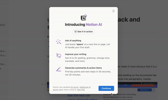
Right from the start, Notion answers the question, "How can this feature make my work easier?" before its users even have to ask.
- The first announcement modal (or welcome screen) introduces the new feature by listing its key value points and capabilities.
- The second modal covers important details about privacy, reliability, and pricing for the feature.
- The tooltips on the feature’s page provide guidance on how to start using it.
✅ What’s good in this example?
- Clear and to-the-point instructions.
- Transparent in terms of the feature’s limitations.
- Informs about the add-on options.
❌ What’s -not really- good in this example?
- No progress bar or navigation buttons for the guide part.
Improving user engagement
Do you ever notice that users don’t return after signing up?
Low engagement can often mean that users aren’t seeing enough value in your product, possibly because they don’t understand how to use it fully. Product walkthroughs can tackle this by highlighting key features, suggesting next steps, and motivating users to explore.
For example, if you create interactive guides for your relatively complex but essential features and trigger them from your onboarding checklist like aclipp does here 👇🏻
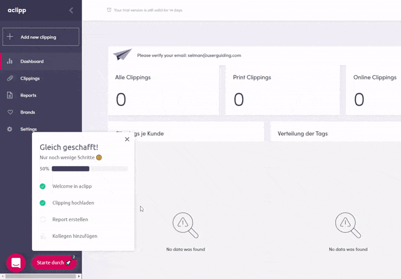
You can not only alleviate the confusion and frustration your users experience but also increase the engagement and usage rate of individual features of your product.
✅ What’s good in this example?
- Important features are highlighted on the checklist.
- Fun and engaging tone, with emojis and gifs 🚀🎉
❌ What’s -not really- good in this example?
- Could be too friendly and casual for some people (if there’s such a thing 🤔).
If you want to take the fun in your walkthroughs to the next level, you can think about integrating gamified elements into your design, as well.
Here’s how Canva uses gamification to announce its new features:

- ✔️ Moving elements
- ✔️ Real-time counter
- ✔️ Shiny doors and passages
- ✔️ Popping confetti
After this theatrical intro, Canva gathers its new feature walkthrough presentations in a checklist:

And each bullet on the checklist has a seperate presentation walkthrough going over the functionalities of the features and how to utilize them.
Like this:
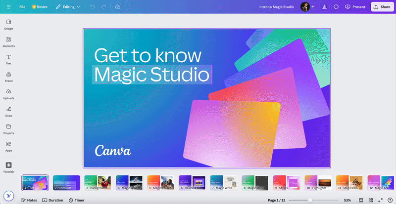
As you can see here, each slide is dedicated to one functionality/ sub feature of the new “Magic Studio”. And Canva explains how to use them with a short step by step bullet list.
✅ What’s good in this example?
- Unique and bold feature announcement.
- Good way to gather and reposit a lot of how-to information –especially for big releases like this.
❌ What’s -not really- good in this example?
- All the gamification is in the introduction, there’s nothing “fun” with the actual walkthrough.
- Checklist items are not check-able.
- Too many unrelated and “filler” images on the presentations.
Reducing support costs
A well-designed walkthrough can answer many common questions and reduce the need for customer support. Users who have access to helpful in-product guidance are less likely to submit support tickets or call for assistance.
(Which frees up your support team for more complex issues.)
❔ Very basic questions like:
- How to customize my profile
- How to integrate with other tools
- How to manage billing and subscriptions
❔ Can be answered with short tutorials, tooltips, or hotspots. However, you can answer questions related to advanced features or settings, like:
- How to export or share data
- How to customize workflows
- How to manage user permissions
All these possible user questions depend on your product type and product itself, of course. But you get the point.
Plus, you can also gather your checklists, product tours, and interactive guides in one place, like an in-app resource center. This allows users to return later and check for information when needed.
By doing so, you not only reduce potential onboarding challenges for new users but also provide a way for existing users to refresh their memories about feature capabilities.
Here’s an example resource center from GroveHR:
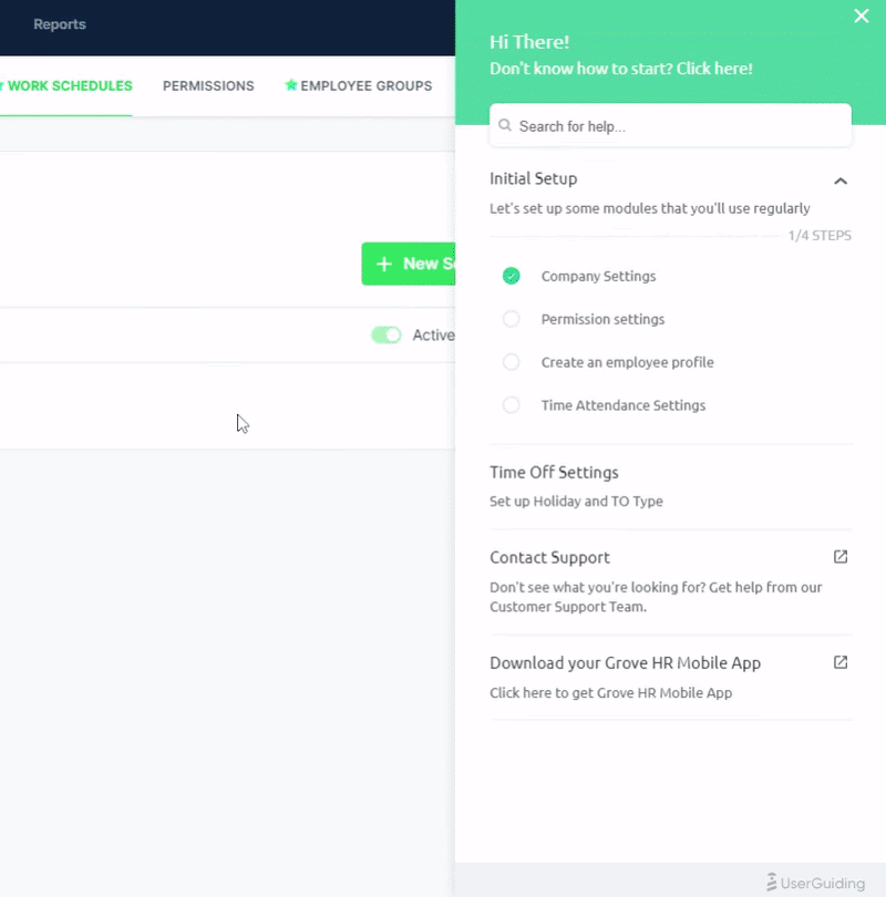
👉🏻 Check out GroveHR’s successful onboarding in more detail.
✅ What’s good in this example?
- In-app support with an organized and centralized resource center.
❌ What’s -not really- good in this example?
- Tooltip copies could be more explanatory.
- Some emojis or formatting choices on the tooltips are not supported by all browsers, which leads to design inconsistency.
Pro Tip: You can also integrate your knowledge base with your resource center and leverage your morre detailed tutorials and best practice articles there, as well.
And GroveHR does that, too!
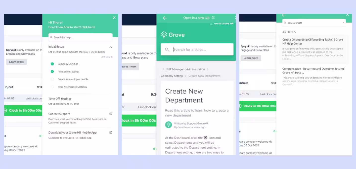
You can search for knowledge base articles in the resource center and read them without leaving the product.
🎁 Start your free UserGuiding trial to create your own knowledge base and resource centers!
📚 Read more on how to become a self-serve business.
Promoting upsells and cross-selling
If your product has various tiers or add-ons, a walkthrough can be a smart way to showcase additional features that users might find useful. By strategically integrating upsell or cross-sell opportunities into the product experience, you can increase the likelihood of users upgrading or purchasing additional features.
Here’s how Crunch, an accounting tool, achieves that:
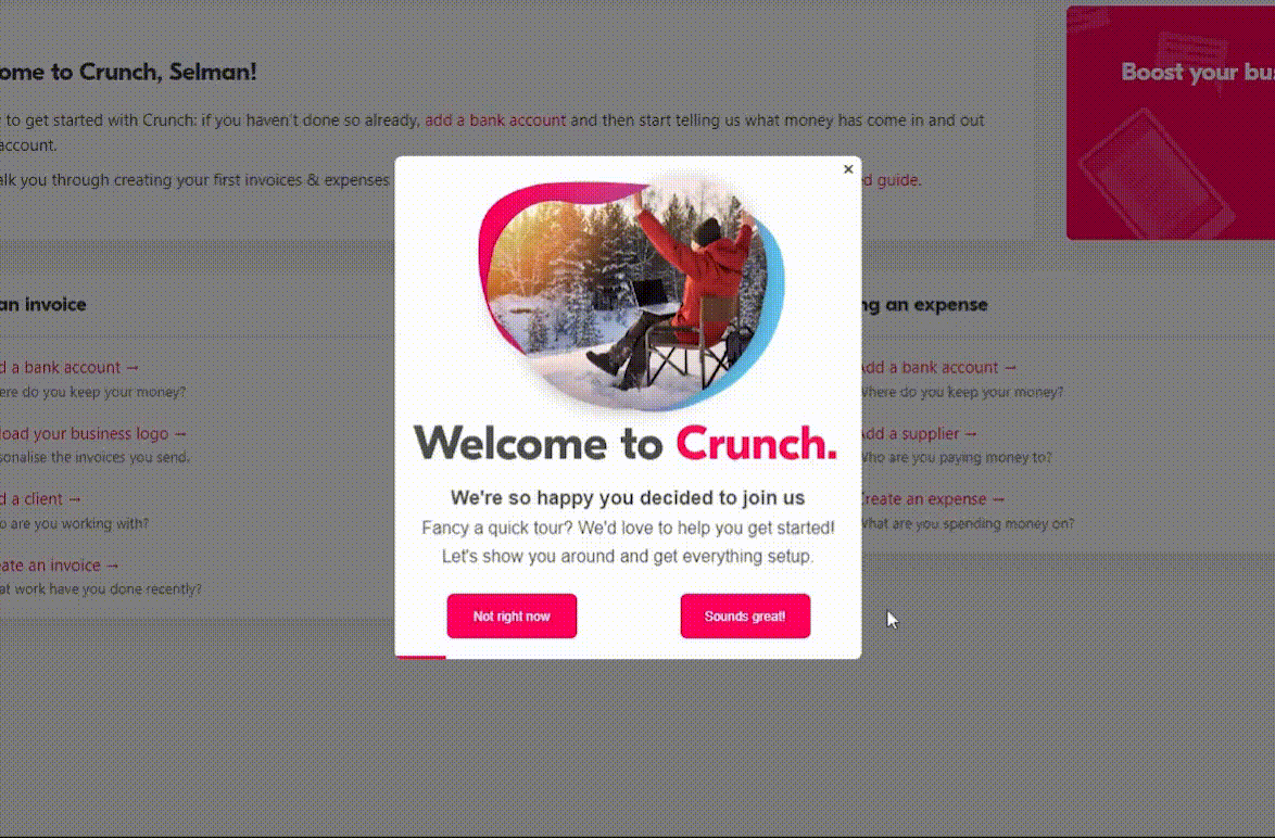
After introducing the home page, main dashboard, and chatbot, Crunch takes the user to the add-ons and upgrade pages. But it doesn’t bombard them with every single add-on option.
Instead, it simply plants the idea —like putting a little bug in their ear— letting them know there are additional options if they’re interested.
It’s a subtle nudge, not an all-out sales pitch! 🐝🐞
✅ What’s good in this example?
- Inviting but not persistent add-on promotion.
- Additional resources and links.
- Branded, well-formatted, and engaging microcopy.
❌ What’s -not really- good in this example?
- Nothing. Not a single bad practice here 🙌🏻
Crunch supports this walkthrough with announcement modals, as well:


👉🏻 Check out Crunch’s successful onboarding in more detail.
📋 Let’s recap what we’ve talked about in this section:
- 📎 Product walkthroughs can help you do many things, such as onboarding a new user or announcing a new feature and providing guidance on how to use it.
- 📎They can also help you ease your first-time users’ frustration and make them feel more confident about using your product.
- 📎 When your users know how to use your product, thanks to your walkthrough, they will be more likely to engage with your features and adopt them.
- 📎 Along with guiding and educating your users, you can also use walkthroughs to create upsell opportunities by reminding them about add-ons and premium features.
- 📎 Finally, walkthroughs can help you prevent common adoption barriers and reduce user friction. By addressing potential issues before they arise, you also lighten the load on your support team.
Benefits of Product Walkthroughs for Businesses
You can provide a structured and guided introduction to the product
Imagine walking into a museum for the first time.
To really make sense of everything you’re seeing, you need a logical path to follow —one that guides you through exhibits in a way that makes sense, maybe by geography, time period, or even climate.
That flow, carefully curated by the museum, ensures visitors get a full experience without missing any key highlights.
In much the same way, product walkthroughs provide a structured journey for new users, highlighting essential features and guiding them through the most relevant tasks.
Instead of wandering through unfamiliar menus or settings, users get a clear, purposeful path to follow, designed to make sure they see the full value of your product.
Why is this important?
You only get one chance to introduce your product to a new user, and that first impression can be decisive. From the moment they first interact with it, users are already forming opinions —about its value, ease of use, and practicality.
If they don’t see the benefits immediately, they may decide to move on before giving it a fair chance.
📌 A well-designed product walkthrough can make all the difference by ensuring:
- Users recognize your product’s value from the start.
- They understand how to use it effectively and feel confident exploring its features.
- They reach their "Aha!" moment quickly and experience firsthand how it meets their needs.
You can convert more leads into paying customers
When you deliver value to potential customers from the very start with personalized checklists, guides, and tooltips —essentially, a full-package, goal-oriented walkthrough— they hardly need to imagine how the product will fit into their workflow.
The walkthrough itself shows them exactly how it can help them achieve their own goals.
And this means user retention.
Your leads and trial users aren’t trying to escape or avoid commitment. They’re engaging with your sales reps and signing up for your free trial with a purpose. If and once they find your product valuable, they’ll stick around.
You can free your support team for more complicated tasks
Your support team can only take on so many tasks at once, and let’s face it —many support requests could be resolved with a little in-app guidance.
Product walkthroughs serve as the first line of defense, addressing common questions, like “Where do I find X?” or “How do I set this up?”. By guiding users through basic workflows right within the product, you’re reducing the number of support tickets for these easily solvable issues.
🪧 Think of it like placing signposts along a hiking trail, so hikers (or in this case, users) know exactly where to go without having to radio in for help.
Why is this important?
💡 According to studies, following the pandemic and the surge in SaaS tool usage, customer support tickets have risen by 16% across various industries.
36% of customer support teams are struggling with unpredictable workloads, making it harder for them to keep up with the increased volume.
Plus, 90% of customers consider an "immediate" response essential or very important for customer service inquiries, with 60% defining "immediate" as 10 minutes or less.
So, your goal here isn’t to make your customer success team work part-time but rather to help them manage their time and energy more effectively. They need to focus on higher-value tasks, and not get bogged down with repetitive, time-consuming questions.
Your customers’ time is limited, and so is your support team’s.
To keep both your customers happy and your support team functioning at their best, you need to streamline and eliminate the easy tasks that eat up valuable resources.
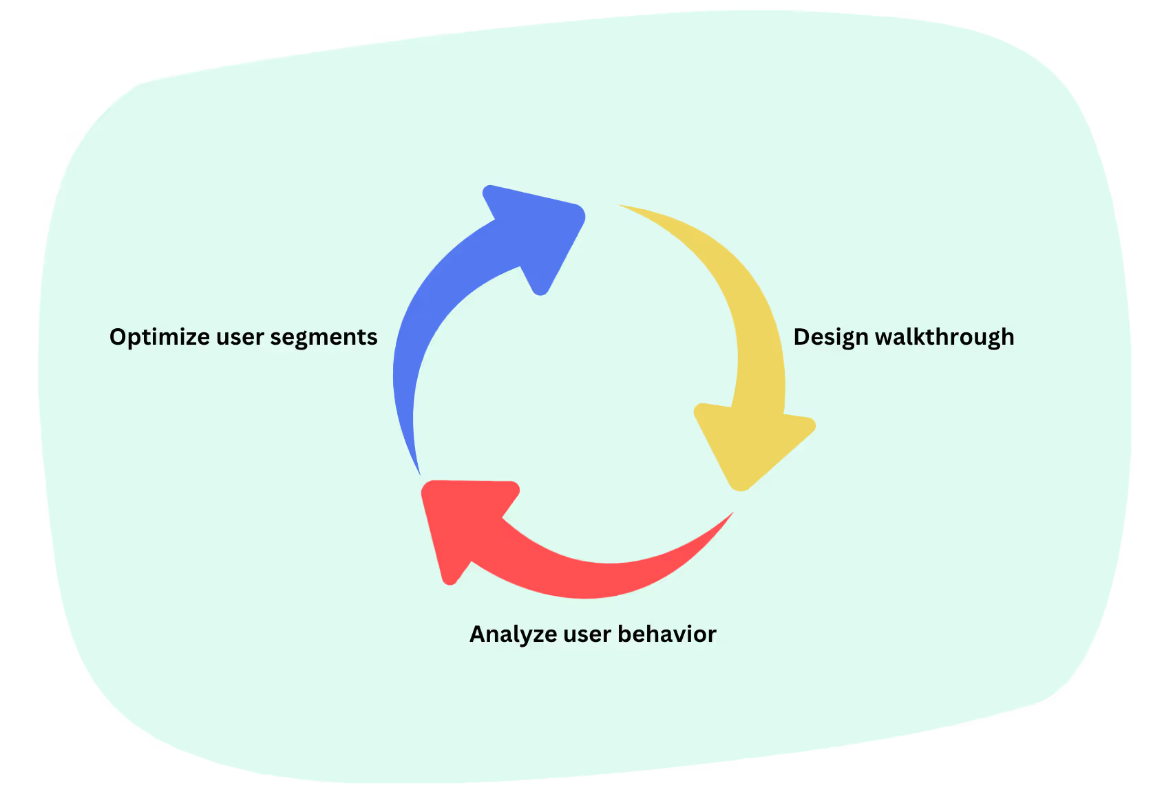
You can collect valuable user behavior data
Product walkthroughs don’t just guide users; they also gather incredibly valuable insights. Every click, skip, and completion tells a story about user behavior and helps you understand exactly how users interact with your product.
By tracking advanced analytics, like which steps users complete, where they drop off, and which features they revisit, you gain a detailed look into different user segments and their specific needs.
User segments are key to crafting goal-oriented product experiences, like personalized checklists and walkthroughs. Then, by analyzing how these personalized experiences are performing, you can assess how well you understand your audience and work on your user segments and personas again.
It's a dynamic loop —design, analyze, optimize, and repeat.
Each cycle leads to more insightful, data-driven improvements to your product.
Why is this important?
Thinking you know your users doesn't always mean you really know them.
To make sure you're on track, you need to maintain ongoing communication through surveys and feedback forms. But that’s not all —monitoring how they behave within your product is just as important.
And product walkthroughs can give you key insights into user behavior and usage patterns.
📌 By analyzing your walkthrough engagement, you can see:
- Which users are interested in which features
- Which users need additional support
- Which users could benefit from premium features or add-ons
📋 Let’s recap what we’ve talked about in this section:
- 📎 A product walkthrough helps you shape the first product experience of a new user, ensuring that the initial interaction is both positive and impactful.
- 📎 When a trial user or lead immediately sees the value in a product and feels it can help them achieve their goals, they’re more likely to convert into a paying customer.
- 📎 Your support team likely has a heavy workload, and you can lighten it significantly by using walkthroughs to address minor issues.
- 📎 Walkthroughs can help you spot user patterns and align your product with their evolving needs.
How to Create Effective Product Walkthroughs in 5 Simple Steps
Define the path to the “Aha” Moment
The “Aha!” moment is when users perceive enough value in your product to decide to keep using it. In the dreamland, this occurs early —such as right after users see the main dashboard or complete their first key action (e.g., creating a task in a project management tool).
However, in the real world, achieving this moment often requires a series of actions, time, and a little more effort both on the user’s and your end.
Users want to be sure a product is worth their time and money.
So, your goal is to identify what actions or features clearly demonstrate the product's value to them.
You can do that by:
Detecting user needs, pain points, and desires
In order to present your product as a valuable solution to a potential user, you first need to know what they struggle with and what they try to achieve. Otherwise, you cannot really hit the pain point and prove your relevance to the user.
You can utilize:
- Onboarding surveys,
- User interviews, and
- Behavior analytics.
Here’s an onboarding survey example from HubSpot:

Once you have gathered the information, you need to group users based on shared characteristics and create user personas. Each persona should represent a different segment with unique motivations and needs.
(We’ll talk about user personas and segments in more detail in just a moment.)
Finally, you need to align the relevant product features with each persona. If each user persona has a slightly different use case and need, it’s only normal that they’ll find different features valuable, right?
Define the barriers to achieving the “Aha” Moment
You know what can really impress a user and turn them into a paying customer now. Yet, it’s still not enough to ensure the user actually reaches to their “Aha!” moment.
There can be bumps on the road… Or, barriers 🚧
Product adoption barriers are obstacles that cause friction or confusion, hindering users from completing key actions that deliver value. These barriers can range from unclear onboarding instructions to confusing UI elements.
You can see what kind of problems your users are facing and whether or not they are getting any value from your product by:
Monitoring value metrics
Value metrics are specific actions or milestones that indicate a user has gained meaningful value from your product. These metrics help you refine the user experience by showing which actions correlate with positive outcomes.
Through these metrics, you can monitor user engagement and success.
Some key value metrics to track for this:
- Feature adoption rates
- Time-to-value
- Drop-off rates
- Task completion rates
- Feature usage frequency
- Engagement depth
Low trends in these metrics can reveal significant adoption barriers. If users aren’t completing key actions, or if the actions they take aren't contributing to the desired outcomes, it’s a sign that something’s wrong in the experience.
Segment users for a personalized experience
Personalization is essential for a walkthrough to be effective; without it, the experience can easily feel generic, and worse —annoying.
An impersonal walkthrough can lead users to disengage, which defeats the purpose.
Turning back to user segments and personas, it's essential to recognize that users don’t just have different goals and pain points —they often come from varying technical backgrounds and occupy different positions within teams.
Even if two users are trying to achieve the same goal, their product usage patterns can vary significantly due to their distinct expertise and experiences.
This means they may require different walkthroughs tailored to their needs.
➡️ For example, a user with limited technical knowledge and no prior experience with similar tools would likely appreciate a walkthrough introducing the basic features.
➡️ On the other hand, a power user who has years of experience with similar products might need a walkthrough that skips the fundamentals and instead highlights advanced features, shortcuts, or time-saving tips.
Let’s go over Zapier’s onboarding survey and see how they segment their users and offer a personalized experience 👇🏻


When you first sign up, Zapier begins by asking questions about your team, company size, and your specific role, as well as your prior knowledge and familiarity with automation. Some of these questions are aimed at personalizing your experience with different levels of guidance.
Others are for Zapier to help you find the best plan for your company and team size, meaning, they promote different features and add-ons to different user segments.
Later on, Zapier continues by asking questions about your use cases and goals:


As you can see here, Zapier does not ask questions for the sake of asking questions. They really go deep into the details of what users have in mind, what they need, and what they want.
So, Zapier asks not 1, not 2, but 3 questions to segment you based on your needs and goals.
Two of these questions are shown here, while the third is about the tools you use in your work environment. This lets Zapier personalize your templates based on the tools you already rely on and what you specifically need to automate.
✅ What’s good in this example?
- Segmentation based on several factors (user needs, experience, team, …).
- Detailed questions to understand user needs.
- Transparency for what the question is for (plan recommendation, template personalization, overall product experience personalization).
❌ What’s -not really- good in this example?
- The survey is lengthy, and we don’t know how many questions are left.
Design the flow as an overall experience
To make an effective walkthrough, each step should feel like part of a continuous, purposeful experience. Each UI interaction and feature introduction should be linked to the others and create a seamless flow rather than a series of isolated tips or instructions.
Think of this like a storyline.
Just like a story builds from one scene to the next, your walkthrough should carry your users from the basics to the more advanced features, in a meaningful manner.
It shouldn’t leave users stranded mid-process, unsure of what’s going on or what’s next. Or, it shouldn’t bore users with irrelevant information that doesn’t add value to their experience.
📌 A good product walkthrough is:
- Clear: It tells the user exactly how to use the features and doesn’t do things such as relying on unexplained jargon.
- Concise: It is comprehensive but as short as possible.
- Engaging: It consists of meaningful and graphically appealing steps and uses appropriate language.
- Skippable: It offers guidance, not forces it.
Create and launch your walkthrough
Whether you opt for explanatory videos, welcome screens, hotspots, checklists, or interactive guides; it’s most likely you’ll need a 3rd party tool. Of course, you can ask your DevOps team to create your walkthroughs from scratch, but then you’ll rely on them for every small update.
And that could slow down both your walkthrough optimization and your developers’ other tasks.
So, if you have the resources, using a no-code tool is a great option.
It allows you to quickly respond to user behavior, pattern changes, or feedback without waiting for development cycles, enabling faster adjustments and keeping the user experience fresh.
Let’s go over some tools you can adopt and see which one is right for you 🛠️
Product Walkthrough Solutions
UserGuiding -all-in-one tool
⭐ G2 Score: 4.7 (419 reviews)
UserGuiding is a product adoption tool that helps you create engaging and interactive product experiences for your users. With UserGuiding, you can create:
- Onboarding checklists,
- Product tours,
- Interactive guides,
- Tooltips, hotspots, and announcement modals,
- Resource centers, and
- In-app surveys
To use right within your product –and without writing a single line of code!
UserGuiding allows you to apply segmentation to personalize your materials and monitor engagement through analytics dashboard.
Moreover, with UserGuiding, you can create standalone knowledge bases and product updates pages to provide value to your users outside of your product, as well.
So it’s really an all-in-one tool!
Here’s an example walkthrough created with UserGuiding:
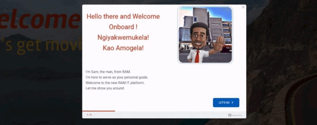
Ram, a leading courier service in South Africa, offers a unique and engaging onboarding flow through their character, Sam. By integrating Sam’s warm and personable tone, Ram strikes the perfect balance between automation and maintaining a human connection with users/employees.
👉🏻 Check out Ram’s successful onboarding in more detail.
✅ With this walkthrough, Ram ensures:
- Engaging and interactive in-app education
- Higher feature activation and adoption
- Automated and standardized employee onboarding
Sounds good?
🚀 Start your free trial and improve your product experience with UserGuiding today!
Appcues -all-in-one tool
⭐ G2 Score: 4.6 (324 reviews)
Appcues is another product adoption and user onboarding tool that enables you to create interactive flow. It allows you to create welcome screens and in-app tutorials, and collect user feedback through surveys.
Here are some examples of what you can create with Appcues:

So, it offers nearly the same features as UserGuiding but at a higher price point.
However, Appcues enables you to create flows for your mobile applications, as well, which UserGuiding currently does not support.
If you need cross-platform onboarding (web and mobile) and have the budget to accommodate the higher costs, Appcues could be the right choice for you.
Tango -product tours
⭐ G2 Score: 4.8 (184 reviews)
Tango is a tool designed to help you create interactive product tours by capturing steps directly from your browser/app through its extension. It records your actions and turns them into a tutorial that can be edited afterward.
You can enhance the walkthroughs by adding descriptions, explanations, and notes to give more context to users. Additionally, the tool allows you to incorporate screenshots and links into your guides.
Here’s an example product tour created with Tango:
Scribe -process documentation
⭐ G2 Score: 4.8 (219 reviews)
Scribe is another tool that helps you create how-to guides and process documentation through its extension. Just like Tango, Scribe captures your actions on web or desktop and then turns it into a customizable guide.
Also, with built-in sensitive data redaction, Scribe helps you stay compliant by automatically blurring confidential information like employee or customer data on screenshots.
Here’s an example guide created with Scribe:

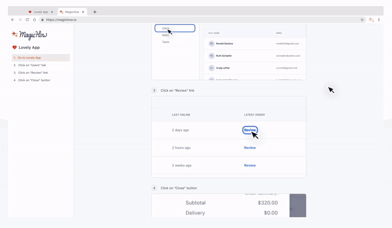
MagicHow -step-by-step guide creation
MagicHow offers a budget-friendly alternative to both Tango and Scribe for creating interactive guides. Using a similar process, you start by activating the browser extension and recording your steps; MagicHow then automatically generates a step-by-step guide.
Although it doesn’t automatically redact sensitive information, it allows you to easily select and hide confidential details while creating the guide, giving you control over privacy.
Here's a sample process for creating a guide with MagicHow:
📋 Let’s recap what we’ve talked about in this section:
- 📎 In order to create a successful product walkthrough, you need to define what success means (both for your users and thus your business).
- 📎 Understanding what brings your users to their “Aha!” moments and helping them appreciate the value you offer is the key here. Then, you also need to find what keeps them from getting there -a.k.a. detect the adoption barriers.
- 📎 Each user has unique expectations from your product. To maximize engagement and retention, you should create user segments and deliver tailored value to each group.
- 📎 There are tools that can help you with all that! some text
- If you're on a budget, consider a screen recording and guide-creation tool like Scribe.
- For a more robust solution with features like analytics, segmentation, feedback collection, and interactive guide creation, try a product adoption tool like UserGuiding.
Perfection in Product Walkthrough: Common Mistakes and Their Solutions
Walkthrough mistake #1: Overwhelming users
Due to their inclusive nature, product walkthroughs often run the risk of becoming too long, too generic, or even too specific sometimes.
When trying to highlight all the essential features of your product, there's a risk of overloading the walkthrough with unnecessary details. Not only can this length overwhelm users, but it also risks being too generic, as not all features will be relevant to each user's use case.
On the flip side, if you focus on just a few key features to make the tour more relevant, you might get too detailed, diving into specifics that aren't necessary for all users.
Like Smartcat’s old 23-step product tour…

Solution: Focus on specific goals
The best approach is to tailor the walkthrough to each user's specific needs, segmenting based on their goals, experience level, and the features they're likely to use.
Keep it clear, concise, and, most importantly, goal-oriented.
We've already discussed the importance of identifying the key actions that lead users to their "Aha!" moments and recognizing the adoption barriers. Now, it's crucial to focus on designing a useful, streamlined flow.
To achieve this, you can utilize checklists and separate guides or feature-specific walkthroughs. These methods help you break down the information into digestible chunks and make it easier for users to follow.
Try to keep each step concise and focused, with a clear path that leads the user from one key point to the next. Ideally, each step should bring the user closer to understanding a feature and seeing its value—ultimately guiding them toward their "Aha!" moment.
Here’s a good example from Equals, a spreadsheet tool:
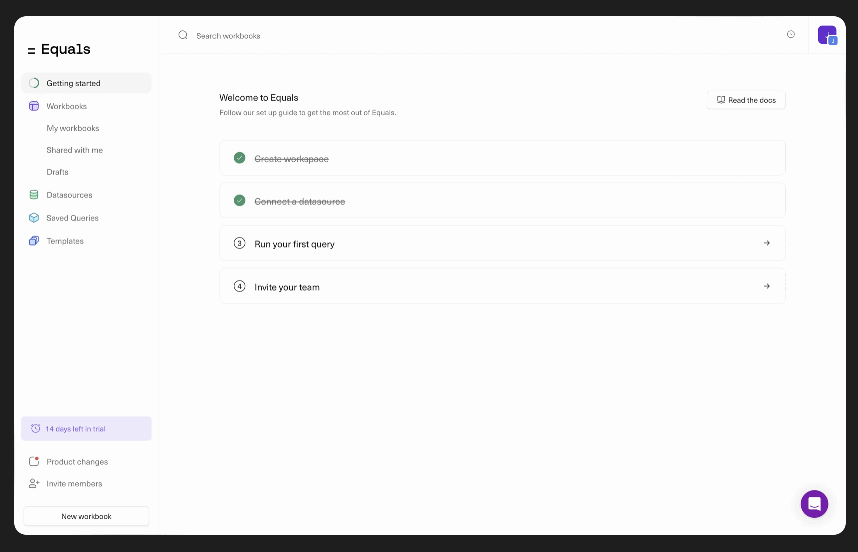
Instead of overwhelming users with a lengthy, 20-step walkthrough, Equals offers separate walkthroughs for each feature, neatly organized into a checklist. This approach allows users to feel a sense of accomplishment as they complete each item, crossing off tasks along the way.
The best part is that users have the flexibility to progress at their own pace. They can choose when to complete each item and pick up where they left off, eliminating the frustration of having to start over.
If they miss something during the first pass, they can easily return to the specific feature they didn’t fully grasp rather than trying to search through a long, continuous walkthrough. This keeps the experience more manageable and less overwhelming.
✅ What’s good in this example?
- Goal-oriented and value-proposing checklist items.
- Short, clear, and interactive instructions.
- Fun animations (striking out the items, end-of-tour celebrations).
❌ What’s -not really- good in this example?
- Nothing. A perfect feature walkthrough triggered from a perfect checklist.
Walkthrough mistake #2: Neglecting clarity and consistency
Disjointed design, inconsistent language, or a confusing user interface can make the walkthrough feel unpolished and cause users to struggle with even the most basic tasks.
This is a common problem long and interactive walkthroughs face, especially if they require the user to complete a lot of actions across different subpages or dashboards. This disconnect can disrupt the onboarding flow and leave users feeling frustrated or lost.
Interactive and story-driven walkthroughs are certainly engaging, but it’s important not to lose sight of their primary goal: education.
Solution: Focus on design and copy
To improve clarity and consistency, you need to focus on cohesive design elements and a clear, user-friendly language. Try to use a uniform color palette, familiar terminology, and straightforward copy throughout the walkthrough.
Your language and tone are as much important as your design.
Clear and concise language, as well as a consistent design, ensures that users can focus on understanding the product without distraction, which can build confidence and foster a positive experience.
Example time ⏰
We talked about Smartcat's previous lengthy product tour, but it wouldn’t be fair not to highlight how they’ve improved it, right?
Here’s how they onboard their new users and explain to them how to use the product now:
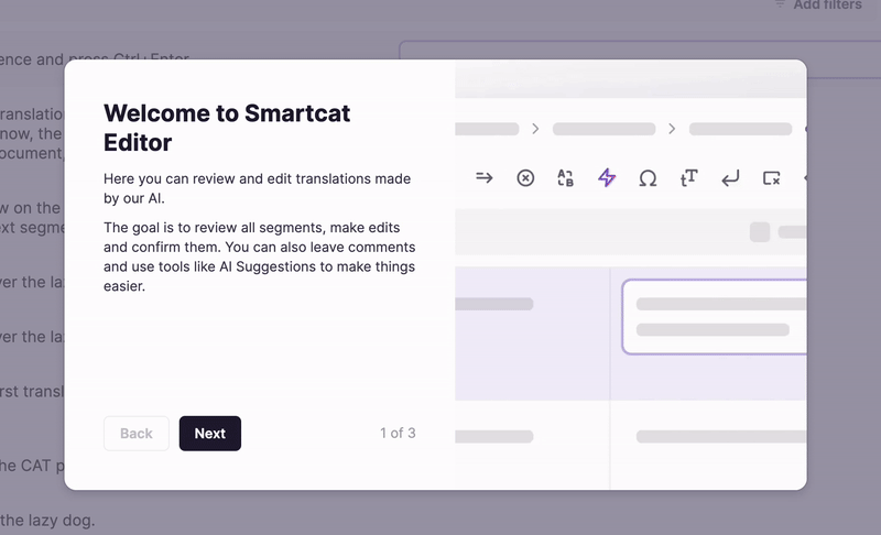
As you can see, instead of one extensive product tour, they now offer separate walkthrough screens in which they explain the main tools and buttons of each feature very shortly.
In the copy section, the walkthrough provides clear, step-by-step instructions on how to use each feature. While on the right side, it visually highlights where the user can find the corresponding feature or button needed to complete the action.
You’re greeted with a similar walkthrough screen on each feature page, ensuring both clarity and consistency in design and content.
✅ What’s good in this example?
- Clear and easy-to-understand instructions.
- Focused on only the main and most valuable features.
- Visuals to spot the placing of the explained feature in the UI.
- Navigation buttons and a progress indicator.
❌ What’s -not really- good in this example?
- There could be more formatting in the copy (lists, numbered steps, subtitles, bolds, etc.).
Walkthrough mistake #3: Ignoring user feedback
User feedback provides essential insights into what users find confusing or helpful.
Feedback is crucial for understanding whether your users like your features and if they can actually use them. But it’s not just about features; feedback is also essential for evaluating the effectiveness of the support materials you create, like walkthroughs and tutorials.
Without user input, it's challenging to know whether your walkthroughs are delivering the right value, addressing pain points, or guiding users toward their goals effectively.
It’s common to forget that creating support materials alone doesn’t solve user problems.
Even if you’ve designed a walkthrough to address confusion, you need to follow up by gathering feedback. Without this feedback loop, your support materials may not be addressing the issues as effectively as you think.
Solution: Gather feedback to identify pain points with the walkthrough itself
The solution to this problem is as easy as pie: collect feedback!
You can incorporate feedback mechanisms like in-app surveys, post-walkthrough ratings, or a quick “Was this helpful?” option after your walkthrough steps.
Gathering real-time insights helps you identify pain points, areas of confusion, and even highlights what users appreciate most about the walkthrough. This feedback can later inform design improvements and content adjustments to better meet user needs.
Here’s an example onboarding satisfaction survey created with UserGuiding:

👉🏻 Try UserGuiding for free 👈🏻
📋 Let’s recap what we’ve talked about in this section:
- 📎 Keep your walkthroughs short and focused.
- 📎 Maintain consistency and clarity in your design and copy.
- 📎 Collect user feedback about your walkthroughs and other product experiences, too.
Product Walkthrough Examples for Inspiration
Remote’s Walkthrough
Remote is an HR and employment solutions tool that lets you manage hiring, payroll, and HR tasks all in one place. Product tours begin even before users register for a free trial or book a demo with Remote.
Here’s what it looks like:
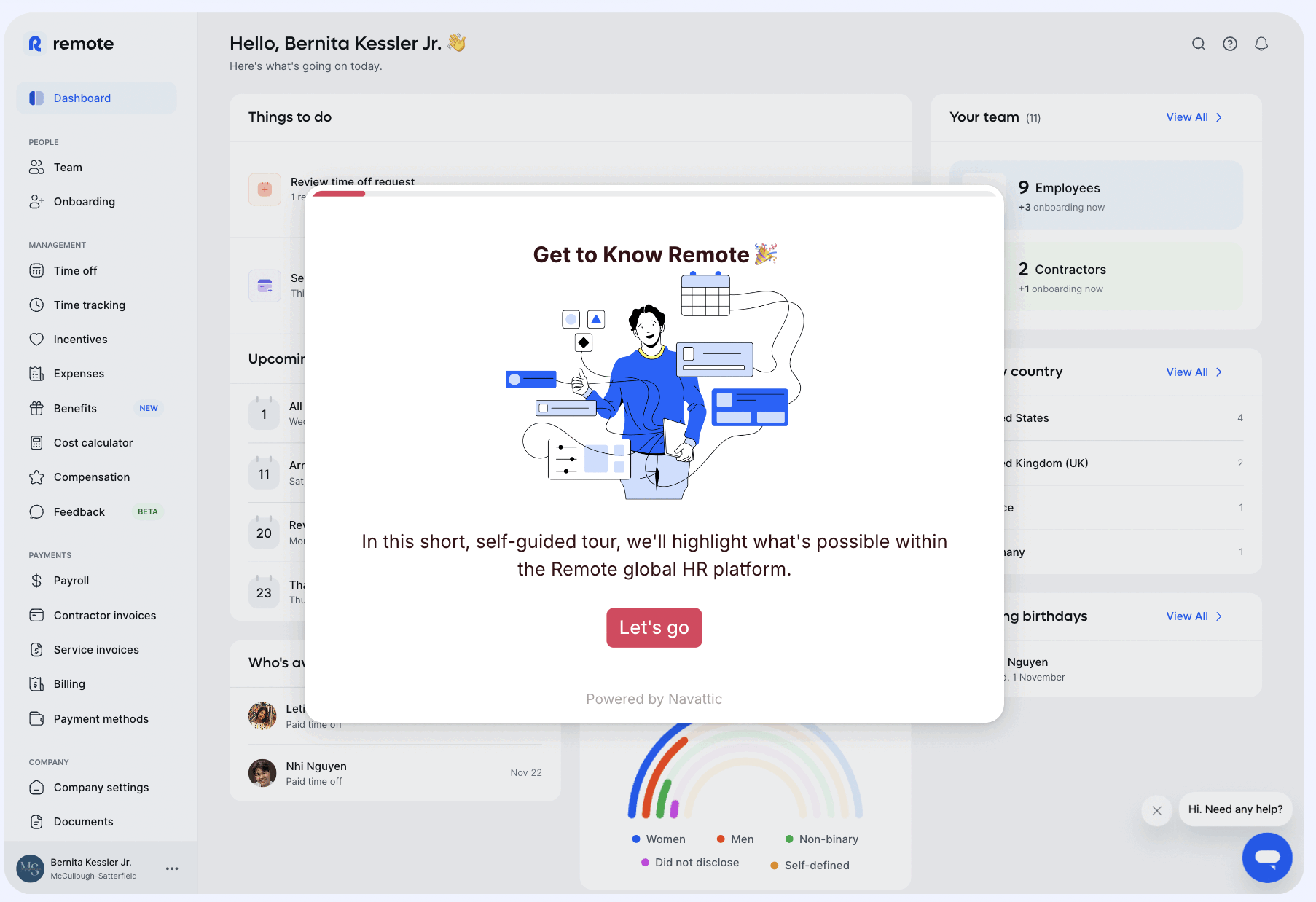
Remote’s product tour begins with a warm welcome message and leads users through 10 steps introducing key features, ending with a congratulatory screen and a CTA to book a meeting.
Since this tour appears on the product’s website, it’s designed more as a demo, focusing on showcasing each feature's value and potential use cases rather than detailed instructions or UI navigation.
Still, it effectively contextualizes each feature within the product’s interface, giving potential users a sense of how the features function in practice.
Here’s how the actual product walkthrough looks once you register:
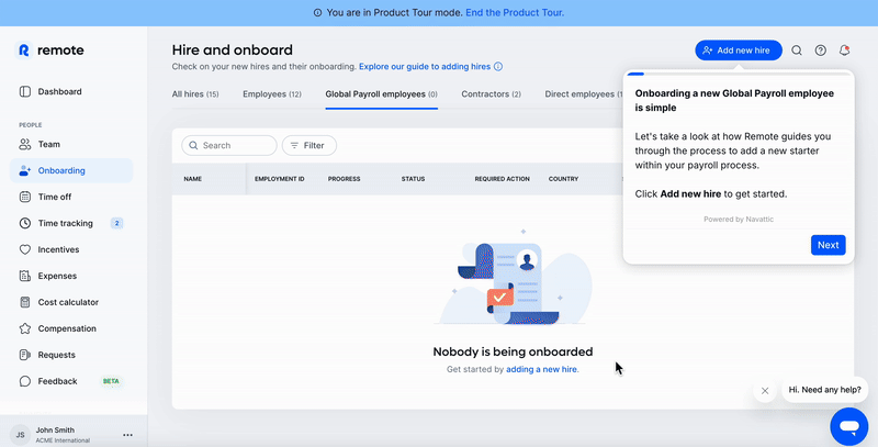
Remote keeps a warm, conversational tone throughout its tooltips, creating a narrative that guides users seamlessly from one step to the next. This approach makes the walkthrough feel like a continuous journey.
By strategically using unfinished sentences and ellipses (...), Remote adds a touch of suspense and flow and gives users the sense that there’s more to discover at every step.
To ensure clarity in more detailed tooltips, Remote also highlights the main points in bold so that users can easily grasp essential information.
For features that are less intuitive, Remote uses real-world use cases and scenarios to help users understand their value and practical applications. This strategy allows users to envision how the features would apply to their specific needs.
Additionally, Remote includes capability details —such as the number of countries covered in its global payroll tool.
✅ What’s good in this example?
- Different walkthroughs with different purposes (demo and product adoption).
- Value-loaded, engaging, and clear instructions.
- Well-structured and formatted copy.
❌ What’s -not really- good in this example?
- There’s a progress bar, but the user doesn’t know how many more steps still await them.
- Neither of the tours is interactive; they both rely on the user to learn and memorize the steps/instructions.
- Although the copy is value-loaded and engaging, the tour is still too long and can be overwhelming for some users.
Salesforce’s Walkthrough
Salesforce is a cloud-based customer relationship management (CRM) platform that helps businesses manage sales, customer support, marketing, and analytics from one integrated system.
Salesforce offers a very detailed service tour with 4 chapters of information and 4 personas:

At the beginning of each chapter, Salesforce provides a general explanation and value proposition, often incorporating customer success stories and statistics to highlight the impact of its features. Following this introduction, key features and their corresponding value propositions are outlined separately:

Then, we have the actual product tour:
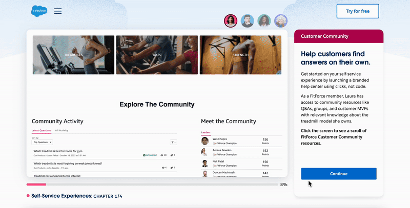
While walking through the actions on the screen, the right panel provides step-by-step explanations and additional details about each feature.
✅ What’s good in this example?
- Very educative and detailed.
- Fun and engaging learning experience with all the personas.
- Going over a real company’s use case and UI makes it easier to understand the features.
❌ What’s -not really- good in this example?
- The length and structure of the tour might intimidate users about the learning curve of the product (it feels like a course you need to study…).
- The example company and scenario might not resonate with some users.
UserGuiding’s Walkthrough
UserGuiding is a product adoption and user onboarding tool that enables you to create interactive and personalized product experiences for your users.
Because it’s a “product walkthrough” tool, its product walkthrough should be a good example, right? Let’s see how it is:
We’re greeted with a welcome screen that asks us whether we’re interested in the functionalities (in-app product experience features) or capabilities (analytics, segmentation, integrations, etc.):

If you choose the first option and want to learn more about the functionalities, UserGuiding asks you about your use case:

UserGuiding is an all-in-one tool that offers a range of functionalities and capabilities, catering to a diverse user base with varying needs and goals.
To ensure users get relevant value right away and avoid overwhelming them with features that don't apply to their use case, UserGuiding employs a quick survey followed by tailored walkthroughs, each focusing on different product features.
Here’s how the “survey users and get feedback” tour goes:

With the welcome modal to the tour and the final modal about the customization and configuration information, the tour ends in 5 steps.
It’s short, to the point, interactive, and instructional.
Now, let’s see an example tour from the capabilities.
Assume you’ve clicked on the second option and are curious about the capabilities of UserGuiding; you get this screen first:

Each capability triggers a different tour so UserGuiding offers a personalized and segmented experience here, as well.
Let’s click on the “Themes and Design”.
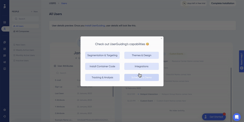
Again, in less than 5 steps, we know where is the themes feature and what we can achieve with it. Instead of making the tour longer and explaining every possible theme customization through tooltips and a mock design, UserGuiding opts for a link to one of their educational videos.
✅ What’s good in this example?
- A very detailed segmentation and personalization strategy.
- Short and goal-oriented tours.
- Fully interactive steps.
- Feature introductions and capability summary modals in each tour.
- Incorporation of additional resources, such as videos.
❌ What’s -not really- good in this example?
- Would it be biased to call it a perfect example 🤔
Anyway…
You've already experienced 2 walkthroughs and explored a significant portion of the platform. Now, why not dive in and try creating your own personalized, interactive walkthroughs?
💬 Create your UserGuiding account.
Poorly Executed Product Walkthrough Examples
You might design a stellar onboarding checklist and guides packed with engaging tooltips, visuals, and dynamic CTAs. However, small execution errors —such as poor placement of elements or a disjointed logical flow in announcement modals— can derail even the most carefully planned walkthrough.
You’ll see what we mean by that with the examples, so let’s get to them 🏃🏻
PostHog’s Walkthrough
PostHog is an all-in-one tool for product developers that offers functionalities for product analytics, session replays, and so much more.
And here’s the screen that welcomes you when you first enroll in the product:

As you can see (or not really see) PostHog offers a 7-step guide to get started with the tool and its features. Unfortunately, this guide is tucked away on the right panel, with no prominent pop-up modals or pulsating tooltips to draw your attention —relying solely on sharp observation to spot it.
Once discovered and clicked, it reveals a well-structured checklist highlighting features designed to guide you closer to your “Aha!” moment. Here's what it looks like:

Each of these items takes you to the relevant feature page, explaining how to use the feature, what elements to look for on the UI, and what those elements mean. Here's an example:

So, PostHog provides a wealth of valuable information and contextual guidance through its checklist and annotated product screenshots. However, the benefit of this guidance is only realized if the user manages to locate the checklist in the first place…
⚠️ What lesson to learn from this example?
- DO NOT hide your checklists and guides on the UI.
- DO inform the user about a tour/onboarding checklist upon their sign-up and then let them decide whether or not they want to take the tour or complete the checklist.
Clay’s Walkthrough Email
We’ve mostly focused on in-product walkthroughs since they are the most common type. However, it's also possible to share your walkthrough materials, such as checklists, guides, and explanatory videos, via email.
That’s what Clay, a sales outreach tool, does here:

In this onboarding email, Clay highlights its value proposition and includes an educational video that guides users through the product, showcasing key features and their benefits. Along with this, it provides a "checklist" to encourage users to explore the tool's capabilities step by step.
However, the checklist is misleading: although it features checkboxes, they are not interactive or clickable. This makes it feel more like a static list rather than an engaging, actionable element, which can be disappointing for users expecting an interactive experience.
⚠️ What lesson to learn from this example?
- DO NOT create the illusion of interactivity.
- Do avoid using checkboxes unless they are functional. Instead, consider using emojis, bullet points, or numbered lists —anything that visually organizes the information without creating false expectations of interactivity.
Who | What to follow to stay up-to-date
Wes Bush
Wes Bush is the founder of ProductLed and the author of the bestselling Product-Led Growth: How to Build a Product That Sells Itself. He also works as a PLG strategy consultant.
You can follow him on LinkedIn, explore his blog (ProductLed Academy), and listen to his podcast (ProductLed Podcast) to stay updated on the latest PLG strategies and product-led design insights.
Ramli John
Ramli John is the founder of Delight Path, a product onboarding consultancy for B2B startups. He is also the bestselling author of Product-Led Onboarding and offers courses and consulting on onboarding strategies.
You can follow him on his website, LinkedIn, and X (formerly Twitter) to stay up-to-date on the latest trends in product onboarding.
To Wrap Up…
By now, you’ve probably realized that designing a great product walkthrough isn’t as simple as it seems —there are tons of little details to consider, as this 10,000-word article (yes, we know, it’s a lot!) probably showed you.
But don’t worry, you’ve got this.
You now know what to focus on, what works, and what to avoid.
The course is over, and it’s time to put all this knowledge into practice. Go ahead, build those engaging walkthroughs, and make them as awesome as you’ve learned they can be!
Frequently Asked Questions
What is a product walkthrough?
A product walkthrough —or product tour— is a tutorial that shows users where features are located in the UI, how they work, and what capabilities they offer. It can take the form of a video, a set of UI modals like welcome screens, or interactive tooltips. The core purpose of a product walkthrough is to onboard users by helping them understand how to use the product effectively. However, they’re also crucial for improving user engagement and retention.
How do you make a good walkthrough?
To make a good product walkthrough, focus on clarity, simplicity, and personalization. Begin by identifying your users' goals and tailor the walkthrough to their needs. Keep instructions concise, provide real-time feedback, and maintain a smooth, engaging flow. Use a mix of tooltips, interactive elements, and helpful visuals to guide users step by step. Don’t forget to gather feedback and adjust your walkthrough as necessary to ensure it meets user expectations and effectively drives adoption.

.png)


