Here's a shocking stat for you.
It takes less than a second for users to decide whether they like your website or not.
And that is a pretty solid reason to consider some drastic measures like, yep, you guessed it: website redesign.
A website redesign can take a long time to implement, give results, and convert customers. Still, it is an essential process to get the attention of your ideal customers.
Not convinced? Here's another stat.
88% of your website visitors won't come back after having a poor experience with your website.
Now that we're on the same page (😏), let's talk about:
- What website redesign is,
- Why you might need to redesign your website,
- The holistic view of the entire website redesign process, and
- Tips to ensure the success of your website redesign
Let's dive right in.
What is Website Redesign?
Website redesign is a process of website enhancement to improve user experience to consequently engage more with target customers thanks to decreased friction.
A typical redesign project can make changes in the most visible parts of the UI, like visual elements and color schemes, in more functional parts, like usability and accessibility, or both. The design phase for a redesign project from scratch can take 30-90 days or more, depending on the project.
Why you might need to redesign your website
There is solid evidence that suggests a website redesign can increase your business value.
From adding value to your marketing efforts to improving your online presence by increasing search engine rankings and more, a redesign project promises a lot.
But there are three main reasons why you might need a redesign for your website.
1- Reparation 🔧
Some reasons why you might want to redesign your website for reparation could be outdated content or interface, not enough responsive design of website pages or elements, and most importantly, the website being too slow.
Keep in mind that more than half of your web visitors will leave your website if it takes longer than 3 seconds to load.
Similarly, 81% of users get a bad opinion of a business if its website isn't updated or features outdated design.
2- Optimization 💡
You might need a website redesign if you think you can use a better user journey or if you want better search engine rankings and more online presence.
Along with a good SEO strategy and the contributions of a content marketing team, an optimization-focused redesign process can work miracles in reaching target customers and even sales.
3- Rebranding 🔃
Think your website needs a makeover after some changes to your market strategy, company culture, or simply the color palette change of your brand logo? Then you might need to start a rebranding-oriented redesign process.
Such a redesign strategy isn't rare either; Instagram, YouTube, and many other big companies are among rebranding redesigners.
There can always be a different reason behind your redesign decisions; what matters the most is that you know how to do it right.
The Website Redesigning Process Explained End-to-end
Like custom website design from scratch, a redesign project can have its own important details, high-focus areas, and difficulties.
Still, we can map out a rough common roadmap for a high-success website redesign process.
1- Revise your old website
"Why do we need a website redesign?" is the first question you should be asking to avoid misunderstandings and miscalculations that can take you to square one in the long term.
If you have an in-house developer team and time in your hands, utilize them in searching for elements, copy, pages, or other items that might be creating a problem. If not, leverage your entire employee base to make sure there is no crack or nook unchecked.
One good way of proceeding with this step is to include your user base in the process.
Give them the chance to give you feedback on your website and feel like a part of the team for the rest of their customer lifecycle.
Two birds, one stone 😎
2- The ideation stage
If the prior step ran smoothly, now you have a list of problems with your website, or areas you can be performing better at in terms of user experience and user journey.
Bring it in team; time to brainstorm.
There might be pages of problems or just a couple; it doesn't matter. What's important is to find solutions to each item on the list while also minding the holistic user experience.

You could solve each problem with the perfect solution ever, but if they don't add up in a comprehensive way, you could need to take a step back and think again.
3- Drafting and early prototypes
When the ideation process is fruitful, you'll have enough material to start coming up with actionable drafts. And with enough drafts, you will be able to create the early prototypes.
This stage of the redesign process is especially meaningful as it creates the base on which you will be working on for the coming month(s). Naturally, any problem should be eliminated at this stage as going back is way harder and costlier once the development starts.
But there is a way to decrease the error rate to a minimum.
4- Stakeholder reviews
By having the stakeholders review the new website redesign prototypes, further concerns and points that need to be addressed can be laid on a table once and for all before the project is underway.
The main questions to be asked to the stakeholders can be:
👉 Do you think the current modifications solve the problems at hand?
👉 How would you view the changes the modifications do to the overall user experience?
👉 Can any further modifications be made in [specific element/section/page]?
👉 Is there a need for reducing or amplifying the new modifications, how would this affect the UX then?
And many more, according to your specific project.
5- Develop, implement & review again
It's finally time to go ahead with all the solutions, design choices, and implementations you have come up with for the new website, and there are two different possibilities.
If you have the in-house team to work on it, the development process needs to be carefully scheduled and distributed as no one wants the redesign project to be a waste of time.
In the other scenario, if you have an agency working on it, an essential reminder is to make sure you or other stakeholders oversee the progress as last-minute changes might have to be made.
For times like this, make sure to prepare a guideline for the agency to make more meaningful decisions.
6- Testing makes perfect
Once you have a finished product at hand that's ready to launch, the first to you need to do is...
Not launch it.
Even when the new design looks perfect, all stakeholders' reviews have been accounted for, and it looks ready to launch, one thing is still missing.
The users' opinion.
That's why before anything else, a finished redesign needs to go through a set of testing. Don't have the budget? Go guerilla.
Can afford A/B testing? Definitely go for it.
Because, at the end of the day, an untested website redesign is as good as the old one. It doesn't care about what users think or experience.
7- Launch and optimize
After testing and probably altering the end product a little, it is finally time for the promised day.
Launch time.
You might think your stress is released finally after the launch, but it is also time to check how the website works live.
Does it take a long time to load? Are there any elements or sections that don't work properly? Has any last-minute change been overlooked, or will there be more changes according to the feedback from the user base?
It's all-natural; it's all alright. Happens to the best of us.
All you need to do is keep optimizing.
Now that we know how the redesign process works let's talk about specific.
Here are some tips to ensure the highest success rates when designing and launching your new website.
10 Ways to Ensure the Success of Your Website Redesign
1- Redefine Your Goals
As we've talked about above, it is best to set a redesign goal before starting to plan it all out.
Is it going to be focused on rebranding? Are you optimizing or repairing?
Discuss this with stakeholders and set the main goal for better streamlining.
For instance, if your goal is to rebrand your site, the new redesigning elements should be able to reflect that change. Ideally, you should select typography, animations, and colors that realistically suit the new aesthetic look of your site.
2- Understand the User Experience
To increase your site’s popularity, you should think like a user.
It only makes sense since you're in it to increase user engagement on your website.
For starters, understand the purpose of your target market for visiting your site and then create a checklist. Ideally, it would be best if you planned the navigation and main menu in terms of a user’s journey.
If a visitor, for instance, can find your product or service information with a few clicks, there is a good chance that visitors will come back to your site.
Here are some good UX examples and bad UX examples.
3- Make a Great First Impression
Remember the first stat we talked about: it takes your users less than a minute to form their opinion about your website.
Are you willing to take the risk of leaving a bad first impression? Didn't think so.
The best way of making the right first impression is through landing pages. Designing an outstanding landing page with a clear value proposition and a great call-to-action can be the key to a significant increase in conversion.
Here are some tips to improve your landing pages.

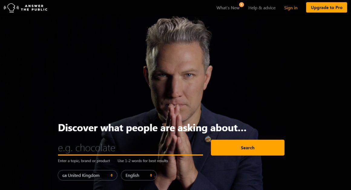
This is the homepage of Answer The Public, an online SEO tool, which I think is a great example of a really interesting landing page.
4- Integrate Onboarding Experience (make it interactive!)
A good onboarding experience is a big chunk of a good user experience.
And believe it or not, users love it when they get to self-onboard. How do you make sure your users get what they deserve, though?
👉 Interactive Onboarding = Good UX 👈
When was the last time you signed up to a new tool, app, or game?
Personally, I get to do it on a weekly basis. What can I say? I am an app nerd.
Here's my point, though: if you've signed up to something new recently, you probably unconsciously expected there to be an onboarding flow, be it a product tour or just simple directions on a slideout screen.
You think you didn't? Keep this in mind for the next time you sign up on a new app.

In 2024, we are all conditioned to the very best of user experiences, and that includes a good onboarding flow. All the big apps and tools do it, and that's how they get to be that big.
They care.
And the good news is you can catch up with them right now, in under five minutes with UserGuiding.
UserGuiding is a no-code user onboarding tool that's easy to use and implement and the kind that won't hurt your wallet while doing so.
A couple of UserGuiding's main features are:
👉 Product tours and walkthroughs,
👉 Interactive guides,
👉 Resource centers,
👉 Hotspots, tooltips, checklists,
👉 Segmentation and targeting,
👉 Powerful analytics, and more.
5- Decrease the Loading Time
Almost half of your website visitors won't buy from you if your website is slow.
Simple as that.
A second might not mean much in real-time, but it does to your target market. Today’s fast-paced audience wants a site that loads instantaneously, and honestly, who can blame them?
So, what you need to do to avoid the consequences is to incorporate new redesign elements that would optimize a much faster loading period on all sorts of browsers and mobile devices.
Several layout elements of your website design ultimately determine the loading time of your landing page. Therefore, keep a close eye on inner pages that might have complicated user navigation.
6- Minimalistic and Uncluttered Design
Minimalism never hurt anybody.
And it turns out it's maximalism that disturbs users more in a digital environment.
The last thing you want in your new website redesign is cluttered web pages with excessive textual information, images, or graphics.
Even if you are not a minimalist by nature, it's clear to see that a less clustered website equals less user confusion.
Select a few fonts and utilize them in various sizes to get the perfect effect. Small details such as shadows, color palettes, gradients, and highlights can go a long way to create a professional look.
7- Make the Most Out of Analytics
Google Analytics and Facebook Insights are some of the most popular analytics tools, and it's never too late to give them a try.
Similarly, there are modules and analytics applications you can amalgamate within your website’s framework.
The main idea is to get the important details about page loading speed, page views, user behavior, conversion rate, and customer demographics.
We are in the era of Big Data. If you want to offer the best product or service to your potential customers, you should have a basic understanding of what your target audience wants.
It's not magic; it's knowing your data.
8- Keep it mobile-friendly
Mobile web traffic accounts for 54.8% of global web traffic.
That's why the redesigning efforts of your website must complement mobile devices.
Consequently, you will be able to garner more visitors than you can imagine.
Additionally, it is a great strategy to rank higher on search engines. Typically, you should take special care of your site’s load time, navigation, user interface, and other design elements that might improve mobile functionality.
9- Pay Close Attention to SEO Mechanics
When it comes to redesigning your website, one of your priorities should be search engine optimization.
In fact, most of the website design elements can impact content, meta tags, and other developmental SEO mechanics. The trick is to combine your website redesigning efforts with search engine optimization tactics.
10- Don’t Hesitate to Restructure Content
It's the content on your site that attracts users and influences them to look through different pages.
Contrary to the infamous misconception, content is more than just product descriptions and write-ups on your site.
Your content should represent a combination of animation, professional photographs, images, and other elements that may appeal to your visitors. A singular content language, for instance, can help you convey the image of your business and form a connection between you and your visitors.
Conclusion
A website redesign project might be a long process with a need for content optimization and improvement, but it sure does pay off.
Now that you know how the comprehensive process works and have the tips, it is time to get to work.
Hope you nail it!
Frequently Asked Questions
How do I redesign an existing website?
Redesigning an existing website is a common occurrence. While many companies prefer to work with an agency for their website redesign projects, many others go in-house. The key is to plan the roadmap properly and stick to it.
What are the phases of a website redesign?
While the specific steps to the website redesign process vary for each company and project, a typical website redesign goes through the current website analysis, ideation, early prototyping, reviewing, development, testing, and finally, the launch.
How much does it cost to get a website redone?
Though the specific pricing for a website redesign project depends on the size of the website, the modifications needed, and many other factors, a small project could cost as little as $1000, while a bigger one can cost as much as $100.000 or more.


.svg)
.svg)
.svg)
.svg)
.svg)


.svg)
.svg)


.png)


