

.svg)
.svg)
.svg)
.svg)



.svg)




.svg)
.svg)

When our Head of Marketing, Mert Aktas, created a browser game of five levels of worst onboarding anti-patterns, he revealed what most SaaS companies know but choose to ignore: Some onboarding flows are so bad that users quit, never to return.
Some had more than 50 rage clicks, some failed at level one, some almost threw their phone at the wall.
Now, think about the impact of a bad experience from the perspective of a first-time user. They’re not trying to beat an online game by staying calm or avoiding rage clicks. They’re experiencing your product for the first time, trying to understand its interface, which feature does what, and what’s necessary for their goals, all the while setting up their account correctly.
If their first-time user experience is a bad one, they’ll churn before they get a chance to see the product’s value. In fact, nearly half of user churn occurs within the first 90 days due to the lack of proper onboarding and engagement.
But how do you make sure that your first-time user experience isn’t one of the bad ones?
This article breaks down what first-time user experience (FTUE) is, why it matters, UX patterns to consider, and how you can measure it.
TL;DR
- FTUE starts before onboarding. It begins the moment someone lands on your website or sees your signup flow, while onboarding is just one part of the overall first-time experience.
- The goal of FTUE is to help users reach value fast, not teach every feature of your product. The best FTUEs reduce friction, guide users to their “aha!” moment, and turn that excitement into activation through real product success.
- Small details shape big perceptions. Clear design, personalized guidance, conversational microcopy, and well-timed support all influence how effortless your product experience feels, often more than the number of steps users complete.
- A strong FTUE drives business growth. Faster activation leads to higher conversions, stronger retention, more referrals, and lower churn because users experience your product’s value before they have a reason to leave.
What Is First-Time User Experience (FTUE)?
First-time user experience is the complete set of thoughts and interactions a user has from pre-signup through first user activation, typically covering onboarding, account setup, and early navigation.
Most teams assume FTUE starts with onboarding. While it plays a big role, FTUE usually starts earlier: When users land on your product website, see the signup form or watch a demo.
Onboarding covers the mechanics behind the experience you hope to create: product tours, checklists, email sequences, scheduled calls, and more.
FTUE (or sometimes referred to as FTUX), on the other hand, is the experience the user actually has. Good onboarding can still deliver terrible FTUE and vice versa.
Here are two concepts related to FTUE:
The “Aha!” Moment
The “Aha!” moment is essentially the turning point when users realize the product can solve their problem, which leads them to see the product’s value. Although most people confuse it with the activation point (which we’ll talk about in a second), the “aha!” moment is a perception change rather than an action a user takes, or a singular moment.
For example, an “aha!” moment for UserGuiding would be when a user goes from an empty state to taking the steps to publish their first tooltip or product tour live on their website.
As the user interacts with the interface by clicking, dragging, and configuring a tooltip or product tour, without waiting for the engineering team, their perception starts to change — from confusion to excitement.
The Activation Point
The activation point is the moment users have experienced the product’s core value, not just understood it.
The “aha!” moment, despite the excitement, carries with it the sentiment of “I think this could work.” The user starts to see the potential but because they haven’t experienced the value first-hand yet, they’re hesitant to call their experience a triumph yet.
The activation point, on the other hand, is clear: “I know this works.”
Designing the first-time user experience to drive both the activation point and “aha!” moments are necessary, in sequence. One without the other might lead users to like the idea of your product but fail to extract its value.
In other words, you need both emotional and practical layers to stop guessing what makes users stick around.
What Does the First-Time User Experience Include?
FTUE can come in all shapes, but all good FTUE typically follows the following building blocks intentionally:
1. Visual and Design Clarity
Humans are creatures of habit, and expect almost every FTUE to follow the established visual and design cues for clarity. A fast-loading webpage is better than a slow-loading one, for instance.
Or users are more likely to recognize pages with clear visual hierarchy and layout logic, where information is present as long as the user needs it at the moment.
But keep in mind that neither logic nor hierarchy are indisputable truths. Human behavior is complex, so rather than following these ideas blindly, base your choices on the patterns of your existing users. What is commonly looked down on (such as placing information in the bottom of a page or app) could very well be the truth: Users still do scroll to the bottom to find what they’re looking for.
2. Signup and Access Friction
There’s not much that would turn off a user than unnecessary friction when they’re trying to get something done. Imagine trying to sign up for a product and they ask about your company name, size, location, and why you need the product. Though that information might be relevant after the signup, it’s not necessary to get started.
Similarly, when the experience is disrupted by immediate email verifications or multi-factor authentication (MFA) requirements that block a user from immediately using the product, these will register as mental and physical obstacles rather than necessary policies.
This doesn’t mean that all friction is unnecessary. Sometimes users need friction (especially when they’re interacting with the product’s features) to pull users from autopilot and make them put effort into their experience — which sometimes increases the perceived value.
Unnecessary friction, on the other hand, needs to be gotten rid of for a well-functioning FTUE.
3. Onboarding Depth and Pace
According to recent research, one-step product tours have a 75% completion rate while products with 5-steps or more don’t even reach the 50% completion mark. You can safely assume that this rate would be lower if the product tour is passive.
Because onboarding is important for a first-time user experience, many teams try too hard to make it memorable, to the point where their efforts make the product tour too complex — and the experience almost too similar to a problem.
The golden rule in onboarding is keeping the process focused on what users actually need, not what you think they should need. A customer-centric approach means adding skip options, only introducing the essentials, and using interactive elements to get users investing into the product from their first moment.
4. Personalization and Contextual Relevance
Generic onboarding flows are a recipe for disaster. They usually include more than a new user can chew at the time, delay time-to-value, and put the cognitive load of figuring out the essentials of your product almost entirely on the new user — which is ironic because they don’t know how things work yet at all.
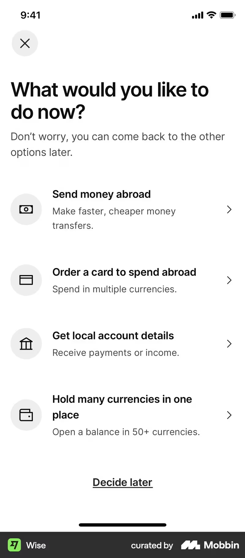
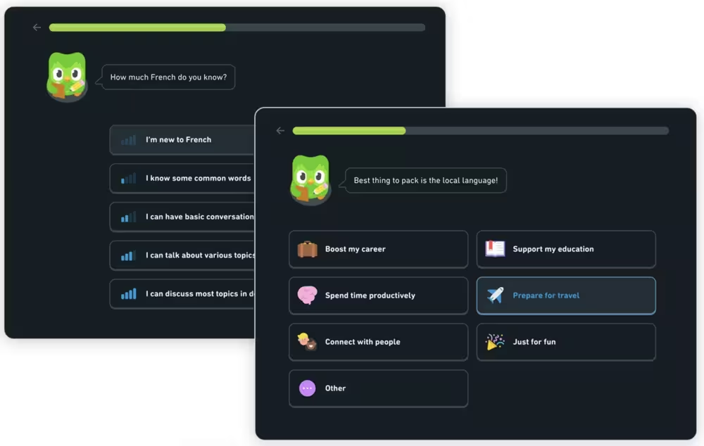
Personalized onboarding experiences, especially those segmented on specific jobs, goals, or persona, prevents overwhelming new users with irrelevant features and guides them directly to their “aha!” moment. A welcome survey where users indirectly contribute to customizing their onboarding flow can be a good option.
Many teams opt for AI to handle personalization in 2026. AI creates knowledge base articles, video tutorials, or highly specific materials based on user personas. AI can also analyze first-time clicks and navigation to serve interactive and context-aware content (like tooltips) to highlight relevant features to the user’s specific use case.
While AI can speed up the content creation, it still needs to be supervised. It can miss nuances or still hallucinate answers and content in order to make the user look right. The hybrid approach of AI input with human oversight is generally more balanced and less prone to error. And when errors arise, humans can fix them faster and consider unstated intent to provide a better experience.
5. Emotional Resonance
A 2021 research by Challenger had a simple premise: Does positive language affect customers’ experience?
The research was an A/B test and the scenario was a common problem customers face daily: They were having trouble transferring funds from one online bank account to another. The reps had two answers drafted, one positive and one negative.
The answer with positive language was viewed as a higher quality and lower experience for the customer.
The power of words isn't just shown in one-on-one interactions. The same Challenger research also found that “how a customer feels about an interaction makes up 2/3 of their perceived effort, whereas what they actually have to do only makes up 1/3 of their perceived effort.”
The way you phrase your microcopy, whether you celebrate the users’ wins, and if your product feels too corporate or approachable with a conversational tone… All contribute to this perception.
Why FTUE Is Critical for SaaS Retention
Before users decide whether your SaaS product is worth paying for, they decide whether it's worth learning. That decision happens during the first-time user experience (FTUE).
Users sign up with expectations, but they stay only if the product quickly proves it can solve their problem. Every extra click, confusing screen, or unclear instruction delays that moment of value. And each delay increases the chance they'll leave before they ever experience the product's benefits.
The business impact is straightforward.
Companies spend heavily to acquire new users through ads, SEO, content marketing, and outbound sales. But if those users never activate, the acquisition cost is wasted. A great FTUE protects revenue by helping more users reach the point where they understand why the product matters.
Activation and Conversion Rates
Every SaaS funnel has a leak, and for many companies, it's activation.
Users arrive with enough curiosity to create an account, but curiosity alone doesn't generate revenue. They need to complete the actions that reveal the product's value — whether that's importing data, inviting teammates, creating a project, or publishing their first campaign. If they abandon the product before reaching that milestone, they're unlikely to convert into paying customers.
That's why activation has an outsized impact on monthly recurring revenue (MRR). A small increase in the percentage of users who reach activation can create a much larger increase in paid conversions because more users make it far enough into the product to justify subscribing. In fact, a 25% increase in activation can lead to 34% MRR growth in a year.
The best FTUEs are designed around this principle. Instead of introducing every feature, they guide users toward one meaningful outcome as quickly as possible. The faster users experience success, the more likely they are to return.
Word-of-mouth and Referrals
People rarely recommend software they never figured out how to use.
A frustrating first experience can influence several potential customers. Users share onboarding frustrations with coworkers, leave negative reviews, and mention poor experiences in online communities where future buyers are doing research.
Positive experiences spread too, but negative ones tend to travel faster and stick longer. That's why a polished FTUE contributes to growth in ways that don't appear on a product analytics dashboard. Every user who reaches value quickly becomes another potential advocate instead of another dissatisfied reviewer.
Long-term Retention and Churn Prevention
First impressions have a long shelf life.
Psychologists call it negativity bias: our tendency to remember bad experiences more vividly than good ones. In SaaS, that means users often remember the confusing setup process long after they've forgotten the features that eventually worked well.
Once that perception forms, it's difficult to change. Users become less willing to explore the product, less patient when they encounter future friction, and more likely to cancel when alternatives appear.
Preventing that outcome is almost always cheaper than reversing it. Reacquiring churned customers requires additional marketing spend, sales effort, and incentives. Helping them succeed the first time requires a better onboarding experience.
That's why FTUE isn't just about making users happy during their first session. It's about creating the foundation for higher activation, lower churn, stronger retention, and sustainable recurring revenue over the months and years that follow.
8 Practices to Design a Great First-Time User Experience
Great first-time user experience goes beyond showing users everything your product can do. It also helps them do the one thing that convinces them they should stay.
The best FTUEs remove friction, answer questions before they're asked, and guide users toward value one step at a time. Here are eight practices that consistently improve activation and long-term retention.
1. Simplify Signup
Every field in a signup form asks users for something before they've received anything in return.
Name, email, password. Those are usually enough to get started. Company size, industry, phone number, job title, and budget can almost always wait.

This approach is known as progressive profiling. Instead of collecting every piece of information upfront, you gather it gradually as users become more invested in the product.
The result is a lower barrier to entry. Users get inside the product faster, experience value sooner, and are far less likely to abandon the process before onboarding even begins.
The rule is simple: Don't ask for information until you have a reason to ask for it.
2. Use a Welcome Survey to Personalize the Flow
Not every user signs up for the same reason. A marketing manager, a founder, and a customer support lead may all use the same software, but they have completely different goals. A short welcome survey bridges that gap.
One or two questions about a user's role, team, or primary objective are often enough to personalize the onboarding experience. Instead of showing every feature to everyone, you can route users into the workflow that's most relevant to them.
Personalization makes onboarding feel shorter, even when it isn't. Users spend less time filtering through irrelevant features and more time reaching the outcome they actually signed up for.
3. Make the Product Tour Optional
Imagine walking into a store and immediately being followed by an employee explaining every product on every shelf. That's what mandatory product tours often feel like.
A simple welcome modal works better. Thank users for signing up, explain what they'll accomplish in the next few minutes, and set expectations. Then give them a choice.
Some users appreciate guidance. Others prefer exploring on their own. A visible skip button respects both preferences while reducing the feeling of being trapped inside a tutorial.
Tone matters, too. "Let's get your first project up and running,” feels very different from "You must complete the onboarding process before continuing."
4. Replace Passive Tours with Interactive Walkthroughs
People rarely learn software by just watching, but they learn a lot by doing. Traditional product tours point at buttons and explain features. Interactive walkthroughs ask users to click the button themselves, upload their first file, create a task, or invite a teammate.
Every completed action builds confidence. Instead of overwhelming users with ten tooltips at once, introduce guidance when it's actually needed. Contextual tooltips, hotspots, and inline hints keep the interface clean while providing help at exactly the right moment.
5. Use Checklists and Gamification
People like knowing how far they've come. They also like knowing how much is left. That's why onboarding checklists are so effective. They turn an unfamiliar process into a series of manageable tasks instead of one overwhelming objective.
Progress bars reinforce momentum. Estimated completion times reduce uncertainty. Small celebrations after completing a step create positive reinforcement that encourages users to keep going.
When users can see the finish line, they're much more likely to cross it.
6. Design for the “Aha!” Moment
Every successful product has an “aha!” moment. For Slack, it might be sending the first message. For Canva, it's creating the first design. Everything in your FTUE should move users toward that moment as quickly as possible.
That means cutting distractions. Removing unnecessary decisions. Delaying advanced features until later. If a step doesn't help users experience the product's core value, it probably doesn't belong in onboarding. The shortest path to value is almost always the best one.
7. Provide Self-serve Support
Even the best onboarding can't answer every question. Users will get stuck. What happens next determines the difference between successful and unsuccessful products.
If users have to leave your app, search Google, browse documentation, or contact support just to continue, you've introduced unnecessary friction. Instead, bring help into the product itself.
Contextual tooltips, searchable knowledge bases, AI assistants, in-app help centers, and quick access to documentation allow users to solve problems without breaking their flow. The fastest support interaction is often the one that never becomes a support ticket.
8. Collect In-product Feedback and Iterate
The first version of your onboarding probably isn't the best version. User behavior will tell you where people hesitate, where they abandon the flow, and where they become confused.
But analytics only show what happened. Feedback explains why.
Short in-app surveys after key milestones — such as Customer Effort Score (CES), Net Promoter Score (NPS), or simple one-question feedback prompts — help uncover friction that metrics alone can't reveal. Then test improvements.
Change the copy. Remove a step. Rearrange the sequence. Personalize a flow. Measure the impact on activation, retention, and conversion.
FTUE Design Patterns: The UI Toolkit
There's no single UI pattern that creates a great first-time user experience. The best first experiences combine multiple patterns, each solving a different problem at a different moment. A welcome modal sets expectations. A checklist creates momentum. A tooltip removes friction. An empty state points users toward the next step.
Using more of them doesn't automatically make the experience better. In fact, layering too many elements on top of each other can overwhelm users just as easily as having none at all. The goal is to introduce the right guidance at the right time, and then get out of the way.
Here's a quick reference for the most common FTUE design patterns and where they work best.
- Welcome modals and screens: A welcome modal or screen is the first message users see after signing up. It introduces the product, sets expectations, and explains what users can accomplish in the next few minutes. Show it once, immediately after account creation or first login. Keep it brief, welcoming, and easy to dismiss. Never as a roadblock that forces users through unnecessary steps.
- Product tours and interactive walkthroughs: Product tours explain the interface by showing users where features are located, while interactive walkthroughs teach by asking users to complete real actions inside the product. Use passive tours to introduce complex interfaces or major UI changes. Use interactive walkthroughs when the goal is activation, since users learn faster by doing than by watching.
- Tooltips and hotspots: Tooltips provide contextual explanations for interface elements, while hotspots subtly highlight new or important features without interrupting the user's workflow. Use them to deliver guidance exactly when users need it, rather than forcing everyone through the same scripted onboarding flow. On-click interactions generally create less friction than on-hover experiences, especially on mobile devices.
- Onboarding checklists: An onboarding checklist breaks the activation journey into a series of small, achievable tasks, often paired with progress indicators or lightweight gamification. Use checklists when onboarding requires multiple steps. Keep them persistent so users can leave and return without losing their place.
- Empty states: Empty states are screens users encounter before they've created any content. Instead of showing a blank page, they explain what's missing and suggest the next action. Use empty states to guide first-time users toward creating their first project, importing data, or choosing a template. They're especially effective for reducing the intimidation of starting from scratch.
- In-app surveys and micro-surveys: In-app surveys collect feedback while users are actively using the product. They can measure customer effort (CES), loyalty (NPS), satisfaction, or gather open-ended feedback after key tasks. Trigger surveys after meaningful milestones rather than during critical onboarding steps. Use the insights to identify friction points and improve future onboarding flows through continuous testing and iteration.
How to Measure FTUE Quality
The only way to know whether your first-time user experience is successful is to measure what happens after users sign up. Are they reaching value quickly? Are they completing onboarding? Are they coming back a week later?
The right metrics answer those questions. More importantly, they reveal where users are getting stuck and what needs to change.
- Time-to-first-value (TTV): TTV is the time it takes a new user to experience your product's core benefit for the first time. The longer users wait to see value, the more likely they are to abandon the product. A shorter TTV usually leads to higher activation, stronger engagement, and better retention because users quickly understand why the product is worth using.
- Onboarding completion rate: It’s the percentage of users who finish your primary onboarding flow. If a large share of users never completes onboarding, they're likely encountering unnecessary friction. A low completion rate is often an early warning sign that your onboarding is too long, too confusing, or asks users to do too much too soon.
- Feature discovery rate: Feature discovery rate is the percentage of new users who engage with your product's key features during their first session or first week. Users can't benefit from features they never find. Measuring feature discovery helps you identify whether important functionality is easy to discover or buried behind poor navigation and ineffective guidance.
- Activation rate: Activation rate is the percentage of new users who reach your predefined activation milestone within a set timeframe. Activation is the strongest indicator that users have experienced meaningful value. Whether activation means creating a project, inviting teammates, or completing a workflow, improving this metric often has a direct impact on conversions, retention, and recurring revenue.
- Drop-off by step: Drop-off step is the point in your onboarding flow where users abandon the process. Every drop-off tells a story. A sudden decline after one step usually signals friction — a confusing form, an unnecessary request, or an unclear instruction. Instead of redesigning the entire onboarding experience, focus on fixing the steps where users consistently leave.
- Day-1 / Day-7 retention: These are the percentages of users who return one day and seven days after signing up. Strong Day 1 and Day 7 retention rates are often a sign that users reached value quickly and formed an early habit of using the product.
- Customer effort score (CES): CES measures how easy users felt it was to complete their first interaction with your product, typically collected through a short survey. Analytics tell you what users did. Customer Effort Score tells you how the experience felt. A low-effort onboarding experience builds confidence and encourages users to continue, while a high-effort one often signals hidden friction that behavioral data alone can't explain.
7 First-Time User Experience Examples
1. Notion
Notion is a digital workspace where you can take notes, manage projects, and document databases into a single customizable platform. Notion’s FTUE is built on two elements: make progress visible and personalize the journey.
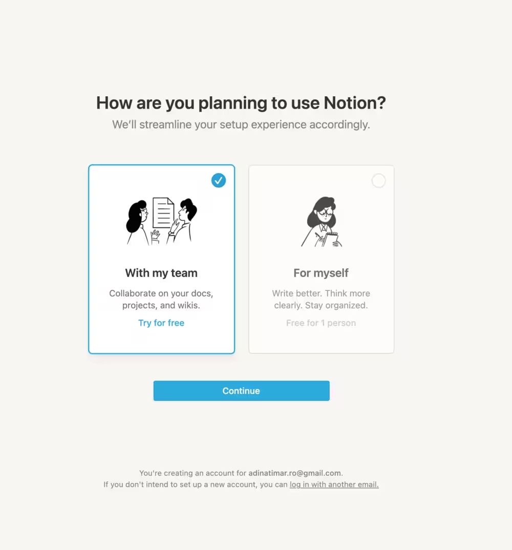
Similar to role-based onboarding, Notion uses user segments (With my team - which focuses on collaboration, and for myself - which focuses on writing and organization) for a personalized first-time user experience.
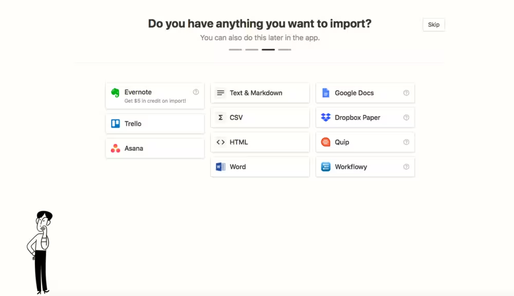
To show users their progress (and signal the start and end of the onboarding tour), Notion uses a progress bar, divided by steps. The skip button also gives the first-time user the option to explore the app on their own first and put effort into how they experience the product. A “choose your own adventure” makes the user (and their time) feel valued.
2. Linear
Linear is an AI-powered issue tracker and project development tool purpose-built for software development and product teams. At its core, Linear prioritizes UI and AI agents for product planning for other high-impact companies.
That’s why Linear’s FTUE follows its own operating model by structuring the experience around issues and focused workspace views.

After signing up, the user is greeted with an “active issues” list which acts as an onboarding list where the items encourage the user for proper account setup and exploring the fundamentals of the product.
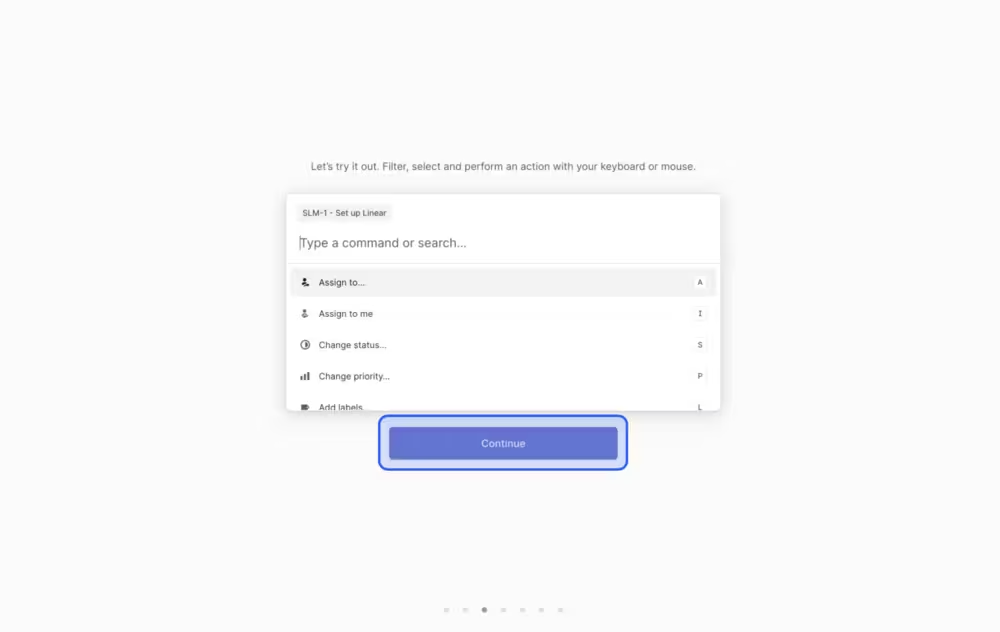
Users are greeted with a command center (and a short instruction on how to open the command center) which they will use to take action throughout their lifecycle. This built-in step helps users learn the system by using it.
3. Canva
Canva is a popular online graphic design tool. Canva’s FTUE has a very important purpose, which is to make feedback easy to give.
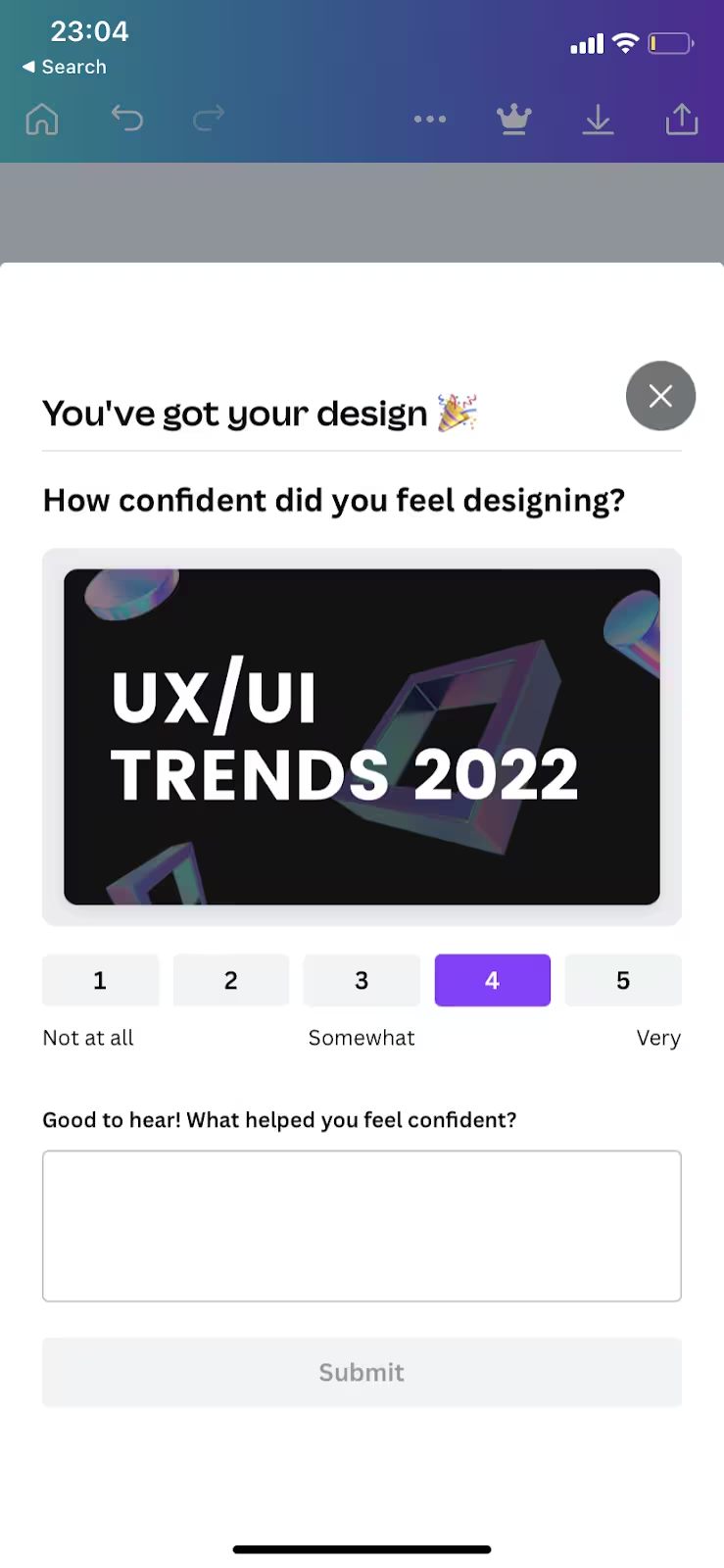
The feedback survey is triggered as soon as the design is complete. In addition to the celebratory feel, the survey itself minimizes friction. The user can opt for a 5-point scale to rate their experience and/or add explanations in the box below about their scoring.
4. Slack
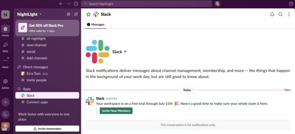
Slack is a team-based team collaboration and project management application. Known for its fast messaging and meeting features, Slack’s FTUE reflects the fast-paced working environments. Its FTUE uses conversational microcopy and allows users to skip steps or the entire tour.

Once the user sees the welcome message, they can explore the channels. During this phase, Slack uses a conversational tone to make the introduction engaging.
5. Forest
Forest is a productivity and focus app that helps you finish tasks and not be distracted by your devices. It gamifies the productivity aspect by asking you to plan virtual trees which grow during your sessions, expand your forest and unlock new plant and tree types, and earn coins to purchase them.

Users can easily scroll the onboarding screens thanks to its minimal and simply copy and start experiencing the value immediately.
6. Lattice
Lattice is an AI-powered HR tool for people management, performance tracking, and employee engagement. It focuses on annual and continuous performance reviews and collects real-time employee pulse surveys and analytics to track workforce sentiment.
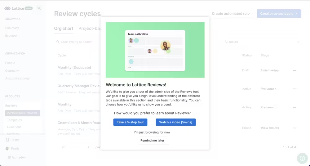
What makes Lattice’s FTUE great is that it offers multiple choices to the user: They can watch a 5-minute introductory video, take a 5-step tour, or skip them altogether and browse the product on their own. By “adapting” to the different user needs, Lattice introduces a pressure-free first-experience environment.
7. Hemingway Editor
Hemingway Editor is a web-based writing platform designed to make your writing concise and correct. Its FTUE is designed perfectly for the “aha!” moment.
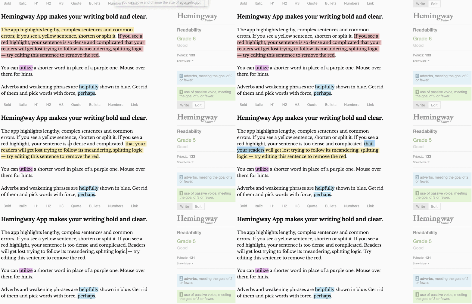
The onboarding shows demo content with highlighted sections that mimic exactly how the tool analyzes and suggests improvement for your documents. Rather than explaining the purpose and how the platform works, Hemingway Editor shows the value right out of the gate.
How UserGuiding Helps You Nail Your FTUE
Most product teams know what good first-time user experience looks like. The challenge is turning those ideas into reality without competing for engineering resources every time they want to tweak a tooltip, update a checklist, or test a new onboarding flow.
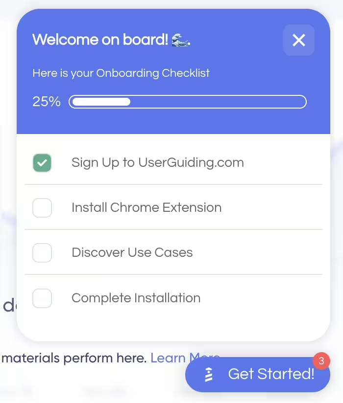
That's where UserGuiding comes in.
UserGuiding is a no-code product adoption platform that lets product, growth, and customer success teams build, launch, and optimize onboarding experiences, without writing code. Instead of waiting for development cycles, teams can create, publish, and iterate on onboarding in minutes.
Here's how UserGuiding helps you put every FTUE best practice into action:
- Product Tours: Build interactive walkthroughs that teach users by doing, not just by showing.
- Onboarding Checklists: Guide users toward activation with clear, persistent task lists that keep momentum high.
- Hotspots & Tooltips: Deliver contextual guidance exactly where users need it, without interrupting their workflow.
- In-App Surveys: Collect CES, NPS, and qualitative feedback while the onboarding experience is still fresh.
- Resource Centers: Give users self-serve access to documentation, FAQs, videos, and support without leaving your product.
- Segmentation: Personalize onboarding based on user roles, plans, lifecycle stage, or custom attributes so every user sees the most relevant experience.
- Analytics: Measure onboarding performance, identify friction, and continuously improve your flows with real user data.
The analytics dashboard is where everything comes together. Instead of guessing why users aren't activating, you can see exactly what's happening.
Track guide completion rates, monitor checklist engagement, identify the steps where users drop off, analyze survey responses, and measure how onboarding changes affect activation over time. All from one dashboard.
And the results speak for themselves. Here are some of the customer success stories:
🚀 Grupo IOB achieved completion rates above 75% for their main onboarding flow
🚀 CitizenShipper increased user activation by 25%
If your goal is to shorten time-to-value, improve activation, and retain more users from day one, UserGuiding gives you the tools to build (and continuously improve) your FTUE without relying on engineering.
Start with a free trial on UserGuiding, or explore the platform's different onboarding and product adoption scenarios on the UserGuiding Use Cases page.
In short…
A great first-time user experience isn't something you design once and forget. It's an ongoing experiment, one you continuously measure, test, and refine as your product and your users evolve.
Every improvement compounds over time. Help users reach value faster, and you'll build stronger retention, generate more word-of-mouth, and create sustainable revenue growth from the very first interaction.
Frequently Asked Questions
What’s the difference between FTUE and user onboarding?,
FTUE (first-time user experience) is the user's very first interaction with your product, while onboarding is the broader process of helping them learn, adopt, and keep using it. Think of FTUE as the first impression and onboarding as the relationship that follows.
How do I know if my first-time user experience is working?
A great FTUE helps users reach their first meaningful outcome quickly, without confusion or unnecessary steps. If activation rates are climbing, fewer users drop off early, and more return after their first session, you're moving in the right direction.
What’s the most common mistake SaaS teams make with FTUE?
Many teams try to explain everything instead of helping users accomplish one valuable task. Information rarely creates confidence on its own, small wins do.
How does AI change first-time user experience design?
AI makes it possible to tailor the experience to each user instead of guiding everyone through the same journey. The best AI-powered FTUEs reduce guesswork, personalize guidance, and help users see value faster without adding complexity.

.png)