I love video games.
When I was pitched me my current position by UserGuiding, my first reaction was, "wait, you guys code those tutorials on video games?" 🤯
They were doing a more complicated job, but I was close.
The truth is, a video game beginner tutorial and a user onboarding flow are essentially the same. They both try to get the user/player familiar with the product.
And as that's the case, today, we are looking at some cool video game onboarding experiences that might inspire you to come up with a killer onboarding UX flow for your product.
Okayyy, let's go.
Why the Onboarding UX of Video Games are superior to all others
Now you might be thinking this is a silly little article on silly little games if the last time you played a game was Super Mario Bros. on NES.
"Well, why don't we look into some REAL and SERIOUS examples instead?" might be what's in your head.
But let me tell you, things have changed. Video games are everywhere, and the SaaS industry has a lot to learn from game designers.
And while we're at it, let's talk about the three reasons why video games onboard users better.
1- They are fun
First things first, what makes the learning experience within a game way more interesting than your boring user onboarding process is that it is actually fun.
"Well, that's because it's a game."
Not the onboarding part. In fact, a game's onboarding part is supposed to be the most boring part since it's all learning. But they design the game and integrate the learning part so well that users actually have fun learning.
For example, in Spider-Man 2, the basic movements of Spider-Man are taught to the player with the witty voice lines of Bruce Campbell.
As your friendly neighborhood Spider-Man jumps around, the voice lines go: "your mother and I are very proud" when he accomplishes something or "here comes the welcome wagon" when bad guys appear.
Now tell me that ain't fun to go along with.
2- They are necessary
One major difference between a video game and your B2B/B2C product is that users are more likely to sit through the video games' onboarding flows.
That's 'cuz they are very much aware that a tutorial is necessary for them to play.
Video games have been around way longer than any of the onboarding we are using for our products today.
Since user onboarding has become a widely-in-use thing a hot minute ago, it is only natural that your users don't perceive your product tours and walkthroughs the same way they perceive a game's onboarding experience.
Then what do we do?
Your best shot is to keep the onboarding as simple and doable as possible. Believe me, however complex and sophisticated your tool is; your users will appreciate a short and simple flow more.
3- They are interactive
Possibly the best thing any user experience can be is interactive.
Be it games or tools.
And the reason for that is quite simple. A hands-on approach beats book-smart any day. Especially when you need your users to learn the tool more than they do.
So making an onboarding process not only makes learning more digestible but also easier.
That's what video game design had been trying for ages with the sufficient feedback of users.
So what do we learn from this?
If a video game onboarding sequence is similar to what we do to onboard our users, then it is only right that we recognize video games as good examples for how to teach our users better.
Easiest Way to Gamify User Onboarding 🎮
A 3rd party user onboarding software such as UserGuiding is the easiest and the most affordable way to gamify your user onboarding in a matter of minutes.
With UserGuiding, you can:
✅ Create interactive walkthroughs without coding,
✅ Set up tooltips and hotspots in minutes,
✅ Create in-app checklists to gamify their progression,
✅ And create in-app resource center widgets that offer your users all the help they need.
Using a basic gamification element called an onboarding checklist, the social media management tool Keyhole increased their conversion rates by 550%. Here's what they've done:

You can use UserGuiding to create gamified user onboarding experiences, right now.
6 Great Examples for Video Game Onboarding (console, PC, mobile)
When I say video games are doing it right, I mean that they are doing it RIGHT. On all platforms too.
So, hold on to your socks, people, 'cuz I got some great examples of video game tutorials that'll inspire some cool user flows for your product, from The Witcher 3 to Candy Crush.
Gaming Console
Though many games on gaming consoles like Sony PlayStation or Microsoft Xbox find their way to PCs and mobile, these two games have been especially great on gaming consoles.
Let's take a look.
1- Star Wars: The Force Unleashed
Although this iconic game made its debut on PlayStation 2, its super cool tutorial sequence has a reputation to this day.
The game starts with Dart Vader arriving at Kashyyyk, the homeland of Wookiees (Chewbacca's kind, yes). As Darth Vader walks through the invasion of the planet tossing Wookiees right and left using the Force, players are taught how to perform the basic movements on the game.
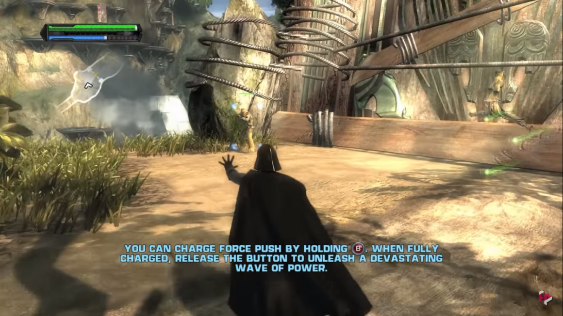
Since there aren't too many commands, the players get to learn how to move the character on the battlefield and how to use the Force and the lightsaber at the beginning.
But the best thing about this tutorial level is that it is woven into the story perfectly, and the users are given enough time to master the game mechanics.
It might be a little heartbreaking choking Chewbacca's friends using the Force, but it is one hell of an onboarding sequence.
Key Takeaways ✍️
- A tutorial level woven into a tutorial always works.
- Keeping the learning to a minimum and hands-on practice to maximum is essential.
- Using a well-known character as a playable character gets the users more engaged, just as using a mascot in a user flow would engage users more.
2- The Witcher 3: Wild Hunt
The Witcher 3 is easily one of my favorite video games ever, and it surely didn't get where it is for me with a sloppy player onboarding.
The Witcher 3 is a strongly story-based game, and it starts off as such. When Witcher Geralt starts training with Ciri, the users are given a choice on whether to begin the tutorial or skip it.

When the tutorial begins, the users learn each button that makes Geralt run, jump, and climb while also listening to the fun little convo between Geralt and Ciri.
Fun, necessary, and interactive; that's what I call a good game tutorial.
After that, the fighters start combat practice, where the players learn how to fight using Geralt. The command for each move is displayed on the side of the screen.
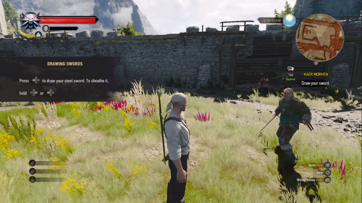
As the player learns using the commands, the tutorial bar is lit up green, indicating that the players are doing it right. Meanwhile, the little progress marker on the right side of the screen also lights up, also signaling to the users that they are making progress.
One last cool thing The Witcher 3 and similar games do is put a list of commands on the bottom right corner of the screen for future reference.
If you think that's unnecessary, I could tell a long, long story on how I finished the game in 6 months playing once every two weeks and forgetting each time how to use the commands.
Key Takeaways ✍️
- Making the tutorial optional is a lifesaver, especially when you know there are users coming back to your product who are already familiar with it.
- Designing the tutorial as a part of the story and keeping the story going throughout by adding voice lines is what makes a game tutorial worth the time.
- Application of game elements is often forgotten, just as the shortcuts of a tool can be forgotten. It can be beneficial to keep a list of the important things somewhere on the screen, depending on the nature of the product.
Mobile Games
Whether it is one of the classic games like Super Mario Bros or some casual games like Fruit Ninja, chances are, it is on mobile now.
So, as the mobile gaming craze continues and our phones keep getting better and better, it is best we take a look at some mobile game onboarding flows too.
3- Genshin Impact
I am currently obsessed with Genshin Impact.
And I bet many will share my sentiments as the game was crowned the best ongoing game and the best mobile game of 2021 in The Game Awards. This highly addictive game of the year excels in its simple yet effective onboarding flow too.
The game starts with a cut scene that has a tiny little signup onboarding flow. It asks you to pick either of the game protagonists and name them so that you can actually start playing.
After this, the story keeps going, and we see our now-playable character elsewhere as we learn how to move around.
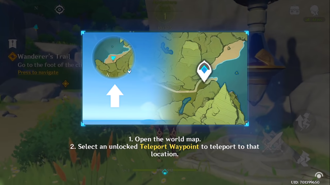
The mascot of the game, Paimon, gives directions to our character as we discover how the combat, the map, and other functions work.
Later on, specific game mechanics are also introduced via a dialog screen. These pieces of info are archived in the tutorial section of the main bar for future use.
Key Takeaways ✍️
- Even a simple process like sign-in onboarding flows can be made engaging using animations or fun images in the case of SaaS tools.
- Not interweaving the tutorial into the story is way more tolerable on online platforms since the nature of online games is way more fast-paced.
- Being able to archive and access the information later on can be a precious element especially if the product is complex and requires looking back at times.
4- Candy Crush
I know, I know. That's what your mom plays.
Well, I play it too.And let me tell you, Candy Crush's player onboarding is the backbone of interactive onboarding of today.
It is a perfect example of background dimming, mascot usage, skip option, and interactivity.
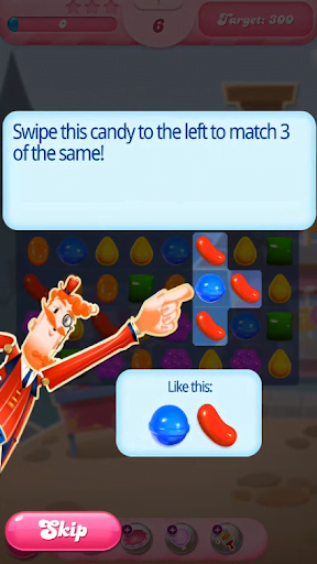

Candy Crush reserves its first few levels to onboarding, showing players what each candy combo does, the game objectives, and how to get boosts.
It has mascots like Tiffi, Mr. Toffee, Mr. Yeti, and others. As the mascots point at the candies you should be swiping, there is also a tiny little gif of the action down below, like in the first screenshot.
All those onboarding elements come together at the initial onboarding so that players don't need additional resources to learn how to play the game.
Key Takeaways ✍️
- Using a mascot for onboarding makes the learning experience feel more personalized and easier to move along with.
- Dimming the background and providing visual examples is great, especially when your audience is closer to the elderly part of the user spectrum.
- A big old skip button never hurt nobody; making it extra big to make sure everyone knows they can skip is a nice little touch.
PC
5- League of Legends
With the cool Netflix original Arcane airing recently, League of Legends now has double the audience it had before. So, right now might be a great time to take a look into its onboarding flow.
League of Legends is one of those complex games you need to actually figure out before you start playing; it's online and multi-player, after all.
To make sure you don't embarrass yourself running the wrong way or trying to shoot at your own teammates, the game puts the players on a demo map before going online with others.
The players are then educated about the map, the battlefield, and how to fight.
What's fun about it is that a certain movement or a task you need to accomplish stays on the screen until you successfully manage it. Lots of time for experimenting, huh?

After showing the players what button does what, the game even recommends that the players place their hands in a specific way, which is a nice little personal touch to the onboarding if you ask me.

Key Takeaways ✍️
- When you need your users/players to deal with a complex product, a demo environment can be a great tool.
- Letting players/users get into the product at their own pace and experiment a little will give them the space to get familiar with the product and even fall in love with it.
- Tiny little tips and personal recommendations always have a special place in your users' hearts, don't be afraid to sprinkle some into the user flow.
6- Among Us
If you weren't hiding under a rock throughout 2020 (I did consider that at one point) you've probably heard of Among Us.
Though the game was essentially a mobile one, it was pretty popular on PC too.
Now, the thing about Among Us is, just like League of Legends, it was an online game that started immediately once you had enough people to play with. But one difference was: it was simple.
You didn't need to get a full-on brief on what was what; you just needed to know the objective and how.
So, aiming at being one, Among Us had a "how to play" section, just like all good classic games.
Now you're thinking, "how's that a good onboarding flow?" or maybe, "is it even an onboarding flow at all?"
Well, it is. And it is good.
See, not all onboarding flows need to be triggered and prompted for the users/players. They just might be optional and need the user to actually look for it willingly.
And Among Us did require exactly that.
It was a brand new game, and no one knew how to play it; the "how to play" button was right there, so everyone did click on it.
It looked a little something like this.
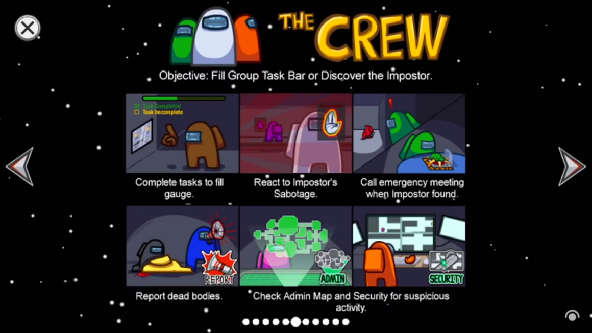
No difference from our SaaS flows whatsoever: the progress bar is there, the visual support is there, and the copy is just right.
And even if they weren't, the players would read through it all the same. It's all about the nature of the game.
Key Takeaways ✍️
- Not all products require users to be forced into onboarding. If the product's the right fit for it, you might as well use a "how to use" button somewhere on the screen.
- If the onboarding is non-contextual, a progress bar is crucial. Even if it's long, make sure to always use a progress indicator of some sort.
- Visuals and concise copy can make a long onboarding feel like a breeze. If your company's voice makes way for it, go for it.
Conclusion
Let me say this once.
Video games are a raw, beautiful inspiration for SaaS onboarding UX, and with the accessibility they have today, it's no hard work at all to take a quick look.
The games I listed above are just the surface of it all; there are many cool onboarding flows out there that can really make a difference in your product onboarding if you get the inspo out of it.
This is your call to start playing games at work saying it's onboarding research 😎


.svg)
.svg)
.svg)
.svg)
.svg)


.svg)
.svg)


.png)


