


.svg)
.svg)
.svg)
.svg)
.svg)


.svg)


.svg)
.svg)

Product-led Growth (PLG) has become a dominant force in the SaaS world in the last decade or so.
Recent research shows that 79% of SaaS companies have adopted PLG strategies, while only 21% continue with traditional sales-led approaches. Even more telling, 91% of companies already using PLG plan to increase their investments in these strategies moving forward.
The companies that hesitate to embrace PLG often do so because of challenges like product complexity, onboarding processes, and the need for extra support.
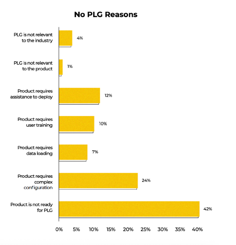
So basically, the biggest barriers to going all-in with PLG boil down to education and support concerns, which makes today’s topic, product-led onboarding, even more critical!
Product-led onboarding assists users at the right technical level and use case, decreases their dependency on your customer-facing teams for training, and smooths complex implementation processes with engaging and interactive flows.
And in this article, we’ll cover everything about it:
- What product-led onboarding is and why it’s important for your business
- Best practices and a step-by-step roadmap to perfect your flows
- Common mistakes and how to avoid them
- Tools and software you can use to create your product-led onboarding materials
- Finally, plenty of real-life examples (with explanations of why they work)
TL;DR
- Product-led onboarding is a user-first approach that helps new users quickly find value within your product. It’s crucial because it drives activation, retention, and long-term engagement without relying heavily on sales or customer support.
- Best practices of product-led onboarding include:
- Personalizing the experience based on user roles and goals.
- Using short, interactive tutorials and clear checklists.
- Guiding users to key activation points and “aha!” moments early.
- Incorporating social proof and success metrics to motivate users.
- Offering progressive onboarding by unlocking advanced features only when users are ready.
- Personalizing the experience based on user roles and goals.
- However, there are several common mistakes you should avoid if you want a successful onboarding experience, such as:
- Delivering long, generic product tours that overwhelm users.
- Ignoring personalization and user context.
- Failing to provide clear progress indicators or guidance.
- Overlooking social proof and user success stories.
- Some good examples you can learn from are:
- UserGuiding’s goal-based segmentation and tailored tours.
- Arc Browser’s hands-on feature trials during onboarding.
- Grammarly’s demo document that teaches by doing.
- For screenshots of these onboarding materials and more detailed explanations of why they work so well, along with additional examples, continue reading!

Product-led onboarding statistics and benchmarks
Are you tired of seeing the same statistics from God-knows-when (probably the early 2010s) while trying to keep up with the latest onboarding and customer education trends? Yeah, us too.
That’s why we did some digging.
Below are fresh, actually-relevant statistics (we promise, nothing older than 2020) pulled from legit reports, studies, and SaaS onboarding insiders 👇🏻
- Industries like FinTech, EdTech, and Customer Experience tend to successfully deploy traditional onboarding techniques, such as in-app checklists, hotspots, and user segmentation.
- 60% AI companies, on the other hand, prefer innovative approaches, such as example prompts and actionable empty states, rather than relying on conventional onboarding elements like guides or checklists.
- According to Gitnux’s 2025 report, automated onboarding reduces onboarding time by 30-50%, and 52% of customers say quick onboarding influences their loyalty.
- According to UserGuiding’s 2023 onboarding research, the most common in-app onboarding element turns out to be welcome screens with a 56% adoption rate, followed by checklists (36%), tooltips (31%), and hotspots (30%).
- In the same research, it’s stated that though many companies prefer e-mail onboarding (34%) at the beginning of the user’s journey, only 15% of companies send follow-up emails based on usage and performance.
- According to a Business Wire report, in 2022, 9 out of 10 companies reported that new users often encountered obstacles during digital onboarding, causing them to abandon products or services before fully engaging.
- The same report states that tech-enhanced onboarding methods can enhance the customer experience by up to 43% and lead to a 37% improvement in customer retention.
- According to Precursive’s 2021 customer onboarding report, when it comes to customer churn, ineffective onboarding is the third leading cause, trailing only behind mismatched product fit and low user engagement.
- Wyzowl’s 2020 onboarding survey states that most customers (90%) think organizations still have work to do in refining the onboarding experience.
- Companies without a well-planned onboarding process have 47% higher support costs per customer.
- 78% of SaaS companies that invest in onboarding utilize progress indicators, such as progress bars, checklists, step indicators, etc., to motivate users to complete the whole onboarding process.
What is product-led onboarding?
Product-led onboarding automates the onboarding process by activating directly within your product when a new or trial user signs up. Unlike traditional onboarding, this approach requires minimal involvement from customer-facing teams like sales or customer success during the early stages.
The process mainly uses in-app elements such as tutorials, guides, product tours, walkthroughs, and onboarding checklists. These tools introduce your product to users and demonstrate how they can gain value from it.
➡️ For example, when you create a new account on Canva, you receive a 3-step basics tour of the design editor, guided by tooltips.
➡️ When you sign up for Duolingo to learn a language, Duo guides you through your first lesson (even before you finish setting up your account). It explains different question types along with the UI elements and icons. This approach lets you jump right into a short, gamified, and interactive onboarding experience.

You can also use external triggers and communications as part of your product-led onboarding processes, such as onboarding emails or push notifications.
These can include success stories, helpful tips, getting-started tutorials from your help center, or reminders about the next step in the onboarding flow to motivate users to explore the product further.
➡️ Here’s how Miro highlights some of their tutorials with an onboarding email:

Each tutorial includes a CTA below it, and clicking on one takes you directly to your Miro board and automatically starts the in-app tutorial. Here’s the tutorial for sticky notes:

Why is product-led onboarding important?
According to ProductLed’s 2025 PLG benchmarks, 75% of companies begin their product-led growth journey by offering free trials or freemium models. While both approaches aim to showcase the product’s value, freemium accounts tend to convert at a much higher rate. On average, freemium users convert at 12%, which is 140% higher than the conversion rate seen with free trials.
One major reason for this difference is time.
Freemium users have unlimited access and can explore the product at their own pace, giving them more opportunity to discover its value. Free trial users, on the other hand, face a limited window, often just 7 or 15 days.
This is where product-led onboarding plays a vital role.
Ramli John calls it a process that "focuses on end-user success" 👇🏼
A well-designed onboarding process guides users smoothly and effectively through the product’s features, helping them quickly realize its worth and possible advantages of incorporating it into their existing workflows/ lives.
Here are other advantages of product-led onboarding:
It reduces time-to-value (TTV)
Time-to-value (TTV) is one of the most critical metrics in onboarding because if users don’t quickly understand your product’s value, they won’t stick around.
Product-led onboarding helps cut down TTV by guiding users through key actions as soon as they enter the platform. Self-serve flows like interactive tutorials, onboarding checklists, and contextual tooltips accelerate that journey to the value moment, where users realize how the product solves their problem.
You might ask, is this not the point of all onboarding processes, the sales-led ones, the customer success-led ones, the demos…
Well, yes and no.
While a reduced TTV is a common positive outcome of all types of user onboarding, it’s even more pronounced with product-led onboarding flows.
Because they eliminate the waiting time that often comes with traditional onboarding.
Instead of scheduling calls, relying on emails, or waiting for a customer success manager to walk a user through the platform, product-led onboarding delivers immediate, in-app guidance. Users are free to explore and complete key actions at their own pace, right from the moment they sign up.
And this always-on, self-serve experience shortens the path to value dramatically, as you can imagine. Less bureaucracy, in other words.
It enables scalability without heavy human resources
Traditional onboarding often relies on customer success teams, live demos, and one-on-one handholding, which doesn’t scale well as your user base grows.
Product-led onboarding replaces that high-touch model with automated, self-guided flows that give every user a consistent, high-quality experience without needing a human on the other end. Whether you're onboarding 100 users or 10,000, product-led flows can handle the load.
‼️ This becomes even more important when your product serves different teams, specialists, or user roles with varying permissions.
In a traditional setup, you’d need to schedule separate demos or host role-specific webinars multiple times throughout the year. With product-led onboarding, you can create tailored flows for each user type once and reuse them across hundreds of users with only occasional updates or adjustments.
Personalization doesn’t get sacrificed as you scale; in fact, it becomes more manageable.
It improves activation and feature adoption
Getting users to sign up is one thing, getting them to actually use your product’s core features is another. Smart onboarding can bridge that gap by introducing users to the right features at the right time.
With automated flows that start the moment someone creates an account (yes, even at midnight on a weekend), you catch users while they’re still curious and ready to explore.
No carving out time for a demo or waiting for the closest webinar required.
That momentum, paired with personalized in-app guidance based on their role or goals, helps them dive into key features right away. Maybe it’s a simple checklist nudging them forward, or a quick interactive tutorial showing them how something works.
This early, hands-on experience builds confidence fast. It encourages users to discover real value, and the more they use your product, the more likely they are to stick around and grow with it.
What happens when you opt for a traditional onboarding?
- People sign up, then wait days for a demo or webinar, and lose interest in the meantime.
- Some show up to the demo, but can’t ask everything they need to. There’s not enough time, or the real questions come later… which leads to long email chains and delays.
- Others try to figure things out on their own to avoid talking to Sales or CS. They miss important features, don’t get the value, or worse, get frustrated and blame the product.
All of the above result in lower activation and feature adoption.
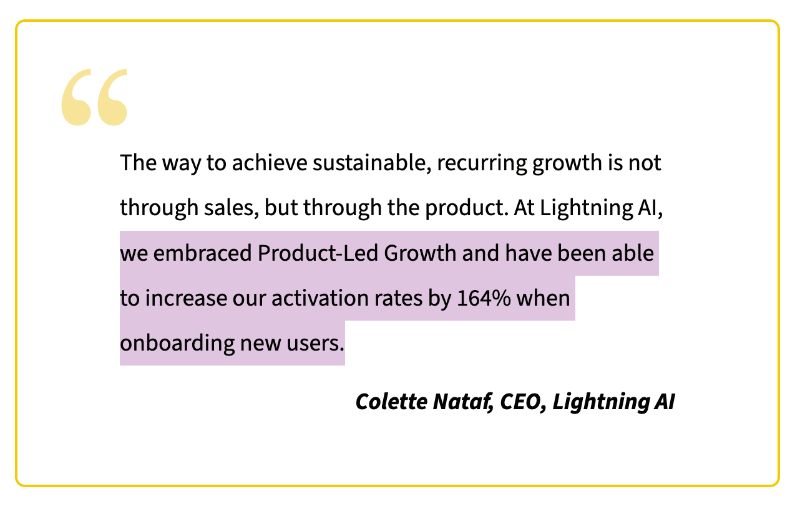
Lightning AI’s CEO, Colette Nataf, shared that after adopting a product-led approach and optimizing their onboarding, they saw a 164% increase in activation rates.
It gives you more actionable user data
One of the most valuable benefits of product-led onboarding is the depth of behavioral insight it offers. With embedded onboarding tools in place, you’re not only providing guidance to your users but also monitoring their engagement patterns and user paths to complete tasks and steps within your product.
So, they learn from you, and you learn from them.
Onboarding tools track how users move through onboarding flows and show you which steps they complete, where they hesitate or drop off, what messages or tutorials they engage with, and which features they ignore entirely.
Some even do more than that and track clicks and scrolls, record user sessions, or create heatmaps.
This data, in general, gives you a much clearer picture of the user journey. It helps answer questions like:
- Are users reaching their “Aha!” moments?
- Where do they typically get stuck?
- Are certain segments struggling more than others?
With this insight, you can continuously optimize your onboarding experience, tweak steps that cause friction, remove unnecessary complexity, or add more guidance for different user types.
Over time, this also builds a powerful feedback loop.
Say you notice lots of people quitting at one step; you can jump in, fix it, and watch more users stick around. And at this point, you already know what better and more user-friendly onboarding means…
It reduces support load and ticket volume
A solid product-led onboarding strategy makes life a lot easier for your support team. Without an effective onboarding flow, your inbox quickly fills up with the same questions over and over: “How do I invite a team member?”, “Where do I customize my settings?”, “Why can’t I find this feature?”
When users can find these answers themselves through clear, interactive, in-app guidance, those tickets never get created in the first place. Onboarding flows help prevent confusion before it even begins.
This way, you free up your support team to work on more complex, high-impact tasks.
Instead of spending their time answering setup questions or sending links to help docs, they can focus on deeper troubleshooting, customer education, and strategic initiatives that actually drive success.
Best practices for product‑led onboarding
Product-led onboarding is more than just throwing a few tooltips into your product and hoping for the best. To do it well, you need to combine behavioral psychology, UX best practices, and customer success insights.
Below are practical and proven strategies that will help you craft product onboarding flows that actually activate users and drive long-term engagement.
1- Keep onboarding workflows simple and frictionless
One of the most common pitfalls in user onboarding is information overload. When a new user signs up, excitement is high, but attention spans are low.
Flooding them with every feature and use case your product offers is like opening 10 browser tabs for them at once and expecting them to know which one is the most useful one for them.
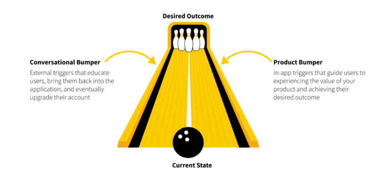
That’s where Wes Bush’s Bowling Alley Framework comes in.
It’s a mental model for keeping users focused, guided, and on track.
In the Bowling Alley Framework, your user’s journey is the bowling lane. The goal is to get them to activation or the first "Aha!" moment.
Left unguided, users will often throw gutterballs. They’ll click around randomly, miss key features, or bounce before they understand the value. So your job is to add guardrails, small nudges, in-app cues, tooltips, and checklists that prevent them from veering too far off course.
💡Tip: Show what’s essential to get to the first win, and nothing more.
Not everything in your product matters on Day 1, anyway. Instead of a grand tour, break things into bite-sized, task-focused steps.
For example, Monday.com uses a combination of slideout modals and pulsating hotspots to onboard new users.
Instead of walking users through a long, step-by-step tour across the entire platform, it keeps things simple with about 4-5 concise modals that highlight key features right on the homepage. Here’s one of them:
💡Tip: Let people skip steps or leave the tour.
Another way to keep onboarding flows frictionless is to add exit points and skip buttons. Not every user is starting from scratch.
Some have used similar tools. Others may want to explore solo.
Give them the ability to skip ahead or revisit tutorials later. The goal is not to trap users in a rigid flow, but to guide them while still respecting their preferences and confidence level.
For example, Webflow starts by explaining the purpose of its tutorial before diving into the steps, giving users the choice to opt in or skip it altogether. It also provides an estimated completion time, so users know what to expect upfront.
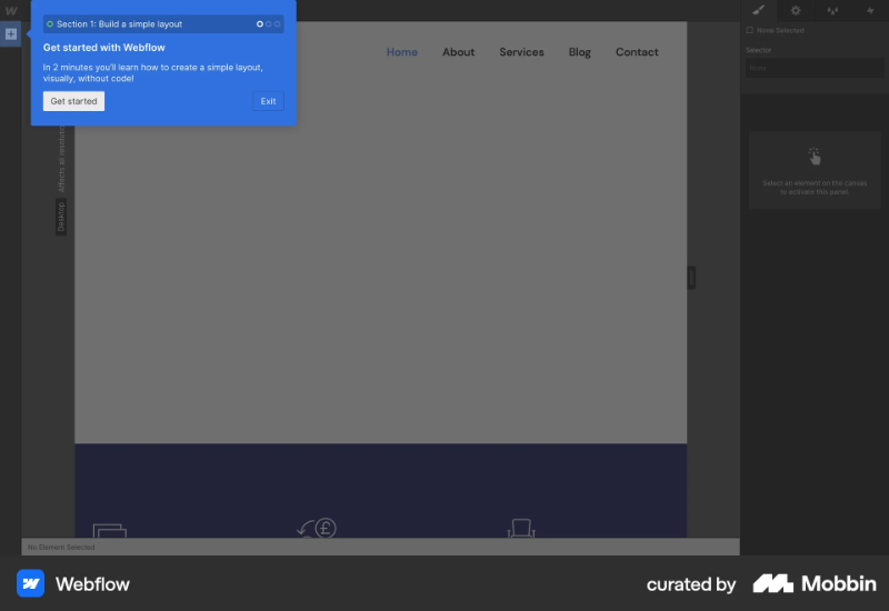
Plus, Webflow lets you check off items on its onboarding checklist without having to go through every interactive tutorial. The checklist has 8 items, so it’s a bit lengthy, but each one is packed with value and leads users to a different “Aha!” moment.
The checklist acts as a helpful guide without feeling like a full-blown university course. You can treat it like a syllabus, skip some tutorials if you want, but still follow the checklist to stay on track.
What’s more, you can always revisit the checklist or retake tutorials anytime from the in-app help center. So, dismissing them once doesn’t mean you lose access forever.

💡Tip: Do not put too much fluff into your flows.
This applies to both your product tour steps and your microcopy or in-app messages overall. Onboarding isn’t the time to get too friendly with your users. Sure, casual language, emojis, gifs, or a well-placed joke can work if it fits your brand’s vibe, but don’t let them drag out the process.
- Skip adding 3 extra welcome screens just for jokes.
- Combine task steps and checklist items when it makes sense.
- Celebrate only after completing the entire task, not after each step.
Slack, for example, is known to have a very friendly and conversational tone with all the emojis, little animations, and the amazingly creative in-app messaging.
But they always provide value and contextual information within their “friendly” nudges.
2- Leverage the BJ Fogg Behavior Model to drive habits
If you want users to consistently engage with your product, you need to design your onboarding to build habits, not just complete a checklist.
The BJ Fogg Behavior Model says that behavior happens when three elements converge: motivation, ability, and a prompt. If any of these are missing, the behavior won’t happen.

So how do you use this in your onboarding?
- ✅ Keep tasks easy and clear (ability),
- ✅ Make sure the user understands the benefit of doing them (motivation),
- ✅ And provide well-timed nudges (prompts).
💡Tip: Be transparent and upfront.
Some products require lengthy implementation and setup processes, or they have complex features that come with steep learning curves and thus require lengthy onboarding processes.
That is okay.
As long as you’re honest about the duration of the process.
Let users know how long the onboarding or setup will take upfront. When users can plan their time accordingly, they’re more likely to engage fully instead of rushing through and missing critical steps. You should also communicate the value they’ll get from completing onboarding.
And don’t just say “do this, click that.”
Help users understand why each task matters. If you have tutorials, guides, or videos for key steps, surface them contextually while the user is taking action.
Mixpanel sets a great example here. Their setup guide clearly outlines the estimated time to complete it (3 minutes) and the total time needed to set up the product (20 minutes). At different points, they explain why each step matters and what kind of results the user can expect.
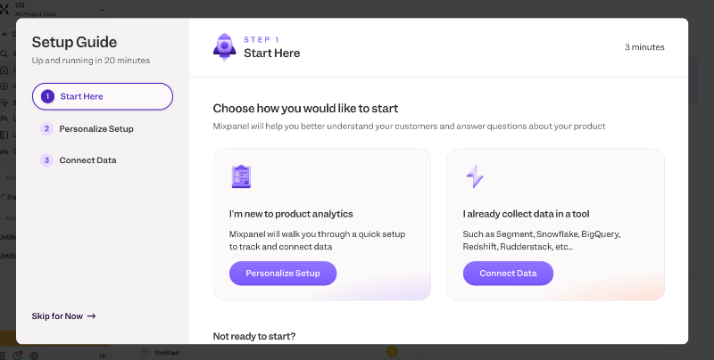
To keep motivation high, Mixpanel also provides demo dashboards so users can see what success will look like even before finishing setup. And if things get too technical, they offer a friendly prompt and a CTA to invite a teammate.
Because at the end of the day, onboarding is about helping users see real value and making sure they’re supported at every step.
3- Use social proof and success signals
People don’t invest (time or money) in products and services they’re not very convinced that it’ll work for them. And most marketing copy is met with a healthy dose of skepticism.
But there’s one kind of messaging that consistently earns trust: social proof.
When you showcase real testimonials, reviews, or success stats, you’re not just telling users your product works but you’re actually proving it. It’s a way of saying, “Look, others like you found real value here. You can too.”
And you don’t need to wait until after onboarding to show social proof either.
You can weave it into early touchpoints like sign-up screens, onboarding surveys, empty states, and even loading moments. It’s a subtle but powerful nudge that helps new users feel more confident and motivated to explore your product.
Here’s how UserGuiding highlights one of their success stories on the sign-up screen:

Here, UserGuiding doesn’t claim you can drastically reduce your support costs with their onboarding flows. But we hear how Canopy was able to save over $300K in their support costs in 3.5 years with UserGuiding’s onboarding flows.
It’s a real-life customer accomplishment.
Below the testimonial, you also see logos of well-known companies and organizations that use UserGuiding in their workflows, along with the latest G2 badges UserGuiding has earned.
💡Tip: Turn your success stories into insightful statistics.
You probably have customers who are absolutely obsessed with your product, always recommending it, leaving glowing reviews on sites like G2, or sending love notes to your support team.
These folks are gold.
They’d likely be happy to share their stories: how they use your product, the metrics they track, the pain points you solved, and the wins they’ve seen since adopting your solution.
Start collecting strong use cases, real goals, real outcomes, real numbers. If you already have some, great! Turn those individual stories into something bigger: a study, a report, or even a mini database.
If 1:1 interviews aren’t practical, use in-app surveys to gather valuable insights at scale.
Meditopia, for example, shares user statistics in the onboarding survey:
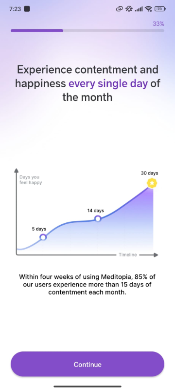
The platform’s onboarding survey is quite detailed, spanning 4 parts with 3–4 questions each. To keep users engaged and motivated throughout the process, Meditopia weaves in powerful social proof.
Between parts, they showcase customer testimonials and compelling stats that highlight the platform’s impact.
For example, one screen features a graph showing users’ improved mood levels over time.
According to their data, 85% of users report feeling content for more than half the month. Other screens include stats on better sleep quality, as well as inspiring quotes from users with different goals and use cases.
4- Segment users & personalize experiences
Not every user is coming in with the same background, goals, or technical level.
So why give them all the same onboarding experience?
Segmentation lets you tailor onboarding based on user roles, industries, goals, or behaviors, making the experience feel much more relevant and helpful.
You can segment during sign-up (by asking a quick “What brings you here?” question), or dynamically based on behavior inside the product. Once you know who your user is and what they need, you can serve onboarding flows that speak directly to them.
A content manager setting up a new workspace in Notion doesn’t need to see database relationships or API integrations first, they need help organizing pages and collaborating with their team. Meanwhile, a product manager using the same tool might want templates for roadmaps, task tracking, or sprint planning.
Same goes for users who’ve used similar tools before versus total newbies.
Someone who’s coming from Trello to try out ClickUp probably doesn’t need a full breakdown of what a task or board is, they just want to know how things map across and what’s different.
But a first-time project management tool user?
They need more hand-holding and clearer explanations from the ground up.
ClickUp, for example, asks users during onboarding which tool they’re switching from or using alongside it (like Asana, Trello, or Monday) and adjusts the onboarding experience accordingly.
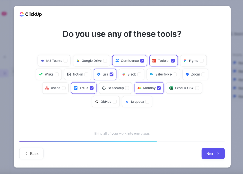
Based on the tools you select, the platform customizes your onboarding, starting right from the checklist. For example, since I indicated I’ve used other task management tools in the onboarding survey, it added a step to help me import my data from them.

If I choose tools like Slack or Google Drive (ones that aren’t task management platforms that are in direct competition with ClickUp) ClickUp doesn’t prompt me to migrate tasks. Instead, it offers CTAs to integrate those tools into my existing workflow.

5- Build task lists and interactive tours toward “aha!” moments
Notice we said “Aha! moments”, plural. That’s because there’s rarely a single, magical moment where everything clicks, the skies part, and your user decides their life’s purpose is to use your product.
In reality, “Aha!” moments are scattered throughout the user journey. They stack, one after the other, guiding users from curiosity to real value. Without an early “Aha,” the next one won’t land. They build momentum.
That’s how Ramli John debunks the magical Aha! moment in his book Product-led Onboarding, at least.
John argues that users experience a series of Aha! moments before, during, and after sign-up. Each one delivers a piece of value, and together, they nudge users closer to becoming paying, loyal customers.
There can be several “Aha!” moments within an onboarding flow, too. And what creates a logical link between them is generally an onboarding checklist.
A well-structured checklist acts like a map, connecting these key moments and making sure users don’t get lost in the process. Each checklist item should be designed to reveal something meaningful for the user and their use case, whether it’s importing data, customizing a dashboard, or triggering a key feature for the first time.
Productboard, for example, uses its onboarding checklist to highlight key platform capabilities and guide users toward their “Aha!” moments. Each item on the list links to an interactive guide, as well.
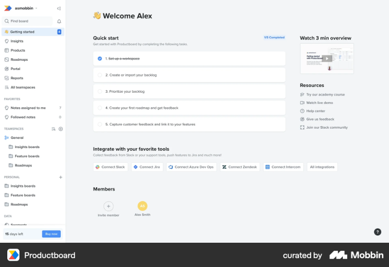
The checklist items are value-driven, they go beyond simple tasks like “invite your team members” or “complete your account setup.”
Instead, they focus on showcasing the platform’s usability and core capabilities.
After completing each task and interactive guide, new users gain a clear understanding of what they can accomplish with Productboard and build confidence because they’ve already experienced success firsthand.
6- Make onboarding continuous, not just a one-time flow
Onboarding isn’t a one-and-done event that kicks off with a welcome survey when someone signs up and then just stops once they complete the initial product tour. Most of the time, it doesn’t even end when a user becomes a paying customer.
Onboarding is an ongoing process that helps users keep learning, discovering value, and deepening their relationship with your product over time.
What do people always say, it’s about the journey, not the destination.
Users only become truly “onboarded” when they not only know what your product can do but also how to do it and actually use it confidently and regularly.
For example, a user might understand the features during signup tutorials, but real adoption happens when they come back weeks later, independently completing important tasks or using advanced features without hesitation.
And whenever you roll out a new feature or a big UX/UI update, onboarding needs emerge, once again. Without this continuous guidance, users tend to forget the value or get stuck, leading to churn.
💡Tip: Keep your onboarding materials accessible.
Your onboarding materials shouldn’t be a one-and-done deal.
People might skip the tour the first time because they’re in a rush, distracted, or just not ready to explore. But that doesn’t mean they’ll never want to revisit it. By making onboarding checklists, tutorials, and guides easily accessible within an in-app resource center, you give users control over their learning journey.
Even better? Let them know it’s there.
Add a quick tooltip or mention it in a welcome message so users know they can always come back and pick up where they left off or restart again.
Besides your interactive materials, you can also keep your other onboarding materials, such as videos and how-to articles, under a “Getting Started” category for easy in-app access as well.
For example, Zendesk keeps its onboarding checklist, important testing links, as well as its popular help topics like setup articles accessible within its in-app help center. You can see how many of the setup steps you’ve completed in your checklist and continue from where you left off with the next guide.

Because Zendesk has a somewhat complex setup with lots of tasks to complete, they divide the process into multiple checklists tailored to different tasks across various feature pages.
This way, users aren’t overwhelmed by one long, intimidating checklist. Plus, the checklists are collapsible, so you don’t have to worry about steps that aren’t relevant yet.
Below the checklists, you’ll find helpful links to the Zendesk Community, a library of videos and webinars, and popular help center articles. The articles are organized by use case and feature, and you can read them directly within the resource center.
So, no need to jump to a separate help center tab.
💡Tip: Refresh users’ memories from time to time.
You’ve onboarded a user for a specific feature, but they’re not using it. Don’t give up, just give them a gentle nudge. Sometimes users forget a feature exists, or they didn’t quite understand it the first time and didn’t want to spend time figuring it out.
Canva does this really well.
It reminds users about unused features right when they’re most relevant, like suggesting the Background Remover tool when you're struggling with a messy design, or the AI Image Generator when you add several images but then delete them all.
These timely prompts feel helpful, not pushy, and often lead to a satisfying little "Oh right, I can do that!" moment.

💡Tip: Onboard existing users after a feature release.
Just like you onboard new users to your product, you can (and should) onboard existing users to new features or UI changes, too. Remember: onboarding is all about helping users get the most value from your product with as little friction as possible.
So, if you move a UI element, rename it, update its icon, or merge it with another feature, don’t leave your users guessing. A small, non-intrusive tooltip or a hotspot can go a long way in avoiding confusion.
But if you’re rolling out a totally new feature (or launching a major redesign that could pass as your product’s v2) then you can go bigger and do a more detailed product tour.
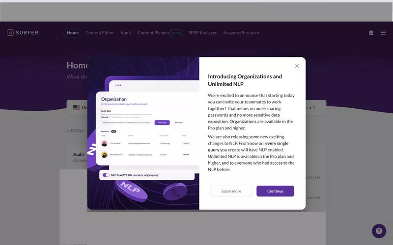
Surfer, for example, introduces its new feature with a clean announcement and follows it up with a guided walkthrough to help users understand exactly what it does and how to use it effectively.
7- Combine in‑app guidance with external triggers
Relying solely on in-app onboarding can leave users stranded when they aren’t actively using your product. Drew Teller’s study found that onboarding emails alone can increase activation rates by up to 20%. That's a big win for a relatively low-lift channel.
These nudges:
- Remind users who’ve dropped off to return and continue onboarding
- Reinforce the value proposition by highlighting key benefits or features
- Personalize the journey based on what the user has already done, or not done
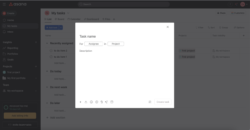
Asana, for example, incorporates onboarding emails into its onboarding process to ensure new users make the most of their short trial period. Here’s one of their onboarding checklist emails, which outlines 3 steps users should take to start getting value from the product:
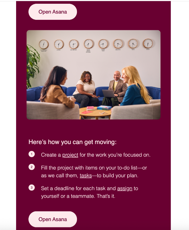
Each item on the to-do list includes a direct link to the relevant feature page or dashboard. For example, clicking on “tasks” in the second step takes you straight to the task creation page, and even opens the feature builder automatically.
8- Use peer-led onboarding via community touchpoints
Sometimes, the best teacher is a fellow user who’s “been there, done that.”
Peer-led onboarding leverages community power to support new users, providing relatable advice, tips, and encouragement.
Building a vibrant community through forums, social media groups, or Discord channels lets users connect, share success stories, and troubleshoot together. This social proof helps new users feel less alone and more confident trying features.
Atlassian, for example, has a huge community divided into various groups.
There are groups focused on specific features, different Atlassian products, training and certification, industry-specific discussions, and even spaces dedicated to gathering user feedback.
Here’s a look at the latest posts on the training and certification group:
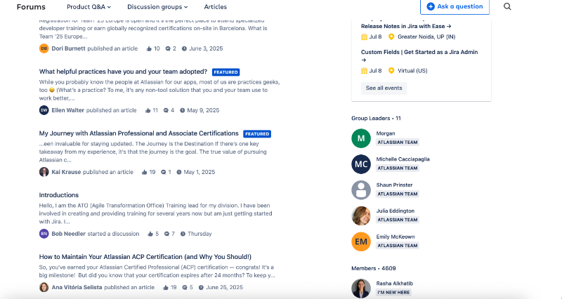
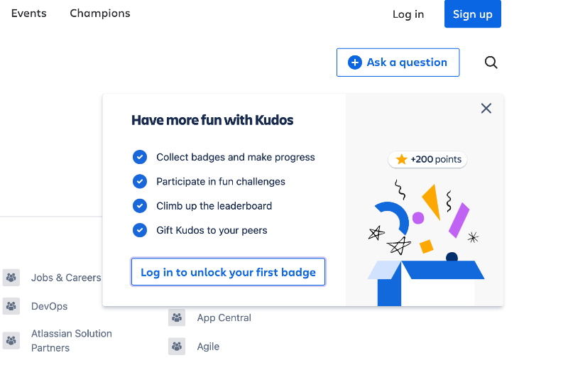
To keep the community lively and encourage customers to participate in groups, engage with posts, and join events or challenges, Atlassian adds a fun twist by gamifying the experience. Users can earn badges, climb leaderboards, and collect points.
9- Continuously optimize via qualitative and quantitative research
Onboarding is never perfect from day one. The best teams treat it as a living process that needs constant tuning.
Quantitative data like user drop-off rates, completion percentages, and time spent on steps give you a clear view of where users struggle or lose interest. Meanwhile, qualitative insights gathered from user interviews, feedback surveys, or session recordings reveal the why behind those numbers.
Combining these helps you identify friction points and redesign flows that actually work.
💡Tip: Use in-app surveys for quick and timely feedback.
Email surveys or 1:1 interviews with CS teams can provide really in-depth insights into the user’s experience with your product, their feelings, the problems they face, and what they love most.
However, there’s generally less motivation for users to participate in.
Interviews require a significant time investment (both for your team and your customers), and email surveys often arrive at the wrong time and end up being forgotten.
That’s why in-app surveys have higher answer rates.
⚡ According to SurveySparrow’s 2025 benchmarks, mail surveys typically see response rates between 12% and 15%, with some platforms like Delighted reporting as low as 6% in their 2024 benchmarks.
In contrast, in-app surveys perform significantly better, one study of 500 in-app surveys found an average response rate of 25.25%, with completion rates around 23%. Many web-app survey widgets consistently reach 15–25% response rates, and some even exceed 30%.
Many product adoption and onboarding platforms do also offer in-app surveys (at least NPS surveys) you can use to collect feedback on:
- Onboarding experiences,
- In-app guidance, or
- New features.
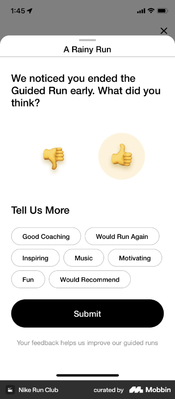
Here’s how Nike Run Club collects user feedback when a user ends a guided run earlier than expected:
💡Tip: Monitor the user paths.
A user path refers to the sequence of actions a user takes to complete a goal within your product, say, creating a playlist on Spotify.
- Do most users click the “Create Playlist” button first and then start searching for songs to add?
- Or do they stumble upon a song they like, click the “Add to Playlist” option, and only then create a new playlist from that modal?
Tracking these patterns reveals how users actually behave, not how you assume they will. Understanding user paths also helps reduce drop-off.
If users are getting stuck halfway, say, they create a playlist but never add songs, it could mean your UI doesn’t guide them to the next step clearly enough.
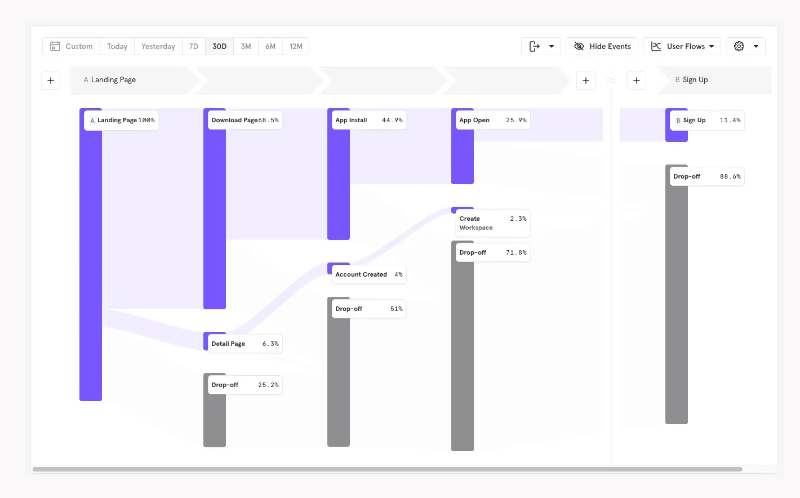
You can use behavior analytics and event tracking tools to monitor and visualize user paths. Here’s an example user path chart created with Mixpanel:
10- Support every learning style with self-help resources inside the app
We’ve already covered how important it is to make your onboarding materials like tutorials and guides available inside your product for easy access.
So let’s not repeat that.
Instead, let’s talk about how to cater to different learning styles.
Not every user learns the same way. Some want to read, others want to watch, and some just want to do without being told too much. That’s why your in-app support resources should be as diverse as your users:
- 🧠 For analytical readers: Make your knowledge base and FAQs easily accessible right from a resource center widget inside your product.
- 📺 For visual learners: Add short, to-the-point videos or GIFs that explain features clearly.
- 🧪 For hands-on explorers: Offer interactive walkthroughs or guided tours that let them learn by doing.
- 💬 For conversational learners: Include a chatbot or AI assistant that lets them ask questions in natural language and get support right away.
UserGuiding, for example, combines its in-app resource center, AI assistant, knowledge base, and product updates into a single widget. This keeps the UI clutter-free and ensures users don’t have to jump from page to page to find the help they need.
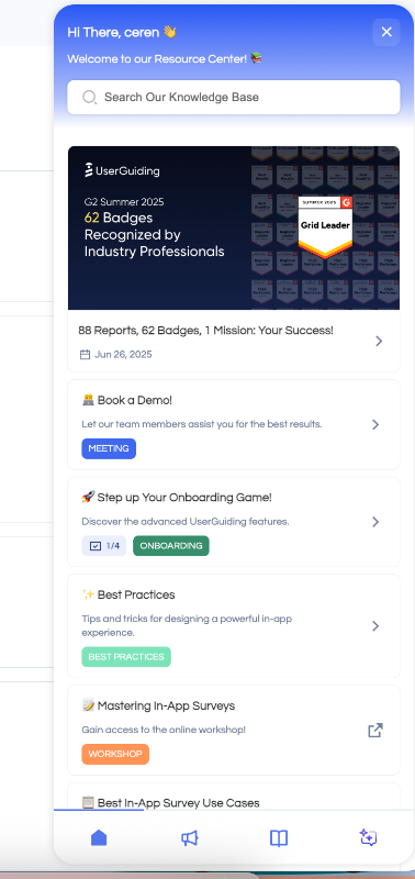
Within the resource center, the onboarding checklist and its guides are pinned for easy access. You’ll also find the latest announcements and events highlighted, along with popular articles that cover best practices.
If you have a specific question or need help with a more advanced feature or setting, you can use the search bar to look through knowledge base articles.
Or head to the knowledge base tab in the widget and browse the categories yourself.
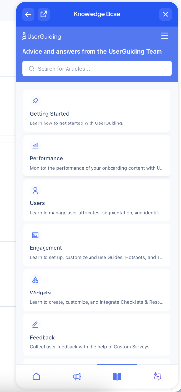
While UserGuiding’s AI assistant, Dylan, has its own dedicated widget, it’s also accessible from within the main resource center widget. It offers assistance with a conversational tone so that you don’t need to search for technical articles and then read them.
Dylan also finds and triggers interactive guides if there’s one that can help you with your question.
Step-by-step guide to building a product-led onboarding flow (without falling into common onboarding pitfalls)
In this part, we’ll provide you with a real action plan on how to create a personalized, engaging, and automated onboarding experience. We’ll also cover the most common onboarding mistakes teams make when designing flows, share real-life examples (good and bad), and explain exactly how you can avoid falling into the same traps.
Andiamo! 🚶🏻♀️➡️
Step 1: Understand your users
Before building anything, get clear on who you're building for. Identify your Ideal Customer Profile (ICP) by collecting data on:
- Job titles and industries
- Company size and maturity
- Use cases and goals
- Common pain points and workflows
Use surveys, interviews, product usage data, or CRM data to define this clearly. The more you understand the motivations and struggles of your users, the more tailored and impactful your onboarding checklist will be.
Common Mistake #1: Forcing all users through the same onboarding flow
"Self-serve personalization isn't a nice-to-have anymore, it's a make or break for activation and retention. You need to understand how different user types experience your product's value and build onboarding journeys that allow them to get to that value quicker.
You're not limiting your product's value by doing this.
You have to strategically expose them to different parts of your product.”
- Yaakov Carno, Founder at Valubyl
Yaakov Carno nailed it: forcing everyone through the same generic onboarding is lazy and ineffective. We won't pretend we can say it better, so just consider this our mic drop moment.
Step 2: Define your activation point(s)
Your activation point is the moment when a user first experiences real value from your product. It’s not just “signed up” or “completed onboarding.” It’s when they feel, “This works for me.”
Here are some examples:
- Canva: publishing their first design.
- Slack: sending 1:1 messages to teammates.
- Zoom: hosting a successful call.
You can analyze usage data to see what actions correlate with retention, use behavior analytics tools like Mixpanel or Amplitude to identify key actions, and interview power users about their insights.
Step 3: Map the minimum steps to reach that activation
Once you know your activation point, reverse-engineer the shortest path to get there. Avoid loading the early experience with extra steps like inviting team members or filling out every profile field, unless they directly help the user achieve their goal.
Break down what users must do to experience value.
That becomes the skeleton of your onboarding.
Common Mistake #2: Overwhelming users with too much info at once
74% of users abandon onboarding if it’s too complicated. Even well-intentioned guides can backfire if they’re too long or too packed with information.
Same goes for so much tasks…
Your product might require many steps for implementation and setup, but that doesn't mean it has to feel overwhelming. You need to present the process in a non-threatening, digestible way. If a new user lands in your product and is immediately bombarded with pulsating hotspots, tooltips, and pop-up modals, chances are they’ll run.
As Jamie McDermott jokes on LinkedIn 👇🏻
A real-life example of this is CommandBar’s we-dont-know-how-many-steps “instructions” tour.
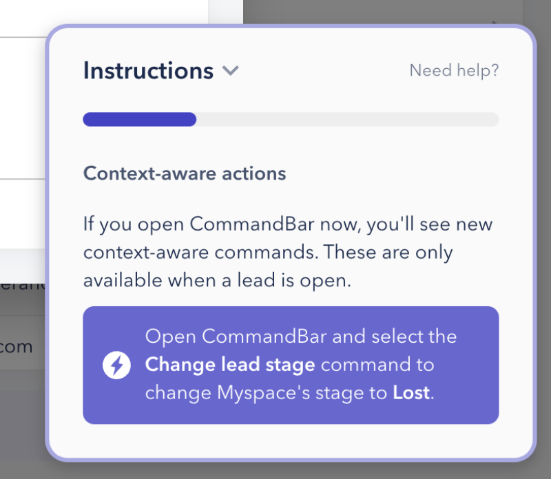
When you look at this single slideout modal, it might seem innocent. However, it's actually one of 15. It’s not explanatory enough, what are context-aware actions, and what are we supposed to command them to do??
There’s no interactive element or even a visual aid to help users contextualize the information.
The progress indicator doesn’t help either, because of the excessive number of steps, it’s hard to notice any change, making the progress feel almost nonexistent.
Plus, there’s no skip or dismiss button.
0/10.
Step 4: Break those steps into actionable checklist items
Turn those essential steps into a checklist users can track visually. Each task should be:
- Goal-driven (not admin fluff)
- Actionable (not vague)
- Rewarding (creates confidence)
Common Mistake #3: Treating onboarding as a one-time event
Make sure your onboarding materials are easily accessible, preferably right inside your product. If a user skips a guide or dismisses a tooltip the first time, that content shouldn’t disappear into oblivion.
Instead, keep everything (interactive tutorials, checklists, help articles, and videos) organized in a resource center or help widget. This way, users can come back to them whenever they need a refresher, whether they’re new or returning after a break.
It also supports your existing users.
Maybe they don’t use a certain feature often and need to brush up. Or maybe you’ve rolled out an update and they want to relearn the flow. Having your materials readily available ensures users always have a reliable way to reorient themselves without reaching out to support every time.
Straico keeps a detailed checklist of all their essential tutorials and interactive guides in their in-app resource center, so users can easily find and go through the tutorials anytime. (This is a good example.) 👇🏻
Step 5: Trigger the checklist contextually
Show the onboarding checklist only when it’s relevant, like right after signup or on the user’s first login. Make sure users can easily close or skip the checklist; don’t trap them in it.
If your product has multiple checklists for different tools or features, trigger each one only when the user is on the related page.
And most importantly, don’t bury the checklists on your UI.
It’s not hide-and-seek.
PostHog’s hidden onboarding checklist is a terrible onboarding mistake, for example:
The checklist is not triggered when the new user lands on the home page. Instead, it’s hidden behind collapsable side bars. Even though there are technically 2 places where you can “see” the quick start checklist, neither is very visible or eye-catching.
Step 6: Provide in-app guidance for each step
Each checklist item should be supported by:
- Interactive walkthroughs
- Tooltips
- Videos or images (when needed)
The key here is: make users act, not just read.
Mistake #4: Using passive content without interaction
Passive content in onboarding can take several forms, there are:
- Emails without any in-app guidance to back them up.
- Static slideshows (Canva style).
- Popups that just list instructions without visuals (CommandBar style).
Onboarding checklists where every item is simply a link to external knowledge. base articles. This is fake in-app onboarding at this point.
Splunk’s static product tour, or slide show, we might say, doesn’t really help users to understand how to use the platform and gain value from it.
It’s more of a “this feature is here, and that feature is there” type of tour, and it doesn’t even work well for navigational purposes, since the user isn’t interacting with the tour or navigating on their own.
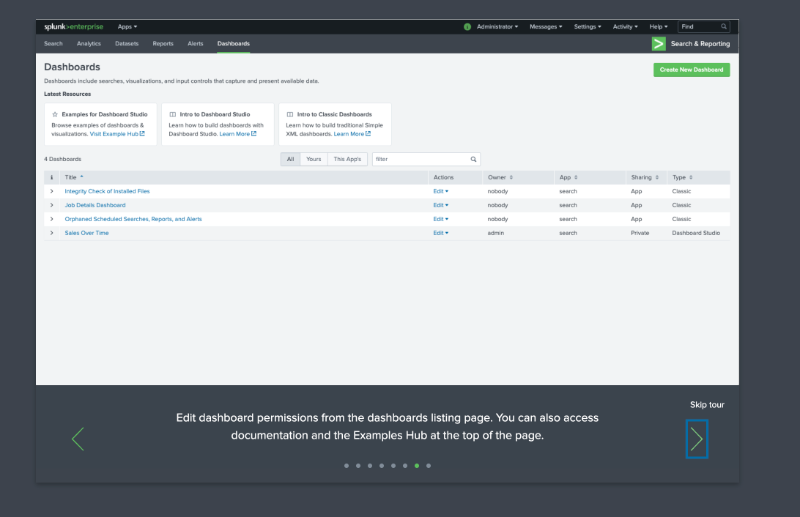
“Here is the listing page.” But where is it, really?
Step 7: Track completion and drop-off analytics
Once your onboarding checklist is live, it’s essential to monitor how users interact with it.Analytics give you the insights you need to understand what’s working and what’s not.
For instance, tracking how many users complete each step of your tutorial can help you identify if a certain part of the flow is causing confusion or friction. If a large portion of users are dropping off after the second step, that’s a clear sign it needs rethinking.
Tools like Mixpanel, Pendo, or Google Analytics can help you collect this kind of behavioral data. Most of the onboarding and product adoption platforms have their own analytics and engagement reporting, as well.
You’ll want to look at:
- which guides users skip entirely,
- which ones they revisit, and
- whether they’re getting stuck at certain points.
These patterns can point to where your onboarding experience needs simplification or clearer instructions.
Common Mistake #5: Obsessing over onboarding metrics
It’s easy to fall into the trap of treating onboarding analytics like high scores, chasing perfect checklist completion rates or high click-throughs on your tooltips.
But those numbers alone don’t tell the full story.
Economist and Academic Charles Goodhart says:
“When a measure becomes a target, it ceases to be a good measure.”
So, instead of optimizing for the checklist completion itself, focus on what happens after onboarding:
- Are users adopting the features they learned about?
- Are they returning and using the product consistently?
- Are they inviting teammates or upgrading their accounts?
Step 8: Iterate based on feedback and behavior
Onboarding should evolve with your product and your users. The best teams continuously gather feedback to improve clarity, reduce friction, and drive better activation outcomes.
We've already talked about the importance of qualitative and quantitative research, so use that data and those insights to update your flows.
77% of customers say they trust companies more when they actively seek feedback. So, iteration not only improves the product experience but it builds brand loyalty, too.
Best product-led onboarding tools
According to Rocketlane’s 2024 Customer Onboarding Report, 40% of companies who invest on customer onboarding tend to use 4 to 6 tools for the onboarding and implementation processes, (which is a lot of tools).

But we understand, it’s hard to find a single tool that solves more than one problem for you. You need one platform for tours and guidance, another for self-serve support, one for analytics, and yet another for user research and feedback…
We’re already at tool number 4.
The good news? You can tackle several of these use cases with just one tool (even if not all of them).
So, let us provide you with a list of the best solutions for product-led onboarding that offer multipurpose, diverse features and capabilities.
UserGuiding
UserGuiding is a no-code product adoption platform built for fast-growing teams that need to launch in-app experiences quickly without relying on developers.
It allows you to create interactive product tours, onboarding checklists, NPS surveys, in-app messages and more in minutes. With segmentation and analytics built in, you can personalize the onboarding experience and track user progress easily.
- Best for: Startups, scaleups, and PLG SaaS teams with limited dev bandwidth.
- Pricing insight: Has a free plan called Support Essentials.
- G2 Score: 4.7 ⭐/ 5
What sets UserGuiding apart from other onboarding tools?
✅ True no-code experience.
✅ Better usability and quicker implementation.
✅ Combines capabilities like an AI assistant, knowledge base, and product updates with in-app guidance tools –features that are rarely offered together in a single platform.
Appcues
Appcues is a multi-channel user engagement platform that also offers tools for product adoption, onboarding, and retention. It lets teams create in-app flows, surveys, and tooltips to create product-led onboarding flows.
Appcues is also one of the few platforms that includes an email messaging feature.
- Best for: Mid-market to enterprise SaaS with event tracking and A/B testing expectations.
- Pricing insight: Starts at $300/month
- G2 Score: 4.6 ⭐/ 5
What sets Appcues apart from other onboarding tools?
✅ A/B testing and experimentation capabilities.
✅ Roadmaps and user journey features.
✅ Email messaging capabilities.
Pendo
Pendo combines in-app onboarding with built-in product analytics and user feedback collection. Teams can track usage data, trigger contextual guides, and communicate roadmap updates.
- Best for: Data-driven product teams and enterprise PLG companies.
- Pricing insight: Custom pricing for paid tiers but has a free tier, too.
- G2 Score: 4.4 ⭐/ 5

What sets Pendo apart from other onboarding tools?
✅ Detailed engagement reporting and analytics capabilities, including event tracking.
✅ Features for product managers (roadmaps and idea validation).
✅ Mobile and iFrame support.
WalkMe
WalkMe is an enterprise-grade digital adoption platform designed to support complex onboarding across both customer- and employee-facing tools. It helps teams build automated onboarding flows, smart tips, and task automation.
- Best for: Large companies managing internal training or multi-platform onboarding.
- Pricing insight: Custom pricing.
- G2 Score: 4.5 ⭐/ 5

What sets WalkMe apart from other onboarding tools?
✅ Additional features for employee training and internal usage in general.
✅ Advanced AI and automation capabilities with WalkMeX.
Whatfix
Whatfix is a digital adoption solution built for onboarding customers across complex tools, often in enterprise settings. It supports multi-language content, deep integrations, and both employee- and customer-facing experiences.
Whatfix also offers 2 more solutions called Product Analytics and Mirror beside the DAP.
- Best for: Enterprise organizations with products that support multiple platforms.
- Pricing insight: Custom pricing.
- G2 Score: 4.6 ⭐/ 5

What sets Whatfix apart from other onboarding tools?
✅ Multiple platform support (web apps, mobile apps, desktop apps, and OS).
✅ Sandbox-style training environments.
✅ Advanced analytics and reporting.
Chameleon
Chameleon is an onboarding platform that helps product teams create in-app tours, tooltips, and launchers with popups ans embedded modals. It also offers a Spotlight-style search bar called HelpBar.
- Best for: Teams looking to enhance onboarding with embedded widgets.
- Pricing insight: Starts at $279/month
- G2 Score: 4.4 ⭐/ 5
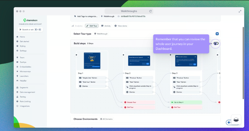
What sets Chameleon apart from other onboarding tools?
✅ Variety of embeddable cards.
✅ CMD+K Search feature.
✅ A/B testing with AI-created variations.
Examples of product‑led onboarding in action
Have we seen enough examples? No, never!
Here are some more 👇🏻
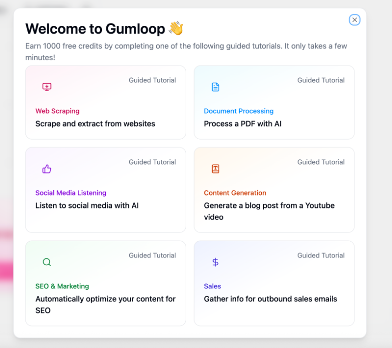
Gumloop - Onboarding Gamification
Gumloop turns completed onboarding guides (and even individual guide steps) into credits you can use later in the product. Instead of saying, “Hey, do you want a product tour?” they ask, “Hey, do you want free credits?”.
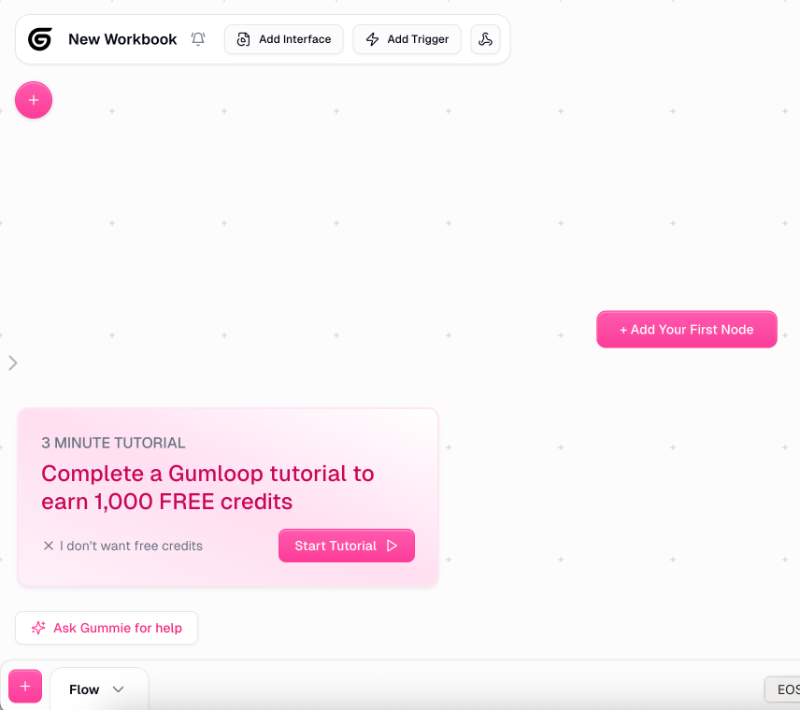
Once you click “Start Tutorial,” you’re not taken through a generic product tour that highlights every feature, many of which may not be relevant to you.
Instead, Gumloop asks about your specific use case and directs you to a personalized walkthrough that goes over the most relevant offerings of the platform for your goals.
Afterall, someone interested in web scraping won’t benefit from the same features as someone looking to process a PDF.
Each tutorial includes a step-by-step checklist filled with interactive elements, clear explanations, visuals, and even animations. Most tutorials have 4–5 steps, so they’re short and manageable while still guiding you from scratch to running workflows.
Here’s a look at the content generation tutorial:

While you can follow the instructions and track your progress through the checklist on the right side of the screen, the left side features animated text boxes that walk you through each step: what to click, what to search for, and what to do next.
If a step involves dragging an item, the animations even show you exactly what to drag and where to drop it.
It might look a bit busy at first, but it’s actually very effective.
In fact, Gumloop’s onboarding is so smooth and well-executed that even Andrew Capland, a PLG advisor to many leading SaaS companies, shared it as an example worth checking out.
📌 What’s so good about this example?
- Gamified experience with free credits to use in the platform
- Goal-oriented and personalized tutorials
- Great use of visuals and animation in the guides
- Estimated time for the tutorials
- 10 points for the “I don’t wan’t free credits” button instead of a classic skip button
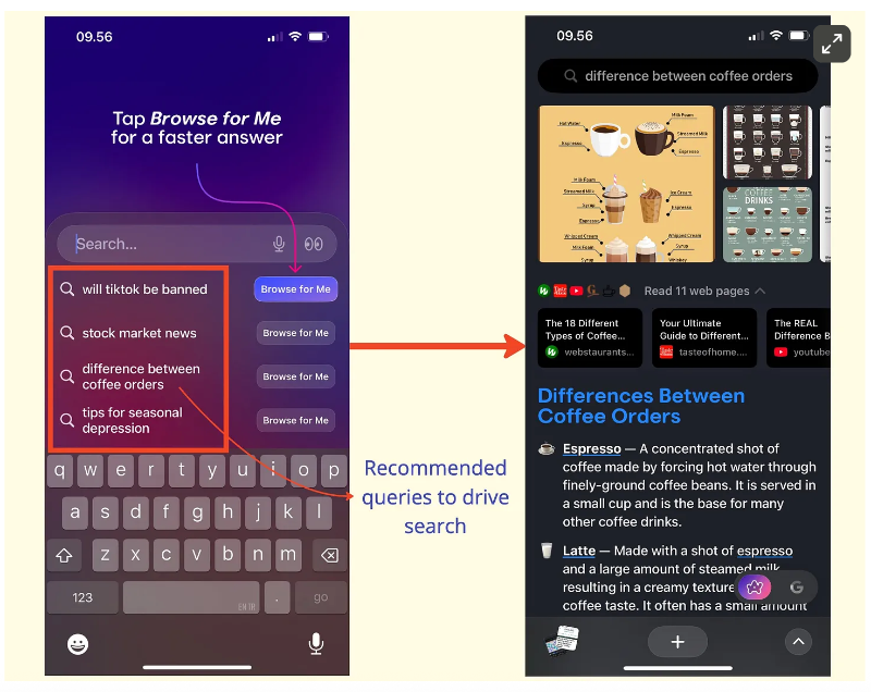
Arc Browser - Show Don’t Tell
Arc Browser embraces a “show, don’t tell” approach in its onboarding by guiding new users through a quick trial search. It suggests a few example queries and then demonstrates how key features work in context.
Take the “summary by pinch” feature, for example: instead of simply stating that you can summarize articles by pinching the screen, Arc lets users try it themselves during onboarding.
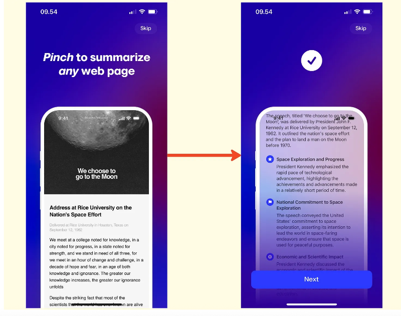
The same goes for their search function, it suggests example topics, lets you choose one, and then displays the results directly within Arc Browser’s UI so you can see exactly how they’ll appear.
📌 What’s so good about this example?
- Interactive and tactile onboarding experience
- More innovative than traditional tooltips
- Shows immediate results and value to the user
Meditopia - Social Proof and Statistics
Meditopia uses social proof and user success stats throughout its onboarding survey to keep new users motivated. The survey itself is fairly long, divided into 4 sections, each with 3–5 questions.
To maintain engagement between sections, Meditopia highlights user testimonials and success stories like this:
Or, they share data on user success, like the improvement in reported moods over a specific period of time.
These statistics and social proof not only help keep users engaged during the survey but also reinforce the product’s value proposition, almost proving its benefits to users before they even try it themselves.
📌 What’s so good about this example?
- Personalized onboarding with a very detailed onboarding survey
- Progress bar with a percentage indicator (crucial for long flows)
- Strategically placed social proof and da
Shopify - Task-oriented Onboarding Checklist
Shopify starts its onboarding with a quick welcome survey consisting of 3 questions. It asks where you plan to sell, what you want to sell, and whether you already have an existing business or are starting from a new idea.

Your answers help personalize both the platform setup and the onboarding flow.
After completing the onboarding survey, you’re presented with a relatively long checklist. However, since it’s divided into multiple collapsible sections, each functioning like its own mini checklist, the overall experience feels more organized and less overwhelming.
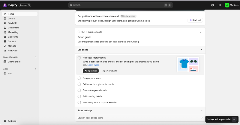
Shopify’s onboarding checklist includes 11 tasks in total. Each item is a value-driven action designed to help users set up their store and deepen their commitment to the platform.
While the tasks don’t include interactive tutorials, each one comes with a static, explanatory guide that walks users through what to do on the relevant page or with the specific feature.
These static guides open in a side panel next to the feature page, allowing users to follow along without losing context.

📌 What’s so good about this example?
- To the point onboarding survey with no unnecessary questions
- Long but well-organized onboarding checklist
- Checklist tasks curated for value moments and commitment
- Non-intrusive side bar guide
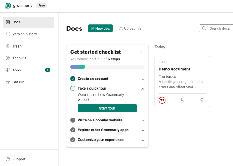
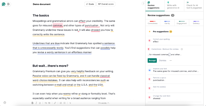
Grammarly - Blank Slate? Seems like Onboarding Space to Me!
Grammarly starts its onboarding process with a quick survey as well, but we won’t dive into its details here. After that, you're presented with an onboarding checklist focused more on helping you complete your setup than immediately showing product value.
Here’s how it looks:
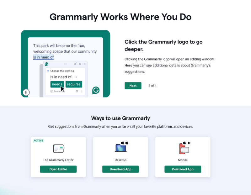
The product tour is a static walkthrough made up of 4 slides, highlighting key features and UI elements with clear explanations and supporting visuals.
Because the platform is already intuitive and user-friendly, the tour works well, it doesn’t feel confusing or unnecessary, unlike static tours from more complex platforms like Splunk, where users can easily get lost or disengaged.
What’s especially interesting about Grammarly’s onboarding is how it uses blank space in its demo document. Normally, when you sign up for a tool like this, you don’t have any content to work with.
Yet, seeing the product’s value often depends on having something in place.
Grammarly solves this by providing a demo document right away. But it’s not just filled with placeholder text.
Instead, the document includes onboarding copy that explains the platform’s features and capabilities. This way, users learn by both interacting with the product and reading helpful guidance within a real editing environment.
📌 What’s so good about this example?
- GIFs in the static tour contextualize the information
- Ready-to-work-on demo document for users to try out features immediately
- Educational copy in the demo document
Auth0 Actions - Onboarding can be Helpful for Technical Teams, too
Onboarding is often mistaken for basic tech training aimed at non-technical users, but that couldn’t be further from the truth.
While it’s true that no-code tools or products with less technical audiences often invest more in onboarding, that doesn’t mean developer tools don’t need it.
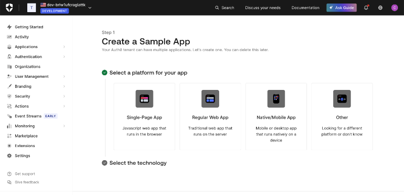
Take Auth0, for example, an authentication and authorization platform built for developers. Its onboarding flow is smooth and well-structured, starting with 4 steps.
First, it asks you to create a sample app so you can get a hands-on understanding of how the platform works:
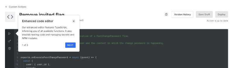
Next, you move on to configuring your login box, the design, social connection options, and more, while seeing a live preview on the right side of the screen.
Once you’ve done creating sample apps and trying out different designs, you can opt out of the “Getting Started” page and the onboarding page will disappear from the side bar.
There are also tooltips scattered across the platform that offer contextual tips.
They don’t launch long tutorials or anything, it’s more like, “Hey, since you’re already here, here’s a quick tip.”
📌 What’s so good about this example?
- Proves onboarding is for ever user (technical and non-technical)
- Has a dedicated onboarding page, which you can get rid of later on
- Also adopts “show, don’t tell” approach
- Tooltips for contextual guidance and pro tips
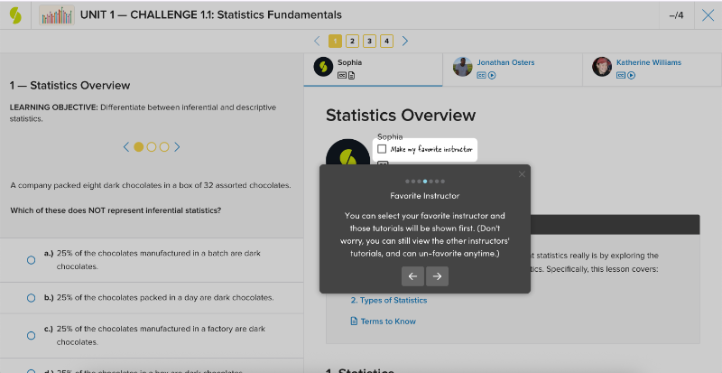
Sophia Learning - Explanatory and Value-packed Product Tour
Sophia Learning provides product tours and interactive guides to help new users understand the platform’s offerings and capabilities.
Rather than relying on a single, lengthy walkthrough, they break the experience into smaller, contextual tutorials that are triggered based on the page the user is on.
Naturally, the home page tour appears first, but it doesn’t launch automatically.
Instead, users are greeted with a modal asking if they’d like to take the tour, giving them the option to engage at their own pace.

As you can see, the microcopy uses a casual and friendly tone, something that remains consistent throughout the tour and all other tutorials.
The initial home page tour includes 5 steps and gives users a general overview of the platform’s core offerings and how others typically use it.
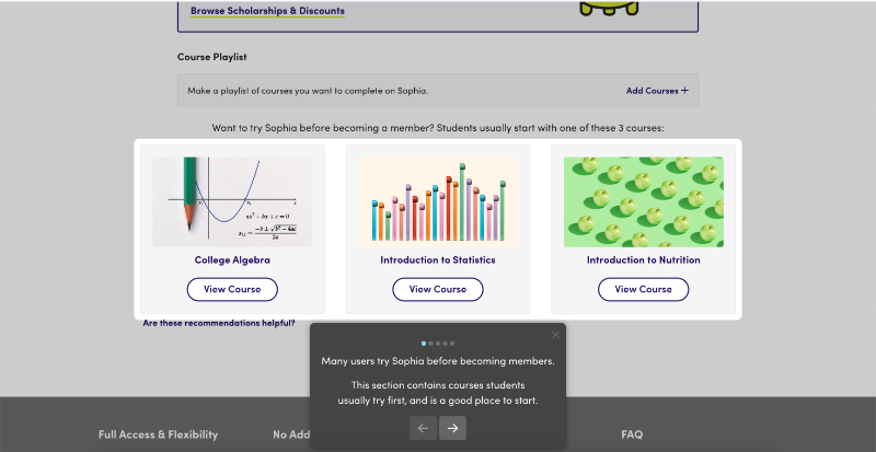
Sophia’s product tour also shares helpful getting started tips based on common user behaviors. The tour ends with a clear call to action (CTA), encouraging users to either try a course or become a member.
Once a user starts a trial and views a course, a new welcome message appears, triggering a second, more focused tutorial that explains the features and UI elements specific to course pages.

The course trial tour includes 8 steps, each covering key elements of the course page, such as units, challenges, and milestones.
Rather than simply pointing out where things are, the tour also explains how to make the most of each feature to enhance the learning experience.
The tooltips also share important details, such as how often you can take a challenge, how many attempts are allowed for questions, and the minimum score required to pass a course.
By doing so, Sophia ensures users understand the rules and can get the most value from their learning journey.

📌 What’s so good about this example?
- Friendly and casual tone (while still offering value and guidance)
- Manageable tours with welcome modals and clear CTAs at the end
- Useful tips and rule explanations to get the most out of the platform
- Modern and simple design that doesn’t tire the user
Lucidchart - Well-organized In-app Resource Center
Lucidchart welcomes its new users with a pop-up modal asking them to choose their next action. You can:
- Create a blank document
- Start with an example
- Watch an introductory video about the platform
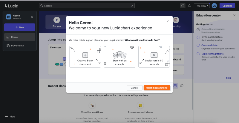
If you choose to start with an example, Lucidchart takes you into the diagram builder and initiates a product tour. Before the tour begins, a brief survey asks about your role and your familiarity with diagramming tools.
Based on your responses, the platform tailors the onboarding experience.
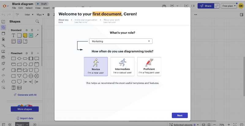
The initial survey recommends use cases based on your role or team, and you can select any to get started. Template suggestions are also personalized according to your selected role and use case.
Each Lucidchart feature, like brainstorming or process mapping, includes small tutorial modals. These aren’t step-by-step walkthroughs but rather pro tips that highlight key capabilities and help users understand what’s possible within each feature.
Here’s an example:
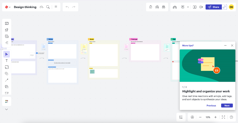
Each tour is short and to the point, typically consisting of 3–4 modals with visuals and GIFs that help contextualize the information and keep it engaging. The tours are triggered contextually when you land on a specific feature page, they’re not connected or part of a larger flow.
After completing a tour, a standalone tooltip appears to highlight the in-app resource center, encouraging users to explore additional educational content.
Within the resource center, users can access help articles, Lucidchart Training Lab materials, video tutorials, and an interactive guide that introduces canvas navigation shortcuts.
While the interactive tour itself is fairly basic, the rest of the resources are genuinely useful for helping new users get up to speed and find value quickly. The “Getting Started” category consolidates 101-level content, essential tips, and foundational guidance.
So, even if you’re not sure what you need to learn, you’ll find it there.

Once you’re familiar with the basics of the platform, Lucidchart allows you to filter educational content by your use case. The platform also makes smart use of loading screens to onboard users and share helpful pro tips.

📌 What’s so good about this example?
- Onboarding personalization based on role and technical expertise
- Encourging users to check the resource center out
- Resource center categories for getting started and use cases
- Utilizing the loading screen effectively
Help Scout - Value Prioritized Onboarding Checklist
Help Scout triggers a brief 3-step product tour as soon as you land on the home page.
Thankfully, it’s short, friendly, and unobtrusive, so it doesn’t overwhelm or catch the user off guard.
The first step welcomes you to your Help Scout inbox, the second explains how conversations work (where they appear, how to collaborate on them), and the third introduces the onboarding checklist.
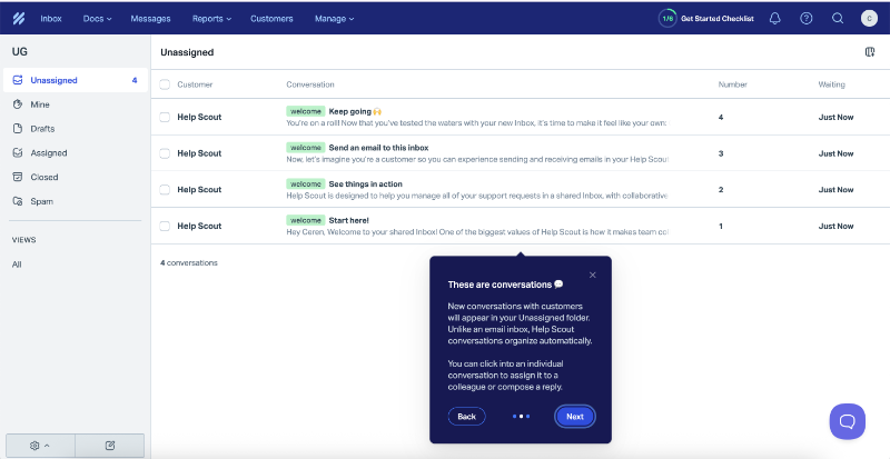
The onboarding checklist includes 6 steps in total, divided into two sections: The Basics and Explore More. By default, only The Basics is expanded, while Explore More remains collapsed until the user chooses to view it.
The Basics focuses on 3 essential actions designed to help new users quickly experience the core value of Help Scout.
The first item on the checklist is already marked complete, as it involves creating your first shared inbox.
The next step is connecting an email or social channel, which is essential for bringing customer messages into the platform and letting users experience it in action. And the the third task is setting up a Beacon for self-service, one of Help Scout’s key features, so it makes sense to include it in the core onboarding flow.
The Explore More checklist, on the other hand, includes lower-priority or more time-consuming tasks like inviting teammates, setting up integrations, or building a knowledge base.
To keep new users focused and avoid overwhelming them, Help Scout smartly hides this secondary list until the user has explored the core value of the platform.
📌 What’s so good about this example?
- Explanatory microcopy with a friendly tone (especially in the product tour)
- Activation and value-prioritized onboarding checklist
- Divided checklist is easy on the eye and doesn’t axe the user motivation
HeyGen - NPS Survey after the First User Session
HeyGen uses traditional tooltips for both its product tours and contextual guidance. The main product tour functions like a copilot, walking users through the steps of creating a video, with steps like writing a script or editing the avatar.
The tour has 4 steps and there’s a cute celebratory animation after it.

Tooltips also appear on the home page when hovering over various features and UI elements, offering quick explanations of use cases and brief descriptions of each capability.
In addition to tours and animations, HeyGen also uses NPS surveys to engage users during the onboarding process.
📌 What’s so good about this example?
- Fun and motivating animations in the tour
- No fluff in the walkthrough copy, simple and clean explanations
- Incorporating a survey (other than welcome survey) into onboarding
Loom – Almost Live Onboarding with Videos
One of the key differences between product-led onboarding and traditional onboarding is the minimal involvement of sales or customer success teams in the early stages, we’ve said.
While Loom follows a product-led approach, they try to compensate for the lack of direct, customer-facing interaction with onboarding videos, specifically, Loom recordings.
On Loom’s Getting Started page, there are 4 onboarding videos that walk users through how to use the tool and how to get the most value from it, such as recording presentations or replacing meetings with Loom.

If you prefer a more interactive walkthrough, there's also a hands-on tutorial that guides you through using the Loom extension, recording a video, and sharing it.
Here’s how that one looks:
📌 What’s so good about this example?
- Loomception! A very meta experience, using Loom to prove its value
- Diverse onboarding experiences with different user preferences (video and interactive tutorial)
- The interactive tutorial’s design is very unique and original
UserGuiding - Different Highlighted Features for Different Use Cases
UserGuiding offers a goal-oriented onboarding experience, created and automated using its own platform (another great meta example!).
Instead of a traditional welcome survey, it uses pop-up modals to segment users by their goals and use cases, then guides them into tailored product tours that focus on the most relevant features for each user.
If your use case is to survey users and gather feedback, UserGuiding directs you to the in-app surveys feature and launches an interactive guide on how to create one. Similarly, if your goal is to offer user support, you’ll be guided to the knowledge base page, where an onboarding video explains the feature.
Since the knowledge base involves more detailed setup, UserGuiding skips the lengthy walkthrough and opts for a concise video tutorial instead.
So, the onboarding strategy and materials vary based on the selected use case.
The initial modal asking about your use case is available in the onboarding checklist too. So, once you’ve checked the feature(s) relevant to your first use case, you can go back to the modal, choose a different use case, and discover different features.
Besides feature-based use cases, you can also explore the platform’s capabilities like segmentation and targeting.
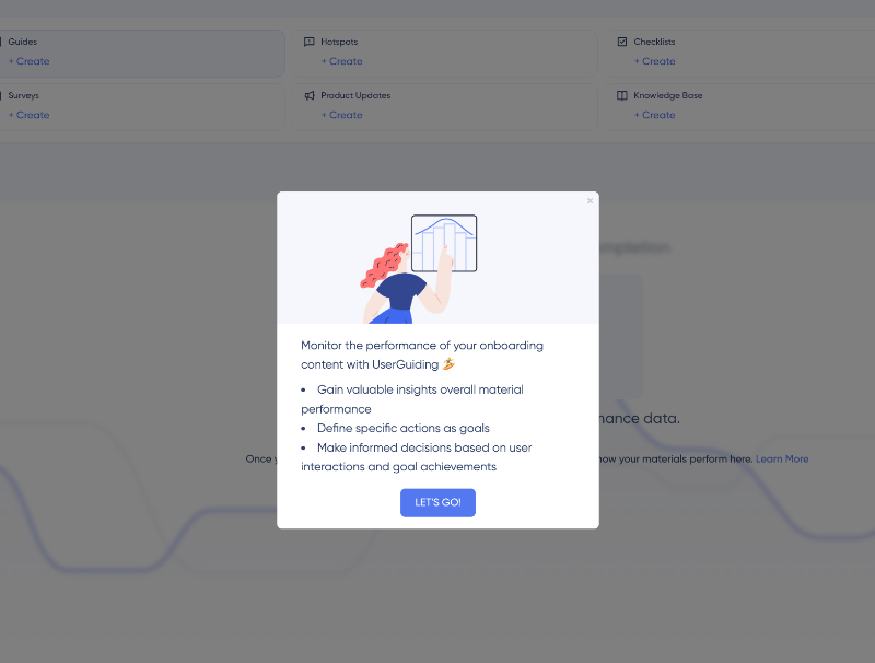
If you’re interested in the platform’s analytics capabilities, or if you think that is a make-or-break for you, UserGuiding first lists the value points of the relevant capability, then takes you to the performance page, and then offers a video that helps you get the most value from UserGuiding’s analytics.
Here’s what the value points look like:
📌 What’s so good about this example?
- Shows the product value using the very same product
- Goal-oriented and personalized tours
- No fluff or filler steps in the guides, if there’s need for more information, UserGuiding offers it in video form
- Value point listings before each feature tutorial
- All tours are accessible and re-triggerable from the checklist
Dropbox - Re-onboarding Inactive Users
Dropbox follows a fairly traditional onboarding flow.
It starts with a surprisingly short welcome survey, followed by a 3–4 step product tour, and then an onboarding checklist designed to guide new users through key “aha!” moments, ideally leading them to the “Upgrade Your Plan” page.
The checklist itself is simple yet effective and does decent job of mapping out the early user journey.
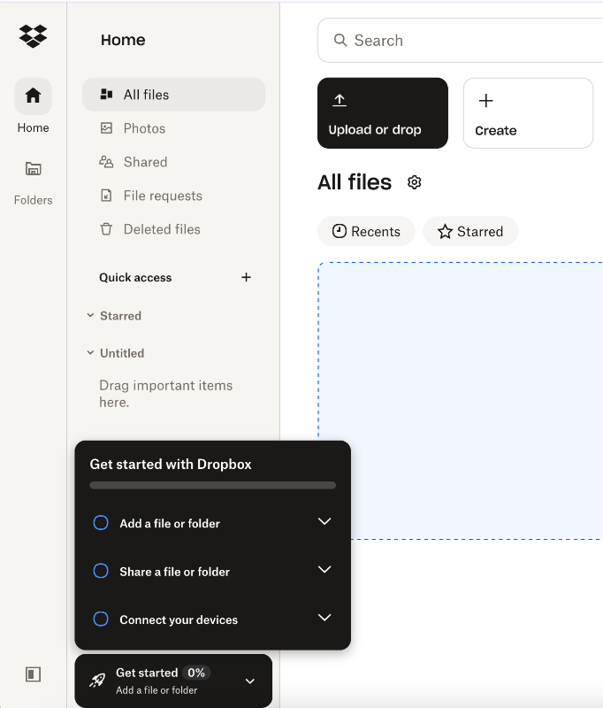
The checklist consists of 3 steps, each representing a key user action and activation point. Each item includes links to the relevant sections in the Dropbox Fundamentals course, as well as buttons that let the user complete the action directly.
For example, the “Connect your devices” step provides links to download both the desktop and mobile apps.
It’s all pretty standard, nothing groundbreaking so far.
But what Dropbox does really well is offering what feels like a second chance at onboarding for inactive users.
They introduce a new checklist that highlights the platform’s free features and capabilities, along with any limitations. When you hover over each item, a tooltip appears to reinforce the value or explain the feature in more detail.
Action buttons are also included to encourage re-engagement.
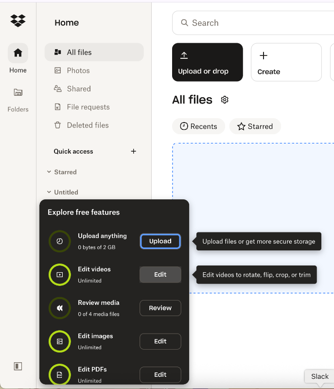
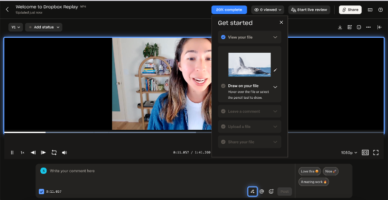
For more complex features, like Dropbox Replay, there are product tours and tutorials to guide users. But for more obvious features on the list like uploading a document, they don’t re-onboarding you.
Because… well, of course.
The tour starts with a welcome modal:
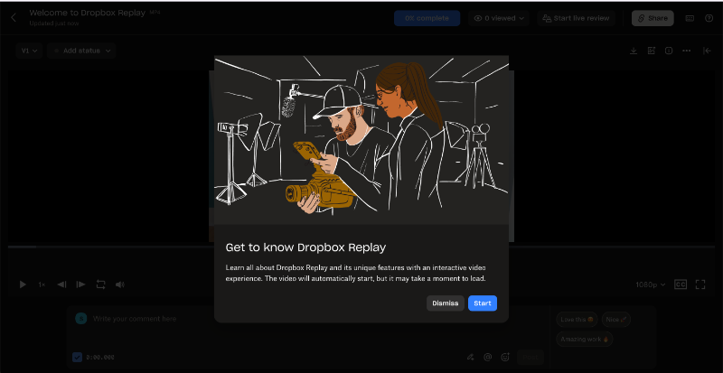
After the welcome modal, an onboarding video automatically starts, walking you through Dropbox Replay’s key capabilities with step-by-step instructions. Alongside the video, there’s a checklist with written guidance to follow.
To make things even easier, relevant buttons and UI elements are visually highlighted with blue borders.
📌 What’s so good about this example?
- Re-onboards inactive users for complex product features
- Restates the value proposition within a single checklist
- Doesn’t push inactive users to become paying customers suddenly (and risk further alienating them…)
- Combines different onboarding methods and visual cues within a single tour
Bonus Example: Strava - Product-led Churn Deflection
Strava utilizes announcement modals to welcome a new user, occasional tooltips here and there to provide guidance, and popups to encourage the user to become a paid member. Like this welcome modal here:

These are all good.
What’s even more effective is how Strava emphasizes the value of its premium features, and the perks of being a subscriber, when a paying user initiates the cancellation process.
The churn deflection (or unsubscription) flow unfolds over 3 steps.
In the first step, Strava leads with impact: it reminds users of what they'll lose by canceling, unlimited routes, heart rate tracking, leaderboards, and more.
It also backs this up with compelling user success stats, showing that paid subscribers stay twice as active and achieve 54% more personal records.

The second step is a classic churn deflection survey, asking users why they’re canceling. It’s a single-question survey with eight predefined options like “My exercise habits changed,” “Had technical problems,” or “Don’t use the subscription features enough.” There’s also an “Other” field for users to provide a custom reason.
In the third and final step, Strava makes one last attempt to retain the user by showcasing recent updates and improvements, demonstrating that the platform is evolving and that the team is actively working to add more value.

📌 What’s so good about this example?
- Strategically positioned value reminders and user statistics
- A detailed survey to understand why users churn
- Proves product-led approaches can be utilized for churn deflection
How to measure product-led onboarding success
Ramli John defines 3 key moments that indicate your onboarding is successful: the moment of value perception (MVP), the moment of value realization (MVR), and the moment of value adoption (MVA).
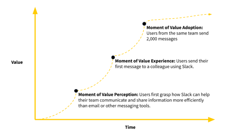
If your onboarding experience can guide users through these milestones, you're on the right track.
However, these moments aren't always easy to measure directly.
So, here are some metrics and KPIs that can help you determine whether your users are hitting these milestones successfully.
Activation rate
Activation rate measures how many users reach a specific milestone that signals they've experienced the product's core value. It’s a key indicator of whether your onboarding is guiding users to their initial “aha!” moment with your product.
On average, activation rates sit at 34% across industries, and 36% for SaaS companies.
Time-to-Value (TTV)
Time-to-Value tracks how long it takes for a user to realize the product’s value after signing up. The shorter the TTV, the better your onboarding is at quickly demonstrating value.
In Rocketlane’s 2024 report, 37% of onboarding teams consider TTV a top metric, right alongside product usage, time to go live, CSAT or NPS, and customer effort score (CES).
Onboarding completion rate
Onboarding completion rate shows the percentage of users who complete your onboarding flow, product tour or checklist, depending on how you organize your onboarding.
It’s a direct way to spot drop-off points and improve engagement during onboarding. A low completion rate could mean your flow is too long, poorly timed, or lacks relevance.
Feature adoption during onboarding
This metric tracks the percentage of new users who actively engage with key features during their initial onboarding period. Which features to monitor and how you define “adoption” will vary depending on your product and user base.
However, focusing on features tied to long-term engagement and retention helps you assess whether your onboarding effectively guides users toward valuable actions overall.
Support ticket volume from new users
This measures how many customer support requests originate from users in their early product experience. A high volume often indicates areas where onboarding falls short whether due to confusing interfaces, unclear instructions, or missing information.
According to McKinsey’s 2022 survey, 65% of leaders believe that enhancing self-service options and automating support reduces these tickets significantly.

Who | What to follow to stay up-to-date
Wes Bush
Wes Bush is the founder of ProductLed and author of the bestselling book Product-Led Growth. His blog and training programs at ProductLed focus heavily on trial conversion, onboarding flows, and PLG strategy.
- 👉🏻 Here’s Bush’s LinkedIn 👈🏻
- 👉🏻 Here’s ProductLed blog 👈🏻
- 👉🏻 Here’s ProductLed newsletter 👈🏻
Ramli John
Ramli John is a leading voice in product-led onboarding and the author of Product-Led Onboarding, and Eureka. In addition to his book, he co-founded Delight Path, a platform that helps SaaS companies design better onboarding flows using visual templates and real-world teardowns.

Kate Syuma
Kate Syuma is the founder of Growthmates and former Head of Growth Design at Miro. She focuses on how UX and product-led growth intersect, sharing practical insights on onboarding, activation, and user journeys through her writing and interviews.
- 👉🏻 Here’s Syuma’s LinkedIn 👈🏻
- 👉🏻 Here’s Growthmates blog 👈🏻
Andrew Capland
Andrew Capland is the founder of Delivering Value, a blog and coaching platform helping product and growth leaders build better onboarding and activation systems. A former Head of Growth at Wistia, he writes tactical posts on user journeys, onboarding emails, and growth experiments.
Kyle Poyar
Kyle Poyar writes the newsletter Growth Unhinged, where he explores product-led growth strategies through case studies of successful startups. His work focuses on how companies scale activation, monetization, and onboarding using data-backed PLG tactics.
Conclusion
Product-led onboarding is about delivering clear, immediate value.
The problem? Most onboarding still feels like a checkbox exercise. Generic tours, too many steps, not enough context.
UserGuiding flips that.
It helps you build onboarding flows that feel like part of the product: personal, helpful, and frictionless. No dev time. No guesswork. Just real guidance that turns signups into active, happy users.
If growth is your goal, let onboarding lead the way.
Frequently Asked Questions
What is the product-led approach?
Early-stage SaaS startups should focus on guiding users quickly to their “aha!” moments by emphasizing value-driven key actions. Personalizing onboarding based on user goals and use cases helps make the experience relevant. Using short, interactive tutorials and checklists rather than long tours keeps users engaged. Also, leveraging social proof and success metrics during onboarding can motivate users to continue exploring the product. Keeping onboarding concise and helpful is key.
How can you create a product-led onboarding flow that improves activation rate?
To improve activation rates, design onboarding that encourages users to complete essential, value-driving actions early. Personalize the experience by asking about use cases or roles, then guide users through relevant features. Use interactive elements, tooltips, and short tutorials to reduce confusion. Provide clear next steps and progress indicators. Offering incentives, such as credits for completing onboarding steps, can also boost motivation and engagement during the critical early stages.
What are the examples of successful product-led onboarding used by top PLG companies?
Top PLG companies use a variety of effective onboarding methods. Gumloop offers personalized tutorials tied to use cases, rewarding users with credits for completing steps. Arc Browser lets users try key features like article summarization within onboarding. Meditopia uses social proof and user success stats to motivate survey completion. Shopify’s checklist focuses on value-driven key actions, while Grammarly provides a demo document that teaches through interaction with onboarding copy.
What are the key differences between product-led onboarding and traditional onboarding, and when to use each?
Product-led onboarding is designed for self-serve experiences where users learn by doing with minimal sales or customer support involvement. It uses personalized, interactive guides focused on value and activation. Traditional onboarding often involves direct training or support for less tech-savvy users or complex products. Use product-led onboarding when you want scalable growth with low touchpoints. Traditional onboarding fits scenarios requiring hands-on guidance or specialized training.
What are the most common product-led onboarding mistakes that reduce user retention?
Common mistakes include overwhelming users with long, generic tours that don’t connect to their needs. Another error is failing to personalize onboarding by ignoring user goals or roles. Lack of clear guidance or missing progress indicators can leave users confused. Not emphasizing value-driven actions early on reduces activation. Lastly, neglecting to incorporate feedback or social proof can make onboarding less engaging and reduce motivation to continue using the product.

.png)


