
TL;DR
- A bad onboarding experience is when your onboarding fails to satisfy your users' needs, desires, and expectations or one that is designed wrong.
- A good onboarding experience is important in emphasizing value proposition, lowering support tickets, and increasing user retention.
- Some best practices to avoid a bad onboarding experience are double-checking for bugs, minding the length, prioritizing visual hierarchy, and being consistent.
- In recovering from a bad onboarding experience, there are best practices like reevaluating your product and audience and using the right tools.
A good, thought-through onboarding experience can work like magic.
It takes a few of the right onboarding UX elements to get users to fall in love with your product forever.

And yet we still come across poor onboarding processes.
The truth is, it takes more than pretty pictures and a few tooltips to onboard your users the right way - the way that gets them to stick around.
It takes understanding user behavior, the goal of your product & the onboarding process, and more than anything, it takes empathy.
Today, we are talking about the straight opposite of that.
Let's dive right in.
What is a Bad Onboarding Experience?
A bad onboarding experience is one that fails to satisfy the users' needs or expectations, complete the initial onboarding goal, or one that simply looks or feels off. A bad onboarding experience can be a failed overall onboarding experience or a single contextual onboarding element; either way, what defines a bad onboarding experience stays the same: clunky elements or images, too long copy, too long flows, and intrusive patterns are among these.
Though onboarding experiences have been getting progressively more empathetic of the users and less intrusive of the overall user experience, we have still not reached a common understanding of what a good user onboarding process looks like and how we can prevent poor onboarding experiences.
But the real question is:
Why a Good Onboarding Experience Matters?
A good onboarding experience is important for the exact same reasons a good user experience matters:
👉 Without a smooth experience, it is hard for users to realize the value of your product,
👉 A good experience helps ease customer support requests, both overall UX and onboarding experience,
👉 Better experiences create repeat users; repeat users mean higher retention rates
But also, there are more specific reasons why a better user onboarding process is important (and even affects the overall user experience greatly):
✍️ An enhanced user onboarding process increases conversion rates, active user rates, and sales processes,
✍️ Decreases friction in user training and education with a personalized onboarding process,
✍️ Lowers the charge of onboarding in the long term since a good onboarding experience is timeless and only requires updating
And how do you make all this work for you?
Let's take a look at some best practices:
Best Practices to Resolve Poor Onboarding Experiences (with Examples)
Whether you use a simple product tour or a well-established interactive walkthrough, whether you have a proper onboarding process set or not, or whether you had a sufficient time when creating your ongoing process for onboarding or not, one thing is true for all of us:
We all make user onboarding common mistakes.
But it is up to us to turn these mistakes into best practices that can be used in common practice.
So, let's go over 6 best practices and examples to see how products we all know suffer or gain from them:
1- Beware of bugs and glitches
One thing a product or its onboarding experience can never be is: buggy.
Yet a popular tool, Heap had to fix their onboarding elements to prevent a buggy look not too long ago.
Using different onboarding solutions, Heap's onboarding UX elements crashed into each other to create a spectacle like this:
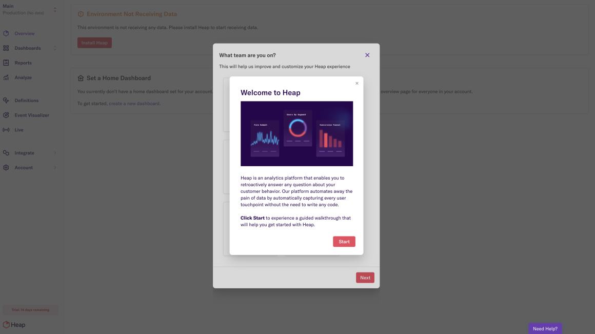
The next step looked a little something like this, and clicking was impossible:
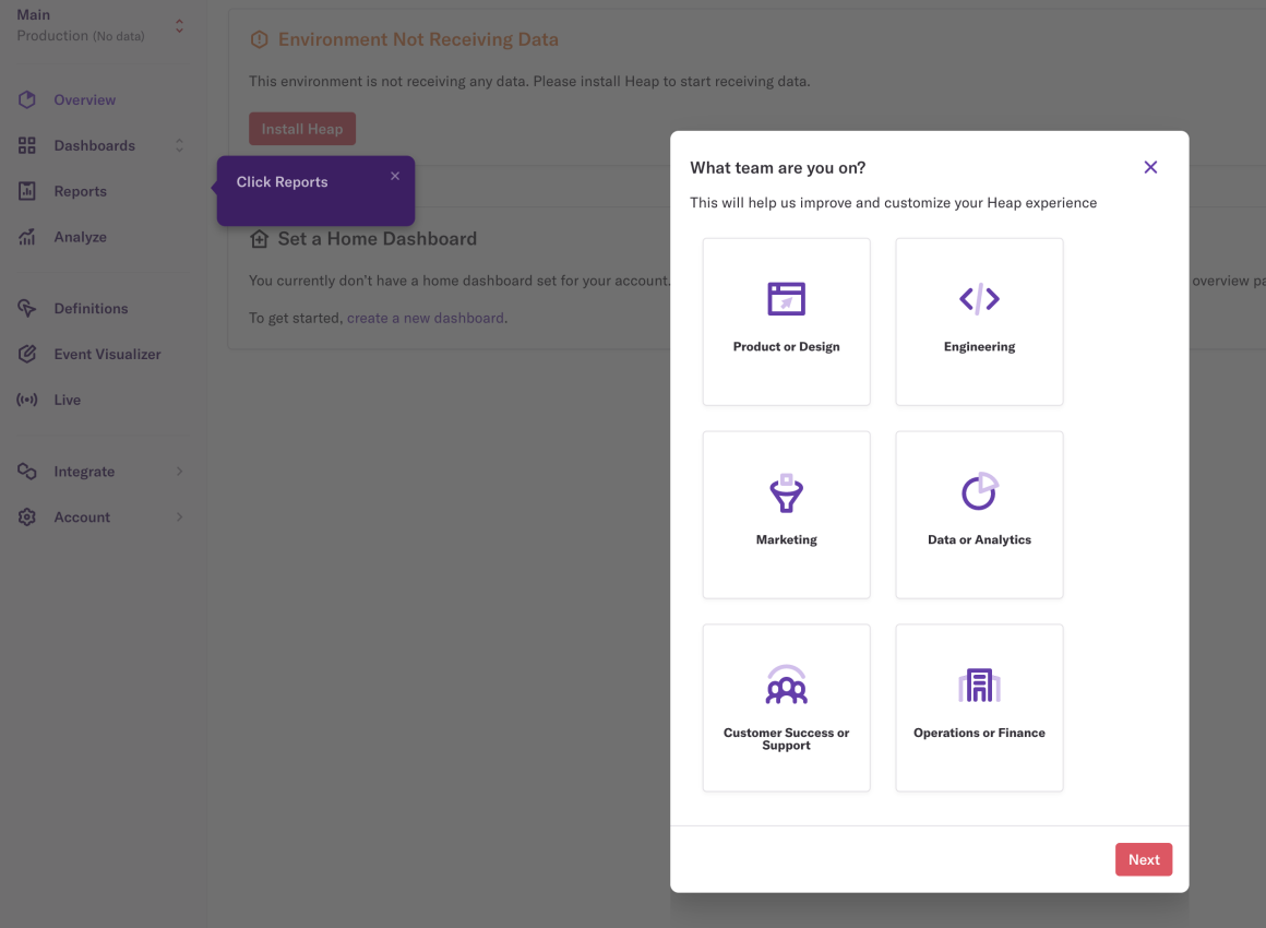
It is the bare minimum to test the onboarding processes and pages of a platform before publishing them.
Make sure you are never in Heap's shoes 😅
2- Shorten it - then shorten it again
Both for copy and flow length, one thing is for sure: the more concise, the better.
Judging from your own user experience with different products, you would know that most of the copy on any onboarding element goes unread.
If it doesn't interest the user (or if it is not formatted well enough to appear interesting), copy is rarely read through.
Instead, it is better to say the most important things in a friendly and well-formatted way to make sure the users don't skip all steps of an onboarding process, assuming all steps will feature long copy.
In Pendo's case, they don't hesitate to dump lots of copy onto users only on the third step on a guide:
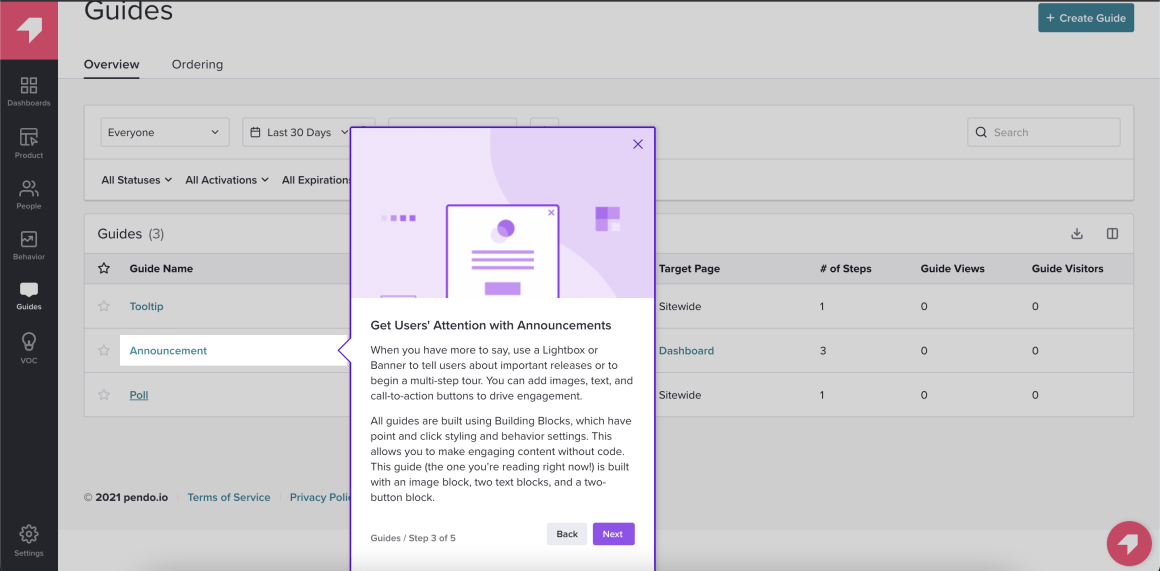
This is a bad practice not only because the copy is long, but it is also not formatted for ease of reading.
We can still appreciate the 5 step guide, though, since not all products are aware of the importance of a short flow.
Vieworks uses a whopping 14-step guide in its first-time onboarding:

Though the onboarding itself looks and reads well with short copy and cool tooltips, it is just too intimidating for first-time users.
It is important to keep your guides under eight steps; we even have a popup for it in our tool:
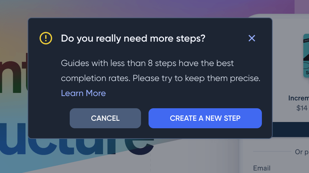
While you're at it, care to take a look? 👀
3- Pay attention to the visual hierarchy
As much as the length and contents of your user onboarding process, the looks of it matter too.
If it looks bad in and of itself, that's an issue.
But it's a bigger issue if it makes your entire product look bad.
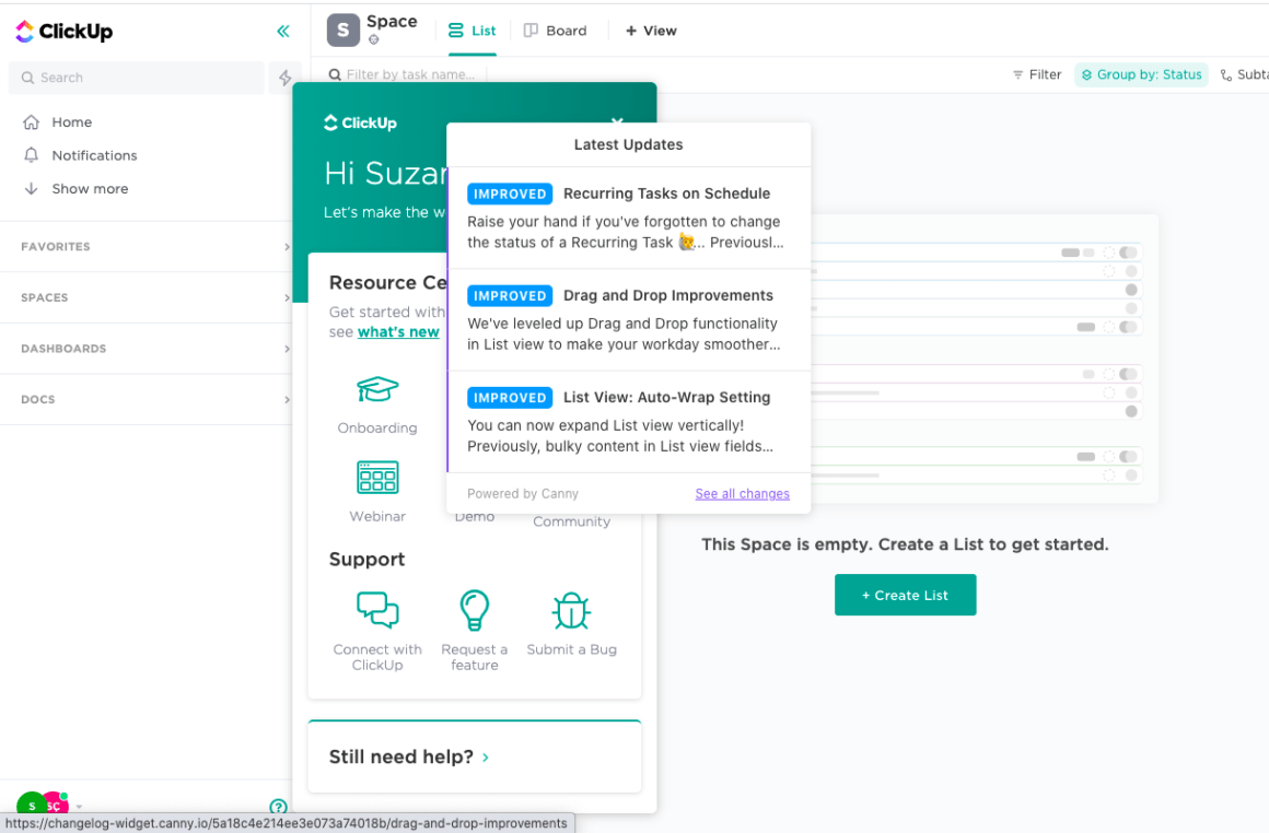
Here, ClickUp's resource center and latest updates window clash, and even though the latter was triggered from inside the resource center, it still makes the whole UI look... bulky.
Another example of this is Slack.
Even though the problem at hand is a simple tooltip, it goes over text, and there is no shadowing in the back, which makes that part of the screen look crowded.
The color and shape of the tooltip don't help either 🤒

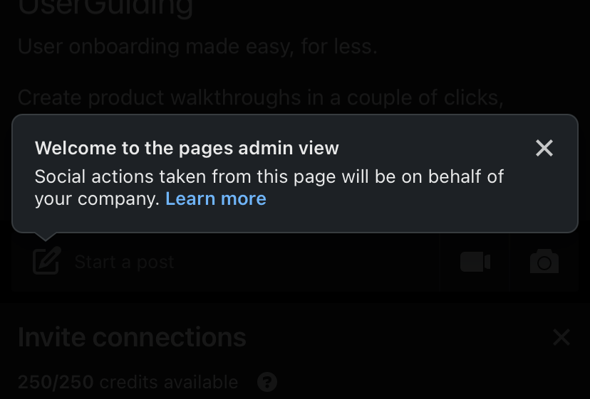
The opposite of Slack's case takes place in LinkedIn's mobile app.
Because the shadowing behind the tooltip is too strong, users can't even see what the tooltip points at:
A good example to get inspired from, though, is definitely Ideta:
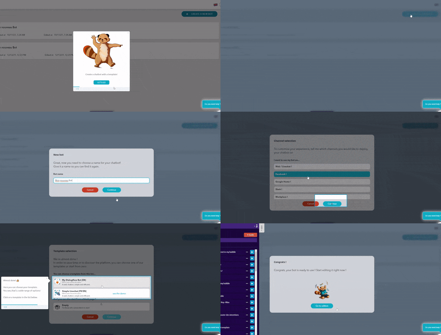
Tooltips are clearly highlighted, and the back of the screen is perfectly dimly lit.
Even when a tooltip appears in front of a text, thanks to backdropping the shadow, the texts don't appear as if on top of each other.
Talking about tooltips, Let's take a look at how some tooltips can hurt your brand consistency:
4- Be consistent
Mobile device onboarding is an art of its own.
And it is also one of the areas in which consistency in user and customer onboarding experience is lost the most.
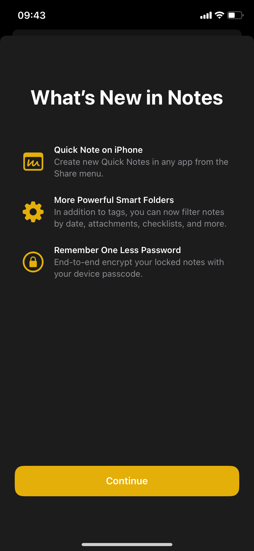
Always coming up with simple features that are anticipated before launch, Apple has never been much of an onboarding mastermind.
Even when they needed to onboard, they always used full-screen directions like:

But for the weather app, instead of a full-screen onboarding page, in the latest product update, they chose to use one singular tooltip, which is an onboarding element that they didn't quite utilize:
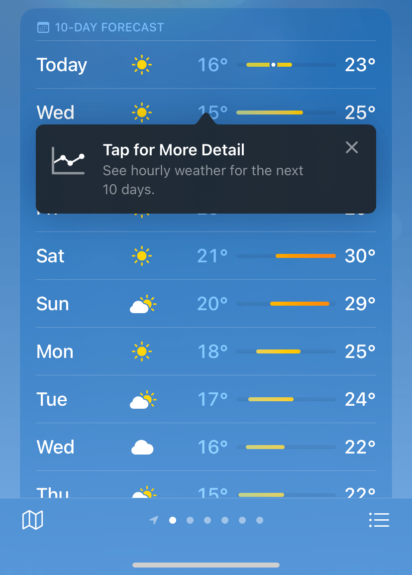
Then, they did the same for a main screen feature as well:

Though it might seem refreshing, for long-time Apple users, it might have felt off-brand.
Another example of this is Spotify with its tooltip:
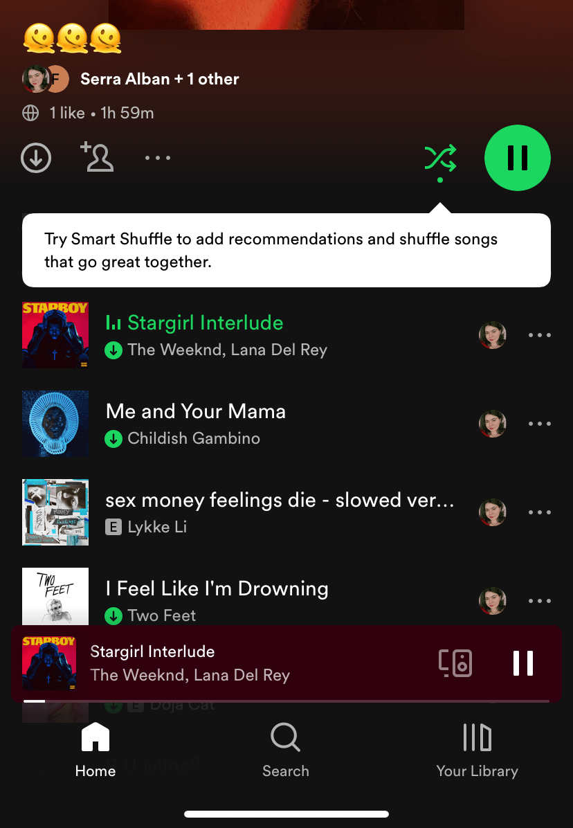
Though Spotify utilizes popup modals and banners way more often, they decided to use a tooltip for their new function.
One that wasn't even pointing at the right UI element.
Tapping on the element only activated the good old shuffle function, and the actual function (called 'enhance') was introduced later that week.
Spotify wasn't consistent with its own onboarding strategy or the timing to prompt its onboarding element.
Yet another one of our poor onboarding practices is:
5- Make it make sense
An exceptional onboarding experience, with the looks of the onboarding flow and the contents of it, should:
👉 Not be confusing,
👉 Not over or underpromise,
👉 Have realistic expectations of users' capabilities,
👉 Make sense
And I'll repeat that last one: Your onboarding flows and overall user onboarding process should 👏 make 👏 sense 👏
If you get users confused, your well-structured onboarding process might just prove to be one that is considered a waste of time.
For example, Notion's carousel modal at the beginning of its mobile app features a download notion button for users to get the app.
When the users are already inside the app 🤡
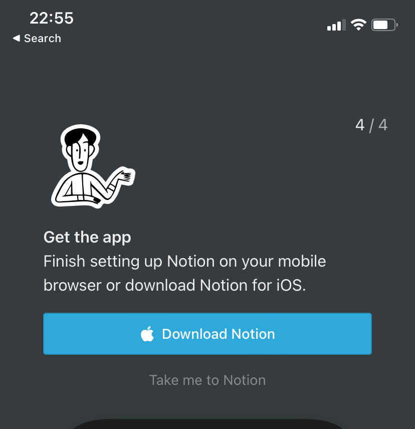
Of course, not all onboarding elements are so blatantly nonsensical.
For example, Spotify prompts a tooltip on its desktop app after an update, which psychologically prepares the users for a product tour.
But it only takes two tooltips, and only very obvious details of the update are featured in the onboarding when there are more important updates, like a new display for friend activity:

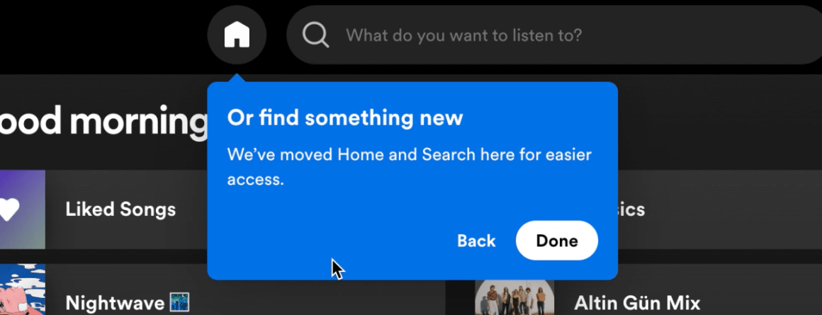
Too bad that Spotify didn't realize that a progress bar could've saved them from all that confusion 🤷
And lastly:
6- Grow from your mistakes
The fact that something is wrong with your onboarding doesn't mean you need to get rid of that element or the onboarding process itself altogether.
A strong onboarding process can bounce back from common user onboarding mistakes and even evolve on its own.
TikTok is a great example of this.
Before the app came to be a major social media channel (and even a little after that), they were prompting a system message - which, in my opinion, looks kinda ugly and definitely doesn't go with TilTok's brand image - that looked like this:
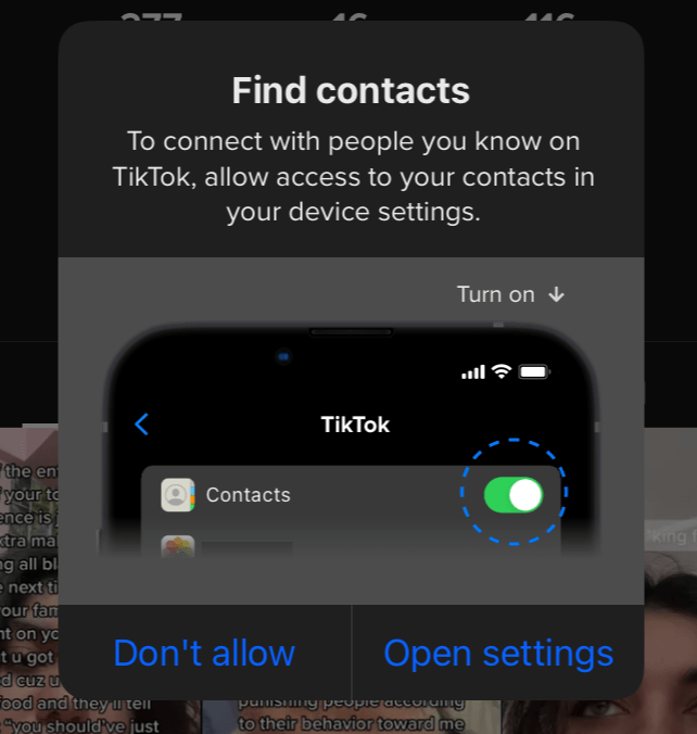
But a few months ago, TikTok decided to use a native full-screen modal to call its users to sync their contacts, and the modal is everything you would imagine it would be:

It has a cute image, the buttons are brand colors, and the copy is as good as it gets.
Just because a mistake is common doesn't mean you need to keep making that common mistake over and over again.
You can grow from any poor onboarding process and create a better, strong onboarding process instead.
If TikTok did it, so can you.
"But how?", I hear you ask 👀
Let's take a look at how you can correct your poor onboarding practices and start out with a proper onboarding process.
How to Detect Poor Onboarding Experiences and Start with a Better Onboarding Process Step-by-Step
If you've come this far in this article, I'm assuming you have a poor onboarding process at hand that needs to be fixed.
The good news is even the fact that you are taking action toward a new onboarding flow shows that you are up for creating an exceptional onboarding experience.
So, I won't keep you for long; let's take a look:
1- Know Your Product & Target Audience
First things first.
The reason why your user/customer experience was bad could be that you don't know what you are talking about & who you are talking to.
And I say this in the least petty way possible; it is an actual issue.
If your product is a mobile one like Apple, you cannot just use product tours liberally.
Or, if your target audience is elderly citizens, too many interactive walkthroughs might prove to be confusing.
Before preparing any onboarding content, it is important to realize what you are working on and who you are working for.
And that just might help you:
2- Change Your Perspective
If you think you are already creating onboarding processes that fit your product and user personas perfectly, the problem might originate from your approach to onboarding.
Make sure to ask yourself these questions and work with the answers you get:
✍️ Why do we do onboarding flows?
✍️ What does an aha! moment mean to you?
✍️ Should you be educating users, training them, or helping them succeed with your product?
✍️ Does user onboarding ever end?
✍️ What defines successful user onboarding?
If your answers don't reflect a desire to make processes easier and more valuable for users and rather focus on making your product more successful (that could be a paradox, even), then there just might be something wrong with the way you approach onboarding.
3- Make a Diagnosis
So, what is the problem?
Is it a lack of understanding of the needs of your target audience?
Or is it a wrong perspective on onboarding?
It might also be a smaller issue with the design of the elements or the wrong mapping of the user journey.
In any case, to come up with a solution, a diagnosis of the problem is necessary.
Then you can:
4- Use the Right Tools
A lack of qualified tools in your stack can also hinder the success of your user onboarding process.
Sure, in-house processes can work perfectly well too.
If you have the time and money for it.
That's why it might be best to give something much more affordable and easy to use a try:
Fix it with the best: UserGuiding 🚀
Picture me this:
You are a company doing your onboarding processes via video calls.
They are pretty effective: they get people to see just how much you care for them, and it helps you make sure you give them everything you need to give, information-wise.
But the issue is, it's not efficient.
Or scalable.
Sure, people get exclusive treatment, but you have many customers and only a few people who can make the calls.
Moreover, all the information you think you are giving them disappears into thin air since you are practically info-dumping with no hands-on practice.
Then you switch to automated onboarding, and it all changes.
You manage to reduce the need for demo calls by 80% and support tickets by 50% for your new feature.
Sounds impossible? It's a true story 😎
Read all about Next Fit's success story with UserGuiding here 👈
And while we're at it...
UserGuiding is a no-code user onboarding tool that you can use to create:
✅ Interactive guides, product tours, walkthroughs,
✅ User onboarding checklists,
✅ Tooltips, hotspots, in-app messages,
✅ Resource centers,
✅ NPS surveys, feedback options, and more
All with powerful analytics, segmentation and targeting, and high customization
👉Try UserGuiding for FREE 👈
5- Test & Collect Feedback
Once your new onboarding process is ready, it is time to make sure you don't repeat the same mistakes.
And that's only possible through: testing and quality feedback.
There are so many ways of testing and collecting feedback, but essentially, A/B testing might be the type you need for starters.
When it comes to collecting user feedback, in most cases, the third-party tool you've chosen as your user onboarding solution might have the answer.
For example, with UserGuiding you can conduct NPS surveys and reach your users without leaving the app with different types of modals and elements.
6- Monitor the Right Metrics
Once your new onboarding process is up and running after the tests and feedback, it is time you closely analyze what is going on with your users and product adoption with your users.
At this stage, knowing which metric is the right one for you and your product is crucial.
What you need might be a session duration rate if your product requires users to be in-app all the time, or you might need to look into product usage depth if you have many different features your users need to be utilizing to reach value.
Either way, knowing to use the right onboarding metrics can save you lots of time and money.
7- Optimize & Iterate
At our very last stage, which is practically a continuous one, there is lots of optimization, updating, and iteration going on.
The truth is, onboarding is one cyclical process.
And it is as good as you make it out to be by continuing to trace this cycle.
Make sure you regularly check if there is any improvement you can make to your onboarding processes and don't be afraid to make changes.
To Wrap Up...
Bad user onboarding processes are everywhere, so much so that we might be conditioned into thinking that they are okay.
When in fact, they are not.
And your product's onboarding might just be a bad one you think is good because there are so many like it everywhere.
The trick is to put something new to the table and make sure that at the end of the day, you are getting your users to success in the shortest way possible.
Best of luck!
Frequently Asked Questions
What happens when a company has a bad onboarding?
A bad onboarding process can lower the product adoption and feature adoption rates drastically, cause churn rates to climb, and in the long term can seriously damage a company's user retention rates.
Why does onboarding fail?
User onboarding processes fail because of a lack of understanding of users' needs and desires and a fixation on showing off the best parts of a feature when what really makes products stick with people is getting to see value right away.


.svg)
.svg)
.svg)
.svg)
.svg)


.svg)
.svg)


.png)


