
Take it from me: interactive content makes the world go 'round.
The other day I overheard my roommate speaking fluent Spanish. Nothing funny here, of course, other than the fact that she wasn't fluent a week ago.
I ran to her room with a baffled face, she went, "hola, ¡adelante!"

me entering the room, still shocked:
Turns out her Spanish instructor was using a super cool interactive content platform to present them with the material and also gave them assignments on the platform.
Not only did he make the class more fun but apparently he also made it easier with the interactive content from the platform.
And the platform was... (drumroll) you guessed it, Genially.
Looking through Genially, I thought "wow". Then I said, "you know what, I'm so writing about this."
And here we are. So now, let's talk about:
- What Genially is,
- What Genially's UX and user onboarding flow look like, and
- The final verdict on how good it is.
Let's start right up.
What is Genially?
Genially is an online tool for creating interactive and animated content. Among its main features are presentation creation, interactive images, animations, infographics, and many more interactive content creation options. Being quite the popular tool, especially in Spain, Genially owes some of its popularity to its free version. The main Genially team/founders Juan Rubio, Chema Roldán, and Luis García once said that the aim of Genially's launch was to make communication more interactive.
What Genially's UX and user onboarding looks like
Genially has two different sites where it offers its UX and onboarding, its website, and the tool itself.
On the website, we come across a cool UX design that enhances the buying and customer experience; on the tool and inside the Genially editor, we come across many tooltips, modals, cool copy, loading page UX, and more.
The Website UX
Genially has a cool website where users can sign-up to use the free version or buy a plan. The website is quite successful in giving a good interactive summary of the functionalities of the tool with interactive images.
For example, users can try out animating and moving elements or make them interactive.

As users scroll down, they can see different types of interactive and complex content they can create on Genially. The website gives users the option to try out the main editor elements to see how fun and easy to use Genially is.

Key takeaways
👉 Interactive content always works to impress, this is especially good for Genailly since it is their entire brand to be interactive
👉 Bringing content to life is easier than ever, Genailly focuses on this by featuring a very easy customization sample
👉 Smooth running and animated websites might get clunky, but if done right like in Genially's case, it can serve to win customers
The sign-up flow
Genially's signup flow starts off with a witty terms of use modal that is essentially part of the procedure but Genially makes it fun.
After typing in the email address, the user onboarding process starts right up with signup.

Genially starts the signup onboarding with a simple personalization question: "what are you going to use Genially for?"
There are two answers, education and corporate; it is almost always a great idea to keep the options during signup to a minimum, and Genially does exactly that.

Right after choosing between the two, Genially walks users through a 3-step signup where it asks some quick questions like how the users describe themselves and their educational stage (if you've chosen the education option)
This stage is also supported by bold typography on one side of the screen and more text about the platform.


Key takeaways
👉 Keeping it short is a basic usability principle, especially for onboarding UX
👉 Few options make decision making easier and the user experience smoother
👉 A hierarchically written copy can draw users' attention easily, double point if it is a call to action or encouragement
In-app onboarding and UX
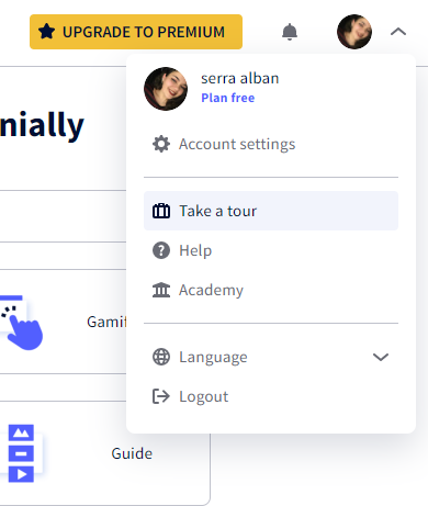
After the signup process, we finally make it to the platform. To start the initial onboarding, users need to go to a sidebar and click on the "take a tour" button. This might seem like a bad practice at first, but because the option is always there, it has its advantages too.
The 4-step onboarding sequence on the dashboard shows users how they can use the most essential elements on the screen.

Moving forward, users can also find hotspots on different parts of the platform that explain tiny details.

The inspiration page on the platform where users can get a design idea from each project features creations from the Genially community.
As users hover over icons and projects, they can interact with them to reveal names and information which makes the website more intuitive and user-friendly.

Just like the website hands-on experience, the templates feature interactivity icons to enhance the digital experience.
After using some features of the platform and going back to the dashboard, users can also follow their progress with Genially on the checklist which only has four tasks on it.

Key takeaways
👉 Customer journeys might start automatically on different platforms, but when it's manual it is also available at all times
👉 Four is the ideal amount of steps when onboarding contextually. Genially not only uses this amount with tooltips but also checklist tasks which makes the entire onboarding feel like a breeze.
👉 High interactivity and advanced micro-interactions help make websites more user-friendly and fun to use.
Empty states and microcopy
Possibly one of the best things about Genially's UX is what they do with their empty states and microcopy.
Whenever there is a chance, Genially is there to make users smile with fun illustrations or witty copy.
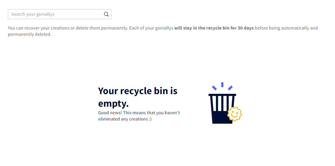
Visiting the trash bin for the first time, users can come across this empty state with a microcopy underneath saying "good news!" It is both fun and encouraging.
Another successful microcopy comes at the end of the content type pages on the platform. The button says "inspiration, come to me" as if it's a chant to manifest a muse, and takes the users to the inspiration page.

One example from the website is this humorous call to action to start using Genially. The bold title is reassuring, the text under talks directly to the pathos, and the CTA button looks more inviting than ever.

Key takeaways
👉 Whether you are a B2B or a B2C business, humor in the right dosages has the potential to make users remember that there are humans behind your product and be more willing to work with you.
👉 Empty spaces can always turn into empty states, all it takes is some visual communication with tiny illustrations or some microcopy.
👉 It is important to build up to a call to action; after encouraging and being empathetic for two sentences, chances are the users will definitely click that CTA button
Modals and tooltips
In first use and along the onboarding pipeline, Genially features many tooltips and modals.
For example, when returned to the dashboard from a different task, a modal is prompted to ask for the users' organization or company which will be used to improve the user experience.

Another modal that's prompted the same way as the one above is for Genially Academy, a website for courses both on Genially and on different topics. The design of the modal is really cool and the CTA button is designed to feature the word "free", something that we can't easily ignore.

One example of a lone tooltip that's not part of an onboarding flow with different steps is one that can be found on the animated presentations page. The tooltip might be by itself, but because it features a gif, it is enough to do all the explaining.

Key takeaways
👉 When asking users something they might not want to answer, it is important to keep the copy short and accessorize the modal with illustrations to make it more engaging.
👉 Putting an important detail like "free" on the CTA button is a way of making sure the information is taken since it is more likely that the users will read the tiny text on the button than the copy above.
👉 Even when there is not much of a chance to employ a long onboarding flow, gifs can help keep things tidy and make it easier for visual learners.
Genially Editor onboarding and UX
Genially editor is where the real action in Genially takes place.
If you are familiar with Canva, it is a very similar UI but Genially's onboarding flow is arguably better.
The automatically triggered flow has five steps and utilizes gifs to make things clearer quickly.

Genially also uses beacons and hotspots for very specific features like showing how to write an equation.

The Genially editor has another flow that is closer to a walkthrough, hidden in the sidebar for when users want to manually activate an extended onboarding.

Key takeaways
👉 Gifs come in handy in the context of longer onboarding flows as well; however, it is important to not overdo it.
👉 For really specific things you might want to show in your UI, a beacon and a hotspot are always helpful.
👉 It can be a good practice to make a product tour or walkthrough available at all times, you might want to show where it is for confused users, though.
Loading Screens
After empty states and microscopy, Genially's loading screens are the coolest thing their design team has come up with.
For example, when starting a project with a template, a loading screen with fun illustrations and a line of legendary Queen lyrics appears.

When creating presentations from scratch, users see this loading screen animation that is right on brand for Genially.

Key takeaways
👉 Animations can go a long way to create a fun brand image and can be a fresh breath of air in a world loading screens are boring.
👉 A pop-culture reference can easily create bonds between products and people.
BONUS: the exit screen
As a bonus, here's an exit screen that Genially lands users on after they have logged out.
Instead of risking first-time users going away forever, Genially leaves a good impression even at the exit stage.

Key takeaways
👉 A good impression isn't always the first impression. Genially guarantees that it is both the first and the last with its users.
👉 Genially again uses an encouraging piece of copy at the end of user sessions so much so that the users might be willing to log back in, thus the "login again" button.
Genially's UX and Onboarding: The Verdict
So, is it good?
Of course, it is! After everything we've seen on Genially's UX and onboarding flow, it would be unfair to say otherways.
The real question is:
What makes Genially so good?
Attention to detail
What puts Genially in a special place in comparison to many other tools first and foremost is the attention to detail they apply to every level of the UI.
From tooltips to hotspots and the tiniest buttons, details are scattered all around the tool to make users fall in love with Genially.
Dear Genially, you did it.
Using every opportunity
Similar to attention to detail Genially fills its UI with meaningful tips, encouragements, and just pure fun when the opportunity arises.
The loading screens and empty states built with a sense of humor and lots of wits proves it.
Empathizing with the users
Perhaps it's a superpower of Genially's product and design team but one thing they do exceptionally: putting themselves in the users' shoes.
Knowing that a user flow might be needed later, placing a direct link to the inspirations when users reach the end of templates, and many other instances in the app show how much they care about the user journey.
What can be improved?
While there is nothing to not love about Genially after the first use, some questions might arise in the users heads right after - consciously or unconsciously.
For example:
👉🏻 How fast do users reach their first Aha moment?
👉🏻 Is manual onboarding flows really a great idea for all users?
👉🏻 Can the empty states and loading screens be used for more useful tips instead?
And more. But remember folks, no product is ever perfect and even if it’s perfect for you it will never be so for someone else.
Conclusion
Genially is a fun solution as a digital tool today for people who need to communicate interactively.
Their solution is thus not short of highly advanced.
But the real deal with Genially’s platform is definitely its UX and onboarding UX.
We can easily say that Genially has a phenomenal UX and onboarding flow for its user base and many more users that will fall in love with it.


.svg)
.svg)
.svg)
.svg)
.svg)


.svg)
.svg)


.png)


