


.svg)


.svg)
.svg)
.svg)
.svg)


I love a well-designed product tour.
I take product tours for fun. I like to be a part of a well-organized, precise onboarding. A good product tour, with all the human psychology and UX design that goes into it, is art.

Let me underline it once again though. A good product tour.
There are so many tools and websites out there that don't know how to utilize product tours that I find myself asking, "wow, and they can sell that?"
But bad product tours aren't avoidable.
Now, if you ended up here in this product tour examples article, you might be trying to figure out what YOUR product tour should look like. I cannot teach you how to do that (this blog post can) but I can show you what I think a good product tour should look like.
But before we get to that, let's remember what exactly a product tour is.

What is a product tour?
Product tours are a series of user experience patterns that aim to create an onboarding process for users that will get them comfortable with the user interface and help them get used to the product. Preferably, a product tour has the key features of starting with a modal window, featuring a number of steps, and serving as an interactive guide when necessary. However, there is no formula for creating the perfect onboarding tour.
Another thing to recall is the difference between product tours and product walkthroughs. Simply put, a product walkthrough is a longer, more extensive product tour. (Check this out)
But hey, now that we know what a product tour is, let's focus on what it should look and feel like.
Here are 8 great examples.
8 Examples of the Best Product Tours
Every time I see the words "SaaS" and "onboarding" in the same context, I remind myself one simple thing just to be safe.
Every tool is different.
That is one thing you should always keep in mind, whether it is about onboarding or sales, or support. It'll be a lifeline and even a guide to success if you ever doubt your product.
Of course, it is important to keep in mind when looking at the simplest, most obscure product tour design. What may have worked for their product might be your product team's nightmare.
So relax.
Let these examples be an inspiration, not a dictation. They are not guidelines, they are starting points.
Now if you are ready, let's take a look.
1- Grammarly
Grammarly is among the most used and most popular SaaS tools today, and they didn't get there using sloppy product tours.
When a user first logs on to Grammar.ly, they are prompted with a product tour modal that lets them choose if they want to "start a quick tour" or skip the tour.

Once the user clicks on the "start a quick tour" button, Grammarly puts them in a demo environment and lets them, in the very sense, play around.
This environment is supported by hotspots and beacons that first draw the user's attention and then get them to learn about the feature as they go.
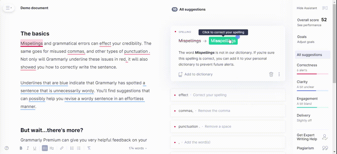
This environment is extremely useful since the way Grammarly operates outside of the demo is exactly the same: by using hotspot-like elements that underline wrong grammar.
What makes Grammarly a good example?
👉 Grammarly remembers to ask its users whether they would want to take part in the product tour or not, which is important since there might be returning users or users who are already familiar with the tools that don't want to go through the onboarding twice.
👉 By utilizing hotspots and beacons, Grammarly turns its onboarding into an interactive experience that helps users actually remember each learning task and engage in meaningful actions.
👉 Since Grammarly can be a complex product, taking the tour in a demo environment helps enhance the learning experience and is more effective than an on-the-go approach or video tutorials.
2- Ghostwriter.ai
Being quite a complex software, Ghostwriter.ai has its product tour spread across all its sections.
This contextual onboarding makes it possible for users to actually learn the tool comprehensively and do so when they need to.
The product tour utilizes tooltips and a progress bar to make it easier for users to proceed, while the highlighting makes it easier to focus.
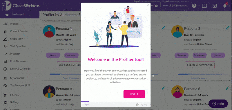
Ghostwriter.ai's walkthrough is not only easy to go through but also engaging and interactive.
With fun little gifs, short copy, and buttons with bold colors, Ghostwriter.ai is one hell of an interactive walkthrough.
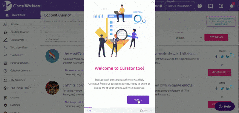
What makes Ghostwriter.ai a good example?
👉 Ghostwriter.ai's use of contextual onboarding as a form of product tour is one that really enhances the learning experience of a user and it lets users focus on what they actually care about.
👉 By highlighting the tooltips and using engaging bold colors and material in the tour, Ghostwriter.ai proves that product tours don't have to be boring.
👉 A progress bar and a skip button can make all the difference in the world and Ghostwriter.ai makes use of this while also using a progress marker.
Oh, one more thing, that it was made with Userguiding.
Give it a try yourself ⬇️
3- HubSpot
HubSpot's product tour example is one that almost goes the opposite direction when compared to our previous example, Ghostwriter.ai. However, that doesn't make it less effective.
HubSpot uses tooltips to walk users through the product while making use of concise copy, beacon type highlighting, and a nice, big "skip tour" button.

The content of the tooltips being just plain old text might come off as boring at first sight, but it is important to keep in mind the audience. Especially when you are as big as Hubspot.
You just might be confusing the users when trying to entertain.
That's why a simple design with the go-to HubSpot color palette works best in HubSpot's case.
HubSpot's use of pulsing highlight is also very clever, if not a genius idea by itself. It gives the onboarding flow a dynamic feel and helps users go further along with the tour.
The "skip tour" button is possibly the best thing about HubSpot's example.
People, take note of what I'm about to say:
Always, and I mean ALWAYS let your users have free will over their actions. Kudos to HubSpot for knowing best.
What makes HubSpot a good example?
👉 HubSpot's use of a plain and simple tooltip-based tour makes it not only more understandable but also more accessible among their user segments.
👉 Using pulsing highlight helps users focus on a dynamic way which gives the onboarding a certain momentum.
👉 By making the skip tour button as big as the next button, HubSpot makes it clear that they are not afraid that the users will skip, in fact, they can compensate for that loss of information any time.
4- Vieworks
If I had to explain Vieworks' product tour in one word, I'd say it is interactive.
It's the same old, there is a welcome modal, tooltips, progress bar, a progress marker, good highlighting, and a close button.
What Vieworks does to be among our top picks is that it combines all that with great interactivity.

Users aren't shown the features and then expected to perform tasks, rather, they are handheld as they perform the tasks. And that is something a lot of tools simply turn a blind eye to.
Believe me when I say, interactivity is the future.

What makes Vieworks a good example?
👉 Vieworks starts off with a welcome modal and proceeds with tooltips which helps users focus more easily and be able to view each feature in a contextual way.
👉 Vieworks' progress bar and marker keep the users inside the onboarding flow and help them track their progress.
👉 Vieworks' use of interactivity makes learning stick while also making sure users perform important tasks when they need to.
5- Trello
Not all product tours happen during the initial onboarding and Trello's new interface tour is a great example.
Trello introduces their new navigation bar in 4 simple steps and asks whether the user would like to switch to the new version at the end. A short and concise interaction with the user for sure.
One thing that can come off as problematic at first glance is how Trello uses no skip or close button. Here we come across a dilemma many SaaS companies face.
Freedom of will or forced response.
It is a continuing debate to this day, and although I fully support free will, it is easy to see why Trello would go with a no-skip option. The tour is 4 steps long, anyway.
Moreover, this goes to show us that forced content can also be engaging since most users ended up switching to the new version.


What makes Trello a good example?
👉 Trello's use of UX modals at the start and the end gives users footing to take a moment from learning, and it makes the tour more engaging.
👉 Trello proves that product tours can be used even when it is not for the initial onboarding.
👉 Trello shows us that as long as the content is really short and the tour engaging, a skip button might not be included.
6-Typeform
Typeform with its laid-back product tour modal and fun little doodle steals our hearts from the very start.
Their way of phrasing the options is also worth mentioning. It all becomes so human and doable through good copywriting and engaging stylizing.

Once inside the tour, Typeform uses a demo-like environment very similar to Grammarly's product tour. They use hotspots and beacons to direct users the way they could be most interested in and easily explain the rather complicated features.

What makes Typeform a good example?
👉 Typeform's human approach to its users in the product tour makes the product more approachable and the tour more doable.
👉 A demo type of environment gives the users the sense of freedom they might be craving after forced walkthroughs and product tours on other platforms.
👉 Since Typeform onboards users within an actual project the user is working on, it becomes a hands-on experience and the information becomes easier to recall.
7- TimeSolv
There are some seriously complicated tools with many features out there that need a proper product tour more than others.
TimeSolv is probably one of them.
With around ten different collapse bars on one page of its UI, TimeSolv has to go through each element to make sure everything sits well. TimeSolv manages to explain each using short copy, highlight focus, and previous-next buttons.
Of course, when the content is plenty, a progress bar is vital. Both a progress marker and a progress bar make the tour content more digestible.

What makes TimeSolv a good example?
👉 Timesolv being a complex product, it is a great practice that they use short pieces of copy for each little element on a screen to make sure no question is left unanswered.
👉 A progress bar is a must-have when going through each little detail, and TimeSolv understood that just right.
👉 The previous-next buttons are vital since each piece of information is given on a different tooltip, they make it easier for users to keep it.
8- Grove HR
Grove HR uses a very popular product tour method: checklist tracking.
By giving users a checklist to go through as they go, Grove HR increases the chances of onboarding completion while also keeping the onboarding flow compact.
Grove HR's tour also enjoys interactivity and highlighting that makes everything faster and easier for the users.

As a bonus feat of Grove HR, it makes it possible to access interactive guides even after the users are done with the initial product tour. (Hey, you can do that too 🤫)

What makes Grove HR a good example?
👉 Using a checklist to onboard users is a popular and effective way of making sure they actually complete the onboarding, Grove HR makes great use of that.
👉 Interactivity and high focus elements make product tours more accessible and easier to complete.
👉 Since Grove HR lets users access interactive guides through the resource center whenever they want, users have the freedom to skip the initial onboarding which is very reassuring.
Conclusion
It is hard to create a product tour fit perfectly for your product. It takes time and patience (and a lot of beta testing) to get where other tools are at.
But it is possible to come up with a good product tour by taking inspiration from the examples on this blog post and adapting it to your product.
Wish you the best of luck!
.png)


.svg)
