.svg)
.svg)
.svg)
.svg)
.svg)


.svg)


.svg)
.svg)


Salesforce finds that 88% of customers believe that a product's user experience is equally important as its capabilities.
That makes onboarding UX elements like website walkthroughs infinitely more valuable.
And you’re already in the right place for a deep dive into website walkthroughs.
Here’s a TL;DR if you don’t have the time:
TL;DR
- A website walkthrough is your users’ guide to your website’s capabilities that often take place as a step-by-step tutorial.
- A good website walkthrough is short, precise, engaging, interactive, and, most importantly, skippable.
- The main benefits of a website walkthrough are:
- It improves user engagement using clear language and actionable directions.
- It increases conversion since it helps show value quickly.
- It enhances user experience by cutting through the noise of your website interface.
- It reduces support loads by answering certain questions early on.
- A good website walkthrough rarely appears right after the signup, sometimes appears after a user returns, usually appears when a user uses only one feature, and always appears when there is an update.
- You can create the perfect walkthrough by focusing on your users’ needs and desires, analyzing user behavior, adopting a good tool, and iterating over and over.
- Some best practices when creating your website walkthrough are:
- Setting a clear goal to avoid straying,
- Segmenting your users and using walkthroughs accordingly,
- Making it as non-intrusive as possible,
- Keeping it short both in content and in steps,
- Focusing on the value by answering “why?” instead of “what?”
- Including ways to track progress like checklists and progress indicators,
- Testing and using user feedback for progression,
- Making support materials easily accessible after the walkthrough
- Grammarly and Dropbox are pretty good examples of a website walkthrough. They both use sandbox environments for a better experience and tick some of the best practices we mention.
- When picking a product for website walkthroughs, ask yourself:
- What features and use cases can I get within my budget?
- Does it offer personalization and segmentation?
- How can I work with the data to perfect my walkthrough?
- Some of the best tools to consider include UserGuiding, Appcues, Walkme, Pendo, Whatfix, Intro.js, Chameleon, and Inline Manual.

What Is a Website Walkthrough?
In the simplest terms, a website walkthrough is a step-by-step tutorial that helps new users navigate and understand a website's features and functionalities.
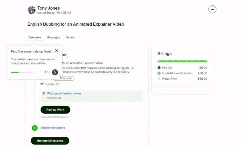
A classic website walkthrough looks a bit like this example from UpWork:
Today, website walkthroughs are practically the same as interactive guides, as SaaS UX leans toward interactivity and gamification.
Still, no matter the decade, walkthroughs have been solid elements in increasing user engagement, reducing bounce rates, and improving conversions.
What makes a website walkthrough good?
A good walkthrough is short, precise, engaging, interactive, and skippable.
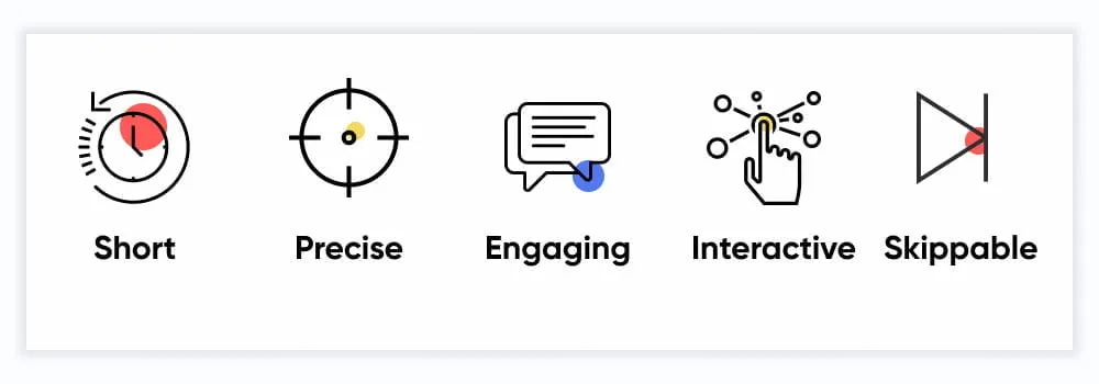
Let's take a look at each of these qualities a walkthrough should have.
A good walkthrough is short and precise
There has been a stigma around website walkthroughs since they have been the face of user onboarding for a long time, and yet they haven’t been intuitive up until recently.
They were often long, confusing, and even unnecessary.
It is interesting to visit the Cognitive Load Theory here, which finds that the human brain can hold 3 to 4 things in the short term before it overloads.
John Sweller, the creator of the theory, explains it extensively here:
So then, how do you work around this limit when onboarding users with a website walkthrough?
By making sure that your walkthrough consists of:
- A number of pop-ups
- Maximum 2-3 lines each pop-up
- Very simple and short sentences
You don’t guarantee that your users won’t close the tab, but at least you know it’ll help proceed with it.
A good walkthrough is engaging and interactive
One primary difference between a product tour and a walkthrough is that the latter is often much more engaging and interactive—in theory.
The truth is that product tours are skipped far less than walkthroughs since they are more straightforward and focus on a product's most fundamental features.
In fact, interactive content gets 52.6% more engagement than static content, which tells us that the differentiator is interactivity, not the UX element.
That means you want to make your website walkthroughs as interactive as possible; the goal is hand-holding, not lecturing.
So you don’t just offer information; you make it engaging.
The UserGuiding feature walkthrough is a good example here, which not only keeps it short but also offers interactivity:
👉🏻 Start your free trial with UserGuiding here to create your very own website walkthroughs!
It doesn’t matter what elements of onboarding you utilize as long as you can get the user to engage with the walkthrough.
Just remember that you have to keep the users engaged to succeed.
A good walkthrough is skippable
Even a long, complicated, and static walkthrough can still have a redeeming feature.
A skip button.
In 2022, Netflix found that their skip intro button was pressed 136 million times a day.
And though it’s not exactly the same principle as a walkthrough skip button, it shows the sentiment that users value autonomy in their time.
Most website and onboarding designers find themselves in a fake dilemma: whether to force a walkthrough to actually educate users or to make it skippable and risk user ability and, thus, loyalty.
But as I just said, it is a fake dilemma.
It can be easily fixed with a different approach, such as contextual onboarding.
Check out our extensive guide to contextual onboarding here 👈
Benefits of Website Walkthroughs
When done right, there are many benefits to using website walkthroughs for your product.
Here are a few:
1- Improves user engagement & reduces bounce rate
One primary benefit of a well-executed website walkthrough is that it provides a clear guide to your website.
More often than you might think, your users will be lost inside your website, however well-designed it might be.
Website walkthroughs help with this stage, where your website’s value might be as unclear as can be.
This then helps facilitate better user engagement and a reduced bounce rate, which in turn leads to better activation rates.
For example, Flowla does a great job using website walkthroughs to their advantage, which, in their case, resulted in a 24% increase in activation rates.

Read Flowla’s success story here 👈
2- Increases conversion rates
Once you manage to activate users, there starts your next challenge: Getting them to buy.
Website walkthroughs are once again effective at this stage.
The primary benefit lies in the fact that a walkthrough is a great element in highlighting key features and calls to action.
Keyhole is a good example of this. The tool uses a checklist that comes with walkthroughs on the platform:
And that resulted in 550% trial conversion rates for Keyhole.
Read Keyhole’s success story here 👈
3- Enhances UX
There are a few main goals when welcoming a user to your website.
While activation, conversion, and long-term retention are priority tasks, none of them is truly possible without a good user experience.
And yet again, website walkthroughs lend a hand here as well.
CXL finds that 94% of all user feedback concerns your website’s design, including the lack of navigation aids.
So it matters to consider a better design along with a website walkthrough that looks and feels good.
4- Reduces support tickets & improves customer success
A common end result of a good website walkthrough will often be reduced support tickets and more successful users.
The reason why is easy to see.
User questions get answered while inside the experience with your product, which decreases the need to go to support for help.
For example, Cuepath reports a 72% decrease in support calls after implementing self-serve onboarding, including a walkthrough.

Read Cuepath’s success story here 👈
When to and when not to use website walkthroughs for your product
No one wakes up, makes coffee, sits in front of the computer, and says, “Ah, yes, a good day to walk through some website.”
That’s how you know when and where the right time and place for a walkthrough are. By putting yourself in the users’ shoes, you ask yourself one simple question:
Would I be frustrated with a walkthrough at this point of the user journey?
And the chances are, you would be.
Now, let’s talk about the specific user journey stops in which you might want to put a walkthrough.
Rarely after a signup
Right after your users sign up for your product, they expect some direction.
But that doesn’t mean they want to be blasted with a 10-step walkthrough before they see the platform’s dashboard.
This of course depends on your product as well, if it’s complex, you want the walkthroughs and the overall onboarding to be a bit more sophisticated as well.
For example, Grammarly is a pretty simple tool; thus, its walkthrough starts immediately because it can.
It is very short, and you can skip it easily.
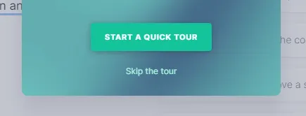
So rarely, especially if what you offer is as simple, it’s good to use a walkthrough right after the signup.
Sometimes after a user returns
It is pretty normal for your users to forget how exactly a certain feature of a certain tool they haven’t used in a long time works.
But then again, it is the tool's responsibility to remind users how it works.
At times like this, you might want to utilize your walkthroughs.
But beware.
If a user has been away long enough, there is the risk that they may have forgotten their first impression of your product.
You might want to treat them like a new signup.
Give them bits and pieces until they are back on track, or they might suddenly realize that they actually hate your product 👀
Usually when a user uses only a small portion of the product
Pendo reports that 80% of the average software’s features aren’t used by its users.
Now, this isn’t too scandalous if you consider your own use of SaaS products like Slack and HubSpot.
Not everyone uses Slack templates or Hubspot’s custom report builder.
And that is a good enough reason for these products to trigger specific walkthroughs regarding these features to users who might use them.
Emphasis on that last part.
If HubSpot triggers custom report builder walkthroughs to its users who don’t deal with reports at all, that just becomes annoying.
With the right strategy, it is usually a great idea to use walkthroughs in this case.
Always when there is an update or upgrade
If a tool is updated or a user upgrades their subscription, there have got to be new features.
New features mean new feature onboarding.
And that means walkthroughs.
You might be thinking, “How am I going to give them a walkthrough when everyone hates it so much?”
Firstly, people hate boring walkthroughs.
Secondly, in this case, it is expected more than it is hated.
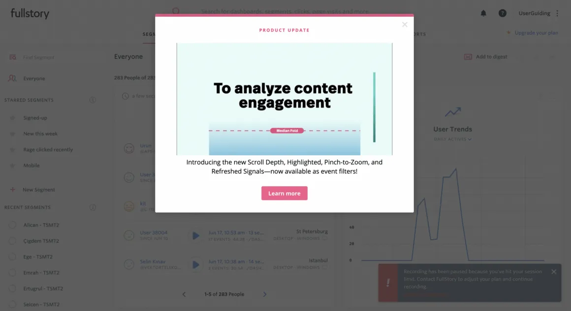
Users are often eager to learn new features, especially after an upgrade. As long as you keep it friendly and straightforward, you’re good.
Here’s how Fullstory does it:
Again, it all boils down to empathizing with the user. Knowing the when, where, and why is a top priority.
But how do you put this into action?
Let’s take a look at how to create the perfect website walkthrough:
4 Steps to Creating the Perfect Website Walkthrough
Creating the perfect walkthrough sounds like a big task.
And it is indeed a big task. But no worries, ‘cause we have the shortest recipe for it.
1- Understand what users want to and NEED to learn
Think of your own experiences with website walkthroughs or other onboarding elements.
You might have found yourself annoyed or frantically skipping through steps.
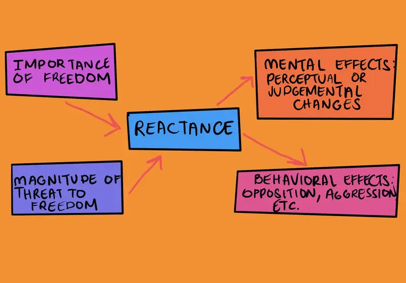
That is what some call reactance, and according to the reactance theory, humans are often inclined to perceive help as a threat to their autonomy and decision-making.
And that’s exactly why you need to plan beforehand where and when you can prompt a walkthrough without your users getting irritated by it.
3 simple practices can get you there:
- Gather all the content you want to offer, chop off anything that is extra
- Plan how you will offer the content by sectioning it into separate pieces
- Look for the best possible moments your users will be open to receive the content
And how do you decide what is necessary and what is not? What is important for the users, and what could be taught during the next login?
How do you guarantee that the users will actually participate in the walkthrough?
By analyzing user behavior patterns, of course.
2- Analyze users’ behavior pattern
Your product can be state of the art, but as long as you don’t surpass user expectations, it will never reach the fame it deserves.
And user expectations have a lot to do with user behavior.
Let there be no misunderstanding:
When I say user behavior, I mean everything from what your users tend to hover on to what makes them click on a certain button.
And, in our case, when and where they expect a walkthrough.
That’s where user testing comes into play.
When conducting user tests for walkthroughs, there are many things to consider, including:
- How long it takes for the users to interact with the walkthrough and to finish it,
- What kind of emotional and mental state users are in during the process,
- If the end goals are easily reached,
- What kind of action you can get after the walkthrough
So, whether you are doing A/B testing, tracking heatmaps, or monitoring eye movements, what matters is that you are aware of the criteria above and others your product could require.
3- Adopt a tool
You know your users more or less, and you have all the data to create a successful walkthrough.
What now?
There is one important decision to make, and that is whether to create the walkthrough in-house or with third-party tools.
Here’s our guide to making that decision:
But a small disclaimer just in case: in-house can be a hot mess.
You need developers, designers, and a lot more people from various departments to create one simple walkthrough.
Plus, Gartner speculates that by 2025, 70% of organizations will be using digital adoption platforms for their adoption needs.
That includes tools you would use to create website walkthroughs, like UserGuiding.
Give UserGuiding a try for free now 👈
4- Create, iterate, and optimize for success
After you have user data and a capable tool for creating walkthroughs, all that’s left to do is actually do it.
Now, creating and publishing a walkthrough with a tool like UserGuiding takes about 3-5 minutes.
But perfecting it might take a while.
With any walkthrough, whether created in-house or using a DAP, you will have skippers, negative user feedback, and even churn.
But user success is no big deal as long as you create, iterate, and optimize your walkthrough.
Best Practices for Website Walkthroughs
If you’ve checked out our simple recipe for a good walkthrough above, you might want to check out some best practices to really nail it.
Here are a few to get you started:
1. Start with a clear goal
You cannot use a walkthrough just because.
As we’ve established throughout the article, walkthroughs are UX elements that often come off as annoying.
It is in your hands to break that stigma, and that’s not gonna happen without clear goals.
So, first things first, you need to define what you want to achieve with your walkthrough or set of walkthroughs.
- Is it for user onboarding, feature adoption, or something else?
- What is an indicator that your walkthrough is successful? Is completion enough, or does it require a certain action?
- How can you update and iterate this goal with user data?
Once you have the answers to these questions, it is time to tailor each walkthrough step to align with your goals and your users’ intents.
2. Segment your audience for personalization
Most products will have a simple default walkthrough during user onboarding.
But that works best for products that people already know how to use, and/or products that aren’t too complex.
Real-time personalization becomes vital for a B2B product during and after onboarding due to the product’s innate complexity.
It can be as simple as personalizing product experiences based on user roles, preferences, or the user journey stage.
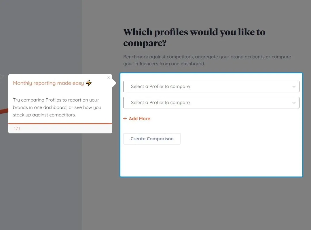
For example, during the personalization step, Jasper asks an additional question when the user clicks on Marketing. This tells us that in the product, the walkthroughs will probably be prompted accordingly:
When creating walkthroughs, you can achieve what Jasper does with conditional logic to ensure users see relevant walkthroughs when and where they are appropriate.
3. Make it non-intrusive with tooltips and guided steps
In theory, creating a walkthrough seems simple.
In practice, there are many things that make or break your attempt at a good website walkthrough.
Your worst nightmare is your walkthrough being perceived as intrusive.
How do you make it so that it won’t be intrusive?
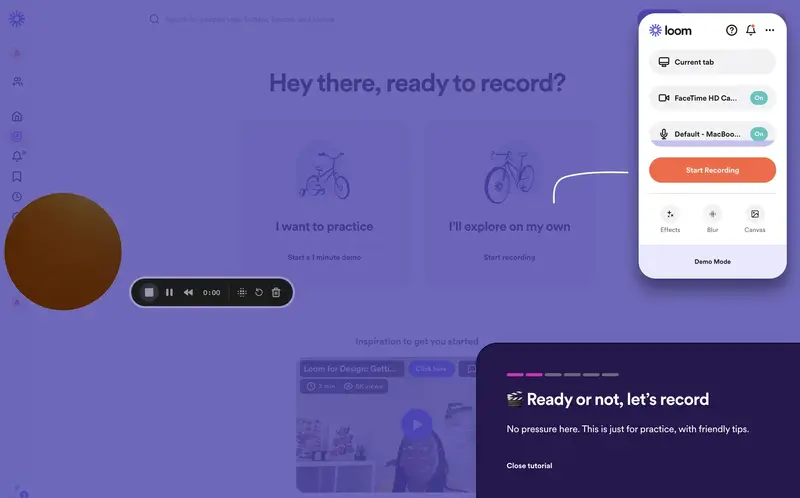
Here’s a super short but effective one of walkthrough examples from Loom:
Loom uses this walkthrough to onboard users using the Loom editor for the first time.
At first, it shows a full-screen modal with fun colors, short copy, and, most importantly, a skip button.
Next, you see tiny tooltips highlighting specific UI areas and a progress indicator.
Looking closer at the copy, you can also see that the sentences are super short and have absolutely no fluff.
They are pretty actionable, in fact.
Plus, only the most important UI elements are introduced, which shows Loom respects the user’s time.
That’s how to keep your walkthroughs non-intrusive.
4. Limit the Steps
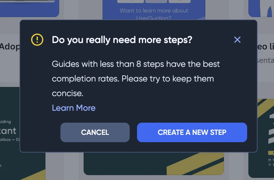
Today, the average attention span of an adult is 8.25 seconds, which happens to be shorter than that of a goldfish.
That’s why you keep it short, or no customer keeps coming back.
We even mention it on the UserGuiding Panel when a user goes over 8 steps:
So, what’s the ideal bracket?
Though you shouldn’t go over 8 steps in most cases, sometimes it can be necessary and even successful.
But in most cases, an ideal walkthrough length is often 3-5 steps.
At the same time, you cannot dump all the content from the other steps into the 3-5 steps and expect your users to like it. You need to truly keep it short and clear.
So, a good practice is to focus on the most critical actions users need to take to succeed.
For example, an ideal walkthrough on Canva would have the user interact with the create a new design button, the templates, and maybe the share button.
5. Focus on User Value
From your experience, you would probably know what an interesting walkthrough should look like.
But when it comes to the contents of a walkthrough, it is harder to create the perfect experience.
👉 The pro-tip to nail this is to approach creating content with a “why?” mindset.
Too many walkthroughs on some of the most popular tools you use every day fail to see it, but your users don’t want to read an essay to find out how to use one single functionality.
This Adobe Illustrator walkthrough seems to focus on the “What?” for example, which is not the best practice:
For example, this short walkthrough from HeyGen is a great example of how you can keep it short, only give the immediately needed information, and make it fun with visuals:
As long as you keep the driving value in mind and don’t get lost on the definitions, your walkthrough should work smoothly.
6. Include Progress Tracking
Walkthroughs are cool but they are essentially a minor part of your overall user journey.
And that journey needs to tell a story while evoking certain emotions.
At this point progress tracking transcends just a regular motivator and becomes a tool to create a frustration free environment.
A very important element here is user onboarding checklists.
They function as a progress indicator while also reinforcing the Zeigarnik effect, which is the phenomenon where your users are annoyed with unfinished tasks and try to complete your checklist.
Also, as we’ve discussed above, keeping the walkthrough is important but it is almost equally important to use a progress indicator.
The goal-gradient effect shows that the closer you are to completion, the more eager you are to work on it, which gives your users enough reasons to keep engaging.
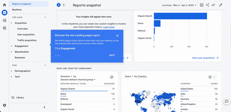
Some good options are numerical indicators, like in Google Analytics’s walkthrough:
A progress bar can work just as well, like in Loom’s case:
As a cherry on top that will complete the storytelling of the user journey, you can add a completion animation or any element that offers a sense of accomplishment.
For example, Vercel uses a full-screen confetti animation:
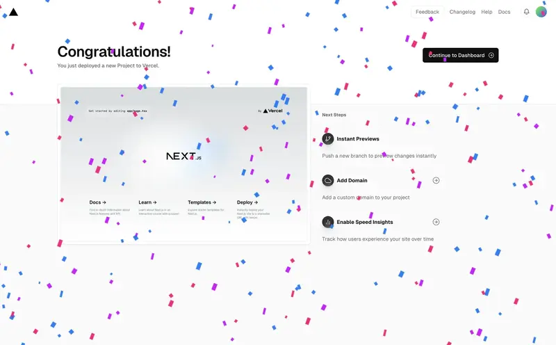
The point is to focus on the positive emotions you want to evoke for success.
7. Test and Iterate
Now, once your walkthrough is complete and ready to use, you can’t just call it a day and never look back again.
You need to get into the nitty-gritty of the user behavior data and look for any potential friction points in the walkthrough experience that might turn into a hiccup.
At this point, using A/B testing and gathering user feedback are essential.
Harvard Business School finds that startups that use A/B testing see 30% to 100% performance enhancements within a year of implementation.
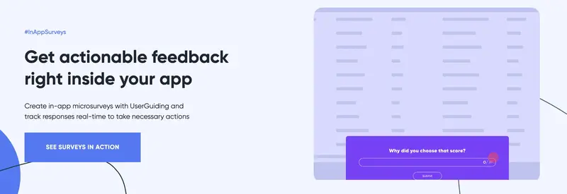
And if this isn’t a good enough reason to get into it, UserGuiding offers in-app surveys to gather the best possible user feedback, along with its walkthrough capabilities.
Give UserGuiding a try for free today 👈
8. Offer Post-Walkthrough Support
Lastly, a step that might get overlooked post-creation is offering support once the walkthrough is through.
Not all of your users might have been able to fully comprehend your walkthroughs, however good they might be.
But that doesn’t mean you should add a live chat option after every interaction.
A good tactic here is to make your help documents as visible and accessible as possible.
Whether you have FAQs, tutorials, or chat support, they need to be a few clicks away.
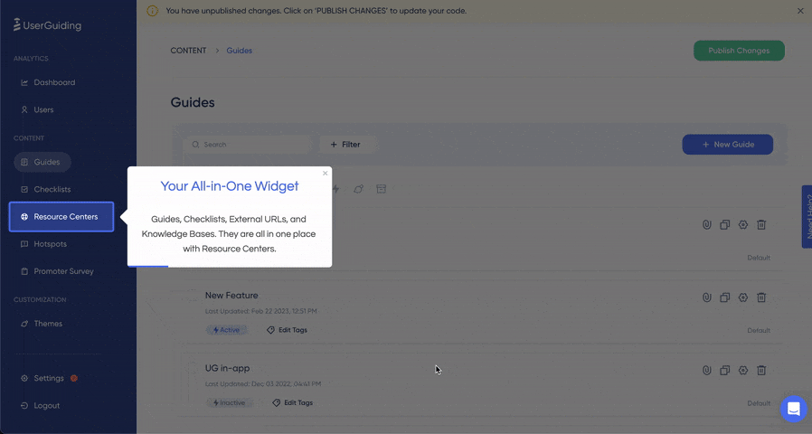
A resource center or a similar widget might help at this point.
For example, our own resource center at UserGuiding features a product updates tab, a knowledge base, and more.
It also includes the initial onboarding checklist in case the users want to revisit it, which is a great practice for anyone with a product on the more complex side.
Examples of Effective Website Walkthroughs
There are many great examples of website walkthroughs, as you might have seen throughout the article.
But let’s turn our magnifying glass on a few examples to really do a full analysis:
1- Grammarly
Grammarly is a great example of a successful website walkthrough for a couple of reasons.
You can see below that Grammarly uses a sandbox environment to teach users a few things right away.
It prompts a walkthrough on the UI, and an important detail is that it is skippable.
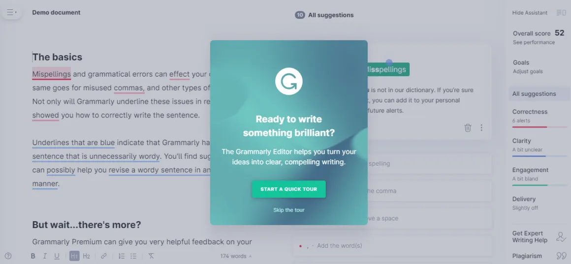
If you haven’t skipped, Grammarly shows you around a demo document using hotspots. You click on the beacons and end up using most of the features the tool offers.
No bite-sized content, just a full-on walkthrough in a demo setup. Ain’t that a bit risky?
Well, that’s Grammarly for you.
Jokes aside, a walkthrough of all features after signup can be the only way for certain tools.
If you think your users won’t get bored or annoyed, and if you can guarantee you can still educate them even if they skip, go for it.
Why it works? ✍️
- It is a good practice to announce that there is a walkthrough coming and let users skip it.
- Hotspots are perfect for a demo or to create a less forced onboarding experience.
- If you think it matches your product's nature and use case, a walkthrough right after signup can work for your product.
2- Dropbox
Dropbox is another good example of a website walkthrough.
Users can easily access the Dropbox experience without going inside the platform, instead they can use a sandbox environment.
And though you need to give your email address, there is no email verification or an actual signup.
Here’s a quick look:
The walkthroughs are interactive and sectioned into different experiences offered inside a checklist.
Why it works? ✍️
- Using a sandbox environment, you can experience the Dropbox onboarding before you actually sign up for the platform.
- The walkthroughs are big and have many steps, as Dropbox is a complex product, and they are still divided into different walkthroughs and offered in a checklist. This allows users to get aligned with the onboarding a lot easier mentally.
- The interactivity element makes the walkthrough more engaging and memorable for users.
Choosing the Right Website Walkthrough Software
When choosing software to create website walkthroughs, you might find yourself in a pickle as there are many great digital adoption platforms out there.
Still, all you need to do is answer 3 simple questions:
What features and use cases can I get within my budget?
You probably have a specific budget you can spend on website walkthroughs or an overall onboarding project, and that’s completely fine. That’s the drill for everyone else.
What matters is to know exactly what you need and can afford within that budget.
Most DAPs will offer tooltips, hotspots, guided tours, and other onboarding elements, while some others add resource centers, onboarding checklists, and other elements to the mix.
You will get to check out many products that have this and that but lack a specific thing.
Pro-tip, don’t get too captivated by extras. What matters is what you need in the first place.
Too often you will end up not using every feature a product needs. Focus on your main goal and the features you might need for that.
Does it offer advanced options like personalization and user segmentation?
Now, even though you shouldn’t be getting too into extra features and focusing on what you initially needed, some features and capabilities are a must.
For example, you definitely need a personalization option to truly optimize your website walkthroughs.
So, look for tools with deep data, user behavior, segmentation, triggering, and scheduling features.
How can I work with the data to perfect my walkthroughs?
And lastly, you will want your potential DAP to have a means to analytics.
While most big products offer deep product analytics with user behavior and reporting options, simpler ones will have very little flexibility or just no analytics option at all.
Even if you have a small budget and your top pick lacks analytics options, try to look for integrations with your analytics products in use for an alternative.
Keep in mind that analytics is a must for any walkthrough.
Otherwise, you are blind to how your users react to it and how their needs change in the long term.
Best Website Walkthrough Tools
Now, having looked at how to pick a DAP, here are some of our top walkthrough software picks for anyone with any size of budget:
1- UserGuiding
UserGuiding is the best value no-code digital adoption platform for product teams who want to create in-app experiences to empower user onboarding, self-service, and engagement from one powerful tool.
The platform makes a difference by offering onboarding elements like walkthroughs and checklists while also offering knowledge bases, an AI Assistant, and in-app surveys.
Overall, it’s a tool that aims to change how you engage with your users and help you activate, convert, and retain them.
UserGuiding is Best For…
Small-to-medium businesses seeking the best value solution for improving user adoption. It works especially well as a holistic approach with features that are still advanced enough.
What users think about UserGuiding
2- Appcues
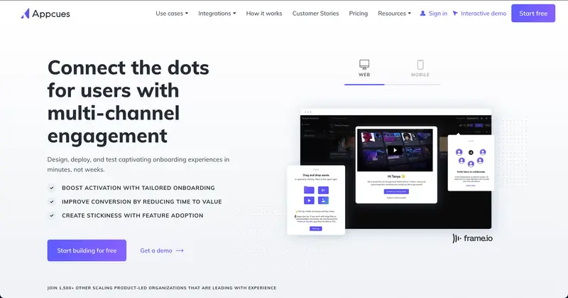
Appcues combines a drag-and-drop interface with in-app messaging and robust A/B testing, making it ideal for building interactive product tours and feature announcements.
Its user analytics provide actionable insights, helping teams refine their onboarding strategies.
Appcues is Best For…
Enterprises looking for customizable, data-driven walkthroughs to enhance user engagement.
3- WalkMe
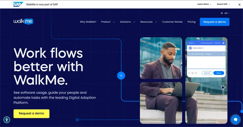
WalkMe excels in providing contextual guidance, real-time analytics, and automation tools to streamline user onboarding and software training.
It’s particularly effective for managing complex systems, making it a go-to for enterprises with intricate workflows.
WalkMe is Best For…
Large organizations that need scalable solutions for employee onboarding with a bigger-than-most budget.
4- Pendo
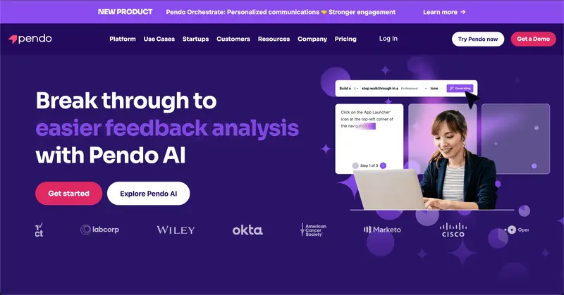
Pendo merges in-app messaging with detailed product usage analytics, offering a seamless way to guide users while gathering feedback.
Its survey and feedback tools are especially good, allowing businesses to understand user needs and adapt their products accordingly.
Pendo is Best For…
Companies that want to combine analytics with engaging walkthroughs for a comprehensive user experience, though it's on the pricier side.
5- Whatfix
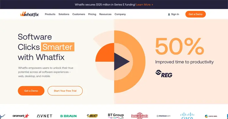
Whatfix provides in-app guidance and contextual help to improve user productivity while offering self-service support options.
Its detailed analytics empower businesses to monitor user progress and optimize training processes. Though essentially, it’s a smaller version of WalkMe.
Whatfix is Best For…
Enterprises that need advanced analytics and self-service capabilities for onboarding and training, especially if they need a slightly more affordable alternative to WalkMe.
6- Intro.js
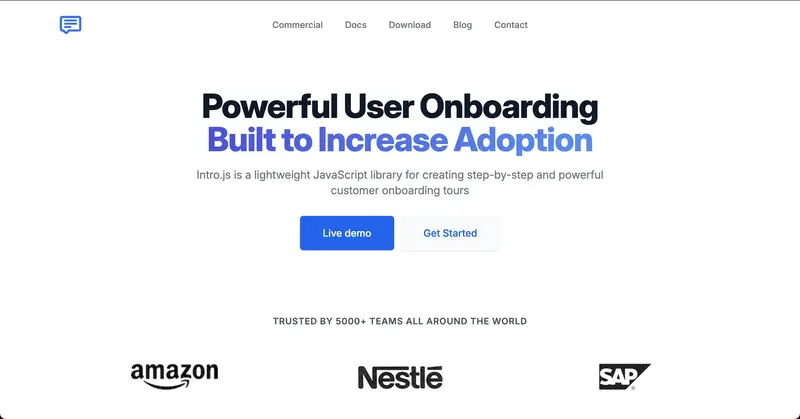
Intro.js is a lightweight, open-source JavaScript library perfect for creating simple yet effective product tours and tutorials.
Its customizable nature allows developers to tweak every aspect of the walkthrough without incurring ongoing costs.
The tool’s one defect is that it needs to be used by developers, but that can be an advantage to some.
Intro.js is Best For…
Developers who need a flexible, cost-efficient tool for building straightforward walkthroughs that are simple but effective.
7- Chameleon
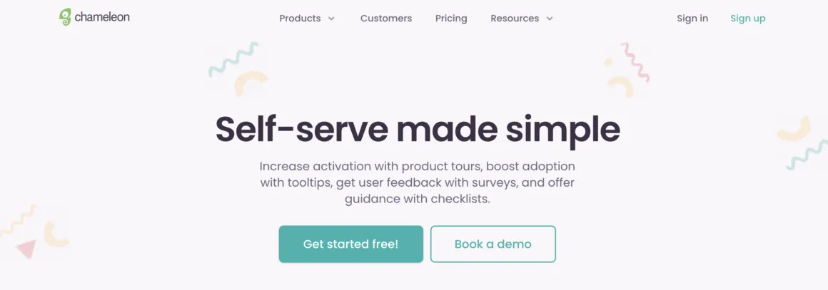
Chameleon provides interactive tours, tooltips, and in-app surveys that integrate well with analytics platforms.
Its user segmentation features enable tailored walkthroughs, ensuring users stay engaged and features are promoted effectively.
The tool is especially useful for deep analytics.
Chameleon is Best For…
Teams looking for an analytics-driven tool to boost user onboarding and retention. It’s another tool that is a bit too pricey for what it offers.
8- Inline Manual
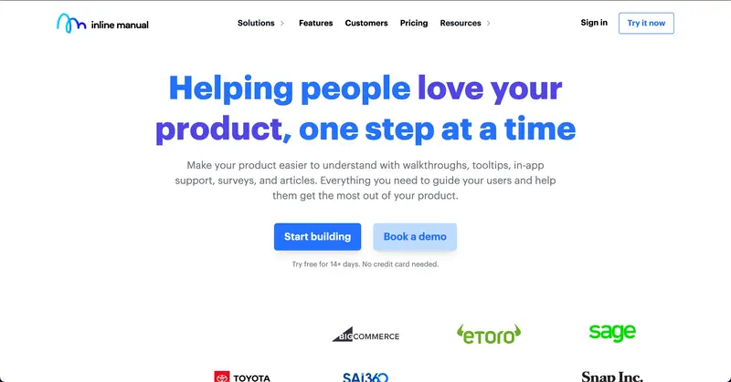
Inline Manual offers tooltips, interactive tutorials, and in-app help designed to make onboarding and training intuitive for SaaS products.
Its feature set caters to a more technical audience, ensuring they get the guidance they need to succeed. If you are going in-house in creating walkthroughs, Inline might be good to consider.
Inline Manual is Best For…
Companies who prefer in-house onboarding but need a base to start building their walkthroughs.
Conclusion
A website walkthrough is an effective way to get higher user engagement, conversion, and retention in the long term.
And yet, this is only true if you manage to create a good walkthrough.
We’ve provided all the necessary tips, tricks, strategies, and tools for you above but if you want a quick solution, UserGuiding can easily do that for you 🫡
Give the best value digital adoption platform a try for free today! 👈
Frequently Asked Questions
What is the purpose of a website walkthrough?
A website walkthrough often aims to get users to value as soon as possible, especially if this website walkthrough is designed to onboard users.
What are the types of walkthroughs?
Website walkthroughs can have different types depending on the purpose of the walkthrough and the design.
For example, website walkthrough types like onboarding walkthroughs and new feature walkthroughs serve different purposes. On the other hand, static walkthroughs and interactive walkthroughs are different types of walkthroughs that are designed in distinct ways.
What are some free walkthrough software?
While there are free tools for creating website walkthroughs like Intro.js and Shepherd, they are software that require a knowledge of coding.
On the other hand, tools like UserGuiding and Appcues offer free trials.

.png)