


.svg)
.svg)
.svg)
.svg)
.svg)


.svg)


.svg)
.svg)


Every $1 invested in UX can deliver an impressive return of $100 (an ROI of 9,900%). It’s no secret that great user experience drives business success.
But if you’re reading this, you’ve probably already heard about the power of small UX elements like tooltips. These little gems guide users, reduce friction, and make your product feel intuitive without shouting for attention.
In this article, we’ll take you beyond the basics.
You’ll learn how to:
- Craft tooltips that actually help users discover features,
- Clarify confusing parts, and speed up activation, and
- Design your UX without annoying your audience.
Plus, you’ll get to see plenty of real-life examples to solidify the theory.
Ready?
TL;DR
- A tooltip is a small, contextual UI element that provides helpful information or guidance. Tooltips can also be interactive, including buttons, links, or visuals to enhance user engagement.
- Tooltips serve various purposes from explaining features and guiding users during onboarding to promoting upgrades and highlighting new functionalities.
- When designing tooltips, focus on clarity, timing, and relevance:
- Show tooltips at the right moment for the right audience.
- Use simple, clear language and offer value.
- Keep text short and avoid overwhelming the user.
- Make sure tooltips can be easily closed or ignored.
- Match tooltip design with your product’s look and feel.
- That said, watch out for common mistakes like…
- Overcrowding the interface,
- Making tooltips persistent without reason, or
- Assuming users understand your terminology.
- Intrigued and wondering how you can create your very own tooltips? Good thing we cover that in the article for you too!
- There are basically 3 ways: the no-code way, the low-code way, and the DIY way. To get into more detail, we invite you to read the parts that interest you.

What is a tooltip?
A tooltip is a UX pattern that allows you to highlight different parts of your product, offer highly contextual guidance, and share short tips on your product’s best practices without interrupting the user’s experience.
You can think of them as small text boxes that pop up on screen after certain user interactions.
In its most basic form, it looks like this:

However, tooltips can vary based on their purpose.
There are onboarding tooltips, which are part of an onboarding flow (such as a product tour or walkthrough) and act like product bumpers, as Wes Bush puts into words in his podcast:
“So product bumper is something intuitive where it's just, hey, click here to go through this step. Click here to go through that step. No-brainer steps for people to go through that straight line with those intuitive tooltips, whether that's a product tour, a little checklist, or anything else like that.”
An onboarding tooltip, therefore, tends to be more instructional with a small amount of microcopy. Here’s an example:

As seen in this example, a tooltip can be interactive, as well as instructive, meaning that it can wait for the user to complete a certain action, like filling an input field or clicking on a button.
This type of tooltips are often seen in onboarding flows.
Then we have feature tooltips, which announce or promote a feature. This can be a brand-new feature or simply a new feature to a particular user. The purpose of these tooltips is to offer guidance on how to utilize the feature to its fullest.
A feature tooltip can also include pro tips and best practices.
Here’s an example of this kind of tooltip:

As you may have already noticed, tooltips also differ from one another for more technical reasons. Almost all tooltips are short, contextual, and instructive.
But some are text-only, while others incorporate visuals. Some are triggered when a user clicks on a tooltip icon or interacts with a specific feature or UI element. Others appear when users hover over a pre-selected area, and some trigger automatically when a screen loads.
Then there are the interactive input field ones, like the example we saw a few minutes ago.
Another differentiating factor is whether you include interactive elements in your tooltips, such as CTA buttons, progress bars, dismiss icons, etc.
Each one of these interactive elements come with a different advantage, like:
- A CTA button can simplify and fasten the recommended user flow with one click.
- A progress bar can create a sense of achievement and keep users motivated.
- A dismiss or remind me later icon can offer flexibility for the user.
But we’ll talk about the best practices and mistakes to avoid in detail later on in the article, so we’re not going down that rabbit hole right now.
First, the basics. Like…
What’s the difference between popup tips and tooltips?
Both tooltips and pop-up tips appear within your product to provide helpful information or guidance. While they’re similar in purpose at a high level, they differ in how they’re formatted, how they behave, and the specific use cases they support.
A tooltip is a small, focused message that appears next to a specific element on the interface.
We’ve seen examples of it in the beginning of the article.
It usually highlights a UI element directly, like a button, icon, or form field, and offers short, contextual information about what it does or how to use it. For example, when a user hovers over a new icon and a small box appears explaining its function, that’s a tooltip.
A pop-up tip, on the other hand, is generally more prominent and less anchored to a specific UI element. It might appear in the center of the screen or in a fixed area and can include more information, sometimes even multiple points at once.
Pop-up tips are often used to onboard new users or highlight several key features at once, like a welcome message that outlines the main actions users can take in the product.
They also tend to be more shiny and obstructive compared to tooltips.
Here’s an example pop-up tip:

What is a tooltip used for?
Tooltips can support many different goals in your product, depending on when and where you use them. Here are some of the most common ways tooltips are used:
User onboarding
Tooltips are widely used in onboarding flows to help new users get familiar with your product without overwhelming them. Instead of dropping a long tutorial or a help doc, you can guide users step-by-step with small, contextual messages.
- Long off-app help documents ❌
- In-app product tours and walkthroughs created with contextual tooltips ✅
Tooltips also make the learning and onboarding experience more engaging and interactive for the user, which helps with steep learning curves and possible frictions.
Contextual guidance and help
Talking about friction… Tooltips can be a great way to simplify complex user flows, or at least present them in a less intimidating way.
This use case isn’t just important for onboarding new users; it’s also valuable for supporting your existing users as they continue to navigate your product. Even after adoption, users might encounter new features, tricky settings, or unfamiliar workflows that benefit from a little extra guidance.
By providing helpful hints exactly when and where they’re needed, tooltips reduce confusion and prevent errors.
Feature updates and reminders
When you roll out new features, it’s easy for users to miss them, especially if they don’t stand out visually or aren’t part of the user's regular flow. Tooltips can help by drawing attention to these updates and explaining what’s new.
You might say, “But don’t we have announcement modals and banners for this purpose?”
Well, yes. But also not quite so.
Unlike announcement modals and banners, which usually cover a larger portion of the screen and interrupt the user’s flow, tooltips are more subtle and contextual. This means tooltips can inform without overwhelming.
Plus, you can trigger tooltips several times in different parts of the UI.
They can also appear during separate user sessions, which lets you remind users gently without interrupting them.
On the other hand, showing big announcement modals more than once can quickly become annoying.
Upsell and add-on promotions
Tooltips can also be used to promote premium features, add-ons, or upgrades. When a user encounters a locked or limited feature, a tooltip can briefly explain its value and invite them to learn more or upgrade.
Or, for features with limited usage during a trial or lower pricing tiers, you can add tooltips to encourage upgrades. These tooltips can appear when users actively use the feature and approach their limit.
The key to a successful upgrade or upsell promotion is timing and relevance.
Which happen to be two of the most important strengths of tooltips.
Why should you use tooltips in SaaS?
You can use tooltips to…
- Improve feature discoverability and activation:
Instead of relying on users to explore everything on their own, tooltips highlight important actions right where users need them. This targeted approach can significantly increase activation rates.
Flowla, for example, increased their user activation rates by 24% with UserGuiding’s interactive UX elements, like tooltips.
Erdem Gelal, the CEO of Flowla, says their users faced friction after signup and were left to discover the platform’s capabilities on their own. And it was impossible for the Flowla team to guide every user individually…
So, they decided to adopt a different onboarding strategy: in-app guidance.
They created product tours and walkthroughs for different use cases and immediately saw positive results. Here’s an example tooltip from their walkthrough for flow building:

- Educate without overwhelming:
Tooltips allow you to deliver bite-sized, contextual information instead of long video tutorials or dense help articles. This means users can learn about features or processes step-by-step without feeling overwhelmed.
You can also highlight the importance of completing certain steps in workflows and explain the value the user will get out of it later on.
You can also use tooltips to highlight why certain steps in a workflow matter and the value users will gain by completing them. While some steps might be optional (and should remain so) it’s helpful to explain their purpose and benefits.
This helps users understand why those actions are included and encourages them to invest the time and effort when it’s worthwhile.
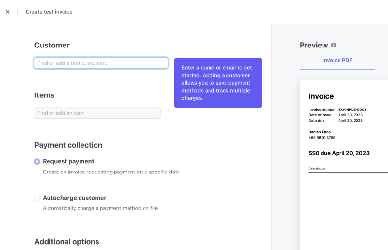
Stripe, for example, uses this tooltip 👇🏻 to explain why adding and saving customers beforehand can be useful later on:
- Reduce support ticket volume:
By providing quick answers and guidance directly within the product, tooltips can reduce the number of basic questions your support team receives. After all, many support issues aren’t unique; on the contrary, they’re quite common and can often be solved quickly, or even prevented altogether with simple measurements.
Plus, when users find help exactly where they need it, they’re less likely to get frustrated.
So, contextual tooltips can lead to:
- Smoother in-app experiences.
- Fewer support tickets.
- More time on your support team’s hand to focus on more complex issues.
- Enhance onboarding flows:
Onboarding is one of the most important phases in the user journey, as it sets the tone for how users will perceive and interact with your product. However, onboarding can also be confusing and overwhelming if it’s not carefully designed…
When new users are faced with too much information at once or unclear instructions, they can easily feel lost or frustrated. This can lead to drop-offs and lower adoption rates.
Tooltips help solve this by breaking down onboarding into manageable, bite-sized steps.
Instead of overwhelming users with long tutorials or complex guides, tooltips provide clear, focused guidance right where it’s needed. By guiding users through key features and tasks one step at a time, tooltips reduce cognitive load and make learning the product feel more natural.
👉🏻 Check out our detailed guide to product-led onboarding.
- Drive engagement:
Keeping users engaged throughout their journey is essential for the success of any SaaS product. However, users often get distracted or lose focus.
Tooltips can play a key role in sustaining engagement by drawing attention to relevant features, new updates, or helpful tips exactly when users need them.
By offering timely prompts, tooltips encourage users to explore and interact with parts of the product they might otherwise overlook. This not only increases usage but also helps users discover functionalities that improve their overall experience.
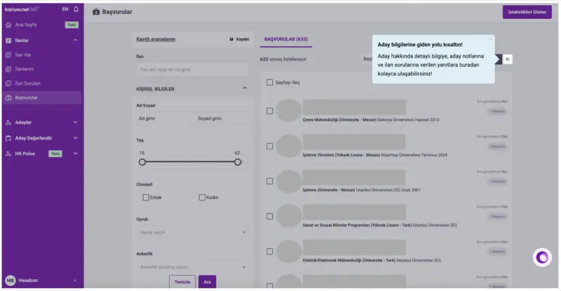
For example, Kariyer.net boosted its engagement rates through tooltips.
Kariyer.net is a leading career platform in Turkey, with a large user base that has diverse needs, use cases, and expectations.
And steering different user personas toward the relevant features and capabilities to drive engagement can be challenging with such a big and varied audience…
However, thanks to UserGuiding’s segmentation capabilities, they were able to offer personalized, tailored tooltips that highlight different features for different users.
Here’s what their UX researcher, Merve Bakar, says:
“With UserGuiding’s segmentation and tooltips, we turned confusion into clarity. Each user now sees actions tailored to their intent and behavior."
And here’s an example tooltip from Kariyer.net:
- Reduce frictions:
Friction in user experience happens when something slows users down, causes confusion, or makes tasks harder than they need to be. This can lead to hesitation, errors, or even abandonment. Identifying and reducing these friction points is vital for smooth product usage.
Tooltips are a powerful tool to lower these barriers.
By providing real-time guidance and clear clarifications at the exact moment users encounter difficulty, tooltips can prevent frustration before it builds up. Even simple hints, like explaining a tricky form field or clarifying a button’s function, can make a big difference.
Where do tooltips fit in the user journey?
Tooltips can appear at different stages to support users effectively throughout their experience. For example…
- During onboarding (step-by-step tutorials):
At this stage, tooltips help break down complex workflows into simple, actionable steps. They act like a friendly guide, helping users focus on one thing at a time without feeling overwhelmed. This incremental learning can reduce drop-off rates and help users build a solid understanding of your product’s core features early on.
- Post-onboarding (feature tips, nudges):
After users settle in, tooltips can introduce lesser-known features or encourage best practices. This keeps the experience fresh and continuously adds value by helping users discover new ways to benefit from the product. It’s a subtle way to increase feature adoption and deepen engagement without interrupting their flow.
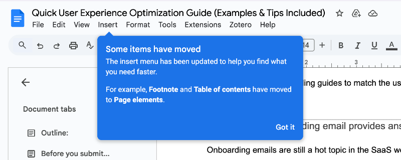
- When introducing new features or UI changes:
Instead of forcing users to read lengthy update notes or attend webinars, tooltips provide contextual explanations right where users interact with new elements. This minimizes confusion and speeds up adaptation.
For example, Google Docs uses tooltips to ease users into UI changes by pointing out new buttons or functions exactly when needed.
- In empty states:
Blank screens or empty dashboards can create a sense of uncertainty or overwhelm. Tooltips in empty states offer helpful suggestions, explain what users can do next, or highlight the value of taking certain actions. This reduces mental load and turns an otherwise confusing moment into an opportunity to guide users forward.
- In error scenarios:
When users encounter errors, tooltips provide immediate, clear explanations and actionable advice. This helps reduce frustration, clarifies what went wrong, and guides users on how to fix the issue or proceed.
Retool’s error message tooltips are a great example of turning a negative experience into a playful one.
Best practices for tooltips: Dos and don’ts
Sometimes, bad user experience can lead to massive, costly mistakes.
Take a famous example from the financial world: Revlon accidentally prepaid a $900 million loan due to a software error caused by an outdated, confusing user interface. This wasn’t just a glitch, it revealed how legacy systems and poor UX can lead to billion-dollar blunders.
While your SaaS product might not handle millions of dollars in loans, bad UX still comes with serious costs like lost users, frustrated customers, and wasted support resources.
Investing in good tooltip design is one small but crucial step to avoid those pitfalls.
You don’t want your users to get stuck or confused because of unclear guidance, right?
With that in mind, here are some dos and don’ts to help you make tooltips a helpful part of your user experience.
Do: Offer value (without overuse)
Tooltips work best when they genuinely help users understand or navigate your product. They should offer clear, relevant information that answers questions or removes uncertainties.
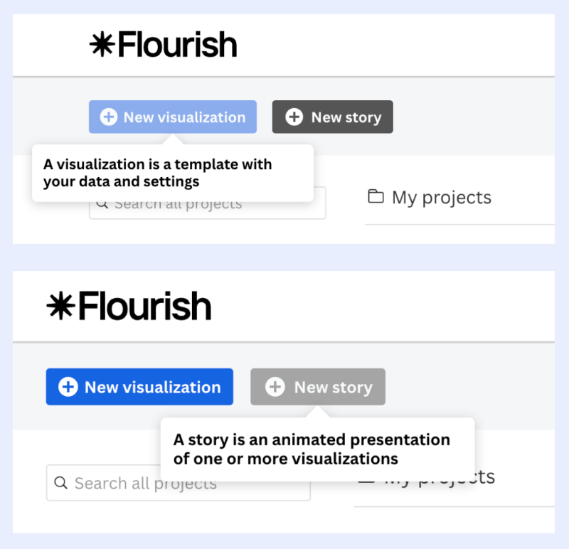
For example, Flourish uses hover-over tooltips to explain the purpose of each feature/button. This helps users gain confidence to start creating right away, and they don’t have to jump back and forth between options to figure out which one best fits their visualization project.
But here’s the trap: overusing tooltips (placing them on every element like confetti) kills their value. Instead of guiding users, you end up annoying them.
Plus, even when you use them for a really good reason later on, your users will skip them too, assuming it’s just another unnecessary popup. Once you’ve trained them to ignore tooltips, it’s hard to win back their attention.
As Ramli John pointed out in his viral post, trying to explain every feature with 47 tooltips doesn’t educate, it frustrates...
It leads to “rage clicks” and ignored popups.
Hotjar saw a 26% increase in feature adoption and a 99% increase in users saving recordings when they stopped interrupting and started enabling.
👉 In short: more tooltips ≠ better onboarding. Use them where they truly help. Not everywhere.
When you create tooltips, always ask yourself:
- Does this tooltip improve the UX?
- Doesit provide any information that is useful for the user?
- Would the user struggle with navigation without it?
Do: Keep it short and contextual
When it comes to tooltips, less is definitely more.
Users tend to skim rather than read in-depth, so keep your tooltip copy concise and focused on the immediate context. The best tooltips quickly clarify or add to what the user is already looking at without requiring them to leave their flow.
The main advantage of using tooltips over other UX elements is that they’re subtle and non-obstructive. So your copy should reflect that, not fight against it.
Here’s a good example from Google Docs:

To make the copy skimmable and easy to read, they keep it short and use formatting smartly, like adding a clear title. The main value is delivered in the bolded title, while any extra context sits in a smaller font below.
That way, even if you close the tooltip right away and jump into writing, you’ve already picked up the key message in seconds.
Does the image make it slightly bigger, and maybe even a bit more obstructive, than necessary?
Well… everything has its flaws. This one? We’ll let it slide.
💡 Pro Tip: Tooltip positioning matters too. Tooltips should appear close to the element they describe, so the user instantly connects the message to the right part of the UI.
Do: Mind the tooltip design and product UI (and the brand voice)
Tooltips should feel like a natural part of your product, not like annoying ads or random pop-ups. Consistency in style (color, typography, shape, etc.) helps users quickly recognize tooltips across your interface.
Help Scout, for example, nails this strategy with tooltips that align perfectly with their brand style and voice.
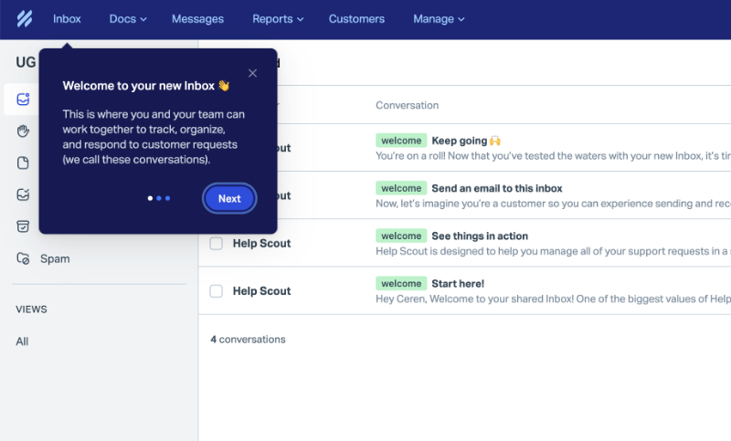
The tooltips don’t feel like extra add-ons slapped onto the interface, they feel like they belong. Their colors, fonts, spacing, and iconography match the platform’s design system, making them a natural extension of the product rather than a separate layer.
And just as importantly, the microcopy used in these tooltips aligns with the brand’s tone of voice across other customer touchpoints like onboarding emails, support docs, or live chat.
It’s friendly, conversational, and easy to digest.
⚠️ That said, a quick note of caution: Consistent doesn’t mean identical.
Your tooltip copy and design should adapt to context, what works for a help article won’t necessarily work in a product UI.
- Do you use a lot of emojis and jokes in your communications? Maybe eliminate them from some tooltips and keep them only in a few.
- Do you include a lot of visuals in your help articles? Very cool, but not all tooltips require images.
- Do you write in a super casual tone across your blog and social media? That works well there, but in-app guidance might benefit from a slightly more direct, instructional style.
💡 Pro Tip: Tooltip design is more than colors and fonts. From icon style and animation to placing and trigger method, every detail contributes to how intuitive and trustworthy the tooltip feels. During the tooltip design process, you should make sure to:
- Use interactive elements when necessary,
- Optimize timing and placing of the tooltip,
- Make use of visual cues such as tooltip arrows and icons,
- Highlight what is important and dim what is not,
- Keep any UI element that is relevant to the tooltip visible.
Do: Trigger at the right time (hover, click, scroll, or after delay)
Timing is everything with tooltips. They should appear when users are most receptive and likely to benefit. Static tooltips that appear randomly can frustrate users. Instead, tooltips should respond to user actions like hovering, clicking, or reaching a certain point in their journey.
According to Kate Syuma, users engage better with tooltips when they control when to see them. This approach respects the user’s flow and encourages more meaningful interaction with your product’s features.
In the Product Growth Podcast, Kate Syuma also gives the example of Airbnb’s contextual tooltips and prompts. For instance, Airbnb first prompts the user to share a wishlist when they create one. Then, when the user closes the popup, a tooltip appears explaining how to share it later on.
Syuma highlights the great timing and placement of this tooltip, and says:
“So they uncovered what is the right time to introduce to me this sharing functionality, right after I created some value in the product. Right after I created this wishlist. If they would show me that, let's say, in the middle of something, like when I was searching for new locations, that wouldn’t be a relevant timing. But this way, they make it interesting and engaging. ”
So, when it’s well-placed and well-timed, even the most standard tooltip about a sharing feature can look interesting and engaging.
Another great example of a “right time, right place” tooltip comes from Humanity.
They trigger their tooltips and walkthroughs when the user is already on the relevant feature page, not on the homepage, where it’s unclear what the user intends to do next.
For example, when a first-time user lands on the shift planning page, they see a tooltip inviting them to take a walkthrough on how to create shifts.

Do: Provide personalization for user segments
Personalizing tooltips for different user segments can make your guidance more relevant and effective. Contextuality isn’t just about placement after all, user needs and expectations are important, too.
Personalized tooltips solve this by adapting the content based on user behavior, role, or stage in the user journey. This could mean:
- Showing onboarding tips only to new users,
- Surfacing shortcuts or advanced actions to returning users,
- Offering role-specific nudges to admins, editors, or viewers.
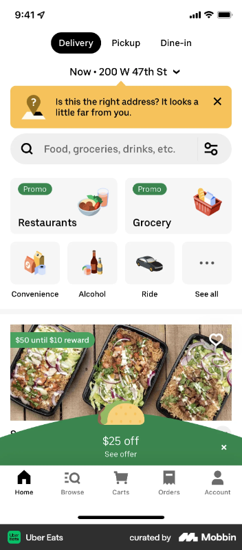
For example, Uber Eats uses geo-location to detect mismatches between a user's current location and their chosen delivery address. When a discrepancy is spotted, they show a tooltip warning the user before the order is placed.
This kind of smart, context-aware tooltip uses real-time data to prevent mistakes, solve problems before they happen, and deliver value precisely when it's needed.
Don’t: Use for crucial information
Tooltips are supportive by nature. They’re meant to provide light guidance, quick nudges, or minor clarifications. They’re not a safe place to deliver critical instructions, warnings, or decision-making information.
Because they disappear quickly after first interaction and can even go unnoticed totally.
If something is mission-critical, like confirming a data deletion, submitting financial data, or making irreversible changes, then it needs to live in a more prominent and accessible space like:
- Modals with confirmation,
- Persistent banners, or
- Inline UI messages.
But you can use tooltips for quick wins, like clarifying a confusing term, or helping them complete a simple but high-impact action, such as saving a draft, reordering an item, or using a keyboard shortcut.
A bad example to learn from comes from Humanity.
They offer sample data to make it easier for first-time users to explore the features and capabilities of the platform, which is great.
However, instead of displaying it by default like many other tools with demo data do (we get it, maybe they want to cater to trial users who prefer to bring in all their real data during the trial period 👀), they hide this information behind a tooltip rather than highlighting it with a more visible and accessible UX modal.

Don’t: Interrupt your users
Tooltips shouldn’t feel like annoying interruptions. When they block important UI elements, pop up unexpectedly, or demand attention before the user is ready, they go from helpful to harmful.
❌ To avoid this, you should not:
- Place tooltips in a way that overlaps with important UI elements.
- Design tooltips without a clear way to close, skip, or dismiss them. If users feel trapped, they’ll get frustrated fast.
- Interrupt users mid-task, especially during actions like changing settings or filling out forms.
- Launch full-blown product tours when someone is trying to use a specific feature. It’s the worst time to introduce an unrelated walkthrough.
One misstep in this area comes from Adobe Acrobat Reader. While their tooltips are meant to assist, they sometimes end up covering key buttons or interfering with the interface. This breaks the user’s flow and causes frustration.
Plus, since these are hover-over tooltips placed on a tightly packed sidebar menu, users often trigger them unintentionally just by moving their cursor around. The close spacing between icons increases the chance of accidental pop-ups, and leads to constant distractions.
An unnecessary amount of visual strain…
Don’t: Overload with information
A tooltip is not a mini help center. It’s not a blog post. It’s a micro moment of guidance.
Trying to cram too much into one tooltip, especially technical jargon or multi-step instructions, will overwhelm users and dilute the message. It also contradicts the main value of tooltips: clarity and simplicity.
Best practice?
- Stick to one (1) clear message per tooltip.
- Use plain, conversational language.
- Avoid jargon unless you’re 100% sure your audience understands it.
- If needed, link out to more detailed help content instead of trying to fit it all in.
Beehiiv’s tooltip about their free trial and what it includes is a prime example of how not to do tooltips.

They list all the features and capabilities included (or not included) side by side, which creates several problems:
- The sheer amount of copy makes it nearly impossible to read.
- Many of the listed features don’t provide value for most users because there’s no segmentation or personalization.
- Half of the features are confusing to new trial users. For example, what exactly is “3D analytics,” and why should I care that it’s part of the trial?
Don’t: Invade the screen
We’ve said that tooltips are preferred due to their non-invasive nature, in most cases. They tend to be small, especially if they’re text-only and have an optimized microcopy. But hey, humans have a talent for turning these innocent little helpers into absolute headaches...
(Yes, being a little dramatic, maybe.)
Some tooltips get as big as announcement modals and take over half your screen. Others throw multiple tooltips your way at once. And the absolute worst? They do both at the same time. Yeah, it’s a thing.
A relevant example is Qwilr, where two big tooltips appear at the same time.

Edd Dawson from SEO is not That Hard also says that:
“Many tooltips can quickly overwhelm users if overused. It’s important to reserve them only for elements that genuinely need extra explanation. Additionally, always provide fallback content for cases when JavaScript fails or is disabled to ensure a smooth user experience.”
Don’t: Make it undismissable or obtrusive
Nothing kills trust faster than a tooltip that won’t go away.
Users need control. If they want to skip a tooltip or ignore it completely, that’s their call. Forcing them to interact with or close a tooltip just to continue working is a recipe for frustration.
Repeat after me: We cannot force anyone to go through a 9-step product tour.
Here’s what to do instead:
- Add dismiss buttons or an option to opt out.
- Include “Remind me later” buttons for flexibility.
- Respect dismissals and don’t auto-resurface tooltips unless the user wants to be reminded later on.
Tooltips examples to inspire your next design
1- Stripe’s onboarding tooltips decrease cognitive load
During its onboarding process, Stripe conducts a detailed survey and asks users about their use cases, goals, and whether or not they’re interested in specific features or capabilities offered by Stripe.
However, the terminology around use cases and needs isn’t always clear.
Users want to do one thing; you call it something else.
So, to make sure everyone’s on the same page about what each use case and feature means (to Stripe and the users, of course), Stripe triggers tooltips that provide further explanation when users hover over them.
The tooltips also go over the basic capabilities of the said features (or relevant features for the use case) and set the user expectations right from the beginning.

Key Takeaways
- Support and enhance other UX modals and onboarding flows with tooltips.
- Ensure clarity by giving users a shared language to express their goals, needs, and use cases.
- Use tooltips to decrease cognitive load and user flow frictions.
2- Toucan’s non-intrusive tooltips introduce the product without overwhelming the user
Toucan goes wild with all the gamifications, colorful animations, and popup modals, especially during its onboarding process. However, to keep things balanced and not intimidate the user with all the extravaganza, they go simple on the tooltips and use small text-only tooltips with a gray background.
They’re already not used very frequently, mostly for UI button and icon explanations.
However, you can also see them here and there to provide further information on how the Toucan algorithm works.

Key Takeaways
- If your UX/UI is already visually intense, tone down tooltip design to create contrast.
- Even in gamified or animated products, tooltips can still be needed and useful.
3- Slack’s tooltips offer personalized pro tips based on usage
Slack’s onboarding has been analyzed and then re-analyzed by many blogs. The tour is short and engaging, the microcopy is fun and friendly, and the whole process is very interactive and optimized.
We get it. You get it. Everyone gets it, probably.
So, instead of showing a tooltip from Slack’s onboarding flow, we’re highlighting a different type of tooltip they trigger for their existing, long-term users in this article:
Their personalized pro tip tooltip.
Slack shows this (image below 👇🏻) to active user segments who have a lot of channels, some of which are inactive most of the time. In the tooltip, they recommend simplifying the sidebar by showing only channels with unread messages.
To make things even easier, Slack includes the relevant setting directly within the tooltip, and allows users to apply the change right then and there.
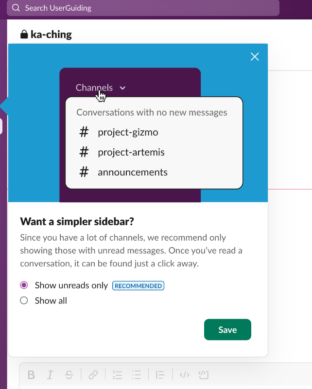
Key Takeaways
- Use tooltips to help users optimize their experience.
- Provide personalized tooltips tailored to specific user segments, such as active or power users.
- Make tooltips interactive by including actionable elements like CTAs.
4- Grammarly’s upsell tooltips highlight value propositions for premium features
Grammarly uses hotspots instead of tooltips in its onboarding tour. There are flashy, pulsating dots around the platform, and the text box gets triggered when you hover over or click on them.
It’s a preference issue. We’ll not say one is better than the other.
Not in this article, at least.
However, where they do use tooltips is on their subscription page. This page presents the pricing plans and what’s included in each (features and capabilities). The purpose is to provide easy access to plan details and offer a basic comparison chart with feature lists.
But, similar to the issue with Stripe’s features, use cases, and mixed terminology, the value of each feature here isn’t always clear on its own.
You can adjust your writing tone with Grammarly Pro. But why? How does that help me? Why would I want that?
To answer these questions and clarify (and sometimes even exemplify) the value proposition of each listed feature, Grammarly triggers tooltips when users hover over them. Most of these are text-only tooltips, but a few include visuals from the platform, showcasing how the feature works.

Key Takeaways
- Exemplify use cases for your advanced features and capabilities.
- Highlight and explain your value proposition, don’t assume it’s obvious.
- Mix and match text-only tooltips with visual ones; you don’t have to pick just one.
5- Discord’s new feature announcement tooltips with brand colors
3 out of the 4 tooltip examples we’ve seen so far were simple, text-only tooltips with gray backgrounds. Slack’s tooltip stood out with its colors, visuals, and CTAs, but it seemed like the exception.
Let’s fix that.
Discord joins the party too, using visuals, CTAs, and their bold brand colors (woohoo!) in their tooltips.
Here are 2 examples of their new feature announcement tooltips in action:
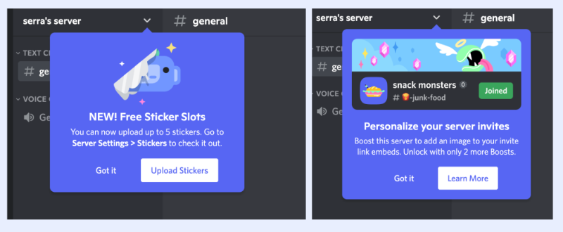
Key Takeaways
- Use color intentionally to guide attention without overwhelming the interface.
- Consistency with your product’s personality makes tooltips feel natural.
- Interactive elements in tooltips (like buttons or links) help users take action right away.
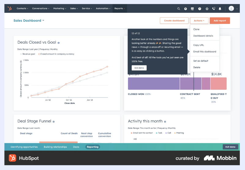
6- HubSpot’s product demo tooltips walk the user through a case scenario
We’ve said that you can give examples on how to use your product features so that your users can solidify the potential value and see themselves getting value out of your product.
Grammarly’s small 1-2 sentence tooltips were great real-life examples of this.
But HubSpot takes it one step further and creates demo tours that go over example use cases and scenarios.
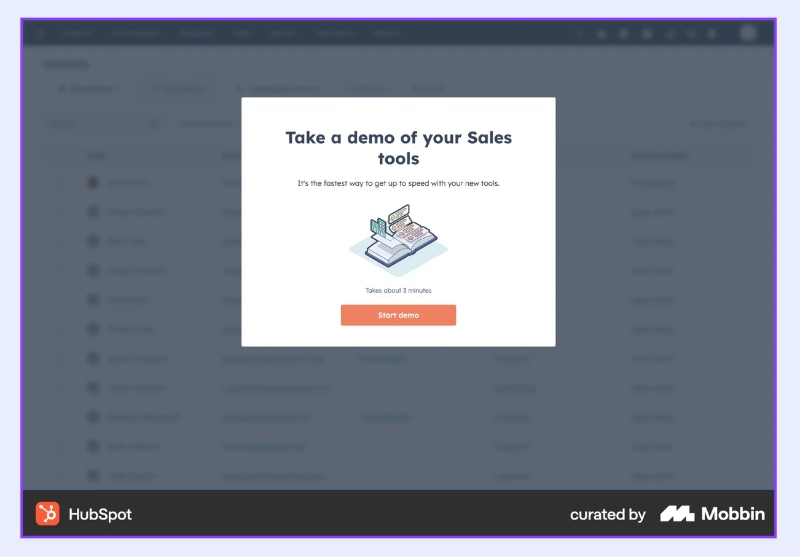
So the demo tour starts with a welcome modal. It says how much time the demo takes approx., and prompts the user to start the demo with a CTA button.
Nothing to analyse here.
Within the demo, there are 12 steps, most of which are tooltips.
The tooltips highlight different dashboards, features, and UI elements like buttons. But their main purpose isn’t to explain how to use these elements individually, instead, they’re used to storify a complete user flow around HubSpot’s sales tools. That’s why the copy in these tooltips tends to be longer.
“Conversion rates look healthy. But your team’s low on activity. They need some new leads to work on, fast.”
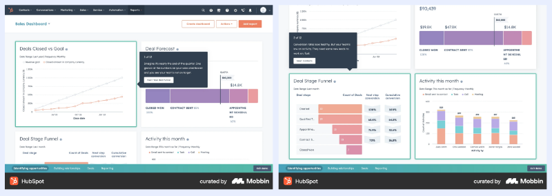
Within the demo, there are also 1 or 2 pop-up modals. They’re used to storify the other side’s actions (like when a customer interacts with the automated email you sent them) or to explain the process behind the user actions.
Other than that, we have mostly tooltips.

At the end of the tour (which takes 12 steps, as we’ve mentioned), there’s a final tooltip that congratulates the potential user on completing the demo. Within this tooltip, HubSpot also highlights that their sales tools are included in the free plan, and wraps things up with an “End demo” CTA.
Key Takeaways
- Use tooltips to build a narrative around your product.
- Highlight value (like free plan features) at strategic moments.
- Tooltips can double as motivational nudges to keep users engaged throughout longer product tours, especially with friendly microcopy.
- Don’t be afraid of longer tooltips if you format them well: use bold for emphasis, italics for tone, and break tooltip text into short paragraphs for readability.
7- Miro’s feature tooltip provides information about the features capabilities
Miro triggers contextual tooltips about feature capabilities when the user is already interacting with the relevant feature, or at the menu where that feature lives.
Considering how Kate Syuma praised a similar use of tooltips by Airbnb (we talked about that earlier when listing best practices, remember?), and the fact that she’s an ex-Head of Growth Design at Miro… this makes a lot of sense, actualy.
Seems like Miro’s learnt a lot from Syuma 💯

Key Takeaways
- Trigger tooltips contextually.
- Keep your UX aligned with proven best practices and learnings.
8- Typeform’s tooltip offers pro usage tips and feature benefits
Some features go unused because they require too much time and effort. Others? Simply because users don’t understand what they actually do.
Aaand we’re back to the old problem: unclear value propositions.
To tackle this, Typeform uses a contextual tooltip attached to their “Time to complete” feature for survey questions. This tooltip explains the potential benefits of enabling the feature and even backs it up with stats from real users.
This makes the value compelling, as well as clear.

Key Takeaways
- Use tooltips to clarify the real-life benefits of lesser-used features.
- Support your claims with data or outcomes from existing users to build trust.
9- Wise’s contextual tooltip decreases cognitive load and user frustration
Tooltips are not for conveying crucial information that isn’t accessible anywhere else. However, that doesn’t mean you can’t use them to further clarify important details.
Guaranteed rate is an important feature of Wise.
You can already see it on your transaction/conversion screen, how much it is and how long it’s valid for (12 hours). But since this phrase can be a bit confusing or require more mental load than many customers would prefer, Wise uses a tooltip to explain what a guaranteed rate means and how long it’s valid in a simple, clear sentence.
- Does this tooltip provide anything beyond what “Guaranteed rate (12h)” already says? Not really.
- Is it still helpful for ensuring everyone’s on the same page? Absolutely.
And for those who want even more detail about the process, there’s a link in the tooltip that takes them to the relevant help page.

Key Takeaways
- Use tooltips to reinforce and clarify important terms already shown in the UI.
- Keep language clear and low-effort to reduce mental load for users.
- Don’t introduce new critical info via tooltips; use them to explain, not reveal.
- Add links to deeper resources for users who want more context without overwhelming the main interface.
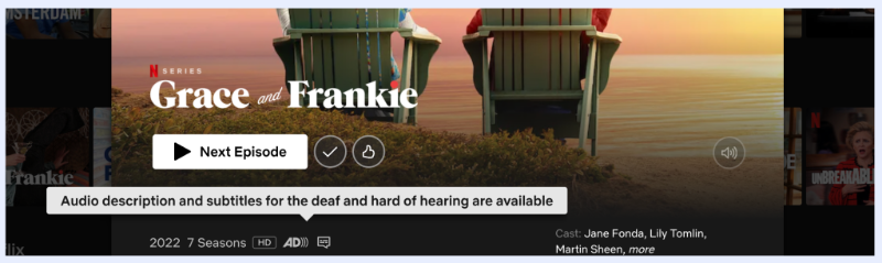
10- Netflix’s hover-over tooltip explains icons on the UI
Talking about mental load and UI explanations… Netflix is another great example of doing it right. Some icons and symbols are universal, pretty much anyone who’s been on the internet for more than five minutes knows what they stand for.
Think: the play button, the trash bin, the close icon, etc.
But then there are the more niche ones that might not be so obvious.
Like the audio description icon.
If you’ve never used it before, or you’re not a UX designer (or a cinema junkie, maybe), you might not know what it means, or even what audio description is for…
No judgment 🙌🏻
That’s why Netflix uses hover-over tooltips to clarify the icons and symbols they use. Simple, effective, no confusion left behind.
Key Takeaways
- Use tooltips to reduce mental load and explain non-standard UI elements.
- Don’t assume all users are familiar with your icons or symbols.
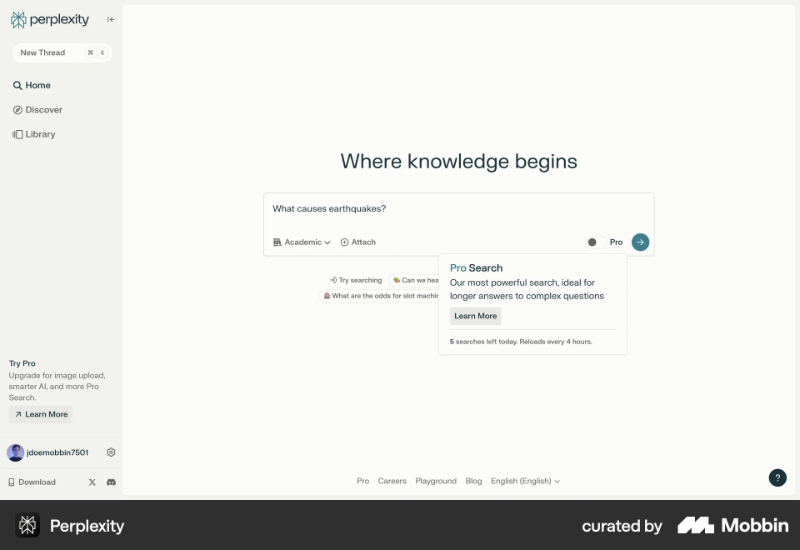
11- Perplexity’s feature tooltip introduces their pro search mode
Perplexity uses a feature tooltip to encourage users to activate Pro Search Mode. The tooltip copy highlights the feature’s strengths and includes a CTA that links to a help article for more information.
It also displays information about daily limits and when they reset. Including this detail creates a subtle sense of urgency or FOMO.
“I have limited searches in this mode, I better make the most of it!”
This can increase the user’s likelihood of engaging with the feature.
Key Takeaways
- Use tooltips to highlight feature value and prompt action.
- Include contextual limits or rules (like daily caps) to set expectations and subtly nudge usage.
- Create light urgency or FOMO to boost engagement without being pushy or manipulative, of course.
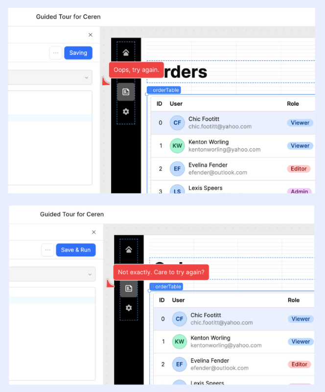
12- Mural’s error tooltip prompts the user to check again
This list of examples wouldn’t be complete without an error tooltip. So, here’s Mural’s error tooltip. It’s an action-based tooltip, meaning it triggers when the user enters a wrong code/input and tries to push the display with it.
You write a code, click on “Push Mural,” then this tooltip appears asking you to check the code and try again. You change the code, click “Push Mural” again, and this repeats until you enter the correct code.
Does this add an extra step? Maybe.
But triggering the tooltip automatically the moment you start typing and keeping it there until the code is right would be annoying.
Like, I’m entering the code, wait a second before telling me I’m wrong…

Key Takeaways
- Use action-based tooltips to provide real-time feedback on user input errors.
- Avoid interrupting users prematurely; wait until an action is completed before showing error messages.
- Make sure your error tooltips clearly explain what went wrong and how the user can fix it.
13- Etsy’s product tour tooltip provides example use cases
A lot of products offer onboarding tours, but what sets Etsy’s apart is how they deliver real value with their onboarding tooltips. The tour consists of 3 steps, all using tooltips. And each tooltip doesn’t just explain key features or list what you can do with them (feature capabilities) but also highlights how other users use these features, offering new users a clear path to get started.
For example, on the Orders and Delivery page, for the workflow customization feature, Etsy showcases popular progress steps used by other sellers on the platform, like “Ready to dispatch” or “Waiting for response.”
This way, new users don’t feel overwhelmed by a blank slate.

Key Takeaways
- Lower the barrier to entry by offering ready-made examples instead of making users start from scratch.
- Show real-world use cases in your onboarding tooltips.
14- Beehiiv’s onboarding tooltip encourages new users to try out advanced features
Beehiiv offers contextual tooltips that are triggered when the user is on the relevant product page. These tooltips mostly highlight advanced features and encourage users to try them out.
This specific contextual tooltip, for example, compares basic editing settings with advanced editing settings and motivates new users to toggle on the advanced settings.
The tooltip also includes visuals (GIFs) showcasing how the advanced settings look and work. At the end of the tooltip, there’s a clear call to action styled in a different color and highlighted.
So even if you skip the copy, the CTA is still hard to miss.

Key Takeaways
- Highlight advanced features to prompt deeper product usage.
- Include visuals (GIFs, images) to demonstrate how features work.
- Use eye-catching CTAs with distinct formatting to drive action
15- UserGuiding’s tooltip on the signup screen decreases frictions
UserGuiding is a product adoption solution, so it’s only fair that they lead the way by being a good example of how to smoothen the user experience and offer convenience, even during the most standard user flows.
On their signup screen, UserGuiding triggers a tooltip in the form of a checklist for password requirements. There are 6 different requirements for a strong and valid password, which means listing them all on the screen at once would cause clutter.
And let’s be honest, it can be annoying to mentally check each condition yourself:
Did I add a number? What do I need next? I’ve got the lowercase, now I need an uppercase…
So instead, they trigger a tooltip that doubles as an interactive checklist, actively tracking each condition and showing a little green checkmark next to the ones you've completed.
So, UserGuiding solves both the clutter issue and the mental load for users.
What do people say; two birds, one stone?

Key Takeaways
- Use interactive tooltips to guide users through complex input requirements in real-time.
- Replace crowded static instructions with dynamic checklists to reduce visual and cognitive load.
- Trigger tooltips contextually, only when and where the user needs them, like during form or task completion.
- Help users feel confident by visually confirming progress
How to create tooltips?
There are 3 main ways to create tooltips, depending on your needs, tech skills, and resources:
- Use no-code third-party tools – the fastest and easiest route. These platforms let you build and manage tooltips without writing a single line of code, saving both time and effort.
- Use design toolkits or frameworks – a middle-ground option. These simplify the process with pre-built components, but you’ll still need to do a bit of coding to customize them.
- Code from scratch – the classic route. If you want full control, you can always build your tooltips manually using HTML, CSS, and JavaScript/TypeScript.
Let’s break down each approach in more detail.
No-code way: UserGuiding, Appcues, and Userpilot
If you don’t want to touch a single line of code and still want to build beautiful, functional tooltips; no-code user onboarding tools are your best friends.
UserGuiding, Appcues, and Userpilot are 3 of the leading options in this category. They allow you to create tooltips, onboarding flows, product tours, and more using drag-and-drop visual builders that doesn’t require to arrange constant meetings with your developer team.
🚀 With UserGuiding, you can:
- Drag and drop elements to build your tooltip in minutes
- Customize fonts, colors, placement, and trigger types easily
- Set up targeting and segmentation for personalized experiences
- Track performance with built-in analytics
Here’s what the tooltip builder looks like:
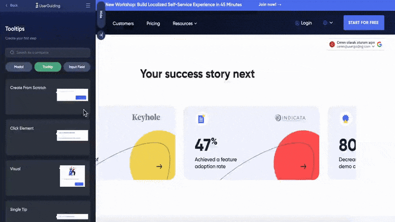
As you can see here too, tooltip templates let you start with a ready-made design and customize it to fit your needs. Instead of creating everything from scratch, like designing buttons, visuals, and layout, you can simply pick a layout that matches your vision, then replace placeholders with your own visuals, text, and CTAs.
UserGuiding allows you to customize your tooltips with:
- Visuals, videos, and gifs,
- Hyperlinks,
- Buttons,
- And your own brand colors.
You can also personalize your tooltips by inserting user attributes.
➡️ Appcues: Appcues is a no-code tool for creating in-app experiences like tooltips, modals, and checklists. It supports detailed user segmentation but is often more expensive and less scalable for smaller teams.
The starting price for Appcues is 300$/mo (paid annually), while UserGuiding’s paid plans (yes there’s a freemium plan, too) start at 174$/mo (paid annually).
More information on Appcues use cases and Appcues pricing 👈🏻
➡️ Userpilot: Userpilot allows you to build in-app guidance such as tooltips and walkthroughs, with strong support for mobile apps. However, it’s also not the most scaleable solution out in the market.
The starting price for Useerpilot is 299$/mo (paid annually).
More information on Userpilot use cases and Userpilot pricing 👈🏻
Low-code way: Bootstrap, jQuery UI, Material Tailwind, Shadcn
If you're not ready to invest in a no-code solution, or you want more customization without fully designing everything from scratch, low-code CSS libraries like Bootstrap and jQuery UI offer a solid middle ground.
Both provide pre-built tooltip components that you can customize with just a bit of HTML, CSS, and JS. They're especially handy if you're already using these libraries in your project.
- Bootstrap Tooltips: Bootstrap comes with a powerful tooltip module that can be triggered on hover, focus, or click. You can adjust placement, animation, styling, and behavior relatively easily.
But remember, it requires Popper.js to handle positioning and dependencies correctly.

Bootstrap also has a very comprehensive tooltip documentation.
It walks you through each feature and design customization option step by step. Every setting comes with clearly marked code examples, so even if you only know the basics of HTML and JavaScript, you’ll be able to follow along and implement them with ease.
If you can read and write code just a little, you'll be more than okay.
Which, we cannot say for jQuery UI, unfortunately…
jQuery UI Tooltips: With jQuery, you can attach tooltips to almost any element with minimal code. It gives you more dynamic control with event handling, but it's a bit more manual compared to Bootstrap.
jQuery UI’s official website might also feel a bit outdated and light on guidance, but don’t let that throw you off. It’s still a widely used framework, which means there’s a ton of community support around it.
You’ll find plenty of detailed articles and blog posts on different web pages that explain how to use its tooltip attributes and customize behavior. For example, GeeksforGeeks offers a step-by-step guide that breaks down each attribute, what it does, and how to implement it in real use cases.
So, while the official docs might not hold your hand, the internet definitely will.

⚠️ jQuery is also becoming less and less popular, especially as newer, more modern, faster, and more customizable frameworks emerge. However, it’s still not obsolete. According to W3Techs’ report, 73% of websites still use jQuery.
- Material Tailwind Tooltips: Built on Tailwind CSS and inspired by Material Design, these tooltips offer more built-in customization than Bootstrap. They're easy to style with utility classes and support animations, placements, and different trigger options.
- Shadcn/ui Tooltips: Designed for React apps using Tailwind CSS. These tooltips are fully accessible, highly customizable, and integrate smoothly with other UI components. Ideal for developers working with React and looking for production-ready components.
DIY way: JavaScript/TypeScript, HTML, and CSS
If your tooltip needs are very specific, or you want full control over the look, feel, behavior, and integration with your product, you can go the fully custom route using HTML, CSS, and JavaScript.
This approach is best suited for:
- Custom positioning logic
- Special animations and transitions
- Unique designs that don’t follow typical tooltip UI patterns
- Products where third-party dependencies are not preferred
Here’s what building a tooltip from scratch typically involves:
- First, designing your tooltip using a design tool like Figma or Sketch to define exact styles (padding, spacing, color, shape, etc.).
And that looks like this:

- Then, translating that design into code using HTML and CSS for all the visual details (positioning, colors, typography, spacing) to make sure it looks exactly how you envisioned.
- Finally, using JavaScript (or TypeScript) to handle interactions and functionalities like hover effects, clicks, timing, and any dynamic behavior that makes the tooltip respond smoothly to user actions.
⚠️ What differentiates the DIY way from the low-code (more like low-design, actually) is the time spent on design. With CSS frameworks like Bootstrap, jQuery UI, or Material Tailwind, you have several ready-to-use design options and components for triggering, placement, animations, etc.
So you eliminate the design step on the DIY method.
But not the code.
At the end, you still need to use JavaScript or Typescript alongside your HTML and CSS parts.
Final thoughts…
Tooltips might be small, but when designed thoughtfully, they make a big impact on user experience. From onboarding to advanced feature discovery, a well-placed tooltip can drive clarity, reduce friction, and boost engagement.
Don’t settle for “just enough”.
Test, iterate, and find what works best for your users.
👉 Ready to try it yourself? Start building your first tooltip with UserGuiding.
Frequently Asked Questions
What are the best practices for using tooltips in SaaS onboarding?
The best approach is to keep tooltips simple, clear, and focused only on elements that truly need extra explanation. Avoid overwhelming users by limiting how many tooltips appear at once and never force users to click through unnecessary steps. Personalize tooltips when possible to address different user segments, and always make sure they complement other onboarding tools without being intrusive or redundant.
How do you create a tooltip without coding using product adoption tools?
With product adoption tools like UserGuiding, Appcues, or Userpilot, you can build tooltips visually without touching a line of code. These platforms offer ready-made templates that you can customize by dragging and dropping text, images, or buttons. You simply pick a design, tailor the message, and set when and where the tooltip should appear, all through an easy-to-use interface designed for marketers, product managers, or anyone who’s not a developer.
Tooltips vs modals: which UX element improves feature adoption more effectively?
Tooltips win when you want to provide quick, contextual hints without interrupting the user flow, while modals work best for more detailed or critical information that requires full attention. Tooltips are less invasive, making them ideal for nudging users gently toward feature discovery. Modals, however, are better suited for onboarding flows or announcements where you want to ensure the user doesn’t miss key information.
How do tooltips affect product activation and time-to-value in SaaS platforms?
Tooltips help reduce confusion by clarifying feature benefits and usage right when users need it, which speeds up product activation. By guiding users through complex features or showing real value early on, tooltips reduce the mental load and shorten the time it takes for users to see meaningful results, ultimately improving their overall experience and increasing the chance they stick around.
What are the best tooltip examples for guiding first-time users in complex dashboards?
Great examples include Etsy’s onboarding tooltips that don’t just explain features but also show how other users engage with them, easing pressure on new users. Slack’s personalized pro tip tooltips simplify clutter by recommending what to show or hide. These tooltips combine contextual help with actionable advice, using clear language and sometimes visuals to make complex dashboards approachable.
How do you trigger tooltips based on user behavior and segmentation?
Triggering tooltips based on behavior means showing the right message only when it’s relevant, for example, after a user performs a specific action or lingers on a feature without interacting. Segmentation lets you personalize tooltips for user groups, like new users, power users, or inactive segments, so the content feels timely and valuable. This targeted approach prevents overwhelming users with irrelevant info.
Are tooltips effective for reducing support tickets and improving self-service?
Absolutely. By offering in-context help exactly where users might get stuck, tooltips reduce the need for users to reach out to support. They act as quick answers that guide users through tricky features or confusing terms, empowering them to solve problems on their own. This improves self-service and lowers the volume of repetitive questions support teams face.
Which tooltips software offers real-time analytics and user engagement tracking?
Tools like UserGuiding, Appcues, and Userpilot all provide real-time analytics, showing how users interact with your tooltips, like how they hover, click CTAs, or dismiss them. These insights help you understand which messages resonate, which features get more attention, and where users drop off, allowing for continuous optimization of your onboarding experience.
How do you A/B test tooltips to measure impact on feature discovery?
A/B testing tooltips involves creating different versions of the tooltip content, placement, or timing, then splitting your user base to see which version drives more clicks, feature usage, or activation. Using product adoption tools, you can run these experiments easily and track performance metrics. This data-driven approach lets you refine messaging and design to maximize user engagement with key features.

.png)


