


.svg)
.svg)
.svg)
.svg)
.svg)


.svg)


.svg)
.svg)


Oh, those old days when we had to use smoke signaling and pigeon posts to communicate...

Communication has played the most important role in human civilization and good communication skills are what separates us from the other living beings on this planet.
In our modern-day, we have so many mediums and methods of communication that it is now much easier for marketers to communicate and engage with users.
When you think of communication, there are three fundamental aspects you need to focus on:
1- The words you choose
2- The way you say or write things
3- The medium you use
In this article, I will focus on a medium that I believe is the most powerful one when it comes to engaging and communicating with users.
Namely, apps. Therefore, in-app messaging is the most effective way of communicating with users.
Now let’s get into talking about:
- What an in-app message is,
- How in-app messages different than push notifications,
- Pros and Cons of in-app messaging,
- Best in-app messaging practices with examples,
- Best in-app messaging platforms,
- Testing and measuring your in-app messaging,
- The metrics and KPIs to track for in-app messaging.
Don't have the time? Here's our quick YouTube video that covers it all ⬇️
What is an In-app Message?
An in-app message is a well-targeted notification that your users can see while they use your mobile or desktop app. In-app messaging helps businesses engage with their users in a time-sensitive way and at the most relevant point. In-app messages can be used to carry out onboarding processes, announce product updates, and promote discounts.
In-app messages can be used for various purposes such as onboarding messages, feature announcements (feature update announcements), discount announcements, and warning messages.
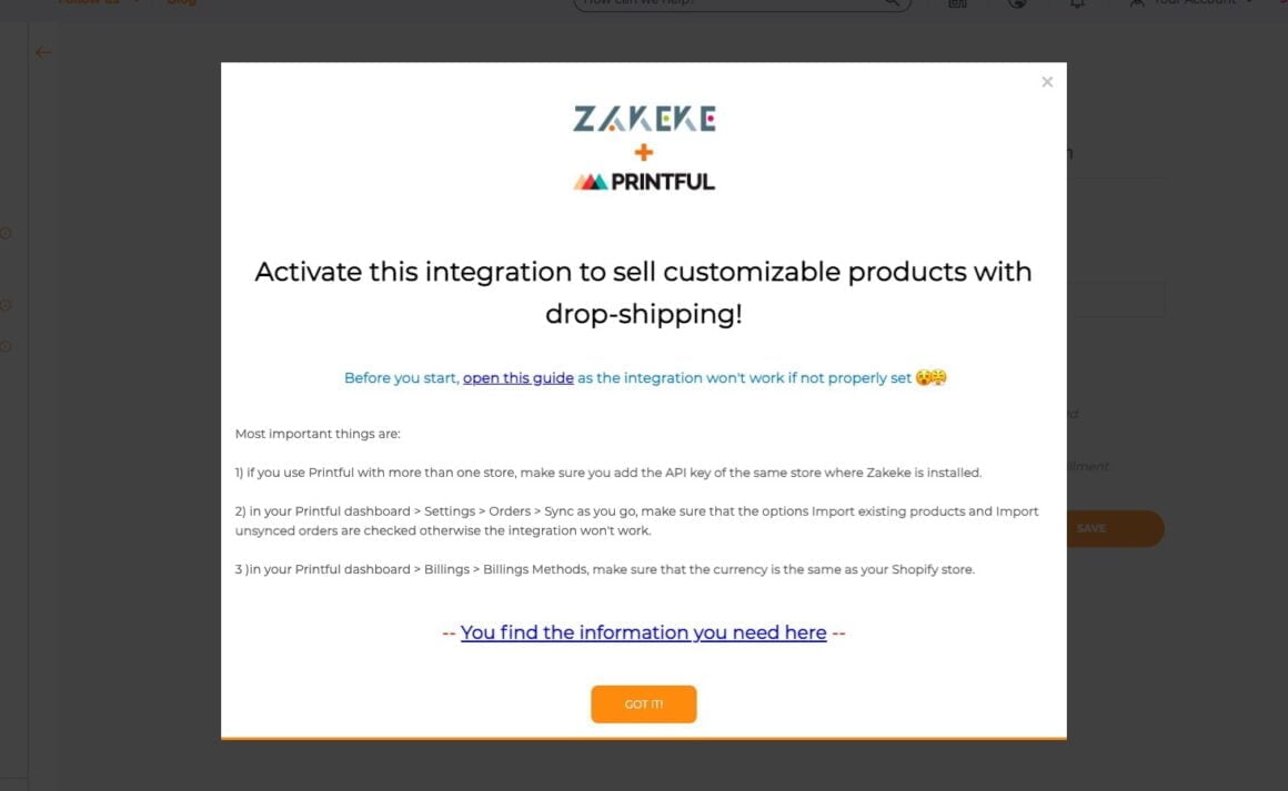
Here is a good in-app message example created with UserGuiding that tells about Zakeke’s Printful integration:
So, what really is in-app messaging?
In-app messaging is a marketing practice that helps businesses provide a better customer experience and increase engagement and retention. With the help of in-app messaging, businesses can walk their users through their onboarding processes step by step and keep them updated about any features or feature updates.
Thanks to in-app messaging, you can send users time-sensitive, contextual, targeted messages.
These aspects of in-app messaging are what make it one of the go-to practices for businesses to provide a good onboarding process and increase engagement and customer experience, therefore retention.
It is the advantages of these aspects that make me say that apps are the most powerful mediums when it comes to sending messages and engaging with users.
So, I can say that when done in the right way, in-app messaging can be a marketer’s best weapon to engage with customers.
What is the difference between in-app messages and push notifications?
Push notifications are those messages that you can see on your phone’s lock screen or status bar. You will see in-app messages only when you use an app. Push notifications, on the other hand, can be sent to you at any time. There are some advantages and disadvantages to both.
Most apps will ask for approval to send you push notifications once you download them.

image source
If you don’t want to receive push notifications, you can easily change the option to not receive them from your smartphone.
An average person has around 80 apps installed on their phone, and people are constantly bombarded with push notifications from these apps during the day.
It is for this reason that push notifications can be easily ignored.
They can be time-sensitive, but they may not be as effective as in-app messages.
For example, let’s say it’s lunchtime and you have a food delivery business. You send push notifications right at lunchtime, but your customer is driving at that moment.
So, it can still be time-sensitively used, but it is not the best moment for your customers.
Let me dive deeper into this comparison when explaining the pros and cons of in-app messaging.
Pros and Cons of In-App Messaging and Push Notifications
If you know how to make use of in-app messaging, you will see that it is the best way to engage with your users and guide them through your app. You can simply reduce churn and increase retention.
Pros of In-App Messaging:
- More convenient for engagement
- Provides better guidance for feature adoption
- Can be sent at a more relevant point
- No word count limit
- Can be better designed and personalized
Cons of In-App Messaging:
- You can only send in-app messages when users are using it
- They can be annoying if you interrupt users
Research shows that 55% of people who use an app in the first week after download will be retained.
When you examine the behavior of those retained in your app, you will have a better idea of what makes them keep using your app.
In this regard, if it is a popular feature of your app that makes your users keep using it, then you should try to find a way to lead new users to those features.
With the help of in-app messaging, you can guide your users to the most used and attractive features of your app and help them engage with your app.
This way, you will have a better opportunity to retain new customers.
As I mentioned in the former section of the article, in-app messages can be sent at the most relevant point.
Push notifications, on the other hand, can be time-sensitive, but you cannot be sure whether it is the right moment for your users or not.
Another advantage of in-app messaging, when compared to push notifications, is that push notifications have a word count limit.
When you need to share some important information that you cannot express with such a fewer number of words, in-app messages will be the better option.
In-app messages can be designed much better and made more attractive to users.
Personalization helps users better relate and help build a powerful relationship with your business.
One disadvantage of in-app messaging is that there may be some users who stopped using your app for some reason.
Since you need users to be active in your app to send them in-app messages, for the ones who stopped using your app, push notifications are a better option.
Also, if you send in-app messages at an irrelevant moment, you will interrupt your users, and this will annoy them.
It is hard to blame in-app messages for this because it is your responsibility to know when to send in-app messages.
You should study the behaviors of your users and accordingly decide when would be the best moment for you to send those in-app messages.
4 In-app Messaging Best Practices with Examples

1- User Onboarding
“User onboarding is the process of increasing the likelihood that new users become successful when adopting your product.”
Samuel Hulick
Localytics suggests that 21% of users abandon an app after only one use. The reason for this simply is that users cannot figure out how to make use of the app and benefit from it.
You need to shine among your competitors in order to reduce the number of abandonment.
In this regard, in-app messages will make it much easier for you to explain what your users need to do in order to make use of your app.
Now let’s look at some examples of the use of in-app messages in onboarding processes.
LinkedIn is among the best platforms when it comes to user onboarding.
Thanks to their user-friendly UI and clear and explanatory in-app messages, LinkedIn is able to provide a quality onboarding experience to its users.
In one of the in-app messages, LinkedIn suggests that you should “complete these steps to get the most out of LinkedIn.”


You can see that in addition to the UI and many other aspects that distinguish LinkedIn from its competitors, it is the good use of in-app messages that help LinkedIn provide a good user onboarding experience.
When you read and follow the directions in those in-app messages, you can be sure that LinkedIn helps you master the platform.
You will be able to make use of the product in the best way possible.
Slack
Slack is one of those apps that I love to use. It is very efficient and user-friendly.
They try to improve themselves constantly, and their constantly improving onboarding process is an indicator of it.

image source
They have a very engaging onboarding process, and they use in-app messages very efficiently.
With the help of in-app messages, they briefly and clearly explain the features of their app to their users.
Giving their users what they need in a couple of words, Slack, also like LinkedIn, suggests that users should follow the next steps if they want to make the most of their product.
Keeping in-app messages short and simple, they help their users digest the onboarding process.
2- Collecting Feedback
Collecting Feedback is a must for a successful business.
In-app messages help you gather feedback from customers in the most effective way possible because the best moment to collect feedback is when your customers reach a milestone.
For example, let’s say one of your customers successfully completed a form; you should realize that this is a great moment to celebrate their achievement and ask for feedback.
Instead of sending them emails, in-app messages help you engage with your users at the most relevant point of their journey.
When you think that NPS surveys are the ultimate way of collecting feedback, you can then better understand why in-app messages play an important role in collecting feedback.
Here is an example of an NPS survey created with UserGuiding:

As I suggested earlier, you should collect feedback at the most relevant point.
In this sense, the best moment for an NPS survey should be when your users fully understand and adopt your product.
You should make sure to ask them another time to see whether they’ve changed their ideas, and if so, why they changed it.
Grammarly
I should say that Grammarly is my BFF!
Well, I believe not only mine but also many other content writers’.
Grammarly is one of those products that heavily rely on user feedback to improve themselves.
The more data they collect and the more they approve that their predictions are right, the better service they can provide.
In line with this endeavor of Grammarly, they use in-app messages to collect feedback and confirm that what they predict is true.
Here is an example of the use of in-app messaging from Grammarly:

You can see that they want to approve whether they “got it right” or not.
Thanks to this in-app message, you can help them improve themselves, and therefore the service that they provide to you.
3- New Feature and Update Announcement
When you know the right way to announce new features and product updates, you can witness an increase in your product adoption rates.
In-app messages play a crucial role in explaining to your users what the new feature or update is about.
If you can clearly and briefly explain to your users the purpose of the new feature or the update and how they can make use of them, you will see that it will be much easier for your users to adopt your product.
Bonus: Guiding your users through the new feature with a tour will crown the whole process!
Google Docs
Here is a matching example from Google Docs:

You can see that with the help of in-app messaging, they announce a new feature that is available to users.
As I suggested, the message is pretty clear and brief.
Their users don’t get bored reading endless sentences about the new feature.
For the ones who want to learn more about the new feature, they give them a tour that will help them learn more about it. They basically crown the whole process.
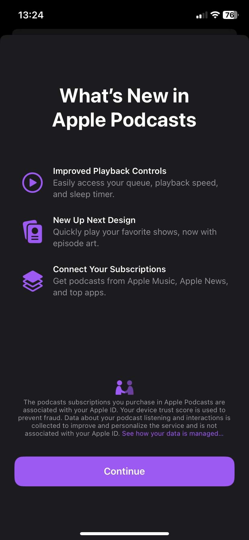
Apple's way of announcing new features for its ios apps is also fun and engaging while keeping it as effective as possible:

4- Upselling
Upselling requires some strong persuasion skills.
Many apps offer both freemium and premium options. As an app owner, you hope that users will get to know the product with the freemium option and upgrade to the premium version.
If you are trying to upsell through in-app, then you definitely need to know how to communicate with your customers.
In line with the need to know how to communicate with your users to persuade them to upgrade, you should know that in-app messages play a vital role in upselling as well.
Spotify
Spotify masterfully and kindly creates a need for your users to upgrade to the premium version.
If you are using a free version of Spotify, you should know that you will be exposed to ads and additionally, you will only have the chance to skip six songs per hour.
Once users start to skip songs and get close to using all their free skips, Spotify sends them a notification through in-app messaging.

Once users reach their limit, they are invited to discover the premium version.
Here you can see that they simply offer a solution to the problem of having only six rights to skip a song:

Here is another good example from Youtube:
They offer the kind of value that their users can find with upgrading to a family plan and send a simple and clear in-app message to their users to let them know about it.

Make the most of it: In-app Messages 📱
Now that you know about the best practices of in-app messages,
It's time to learn how you can start using them in the best and most efficient way.
In-app messages will help you improve your:
✅ Onboarding Process
✅ Efficiency in Collecting Feedback
✅ Attractiveness for New Feature and Update Announcements
✅ Encouragement for Upselling
✅ Efforts of Helping Customers Out
To help you achieve these improvements, I will share some of the best products that are out there.
Best In-app Messaging Platforms for Different Apps
In-app messages can be sent through different platforms such as:
- Web Products
- Mobile Apps
With respect to each platform, you can find tools that mastered their products.
UserGuiding - No-code Tool for Web Products - Customizable and Personalized In-App Messages

With UserGuiding, you can create personalized and customizable in-app messages for the features of your web products.
Its easy-to-use tool will help you provide a better customer experience and customer service.
You can increase your feature adoption rates by integrating in-app messages to your product via UserGuiding.
Let’s take a look at Plandisc’s experience with UserGuiding:
Plandisc is a planning tool that helps you create an overview of your entire year.
They constantly improve themselves by coming up with new features that will make it easier for their users to benefit from their product.
The problem that they faced was that their users needed help to learn how to make use of these new features.
With the help of UserGuiding, they’ve started integrating attractive in-app messages into their processes.
Let’s take a look at one of these in-app messages:
As a result of this specific integration, they’ve experienced a 15% increase in this feature’s adoption rates.
And the impressive part is that they’ve managed to have this increase in only one week after integrating this in-app message to this specific feature.
If you also want to provide a better customer experience for your customers and increase your feature adoption rates and retention, you should also take a look at UserGuiding’s no-code tool.
Firebase - An in-app Messaging Tool for Mobile Apps

Firebase is a tool for you to create customizable and targeted in-app messages.
Considering that mobile apps play a huge part in engagement with users, you should keep an eye on this tool.
You can analyze the behavior of your users with their tool and accordingly create triggered in-app messages.
Thanks to this aspect of Firebase, you will know when and how to send in-app messages to your users.
As I explained throughout the whole article, knowing user behavior is among the most important part of engaging with users through in-app messages.
Test and Measure your In-app Messaging Campaigns
What you need to know about testing and measuring your in-app messaging campaigns is that a successful in-app messaging campaign comes out of detailed research, successful segmentation of users, and well-conducted A/B testing.
Test your In-app Messages
Before explaining a method that you can test your in-app messages, let’s talk about what affects the attractiveness and effectiveness of your in-app messages.
Test The Words You Choose
You should know your users well and be very careful about what type of words will speak to your users.
Keep in mind that each word will have a different effect on your users.
Your words should make your users feel that you strive for their benefit. They need to believe and know that what you tell them in your in-app messages is important and will provide them a better experience.
Test Your Tone
Your tone is also crucial in touching the hearts and minds of your users.
If your in-app messages call for action, then your tone needs to be kindly demanding and encouraging.
Don’t forget! A commanding tone is never encouraging for users.
Test Your Timing
Timing is another aspect of your in-app messages that you need to test carefully.
You may believe that what you offer or explain in your in-app messages is excellent, and you have chosen the best words and put them forward with a great tone; however, when your timing sucks, I can assure you that you will be highly likely ignored.
I would say that timing plays the most critical role in this regard.
Now, let’s get to A/B testing:
A/B testing is one of the most effective methods to test your in-app messages.
Let’s say you have two different in-app messages to announce a new feature, and you can’t decide which one will be more attractive to users.
In order to test which type of message will be more attractive to your users, you should send each message to a specific number of users.
First, send message A to a specific group of users.
And
Send message B to another group of users.
Wait a certain amount of time to make sure that your users had enough time to interact with your message,
Finally,
Analyze the CTR and feature adoption rates.
In-app Messaging Metrics & KPIs
Here are some metrics that you can use for optimizing your in-app messages:
Apart from informing your users by not requiring any action, you may be sending in-app messages for various reasons such as increasing conversion, feature adoption, engagement, etc.
1- CTR (Click-Through-Rate)
If your in-app messages call for action and they ask your users to complete a task, take a tour, or simply click on anything on your app, you can analyze CTR to decide whether your in-app message is convincing or effective enough.
2- Retention Rate
Customer retention is for sure a must in deciding the success of your business.
When it comes to the success of in-app messages, retention rates also play an important role.
You should constantly take a look at and analyze retention rates.
3- Feature Adoption Rate
If your in-app message announces a new feature, then analyzing your feature adoption rates will give you a better understanding of the success of your in-app messages.
The better you increase your feature adoption rates, the more you can count on your in-app message strategy.
4- Conversion Rate
Let’s say you have a visitor to your app, and you welcome them with an in-app message.
To decide whether your in-app message is appealing enough, you can analyze conversion rates and accordingly adjust your in-app message.
Let’s Wrap It All Up
I hope I was able to convince you about the importance of in-app messages.
If I was successful in doing so, then all you need to do is follow the steps I suggested in the article. The better you use in-app messages, the stronger you will get in engaging with your users.
Stronger and better engagement means that your users will be more loyal to your business.
It all is simply about making it more efficient and convenient for your users to use your product.
All in all, in-app messages help you do it in a more effective way.
Frequently Asked Questions
What is the difference between cloud messaging and in-app messaging?
Cloud messaging is simply sending messages from one platform to another. In other words, it is a cross-platform messaging method. In-app messaging, on the other hand, is sending messages to your users on your own app.
What are in-app notifications called?
In-app notifications are called in-app messages because they are the notifications or messages that you can see while using the app. Push notifications, on the other hand, will pop up on the lock screen of your phone. So, you do not see them while you are using the app.
How do you test in-app messaging?
A/B testing is among the most popular and effective ways of testing in-app messages. You should prepare different types of in-app messages and basically try, fail, and learn.

.png)


