


.svg)


.svg)
.svg)
.svg)
.svg)


Do you recall Lewis Carroll's enchanting tale, Alice's Adventures in Wonderland?
In it, a young girl encounters an interesting-looking rabbit and decides to follow it through the rabbit hole. This choice takes her into a room filled with intriguing objects, each tagged with instructions like 'eat me' and 'drink me,' propelling her at the end into a wondrous garden.
Let's analyze the story in a SaaS-ist way.
➡️ Alice is our potential new user, wandering on the internet, coming across our blog, let's say.
(The interesting-looking rabbit is the blog in this case, as you can guess.)
➡️ Alice gets curious and decides to give our product a go and signs up for a free trial.
(So yes, the free trial is the rabbit hole.)
➡️ And then here comes the room with the guides! Onboarding screens, I mean. Checklists, guides, walkthroughs... Anything to help Alice access the magical garden and improve her user experience.
➡️ Finally, the beautiful, blooming garden waiting for Alice on the other side: our product.
Could Alice find the rabbit hole by herself or by accident and end up in the room with the instructions without the rabbit?
Maybe.
Could she enter the garden if the room with the instructions were an empty room with just a tiny weenie door to the garden?
Don't think so.
So, what do we learn from this story?
Onboarding screens are the keys to your products 🗝️🗝️
And here I present the ways to utilize these keys perfectly to ensure a positive user experience:
The Art of Welcoming Users + 8 Examples of Art-Like Onboarding Screens
Before going into detail and talking about pro tips & tricks and successful real-life administrations of onboarding screens, let me summarize the content briefly for those who are in a rush and cannot stay with us till the end 🏁
What Is an Onboarding Screen?
An onboarding screen, or in other words, an introduction screen, is the initial screen that welcomes first-time users to the app/software after the installation.
It can be a small pop-up box with a concise welcome message, an introductory video providing an overview of the application, or a series of interactive screens presenting questions to guide users through the initial setup and familiarize them with the app's functionality.
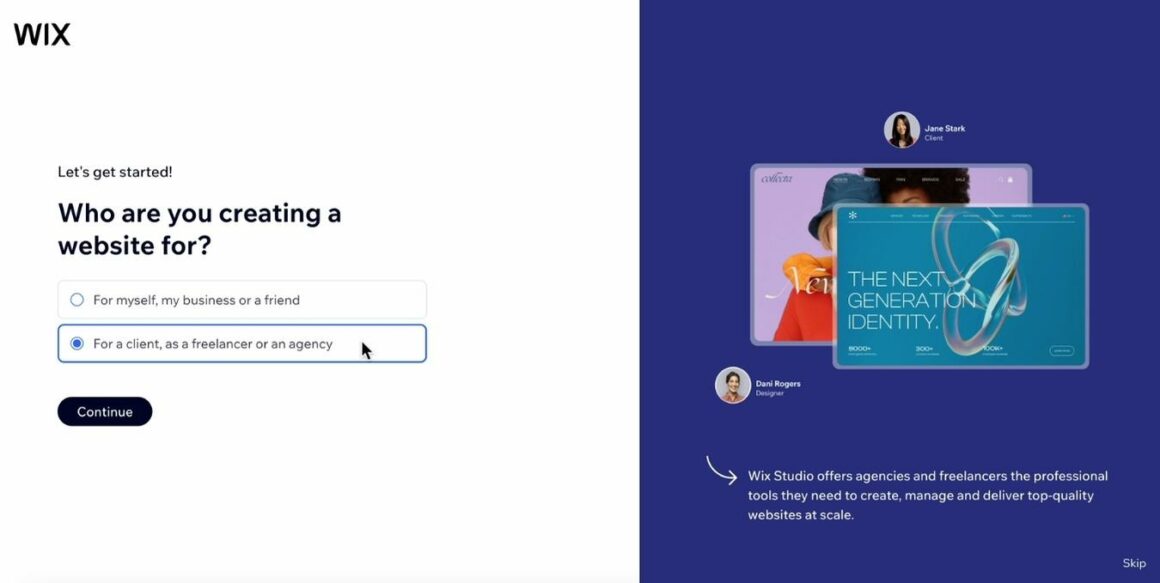
So, it can look like this:
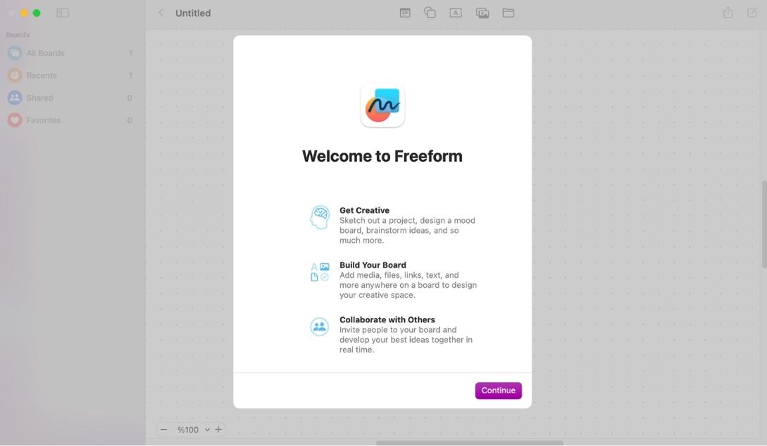
Like this:
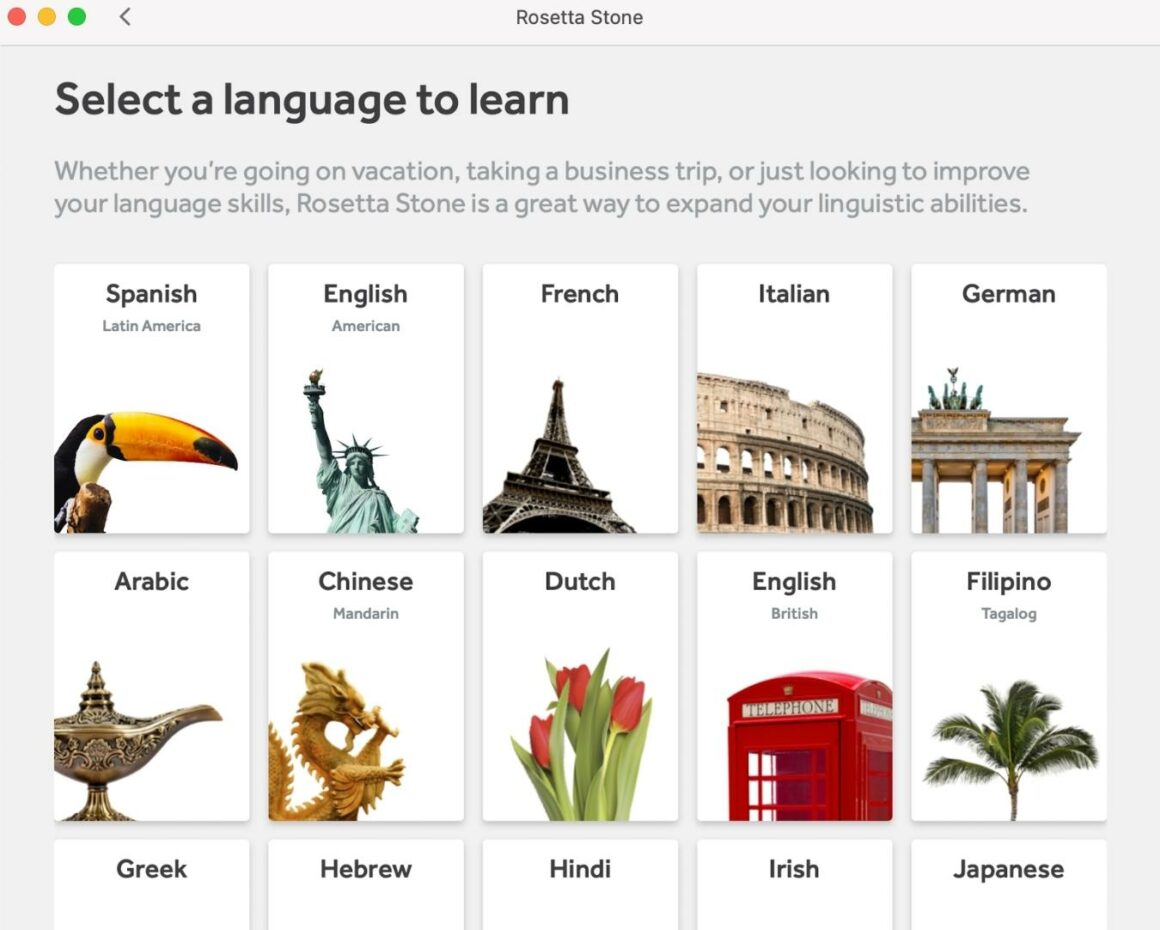
Or this 👇
Confused?
Let's simplify things a little bit more.
7 Types of Onboarding Screens Based on Their Styles and Purposes
While various teams can devise their own formulas and strategies for categorizing onboarding screens, I've distilled them into seven types for the sake of clarity and education in this article.
And here's the list:
- Welcome Screens
- Video Screens
- Questionnaire/ Survey Screens
- Tutorial Screens
- Gamified Screens
- Value Proposition Screens
- Filled "Empty" States
1. Welcome Screens
A welcome screen is basically a screen with a cute design and a friendly message that warmly welcomes and wishes a nice app experience to a new user before all the other user onboarding flows and processes.
It doesn't talk about app functionalities, company values or provide any instructional content.
The primary goal of a welcome screen is basically just to say hi 👋👋
2. Video Screens
Depending on their content, video screens can also be welcome screens, tutorial screens, or value proposition screens.
For example, if we're talking about a video from the CEO of the company greeting us real quick, then we can call it a welcome screen.
Or if the video is from the product team and it explains some of the key features or core benefits of the product, then it can be counted as a tutorial screen or even a value proposition screen.
But names and categories are just details at this point...
What actually matters is that we know we can welcome a new user with a video 🎬
3. Questionnaire/ Survey Screens
Are we always gonna be the ones giving users the grand tour of our product?
Can't we get to know the user a bit too?
After all, they're new to us as well, let's make it a two-way street of discovery 🚀
Well sure!
Dust off your keyboard; we're designing an onboarding survey 💨
We can ask;
- Demographic questions
- Questions about professional background and experience
- Expectations, goals, and use cases
- Preferences regarding educational content
4. Tutorial Screens
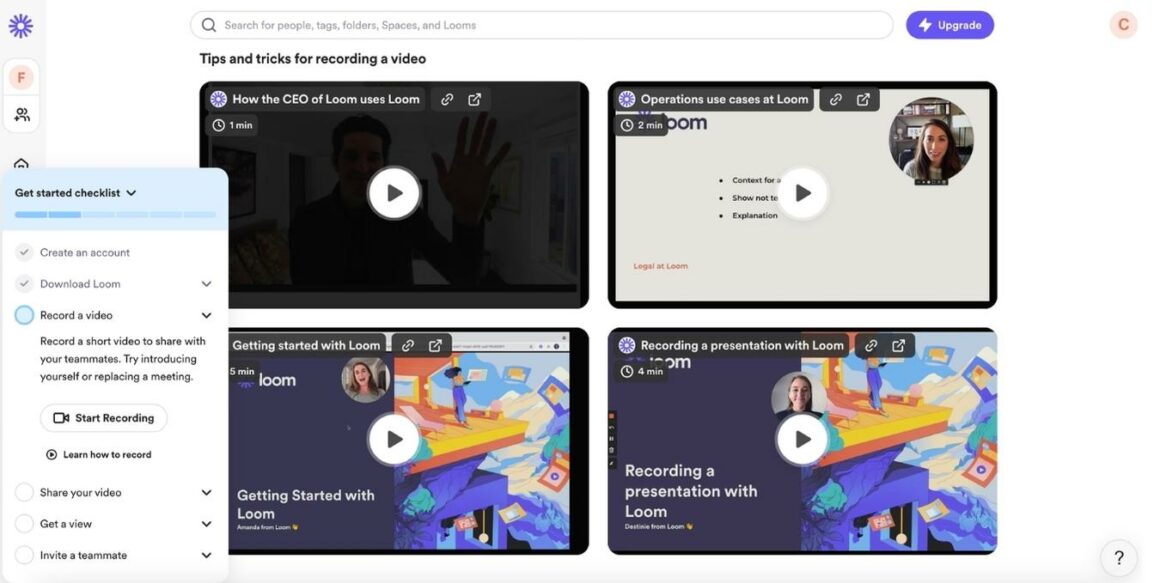
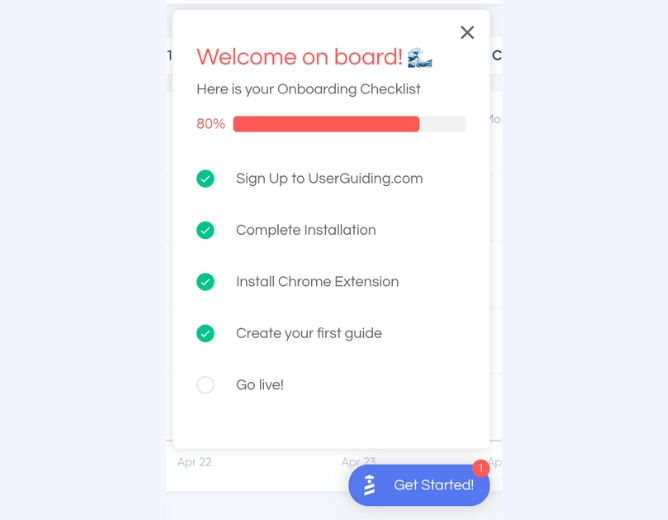
Tutorial screens, as the name suggests, are onboarding screens that comprise a set of instructions or guides explaining how to use the core features of a product. These can include interactive elements, pre-recorded videos, explanatory gifs, as well as onboarding checklists or guide libraries.
The first thing Loom shows to the new users after the signup process is a bunch of tutorials and tips & tricks videos, as well as an onboarding checklist 👇
5. Gamified Screens
Just like video screens, gamified screens can be anything too.
Anything but boring, duh!
Add progress bars, badges, special effects, animations, illustrations, spinnable gift code roulettes...
Yes, your banking app might have the coolest and most functional features, but how about its visual design and color scheme?
Is there any shiny button, a reward program, or a leaderboard that immediately welcomes me to the game and motivates me to save more money than my upstairs neighbor, Catelyn?
6. Value Proposition Screens
Many users have a rough idea of a product's purpose when signing up.
But there's always more.
And as product people, it's our responsibility to provide the rest of the information package so that users are aware of every use case of our product and every additional feature it offers beside its core functions.
(I'm actually a marketing person, but I'm with you in this; we got this!! 💪)
So I'm saying let's greet the new users with a list of cool features, use cases, and maybe stats from our regular user's success stories.
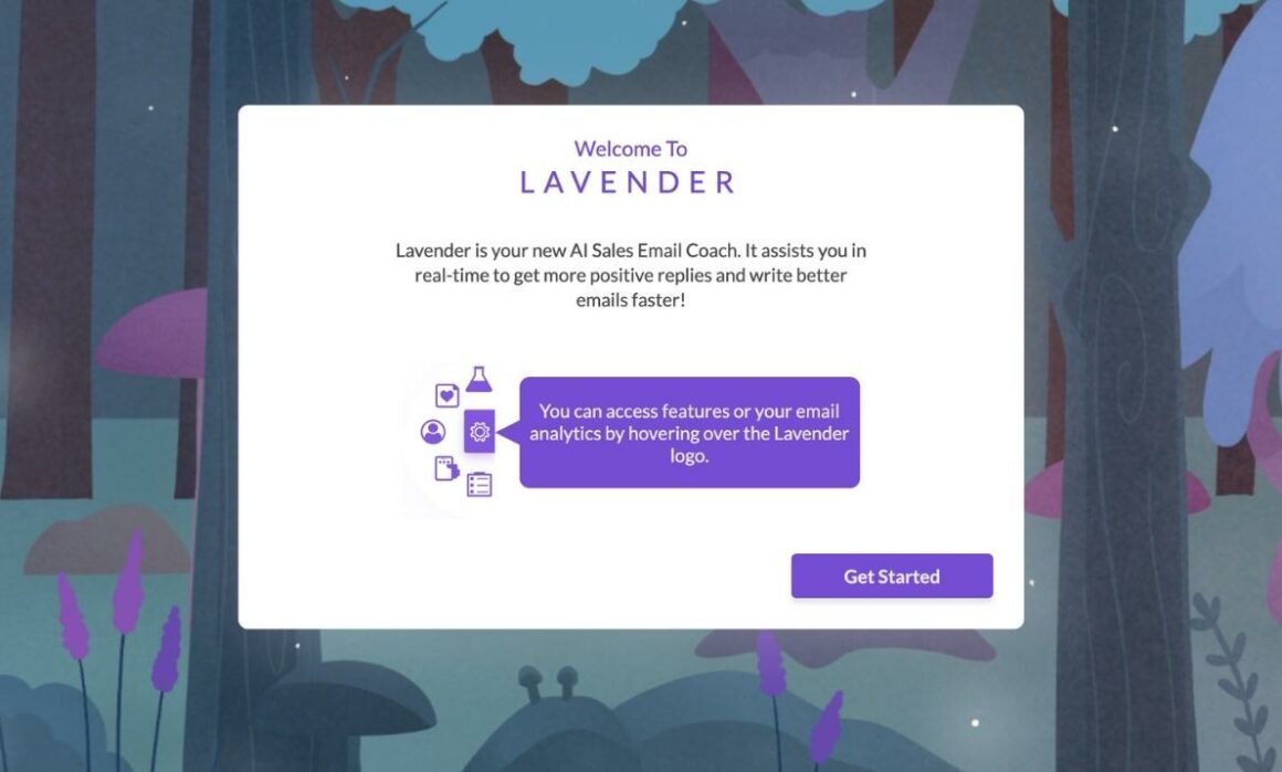
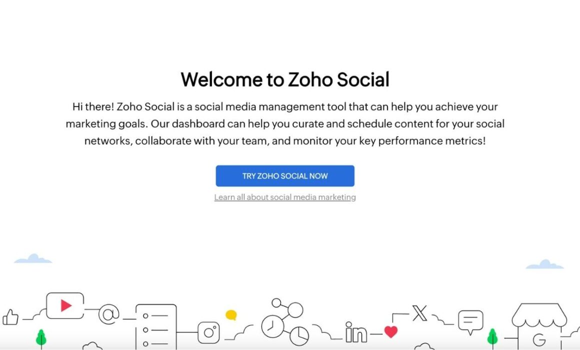
For example, Lavender provides a brief definition of the app's primary purpose and offers a reminder on where and how to access its features.
Zoho Social does a similar thing, too 👇
7. Filled "Empty" States
An empty state is a design term that refers to the almost totally empty state of a product interface.
A blank screen with only the frames of the dashboard and a few buttons, in other words. And most of the time, for most people, they are intimidating and discouraging.
But hey, everything has a solution.
Sometimes, breaking the ice is all about adding that extra touch, even if you don't have the data to craft a comprehensive analytics dashboard.
You can always;
- Add demo content or data to show what it could look like if the user spends some time around.
- Create onboarding checklists and fill the space up a little bit.
- Provide interactive guides to take actions in the app and improve the dashboards themselves.
- Take users to a product walkthrough and show them around; they might feel less intimidated and more familiarized if they know what's where and how it works.
Are Onboarding Screens Necessary?
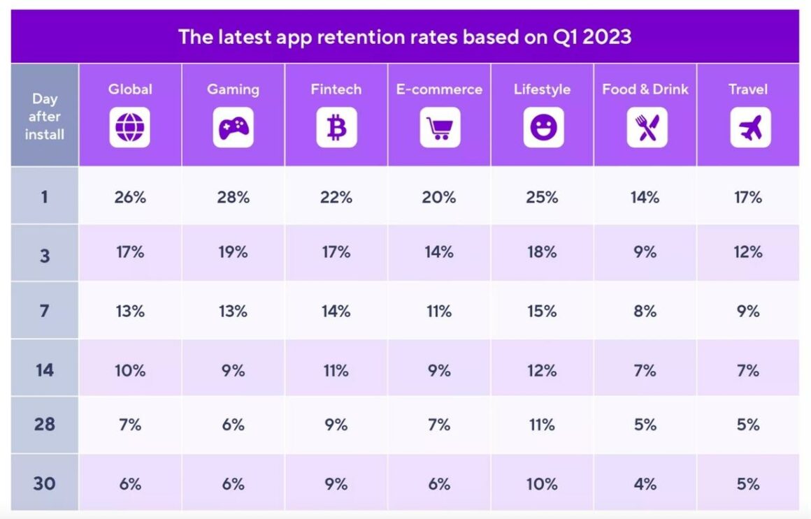
⚡ According to recent field research, the average day-1 retention rate of an app is around 26%, which means 74% of users never turn back to an app after installing and checking the app.
Here are the specifics:
So, yes. Onboarding screens are necessary.
You have only one shot for most of the potential users.
Gotta use every space effectively!
Plus, onboarding screens
- Leave a positive first impression on the users.
- Enables users to get familiar with the product and its UI.
- Ensure a smooth, personalized, and contextual onboarding experience for all kinds of users.
- Help companies get to know their users better, collect user insights, create user personas, and analyze them even before they interact with the product.
- Provide an opportunity to establish expectations; demonstrate product value proposition, success stories, use cases, etc.
- Drive user retention and improve customer satisfaction in the long run. Warmly welcomed and guided customers = Happy and loyal customers.
6 Tips for Creating Better Onboarding Screens
Okay, I'm sold.
Give me all the tricks so that I can finally welcome my users the right way.
Let's get started, then 🏃🏃
Tip #1: Decide on your onboarding strategy first.
Gonna just welcome the newbies and leave it there? Promote your product and highlight your most common use cases and app features by restating your value proposition? Provide an onboarding checklist with a bunch of interactive guides and a thorough product walkthrough?
How will you continue onboarding?
Because onboarding screens are just the beginning, they set the tone, they warm the users for the real game, they're like teasers, and once they're done, you're expected to maintain the standards you just set.
The design, the interactivity, the educational materials...
So, analyze your users and your product, then map out an onboarding process and different onboarding flows based on your user personas before designing your first onboarding screen so that everything will be smooth like a marshmallow.
Tip #2: Keep the design of your onboarding screens simple.
⚡ According to a study, while 74% of people state that they would revisit a website if it's user-friendly, 50% of people say that they would not visit it again if it's not.
The user-friendliness of a website or product is influenced by both design and technical aspects.
Your design might appear beautiful and flawless on your end with adequate bandwidth and infrastructure, but does it work at your users' end, too? Or, for example, having a giant tree in the middle of a webpage with content swinging from its branches might sound like a creative design idea, but is it truly functional and understandable?
In short, be careful with your design.
Simple is always beautiful when it comes to UI.
👉 Looking for no-code websites to create responsive and interactive pages?
Tip #3: Incorporate videos into your onboarding screens.
⚡ Wyzowl's research highlights that 65 out of every 100 individuals express a strong preference for using videos as their preferred mode of learning how to utilize a product.
So why not offer a short introductory video showcasing the product and pro tips about the essential features in our onboarding screens, right?
Or an explanatory video about the particularities and potentials of the product could be nice.
Tip #4: Don't lose the grip of your onboarding screen.
This tip is especially important for survey/ questionnaire screens, especially as they're generally the ones that tend to go off the rails the most.
Keep your onboarding screen organized, coherent, and concise. Don't ask way too personal questions on sign-up pages, or don't present an extensive product pitch to a user as if they were stakeholders in your company.
You don't need more than 5 or 6 screens tops to get actionable insights about a user.
Sorry, no room for negotiation!
👉 Let's take you here to learn more about in-app microsurveys.
Tip #5: Don't be afraid to experiment with new things.
Perform A/B tests and consistently enhance your onboarding screens to stay in sync with product, company, and target audience shifts to ensure your onboarding process is in harmony with the changing product or service dynamics.
Got a new success story? Highlight it.
There's an upcoming seminar or a webinar? Announce it.
New feature? New pricing? New use case?
If there's a change in anything, or if your current strategies are no longer effective, and you decide to pivot towards a different onboarding method or focus more on customer education, go ahead and update your onboarding screens accordingly!
Tip #6: Don't keep your users in the waiting room against their wishes.
Onboarding screens are amazing opportunities for us to promote our product, get to know a new user, or provide educational material to them.
To interact with a user, basically.
But there's also the other side of the coin:
Does this lovely new user want to interact with us as much as we want to interact with them?
"I already limited my questions and shortened the tutorial video a lot!"
Yet again, our whole purpose is to leave a positive image and show we care about our users, which wouldn't be really the case if we push the limits and force someone to go through a bunch of screens and steps to access a product, right?
So, always put a skip or a cancel button for your onboarding screens, especially for the lengthy ones.
Wanna know how you can practice all these tips without coding and in a few minutes?
I got you ⬇️
8 Onboarding Screen Examples from Real Apps
Now that we know what makes an onboarding screen good and what pitfalls to avoid while designing and creating it, it's time to see and analyze some real-life examples.
Ready for some creative inspiration?
Here we go ✈️
Blinkist
Blinkist is a mobile book summary application that provides key takeaways from non-fiction books. It condenses full-length books into shorter, digestible content known as "blinks," which can be read or listened to in around 15 minutes.
And it has this cool onboarding screens asking a bunch of questions to create a more personalized app experience based on our book preferences:
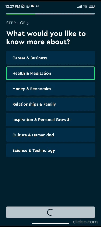
Let's break the flow into pieces👇
First, the app asks about our favorite non-fiction book genres and subgenres:
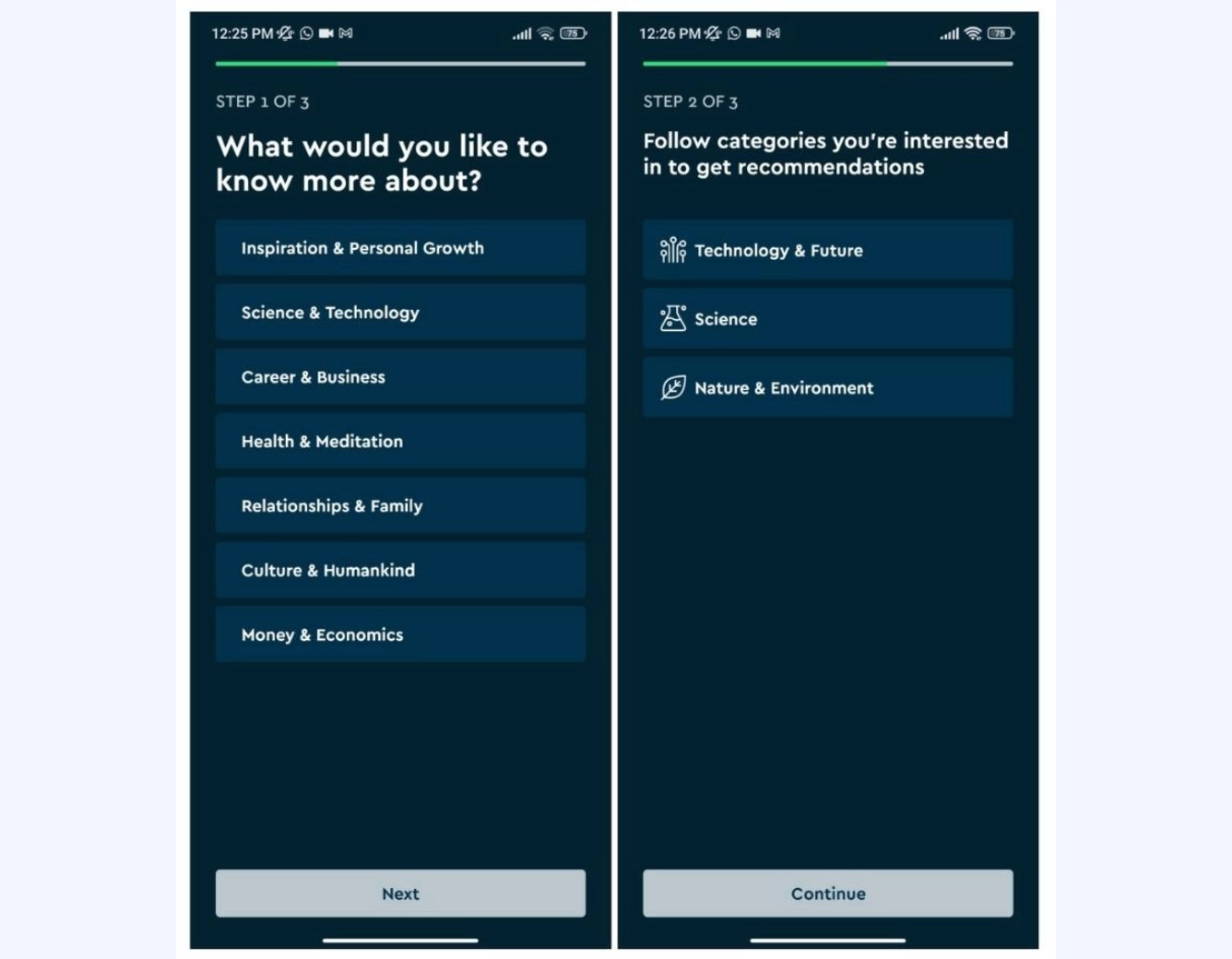
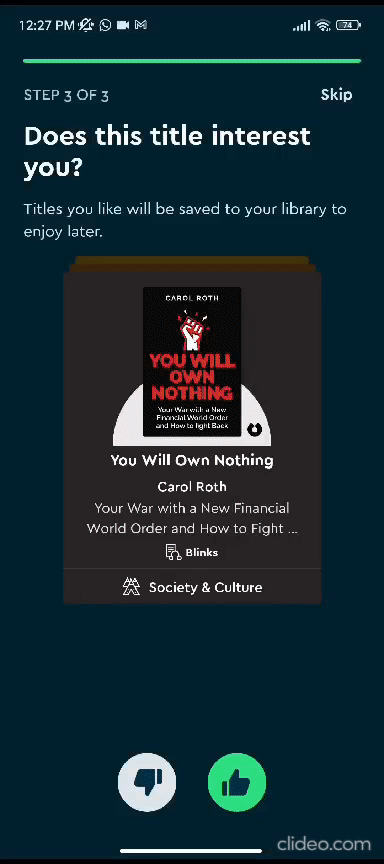
Then, it recommends a few books from the genres you chose and saves the ones you like to your library:
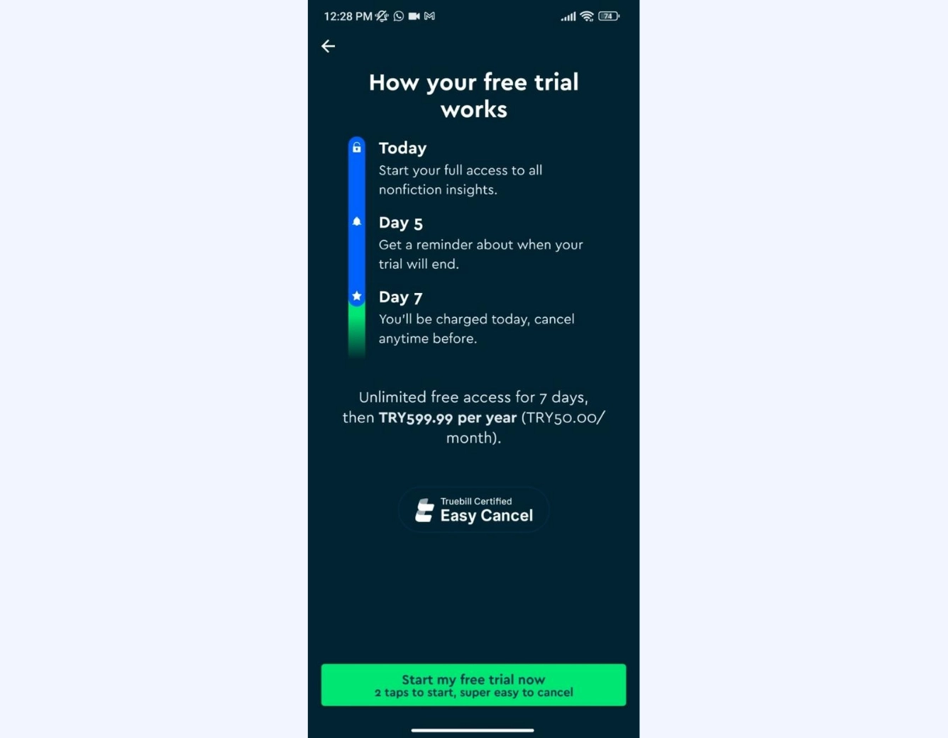
After the book suggestions, a final onboarding screen comes and gives details about the free trial period and billing & payment options:
Meditopia
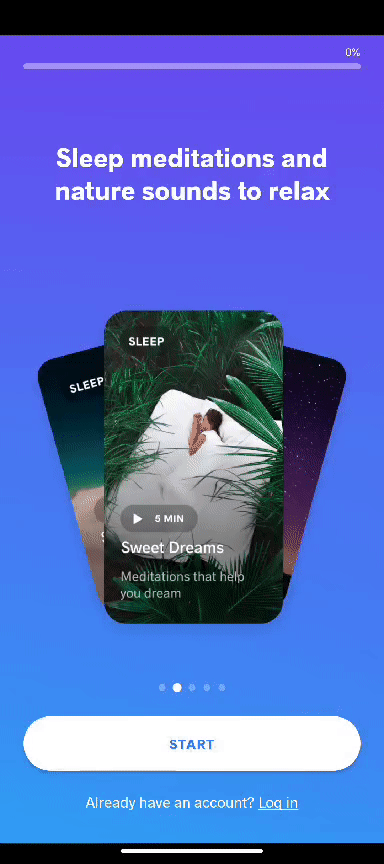
Meditopia is a sleep, meditation, and mindfulness app that offers a variety of guided meditation sessions, relaxation techniques, and exercises to help people reduce stress and anxiety in their lives.
Meditopia's onboarding screens are like an enlightening adventure through the tranquil countryside of your mind. They're decked with picturesque images, practical use cases, and app explanations.
But my personal highlight?
The pit stops filled with research-backed mental health and well-being stats—because who knew data could be such a refreshing oasis on this journey to serenity!
Let's see them one by one.
The onboarding starts by setting expectations for the user -both for the app and the overall user onboarding experience:
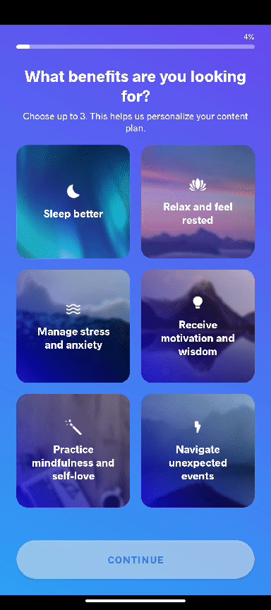
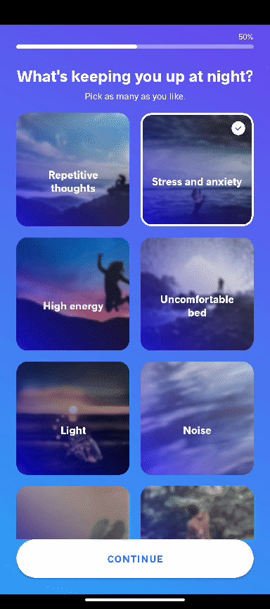
Then there comes a relatively long user survey:
But in order not to bore the user, Meditopia sprinkles a few statistics and factual information among the questions:
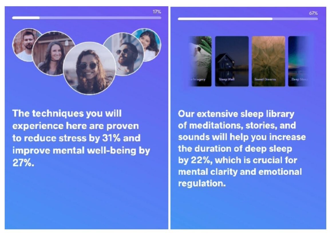
Meditopia's onboarding stands out as one of the most elaborate and lengthy onboarding experiences I've ever encountered. The gradual progression of questions, interspersed with resting points like the statistics pages and a motivating progress bar, made it manageable for me to complete.
Yet, one wonders—will every user take the journey?
Well...
Let's say mindfulness takes time 🧘♀️🧘♀️
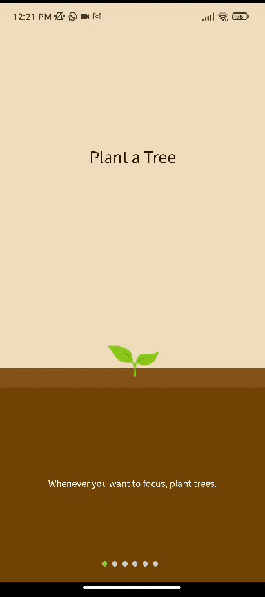
Forest
Forest is a productivity app that assists users in maintaining focus on specific tasks by prompting them to plant virtual trees, which grow during their work sessions. The main objective of the app is to deter distractions and motivate users to complete tasks from their to-do list by gamifying the process, effectively turning productivity into an engaging game.
However, here's the catch: The app must remain open throughout the session. If users switch to social media or another app, the growth process halts, and the tree dies.
When it's explained like that, it sounds a little bit confusing and complex, though, right?
But that's because of me, sorry.
Forest actually welcomes new users with a set of onboarding screens that explain the whole purpose of the app and the operating logic way better 👇
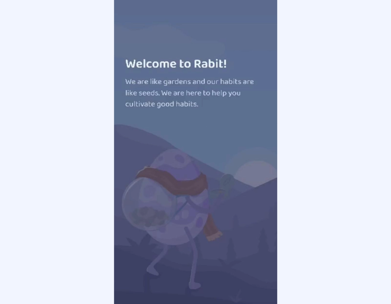
Rabit
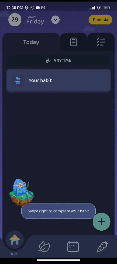
Rabit, a habit tracker and planner app, is somewhat similar to Forest. You make to-do lists and set up habit trackers, and here's the cool part: you get to grow little digital plants by sticking to your routines and habits.
Drank 10 glasses of water? Congrats, here's a carrot for you! 🥕🥕
But there's more.
Rabit isn't your typical habit tracker; think of it as your interactive habit buddy. It's more than just a passive calendar—it's like a helpful habit coach who checks in on your progress, asks how you're doing, offers suggestions, and cheers you on as you strive to build better habits.
Let's break down its onboarding now👇
It welcomes the new users warmly:
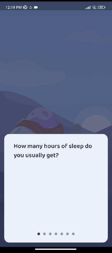
Asks a few questions to understand their needs:
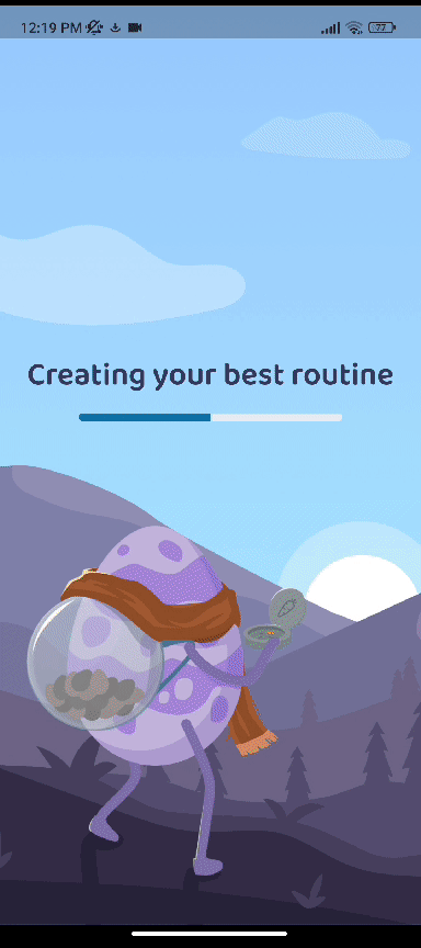
Then, it creates a personalized route for you and helps you get started:
Welcome message, checked.
User survey, checked.
Personalized suggestions, checked.
Does it end there? Well...
Rabit raises the stakes and continues with an interactive product walkthrough showcasing the core functionalities of the app and how to use them 🔥🔥
Just. Perfect.
Notion
Notion is a versatile productivity tool renowned for its adaptability to a spectrum of user needs. It enables its users to take notes, manage projects, bookmark pages, or create extensive knowledge bases. For some, it functions as a recipe book; for others, it transforms into a diary or a collaborative workspace.
But this amount of versatility comes with a lot of white space and pages...
And we don't really want that.
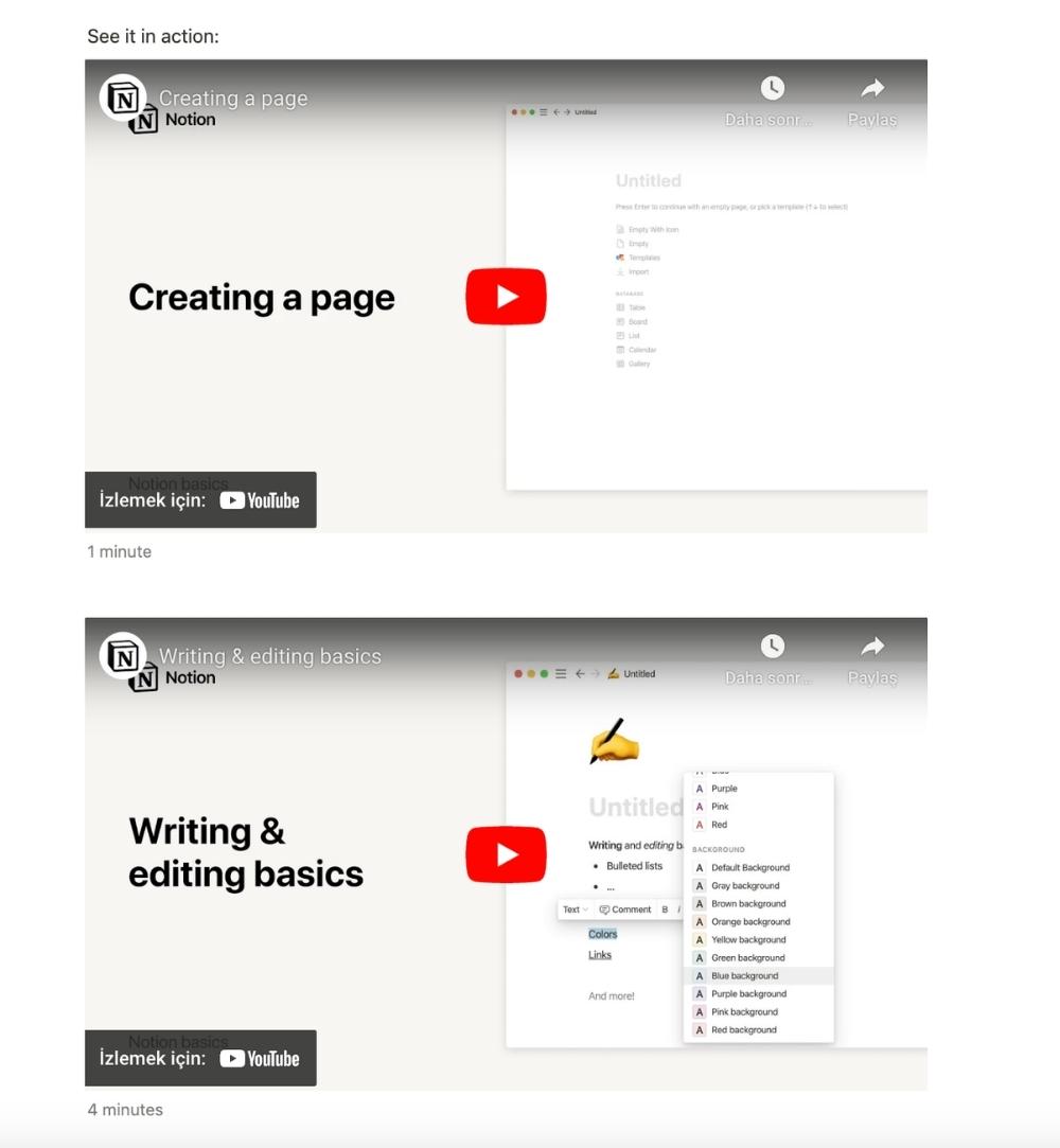
Here's how Notion solves this problem and neatly fills the empty state with an app onboarding checklist and a few video tutorials:

Hemingway Editor
While we're talking about filled empty states, let's continue with another perfect example: Hemingway Editor, an online writing tool that improves the clarity and readability of written content by evaluating the text and highlighting elements that might affect the quality of the content adversely.
But as it's a tool that evaluates the content/data provided by the user, it's basically a white page without the user's input.
Or, is it?
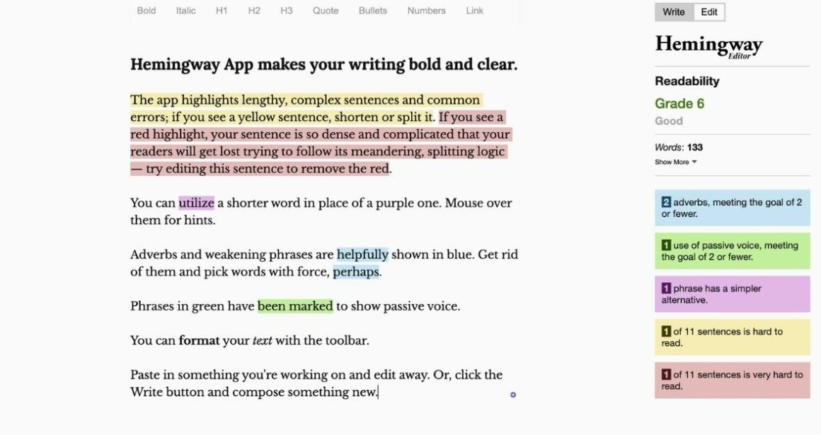
Hemingway Editor fills the empty state with demo content, showcasing the tool's highlighting features effectively. What's truly impressive is that this demo content isn't just random text; it's a product explanation, providing users with a practical demonstration of how the tool operates.
Clever, right?!
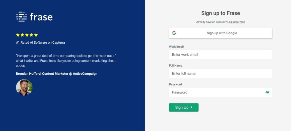
Frase
Frase is an AI-powered content writing and SEO optimization tool that's designed to assist with content creation, research, and optimization and is used by a lot of marketers.
The sign-up page of the app welcomes the users with Brendan Hufford's review of the app.
Pretty cool, to be honest.
Then, there comes a short onboarding survey with only 4 questions:

Nothing fancy or complicated.
Simple and neat.
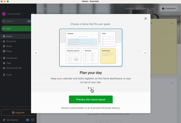
Evernote
Evernote is a widely used digital note-taking and organization application that allows users to capture, store, and organize various types of information in a digital format. It is designed to help individuals or teams keep track of ideas, to-do lists, projects, research, and other important information across devices.
Here's how Evernote welcomes the new desktop app users and offers a product value proposition packed with different use cases and key actions that can be done with the app:
In Short...
Onboarding screens are not additional burdensome tasks randomly thrown upon you by internet people, I promise.
They serve as valuable tools that enhance communication between new users and a company while also refining the overall appearance of a product's user interface. Moreover, in certain cases, they play a vital role in educating new users and facilitating a smoother start with the product.
So feel free to choose a use case and a style that suits your need and product or mix some things up and create a whole new onboarding screen category.
But don't forget, it gotta look cool and be fun to interact with!
Frequently Asked Questions
How many screens should onboarding be?
Though the ideal number of screens for onboarding largely depends on the nature of the product and its target audience, in general, it's best to keep the onboarding screens concise and focused, ideally between three to five screens. The key is to convey essential information, showcase core features, and demonstrate the app's value quickly and effectively. Any more screens than six could risk overwhelming or losing the user's interest.
Are onboarding screens good practice?
Yes, onboarding screens are indeed good practice for several reasons. Firstly, they contribute to making a positive first impression on users, setting the tone for their experience. Secondly, onboarding helps in setting clear expectations regarding what the product offers. Thirdly, by educating users about the key functionalities and potential use cases it enhances user understanding and engagement. Lastly, onboarding is a valuable tool for companies, aiding in user insight collection and the creation of user personas, which are crucial for tailored product development and marketing strategies.
.png)


.svg)
