


.svg)
.svg)
.svg)
.svg)
.svg)


.svg)


.svg)
.svg)


I used to think I hated in-app notifications.
Then I realized that what I don't like is bad in-app notifications.
After that, I soon figured out how they can be used to create a delightful user experience that can engage and re-engage users.
And contrary to popular belief, they can be a lot better for engagement than push notifications.
Ask yourself this:
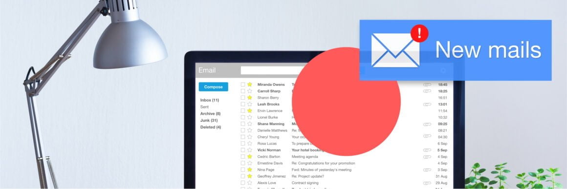
Am I more likely to click on a notification on my lock screen or inside an app?
Let’s talk about this curious case through the questions:
- What in-app notifications are,
- What the difference between push notifications and in-app notifications is,
- Why you should use in-app notifications,
- What some types of in-app notifications are,
- In-app notification examples, and
- How you can create your own in-app notifications
Don't have the time? Here's the summary:
TL;DR
- An in-app notification is a message for the user that appears inside an app in the form of modals, tooltips, notification bars, hotspots, etc.
- Some important differences between in-app notifications and push notifications are:
- The UI & UX,
- The format,
- The copy (length & content),
- Goals, and more
- In-app notifications matter because:
- They help prompt users in the right place at the right time,
- They help display more engaging CTAs,
- They help use better copy where it matters,
- Some prominent in-app notification types are:
- Announcement bars,
- Modals,
- Slideout notifications,
- Tooltips,
- Hotspots & more
- Some steps toward creating engaging in-app notifications are:
- Start off with a user journey,
- Segment and target users,
- Design it right,
- Launch it,
- Recharge, analyze, and regroup
Let’s get into it!
What are In-app Notifications?
In-app notifications are contextual notifications that appear inside an app, website, or software in the form of announcement modals, tooltips, notification bars, hotspots, and more. An in-app notification's main purpose is to offer contextual messages where needed to elevate the user and customer experience of active users inside the product. While these notifications can contain any type of content or media, they are typically short and informative, often with a clear call to action like updating the app or buying what you left in the cart.
Push Notifications vs In-app Notifications: What’s the difference?
Although push notifications and in-app notifications often have very similar content and serve the same functions, there is a very clear difference between them:
👉 In-app notifications are sent to users while they are inside the app, website, or software.
👉 Push notifications are sent to users while they are off the app, website, or software.
Apart from this very basic fact about them, some other differences are:
💻 In-app notifications are...
✅ Prompted in the user interface of a product, often as partial or full-screen pop-ups,
✅ Used to call to action or guide engaged users in the app/website/software,
✅ A part of the product, cannot be disabled,
✅ Contextual notifications, and/or triggered when a certain action is performed,
✅ Can be in different UX patterns like tooltips, modals, and more,
✅ Often created by the product team,
✅ Different types of notifications (modals, tooltips, hotspots, etc.),
📱 Push notifications are...
✅ Prompted on the lock screen and/or notification center,
✅ Used to get the inactive users/disengaged users on the app/website/software regarding in-app content,
✅ Can be disabled by the users,
✅ Often non-contextual and bulk-sent,
✅ Only viewed on phone/computer screen when not using the app/website/software,
✅ Often created by the marketing team or customer success team,
✅ No distinct notification types in terms of format,
But there are also similarities...
Push notifications and in-app notifications both...
👉 Are powerful tools used to increase engagement rates and user interactions,
👉 Can be used for feature announcements, special offers, personalized messages, onboarding experiences, and marketing purposes,
👉 Are often non-transactional messages,
👉 Can be used during the initial onboarding process and other user onboarding experiences,
👉 Can be used in app messaging campaigns,
And similar in so many other ways.
So, one can say in-app notifications and push notifications are quite similar and different at the same time.
But here’s the real question: why use in-app notifications?
Why should you use In-app Notifications?
If you are an app/website/software owner, you probably got some cool push notifications already.
And if you are not, push notifications might be the only type of notification that comes to your mind.
But when used right, in-app notifications can get you double the efficiency.
Let me give you 3 reasons why:
1- Right Place, Right Time
The whole deal about in-app notifications is that they are in the app.
“We get it already, so what?”
So, you can talk to your users when you want to, that is, when they trigger a certain action or when they have landed on a certain page; and where you want to: inside your app.
I just basically explained how contextual notifications work.
And the more contextual you are, the better the user experience.
Just look at how Discord does it:

With contextual messages, Discord makes sure users will actually read and interact with in-app messages.
2- More Successful CTAs
You put a call to action on your push notification, users don’t engage.
You put a call to action on your in-app notification, they are more likely to respond.
I don’t think I have to explain why.
But I will.
The users are already halfway through when they see your in-app notification.
They got half the work done, which is opening your app/website/software, where they come across your in-app message.
So obviously, it is not hard to imagine why users tend to engage more with in-app notifications.
They just might as well do what you say while they are there.
And that’s something you want to make use of.
Here's how Calendly benefits from an in-app new feature announcement with a strong CTA:
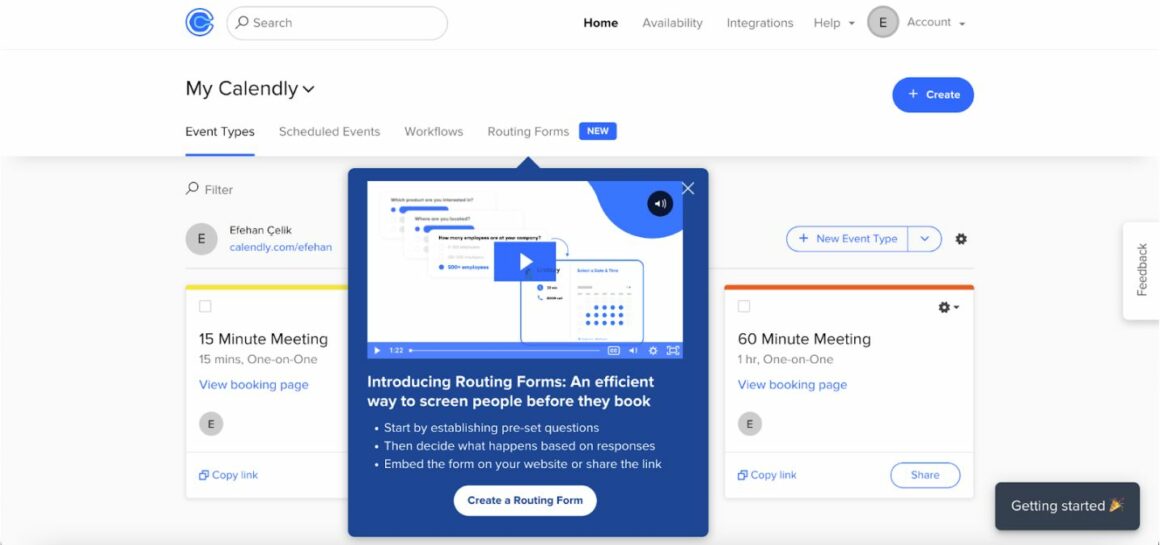
You might or might not click on the "Create a Routing Form", but one thing's for sure:
You definitely wouldn't click if it was a push notification 🤷
3- Better Copy Where It Matters
You could send an announcement email to a user explaining why and how your app/website/software will be updated, or where they can access a certain feature within your app.
You can send them a push notification telling them to give your new feature a try.
Hell, you could even send them a text message about your discount on a plan.
All of these are perfectly good options (not the text message one, that’s actually annoying), but hey:
Why go to those lengths when you have in-app notifications under your belt?
👉 An email is often ignored,
👉 Push notifications barely have enough space to explain,
👉 A text message straight-up sucks 👎
Instead, you can use an in-app notification to make sure your big news isn’t ignored, non-contextual, or annoying.
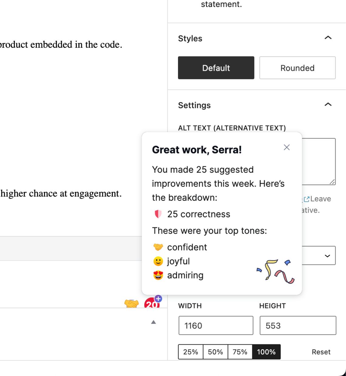
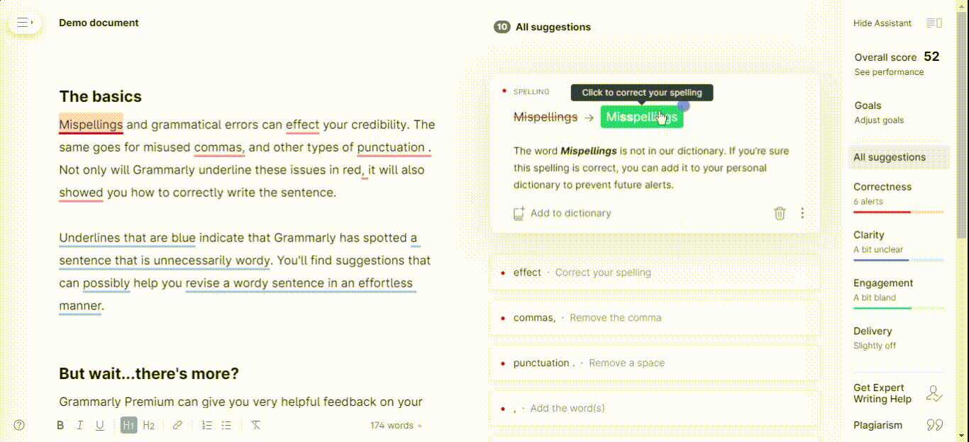
Here's a good example from Grammarly I came across as I was writing this piece:
“But in-app notifications are also annoying.” you might be thinking.
Not the well-designed ones.
Let me explain.
5 Different Types of In-app Notifications and When to Use Which
As you might have guessed or seen for yourself, in-app notifications come in different shapes and sizes.
This is because in-app notifications don’t have a common function or one-fits-all format.
All app, website, software, and user needs are different.
So, different types of notification in-app can work to answer different needs.
Let’s take a look 👇
1- Announcement/Notification Bars
Remember those tiny little colorful bars on top of websites?
That is an announcement bar or a notification bar and they are super useful if you don’t want to prompt your users with a huge full-screen modal or get them too distracted.
Here’s an example from Zapier:
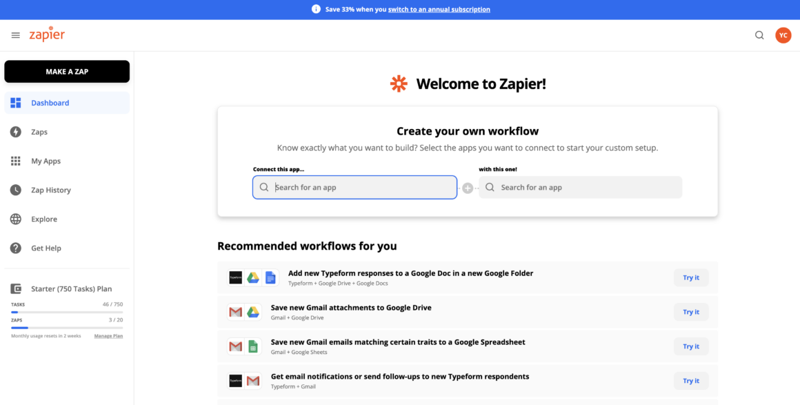
The good thing about a notification bar is that it doesn’t pop up which is something most users get slightly or immensely get annoyed with.
When they get on your app/website/software, oftentimes the notification bar is already there.
No sudden prompting = no needless frustration 🙌
When to use announcement bars ✍️
Like in Zapier’s case, notification bars are perfect for informing people about:
👉 Sales,
👉 Events and webinars,
👉 Discounts, and
👉 Updates on your products & more
It’s important to note that a notification bar is probably the least distracting and the most persistent type of in-app notification you can send your users.
That means if you need to tell your users something that won’t make a huge difference if they engage with it or not, announcement/notification bars are the way to go 🙌
2- Modals
A modal can be defined as a pop-up window with the main objective of letting users know of something important.
In-app modals can:
✅ Be big, small, center-piece or on the side; different shapes and sizes are used to increase engagement rates, conversion rates, and product adoption rates,
✅ Feature different visuals, videos, interactive elements,
✅ Be used for onboarding, marketing, or for customer success analyses,
✅ Be a tenet of communication with users in-app
And yes, they might seem annoying but only if you don’t know how to use them right.
Look at this modal by Jarvis, for example:

If you use this kind of in-app notification - well-designed with a clear visual hierarchy - to relay something that actually matters, no user will be frustrated (hopefully).
When to use modals ✍️
Modals as in-app notifications are best for new feature launches, important updates on a website or tool, or a necessary user onboarding flow.
As I just said, don’t overuse it or you’ll get yourself some grumpy users.
3- Slideout Notifications
Slideout notifications, also called slideout modals, are probably the type of in-app notification that we are most used to as many computer software use it.
They are generally non-disruptive in a tiny message box by the bottom right corner of the screen, and today, they tend to be super engaging with a personal feel.
Look at Notion’s example:
Low distraction, personalized and super chill!
When to use slideout notifications ✍️
Slideout in-app notifications have the vibe of a “psst” message.
They don’t really get user attention right away, they are just there with a tiny little information in them.
Oftentimes, product designers tend to use slideout notifications for informing about a change in terms of use, settings, or a way of doing things.
You can see them having different content too since they are not so annoying compared to other types.
4- Tooltips
Another type of in-app notification greatly in use today is tooltips, and it is for good reason.
Tooltips are:
👉 Dismissable,
👉 Highly contextual, and
👉 Just right for saying something quick and on the go
Like “check out this new feature” or “click here to see our new page”.
Or they can even work as tiny notification bars, like this:

When to use tooltips ✍️
Tooltips are best for user onboarding, hands down.
But as I just pointed out, they come in handy for a lot of different purposes like:
✅ Announcements,
✅ New features,
✅ Updates,
✅ Or even a “thank you” message hidden somewhere on a website
What really matters is that you design your tooltips to be small with a short copy and with a close button.
Nobody wants a message box just hovering somewhere on the screen with no skipping option 😬
5- Hotspots
A very subtle (yet not so much so) way of sending in-app notifications is hotspots.
A hotspot is an in-app message that’s pointed out using a beacon, and it looks a little something like this:
Now, the right execution of a hotspot depends on how you choose to design the beacon.
It simply can’t be too aggressive.
One more thing is to keep it relevant. You don’t want to hide a message inside of a beacon where it doesn’t matter:
Make sure it is worth your users’ time to find, click on, and engage with the hotspot.
When to use hotspots ✍️
A hotspot is great for signup onboarding flows and/or log-in pages.
Because you don’t want to confuse your users just when they are about to walk into a new product experience with you, the last thing you want is to scare them off with a long copy.
Use hotspot, be wise.
Bonus: Chatbots 🤖
Recently joining the game, our last type of in-app notification is chatbots.
Or rather, the slideout messages they send the users.
That’s right.
Those tiny messages you see on top of a chatbot when you visit a website for the first time can be a tooltip, slideout, or some other type of UX pattern.
But what makes chatbots a great in-app notification experience is that users can follow up easily.
They get to see the notification and learn more about it by talking to the bot, which is a great piece of user experience.
Here's an example from Intercom's website:
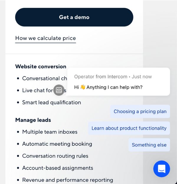
The only difference from a slideout modal is that it is more extensive and gets more transactional by sending messages to users and visitors.
Well, now that we know the what and why of in-app notifications in theory, let’s get to the practice part.
Here are 5 great examples of in-app notifications for mobile, web, and desktop.
5 Examples of Perfect In-app Notifications for Mobile, Web, and Desktop
Mobile Apps
1- Duolingo
When Duolingo is first onboarding the users to the app through classes, users are prompted with a tooltip calling them to action.
This is a great example of an in-app message on mobile since mobile apps don’t have the luxury to use a slideout notification or a notification bar.
Instead, they work what they have at hand to their fullest.

Website and Web Products
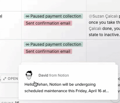
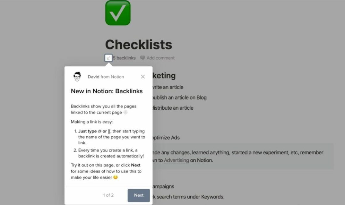
2- Notion
Notion’s contextual tooltip used to introduce its new feature is one of a kind.
Instead of going with a whole product tour or modal introduction, Notion explains the feature in two slides, and they do so with a fun feel to it.
I mean, look at the emojis and the little doodle of “David from Notion”:
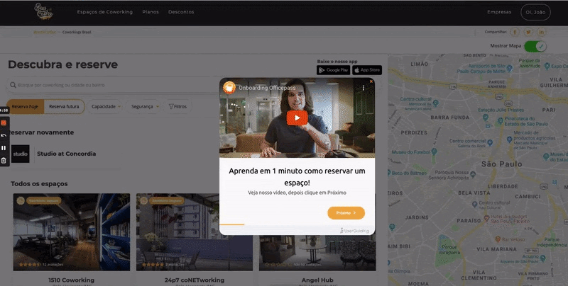
3- Grammarly
Grammarly’s in-app notifications through hotspots + tooltips make their user onboarding a fun little experience where users get to explore the tool in a demo environment and I could not love it more.
A perfect example of how to use hotspots right, everyone:
4- Indicata
How else can we use hotspots to our advantage?
Like Indicata does.
By prompting users with a contextual, non-disruptive new feature hotspot, Indicata gives off a fairly laid-back vibe.
They don’t need us users to know the new feature, but if we want to know more, here’s a hotspot, and here’s a tooltip:
Desktop Apps
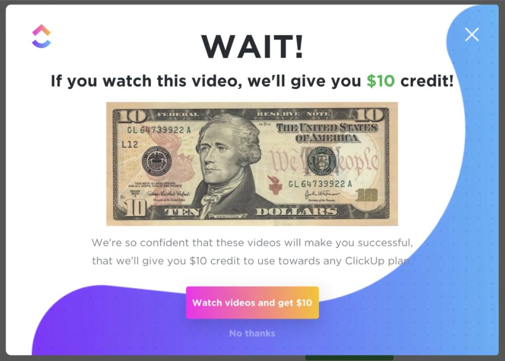
5- ClickUp
Remember how I said modals can be annoying for users?
Not this one.
ClickUp knows exactly how to get their users’ attention by inserting a shiny green 10 bucks on the modal and that double-take gives them the time to get their message through.
Well played ClickUp, well played 😎
How to Create an In-app Notification in 5 Steps
Creating in-app notifications is easier than it sounds, but the process is probably longer than you think.
There is a good amount of variables to consider.
Let’s take a look.
1- Start off with a user journey 🏃
Contrary to push notifications, in-app notifications are a part of your app, website, or software as well as a part of the user experience.
So obviously, just like anything that has users in it, an in-app notification needs a user journey map.
To do it right, what you need first is data on your users.
Ask the questions:
- Who are my users?
- What is my user persona?
- What are the needs and desires of my users?
- What user flow is optimal for your product and for a better user experience?
And more questions on whatever specific problems you might face in your field.
What really matters is that you plan ahead to make your in-app notifications achieve their goals.
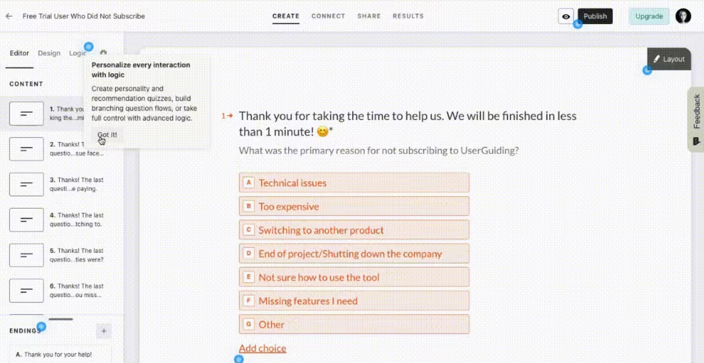
2- Segment and target users 🎯
Once the planning is over and you have a basic understanding of who your users are, it’s time to segment them into more defined groups to address their needs and communicate with them better.
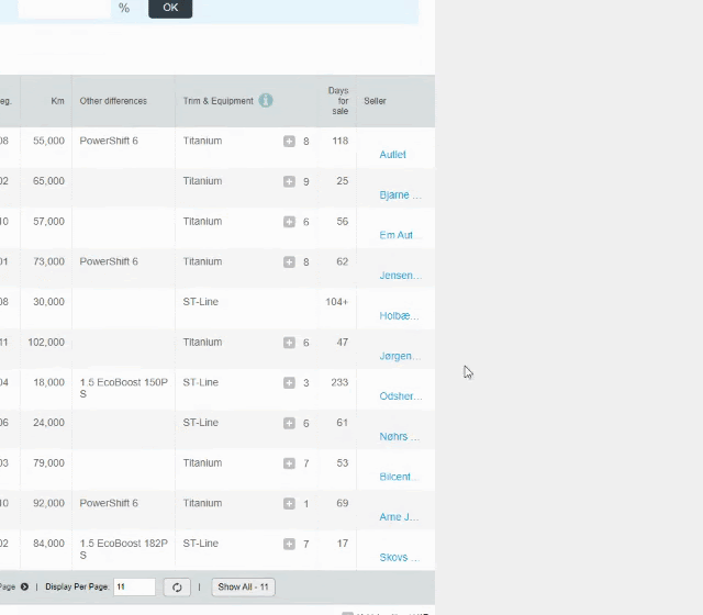
Here's a look at how segmentation can be done with a no-code tool:

This step is essential since in-app notifications can be fairly disruptive, especially when they have nothing to do with the users you send them to.
End result: user frustration.
So before moving along with your in-app notifications, make sure you know who sees what message, bar, banner, or tooltip.
Focus on improving user engagement, not solving user frustration 🙌
3- Design it right 🎨
One big step while creating in-app notifications is the design.
And believe me, it gets tricky.
Design is not just about what color, shape, and size your in-app notif will be. It’s also about the type of UX pattern you are using.
And that’s exactly why it is an intricate task.
If you use an announcement modal where you should’ve gone with a notification bar, things tend to go wrong real fast.
Be conscious of your choices during this stage, and make sure to keep the copy concise with a pinch of engaging media (Gifs? hell yeah)
Here's how BeerOrCoffee does it:
4- Launch it 🚀
It’s time to launch your in-app notifications.
The question is:
Did you go in-house or did you use a third-party tool?
‘Cause let me just tell you right off the bat: you got trouble coming if you opted for in-house unless you are among the big players of SaaS.
The thing about in-house is that if you don’t have a big team of developers that can take time to code, set up, and maintain in-app notifications.
And it just might not be worth it anyways 🤷
If you are common SaaS folk like the rest of us, well, welcome to the no-code tool club:
No Code No Cry: In-App Notifications Done Right 👏
In-app notifications are hard work by themselves.
👉 What type to use?
👉 Which flow for what segment of users?
👉 Where the hell do you place that little message box?
All valid questions.
Questions you wouldn’t have to dwell too much on if you go with a no-code tool for in-app notifications.
That’s where UserGuiding comes to play.
UserGuiding is a no-code tool you can use to create many types of UX patterns, including:
✅ Product tours, walkthroughs, interactive guides,
✅ Hotspots, tooltips, in-app messages,
✅ User onboarding checklists,
✅ Resource centers,
✅ NPS surveys,
Plus advanced features and capabilities like:
Segmenting and targeting users, designing your own UX patterns for in-app notifications with high customization, analyzing user behavior, and more.
👉Give it a try, for FREE👈
5- Recharge, analyze, and regroup
After you have launched your in-app notifications, it is time to sit back and watch.
Your users will engage with your in-app notifications, ignore them, reach out to you thanks to them, and maybe even report them. But hey, that’s all valuable user data.
What you do next is take it and use it well.
And hey, if you went with the no-code tool option, you even get to analyze it easily!
Here's how it works for UserGuiding:

Remember, whether your in-app notifications perform well or not, it’s up to you to bounce back and try again. You got this.
To Wrap Up
In-app notifications aren’t always the most fun user or customer experience, but they can turn into a good weapon for:
👉 Higher user retention,
👉 A better in-app messaging strategy,
👉 More user feedback,
👉 Enhanced customer loyalty, and more.
That is, if you play your cards right.
Using the right types of in-app notifications, making sure you use the push notifications to complement it well, and analyzing user behavior is top priority.
Now, go notify some users; you got this!
Frequently Asked Questions
What do in-app notifications mean?
An in-app notification is a notification sent or shown to users while they are active on an app, website or software.
What is in-app notification settings?
Normally in-app notifications don’t have a setting to turn them off like there is for push notifications. In-app notifications are a part of the product embedded in the code.
What are in-app notifications called?
In-app notifications can be called tooltips, announcement bars, hotspots, or modals which are all types of in-app notifications.
Why are in-app notifications important?
In-app notifications matter because of the fact that they are prompted exactly when the users are active on the product, which gives them a higher chance at engagement.

.png)


