


.svg)
.svg)
.svg)
.svg)
.svg)


.svg)


.svg)
.svg)


I remember my first day at college. It was exhausting.
No, not because of the courses I attended that day. But, because of all the hassle about finding the classrooms, the restrooms, and the cafeteria on a campus vaster than 300 thousand square feet.
I was like a lost boat in the middle of the ocean, floating around to find its way. I was walking my feet off. I don't remember how much I walked in total, but I remember the pain I was feeling at the end of the day.

This is how important to make your users onboard on their first day in your app, website, or SaaS product.
I had to learn about all the locations on the campus and campus life to continue my studies there, and it took quite a lot of time.
But your users are not obliged to go on with your product. Plus, they don't have loads of time and energy to discover what value you are offering them. They can prefer the product that causes them less blood, sweat, and tears (metaphorically speaking). And I bet it wouldn't make you happy at all.
Then, user onboarding is vital for your product to turn your new users into regular users.
How do you design an onboarding process?
When it comes to designing an onboarding process, the terms UX and UI start coming up again and again.
The UX part of the onboarding design focuses on the functional concerns of the user onboarding flow, while UI deals with how these functions are served to the user.
In this article, I will walk you through the steps to make your user onboarding more appealing to the eye, so I will handle it from the UI designer's lens. I think the onboarding examples will inspire you for the design.
Step 1: Choosing your onboarding screen
What are the different types of onboarding?
There is more than one way to help your first-time users feel comfortable with your product. The user onboarding UX and UI patterns mostly utilized are as follows:
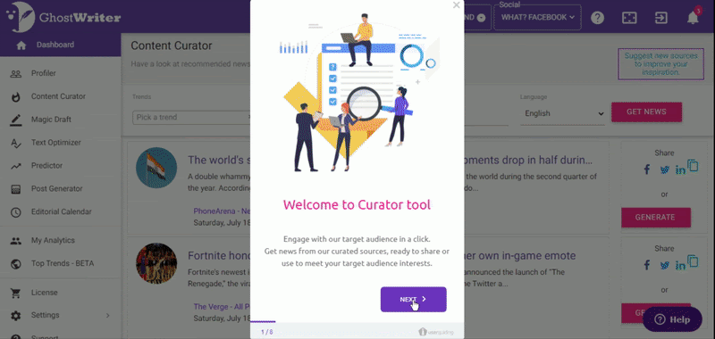
- Welcome Mat: Say hello to your new users.
- Product Tours: Show them around with interactive walkthroughs.
- Checklists: Assign them some tasks for self-learning and let them know where they are in this process.
- Hotspots: Highlight some product features.
- Tooltips: Show them some tricks or app tutorials to master your product.
- Progress Bar: Let them know how many miles are left to complete the onboarding steps with a progress indicator.
- Self-segmentation: Ask them about themselves, what they like, why they are here, etc... You should try to learn about them while they are trying to get to know your product. Treat them exclusively. It is also great for creating user personas.
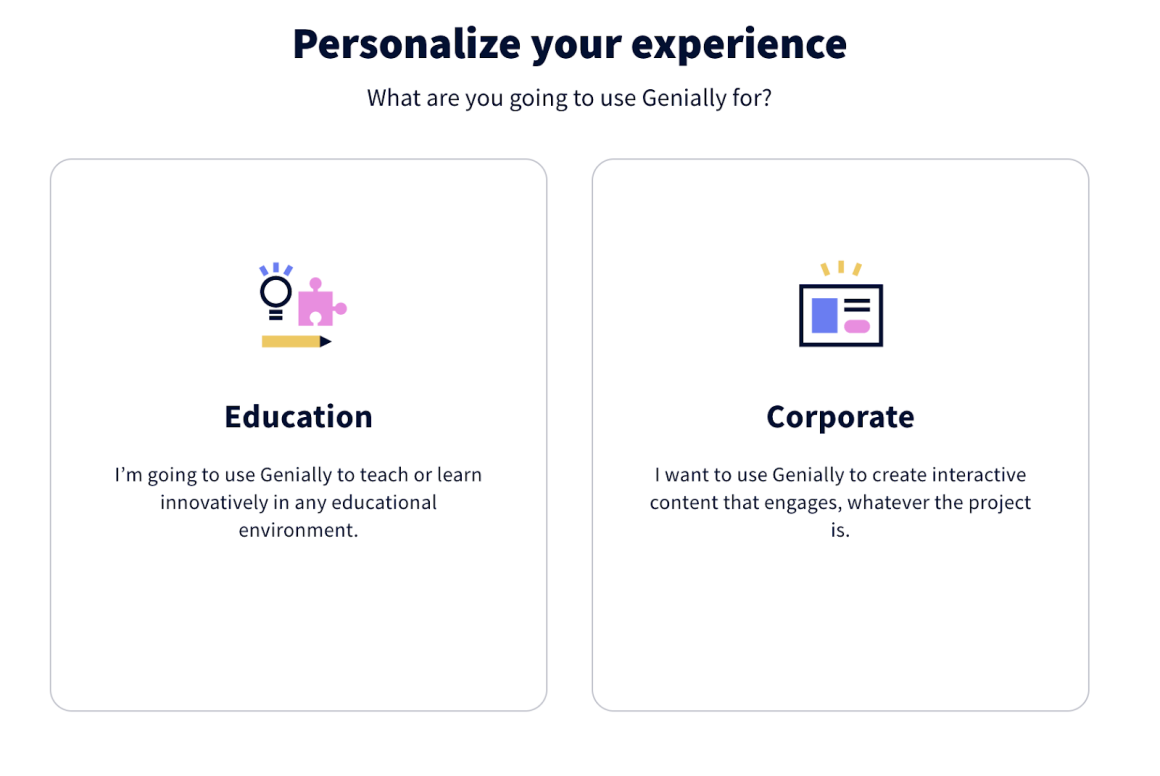
See how Genially asks you the aim of your using their product. It conditions the following steps of your user onboarding process accordingly which is called persona-based onboarding.
Although these steps seem like distinct and different items, they are actually very similar and complementary to each other in onboarding UI design. Most of the time, you need to use more than one of them for successful onboarding. Just make sure you use the one which best serves your intent and the need of the users at that point in their onboarding sequence.
It is needless to say that you shouldn't utilize an onboarding checklist to highlight your product's core features. Of course, you might simultaneously add a hotspot and a checklist in your onboarding design. I think you get what I mean.
Step 2: Scale the element
Whichever pattern you implement for the user onboarding experience, the size matters. Some might want to add all the information on the hotspot to show what's new on your product, but it's not a good idea to let it expand to all the corners of the page. It would overwhelm the user and disorient them to go on with the onboarding process.
You can consider the rules of visual hierarchy while scaling your elements.
The bigger elements grab the attention of the user first. So, think of when and how you want the users to see your onboarding screen.
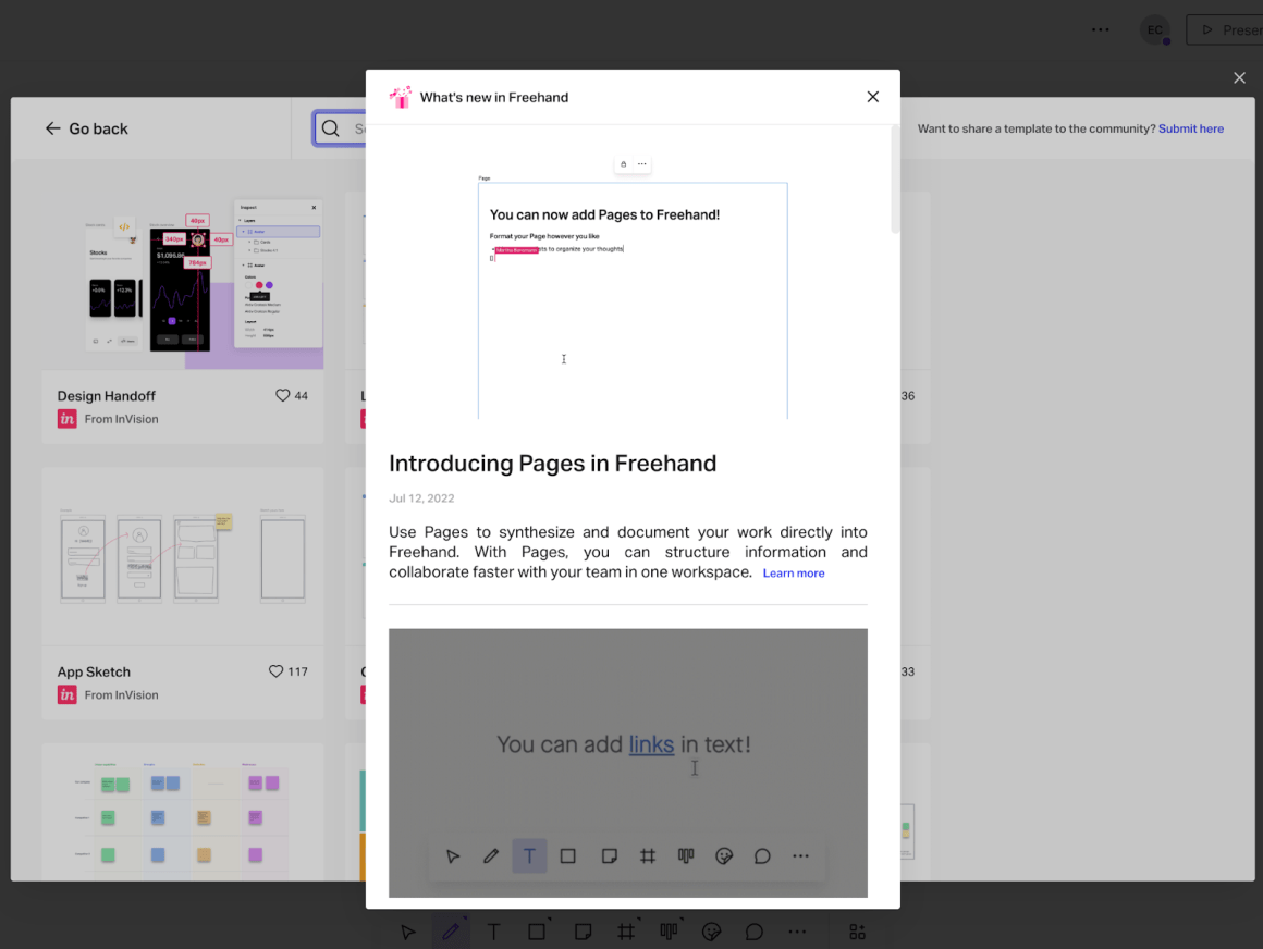
Look how InVision uses a hotspot to show its users what's new with the Freehand tool. It contains a full list of information about it, but it takes up only almost one-third of the screen. You need to scroll down to see the rest of the list; it is up to the user to see them or close the hotspot.
Step 3: Position your element
Some elements, such as welcome modals and segmentation surveys, deserve to be under the spotlight. But I can’t say it for others like progress bars or checklists.
What I mean by that is locating the onboarding element in the right area of your page.
If you think interfering with the user's self-discovery process is necessary, you might choose the center of the page. However, if you decide that what you want to say is not as important as the users’ interaction with the product at their own pace, you might locate it on one of the corners of the page.
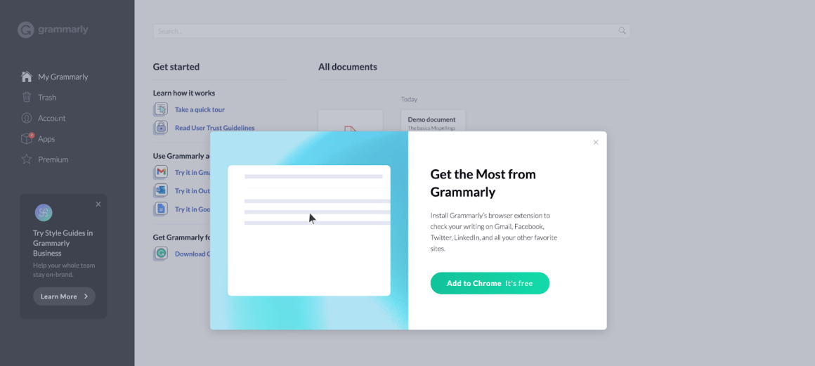
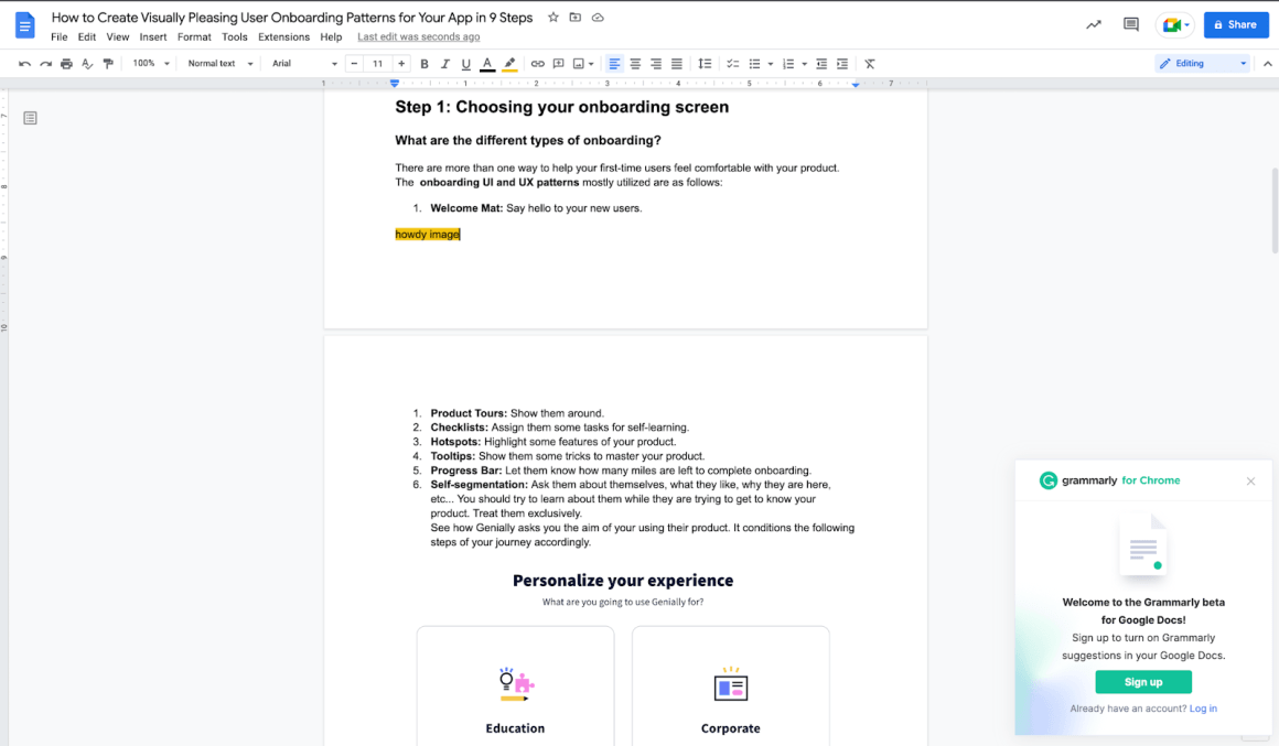
This onboarding example by Grammarly shows a modal with a CTA button at the center of the panel page when you first step on it. It is impossible to oversee it, and highly encourages you to take that action.
After you add the extension, Grammarly asks you to sign up with a small tooltip located in the bottom right corner. It doesn’t disturb you while you are typing on the document at the center of your screen. It is more like a suggestion than an imperative.
Step 4: Picking up colors
The consistency of the colors throughout your onboarding process and their harmony with your branding colors make a huge difference.
First, it makes the user trust the integrity of the onboarding elements.
It’s like yeah, it won’t take me to another irrelevant website, or it’s not a spam advertisement. It assures the users to follow the steps you created for their success.
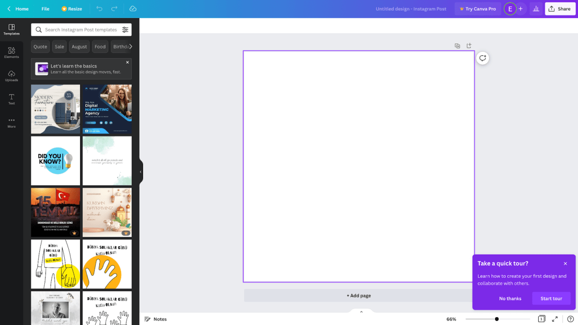
Canva uses the color purple all around its product. It creates a contrast with the background of the canvas, which makes it more visible to the users. They use a high-saturation color for the background of the onboarding element and finish it with white text to create contrast.
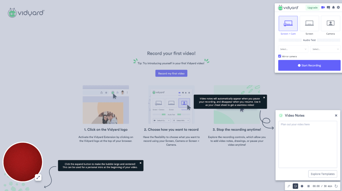
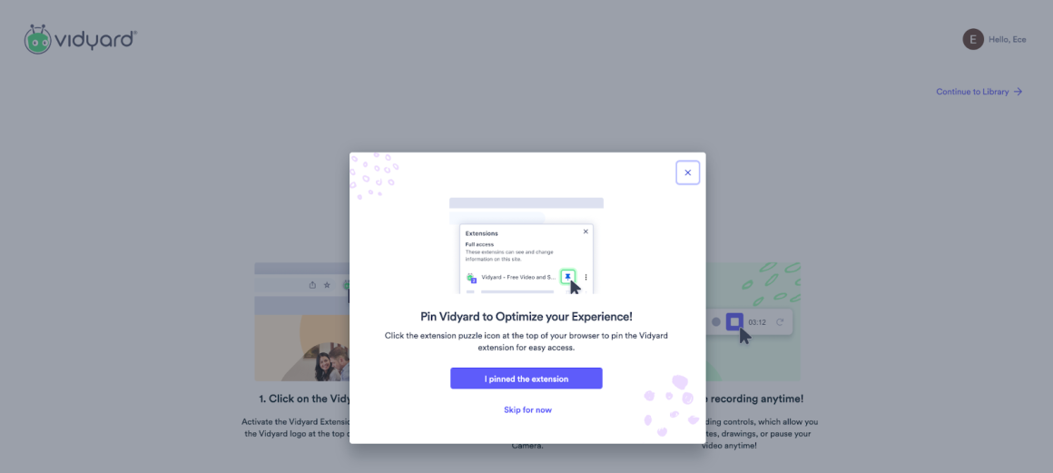
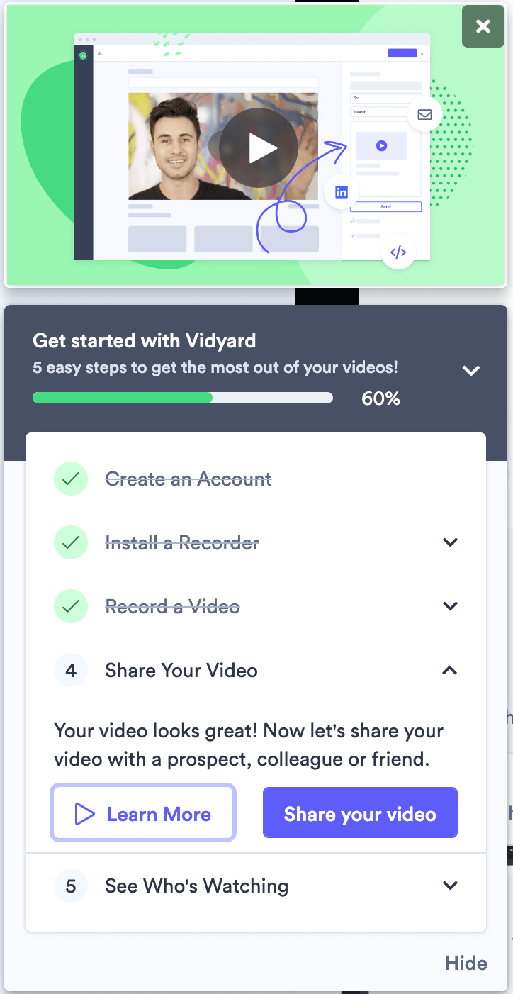
Similarly, Vidyard’s tooltips in its progressive onboarding process are more visible thanks to the black color fill of the tooltips in contrast with the white background.
The color of the button and the modal on the upper right corner is contrasting, but both of it is from the same color palette with the overall design of the page.
Step 5: Choosing Font and Font Size
Creating harmony between how your texts appear is another factor in onboarding UX patterns. They should make your users feel comfortable during their product onboarding.
Using the fonts from the same font family gives the impression of security besides looking good.
As for choosing the size of your text, remember the visual hierarchy rules. The heading must be larger than the following text on the elements.
Choosing bold fonts in the CTA buttons, especially when hovered, also works as they are more eye-catching.
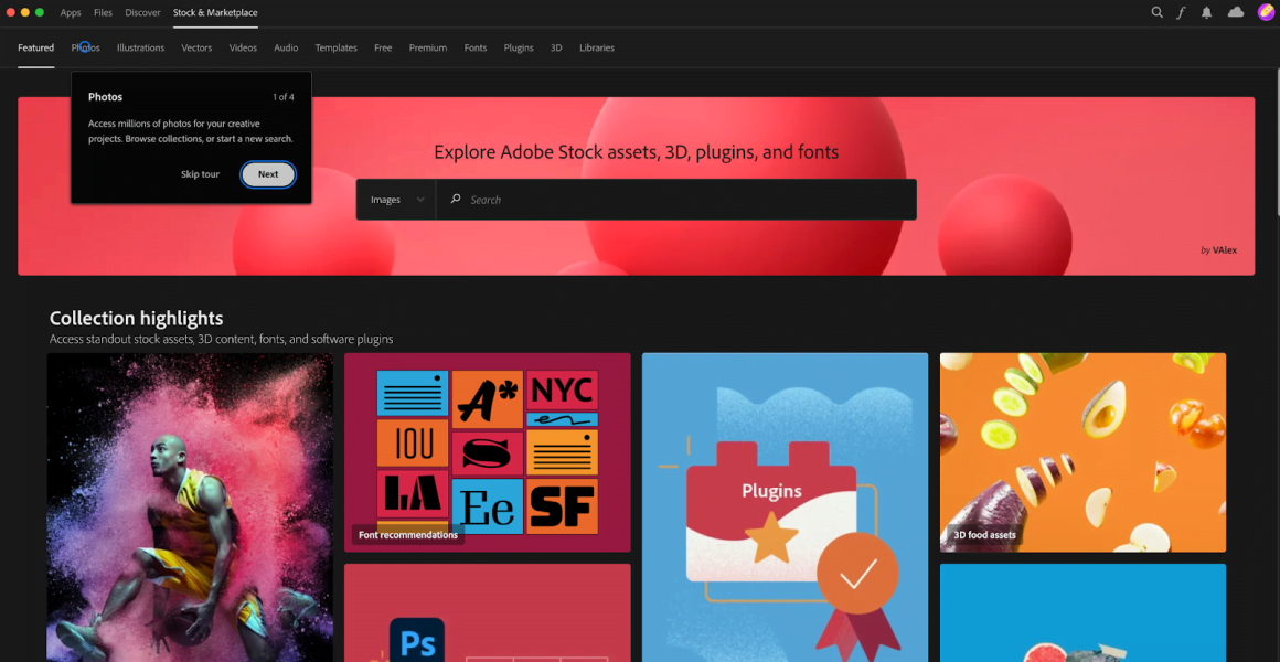
Check out how Adobe Creative Cloud uses the same font around the page, including the onboarding tooltip.
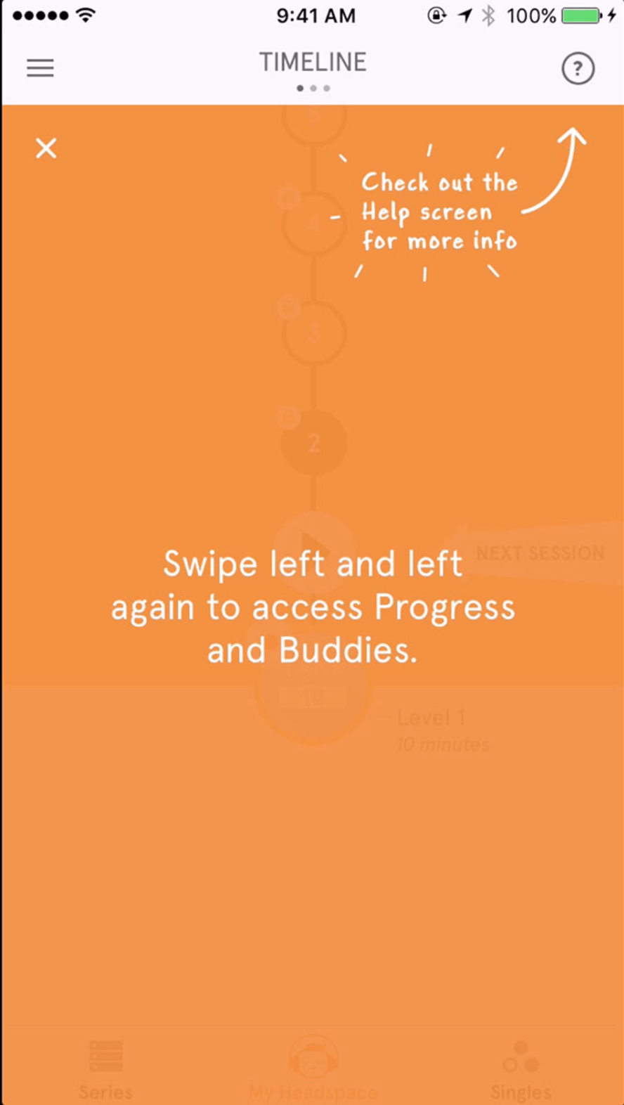
Headspace uses two different fonts in its visual design of the onboarding guides, but they are not discordant. While the one in the center is more like a typed text, the one on the corner is a more playful handwriting font. Both offer something different on the onboarding page, so this distinction makes you realize that.
Step 6: Align all the elements and set the paddings (including the text)
Alignment is another important rule of the visual hierarchy. According to that rule, the elements aligned with each other are easier to follow.
Paddings function as the margins of the text you put into an element. So they should be equal to each other and with the right ratio.
Check out the paddings and alignment of the modal used by Vidyard:
Step 7: Button Shape
Well, we come to a bit of a tricky step.
That’s because several types of buttons are used in UX and UI design. But most of the time, onboarding designs are made with the following types:
- Solid Buttons
- Line & Ghost Buttons
- Rounded Buttons
For example, while rounded buttons go well with grid designs, solid buttons are the most commonly used ones.
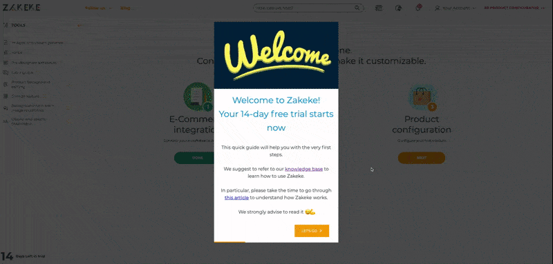
In Zakeke’s user onboarding design, it works well. For the modals and tooltips with sharp corners, they use solid buttons, but on the main page designed with grids, they choose rounded ones.
Take your time and find which of them works best for you to make your users familiar with your product.
Step 8: Go Visual
Images are perfect garnishes for onboarding design. They are attention-grabbing and engage the user with the process.
- Photo
Using photos of people always gives secure vibes to the user in each part of their experience. And it is effective for the onboarding process as well.
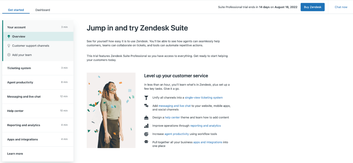
Zendesk loves using this trick from their landing page to the onboarding design.
Webflow goes with a screenshot from the user panel to explain the task better to the users. It is also a good way of using photos for onboarding.
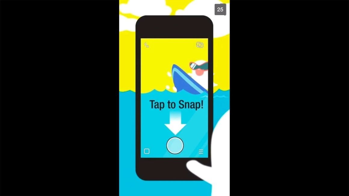
- Illustrations
Illustrations make the onboarding process much more fun and game-like.
And they look good as hell.
See how Snapchat uses them:
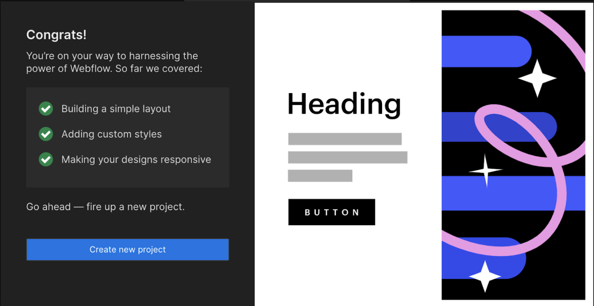
And here is Webflow’s geometrical illustration to congratulate their users:
- Animated Gifs
We all love funny gifs and use them here and there, right? They tell a lot more than words, especially in chatting apps. They do so in the onboarding process. It’s a way of communicating your appreciation with the users who completed the onboarding process or a way of encouraging them to take off that journey.
Look how it colors the onboarding elements in this example:
- Video
97% of people think that video is an effective tool to welcome and educate new customers.
So, a great strategy for user engagement is to show them a tutorial video during the customer onboarding process.
Check out this detailed article about video onboarding to come up with inspiration for your design.
And here is how Vidyard utilizes video tutorials to complete onboarding tasks.
Bonus Step: Get Rolling with UserGuiding
UserGuiding helps you with each step of designing visually pleasing onboarding materials to reduce churn rates and increase your conversion rates.
You can create your own themes to follow your branding and other design patterns to apply to several different onboarding elements.

And it saves time and energy to deal with the details of your design. For each item and step in your onboarding design, you can customize text, paddings, alignment, images, and more…
Here, you can check out how to play with several design features on UserGuiding.


In short,
Onboarding your users is as important as your product itself.
Effective user onboarding requires successful design, and a poor design might get you in trouble. So, you need to create perfect onboarding journeys in terms of user experience and user interface.
Here are the steps to consider while designing your entire onboarding process:
- Choosing your onboarding screen (modal window, product walkthrough, etc.)
- Scale the element
- Position your element
- Picking up colors
- Choosing Font and Font Size
- Align all the elements and the paddings (including the text)
- Button Shape
- Go Visual
Think of all of them both separately and all together as a whole. Remember that the goal of onboarding is to enhance the product experience for users. Then, put yourself in the shoes of your users and decide what works best for you and your users.

.png)


