


.svg)
.svg)
.svg)
.svg)
.svg)


.svg)


.svg)
.svg)

UX design is thriving.
And the reason for that is very simple;
Competition.
Nowadays, there are numerous products with similar features that solve the same problem. To get ahead in the competition, businesses try to create products that users fall in love with.
The only way to do so - offer a great UX.
When offered a good UX, customers enjoy their time with your product and they become satisfied with your business. Increased customer satisfaction means it is much easier to attract new customers, convert first-time users into regulars, and retain the existing customers.
TL;DR
- UX design is one of the top elements that can make or break your website, therefore, a good UX design is crucial.
- Good UX design involves several factors, including simplicity, usability, and visual aesthetics.
- What's great is that we're surrounded by good UX most of the time. For example, your favorite language-learning mobile application might have striking features.
- UserGuiding helps you easily create user-friendly onboarding experiences, contributing to better UX.
- UserGuiding also enables you to analyze user behavior, making it easier to improve your product's UX over time.
- This article involves good UX elements and multiple good UX design examples, so, don't forget to check them out.

In order to design products that offer great UX, you must see the best and the worst examples of UX design.
But how do we define good UX?
What does good UX look like?
If you've been in the SaaS business for a while, like we have here at UserGuiding, you probably have a keen eye for good UX.
Well, not everyone knows what's wrong when they see a problematic UX design, but at least most of us realize that there is something wrong. And that is because we recognize 3 simple elements of good design:
1- Simplicity
Perhaps the most crucial part of good UX design is simplicity.
In fact, it’s so important that simplicity often takes precedence over usability.
Why? Because if your product isn’t simple enough, users might not even stick around long enough to experience its usability.
Simplicity is the foundation—and the great thing is that tools like UserGuiding help make even the most complex products feel simple.
By providing interactive walkthroughs and onboarding guides, UserGuiding ensures users can navigate through your app with ease, reducing any confusion or frustration right from the start.
Take Zara’s home page, for instance.

Picture a clean, white background with simple black text and a search button slightly larger than the rest of the elements.
Even if you don’t frequent shopping websites, navigating this one feels effortless. That’s the power of simplicity in UX—much like how UserGuiding simplifies onboarding for users, ensuring they feel comfortable from day one.
2- Usability
Simplicity and usability often go hand in hand, but they can also be polar opposites. Just because a design is simple doesn’t necessarily mean it’s usable.
Usability is about how effectively users can achieve their goals within your product.
🚀Here’s where UserGuiding steps in again to bridge the gap. While simplicity might get users in the door, usability keeps them there.
With UserGuiding, you can add helpful tooltips, in-app guidance, and checklists to ensure that your users know exactly how to get the most out of your product—without the guesswork.
It’s like having a personal guide that turns a simple experience into a truly usable one.

3- Visual aesthetics
We’ve all been told not to judge a book by its cover, but when it comes to UX, users have no choice but to make split-second judgments.
In fact, users decide whether they like your website or app in about 50 milliseconds.
Tough crowd, right? So give them a reason to stick around.
Take the "How Far Is It To Mars?" website, for example. It has one simple function—it tells you how far Mars is.
But the way it’s designed is captivating, and even though I had no real reason to care about the distance to Mars, I stuck around just for the experience. That’s the magic of good UX design.
Creating good UX is, of course, not easy. But making sure your website/app is simple, usable, and aesthetically pleasing enough can be a good base before, during, and after the UX design process.
Let's take a look at some examples that made note of these three elements.
9 Great Examples of Good UX
1) Google keeps it simple since 1998
Google, officially founded on the 4th of September, 1998 by Larry Page and Sergey Brin, is the world's biggest search engine without a doubt.
Over 3.5 billion searches are made every day with Google, which translates to 1.2 trillion searches per year.
Also investing and researching in web-based technologies, machine translation, artificial intelligence, and various other fields, Google is a massive business that is among the top 5, if not the first tech company that comes to mind.
Their most loved and most widely-used product, however, is the subject of our article today:
Google Search Engine.
Why did Google become this successful? Solely because of their marketing campaigns or their investments in tech?
The answer is no.
Perhaps the biggest reason behind this success is what the great UX Google Search Engine offers.
It is the simplest and fastest tool ever created. It doesn't require a tutorial or a tooltip of any kind. Just type in what you want to search for and hit the Enter key, done. The product has always been like this, and it seems like it will only get easier, simpler, and faster in time.
Here is a really early version of Google Search. Does it bring back any nostalgia?

Although they have a few additional links at the bottom, the tool stays the same, fast and simple.
In over 20 years, all they have changed with Google Search was removing the additional links and making it simpler and faster.
Here's what the Google homepage looks like today:

A good UX is where you deliver on your exact promise in a simple and enjoyable way, and that's what Google has been doing all these years.
2) Grammarly's onboarding emails are a huge success
I use Grammarly a lot.
Whether it is for writing an academic document, a blog post, or a message to a customer, I just don't want to make any mistakes.
And if you ask me, Grammarly is an outstanding tool for that. It doesn't just fix your spelling mistakes; it corrects you in many other ways, such as wording, tone, etc., as it clearly tells you what you did wrong.
It's not just a spelling checker; it's a tool where you can learn grammar.
But I am not going to praise the tool itself in this article. Instead, I will focus on these interesting emails I have been receiving since I first started using the tool.
Grammarly does a great job of sending onboarding emails to its users. They don't just send premium offers and product updates; they regularly send you your stats and achievements to encourage you.
Here are the latest emails I have received from Grammarly.

I genuinely love these emails; I used to open every single one of them until they started to appear in the promotions folder.
They send genuine emails that offer value, make sure you understand your statistics, and approach their users in an extremely friendly way.
Here is an email they sent me when I switched to another computer and forgot to install Grammarly:

And here is the email they have sent me when I was on a vacation:

As you see, even a couple of carefully written emails can make your users fall in love with your brand.
UX doesn't have to be in-product, as it refers to the overall experience your business provides to your users. It can be improved via non-product methods as in Grammarly's case.
Oh, and here's all there is to know about onboarding emails.
3) LinkedIn offers one of the most useful onboarding checklists
Can you imagine how your business life would be without LinkedIn?
How could you search for jobs or hire new employees?
Well, it wouldn't be that hard when you think about it, but LinkedIn actually does make our lives much easier.
I remember taking my first step into professional life by creating my LinkedIn account. The first thing I noticed was, how the product kept suggesting to me things to do to improve my LinkedIn profile appearance and ability to use the product.
And I remember doing them all because it felt necessary and was enjoyable.
When a new user winds up inside your product with a freshly created account, you have to provide them with a sense of what they must do next. LinkedIn was successful in this instance.
Here's what your homepage looks like after you first log in to LinkedIn:

"Complete these steps to get the most out of LinkedIn"...
One can't simply ignore these to-dos after a sentence such as the one above because it is honest and right to the point: if you want to be an efficient user, you must do these!
LinkedIn also gives you some tasks on improving your public profile; here is what your profile page looks like at the beginning:

After I had completed these to-dos, I had a decent public profile and a decent knowledge of the product itself. I was fully onboard.
But don't think that's something only LinkedIn can pull.
In order to onboard your users effectively, you can integrate checklists into your onboarding process. They help guide your users through their baby steps until they reach their "Aha!" moments.
4) We all love how Facebook cares for its users
There are over 2.5 billion monthly active users on Facebook.
Each second, 5 new profiles are created.
It must be a challenging task to provide a good UX for each of those users!
But Facebook handles this like a boss. It personalizes each user's experience based on their interests and activity on Facebook, provides every user with a unique experience.
With dozens of elements depending on the user's location, language, interest, and activity; Facebook becomes your own virtual space to hang out.
Each of these features could be mentioned as a good UX, but now I would like to talk about the value Facebook gives to its users.
Facebook doesn't aim to be just a social media platform, it seeks to help its users in every way it can.
Like in this example where Facebook gives you brief information on what the weather is going to be like in your location that day:

This may look like a simple thing, but it is not. They did not have to add this feature to Facebook, it is far from necessary.
Since they value their users and the experience their users go through, they added this feature and people love it.
Here's another Facebook feature: Safety Check.

Safety Check allows you to mark yourself safe from an incident that has happened near your location, and request your Facebook friends to mark themselves free.
In such hard times where disasters happen, everyone seeks comfort by asking their friends and family if they are safe, and Facebook helps them.
Even though it might not be bringing profits to your business, providing your users with a valuable feature to improve their experience with the product is a chance to establish a bond of trust between you and your users.
5) Apple's web store is one of a kind
I was looking for an iPad the other day.
Instead of the popular websites where you can buy tech products for lower prices, I wanted to look at Apple's own web store.
Although I was just going to check the iPad section, I found myself aimlessly wandering on the website.
It was so smooth to use and offered such interesting content that I was comparing Apple Watches and checking the latest shows on Apple TV.
And what was it that made this website so tempting to me?
Its design.
First off, the site was easy to navigate. Here's how the navigation bar looks like.

Along with the names of the categories, subcategories consist of little images to offer easier navigation.
Another thing that grabbed my attention was the language they used throughout the website.
Here's an example section:

The thing about the language on the website is that they are right on point, and they are creative.
Just by reading these sentences, you can understand the value proposition of the products.
You might think this is more of a UI example rather than a UX one, but the Interface you offer to your users is also a part of the experience they go through.
Improving the design of your interface, understanding, and working on what your users would want to see is a great way to improve the UX of your product.
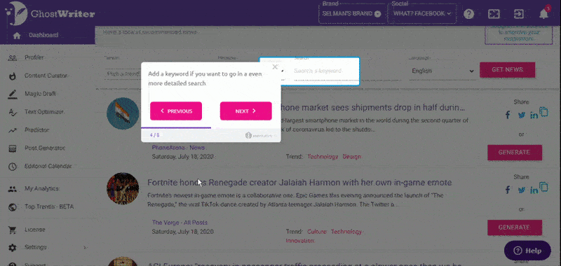
6) GhostwriterAI onboards separately for each feature
GhostwriterAI is an AI-based platform that helps content marketers identify the target audience and involve it with new highly focused content.
This one is in fact a later addition to the list. But after our success story with the CEO of GhostWriterAI, Ester Liquori, I just had to add it real quick. They have been using UserGuiding to effectively and efficiently onboard new users to their platform and boy have they done a beautiful job.
And the special thing about their onboarding is, it isn't linear.
There is a different user guide for every feature as if they were standalone products (which sometimes can feel like it). For example, this is from their Profiler tool:
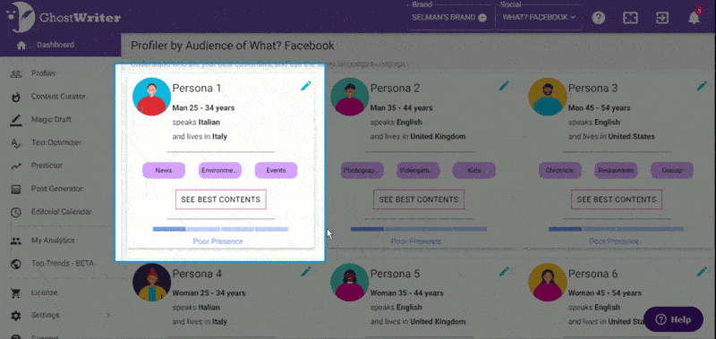
And this is from their Curator tool:
Instead of going with a long guide that jumps from feature to feature showing only the essentials and boring the users, they divided their onboarding into many parts that can be digested when needed.
Thus avoiding the loss of many users that would be confused with all the information pouring in.
I believe this is a pure effort to improve the experience of their users, saving them from minutes of torture.
Important: GhostwriterAI has achieved efficiency in their onboarding not only by dividing their onboarding but by using UserGuiding, a tool that would enable them to spend 63% less time creating and maintaining guides and achieve a completion rate of 80%.
7) Duolingo is more than a meme
We all know and love Duolingo. It was the funniest meme and from a marketing perspective, it worked wonders.
But putting the psycho owl branding aside, Duolingo knows what they are doing when it comes to UX too.
From the Website/app UX to the onboarding UX, and then to the notifications, what Duolingo does is create an experience of language learning that goes beyond a mere task by using gamification. It becomes a game.
Take a look at this onboarding UX pattern on Duolingo.


Another example of Duolingo's gamified UX is the scoring of each round you take on your course.

By equating learning to EXP and putting it all on a leaderboard, Duolingo does more than enough to get the users to use the app. And when your users are using your app like they use Duolingo, you know you have good UX.
8) Airbnb knows what you want to know
Ever since it was first founded in 2008, Airbnb has been one of the coolest websites out there, and of course, this applies to its UX too.
'Cause it only gets better and better.
When you step into Airbnb territory, the first thing that greets you is a search bar. What's special about this search bar?
Nothing. That's why it's so cool.
Airbnb keeps the search so to the point that every time I open the website I end up planning a random vacation I can't even make time for.

But for sure, the signature UX pattern of Airbnb is the side-by-side map view.
By giving the users the opportunity to view prices on a map, Airbnb provides the one thing we all have been begging for: the ability to see it all in one picture.

What's more, Airbnb also provides us with the second most needed thing on a vacation rental website: actual insight.

From the "you won't be charged yet" microcopy to the "this is a rare find" box, Airbnb puts all the information you need in one place in the most digested way so that you can actually read through them.
And that folks, is what we call good UX.
9) Spotify changed personalization forever
I said this many times and I will say it again: whoever came up with the idea of Spotify Wrapped deserves a marketing prize.
With Wrapped, daily mixes, personal release radars, and the latest addition, the blend feature that lets you match your music and get a playlist with a friend one thing is clear.
Nobody does personalization like Spotify.
And that personalization that we all crave in is what makes Spotify's UX unique.

Not just personalization but the way the app is revolving around this concept of personal music is also a great part of Spotify's user experience. By forming a loop of personalized music, they keep us on the app and we get to see what we listened to every 365.
Now that's a bargain.
Conclusion
As your audience grows and you reach more users and you enter the competition, UX becomes a crucial part of the "better product" race.
Working on your product's design, engaging with users out-of-the-app, providing valuable features, and improving the onboarding experience you provide to your users can be a great way to improve your UX.
While enhancing your UX, keep in mind that it should be:
- easy-to-use,
- visually pleasing,
- and as simple as possible.
Take a look at how the best of the best create their UX and get to work!
Frequently Asked Questions
What is UX?
User Experience (UX) is the thoughts and emotions of a customer when using a particular product.
Why is having a good UX important?
A good UX means your customers are satisfied with what you offer. When your customers are satisfied, you are likely to experience growth.
Is it possible to have good UX without a good UI?
Yes, you can have a good UX without a decent UI but to have the perfect UX, a great UI is also important.

.png)


