

.svg)


.svg)
.svg)
.svg)
.svg)


Web tooltips are the equivalent of tour guides.
Guided tours of ancient cities like Ephesus and Aspendos elevate your travel experience significantly, transforming ordinary stones into captivating stories.
Similarly, using a SaaS product with tooltips offers a comparable enhancement, providing valuable insights and seamless guidance during your digital journey.
Of course, visitors can guess where people gathered for theatres or where they bathed and slept by themselves, just wandering around.
But how about the hidden passages and secret chambers??
What I'm saying is that yes, your lucky users can find out what they can do with which features in time.
But the critical question here is:
Can they find the right features at the right time, before they churn?
Well, with simple tooltips, they can.
Wondering how, where, and when to use tooltips?
Here I present:
The Complete Guide to Master Web Tooltips + Real-Life Examples
To begin our journey into the world of tooltips and explore their useful tips and tricks, it's essential first to understand what they are, how do they look, and what do they achieve.
So, let’s start with the tooltip 101!
TL;DR
- A website tooltip is a small UI element that provides information about another UI element.
- There are various types of website tooltips that have various purposes and use cases.
- Some of these use cases can be listed as follows: product onboarding, feature explanation, feature announcement, error reporting, and discount offerings.
- 4 factors that affect the quality and success of a tooltip: placement, design, interactivity level, and the microcopy within the tooltip.
- In order to design and develop tooltips, you can use 3rd party no-code tools, code libraries & templates, as well as programming languages such as javascript, CSS, and HTML.
What Is a Web Tooltip?
A web tooltip, basically a small pop-up box, is a helpful UI feature used to provide users with additional information or context when they interact with various elements such as buttons and links. A web tooltip appears either when a user clicks on a certain UI element or hovers their mouse pointer over it. By offering concise yet informative details, tooltips enhance the user experience, guiding users and clarifying the purpose or function of different UI components.
🛎️ For example, on Mac, tooltips show the title of the webpage when you hover over an active tab, making it easier to navigate when you have many tabs open.
Similarly, web tooltips are activated when a user clicks on/hovers over a certain button, icon, or link on a website or web platform; and they aim to improve the user journey and provide guidance when it's needed.
🛎️ Here's a web tooltip example from Upwork:
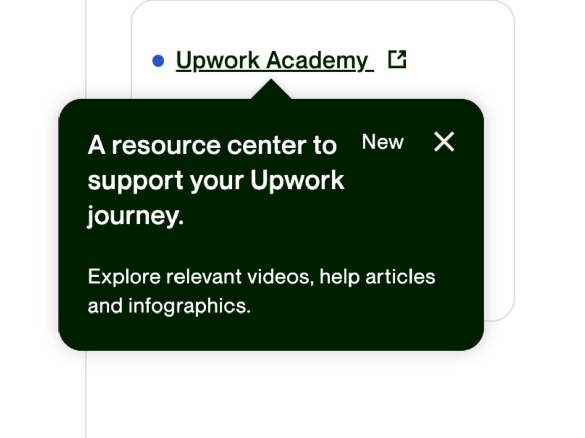
Basically, it's an in-app message that points out a UI element and provides information as well as context about it.
And generally, it looks like this:
What's the role of a tooltip on a website?
When it comes to tooltips, the sky is the limit, really.
Yet, here are the most common use cases of them 👇
✅ Product Tours and Walkthroughs -A.k.a. User Onboarding
As you can remember from my tour guide metaphor, one of the most common duties of tooltips is to introduce first-time users to the UI and provide feature explanations.
User onboarding tooltips ensure interactive and contextual learning for the users; thus, they reduce the learning curve. Also, as they provide short information and guidance within the product, they DO NOT tire or overwhelm the users.
Long product documentation and how-to articles can be pretty annoying and incomprehensible, to be honest 🤯
✅ Feature Explanations and Informational Support
Another popular use case of tooltips is providing an additional explanation for product features. If you offer various services or your product has so many features, it's best to tell which one does what so that your users won't miss anything that can be useful to them.
Let's see some examples:
🛎️ Google uses a contextual tooltip to inform the user when the energy-saver mode is activated 👇
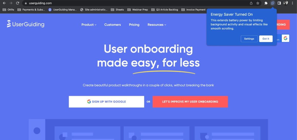
The tooltip not only informs the user about the feature but also lets them change their settings regarding this feature with an interactive element.
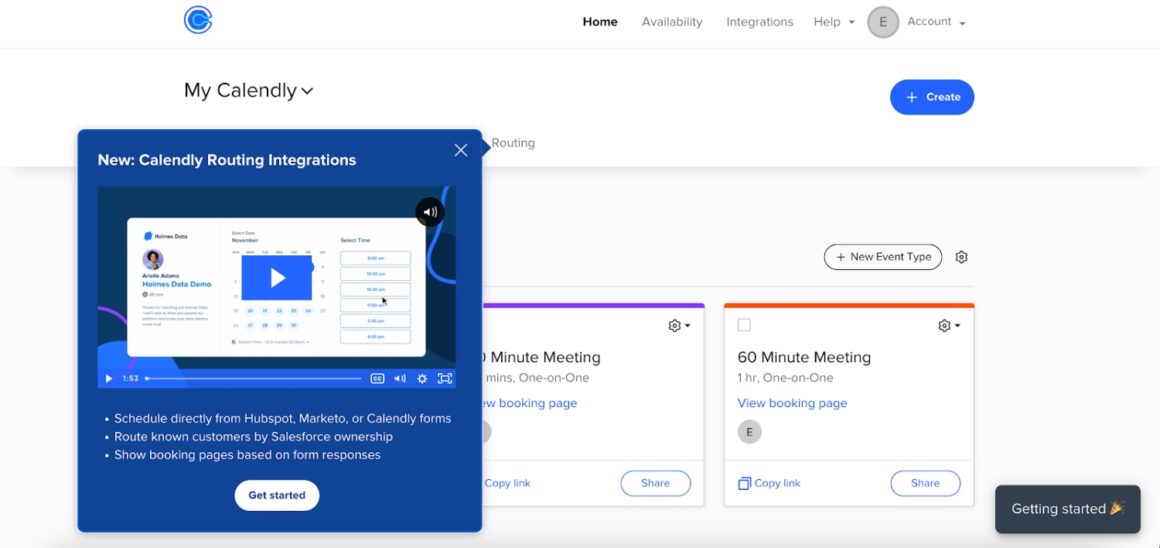
🛎️ Similarly, Kajabi, a SaaS platform for digital content creators and sellers, provide industry insights within their tooltip box:
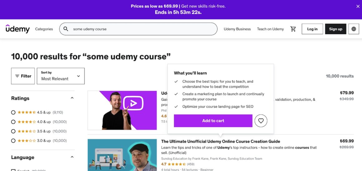
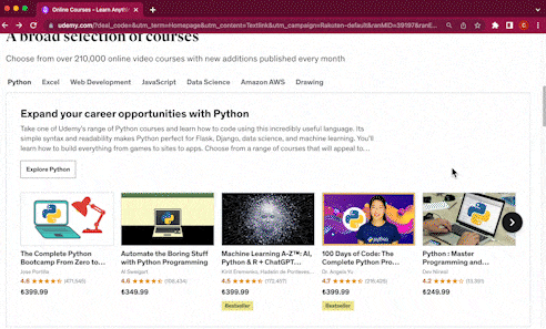
🛎️ Or, if you're an educational platform with lots and lots of courses Like Udemy, you can use tooltips as tl;dr boxes for the courses!
✅ New Feature Announcements and In-App Messaging
There are updates you can announce with big, full-screen messages and hotspots, and there are updates that really do not need such a big fuss.
It's best to keep the expectations at a normal level, right?
If you add a new emoji to your already-existing emoji reaction feature, you might consider going with a simpler tooltip rather than a bigger announcement model.
🛎️ Like LinkedIn does with this feature announcement tooltip:

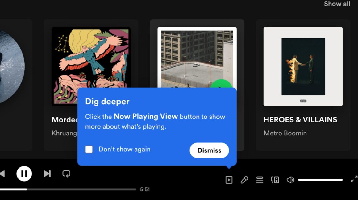
🛎️ Or Spotify with the "now playing view" button announcement👇
✅ Offering Discounts, Add-ons, etc.
I believe you have started to understand that the tooltip element can be anything you want it to be.
You can create custom tooltips for any UI element, for almost any purpose.
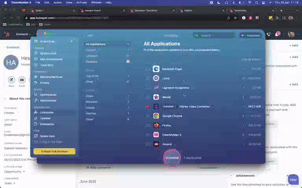
For example, MacPaw, a software company that develops apps for Mac users, positions its tooltip arrow right over the quit icon and offers a discount to the user.
What makes a good tooltip?
You probably encountered really bad tooltip examples.
I did. Many times.
You found the tooltip design eye-straining and boring. You tried to block a persistent tooltip that comes over and over again, every time you open the app. Or, you couldn't click on a button because of a tooltip that wasn't positioned according to the placement principles, at least once in your life.
So we all know what makes a bad tooltip.
And here's what makes a good one 🤩
Placement
Well-placed tooltips DO NOT spread over the whole screen and block important buttons and icons on the user interface.
You want to improve user experience with tooltips, not hinder them.
⚠️ Although Udemy's course overview tooltip serves as a good use case, in practice, it can be a little buggy and annoying because the tooltips block the course located just next to the one it provides information about:
Visually Consistent Design
Well-designed tooltips = A good brand image.
You should keep the colors, font, shape, and transition animations of your tooltips consistent with the rest of the product design.
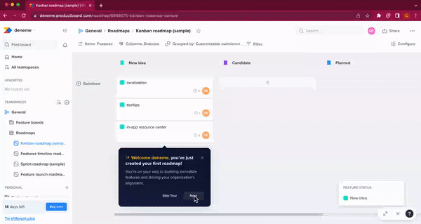
🛎️ Look how Productboard uses a color palette that doesn't tire the eye and the same font it uses across the web platform for its onboarding tooltips:
Clear and Concise Microcopy With Value
A good tooltip should include an informative message, not an unnecessary one.
But also, this message shouldn't be vital for the user to complete a task, as tooltips might go unnoticed.
The language of the microcopy should be clear, and the main point it conveys should deliver value to the user.
🛎️ Here's a bad example from Windows:
Not really helpful, I believe.
🛎️ And here's a good one from Facebook:

Although the beauty of the design is open to debate, the microcopy in the tooltips is clear, understandable, and informative.
User-Friendly Interaction
The effective tooltips generally consist of active elements -a.k.a. interactive elements-, such as CTA buttons and clickable links.
As the space is limited and valuable, it's important to use it effectively.
You don't need to provide in-depth explanations in your tooltips, as the name suggests itself too; they're just little tips at the end.
But if you believe there is more to learn about certain product features and their use cases, you can always forward the user to your knowledge base for further reading by adding links to related articles/videos.
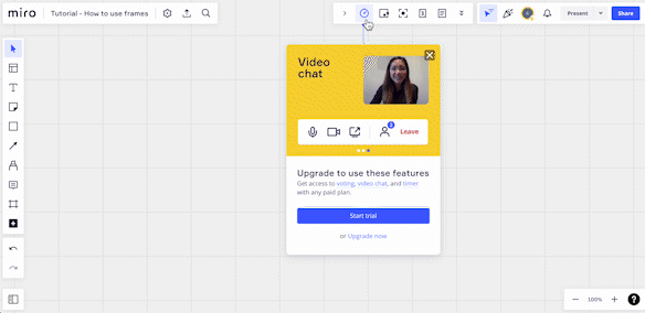
🛎️ Here's how Miro uses its limited space to inform the users about additional features and keeps the details as well as additional content in the clickable links positioned on the feature names.
6 Tooltip Examples
Now that we know how and when to use tooltips, we can move forward.
Cool. Perfect.
It's time to examine a few more examples in detail and see which companies offer a golden standard for tooltips and which ones still need to work on their design and other aspects.
Shall we?
Upwork: Feature Explanation
There are many factors people consider while applying for a freelance job on Upwork.
Project language, client's time zone...
But for a newbie freelancer, the process might be confusing with all these nuances.
Luckily, Upwork adds little tooltips for the filters and terms that can go unnoticed to prevent some of the common mistakes first-time users might make.
Here's how it looks:
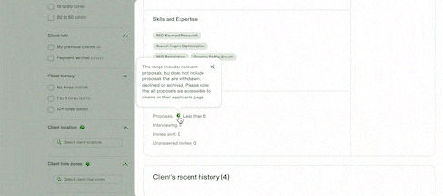
Key Takeaways
✅ Upwork uses hover tooltips, preventing unnecessary crowds in the UI and eye-strain.
✅ The tooltips on the client location and time zone do not block any important buttons or text boxes.
✅ They're aware of the space constraints!! Clear and informative copy.
❌ They're traditional tooltips with nothing exciting or new. The design could be better.
❌ The white space usage is not ideal. The copy might be hard to focus on and read for some.
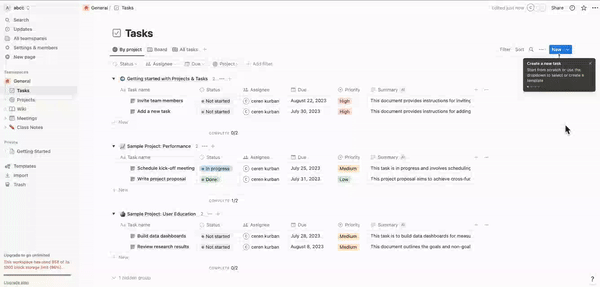
Notion: Feature Guide
You probably saw Notion's onboarding checklist somewhere, even though you yourself haven't used the tool maybe. It uses the white space just fine, with a few emojis, definitions, additional video content, and clickable links to help articles.
Not an all-inclusive product tour with fully interactive elements, yet it works well.
But what I want to show you today is the way they help their users complete little tasks within the app, such as creating a task.
Key Takeaways
✅ They use contrasting colors to draw attention.
✅ There are little titles for every individual tooltip, even though the texts are not long.
✅ There isn't any unnecessary word within the tooltips. They're edited carefully.
✅ The tooltips are interactive, allowing users to try the processes in real-time.
✅ There's a quit icon AND a progress bar.
❌ The tooltips might be small and hard to read for some users.
Indicata: New Feature Announcement
Indicata, an Autorola Group platform, offers car deals in 13 different markets in 11 different languages. This means catering to thousands of users from diverse backgrounds with varying levels of tech proficiency.
It's hard.
It's hard to ensure a fantastic customer experience for all of these people. There's the whole education part, the support part, the announcement part...
Can you guess how Indicata pulls it off? Yes, with in-app onboarding and TOOLTIPS!!
Here's an example feature announcement modal:
Key Takeaways
✅ A neat and eye-catching heading.
✅ They DO NOT explain everything in a small space and confuse users, as it is a feature with a lot of details.
✅ Instead, they offer an explanatory video.
✅ There's a CTA button that invites users to an interactive guide.
❌ Nothing. 10/10. A very successful tooltip usage.
⚡⚡ Indicata achieved a 47% feature adoption rate upon adopting in-app onboarding strategies. Check out their success story.
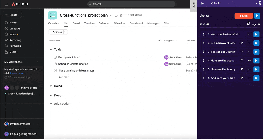
Smartcat: An Extensive Product Walkthrough
Smartcat is not only a cloud-based translation and localization tool but also a platform that connects translators and businesses -a.k.a. a marketplace for translators.
It has a lot of features and pages.
Many great translators got lost within the platform while trying to add a termbase for a project...
But it was before the company adopted onboarding solutions, ofc.
Here I present the new Smartcat:
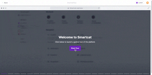
Key Takeaways
✅ They use the brand color, a bold purple, and create contrast with the white background.
✅ They explain every important button and box in the UI, preventing any future confusion.
✅ They use transition tooltips, too. I think it helps the user to keep their focus without scaring them with too much information.
✅ There's a progress bar motivating users to continue and finish the tour.
❌ It's a very long walkthrough; some users might feel overwhelmed.
❌ Although the tour is kinda interactive, the user doesn't really complete the tasks simultaneously, which might not be an effective way of learning for every user.
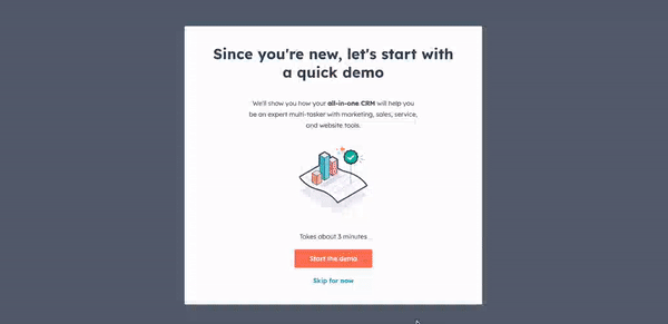
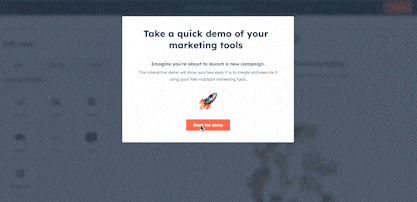
HubSpot: Interactive and Personalized Product Tour
HubSpot is a magical software that can be used by marketers, sales reps, content managers, and customer service people.
Okay, not magical, maybe, but very comprehensive and versatile, for sure.
And that makes it... Complex.
That's why HubSpot doesn't settle for one rather general product tour but also offers personalized tours around your marketing or sales hubs, too.
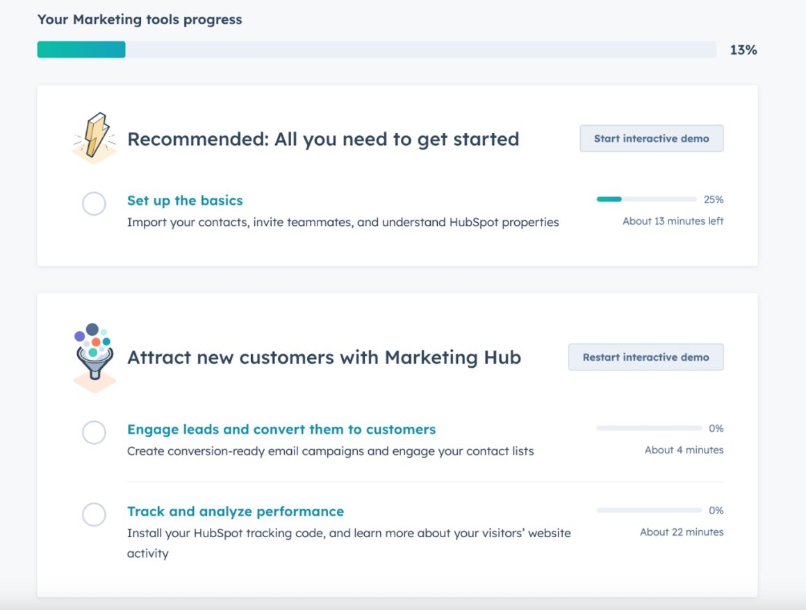
👉 Here's the general tour, presented to every user regardless of their use case:
👉 And here are the other tours presented to marketing people for providing additional context:
Key Takeaways
✅ They use their brand colors, too, like Smartcat, creating contrast with the white background and ensuring an easier reading experience.
✅ There are titles that summarize the main point in every single tooltip.
✅ They divide the long information into paragraphs and improve readability.
✅ The microcopies in the tooltips are very informative; some of them include links to additional articles.
✅ They show how many tooltips are completed and how many of them remain.
✅ They provide an estimated time to finish each tour.
❌ Tours are long.
❌ There is too much information in some of the tooltips. It might discourage some users from continuing with the other tours.
Google Analytics: User Onboarding
Let's come to terms with one topic: Analytics tools are hard to use.
Even the most user-friendly ones like Google Analytics.
Because analytics is hard.
Thankfully Google puts some effort into educating users and provides tooltips to their users during the onboarding process.
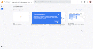
Key Takeaways
✅ They use the space efficiently, incorporating paragraphs when necessary.
✅ The copy is clear and easy to understand.
✅ For longer explanations, they forward users to help articles outside of the product.
❌ It has a pretty minimal design, without any image, video or emoji, which might be boring and ordinary for some.
Creating a Tooltip in 6 Steps
After talking about the use cases of tooltips and analyzing various real-life examples in detail, I believe now you're ready to take the next step:
Creating them!
Depending on your expectations, needs -and budget, of course-, the process can be short and easy, or a little bit complex and time-consuming.
But don't worry, I'll walk you through each step and help you make educated decisions.
Let's go 🏃♀️🏃♀️
Finding the Right Development Source
The first decision you need to make, and maybe the most important one, is to choose the most suitable development method for your company and product. Because that will also establish some standards and limits for your tooltips.
Here are some questions you should ask yourself:
💭 Do you have a developer team that can allocate enough time to develop tooltips and update them when necessary?
💭 Will you need to update your tooltips and/or develop new tooltips regularly?
💭 Do you want interactive and complex tooltips that look more professional, and fit your brand image?
💭 Do you want to offer a holistic onboarding experience with a wide range of interactive content, or do you only need a few tooltips?
💭 How much budget can you allocate for this project?
Depending on your answers, there are 3 paths in front of you:
1) 3rd Party No-Code Tools, Like UserGuiding
If you don't have a developer team that can handle the job, or simply you don't want to put more work and responsibility on their shoulders, you can go with no-code onboarding tools like UserGuiding.
With UserGuiding, anyone can design and create code-free tooltips in a matter of minutes!
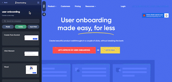
🚀 You can create from scratch or choose among the tooltip modals.
🚀 You can add videos, images, gifs, and links to your tooltips. Who says tooltips have to be either boring or hard to design!
🚀 You can adjust the design (color, size, box style, backdrop shadow, etc.) in accordance with your brand style.
🚀 You can decide on the tooltip triggering method (mouse hover or click).
🚀 You can easily change advanced settings such as timing and step skipping.
Here's an example:
2) 3rd Party Libraries & Code Templates
Continuing with a little bit more complex but cheaper solution: Bootstrap, a code library that offers pre-made templates for front-end developers.
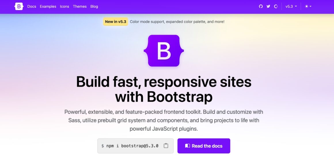
Bootstrap offers a wide range of tooltip designs, though they don't really look like designs until you embed the code within your product if you ask me.
⚠️ As you can see, it requires some technical knowledge. Yet, if you're familiar with the programming languages and processes, I believe you can handle it, as the platform has great documentation and really helpful explanations.
3) In-House Solutions -A.k.a. Your Developers
It is time to elevate the complexity levels and continue with the solutions that demand a higher degree of technical expertise.
If you have sufficient time and financial resources and declare, "I want every aspect to be meticulously embedded into my product's source code, and I am prepared to hire as many people as required for this task," then you better start expanding your developer team.
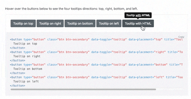
There are a few languages you can use to create native tooltips:
👉 Javascript
👉 HTML
👉 CSS
⚠️ With this method, every time you release a lot of feature and/or UI updates, you will need to change and adjust the code, which requires a lot of time and money. Also, this way, your tooltips will be more prone to errors and bugs.
The decision is yours 👀
Positioning the Tooltip
Ever since the beginning of the article, I've been stressing the importance of ideal placement.
Whether you use a simple standalone tooltip to provide context to a recently released feature or use a series of advanced tooltips that walk the user through different pages and dashboards, you cannot throw any tooltip onto the UI without considering its positioning.
Does it refer to the right button?
Does it block an important UI element, such as text boxes, back button, next button, etc.?
Do any of the tooltips clash with each other?
Questions... Questions...
If you opt for the D.I.Y. approach, you will learn through the trial-and-error method.
Well, if you opt for the no-code tools, then you can easily control all these aspects while designing.
Choosing the Trigger Event
There are basically 2 triggering methods for a tooltip:
➡️ You can either trigger it when the user hovers over a certain area with their mouse.
➡️ Or, you can trigger it when they click on a certain UI element.
⚠️ It is essential to ensure that there aren't too many buttons or features clustered in a single area when using the hovering-over method. Otherwise, users might struggle to discern which specific feature or button is being referred to.
Also, if there are multiple tooltips located close to each other, hovering over the area may cause the tooltips to appear simultaneously.
In these cases, it's best to go with the "click on" tooltips.
Designing the Tooltip
There are a few things you should keep in your mind during the design process:
➡️ Display size
➡️ The color of the tooltip
➡️ White space usage
➡️ Darkening the background color and focusing on a single UI element
👉 It's important that your tooltip design suits the overall product design so that it doesn't look unprofessional and tarnishes your brand image.
Here are a few things to consider:
Does your product have a minimalist and modern design?
What colors do you use across your product UI and company websites?
How's your relationship with your customers? Formal, friendly? Will you use gifs and emojis?
Writing the Tooltip Content
And, finally, my favorite part: writing the actual tip ✍️
Have you noticed how there are so many things to consider, and so many decisions to make while creating these little boxes of tips? 🤔🤔
Just like life...
Anyway, it's best to continue with the tooltip content.
Here are the DOs and DON'Ts of microcopy writing:
✅ Keep it short and understandable. Users don't like doing research for tooltip explanations, as they should be explanatory themselves.
✅ Forward the user to help articles via clickable links when necessary.
✅ Make use of formats: divide the information into paragraphs, use titles, italics, and bold to increase the readability of your copy.
✅ Provide value and context to users.
✅ Add images, gifs, and videos instead of long explanations.
❌ Don't overwhelm users with a lot of information jammed in a small box.
❌ Don't explain universal buttons and icons, such as save, quit, help, etc.
❌ Don't hide vital information behind tooltips, as they might go unnoticed.
Debugging & Testing
It's time for the final tests, yay 🥳🥳
There are various methods available to ensure tooltips work properly. You can examine the source code, use additional software for debugging, or implement the tooltips live on your website to test their functionality.
However, if you opted for no-code tools, like UserGuiding, you can go and have a cup of tea, as you would have already previewed how the tooltips appear during the design phase. ☕☕
Ah, the convenience of no-code tools...
In Short...
Do tooltips still offer value? Yes. Robust tooltips improve UX greatly.
(Didn't I tell you they are like tour guides?)
Are they easy to design and implement? With this guide, hell yeah! You can get started with them like... NOW.
And you know what, I'll not keep you any longer.
Go and take your first steps for the great UX your customers deserve: Create some tooltips!
Frequently Asked Questions
How do I add a tooltip to my website?
To add tooltips to your website, you can use no-code tools like UserGuiding and Chameleon, leverage code templates and libraries, or custom code using JavaScript, CSS, or HTML. Each method offers different levels of ease and customization to suit your needs.
What are tooltips good for?
Tooltips play a crucial role in product onboarding, assisting new users in navigating the platform and understanding its features. They provide context, educate users on how to use specific functionalities effectively, and enable companies to make feature announcements. Overall, tooltips contribute to enhancing the UX and promoting feature adoption.
.png)


.svg)
