


.svg)
.svg)
.svg)
.svg)
.svg)


.svg)


.svg)
.svg)


No matter what you say, what you say is (worths) as much as the other person understands.
Rumi
I love how Rumi puts it forward perfectly.
Sometimes, you may think that you come up with the best ideas, yet when explaining them to others, it may not sound exactly how you think in your mind.
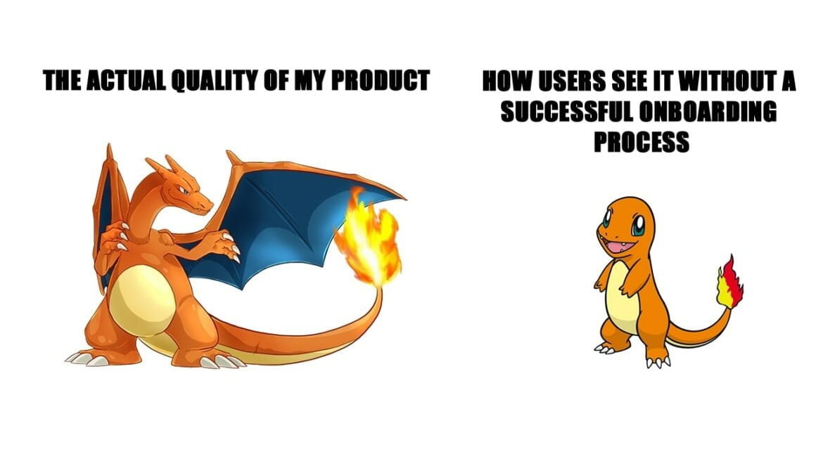
The situation is no different for your product.
No matter how good your product is, it is as much as the user understands and makes use of it.
Product teams put a lot of effort and time into their beloved and quality products. However, without a successful user onboarding, there is a high chance that you will not get what you expect from the product back.
If you want to enjoy the fruits of the efforts that you put into your product, you should take one further step to get to excellence, that is, helping users adopt your product with a successful user onboarding process.
Research by Salesforce suggests that %80 of customers consider the experience a company provides is as important as the quality of its products and services.
Although there is no single way of achieving successful user onboarding, I will share with you some key elements and examples to give you ideas that you can relate to your own user base and product.
Hopefully, this article will help you implement those ideas to your user onboarding process and unleash the potential of your product.
What is User Onboarding?
User onboarding is the process of helping users efficiently learn how to use your product or service. It is an ever-ongoing process that begins with the first interaction of users with your product. When you guide users to find value in your product and learn how to make use of it to the maximum extent, you can increase product adoption and customer retention in a significant way.
It is one of your ultimate responsibilities to provide an excellent user onboarding experience

User onboarding can be processed by using various methods such as interactive guides, video guides, in-app messages, and e-mails, etc.
With the help of a combination of these elements, you help your users understand and learn using your product in an efficient way.
If I am to explain it in its purest form, I should say that:
Starting from users’ first interaction with your product, your goal is to guide users to their “Aha!” moments.
Why is User Onboarding important?
It has a simple answer:
First-time user experience decides if a user’s journey will continue with your product or not. It is thanks to user onboarding that you give an ever-lasting good first impression to users.
Here is a striking statistic:
%80 of users deleted an app because they didn’t know how to use it.

I said it earlier, and I want to emphasize again, it doesn’t matter how successful your product is unless you cannot get users past by the initial learning process.
Your product adoption rates will skyrocket once you learn how you implement user onboarding best practices to users’ journeys.
Another important point in providing a successful user onboarding is that,
If you want to distinguish yourself from your competitors, your users should feel that their needs and expectations are being taken care of.
This is simply because %66 of customers expect businesses to understand their needs and expectations; however, %66 say they are usually treated like numbers.
By providing a complete and personalized user onboarding experience, you can make users feel that you make empathy with them and shine among your competitors.
What makes a user onboarding good - the key elements
You should know that best user onboarding practices are chosen in accordance with your users’ needs and expectations.
You need to personalize and adjust your onboarding process to who your users are.
However, there are some DOs that you should consider including in your user onboarding process.
#1 A good time to value
What does “a good time to value” mean?
It refers to the amount of time that it takes users to find value in your product.
In other words, users invest their time into your product, and the success of their investment is calculated with respect to the effectiveness that your product can provide in exchange for the time that users invest.
Your goal should be to decrease the amount of time that users find value in your product in their initial interaction with it.
Let’s look at Bitly for a perfect example:
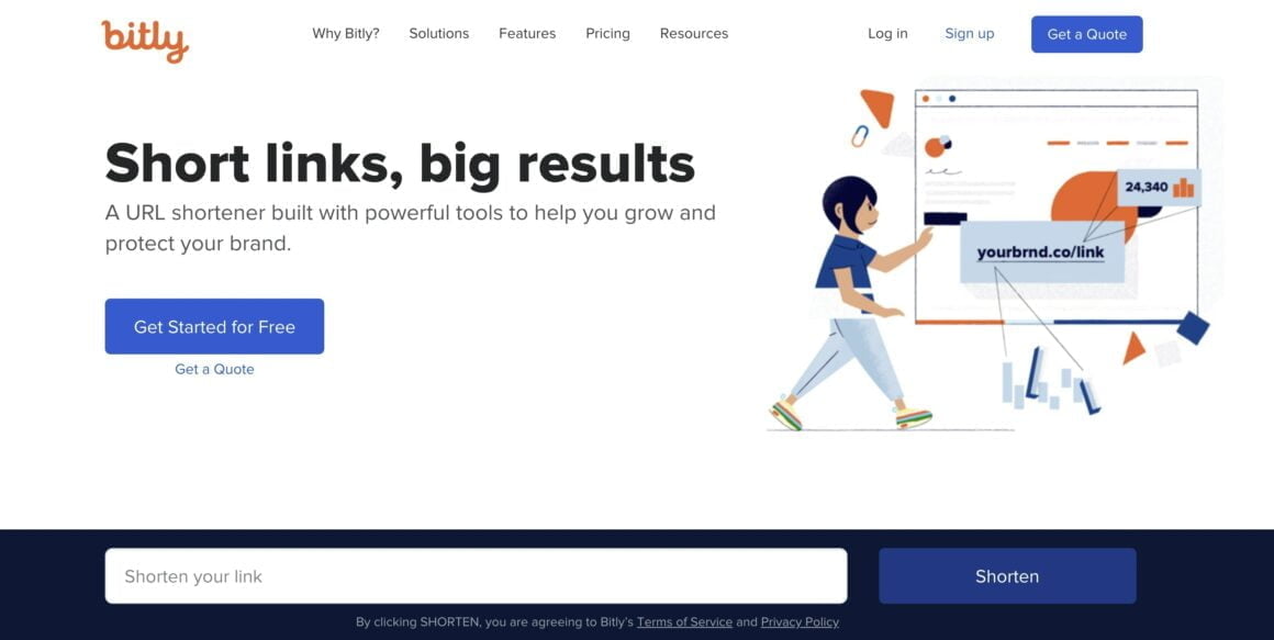
You can see that users can immediately find value in their first interaction with Bitly and shorten their links.
If they like to benefit further from the product, they can also upgrade their membership.
You should always keep in mind that users’ time is one of the most important things that you can take from them.
If you fail to provide something beneficial to users in exchange for the amount of time you take from them, then it is highly unlikely that you retain those users.
#2 Being direct and clear
Efficiency is the keyword when it comes to successful user onboarding.
Users would appreciate plain and clear language instead of complicated long texts that overwhelm users with too much information.
You should be able to explain what users should expect in each of the features of your product.
Here is a good example of direct and clear language from Canva:

You can see that the language is straightforward and clear. It is as simple as saying, “Rearrange your pages.”
Simple as that! Just three words…
And below those three words, they briefly describe how users can actually do it.
This is what I mean when I say efficiency!
#3 Assisting instead of merely informing
Throwing long informative texts in front of your users to let them learn about your product is one of the worst things you can do.
I am telling you right now,
Users, most of the time, will ignore those and fail to learn and adopt your product.
This is why I believe interactive, and video guides are the best way to assist and help users learn using your product.
Personally, I believe that interactive guides are much better in helping users learn because it requires users to take action and actually practice how they can use your product.
This is why I think interactive guides are a must in a successful user onboarding process.
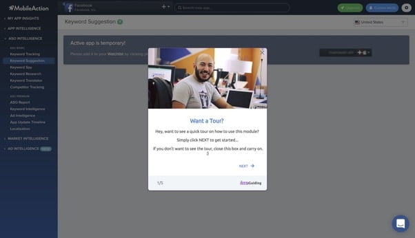
Let’s look at an interactive guide created with UserGuiding for GhostwriterAI so that you can visualize what I mean by assisting users:

Let’s say your users wanted to take the product tour; you should be able to assist them with interactive guides through any feature of your product.
These types of guides will help users remember what they can do with your product and how they can actually do it.
#4 Personalization
You should tailor onboarding to the individual needs and expectations of your users.
This helps them better relate to your business and product; therefore, it increases product adoption and customer retention.
58% of smartphone users feel more favorable toward companies that remember who they are and their past behavior.
You need better targeting and segmentation to be able to personalize better your onboarding process, and third parties such as UserGuiding will help you in this.
You should also keep in mind that welcome messages are pretty effective when it comes to making users feel at home with your product.
Here is an example:
#5 Collecting feedback in the right way
Getting feedback is crucial for many reasons, from helping increase product adoption, customer retention, and of course, learning about your weaknesses and strengths to improve your product and service.
It is a vital part of user onboarding because you hear what users like and dislike about your product or service firsthand.
It is for this reason that you should collect feedback after users interact with your product.
Please hear this out! There is a fine line between showing users that you care about their opinions and overwhelming them with too many questions to collecting feedback.
You should make users realize that you need feedback from them in order to improve your product or service.
So, you should be able to collect feedback with as few questions as possible, and you should not ask for too much.
Skype helps me show you exactly what I mean:
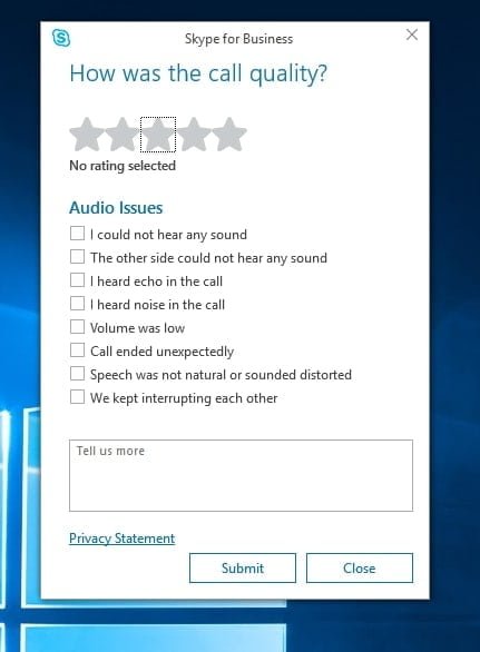
You can see that they include nearly every possible issue that users can face when using Skype.
Yet, it is still up to users to give further feedback.
What’s the take from what I have just explained?
- Deliver instant value to users.
- Briefly explain what value users can find and how they can find it.
- Do not simply put information out there, instead, assist them in how to make use of the information.
- Segment users and personalize the process for them.
- Collect feedback in the right way so that you know what you do good and what you can do better.
Conclusion
User onboarding should be processed taking your product and your users into account. As I said, there is no single way of onboarding users, yet I shared with you user onboarding best practices that you can integrate into your onboarding process.
It is your responsibility to tailor them to the needs and expectations of your users, and I believe you will do it with your strong dedication!
Keep in mind; your product is as successful as your users find value in it. So, the better the onboarding process, the more successful you will be.
If you want a more detailed guide about user onboarding, here is everything you need to know about user onboarding.
Frequently Asked Questions
What is an onboarding checklist?
An onboarding checklist helps you organize steps through the onboarding process. It is crucial in helping users manage their time and steps through the journey.
How long is the onboarding process?
Although people don’t refrain from giving a specific time frame for the onboarding process, I suggest that it is an ever-ongoing process.
Is Sign-up part of onboarding?
Sing-up is definitely a part of onboarding. Matter of fact, onboarding begins even before sign-up. Helping users easily download your app is also a part of onboarding.

.png)


