

.svg)


.svg)
.svg)
.svg)
.svg)


Which one would be more terrific:
🤳🏽 Losing your mobile devices.
🛂 Losing your passport.
It feels terrible to admit that mobile devices are now more important than an ID card. Mobile devices are the #1 ID authenticators now.
No wonder why every single website also has a mobile adaptation now. Mobile is outrunning PC.

I have proof.
A study has shown that 68% of website visits were from around the world made with mobile phones, while only a small 29% of them were made with desktop devices. (source)
The emphasis of this article will be on mobile devices and what a mobile tooltip should be like. We'll cover:
- Great mobile tooltip examples from the whales of the mobile world
- How tooltips should function on a mobile screen
- 6 steps to creating perfect mobile tooltips that don't fetter user experience
If you would like to learn more about the general aspects of tooltips and tooltips for desktop users, here I have the perfect source for you.
But first, let me clarify:
Do Tooltips work on mobile platforms?
Tooltips are designed to navigate the user within a platform, and increase the feature usage of unused or new ones. So, they act like maps in websites. Tooltips also provide interactive content for the user to engage with, thus, contributing to the UX (user experience).
✅ So yes, tooltips do work on mobile platforms.
The shift from desktop to mobile is quicker than the spread of the pandemic, so almost all platforms have mobile versions now.
And just like all products, they need to teach the first-time user how to get the best out of the platform.
And let's agree on this; written tutorials are outdated.
That's where tooltips come to the rescue.
Using tooltips for desktop interfaces is easier since mobile devices have limited screen space.
But that is exactly the #1 reason why you should use tooltips, to fit more information into a smaller space.
You can burry the tooltips into interactive elements, like an action button or a mouse hover.
I won't tell you how, but I will show you:
7 Examples of Smooth Mobile Tooltips
Why use words when I can use visuals?
1- Linkedin
We all know what Linkedin is, and we can rest assured that tooltips can be good for mobile if even Linkedin uses them.
The tooltip has simple yet effective that can be useful to both new users and the current community of the platform.
The placing is great, it doesn't block any other important information, and the design can be easily noticed thanks to the little arrow on the top.
Also, you can close the tooltip if you understand what to do so that it doesn't bother you anymore.
2- Google Maps
Have you ever experienced this:
🤔 You download a new game and want to shut the annoying background music.
🤔 You go into the settings, and there is only an icon of a speaker and no written info. 🔈
🤔 You click on the icon, and a line appears on it 🔇 - which usually means that it's now muted.
😓 It turns out that the game was already on mute, and the icon shows what will happen if you click it, not the current state.
So 🔈 means muted, and 🔇 means ”unmuted, click to mute.”
It happens a lot more than you think...
Back to our topic, google maps found a way to use tooltips to avoid such inconveniences.
The small tooltip that appears after you select a sound setting is simply genius.
It's tiny, it's noticeable, it's effective, it's perfect.
3- TikTok
TikTok is a popular short video publishing platform.
But did you know that you can create a TikTok video, using only one image from your gallery?
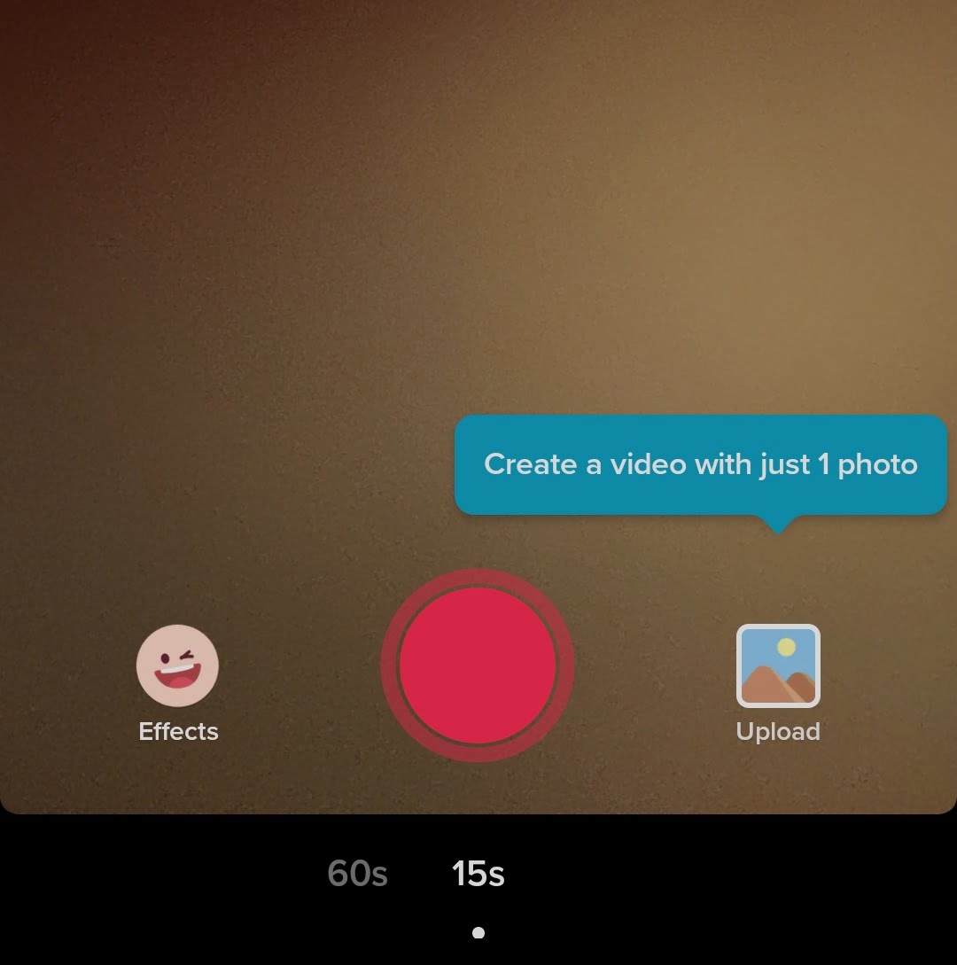
Thanks to this tooltip, now I know.
Also, this tooltip's color is enough evidence to prove that the color scheme of the tooltip must not blend into the background color.
4- Duolingo
Duolingo is a language learning app that does a lot...
So they had to fit a massive amount of information into a small screen size.
So, they put the secondary information into a tooltip that appears when you click on a course.
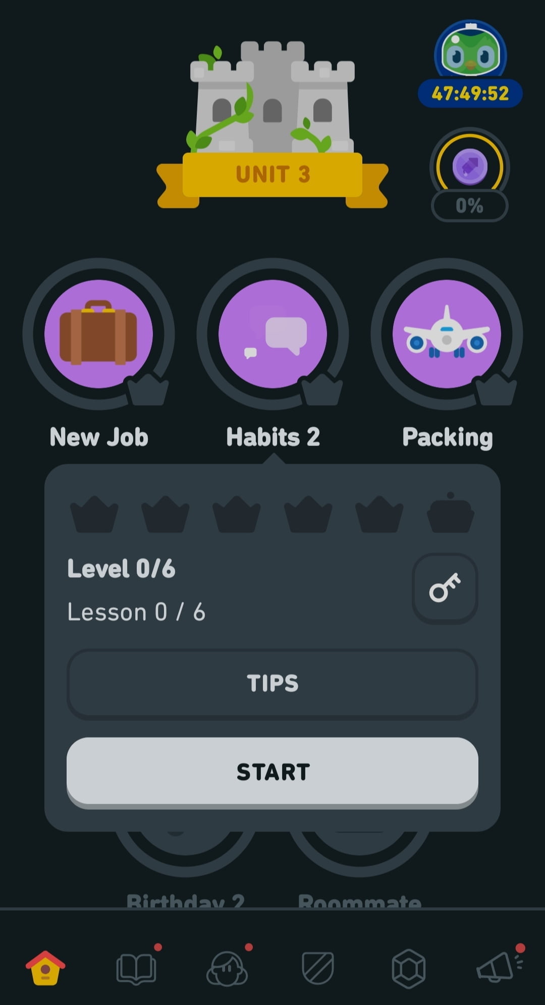
The tooltip creates a great focal point, emphasizing what the user needs to know before starting the selected course.
Also, even though the color doesn't stick out, it's lighter than the background color and can be easily noticed.
5- Binance
This example is a rather heartbreaking one for me...
Here's the tooltip that Binance shows you when it takes you too long to buy an asset.
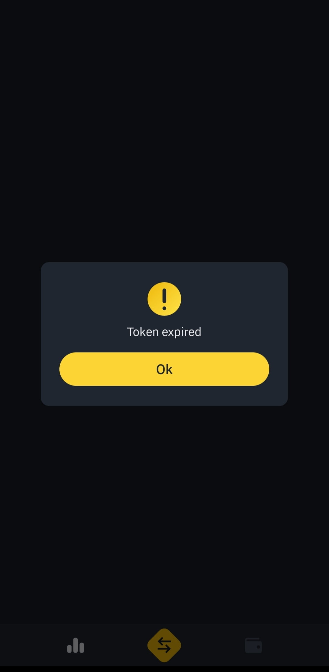
There are only three words, a visual, and a button on this report tooltip, yet it's effective.
I know that it's effective because I was trying to get the transaction done in light-speed on my second try.
P.S. : I wasn't lucky enough to get the coins for the same rate as before.
6- Sosyopix
Sosyopix is a company that prints your photographs on many things, and turns them into gift boxes for you.
And how do they announce their deals?
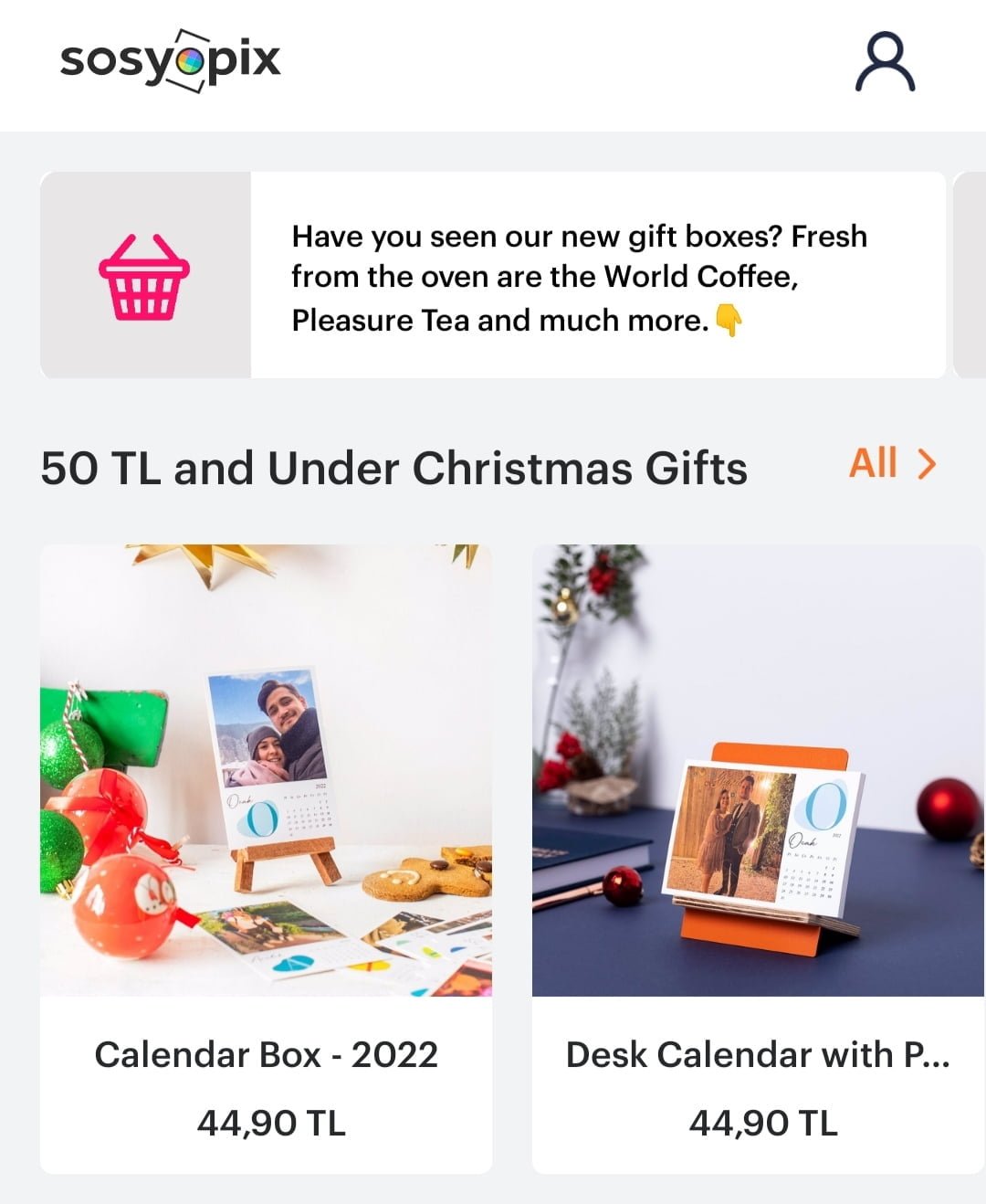
Right answer. Tooltips.
This way they don't bother users who don't want the deal while attracting those who are interested
7- Hepsiburada
Hepsiburada is the Amazon of Turkey. And what is the one thing you have to know about Amazon?
- Except for the fact that the delivery can take up to 2 months -
It is how to check out.

Amazon has a similar tooltip too? Do you remember it?
How should Tooltips function on mobile apps?
Remember, only 29% of people use desktop and 68% use their mobile phones to access information.
So what about the time people spend on each website?
That's even more tragic.
A desktop user spends an average of 351 seconds on a website while this number drops down to 160 seconds for a mobile device user. (source)
Those numbers are based on the online community of 2020, so they are pretty up-to-date and accurate.
Here's the catch:
✔️ People spend more time on mobile devices, so it's crucial for websites to have a mobile design along with their desktop design.
✔️ People become more impatient on mobile devices, so the quality and UI of the page become even more important.
Taking all this information, combining it with the examples that I provided, here are the top three most important attributes of a mobile tooltip:
1- The text should be short and clear:
You should inform the user about what they have to know. No one likes a rain of tooltips, so you had better provide helpful content within it, and keep the content short.
2- The color and placing is crucial:
You don't have a larger screen size on mobile. Along with limited conversation within the infotip, you have to make it stand out. Don't make the tooltip big, make it visible.
3- There are different types of tooltips
Tooltip contents and needs can differ from type to type. Tooltips for content hints probably don't need buttons while a report tooltip definitely does.
6 Steps to Creating a Great Tooltip on a Mobile App
So how do you make the perfect tooltips for a mobile design that will satisfy the power users?
Trust me it's not that difficult. In fact, there are only six steps you should follow:
1- Decide on the design
While deciding on the design, you should focus on three main things:
- The shape should be similar to the other interactive content on the screen. Sharped, edged, round; all work and it's totally up to you.
- The color should be noticeable, but not absurd. For example, don't put neon-colored tooltips on a pastel-colored page.
- The size should be smaller for information tooltips but larger for onboarding tooltips. If you have a larger tooltip, don't forget to blur or darken the background to make sure that the tooltip is visible.
2- Use short sentences
Some might say the text is part of the design. I say it deserves a special emphasis.
No matter how big your tooltip is, give less space to words, and let the visuals be the star if you want to make the tooltip bigger.
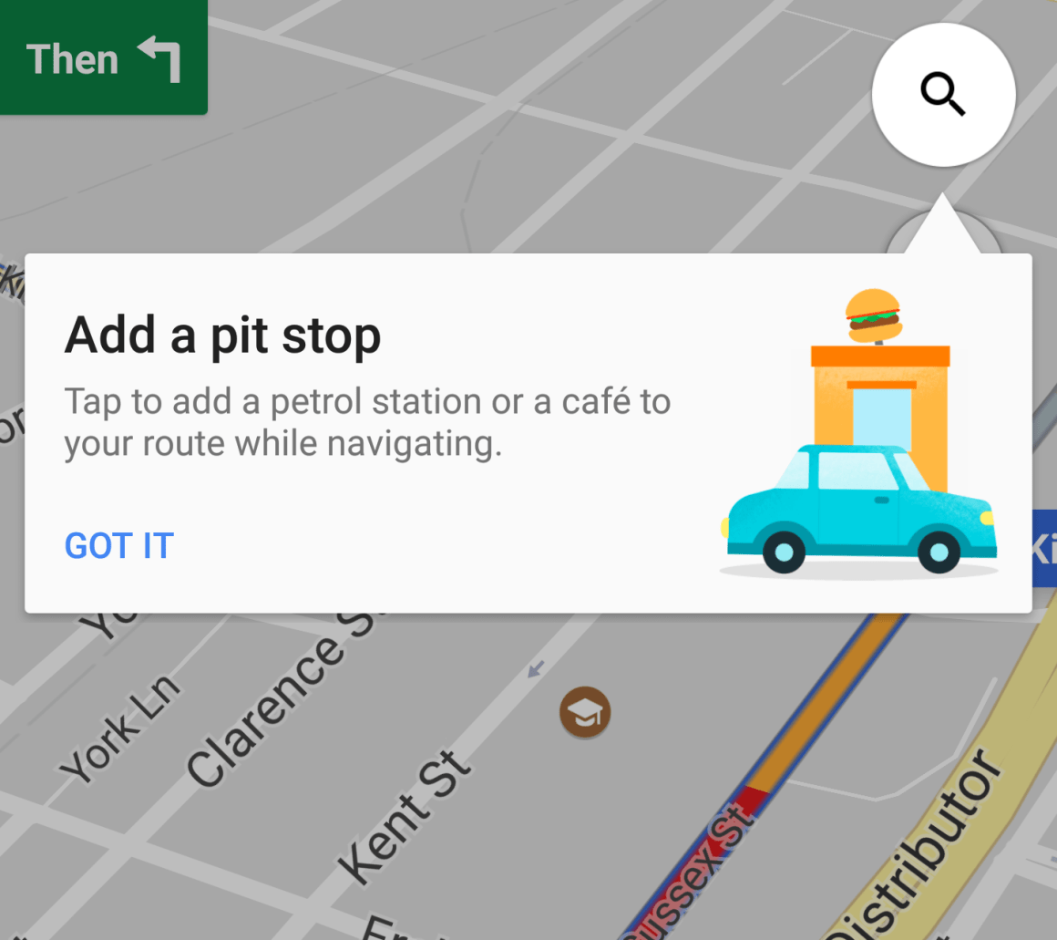
Take Google maps as an example.
✅ The text is short and precise,
✅ The visual is big and explanatory,
✅ The tooltip is big, so the background is blurred.
But there is one more thing that we can learn from this example:
3- Place the tooltip inside a button
The smaller the space, the smarter you should design it.
If you don't have enough space in a room for two kids, use a bunk bed.
If you don't have enough space on the screen to fit a big tooltip, put it into a button.
This button can be anything. It can be a keyboard hover; it can be a field label. It can be a link. In short, it can be anything that can be turned into interactive content.
4- Decide on the timing
There are three ways your tooltip to show - if it's hidden within another element:
1. It can show when the mouse comes over a mouse hover,
2. It can show when the user taps on a certain element, such as the refresh button,
3. It can be timed.
Timed tooltips show up when the user takes a certain action.
Like clicking the full-screen toggle button.
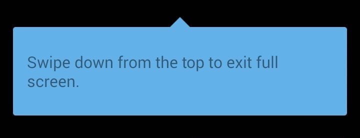
This tooltip appears when the user goes fullscreen and disappears within seconds, leaving the user in peace.
5- Add a button to your tooltip
If you can make the tooltip a part of interactive content, why shouldn't the tooltip contents be interactive themselves?
I mentioned that some tooltips disappear on their own, but some others that contain more important information should be closed manually.
For instance, if the tooltip explains the value of the key features, it should stay longer on the screen to make sure that the user experience is smooth.
Especially on onboarding tooltips.
[citizen shipper mobile tour tooltip image from the WordPress media]
See how easy it is to absorb the given information in this example?
6- Make the tooltip the only focal point
And our last step is just the cherry on the top.
If the tooltip is pointing at something, try to make that part of the screen the focal point.
If possible, darken the background of the tooltip.
👉 For instance, if you want to point out how to sort a collection of dashboards according to the dashboard themes, blur everything else that is not about the themes when the tooltip is on the screen.
Conclusion
People often forget about the necessity of a mobile form while making a product. Still, those who don't forget usually don't put much care into it.
Having mobile-friendly products is even more important than having good UX.
And one of the best ways to fit all the necessary info into such a small screen is to use tooltips.
For instance, if you have a mobile report to display, you can direct them to the report using a tooltip on the main screen instead of filling the screen with the entire report.
Or you can turn the links in reports into tooltips to make them more fun to read.
I'm just saying, you know.
P.S.: Stay safe, and keep scrolling o discover even better blog posts
Keep engaging, finding new ways to engage, and never stop testing!
Frequently Asked Questions
How do you place tooltips?
Mobile tooltips should be easy to find and shouldn't exceed the screen size. Also, the tooltip should stand out and shouldn't block other helpful content on the screen.
When should you not use tooltips?
When you are explaining critical key features about the page, you shouldn't use tooltips. Instead, try to show the text on the main screen to a first-time user.
Are tooltips effective?
Tooltips are highly effective - if used correctly. If the tooltips are well designed, timed, and placed correctly, they can increase feature discovery rates and generate focus on a selected target element.
.png)


.svg)
