

.svg)


.svg)
.svg)
.svg)
.svg)


TL;DR
- Feedback modals are the UI elements that ask users for feedback on specific topics like new features or the onboarding process.
- Feedback modals usually take a good part of the screen to catch users' attention and encourage them to submit their feedback.
- These modals can include a combination of emojis and a comment section for users to rate their experience and tell further about it.
- When creating a feedback modal, you should make sure it has a clear copy, a user-friendly design, a close button, smart CTA.
- Feedback modal examples from UserGuiding, Duolingo, and ClickUp might inspire you to create your own.
Do you have an embarrassing moment that you had a hard time explaining?
I have a dozen of them, but let me tell you one that's actually related to the topic.
It was raining cats and dogs, and I ordered some food from my favorite food delivery application.
After I received my order, I opened the application to check if everything was sent correctly.
Then... a feedback modal that appeared out of the blue made me accidentally touch a part of the screen—giving the delivery person 1 star out of 5.
It didn't wait for me to submit or anything...
In 10 minutes, I received a call regarding the delivery experience, and I quickly admitted that it was a mistake.
In short, feedback modals can help you gather valuable user feedback ONLY IF you know how to implement them.
And now, in the golden age of acting on user feedback to actually keep them, just like how my delivery application did, you might need to work on the ways you collect feedback.
Let me break this article down into two sections for you to navigate through it easily:
- What makes a feedback modal good,
- and 5 great feedback modal examples to get inspiration from.
What makes a feedback modal good?
Before showing you the designs that make the (feedback modal) world go round, let me tell you more about items that surely enhance the user experience when using a feedback modal.
#1 Clear and concise copy
Every feedback modal has a purpose, whether it's solely about getting customer feedback or being publicly rated on a platform.
When it's time to inform users of your intention with a specific feedback modal, you should clearly state your aim in the copy and keep it as short as possible.
If you're aiming for a high response rate (who doesn't?), you might want to make sure the copy is concise by not putting too much text in a modal.
When all you have is a few seconds before users close the modal window, you should focus on keeping this interaction short but to the point to catch the user’s attention without any trouble.
#2 User-friendly design
You wouldn't get into a shop whose display window doesn't intrigue you, right?
The same goes for feedback modal windows.
If your target audience doesn't find the feedback modal design accessible enough, then they might simply not interact with it.
Here are a few steps that might come in handy when designing a modal window for feedback:
- the type of the modal,
- the size of the modal,
- the color theme of the modal.
First, you should decide on the type of feedback modal. Is it going to be a website modal or a mobile modal?
Then, you should figure out the size of the window if it isn't going to be a fullscreen modal window.
If you're not going with a fullscreen, you should make sure that the modal is big enough to engage the users but not too big to overwhelm them.
The last step is all about customization, where you should match your modal to your site’s aesthetic.
This can be done by matching the modal's color with your brand's color theme and the elements you put on your modal.
Put your brand recognition to work!
#3 Close button
Another item you should put importance on is the dismiss button.
Here, you can also opt for having a close button at the top — it doesn't matter as long as you provide users with a way out.
You have to think of every possibility, every scenario... and one of them happens to be a website visitor who has to buy one item and who also might continue with the sign-up process.
With a feedback modal coming up right after sensing a new item in the shopping cart, it might intervene with the current purchase experience and even lessen the chances of signing up post-checkout.
With a dismiss button present, no user or visitor would have to cut their actions short to provide feedback.
#4 Smart CTAs
Just like the copy, call-to-actions matter, too.
A good copy presents users with what you'd like them to do, while a good CTA directs them to how exactly they can do that.
There are two ways you can do that to collect feedback:
You can prepare the modal with emojis, such as stars, thumb up, and thumb down actions, or provide them with a comment section for an open-ended question.
Or you can take them to another page, like a feedback form or an application itself, which is what most mobile apps do.
Depending on your choice, you should design a CTA that supports your purpose and navigates the users without any problem.
#5 No repetition
Modal windows are known for being signs that interrupt user sessions — which is why you should use them only when you need to.
If you use feedback modals constantly, then positive feedback will turn into negative feedback or worse... users might just skip it and even stop using your services due to the non-stop intervals throughout the in-app experience.
Trust me, no dismiss button can save you from this.
That's why you should make use of this user interface element for crucial customer feedback at intervals.
5 great feedback modal examples to get inspiration from
Now, it's time to see what these elements create when they're combined together.
1- UserGuiding
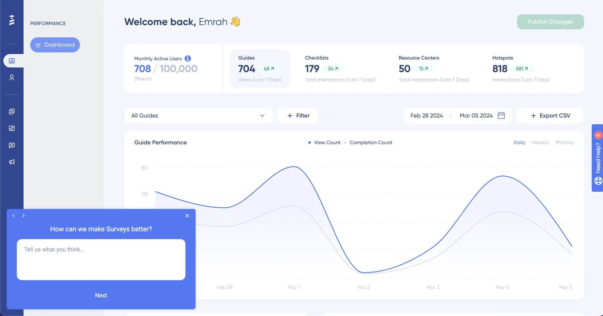
Created with UserGuiding without coding.
UserGuiding here makes a dream come true with its feedback modal.
Let me explain in detail: First off, you can choose the exact place where you'd like the feedback modal to appear, which helps with the user experience interval problem since the sequence might not get cut off at all based on the placement of the modal.
The brand recognition is bringing its A-game on by matching the general color theme according to the brand itself with white and blue (That much you can see from the background elements as well 🤭).
My next point includes how this example creates a sequence by having a Next button that users can use to move on to the next question or go back to the previous questions by using the previous button.
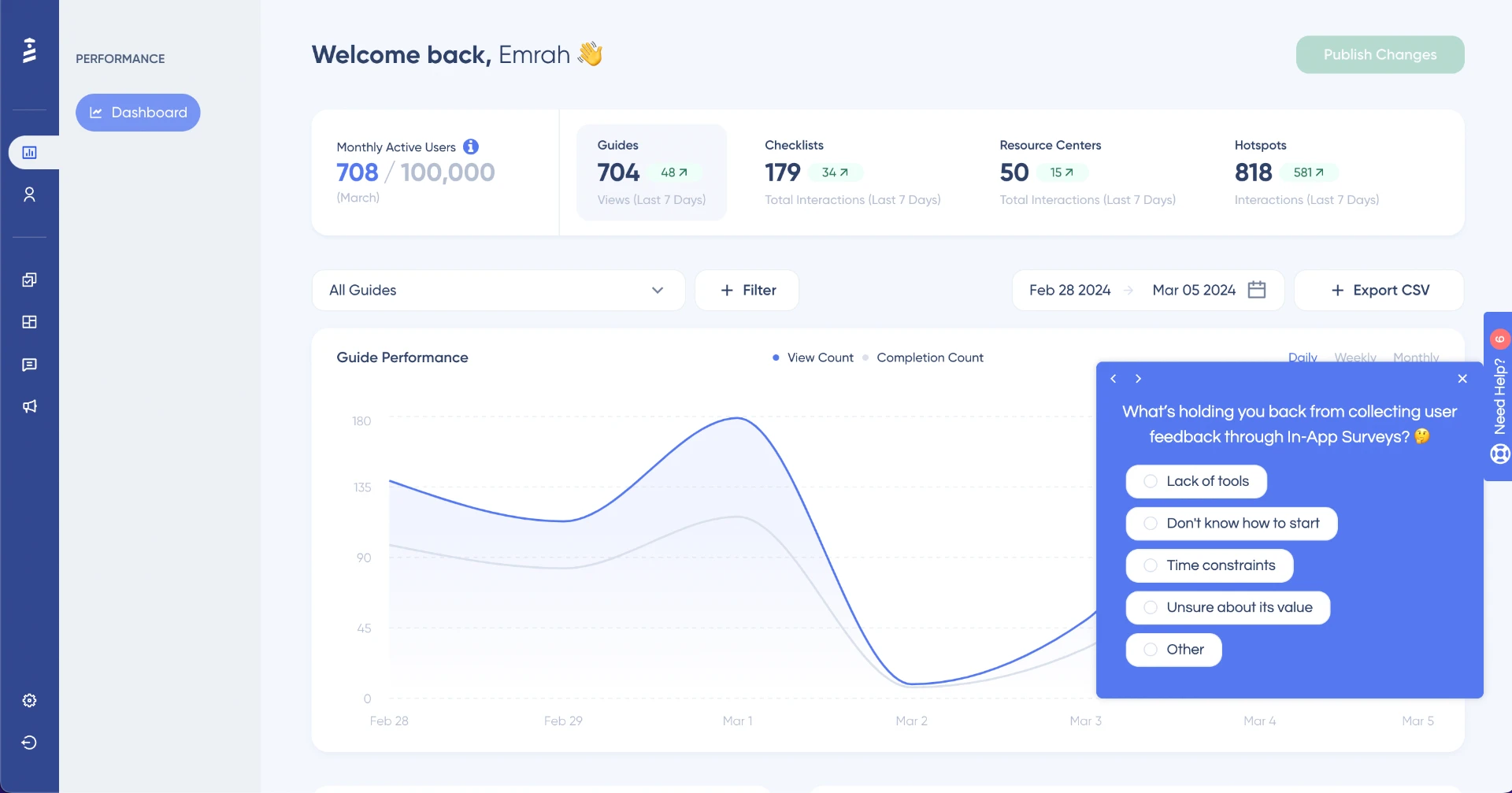
A multiple-choice feedback modal example you can create by using UserGuiding.
Here comes another example with a different element, which is a multiple-choice question that users can choose.
The copy itself is still short and to the point, but the tone becomes more friendly with the usage of emojis.
Moreover, users can choose multiple choices at the same time, and if they choose Other, then a comment section appears to get their further ideas on the topic.
You can also see that both feedback modals have a close button for the users who don't wish to take part in the feedback process.
In short, UserGuiding is home to several feedback models that you can customize and adopt when it's time to collect feedback from users.
2- Calendly

Calendly offers an interactive walkthrough that comes with one question on a pop-up modal to collect feedback from first-time users who have just finished onboarding.
Thanks to this step, Calendly manages to hear the thoughts on the initial onboarding, where users get acquainted with the tool for the first time.
By leaving a blank space for them to write what they thought of and rate the whole process in words instead of employing emojis, the software successfully gathers the pros and cons in one place for a later review.
Now, teams are able to utilize these comments when they need data. For example, product teams can see what users think of a specific feature going through onboarding, while marketing people can get inspired based on the pain points users mention.
Most importantly, teams can understand what first-time users think of the product — if they reach their aha moment and if it was a successful onboarding sequence in users' own words.
Moving onto the design choices, you can see that Calendly opts for a short question that displays what Calendly is after.
The modal itself isn't a large UI element that overwhelms the users; it's a rather small modal that comes with a comment section.
It also has a close button for users who don't want to leave feedback and a Learn More button for users who need more assistance post-onboarding.
3- ClickUp
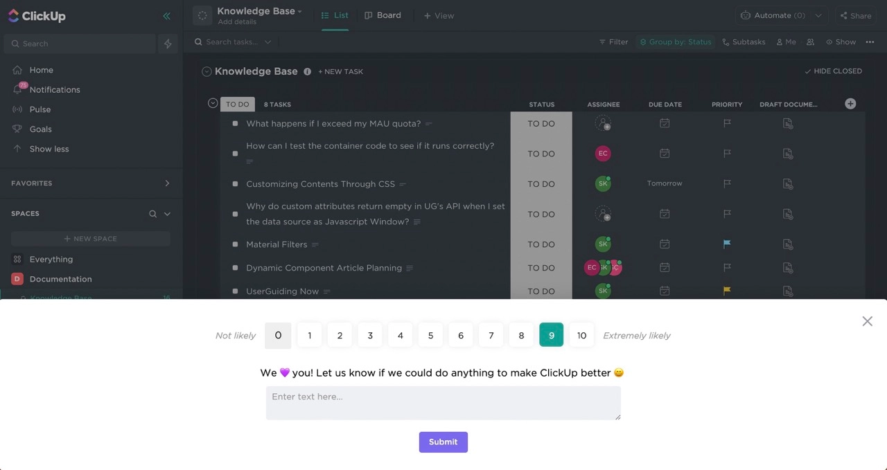
ClickUp requires users' attention with a popup survey that includes an NPS with dynamic text that changes according to the score users give.
This feedback modal benefits from a contrast color against the preferred color mode theme, which enables the modal to grab users' attention quickly.
The copy is brief and enables users to understand ClickUp's intention; it even involves a friendly tone with emojis instead of words and punctuation marks.
It also makes use of a comment section where users can freely provide feedback regarding the user experience (and even additional information for new feature requests or improvements) for teams to consider later on.
Last but not least, it has a close button for users who wish to hide the feedback modal from their screens in the meantime.
4- Duolingo
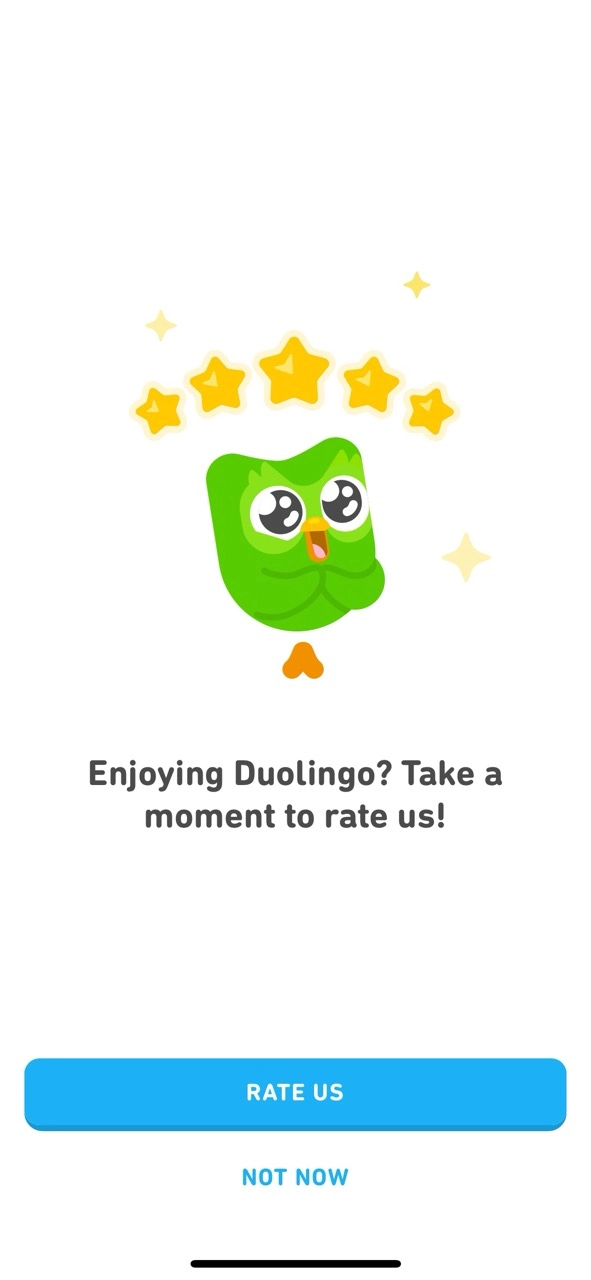
Here is a feedback modal example from a mobile app.
Duolingo chooses to employ a fullscreen modal that asks for feedback and stars on an app marketplace for other people to see and consider before downloading the application.
As a mobile app, it makes sense for it to go with a fullscreen modal since otherwise the modal itself could be rather small for some users to read or interact.
This example showcases how brief copies win over long ones once again. It also pays attention to brand recognition by using its official mascot, Duo's image. All on point 👌
The call-to-action part is simple yet practical enough to urge users to provide them with feedback and stars based on opinion.
This time, there's no close button at the top right, but there is a dismiss option right below the Rate Us option.
The placement of it and the CTA is definitely a deliberate decision because the target audience uses the below half of the screen to move on to the next question all the time.
5- Slack
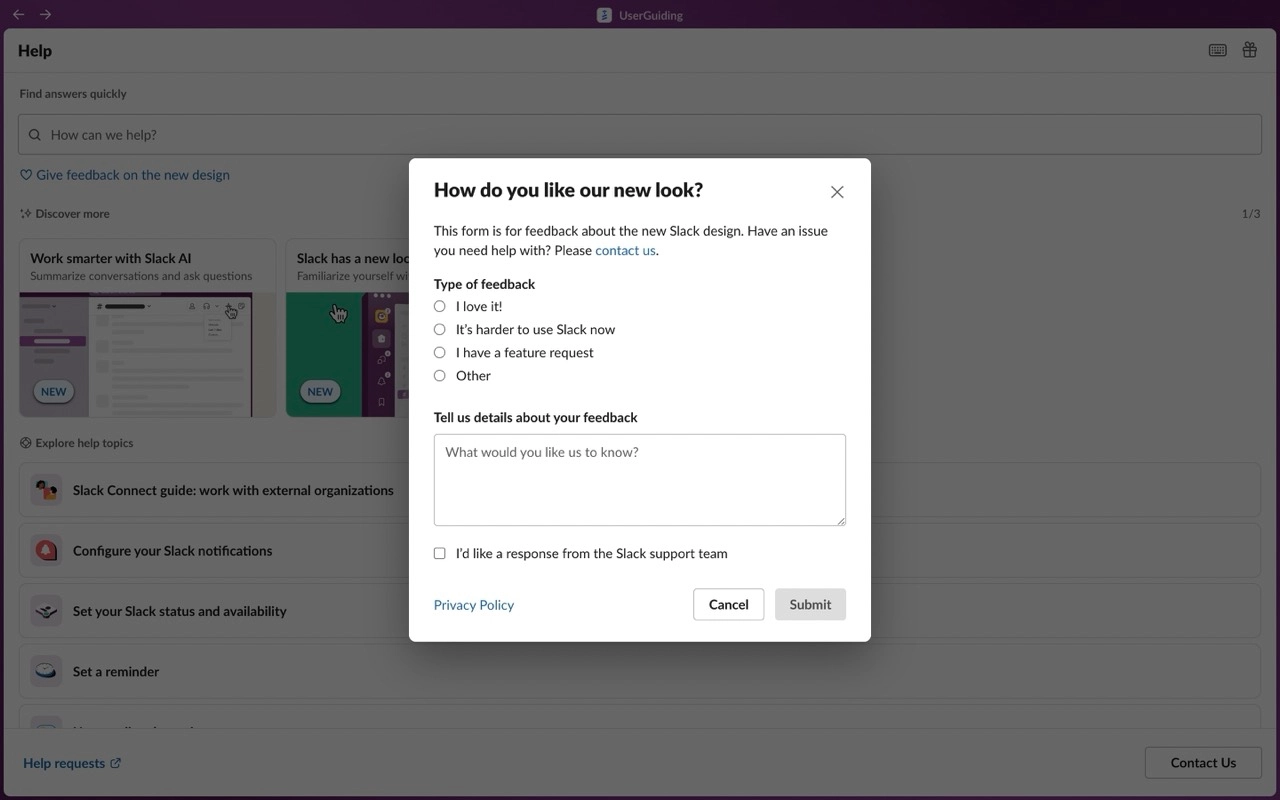
Allowing no room for repetitively asking user feedback through UI modals, Slack proceeds with a feedback modal that pops up when the user decides to interact with it from the Help section.
Users are encouraged to follow the instructions while still seeing the content behind the modal since Slack semi-darkens the area behind the modal, just enough to catch users' attention.
Moreover, it involves questions with multiple answers by not only asking for thoughts on the new design but also allowing users to make a feature request.
This might be distracting for some users, but I'm betting on Slack that this gamble works in their favor.
Moving on, this feedback form includes a multiple-choice and open-ended question together, yet can you see how short it is?
One last detail I should point out is that it enables users to be in contact regarding their feedback with the support team if they wish so by simply checking the box.
Wrapping Up
Here, you just read the ways you can build practical feedback modals.
These feedback modals help teams gather feedback from users on topics of their choice—whether it's about a new feature or the onboarding process.
There are some elements you should consider when creating them as they should:
- have a short copy,
- include a close button,
- have a user-friendly design,
- include smart CTAs,
- and avoid repetition.
You're in good hands because the feedback modals examples I included above contain every required element.
So, it's for me to write and for you to check out!
Frequently Asked Questions
What does a modal look like?
A modal in web design is a box that appears on top of a webpage, blocking interaction with the underlying content. It typically contains a dialog box with a button that needs to be clicked to dismiss it.
What is modal in mobile apps?
Mobile modals, also called modal windows or overlays, are in-app messages that appear as large UI elements on top of the main app window. They typically have a transparent background to provide users with a glimpse of the main app while focusing on the modal content.
.png)


.svg)
