


.svg)


.svg)
.svg)
.svg)
.svg)


Here goes my semi-poetic explanation of modals.
Modals are like post-it notes you leave on the fridge for your housemate to remind them of the meal on the second shelf of the fridge.
You let them know what's inside it just before they open its door and oversee the food on the second shelf.
Modal windows in UI design function the same as these notes. They are not part of the main display of an app or a website but neither totally unrelated to them.
Better put, modals are UI elements displayed in front of the page and require the user to engage with them to continue interacting with the page.
I collected several examples across apps and websites to inspire you to create the best modal window for you.
Let's go 🚀
1- Cuepath

Cuepath is a tool to ensure patients take the right pills at the right time and day. As a product designed for seniors, it needed a good onboarding user experience to make users happy and healthy.
See how it uses a funny modal to welcome its users. The gif makes the modal more engaging and attention-grabbing.
2- Logcomex

Logcomex is an intelligence tool for foreign trade. Using models with illustrations and CTA buttons with a short copy is what makes this one a good example.
3- GroveHR

GroveHR uses a video to enrich the user experience of the welcome modal. And there are other functions where they use modals. They also achieve user segmentation via a short survey at the beginning of the onbaording process within a modal window.
4- Acclip

Acclip is another SaaS product to use a welcome modal to onboard its users. See the consistency between the chatbot button, the modal, and the dashboard's overall design, and it is perfect!
5- TimeSolv

TimeSolv's modal is both informative and welcoming. Its copy deserves attention as its tone is formal but far from long and boring. The bullet points make it easy to follow.
6- Indicata

Another place to use modals instead of the middle is the right side of the page. Indicata displays a modal to announce the release of its new market report. The call to action buttons and the overall design are basic yet inspiring for all.
7- KeyHole

Modals are not necessarily popup windows appearing on users' screens. They can be triggered by any interaction of the users with the page. In KeyHole's case, the modal appears when a user clicks on a button to start the onbaording process.
8- CitizenShipper

Responsive design is the key to success if you are a designer. So, your modals also need a bit of responsivity for all mobile devices. Check out how CitizenShipper's mobile modal for welcome is a good example.
9- Adobe Acrobat Reader

One of Adobe's great tools, Adobe Acrobat Reader, displays a modal to take you on a tour of the tool.
The dark mode in the overall design reflects onto the modal, and the contrasting colors make the image and the copy more visible.
10- Airbnb

I have loved the color palette and simple UI design of Airbnb since I first saw it. Look at this modal; doesn't it seem comfy?
11- Booking.com

Loyalty programs are nice to have for businesses.Booking.com shows your progress in an engaging modal window with a progress bar.
12- Bundle

I started to use Bundle since I realized I had given up keeping up with the current happenings in the world. Reading news articles of interest in one app is a good solution. They utilize a modal to announce their feature, which shows you the weather forecast for your location.
13- Clue

Clue is my best period tracking app so far. This modal window offers you a premium subscription to have more detailed info about your period symptoms. What I like about this simple modal is its effective UI design.
14- Coursera

I love learning new things, and Coursera is my to-go app for discovering online opportunities for learning. It shows a modal window to ask me to take a survey about the application. It is neither much nor lacking anything. It is as it should be: kind, clear, and concise...
15- Google Drive

While using Drive with a business account, a new feature allows you to create workspaces. It encourages you to create one with these tile-like modal windows, both sleek and attention-grabbing.
16- Dropbox

Yet another great tool for organizing and creating files is Dropbox. This basic modal window lists the benefits of having a premium account with a bullet list and a little illustration that feels calm and creative, which I liked most.
17- Duolingo

It had been a long time since I didn't open Duolingo to continue learning French. When I did, Duo welcomed me with this cute modal window 🥺
18 - Webflow

I liked how Webflow greeted me when I signed up for the trial. This is a brief welcome message with a kind request to share my feedback. Also, I always appreciate the representation of the black community in in-app images like this one.
19- Grammarly
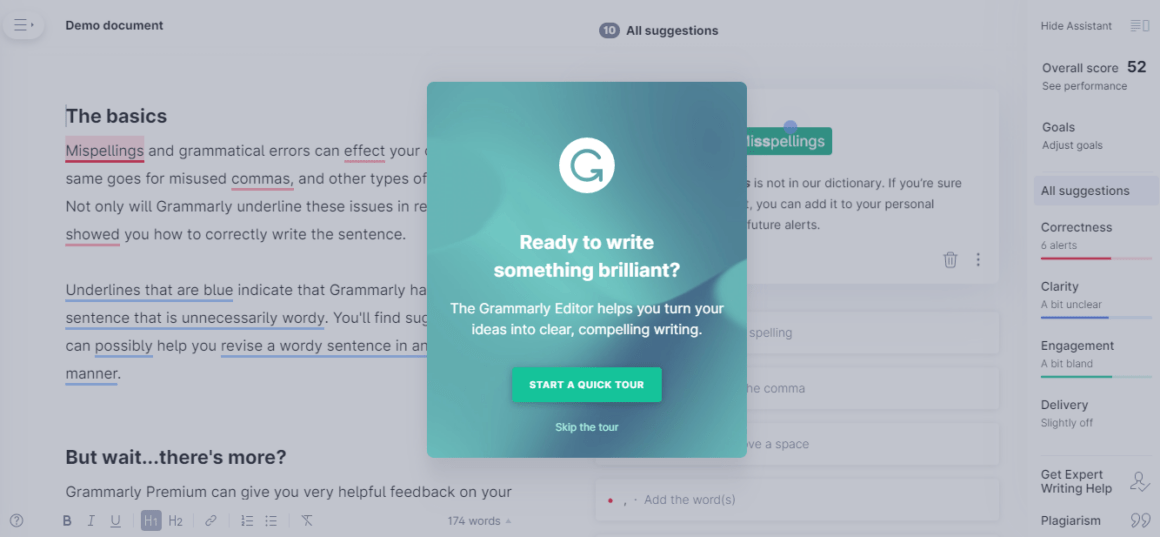
I have used Grammarly almost every day since my years in college. The modals from its web dashboard prove why I prefer using it. The design of the windows is always a good mix of copy and visuals. The message on them is as open as possible, and the flat design of the visuals goes hand in hand with that.
20- Invision
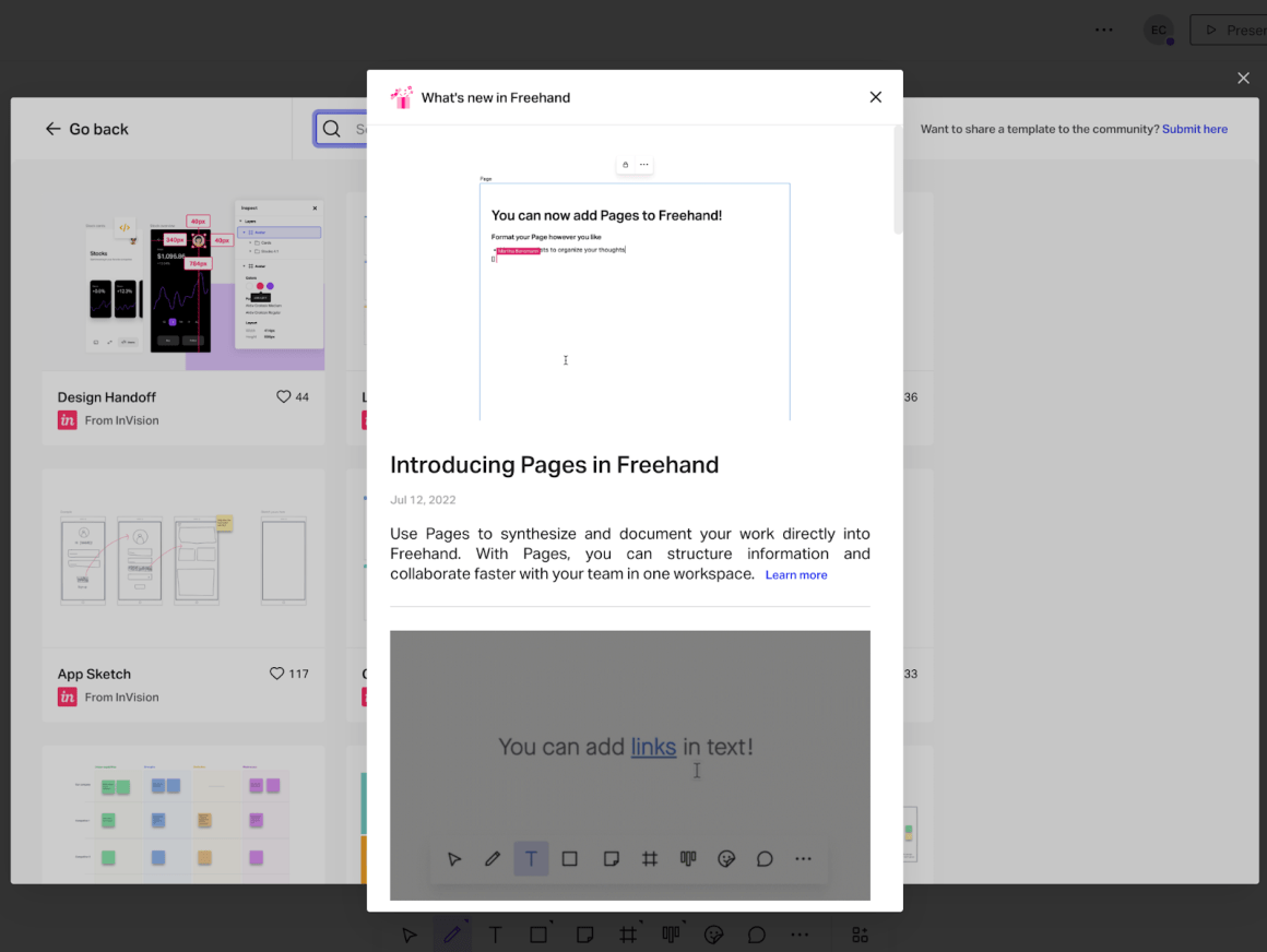
Using modals for feature announcements is a familiar thing, but Invision stands out with two gifs shown in the modal. These gif images show a short video of how to use this new feature, which is exactly what we need in feature announcements. They are like tooltip popups that make your job easier.
21- Linkedin

As you already know, I enjoy flat design, and Linkedin's colorful illustration in this modal looks so good. Also, adding two option buttons to a modal is a smart way to use it.
22- Linktree


Linktree uses a modal like a resource center to share new feature announcements with users.
But more importantly, the modal they use for offering a pro-plan looks better and more beautiful.
23- Loom

Another great way to use modals is by giving users offer plans. See Loom's marketing strategy to incentivize inviting team members to the app via a modal.
24- Monday.com

Monday.com gives notice with a modal to let me know my trial is over. The CTA button is designed with a proper message.
25- Dimensional


I explored Dimensional recently, and it is so much fun to answer questions, especially while commuting. Here, the modal announces a new feature with as few words as possible. I liked that even if the modal's color doesn't contrast with the background, the images provide that contrast and keep the focus on them.
26- Splitwise

Splitwise uses the same strategy as Loom. The offering is displayed on a modal window, and the contrast between CTA's and the background is near perfect.
27- Spotify

I find Spotify's modal designs quite interesting and to-the-point. They always find engaging data to make me curious about. Towards the end of the year, they reminded me of the first song I played this year on Spotify.
28- Bumble

I can't say I'm a big fan of Bumble's UX/UI design, but it's a sure thing they know how to use modals. See, for example, the modal below, and it gives me enough information to become a premium member and a compelling offer for today.
29- Figma

I want to end this article with my fav modal. Figma knows how to do it! Look how cute the copy and the image in this modal are. Lovely 😻
See also this feature announcement modal in Figma.
Frequently Asked Questions
What is modal in design?
A modal in user interface design is a window shown in front of the main window. Modal windows require interaction to disappear and let the user continue with the main page. Designers use it for ends such as welcoming users, announcing features, user surveys, and upgrade messages.
Is modal good for mobile?
Modals are good ways to communicate with users with in-app messages and surveys. It is important to keep their number limited and make them as least annoying as possible. For that, the modals shouldn’t interfere with the overall user experience with the application’s main window.
Are modals good for web design?
In web design, modals are the best if you want to grab users’ attention and ensure they see your message. Just beware of being user-friendly while using modals in web design lest you frustrate them instead of exciting or helping them.
.png)


.svg)
