


.svg)
.svg)
.svg)
.svg)
.svg)


.svg)


.svg)
.svg)
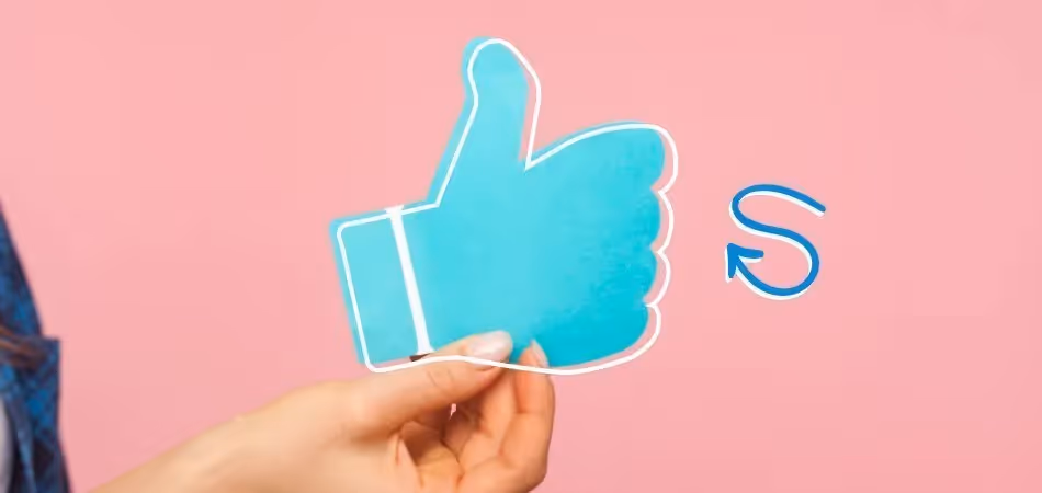


See the blue line above that moves further as you scroll down?
It turns our trademark orange when you finish the article too.
I have always been a fan of that.
It somehow makes the whole reading experience easier, besides it’s fun. It’s a really thin line so it doesn’t bother or distract me and overall, it’s very functional.
And that is a great example of a microinteraction, which can make your product even more fun and enjoyable than it is.
What are they exactly? Let's answer that.
What are Microinteractions?
Microinteractions are, as the name suggests, small interaction moments in a design.
They are trigger-feedback pairs occurring on your website, app, or device. In fact, we are surrounded by them in our everyday lives.
- Swiping, scrolling, and clicking,
- hovering over something,
- liking, sharing, and saving,
- turning the volume up and down,
- muting and unmuting your phone,
- the mall restroom faucet detecting your hand,
are all microinteractions or involve microinteractions.
You can figure it out easily once you realize the trigger-feedback relation between them.
Let’s take a deeper dive into the mechanics of microinteractions.
The Mechanics of a Microinteraction

As we already know by now, microinteractions are trigger-feedback pairs.
What does that mean exactly though?
Microinteractions work on a standard four steps. These are;
1- Trigger: a trigger is the start of the micro-interactions. It can be initiated by the user or the system itself.
User-initiated microinteractions can be pressing a button, swiping, scrolling, or clicking; system initiated triggers, on the other hand, happen when certain qualifications are met, and the system decides to initiate a trigger. For example, a pop-up animation, or a notification can be system triggered.
2- Rules: determine what happens after the trigger is initiated.
3- Feedback: is what happens once the trigger is initiated, basically, everything the user hears sees, or feels (e.g. vibration) count as feedback. For example, when you swipe, that is a trigger; and the animation you see on the screen (changing of the colors, highlights, or the screen in an animated way) is the feedback.
4- Loops & Modes: determine the meta-rules of the microinteraction, they are needed when the conditions of the microinteractions change. They may not be a part of the initial design, but they are important for user satisfaction.
Why do Microinteractions Matter?
The devil is in the detail, they say.
Although they are called microinteractions, the effect they have on the design and the user experience is MACRO.
There are some websites and apps you actually enjoy using, and there are the ones you have to use. We don’t even notice it, but the distinction is very much affected by the micro-interactions.
But why? And how?
They make the interface more user friendly.
Microinteractions are great for when you need to enhance ease of use.
They can be used on very different forms and platforms, but it is not hard to see that they are needed for user-friendliness.
You have probably come across a website with a tab bar that lights up when you hover over the icons, some even produce another menu when you hover. This micro-interaction is important because it lets the user know whether the tab bar or the icons are interactive or not.
We instinctively think of visual microinteractions, but hearing can be as essential as seeing sometimes. When you receive a notification, you usually hear a sound too. Personally, I hardly ever know I received a notification without this type of microinteraction.
Ease of use, check.
They create a more delightful experience
I don’t know about you, but if I’m having a bad day, and I press a button and the button suddenly turns into a plane and flies away, I just feel a bit better. Take a look at this animation by Mauricio Bucardo, for example.
Or maybe if you need a real-life example, remember Snapchat’s bitmojis?
When both parties are in the chat and one is typing something, his/her bitmoji appears right on top of your type bar. Sounds like a clever use of microinteraction to me.

They make it more human
No need to deny it, we are all just a little afraid of artificial intelligence.
In an effort to make our apps and devices, well, less scary we design and decorate software. For some reason, the human mind perceives animated interactions as less threatening.
Probably because they are cute but oh well, whatever floats the boat. Look at this design by Paarth Desai.

Could this cute little bell ever hurt you?
On a different note (and a less humorous one), they really make it more human.
Imagine all the old websites we had to use before microinteraction was a thing. And then there are the ones you can access right now. We can all agree that a badly designed website is torture.
They make users come back
Keep in mind that, a well designed microinteraction can and will do the marketing for you.
There are just some microinteractions that attract the user.
It could be as small as a trash bin animation like WhatsApp uses for deleted voice recordings or something bigger.
Twitter recently came up with a microinteraction that displays different animations when a tweet is liked. All they had to do was link it to hashtags. Companies and communities started their own animated hashtags and some people ended up downloading Twitter just to see the trick.

Microinteractions not only attract the users but also keep them. since they make the user experience smoother and fun, we inevitably come back.
To clearly spell it out, micro-interactions are very important. But an overnight realization won’t do if you want to make good use of them. Let’s move onto the “how?”
How to Make (Good) Microinteractions?
Most of the time we don’t even realize we are interacting with a microinteraction, but then again that is the whole point to it.
A microinteraction shouldn’t draw attention to itself and overshadow the whole design.
A properly designed microinteraction is subtle, occurring in a short moment, or throughout a longer interaction in an even more subtle way.
That is because, even though the design is fun and all; users always choose functionality over design. So, microinteractions should be moments where functionality and design meet to enhance user experience.
If we were to take a closer look into an instance of interaction, microinteractions serve three important purposes;
- Enhance usability and make functionality more fun,
- Give the user a feeling of direct control,
- Create a connection between the user and the design.
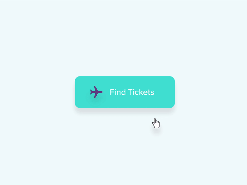
Take a look at this microinteraction by Aaron Iker.

We can easily say that it is fun and functional.
As the user gets feedback on their actions, the user is aware of their control over the app and thus, the animation gives the user a feeling of control. Furthermore, since it’s fun to use, it creates a connection between the user and the design.
Great work.
But making a good microinteraction goes further than that. There are do’s and don’ts and sometimes the line in between can be really thin.
1- User satisfaction comes first
Let’s go back to square one for a second.
Everything we do, we do for the user.
The sole aim of the design is to please the user, so is the microinteractions.
Now, keeping that in mind, it is very clear that microinteractions should be designed carefully. Although the interaction looks fine at first, it may decrease overall ease of use, or end up becoming a bad experience for the user. Just like I said in our microcopy article, don’t forget to test!
2- Keep it simple
We need microinteractions because primarily, they enhance ease of use.
So, why make it complicated?
Cute animations are cool and all but putting them everywhere can be a bad move. Besides, too much animation can damage a company’s image too.
Keep it serious, but fun. The distinction can be thin, but it exists.
3- Don’t let it overshadow the content
This is very important especially when your product is not the website or the app itself.
Going back to the Twitter example, one small micro-interaction made people go crazy over it.
But it didn’t affect Twitter in a bad way, since its product is the app itself, and well, Twitter is a huge company.
But imagine the same thing happening to a company that sells something. It’s good marketing, but still overshadows the product itself. Because people won’t be on your website/ app forever, such “marketing” is not necessarily reliable or stable, and in the end, has the potential to affect you badly.
4- If it’s not functional, you don’t need it
Some websites and apps make the mistake of including a lot of design components, just for the sake of appeal.
At times like these, you must remember your product and what it does.
If you sell sneakers you don’t really need an interaction that tells the user what time it is. Keep only the necessary interactions and work on bettering them.
5- Don’t Reinvent the Wheel
Users are accustomed to certain types of interactions, whether the interaction is happening in a digital environment or real-life devices.
For example, imagine opening an app and scrolling down. You would be dumbfounded for a moment and even irritated if the page moved up instead of down, right? That is because we are all accustomed to it working the other way.
Make use of tradition but be revolutionary in doing so. Sometimes old is good enough when it’s touched by a bit of the new.
Good (and Bad) Examples of Microinteractions
Light/Night Mode
Let’s take a look at my favorite microinteraction ever.
I seriously do not remember how I put up with light theme before.
Kudos to whoever came up with the dark mode!
Now, take a look at these examples. This switch interaction by Andrey Bogdanov is a good one. I especially like the moon – sun switch but it is rather confusing due to the lack of “light – dark” tags.

Then we have this switch interaction by Tim Silva. It uses the same principle as the first one, plus there are the tags.

It is important to mind functionality, even when the design is minimalistic.
Add/Share Button
Add/share buttons give designers a lot of room to be creative.
Oleg Frolov is one of them. In this microinteraction design, he introduces a really original and cool looking add button.

And again by him, in this microinteraction design for a share button, we see something similar.

Now, although the first one looks really good and creative, for different user groups it might be challenging. Most of the time, we see apps prefer micro-interactions like the second one.
Here we have a photo of Tumblr’s add button. Although it is deemed to be a way more marginal app than most, it still keeps it rather simple.

Animated Call to Action Button
Animated buttons are always fun.
However, there’s something to remember: animations are tricky.
If it doesn’t compliment the website/ app, it’s best to keep it subtle.
Let’s look at Brenden Fletcher’s add to cart button design. It’s simple and fun.

Now, look at Pineapple Studio’s pay button design.

Comparing the two, one might say that the second one is more subtle while still keeping the clever card swipe design.
Both designs are valid, yet because of the second one’s simpler nature, it may be preferred to the other.
Download Animation
What is the most boring thing we all do on the internet?
Downloading.
Sometimes you just have to wait and wait and wait and wait and wait...
That’s exactly why designers have to make that bit of animation extra fun, take a look at Oleg Frolov’s download animation design.

Now take a look at another download design of his.

Both are pretty good, right?
Here, the key is the user.
The first one is more subtle and elegant while the second one gives off a vibrant feeling. Both designs make good use of color – emotion relationship.
The first one uses percentage and the second one is more like a countdown. I would say the first one is a bit more professional in a relative sense.
Conclusion
In UX design, micro can be macro.
Microinteractions can be very short moments, yet their effect on the user experience is undeniable.
One good animation or sound design can get the users hooked, whereas a bad design can put them off. Furthermore, these little instances have marketing value as well.
Still, as small moments as they are, they can be tricky.
One must learn how to adjust their subtlety as well as their relevancy to the rest of the product. Deciding all that is put on the UX designer’s shoulders, but it is no burden but the power to make use of the digital realm’s most powerful weapon.
Need further instructions?
We said that microinteractions can be used as tools to delight, and what is a tool without its manual?
Although this article sums up the topic and gets you started, you can get further inspiration from the biggest resource on microinteractions.

.png)


