


.svg)


.svg)
.svg)
.svg)
.svg)


Ever had a hard time trying to figure out how to create one of those very complex-looking graphs?
I can assure you; you'll be amazed to see how easy it is to make one with the help of Google Sheets.
But before I explain how you can create a line graph, I want to quickly explain what line graphs are and what they're used for.
What is a Line Graph in Google Sheets?
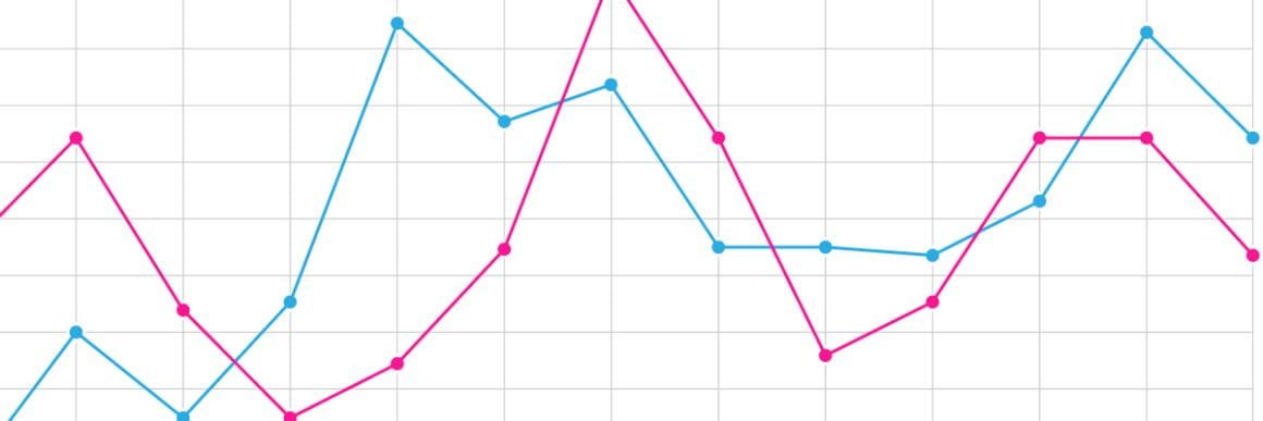
A Line Graph -also known as a line chart- is a graph that displays the graphical portrayal of changes in values over a period of time. Sounds a little too wordy? No worries, by the end of this article, you'll be killing those graphs!
Before we dive into our step-by-step tutorial, let's find out what to do with Line Graphs and how we can benefit from Google Sheets along the way.
What are Line Graphs used for?
Line graphs are powerful visual tools and are very common! Here's why:
- They are easy to understand, read and plot. ✔️
- They are practical to create. ✔️
They are especially great for :
- Comparing large sets of data
- Easily displaying changes over time
- Determining trends in your data over time
Different Line Graphs and Their Benefits
There are three versions of Line Graphs you can utilize in Google Sheets: Regular Line Charts, Smooth Line Charts, and Combo Line Charts.
They all have different strong suits that make them perfect for different tasks. Let's get to know them:
Regular Line Chart
A Regular Line Chart is a basic type of chart which is very common in various fields. It displays information as a series of markers that are connected with straight lines.
Advantages 🤩 :
- It helps show continuous data.
- It enables you to compare two or more items to see if there is a connection between them.
- It will enable you to find missing data.
Disadvantages 😐 :
- It can sometimes be challenging to compare data between the lines that possess similar values.
Smooth Line Chart
Smooth Line Charts are useful, yet controversial graphs that most people avoid using. They're basically the same as the regular line charts, except the corners are smoothened out to create an eye-friendly representation.
When working with large data sets, they can be helpful to make things look smooth, but it's best to avoid them when working with smaller data sets.

Advantages 🤩 :
- They come in very handy in that they can observe alterations over a certain period of time, and while drawing them, we can use exact values from our data.
- They can give us a quick data analysis.
- They enable us to understand right away if there are any gaps or clusters.
Disadvantages 😐 :
- They are not very convenient to create if you're dealing with fractions and decimals!
- It is common for smooth line charts to misrepresent a data set.
Combo Line Chart
A Combo Line Chart is a mixture of two or more chart types, like a Line Chart plus a Bar Chart.
They're especially useful for easily comparing two different data sets, to see their relation to each other.

Advantages 🤩 :
- You can use Combo Charts to create multiple data sets on one graph only.
- Values can be easily compared and measured thanks to them!
- The main advantage is that you can display multiple measures with different scales.
Disadvantages 😐 :
- Only one dimension can be displayed at a time.
- Combo Line Charts can be more complex than other chart types.
How to Create a Line Graph in Google Sheets in 4 Steps
In order to create a Line Graph in Google Sheets, you need to follow the basic steps which are:
- Enter your data,
- Highlight the data you want to be in the graph,
- Click on "Insert Graph" from the top toolbar,
- Choose your desired chart,
- Customize and place your chart.
Check out my video to see how you can do just that, or keep scrolling to find the written and detailed instructions; whatever you please!
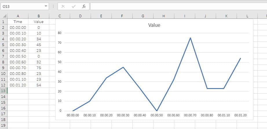
Step 1 - Enter Your Data
The first step is of great significance in order to achieve an accurately created chart. The data you enter is what will be conveyed in your chart.
Step 2 - Highlight Your Data
Once you have your data on the spreadsheet, you are now ready to create your very own!

The next thing you need to do is click, drag and highlight all of your information.
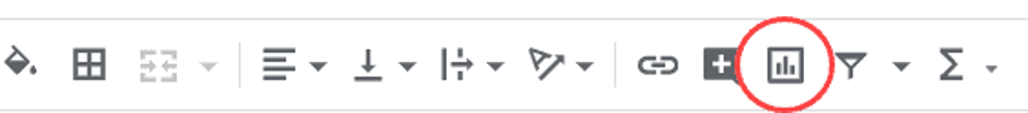
Step 3 - Click on "Insert Chart" at the Top Toolbar
Then simply go to the toolbar up there and click the button named ‘’Insert Chart’’.
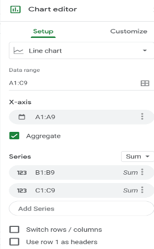
Step 4 - Choose The Right Chart For You
Once you click on the chart icon, you will see that the system provides you with plenty of options and also gives suggestions but there will be three options in the ‘’line graphs’’ section that you can choose from :
- Regular Line Chart
- Smooth Line Chart
- Combo Line Chart
We've described the use cases of each of these sets above, so choose to your own liking.

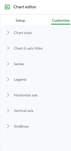
Step 5 - Customize Your Chart
After choosing your Line Chart, you’ll be good to go unless you seek further
customization options for your chart.
If you do, it will be enough for you to click on the ‘’Customize’’ button and then continue.
By following these steps, you'll be creating and improving graphs in Google Sheets in less than 5 minutes.
I hope you found this tutorial useful! See you next time. 🤝
Frequently Asked Questions
How do you make a smooth scatter plot in Google Sheets?
You first need to highlight the columns you want to compare and then open the ”Chart Editor” by clicking on the ”Chart” icon. Then, click on ”Chart Type” and select ”Scatter Chart” from the ”Chart Editor” options.
How do I make a chart in sheets?
To make a chart in sheets, you start by selecting the cells, click on ”Insert”. Select ”Chart”. Then select a kind of chart for your plan, don’t forget to click on ”Customize” to make it more like your own!
How do you make a graph with multiple lines in sheets?
To make a graph with multiple lines, you need to select the data-set, through which you want to plot both of your data in the same line graph. Then, in the toolbar, click on the ”Insert Chart’‘ icon. You’ll see that Google will automatically give you a suggestion, so if you end up with something different, you can always change it from ”Chart Editor.”
.png)


.svg)
