


.svg)


.svg)
.svg)
.svg)
.svg)


Charles Eames once said;
“The details are not the details. They make the design.”
And I could not agree more.
In 2020, every single bit of content counts. And by bit, I mean microcopy.
Microcopy is the tiny weeny small words you see on the internet; websites and apps likewise.
But don’t mind them being so small, their impact is huge.
Companies and designers rely on the power of words now, which, to me, is extremely wise.
You could have the most beautiful, intriguing, and original interface design, but without the words to build trust and navigate the user, the design is not finished. On the other hand, one tiny microcopy can carry the whole design and sell the product.
But what exactly is Microcopy (or UX microcopy) and how do you nail it?
I'll try to explain it best I can, and give a few examples throughout the article, and eight more at the end of it.
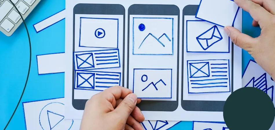
What is Microcopy (UX Microcopy)?
UX microcopy is the small little words and sentences you come across on the internet; on a website, in an app, or on a product.
It could be the tiniest error message or the navigations on a pop-up. it could be captions, buttons, loading, or error pages. Even that one message that tells you the website is using cookies.
That would be the formal definition of a UX microcopy. but what makes (good) microcopy what it is, is its power to encourage the users, gain their trust, and empower them. A good microcopy creates a difference and has a macro effect.
That’s exactly why it matters,
though let’s take a deeper look into the reasons why just to be clear.

Why does Microcopy Matter?
Quick question.
Which one sounds better?
- Start using
- Get started now
- Get started (no credit card required)
See?
I’d bet 10 bucks that no one would prefer the other options after seeing the insightful “no credit card required”.
By adding those four words to your cute little green button, you guarantee 3 things.
- Your customer trusts you.
- Your customer is satisfied.
- Your customer makes the purchase.
How come, you might be asking.
Simple.
Customer Trust
A microcopy’s very basic task is to gain the customer’s trust.
Although online shopping is in peak demand now that people can’t really physically go shopping anymore (no thanks to the pandemic), so is people’s anxiety to get scammed.
It doesn’t even have to be about a purchase or a scam. We are afraid that our private data will be leaked, or we will receive spam messages.
It does not particularly solve the problem, but somehow – just somehow – when I see small text underneath a button telling me that my private data is safe and they will not send me emails if I don’t want them to, I magically feel safer.
That magic is the magic of microcopy.
Microcopy is basically the company taking of the formalities suit for one second and telling you, human to human, that you are safe.
If you are not Jeff Bezos or some billionaire, I just instinctively know that you don’t want to give your credit card info to some random website (Actually, I doubt even Jeff Bezos would want that). In the example above, when the website tells me that they don’t need my credit card, I feel safer and I trust the website and the brain behind it.
Customer Satisfaction
Take trust one step ahead and you have customer satisfaction.
Or rather, if you don’t give trust you give dissatisfaction – and vice versa. Businesses are starting to understand that microcopy gives trust, so they use it.
When you expect to see those trust-inducing words on the website and you don’t, you are subconsciously dissatisfied.
But satisfaction goes further than that.
It’s all about thinking about what the customer wants before the customer even knows he/she wants it. Cue the credit card microcopy. We want companies to not want our credit card information, yet it’s so subconscious.
We feel nervous when we don’t see the “no credit card required” text, but we don’t even know why. Companies use that tiny microcopy and instantly ease us.
Now, that’s satisfaction.

Buy Me a Coffee knows that we don’t want the sign-up process to take ages. That little microcopy made me sign up just to see if it actually took that little time.
Purchase
It is a proven fact that microcopy increases business. According to this article, the addition of two words of microcopy made an increase of 17.18% in conversions.
The product looked like this; the only copy being “add to basket”.
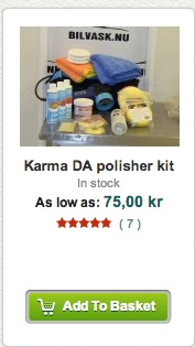
This confused people because they didn’t know what was included in the price, the customers didn’t know if they could click on the product image and see the details.
With the simple addition of “see bundle” microcopy, the conversion rates raised by 17.18%.
Back to our example. Trust brings along satisfaction and satisfaction brings along the purchase.
I won’t give you any statistics, any numbers or reports to prove that the tiny weeny “no credit card required” microcopy increases purchase and conversion.
Because you already know it does.

How to Make the Most of Microcopy
Microcopy is simple, yet tricky.
It requires a personal, human touch but not too much.
And note this down. Microcopy is not a miracle.
It cannot increase your conversions overnight but it surely is a great helper. Let’s revise what to do and what not to do for it to have a better impact.
Think human
Talking to a robot is definitely not as adorable as it was in the 80s.
Even websites don’t like robots (how many reCAPTCHAs did you go through today?).
So why act like it is a robot reading through your website?
As humans, we don’t pay attention to everything.
In fact, our attention span on the internet is around 8 seconds. What’s more is that we read only 20% of the content on a website.
These data tell a lot about what UX designers need to do to make a microcopy a hit. Place it where you get the most attention!
Make It Short and Simple
I just said it and I will say it again.
Our attention span is seriously short. So, make good use of it.
A microcopy is supposed to give trust, satisfaction and it should help the customer make a purchase, if not persuade them. None of that happens if the copy is too long or complicated.
It’s called micro for a reason.
However, it’s tricky to make it short and simple. You shouldn’t exclude any needed information or simplify it too much to the point that it loses its meaning (ahem, legal reasons)
The best action to take here is making an infobox that appears when you hover over the actual microcopy.
Take a look at Booking.com using this technique. They went for the short and simple with “driver aged between 30-65”. But that’s no explanation, so they went for a slightly longer explanation that appears when you hover over the “?” icon. And it’s again, simple.

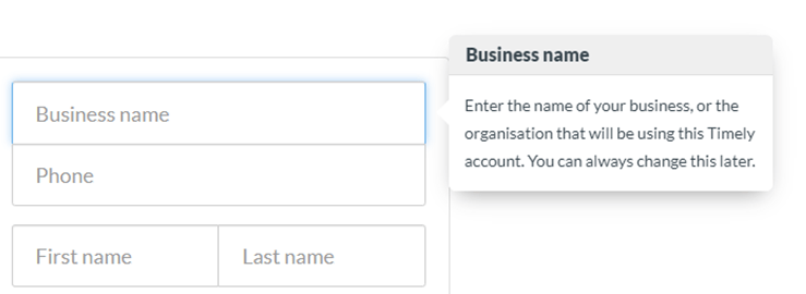
Timely uses the same technique to further explain what you need to do.
Apart from it being short and simple, it’s also reassuring thanks to the “you can change this later” part. Great detail.
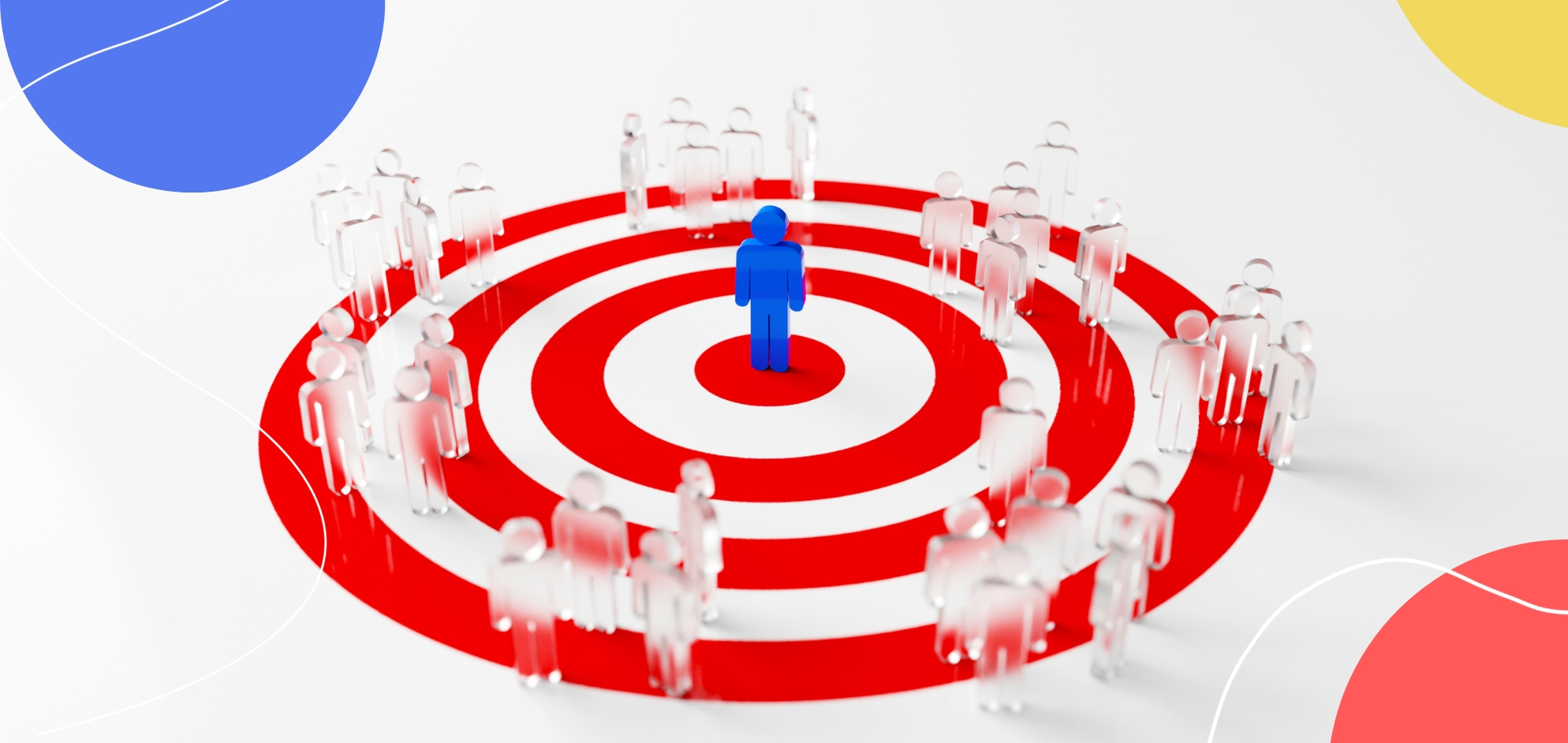
Know Your Audience
When you’re working on UX, the audience is the core.
No wonder it is the same for UX microcopy.
Since microcopy is all about making sure your customer is satisfied and trusts you, it is only natural that you have to know who you are pleasing and whose trust you are trying to gain.
Here comes in flexibility. The flexibility of your microcopy almost solely depends on audience.
You can guess that companies like Netflix and Spotify have a bit more space for flexibility while Microsoft is a more uptight one. Their websites have exactly that flavor, respectively.
It would be absurd if Microsoft suddenly went for a more carefree approach and it would be no fun if Netflix left its casual air behind.
When deciding their “manner” on their websites, companies take gender and age into account. They know that people use Microsoft at work and Netflix at home. And their microcopies are greatly affected by these factors.
A Sprinkle of Fun
All work and no play makes Jack a dull boy.
And it makes me yawn.
That’s why some companies sprinkle a bit of fun on their microcopy.
Let’s be clear, it’s not like they put a whole joke under a button. But a bit of colloquialism and some emotion in a microcopy never hurt nobody.
It can be subtle but still fun. Look at Imgur’s approach to a fun 404 error page. It rhymes!
Playing around with microcopy humor can be dangerous, especially if your company has a reputation for being serious. But it is up to you to not bore the living soul out of a customer, at least use an exclamation mark every now and then.
Test It and Test It Again
You have a good microcopy idea?
Test it first.
It can cause problems when you least expect it.
Let’s say you want to sound more professional and instead of having a button on your website that says “pricing”, you replace it with one that says, “ask for quote”. You put on the website, all done. In the next month’s report, you realize that clicks on the button dropped.
Oh no.
The problem is when people come to a website for a product, the first thing they do is look for the “pricing” button. It is being used widely and it’s very simple and to the point.
These kinds of problems are inevitable when you skip testing. Never skip testing.
Go back to Square One When Needed
Microcopies change all the time.
If you read any article about UX designs or microcopies, you’ll see that sometimes the websites given as examples have changed and that design or microcopy mentioned in the article is gone.
Because sometimes it is best to go back to square one.
Why?
The design might have reduced conversions, they may have needed a new design, or it could be just a legal issue.
In the end, what matters is to remember your goals as a company and go with the flow. Don’t be afraid to change your approach when it comes to microcopy, find what your customers need and desire.
But as I said above. Never. Skip. Testing.
8 Examples of Microcopy Done Right for Inspiration
1- Spotify
Do you see it?
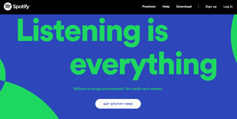
“No credit card needed”.
That is the magic sentence. And what’s more?
“Get Spotify FREE”
Combine them together and you have a billion-dollar company.
On top of all that, the design for such a landing page could not be better. Remember the study that says people only read 20% of a website? That 20% is the headline and the area surrounding it.
When you look at the page, you instantly read the headline, then the button, and then the microcopy. That is a perfect place for the copy because it’s in between the main attention points.
The microcopy won’t matter if no one gets to see it. Mind your layout.
2- Flickr
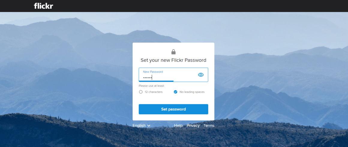
It is always frustrating when you are setting a password, you click done and it tells you the password is no good.
Flickr sets an example using a generally overlooked microcopy. When setting a password, you are informed whether the password meets the requirements WHILE setting the password.
Kudos to Flickr.
Another cool microcopy Flickr uses is this.
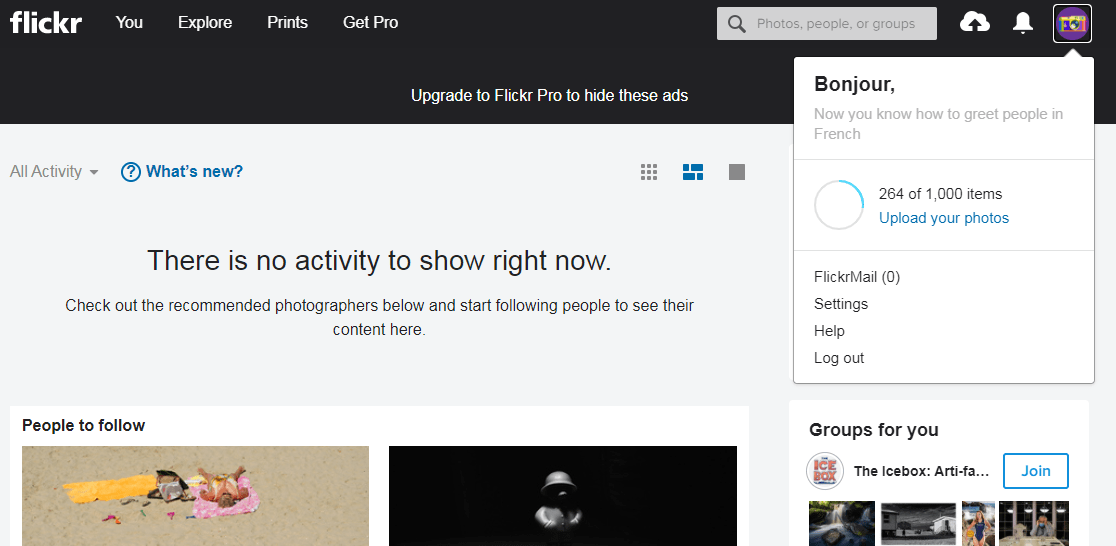
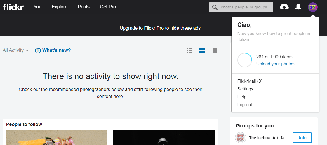
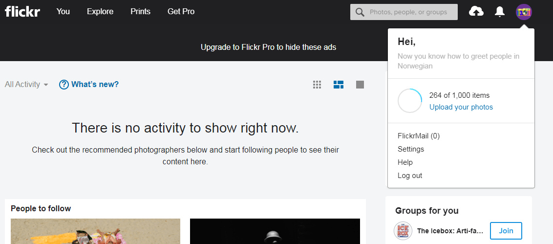
When you click on the profile icon, Flickr greets you in different languages and tells you which language it is.
Arguably, it’s not very functional but it’s definitely memorable and charming.
3- Bored Panda
I have to confess that Bored Panda is the only website I turn off my adblocker on.
This message is convincing, adorable and it makes use of its brand.
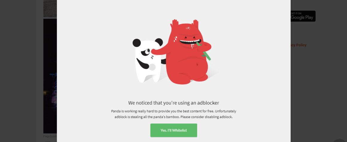
When you are on the more carefree side of the spectrum, as Bored Panda is, it is easier to brand.
But that does not mean a more serious brand can’t do this. It’s all about subtlety and functionality.
Besides, if it makes the customer turn off the adblocker, the means justify the ends.
4- Uber Eats
Uber Eats makes great example of an essential microcopy, the search bar placeholder.

I would definitely answer if someone asked me “what are you craving?”
Look deeper into it. It’s not just “what do you want to eat?”, it’s the word “crave”. It’s such a passionate word that I feel hungry.
Use the search bar placeholder but make it right.
And that’s not it.
It’s already genius that Uber Eats came up with a delivery fee solution by getting people to share the fee.
But it’s already better that they have a countdown and it’s right under the website header and above a picture. Right in between two attention points.
Purchase guaranteed.
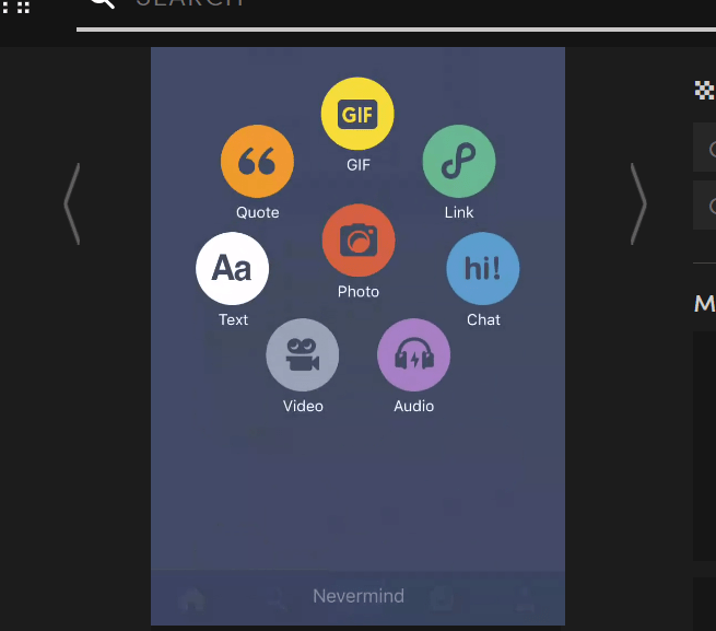
5- Tumblr
Tumblr is the best place for creative microcopy.
They have all the flexibility possible and they make good use of it. Especially on their mobile app.
You don’t want to post? “Nevermind”.
Tumblr came up with the coolest “could not find” pages too.

It also shows a cool new message every time you copy something.

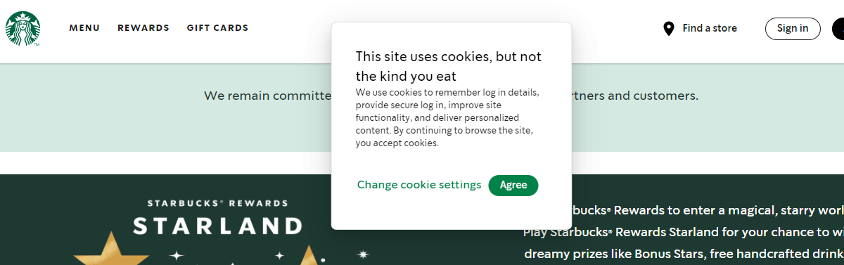
6- Starbucks
Starbucks has the best website cookie message and you cannot change my mind.
Trust, satisfaction, purchase.
All check!

7- Pull and Bear
It’s really subtle, but details make the design right?
I absolutely loved it when I saw that when you hover over the colors, it actually tells you what color it is.
A+ for thoughtfulness.

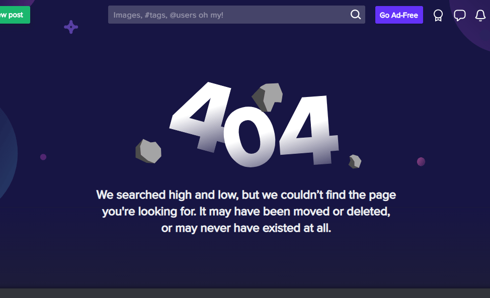
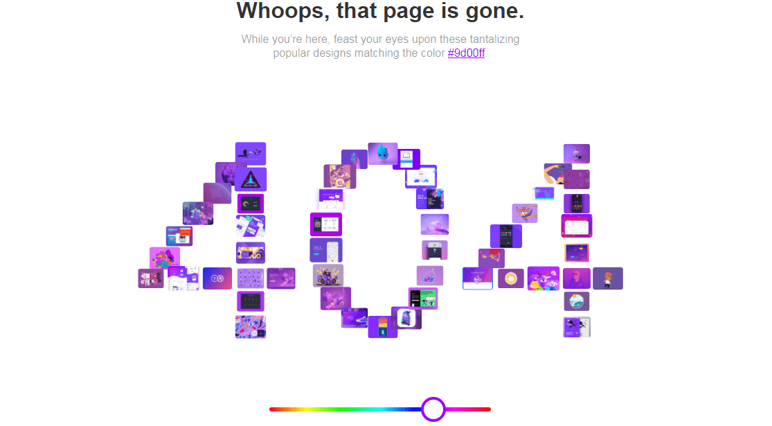
8- Dribbble
Dribbble has one of the designs that make great use of branding.
It’s 404 error page has a color palette that you can play around with.
Creations in the specific color you choose make up the 404 sign and you can actually click and go to those pages.
UX masterpiece.
Conclusion
Microcopy is not a miracle that can magically boost business metrics, but its impact should not be underestimated.
Minding your business’s style and needs, creating a difference with microcopy is an easy job.
Don't forget to test though!
.png)


.svg)
